

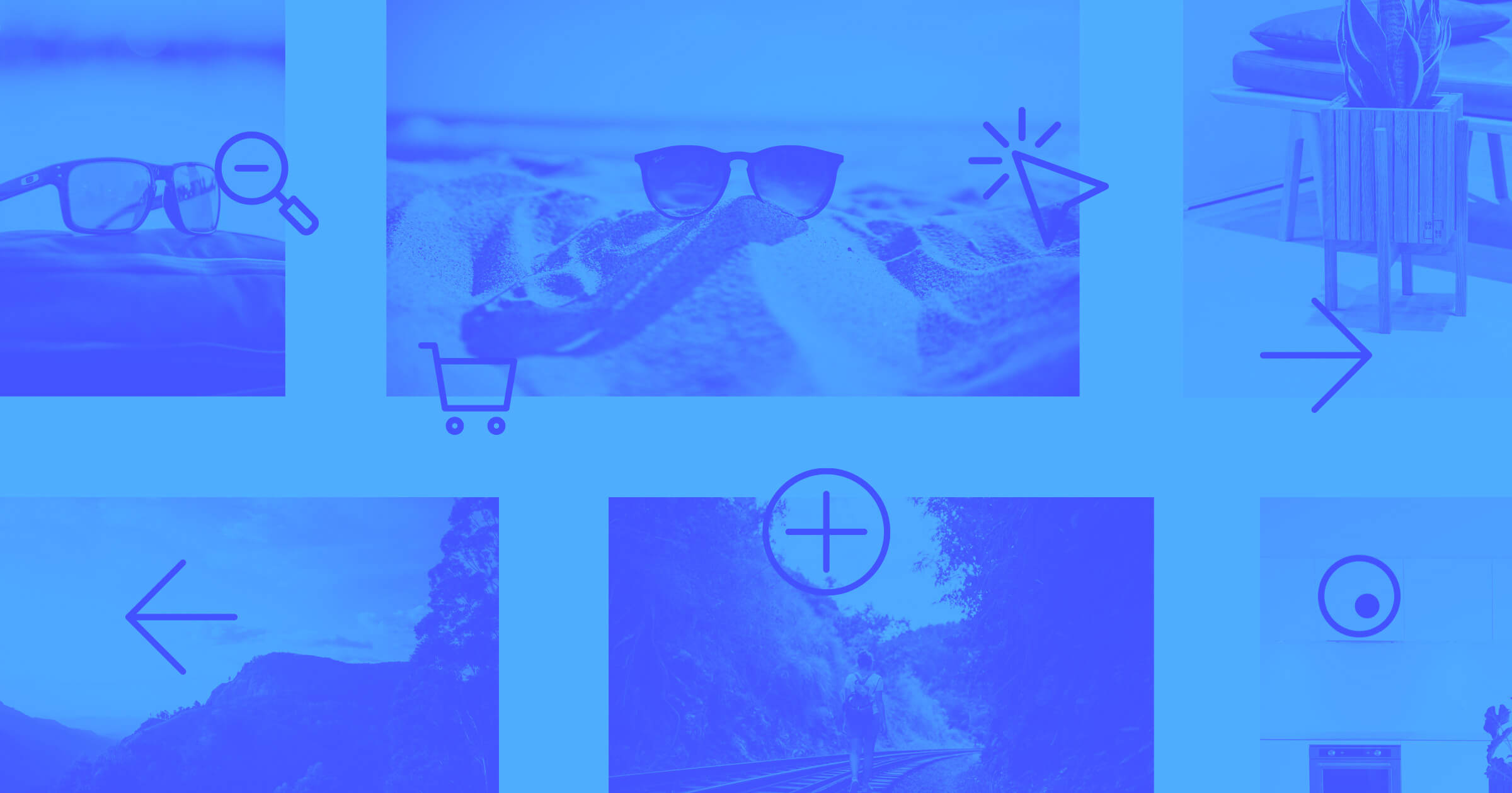
Hover effects are a part of most site designs. They can be simple — like enlarging an image — or, they can trigger multi-step animations. In this tutorial, we’ll walk you through some of the basics and a couple slightly more advanced techniques to get you started on integrating hover effects into your own designs.
Hover effects bring interactivity and motion to a design, making for a more dynamic web experience. Whether they indicate an active link or trigger a burst of animation, hover effects give you immediate feedback. They can guide visitors to take a desired action or act as an artistic embellishment that livens up a digital space.
Hover effects vary in complexity, but creating simple ones in Webflow involves:
- Selecting the element you want to apply a hover effect to
- Switching the states menu to the hover state and adjusting styling
- Switching back to the none state and adding a transition
Let's start by taking a look at how these 3 steps can be used to create one of the most basic interactions — hover and zoom.
Creating a basic hover and zoom effect
To show you how to build your own zoom-on-hover effect, we’re going to break down how we built one ourselves. Want to follow along? Open the project in Webflow.
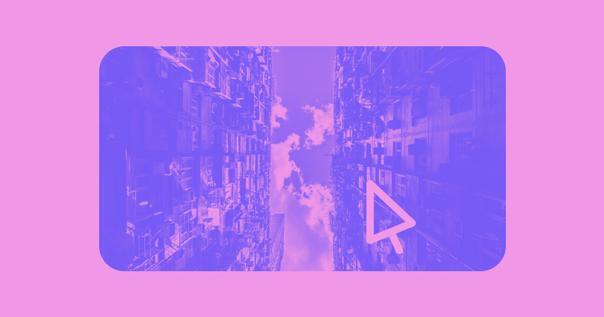
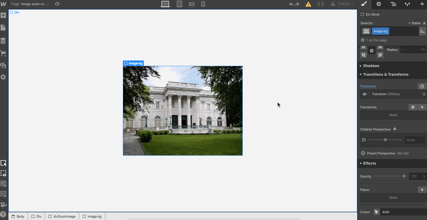
Clicking the image selects it in the Navigator and reveals its name: image-bg. The Navigator shows the hierarchy of elements and we can see that the image is contained in the div block named: divZoomImage.

To find out what happens to this image when we hover over it, we can select hover from the states dropdown menu for this element. We can see a transform effect scaling it up 1.2 times on both the X and Y axes.

The transform effect is part of the hover state. The rate the house scales up is a transition that’s added to the none (or default) state. The transition is set to occur over 500 milliseconds, and has an easy mode of … well, ease.

This is an example of a hover effect being applied to an image — but what if we want to play around with shapes? This circle-to-square effect follows the same process, with the none state containing the transition between states, and hover controlling what happens in the hover state.

In the hover state, it’s just a div block with a blue background.

Going to the none state shows us the corners have a 50% radius applied that creates a circle. So it goes from being a circle (with the corners set at a 50% radius), to being a square (with the radius of the corners set at 0%).
A transition time of 350ms controls the rate of this circle-to-square transformation. This may look like a complex animation, but it’s just a matter of decreasing the roundness of the circle until it has corners, yielding a plain blue div block.

The different states of none, hover, pressed, and focused in the states menu are known as pseudoclasses. We won’t go into too much detail about the differences between them here, but check out this tutorial on Webflow University to learn more.
You can also head over to this testing ground page on Webflow. It has these hover effects and a lot more to explore — just click the Pages icon in the left-hand toolbar.
Using filters to go beyond the basics
We’ve looked at adding effects in the hover state and setting the transition time in the none state. To create more sophisticated hover effects, like fading an element in or out, or colorizing a grayscale image, we need to apply filters.
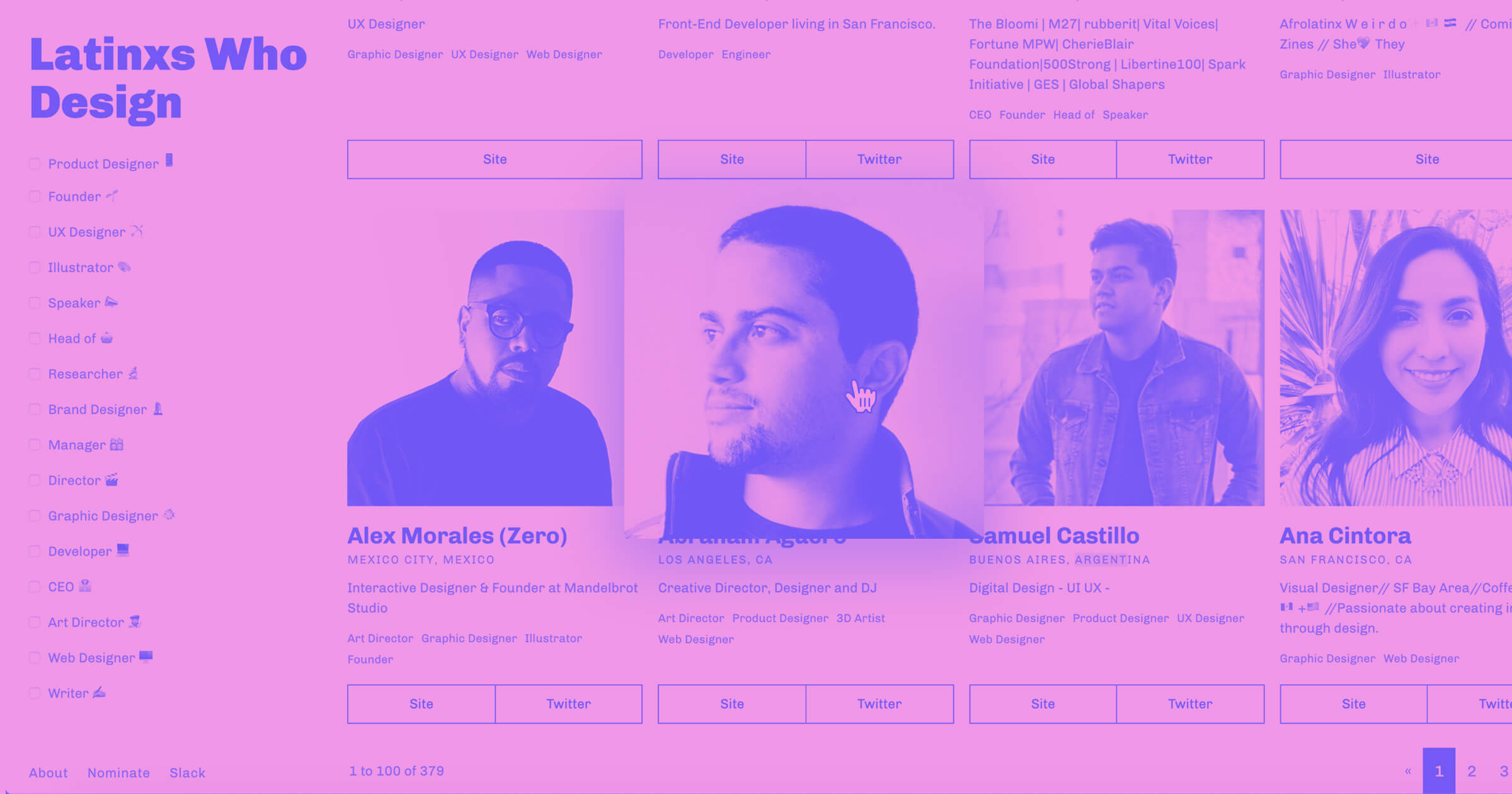
Latinxs Who Design is a showcase of designers, all organized on a grid layout. Hovering over each black and white headshot colorizes it and zooms in.

Let’s look at what’s happening in the hover state.

Here we see a transform effect (just like the zoom-on-hover we looked at earlier) that scales the image up 1.2 times on both the X and Y axes.
There are also two filters in place: the saturation is set at 110% and the contrast has a value of 120%.
Let’s go back to the none state and see what these filters start out at.

We see that the saturation starts at 0%, which removes all of the color, transforming the images to black and white. The contrast starts at 109% and bumps up to 120% on hover, making the image more pronounced and this effect more dramatic. Both effects have a transition time of 800 milliseconds applied to them.
Along with saturation and contrast, there are other filters to pick from, like hue rotate and blur. Just for fun, let’s add a blur filter with the default radius of 5px and see how that looks.

Yeah, this is a bit too much, taking away from the impact of the original effect. Showing restraint and not piling on effects keeps interactive elements engaging rather than annoying.
If you’d like to clone or explore this design further, check it out on Webflow.


Design interactions and animations without code
Build complex interactions and animations without even looking at code.
Getting started with timed actions

What if you want to build more complicated hover effects, like a triggered animation with multiple, timed steps? In the interactive photo above by the Digital Bake, multiple elements are affected by animations triggered by hovering over and away.
Having a team page is a great way to personalize your business, but these pages are typically static, without much visual interest to keep your attention. Digital Bake brings interactivity to what’s often an overlooked element.
All of the elements are contained in the div block “Team Member Wrapper.” The bolt symbol next to it in the Navigator tells us an interaction has been applied.

Let’s take a look at this interaction:

It has an element trigger, meaning that hovering over the “Team Member Wrapper” div block initiates the animation.
Clicking “Mouse Hover” opens the details of this triggered animation.
Here’s the timed animations that are triggered. We’re going to ignore the ones titled “SYSTEM,” as we’re focusing on the Team Member image.

Previewing shows us this triggered animation in action.

Here are the timed actions that make up this on-hover animation.

“Team Member Read More” starts out at 0% opacity, which increases to 100% over the course of 20 seconds and prompts the read more button to appear.
Here it is at the outset:

And at 20 seconds:

The “Team Member Image” is scaled up to 1.05 on the X and Y axes, starting at 0 seconds:

“Team Member Hover Out” simply reverses this effect, returning the image back to its default state and making the read more button disappear.

Get a closer look at how this was made by opening it in Webflow. There are some additional animations that don’t have anything to do with our focus for this post, but feel free to explore what else is going on in this design. And check out our tutorial on triggers and animations for a more in-depth explanation.
Moving to more advanced techniques by creating a 3D team card

This 3D team member card (also courtesy of Digital Bake) builds on the hover effect basics that we’ve already looked at.
Let’s take a look at how this was made.
Every part of this block is contained in a link block named “Card Wrapper.” Here are its elements:

We can see, just like in the last example, that there’s an interaction that affects these elements.
Clicking on the interaction icon tells us this is a triggered interaction initiated by moving the mouse over an element. In this case, the “Card Wrapper.”

Let’s explore this by clicking on Team Member Hover and taking a look at the Mouse X actions.

Instead of a timeline, we get a range of 0% to 100%, which represents a hover movement on the X axis moving back and forth on this horizontal plane, with 0% being the left-hand side of the image and 100% the right.
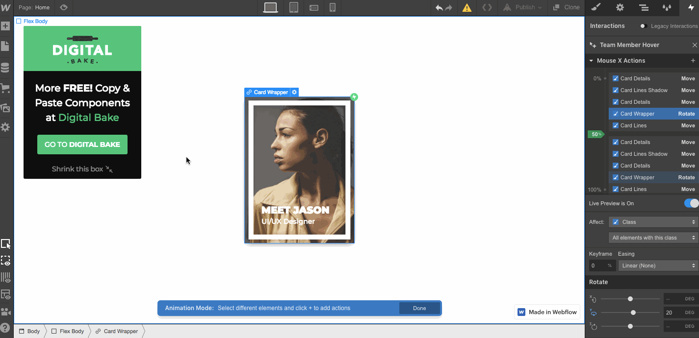
The entire “Card Wrapper” has a rotate effect applied to it, while the other elements just move laterally on the X axis.
Okay, let’s see what’s going on with the mouse Y actions.

Once again, we get a range of 0–100% , which is movement on the Y axis triggering each event of this animation. 0% is at the top of the page, and 100% is at the bottom.

You can also clone this for your own use and see how it was constructed on Webflow.
Going further with hover effects
Hover effects definitely make a design more interesting. Static pages make for bored, static brains.
There are plenty of other hover effects out there for you to try out, but hopefully this intro is enough to get you started. Head over to our interactions and animations course to learn even more and see what’s possible for your own designs.
Get started for free
Create custom, scalable websites — without writing code. Start building in Webflow.