Filters add another powerful tool to your design toolkit, allowing you to add graphical effects like blurring, sharpening, color shifting, and more to your designs.
And while you’re used to applying filters like these to images, you can use CSS filters on any element: buttons, text, videos—whatever!
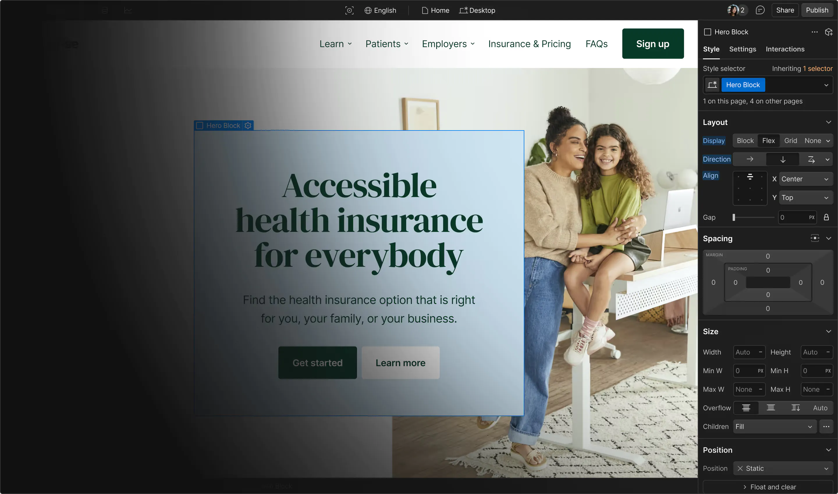
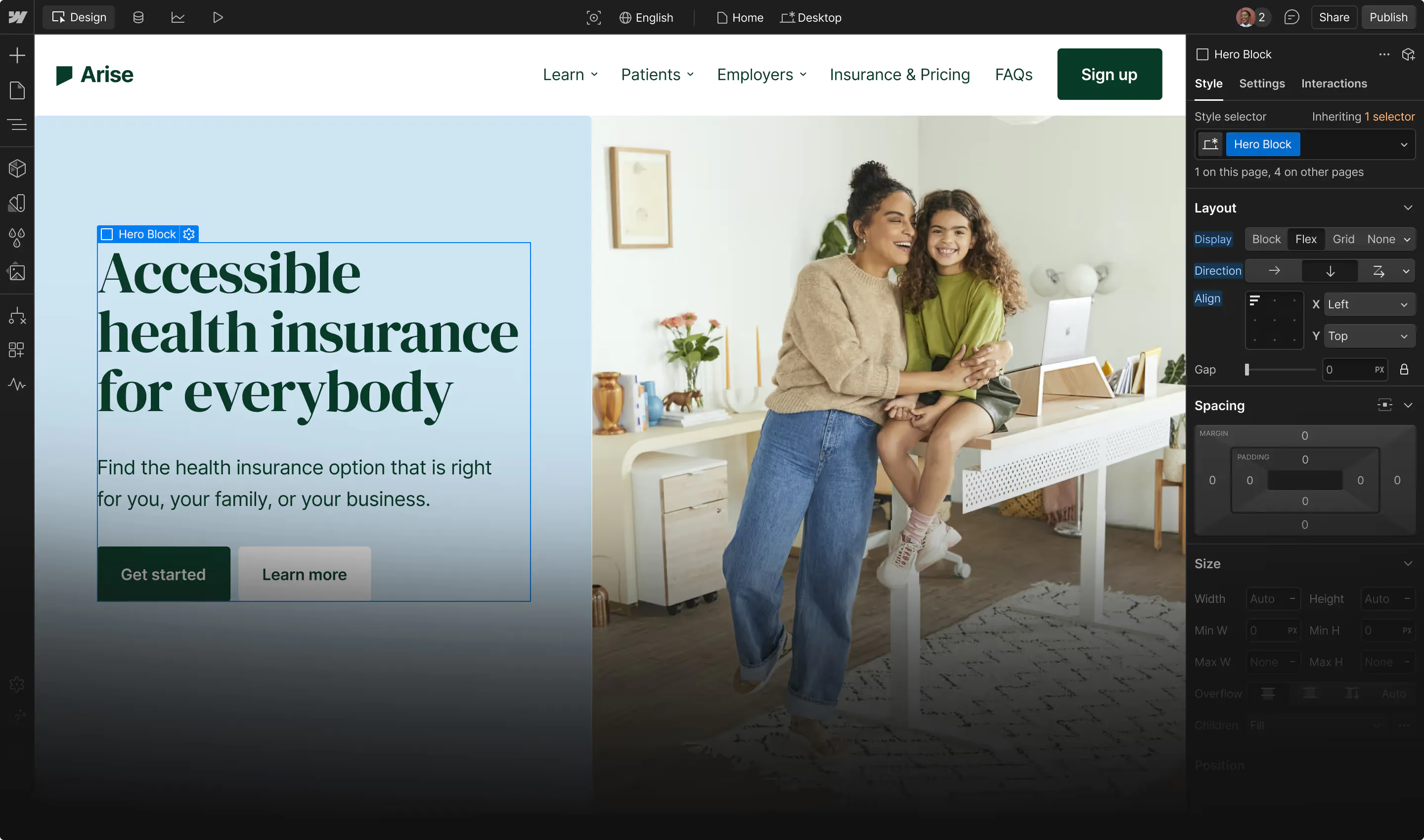
You can find all your new Filter options in the Effects section of the Style tab:
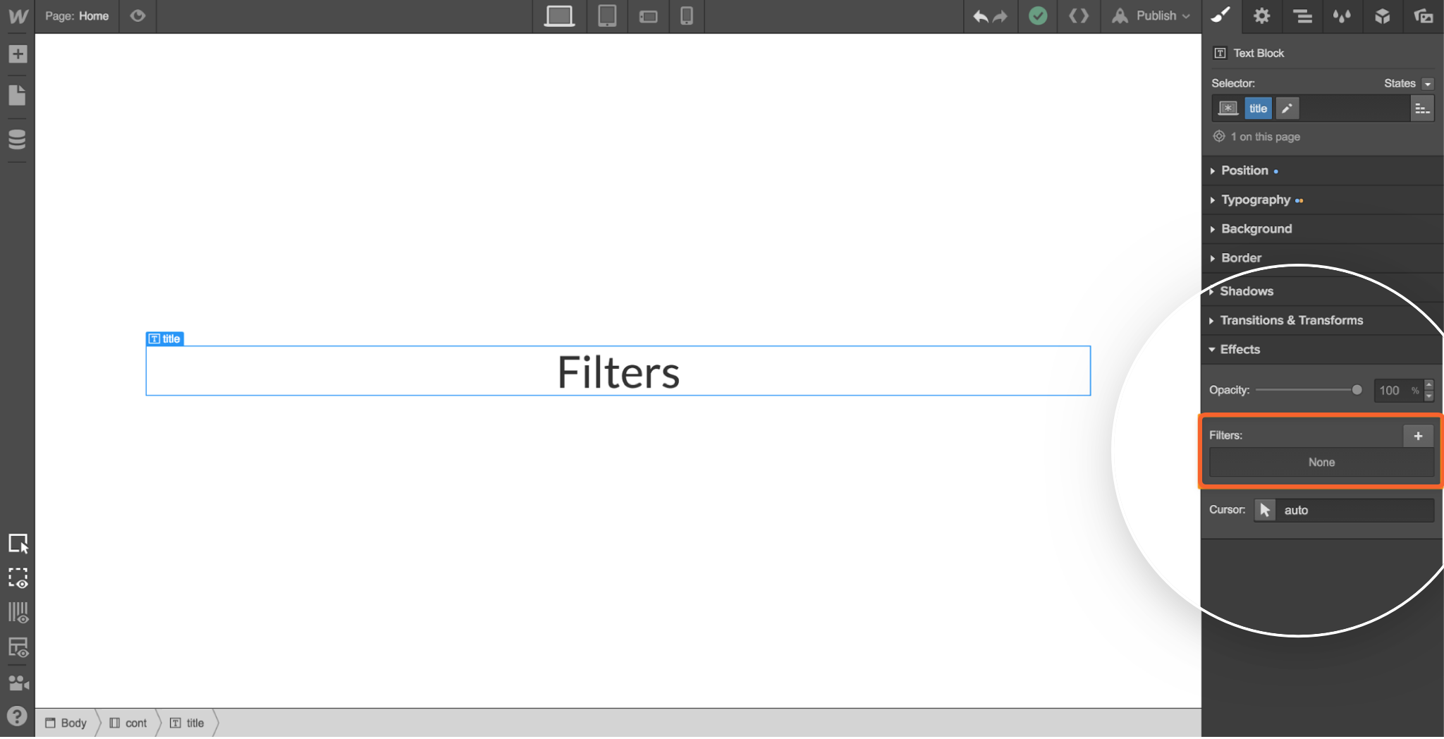
Every filter type also gives you values you can use to fine tune your effects, such as radius for the Blur filter.
Here are the 8 brand-new CSS filters you can apply in the Designer:
1. Blur
Applies a Gaussian blur to an element. Increase the radius value to make elements even blurrier.
2. Hue rotate
Adds a hue rotation to the selected element, adjusting an element’s colors based on the angle value: 0 degrees leaves the element untouched, while 180 will take you to the opposite side of the circle, and 360 will bring you back to square one. The maximum value is 1440 degrees, i.e., 4 times around the circle.
3. Saturation
Saturates the selected element to the degree defined by the amount value you select. The amount ranges from 0 to 100+, allowing for some super-saturated results.
4. Brightness
Lets you make an element more or less bright. A value of 0% turns an element completely black, while 100% leaves the element unchanged. You can take brightness beyond 100% too, for even brighter results.
5. Contrast
Adjusts the level of contrast in an element, where 0% equals completely gray, 100% leaves the element unchanged, and anything over 100% creates super-contrasted effects.
6. Grayscale
The easiest way to turn a color photo into a black-and-white masterpiece.
7. Sepia
Want to add a vintage feel to your site? Then Sepia’s the filter for you. Values range from 0% to 100%, so you can control just how vintage your images feel.
8. Invert
Inverts the color values in a selected image, with 0% leaving the image unchanged, and 100% creating completely inverted values.





Get started for free
Create custom, scalable websites — without writing code. Start building in Webflow.
3 creative applications of CSS filters
Because you can combine CSS filters, apply them to hover states, and add them to any element, there’s all kinds of creative ways to put CSS filters to work in your websites.
Here’s just 3 ideas we came up with:
1. Add and reorder multiple effects
Try adding a couple different CSS filters to an element, then dragging and dropping them to create different visual effects.
Not happy with the result? Click the eye icon to hide an effect, and if you like the result, click the trashcan icon to get rid of that effect.

2. Apply different effects on various states
For example, you can easily make blog thumbnail photos go black-and-white on hover, invert clicked link colors, and more.

3. Filter any of the things
Don’t feel like that stock video “pops” enough? Just wait till you see what it does when you rotate its hue, invert its colors, or grayscale it!

What will you do with CSS filters?
We can’t wait to see what you create with this new feature! Share what you’ve done with filters in the comments below, or tweet @webflowapp with the hashtag #MadeInWebflow.
Editor's note: When we first published this post, we mistakenly stated that CSS filters could be used with interactions. Today, the only interaction you can use CSS filters with is the hover state of buttons and other links. We're looking into adding interaction support for CSS filters, but don't have a firm timeline yet. We'll keep you posted!
