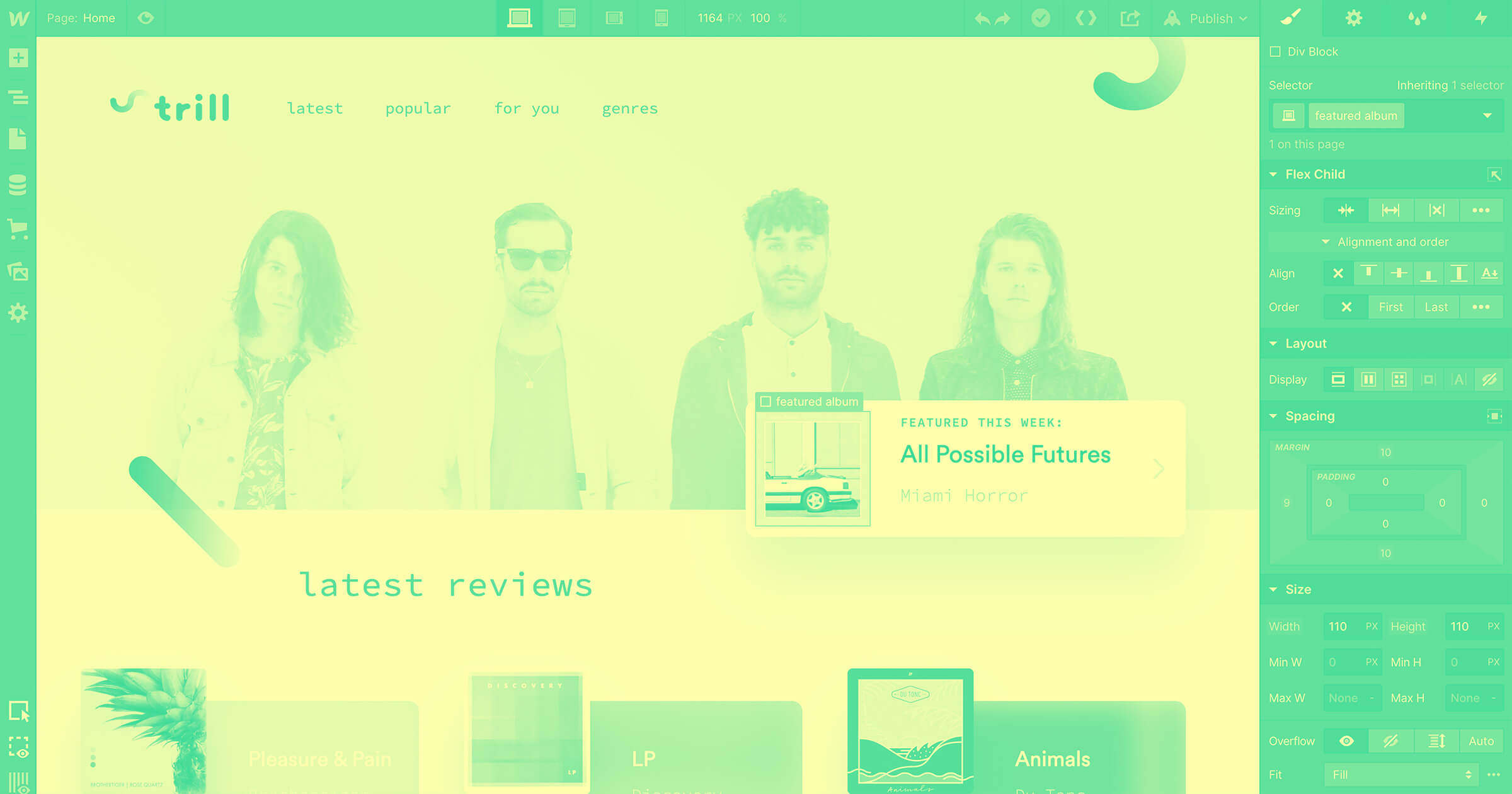
Ultimately, CSS is just about styling — which designers are used to doing in complex visual tools like Sketch, Figma, and Photoshop — but other than Webflow, there's never been a production-oriented tool that provides the power of HTML and CSS visually.
This post is based on an interview with CSS tricks founder Chris Coyier. Check out the full interview and demo below:
For those who prefer to read, check out a listicle version of the interview below.
Why Webflow for web development?
If you’re a front-end developer, you may ask yourself “why Webflow?” In this post, we’ll go over 7 reasons why you should start coding visually with Webflow.
1. Webflow is built for professionals
Webflow sometimes gets lumped in with less sophisticated web builders. If you're a developer, and you’ve made that judgment, I can understand the hesitation. But the major difference between Webflow, and these other more consumer oriented tools, is that Webflow doesn’t try to hide the complexity and power of web development — instead it embraces it.

Webflow brings the power of code into a visual canvas — which means if you can design it, you can build it. This means that whatever you’re looking to build, Webflow has the power and control you need to build something completely custom. Take for example HR startup Lattice, whose entire company website is built and managed on Webflow.
Developers will quickly grasp Webflow’s UI
One of the harder things about adopting Webflow is that, like any professional design tool, it takes some upfront learning to get the hang of it. This is particularly true if you’re a designer or marketer who’s never learned the fundamentals of HTML and CSS. But for developers who already have this knowledge, Webflow will be easy to grasp.
Webflow’s UI maps directly to the controls of HTML and CSS, with your elements (e.g. div blocks, links, text) on the left side and the styling controls of CSS on the right. This means you’ll use similar mental models when you’re building in Webflow as you’d use when writing CSS in a code editor.
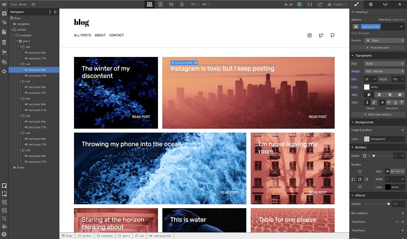
And because the UI controls map directly to HTML and CSS, and you build using classes, the code behind a Webflow site is as clean as if you were to code it by hand.
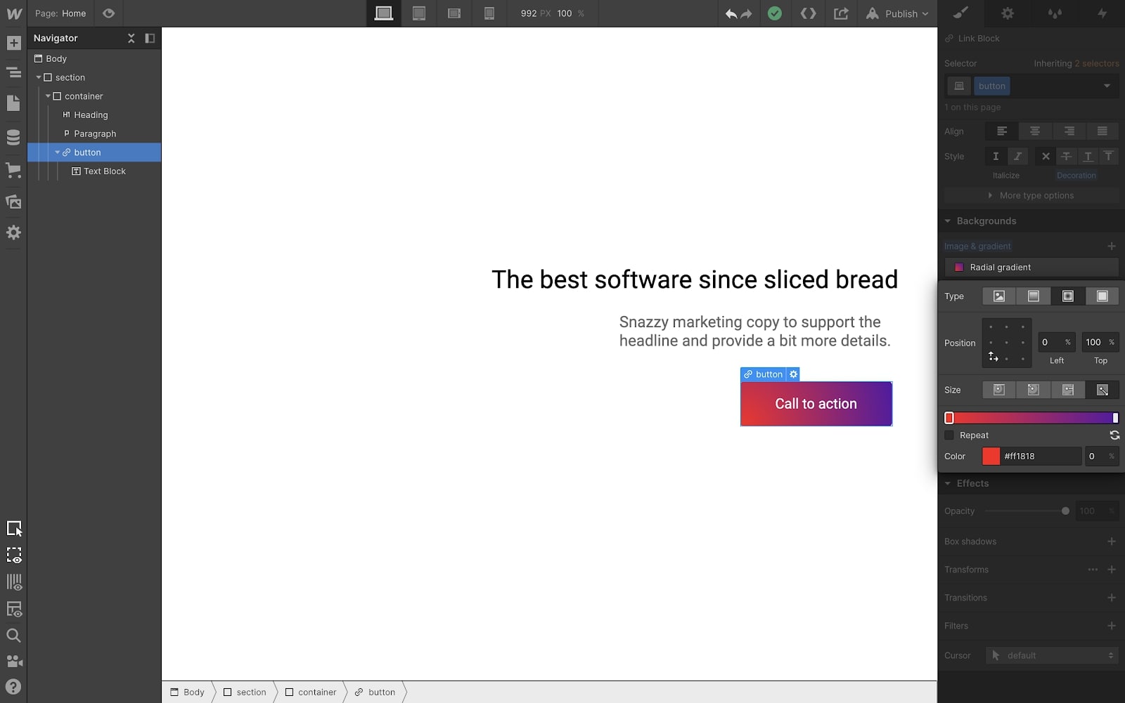
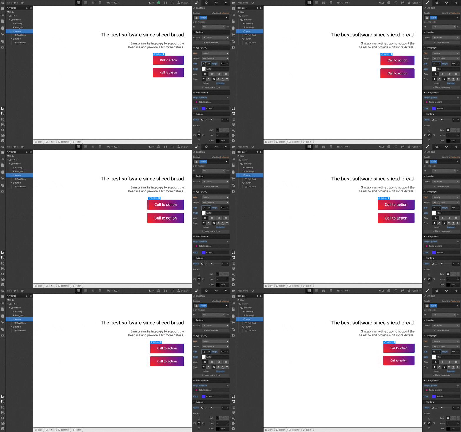
This is particularly helpful when you’re creating styles whose CSS is particularly hard to memorize: for example, giving a button a radial gradient that designers seem to be so fond of.
2. Classes and reusable styles are core to Webflow
Styling elements visually in Webflow with the power of CSS is great and all, but what if you want to reuse or update those styles across your site? Good news, just like CSS, Webflow is built with classes as a core component. Meaning Webflow not only makes it easy to build sites, but also to maintain and update them.
CSS styling affects the appearance of visuals in a design. With Webflow, you're not burdened with changing these CSS stylings through code. Site wide changes are simple with our visual interface. As you style and change each element, you'll see your changes happen instantaneously. You can create site-wide CSS styles for a given element, or have complete control over an individual element as needed.
3. Use modern layout tools like flexbox and CSS grid
Working visually in Webflow doesn’t mean you have limited options for layouts. On the contrary, Webflow treats cutting-edge layout systems like flexbox and CSS grid as first-class citizens, meaning you have full control to build your site however you’d like.
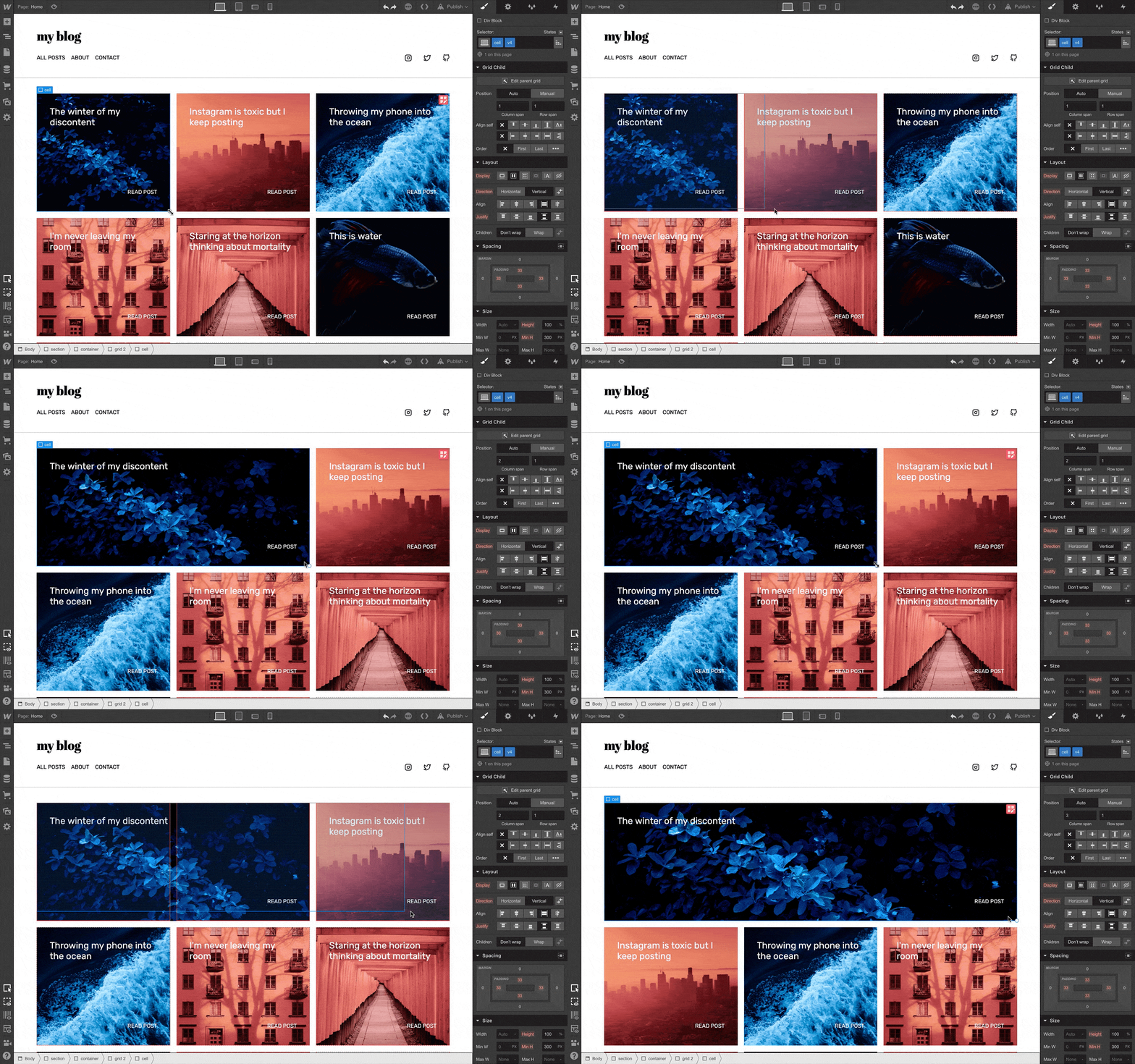
And what’s best is that by making these layout systems visual, you’re not forced to spend time looking up syntax, or writing out lines of code in one place then checking the result somewhere else. Instead, you can directly see how your layout tweaks impact the site as you’re building it.
Ultimately, writing CSS is about styling things visually, so who says it needs to take place in a code editor?
4. Publishing is just a click away
Webflow is more than just a visual way to code — it’s also a built in publishing and hosting platform. This means you can go from zero to published website in a fraction of the time it’d take when coding by hand. Once you’ve built your design visually, you can hit publish and push your site live.
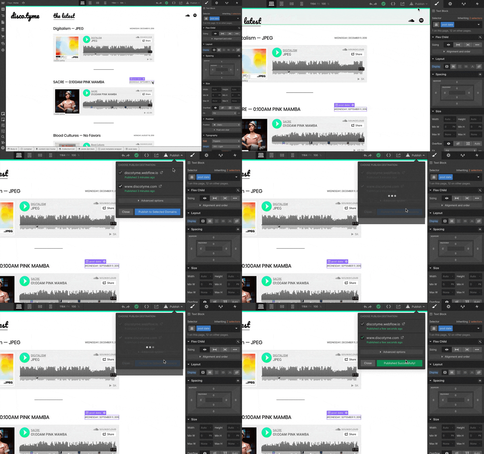
5. Flexible and powerful CMS (ditch WordPress)
Building static pages visually in Webflow is cool. But as any seasoned developer knows, websites that are meant to live and grow rely heavily on the CMS underneath the hood — which lets their teammates or clients update the site without bothering development in the future.

To that end, the Webflow CMS is an extremely flexible and powerful tool that combines the visual design controls, inherent to Webflow, with the flexibility of a CMS that doesn’t lock you into specific formats or post types. With Webflow, you have the freedom to create whatever content type your site needs, then craft your design around that content from scratch.
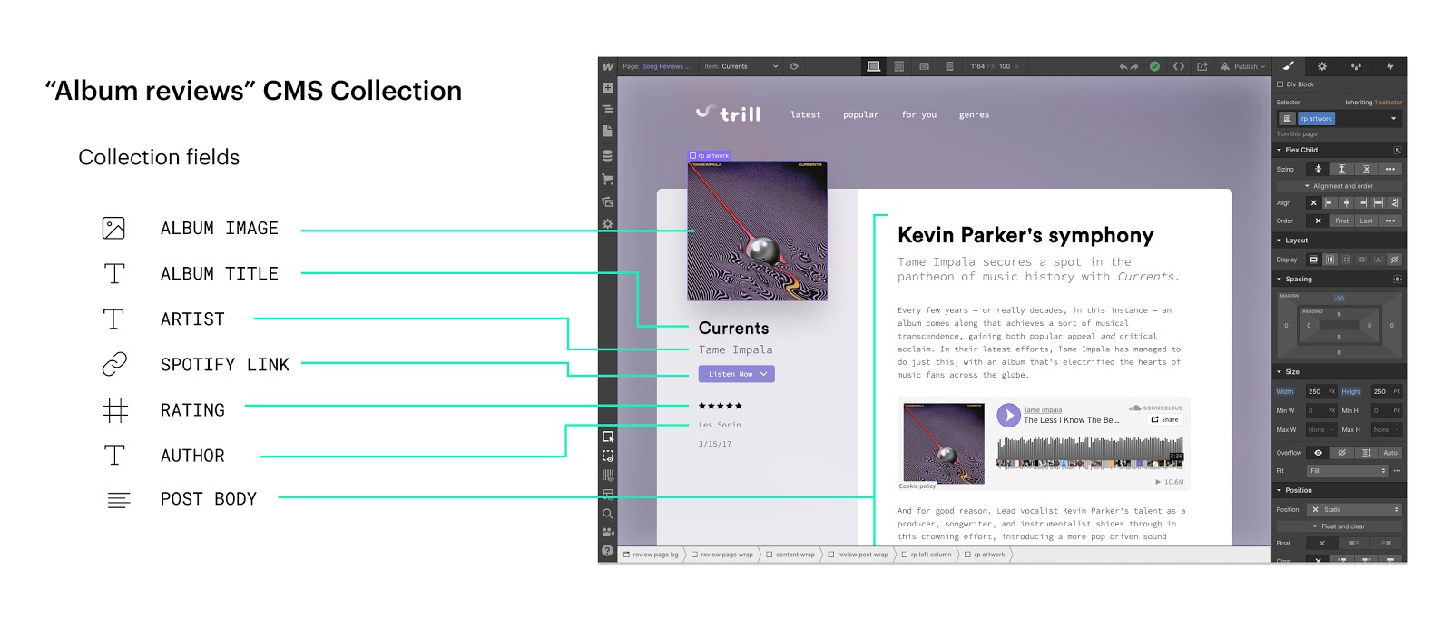
From the content editor's perspective, editing and updating content for a Webflow site is straightforward and intuitive — thanks to the Webflow Editor. The Editor gives your colleagues and clients a simple UI for editing and updating content right on the page, without needing to log into a clunky, disconnected dashboard that overcomplicates publishing.
6. Build completely custom interactions and animations
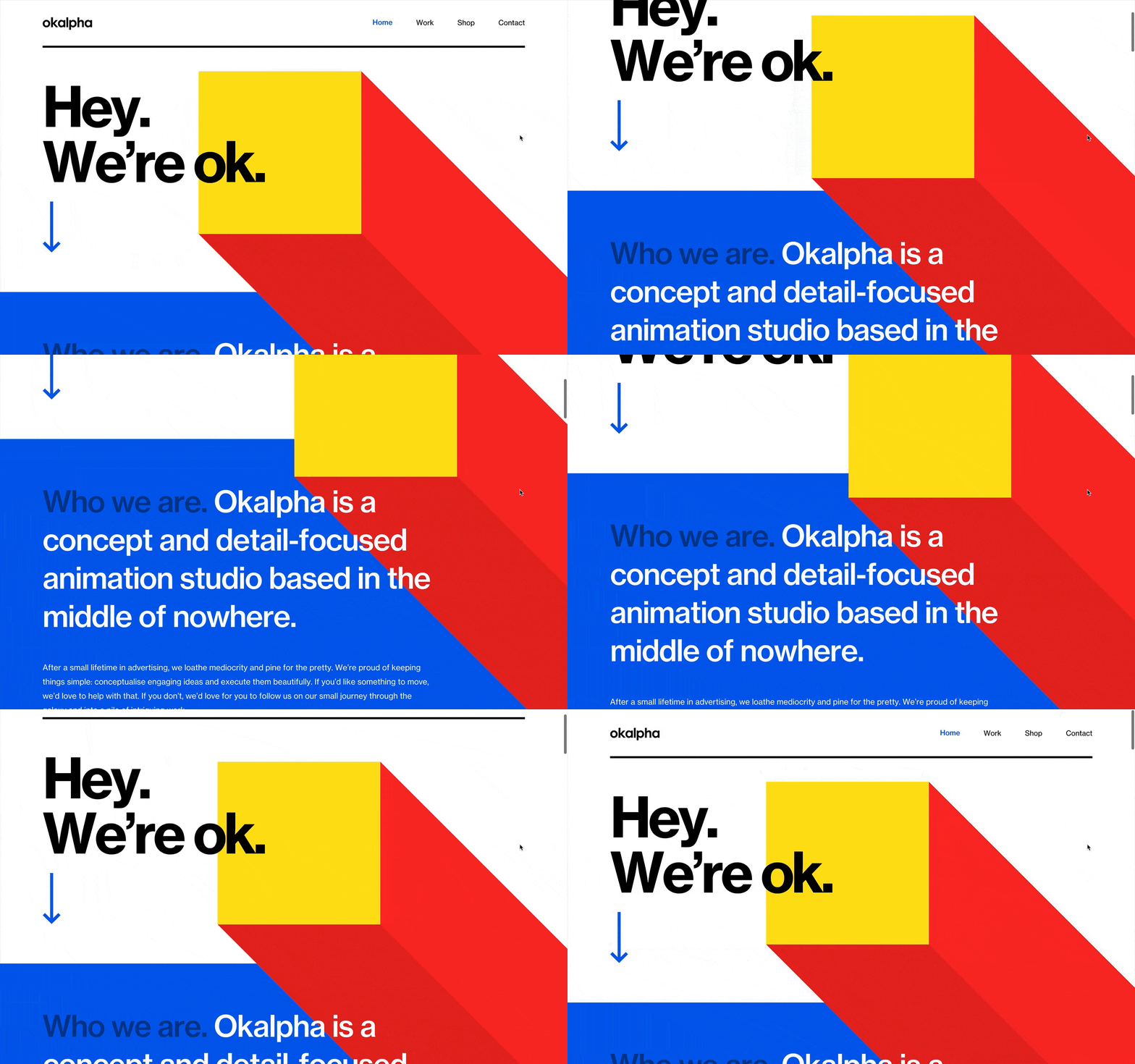
Building layouts from scratch is level 1 Webflow. Powering those layouts with custom CMS content is level 2. But why stop there? Level 3 is Webflow’s interactions and animations tools — which blows the lid off of what you might have thought was possible for visual web development.
Webflow’s interactions and animations tool lets you control animations based on common triggers like:
- Page load
- Click
- Hover
- Scroll position
- Mouse position
- … and many more
This is especially great news for front-end developers who are comfortable with HTML and CSS, but are still wrapping their heads around (or delaying their studies of) the intricacies of JavaScript. Webflow aims to bring the power of website animations and interactions directly into a visual toolbox — making this entire realm of web design more visually creative and accessible.
7. Start learning with Webflow University
Learning a brand new, professional grade tool like Webflow can be daunting, and we understand that. To make that learning process fun and approachable, we’ve invested tons in creating the best educational video and materials possible on Webflow University, so you can find the answers you need and enjoy yourself along the way.
In closing: designers and developers should code — but visually
At the end of the day, I often describe Webflow as a different way to code. And so when the time old question of whether or not “designers should code” comes up, I actually think the answer is “yes, designers should code — but visually.”
Webflow’s whole thesis is that designers are used to learning complex visual tools to do their work, but none of those in the realm of web design have been production-oriented. Webflow bridges this gap by taking front-end development and making it visual. This means that even if Webflow designers aren’t writing code, they’re going through the same mental model when thinking about building for the web — directly working with the medium they’re designing for.
Ultimately, this makes designers and developers speak a common language — and ship things a whole lot faster as a result.
What are your thoughts on Webflow as a developer? Let us know in the comments!


Get started for free
Create custom, scalable websites — without writing code. Start building in Webflow.


