The right background pattern adds a touch of class and transforms your site into a unified visual experience. Here’s where to find background patterns for websites and how to use them to enhance your design.
Many designers opt for minimalistic neutral colors and white space instead of patterned backgrounds. But that’s exactly why you should explore swimming against the current. Beautiful patterns can lift your designs out of the oversaturated sea of minimalism and make viewers sit up and take notice.
Patterned website backgrounds add visual interest and dimension. With a variety of options available, like delicate line patterns and bold and eye-catching textures, you can leverage background wallpaper to add a whole new dimension to web design. The right pattern can even reinforce your brand identity and make your website stand out in a crowded digital landscape.
Where to find free background patterns for websites
The best places to find background patterns are online pattern libraries. Here are a few of our favorites.
The Pattern Library

The Pattern Library has a selection of free, high-quality backgrounds, including line drawings, pictures of food, and geometric shapes. The site allows you to flip through the offerings individually to preview what they look like on a full page or choose the thumbnail to see all of them at once. The designer’s name appears on each pattern, along with a direct link to their site, to view more of their work.
Background Labs
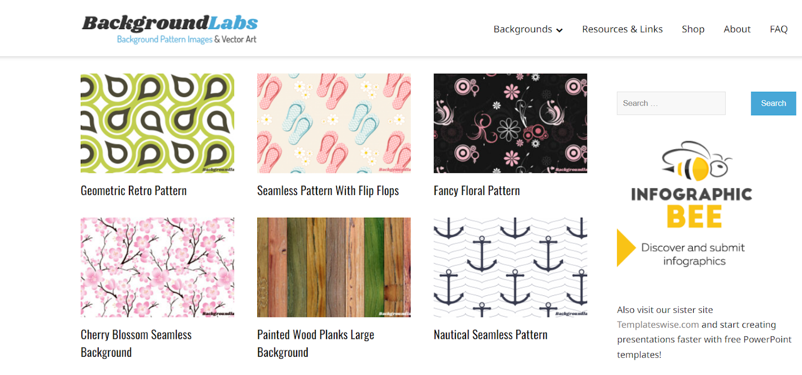
Background Labs offers multiple free repeating pattern options, including panda faces with polka dots, wedding rings, mustaches, and music notes. The site also includes a page of graphic design resources, such as color wheel tutorials and useful font sources.
Background Labs specializes in seamless patterns (those that repeat infinitely without perceptible boundaries). Seamless patterns are instrumental in adaptive and responsive design, as they easily accommodate smaller devices. The patterns are searchable by theme so you don’t have to click through every page to find the perfect background for your site.
Wild Textures
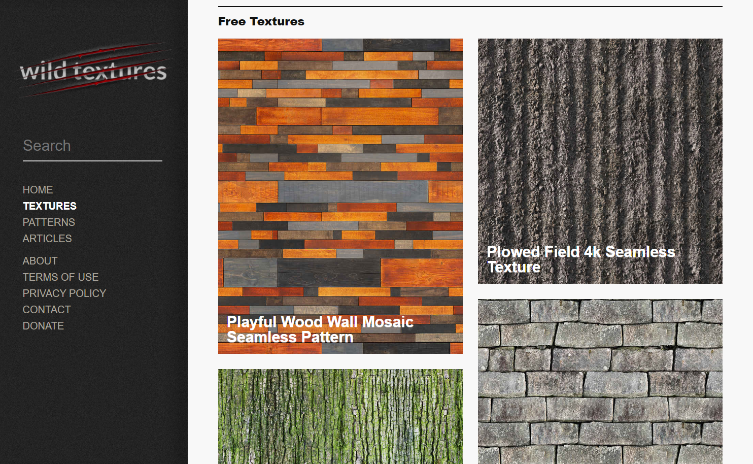
If your aim is to create an almost tactile user experience, browse Wild Textures. They offer an evocative collection of patterns that add a real-world feel to any site. Their wallpapers include natural finishes like stone, tree bark, and greenery, plus high-resolution photos of metal, glass, creased paper, tile patterns, and grunge patterns like peeling paint and dirty walls.
Pattern8
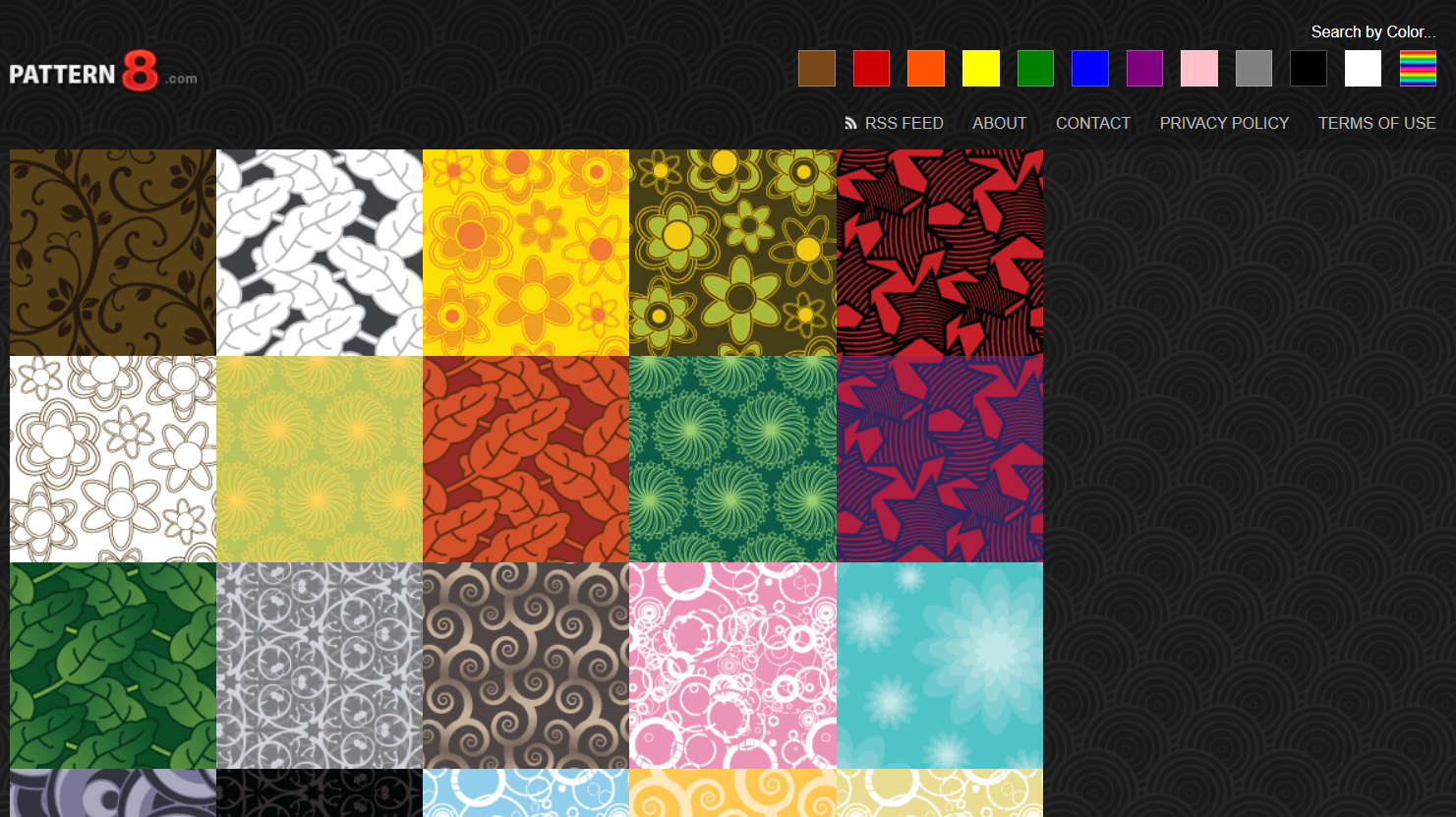
Pattern8 offers a variety of seamless background patterns for websites, including stylized nature motifs and festive seasonal and holiday options. Backgrounds are searchable by dominant color using the bar at the top.
Create your own pattern with a background pattern generator
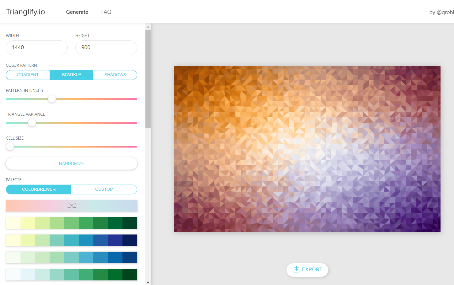
For a more DIY option, experiment with a background pattern generator. Choose the generator that best suits your style and the effect you want to achieve.
Cool Backgrounds has a range of free abstract patterns and gradients that you can customize with selectable color schemes, and sister sites Trianglify and CSS Gradient let you tailor the designs even further.
SVG Backgrounds offers a combination of paid backgrounds and freebies that you can adjust using sliders, while PatternPad enables you to create geometric designs in various styles and hues.


Get started for free
Create custom, scalable websites — without writing code. Start building in Webflow.
Get creative with background patterns
To get the most out of your website background, match the pattern to your brand identity. If you’re showcasing your web design skills, incorporate an interactive element. If your company has an interesting logo, build brand recognition by incorporating the logo into the backdrop. Experimenting with different patterns, effects, and colors for your website background enhances the visual appeal of your website and makes it more memorable.
Here are a few ideas for getting creative with background patterns:
Show some personality
Use patterns to offer visual cues about the brand personality you’re working with. Paw prints trotting across a pet grooming website or cute teddy bears on a toy store site signal to users that it’s fun to interact with the brand, potentially encouraging them to convert into customers.
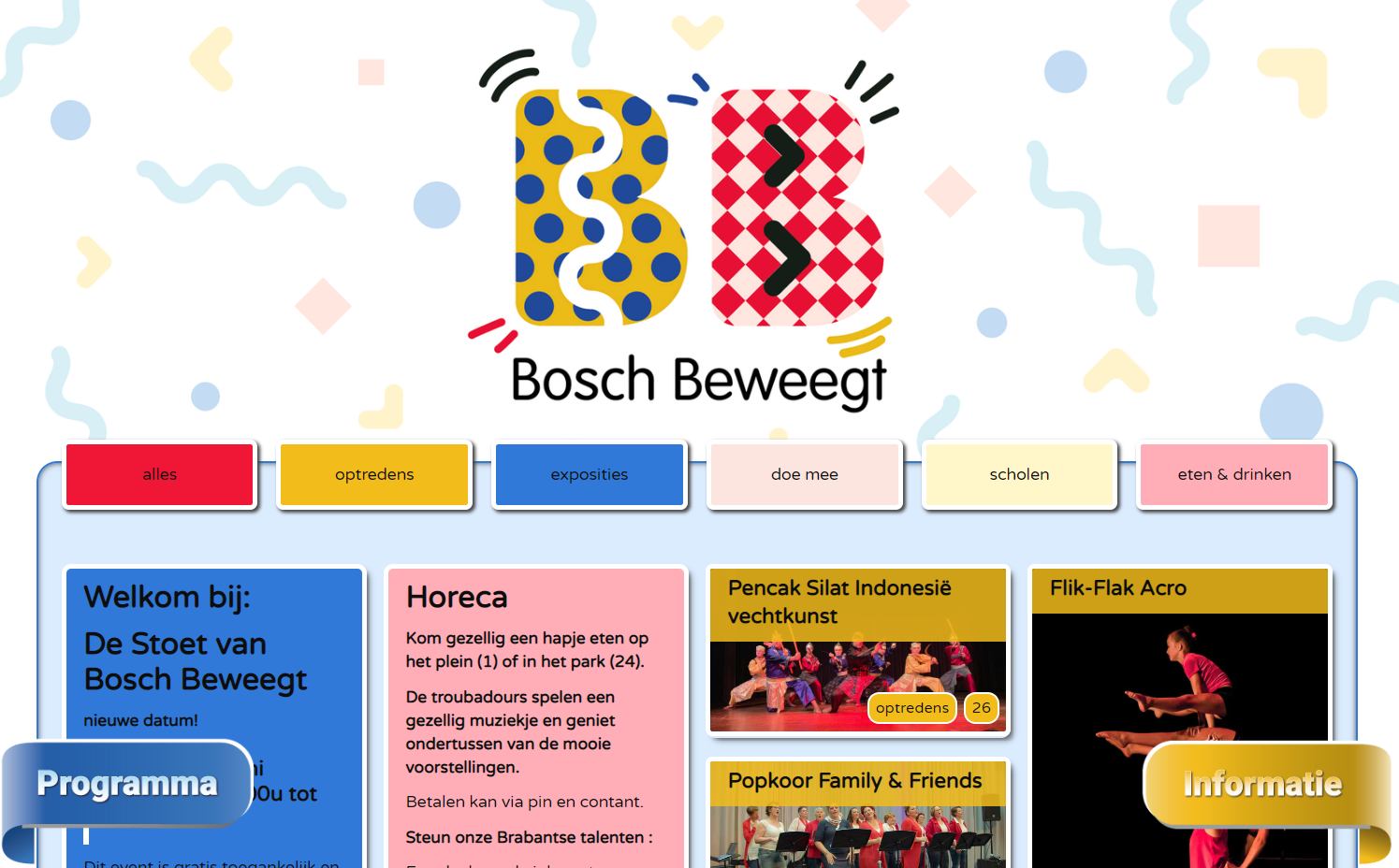
When designing the website for the Bosch Beweegt, an outdoor cultural festival held annually in the Netherlands, site designer Stephan Nabbe chose a vibrant geometric background pattern to match the festival’s playful vibe while incorporating its geometric shapes into the logo.
Use your logo
Designing a logo requires thought, time, and creativity. Instead of using it once, consider incorporating it into a faint background pattern. Doing so reinforces the brand identity of your product or service, improves brand recognition and awareness, and creates a coherent visual experience for visitors.

When designing the site for Neil’s Real Deal Trinidadian hot sauces, designer 5FOLD used the company’s evocative hand-drawn ocelot logo as a background. The dark-blue hues ensure the logo’s unifying effect is discreet rather than intrusive.
Add interactive elements or animation loops
Whether it’s a slight hover effect, a parallax animation, or a looping video, implementing movement into your background pattern captures visitors’ attention and encourages further site exploration. Just be sure to know when to say when — going overboard may distract from your main site’s content.
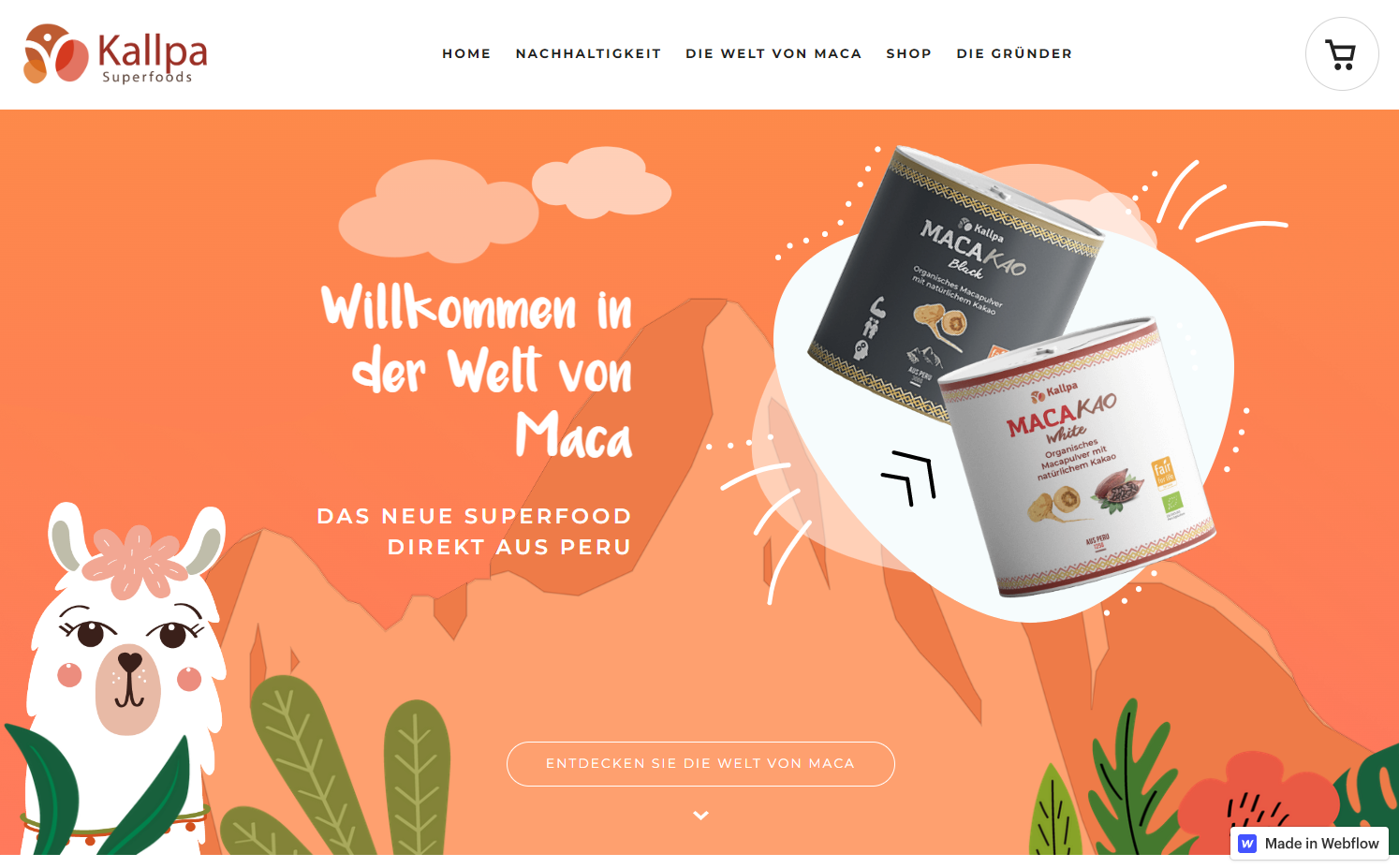
Kallpa Superfoods site designer Magni & Tude added loads of personality to the Kallpa Superfoods site by using animated and interactive elements in their unique background pattern. Clouds roll across the screen on the landing page, a map of South America zooms in to explain where the products are from, and alpacas pop up and bob back down again as you scroll down through the site.
Incorporate layers
Applying layers and transparency to a background pattern achieves eye-catching visual effects. Use a combination of media types, such as photos and illustrations, to add depth and dimension to your website’s visual aesthetic. Experimenting with layering background images and text creates a more visually engaging experience and helps communicate your message more effectively.

To create the landing page of photographer Kourtney Roy’s site, designer Gaël Roussel rotates through a set of background images underneath the text. This choice showcases Kourtney’s photos while adding visual interest — visitors are more likely to look longer because their brains are working to fill in the gaps in each image, leading them to spend more time on the page.
3 Webflow websites with inspiring background patterns
From subtle to bold, background patterns can add a unique touch to any website design. Whether it’s a simple geometric pattern or a complex animation, leveraging background patterns helps your site stand out. Here are some sites that show Webflow designers using background patterns to achieve striking effects.
1. Coffee Park

Designer Israel Benítez uses background patterns to create a rich sensory experience on Coffee Park’s site. The landing page, which features retro-style red, blue, and orange flowers, sets a vintage vibe that reflects the Mexico-based cafe and bakery chain’s eclectic, nostalgic vibe.
The top of the page has a faint, seamless white brick background pattern that echoes the exposed brick of the restaurant’s interior. Framed pictures are “hung” on the brick wall background and move as visitors scroll down to create an immersive user experience.
As visitors scroll down, they pass through various wall finishes, including velvety gold and blue paint and a dirty white wall. These background patterns powerfully capture the sensory experience of being in a restaurant with eclectic, artsy decor.
2. Niall Mc Dermott’s design portfolio

Niall Mc Dermott’s web design portfolio site, which Niall designed, features vibrant geometric patterns that slide into place after visitors scroll to new parts of the site. This animated approach gives users the sense of Niall building the website before their eyes, perfectly complementing Niall’s promise of “completely custom websites built from scratch.”
3. Cannella

Designer Venbos Media, who created the ecommerce website for Puerto Rico’s Cannella, uses the bakery’s logo as a recurring background motif. The logo — a smiling woman’s face with hair reminiscent of cinnamon buns (“cannella” is “cinnamon” in Italian) — appears as a vector pattern in different sizes and shades throughout the site. This repetition of the woman’s delighted smile throughout the site gives it a welcoming, friendly feel.
Experiment with backgrounds to make your Webflow site special
If you’re looking for an interactive or animated design pattern but are unsure of how to create one, you can clone a pre-built background from our selection of backdrops created by our talented designers. For inspiration, look no further than the random strokes and interactive halo backgrounds by Jakob Wrs and the moving gradient background by Web Bae.
If speed is a priority in your design projects, consider using a template and then customizing the background color or pattern to add a unique touch. A minute change in the background pattern could transform a generic look into a distinctive site that captures the essence of your brand. Get started building your next website with a unique background pattern with Webflow today.


