Interior designers are known for brilliant designs. That same brilliance should translate to their websites.
Interior design, like web design, focuses on combining cohesion with functionality to transform a space. Both rely on pleasing color palettes, logical placement, and maneuverability to create positive visitor experiences. As a result, many aspects of effective interior design translate to stunning websites.
Blending the expertise of both design worlds results in a strong interior design website. These online portfolios are the first touchpoint for clients searching for an interior designer — they expect an aesthetically pleasing website, whether it’s a one-person business or a large agency.
Get some interior website design inspiration from these beautifully crafted sites.
7 incredible websites for interior designers
Everyone has different tastes and preferences when it comes to styling their home or office. The websites we've listed below provide distinct features and design styles to showcase various trends you might want to emulate. Whether you're looking for something modern, antique, or contemporary, you’ll find inspiration here.
1. 2Michaels
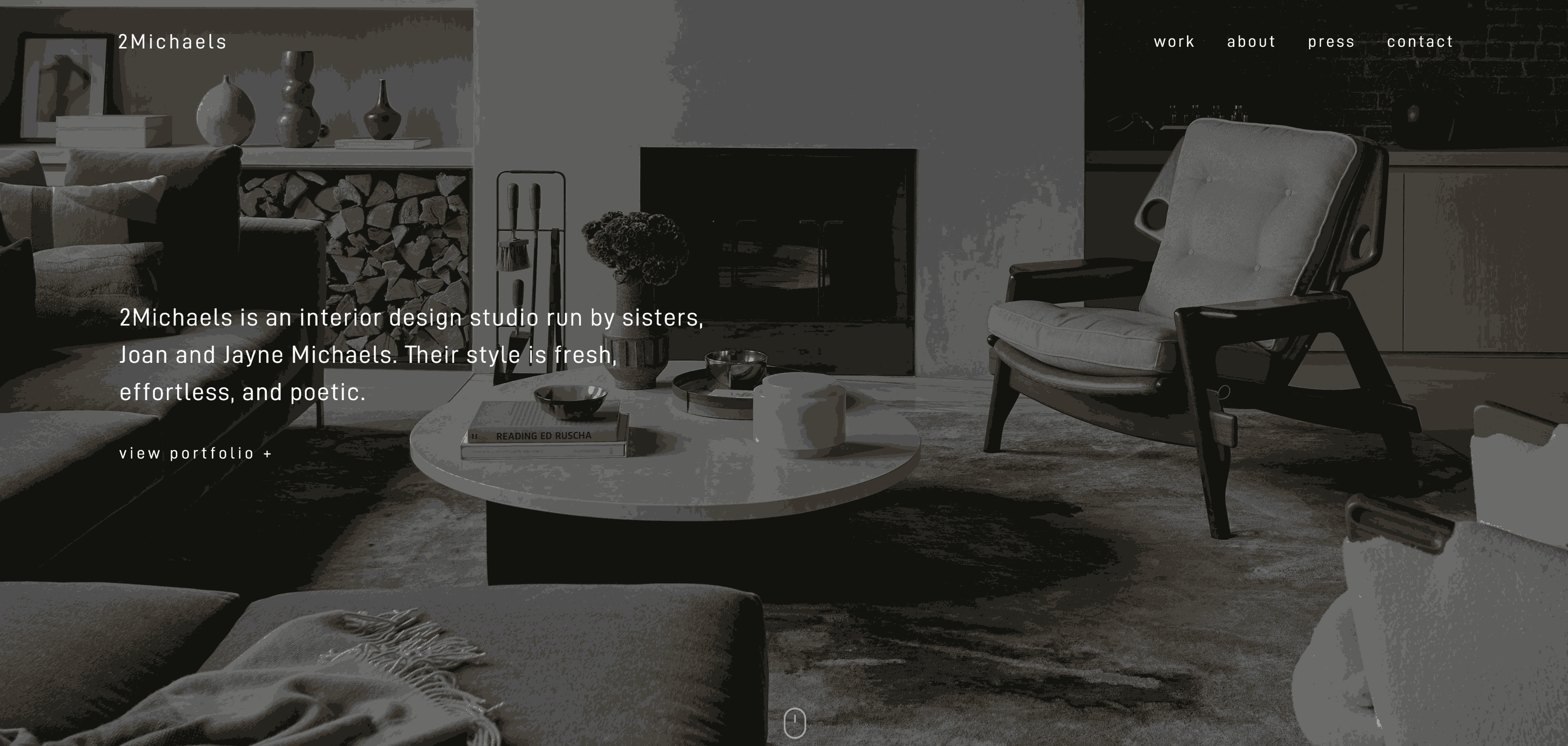
2Michaels is the joint venture of Joan and Jayne Michaels, sisters from East Hampton in New York.
The 2Michaels’ website is simple and to the point. You’re greeted by a home page with a brief description of 2Michaels and a button leading to the portfolio in the page’s center. As you scroll, large images of different spaces dominate the screen. If you hover over one, you’re told the address with a “view project +” button to see more photos of the space.
Hover-activated animations like the menu text expanding and images darkening add a little something extra to this straightforward site design. The other sections of the website follow the homepage’s theme with edge-to-edge pictures, a clean white background, and a consistent font. This website’s expansive design represents 2Michaels’ interior design style — spacious, modern, and fashionable.
If you love the simple yet chic aesthetic, 2Michaels is a great site to explore to get some ideas for your own design.
2. Bold Interior Group
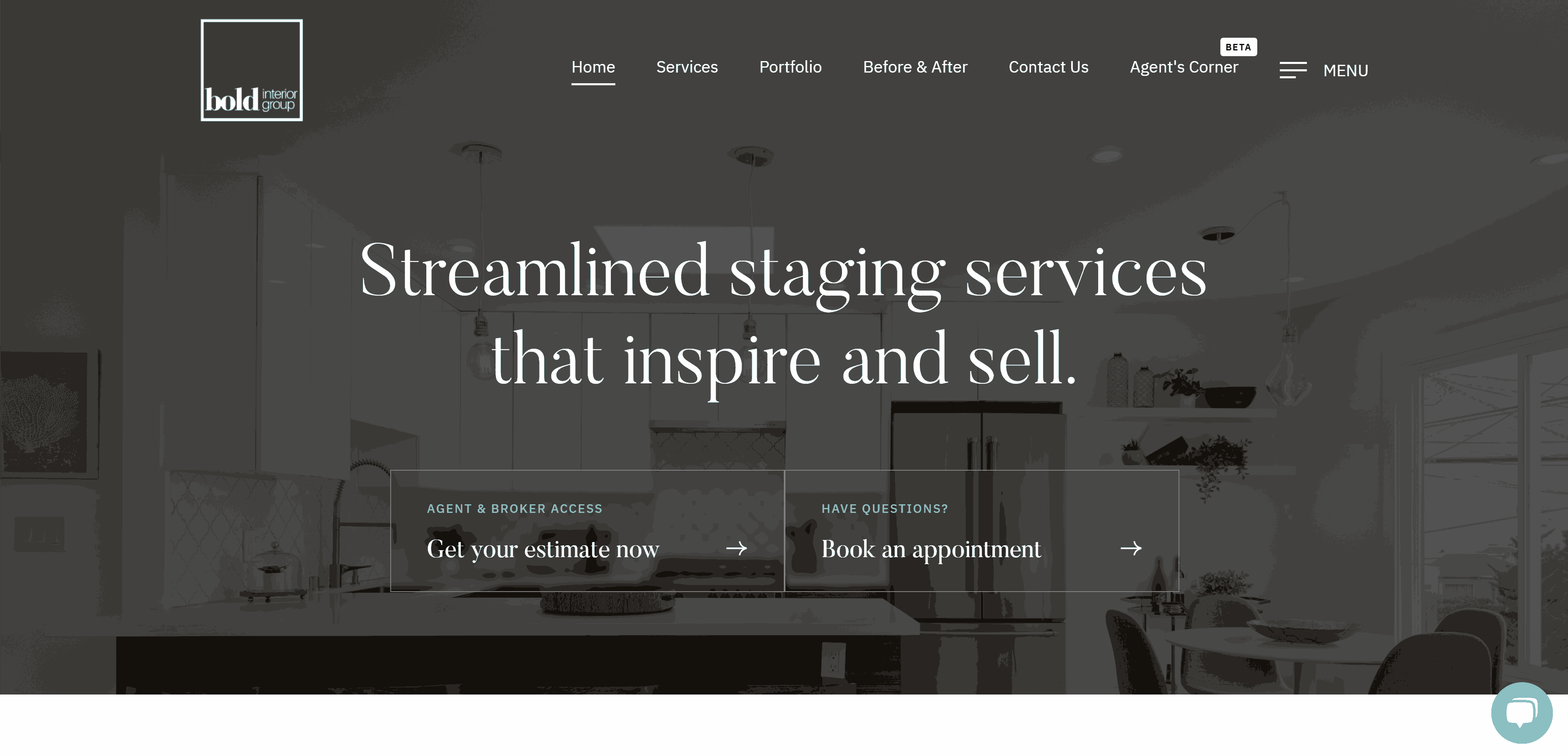
Bold Interior Group’s website is all about sophistication and elegance. The home page is divided into clear-cut sections as you scroll and includes links to book appointments, view portfolio, and read the blog.
Our favorite part of the website is the “Before & After” page. Each image has a slider that shows you an interior’s “before” when you slide to the right and its “after” when you slide to the left. It’s a clever and effective web design technique that shows off the company’s interior design skills.
3. Irina Markovskaia
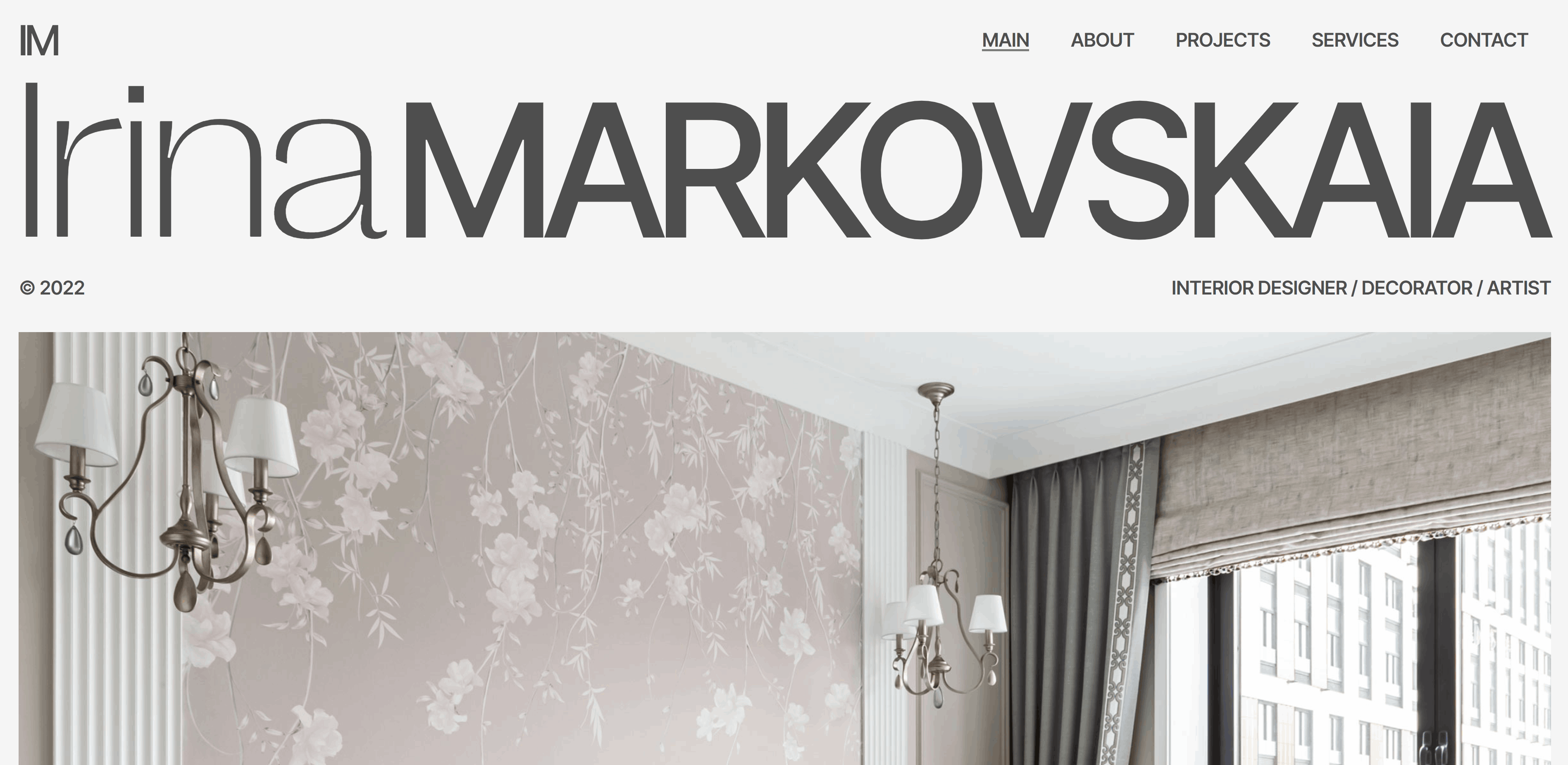
Irina Markovskaia is a Russian interior designer, decorator, and artist. This decorated website is her personal portfolio. She uses two distinct fonts throughout — a serif and sans serif font combination that works very well with Irina’s aesthetic. Using two different font styles provides a nice contrast for this minimalist website design.
This contrast matches Irina’s style: minimal and neutral with elegant finishes, whether those are velvet sofas or floral wallpaper.
Irina makes clever use of whitespace, offering the right amount of breathing room while keeping the design compact. Like Irina’s interior design, the portfolio page is clean and simple with an air of sophistication.
The elements and animations are consistent throughout the website — a key principle of high-quality design. Irina’s website is a fantastic example of minimalism and a well-rounded reference for your interior design portfolio.
4. Yana Prydalna
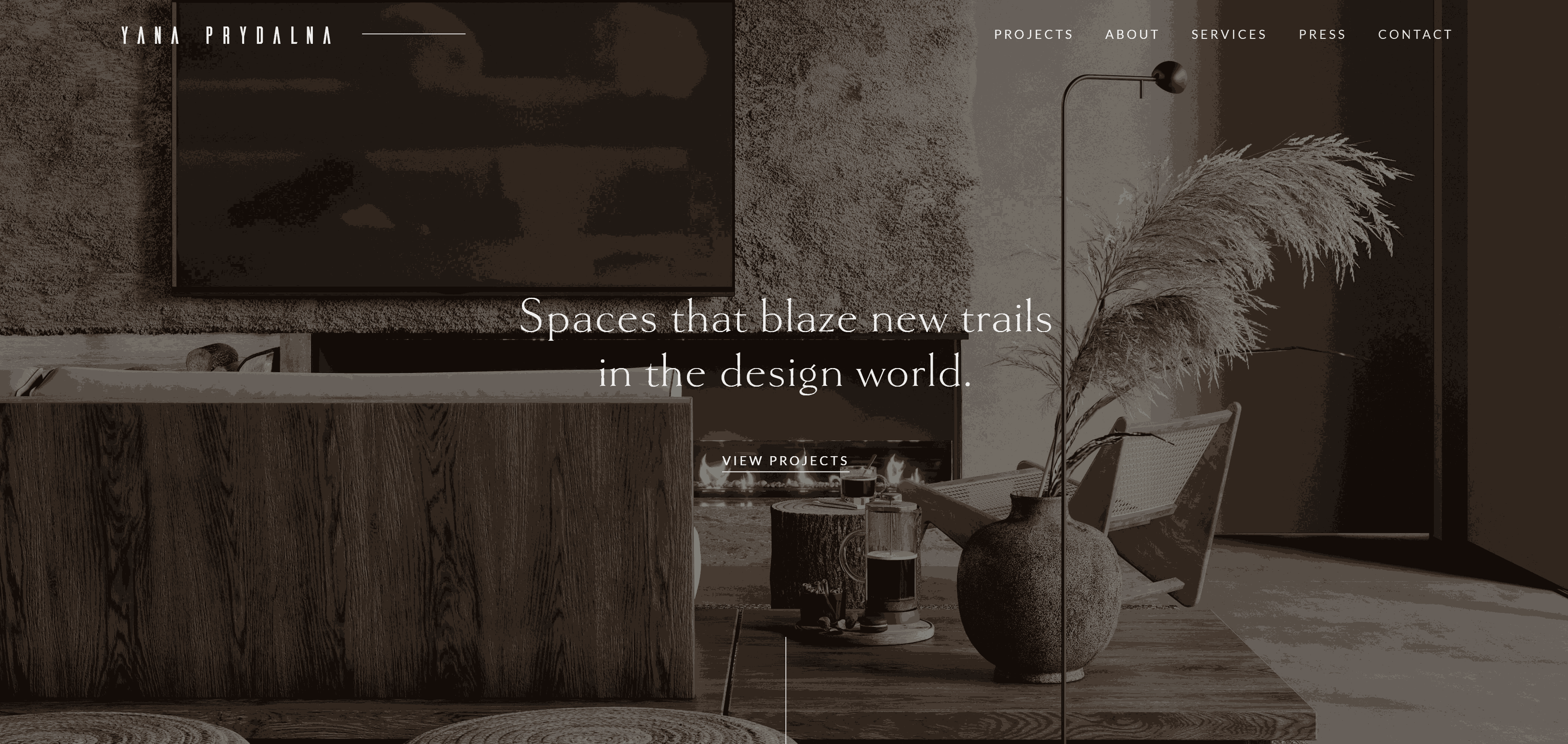
Built by Jeff Ross, Yana Prydalna’s personal portfolio website offers rustic home design inspiration.
The home page greets you with white text on a background image, followed by a gray background that remains consistent throughout the site. When you reach the bottom of the homepage, you’ll discover a carousel scrolling effect that pulls the images from right to left.
The “Projects” page really suits this home interior website design. Earth tones complement the projects themselves, which feature a lot of wood and natural textures. Yana’s interior design projects have a rustic, relaxing feel and the site mimics the same style.


Get started for free
Create custom, scalable websites — without writing code. Start building in Webflow.
5. Elite Design Studio
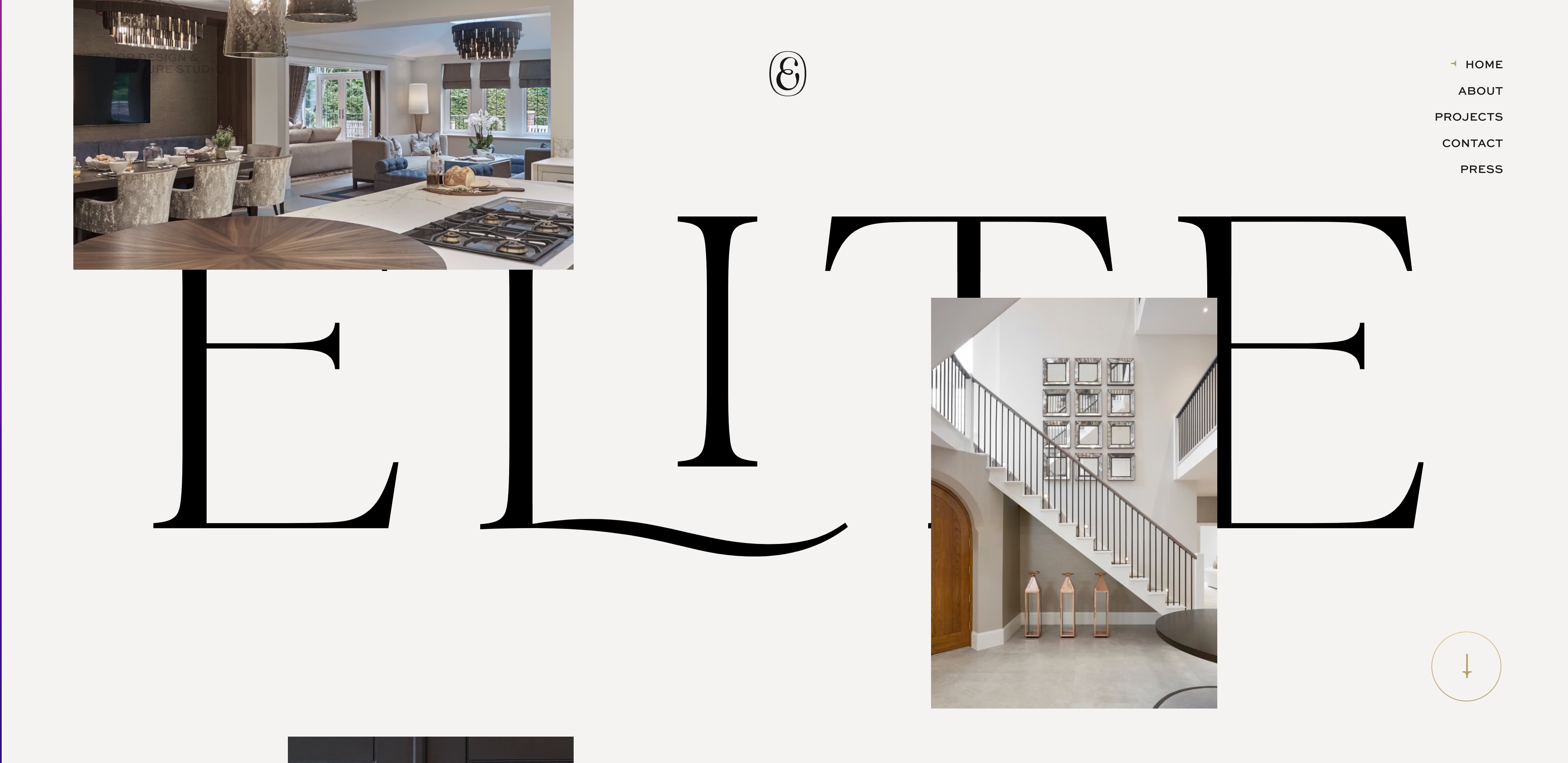
Elite Design Studio describes their style as exclusive, elegant, tasteful, and timeless and their website design definitely matches the aesthetic.
Upon entering the homepage, you’re met with the word “Elite” unfolding in a beautiful animation and an endless scrolling effect of project photos. The images cover high-end home design with close-ups of expansive living spaces and cutting-edge interior decoration.
A compact menu in the upper right hand corner allows you to navigate to different pages such as their about page, projects, contact information, and press mentions. No matter where you are on the site, the stylized “E” in a circle remains at the top of the page. Clicking on the “E” takes you back to the homepage.
We love Elite’s color scheme and modern design with white, gray, and black colors pair well together. The gold accents and overlapping typography throughout the website give it a premium and modern feel.
Elite Design Studio’s website is a stellar example of beautiful design, minimalist colors, and an immersive user experience, matching their thoughtful and timeless interiors.
6. Junilla Interior Design
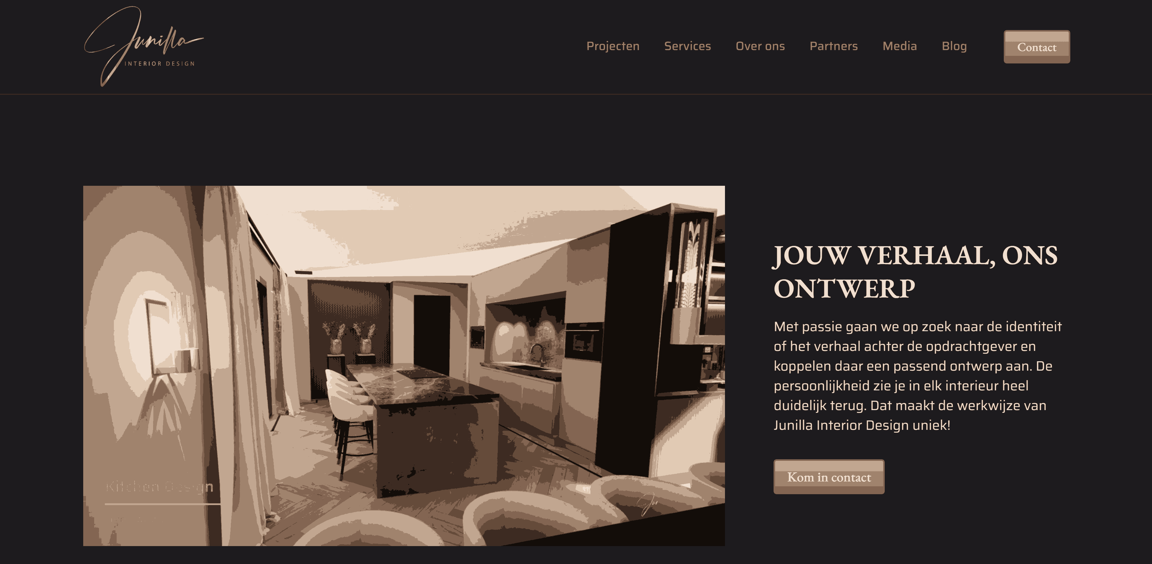
Junilla is a Dutch interior design firm founded by Junilla Bakridic. Built by Gjis Campbell, Junilla’s website uses a dark canvas with light coral highlights.
The homepage has an introductory video at the top and testimonials near the bottom. Junilla’s logo is a signature, which is cleverly shown through a looped animation in the left hand corner of each page. We also love that on the contact page, the logo attaches to an old phone headset.
The other sections all maintain chocolate brown backgrounds with white text and pink gradients. The website’s palette lies in high-contrast tones that represent Junilla’s design style — dark and dramatic.
7. Nest
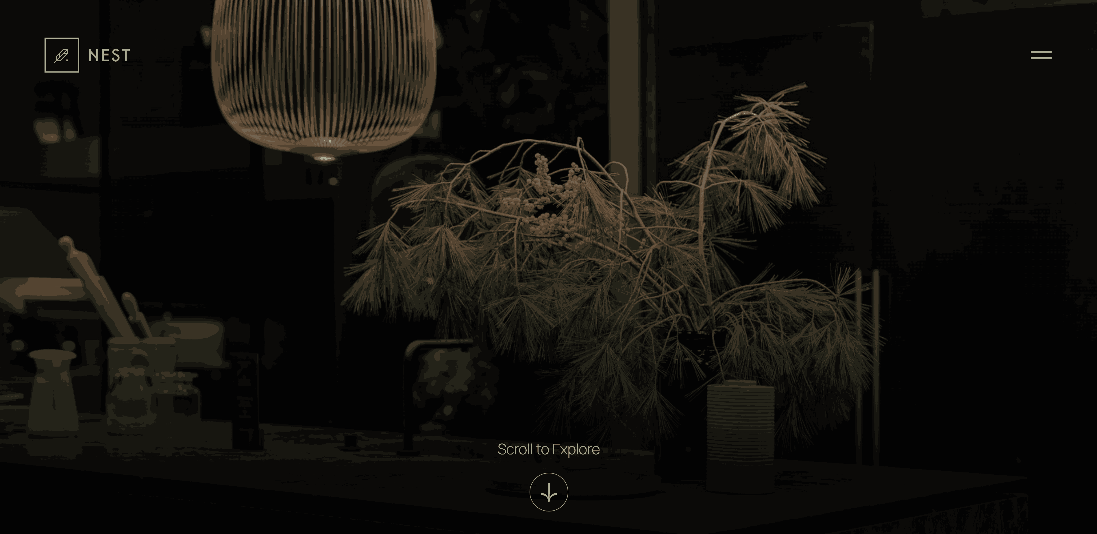
Nest is a boutique interior design showroom from Portland, Oregon, and the brainchild of international interior designer Michael Reper. The site was built by Joseph Graham.
Nest’s home page greets you with a simple image and animation inviting you to scroll down. As you explore the dark and moody website, you’ll discover thoughtfully placed elements like collapsible menus, animated buttons, and images that shift subtly as you scroll past them.
Nest offers wall coverings, lighting, furnishings, fabrics, and arts and accessories as part of their services. Pale tones like beige, brown, and sepia in Nest’s interior design show where their website inspiration came from.
Not only is this one of the best interior design websites on this list, but it’s also exceptionally functional. If you’re looking to model a site after Nest’s, you’re on the path to exemplary design work.
Create amazing interior design websites today
Every interior design website should be unique and match the interior designer’s style. Regardless of the aesthetic, a great interio website strikes a balance between flair and functionality.
You can get a head start on your website with one of the many interior design website templates from Webflow creators.


.jpeg)



.jpeg)


