Background videos aren’t the future. They’re the now. Not because they’re super cool and everyone’s doing them. But because social platforms like Facebook are betting on augmented reality (AR) — immersive experiences that drive our interactions. And video is a leading arm to AR.
Background video is a beautiful thing. But without following some important guidelines, it can ruin your site’s performance and mess up the overall design and experience. Before we dig into those guidelines, let’s make sure we’re up for adding background video to our site.
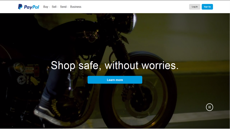
We’re seeing background video more and more all over the web
Background videos can be a great way to improve your website’s look, make it more enjoyable for visitors, and command attention.
Visitors want to be drawn in, and good video does this. Videos can tell the story of the business and every business has a story that can be told better.

Best practices for adding background video
Only use a background video when it will truly improve your site’s look and feel. It’s tempting to grab onto a shiny, new thing without considering its impact. While the impact will be minimal if done right, your site will be slower. Trading a static image for a video must be worth it.
Here are some things to consider:
- Choose a short video that will load quickly. Save feature-length films for the theater.
- Don’t use sound. Sound adds to the file size and adds little value. Unless you consider forcing visitors to scramble in search of ways to turn off their sound valuable.
- Use a placeholder. If the video is stopped or can’t be played, make sure there’s a fallback image. Creating placeholders in Webflow is easy. Place your background video element into a section with a background image in place.
- Replace the video with an image for the mobile experience — videos either don’t play or are difficult to implement on mobile. It’s also impolite for sites to hog a user’s mobile data with background video. Replacing the video with an image in Webflow is also a cinch. Hide the background video element at mobile breakpoints to reveal the background image. Doing so provides the best experience for the mobile visitor.
When you shouldn’t use a background video
While a background video is great at grabbing attention, it can backfire if you want visitors to focus on your copy.
If you’re too aggressive with your background video, it will overpower important content. Videos can be distracting when there’s complex ideas, like sales-related content, to read. If your offer requires a lot of explaining, words are better. Don’t run the risk of distracting or losing visitors with a video.
Choose useful over complex
“What‘s the least amount of UI that will allow content to be found by and speak to the user?” We should ask ourselves this frequently during the design process — especially when we’re deciding whether or not to add an element.
It’s easy to make the mistake of thinking you‘ll enhance an experience by sprinkling in some fun animations or by hiding and revealing elements. But you might actually be adding an obstacle.
The best approach to keeping things simple is … to keep things simple! Start with the most straightforward solution and add more complex layers only as necessary. Your background video should reinforce the content message, eliminate barriers, and complement the rest of your site’s content.
The keyword here is “background.” Background videos should melt into the aesthetic of the website — not stand alone or get in the way.
“Good design is as little design as possible.”
–Dieter Rams
The smarts behind adding a background video
Keep the conversion goal front and center. The storyline of the background video should always support the end goal of the page.
A best-case scenario is when background videos supplement or enhance the CTA.

Make it personal
In general, people want to work with people, not faceless businesses. This is one of the reasons buyers love purchasing items from stores like Etsy: there’s a face to the business.
Adding a short video that shows people interacting with your service lets potential clients visualize themselves working with you . This ideally leads to your audience taking an action, like signing up, making a purchase, or getting in touch.
Make it pop
In most cases, you’ll want to have text layered on top of the background video — so make sure it’s easy to read throughout the entire video loop. Generally, aim for a strong light/dark contrast between the background video and the copy.

One way to ensure full, legible contrast is to apply a solid, monochromatic filter on top of the video. Not only does this look super professional, but the color contrast makes the text, form, and landing page CTA stand out. Other alternatives include a text shadow, or a semi-opaque color block behind the text


Design interactions and animations without code
Build complex interactions and animations without even looking at code.
Keep it short
Background videos should be no longer than 10 seconds. A short, looping video should be enough to get the point across without impacting load time.
Remember, it’s a loop. If the video is too short, the loop will appear out of place or incomplete. On the other hand, if the video’s too long, visitors may click away from the site or to another page before the video’s had a chance to do what great video does: stir up the desired, strong emotions.
Look for, or produce, a simple looping background that’s relevant to the content of your website. There are lots of places to get stock video clips. If you can’t produce your own footage, double check the copyrights associated with any video before you use it.
But making something personal is hard when it’s not actually yours. So if possible, always produce your own video.
Make it unstoppable
As long as the video content is quality and on brand, there should be no reason for visitors to press play or pause — don’t make it an option.
Background videos play automatically. This grabs the visitor’s attention, and keeps it, as soon as they see the video element. I promise, they want their attention grabbed — that's why they're visiting.

Don’t forget the analytics
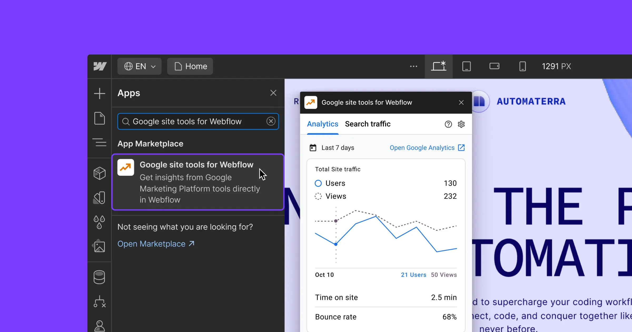
As with anything, check the numbers and ask your users to understand how your background video is affecting your key metrics.
To keep your testing clean and accurate, don’t add a background video along with a number of other design changes. If you do, you won’t be able to draw any definitive conclusions from your addition of background video. And be sure to have a plan in place, just in case your background video actually hurts key metrics.
Run an A/B test to compare how your page performs with a background video compared to a static image. To be safe, start by pushing a small portion of your traffic towards the page .
A/B testing can be tricky — a dash of magic and a pinch of math. Most usability specialists lean on experience, gut, and personal opinion when it comes to deciding what design changes delight customers.
At the end of the day, it’s your customers and your brand that will decide what converts best. But data is a great way to know what your customers actually think, as opposed to what they say they think.
Have you experimented with background video yet?
If so, we’d love to hear about your findings! We might even be interested in featuring your story, so be sure to drop a note in the comments below.


