Your website’s hero image is more than just a pretty picture — it’s your first opportunity to captivate visitors. Choose one that sparks engagement right from the get-go.
The human brain processes images in as little as 13 milliseconds, and a visitor’s first impression of a website starts forming within the first 50 milliseconds. Given this rapid timeframe, these initial moments significantly shape the user experience — including whether visitors stay to explore or bounce to continue their search elsewhere — making hero image choice one of the most high-stakes aspects of website design.
What is a hero image?
A hero image, part of a hero section, is a full-screen video, illustration, animation, or banner image at the top of a webpage. The hero section serves as a visual focal point and often includes more than just an image, guiding visitor attention toward key messages or calls-to-action (CTAs). Hero images often appear on a website’s homepage, but other site pages can also feature them, such as blog posts, product pages, or landing pages.
Some designers build intrigue by opening with a single photo with no text overlay, compelling visitors to scroll down to discover more. The vast majority of hero sections, however, include a background image and a combination of the following elements alongside the hero image:
- A headline
- A subheadline
- An initial CTA
- A navigation bar (for desktop sites) or hamburger menu (for mobile sites)
- Social proof badges
The amount of information a site displays above the fold partly influences the choice of a hero image. Hero sections that are light on text allow for busier and more colorful images, while text-heavy hero sections need to maximize legibility through softer photos with less color contrast.
Selecting the perfect hero image for your site: 10 tips
Selecting the perfect hero image is crucial for a site’s success. Keep these tips in mind when making your choice.
1. Consider your desired mood
A compelling hero image evokes emotions in visitors upon arrival. Bright colors and sharp contrasts invigorate, while cool tones and soft edges induce a calming effect. Mood can influence engagement levels and overall brand perception, so aligning the hero image with your brand’s messaging is critical.
2. Get things moving with a hero video
Video hero images captivate visitors by immersing them in a story, including movement and action that still images can’t match. They have the power to virtually transport users to different settings, like a bustling restaurant kitchen or an intense boxing gym. When using video, however, it’s essential to keep accessibility in mind. Offer clear options to pause or stop the video to respect the needs of people with motion sensitivity and deliver a more inclusive site experience.
3. Keep other design elements in mind
It’s important to balance the hero image and the accompanying content. Consider the space you need for overlay text, branding elements, and CTA buttons within the hero section. If including extensive text overlay, an image with abundant negative space avoids a crowded and visually overwhelming presentation.
4. Avoid stereotypes
Standard stock photos aren’t known for their diversity. When selecting hero images featuring people, avoid racial, gender, and other stereotypes by manually screening images or sourcing from providers known for their inclusive and diverse image options. This consideration strengthens a brand’s wide appeal and underscores its commitment to diversity and inclusivity.
5. Use graphic design principles to steer viewers
Use graphic design composition techniques to strategically guide visitors’ attention toward critical elements, such as CTAs or key information. For example, effective composition can leverage the gaze direction of a figure in the image, like a mountaineer looking toward the horizon in the same direction as your CTA. Alternatively, an outstretched arm of a dancer can subtly point toward it. Choosing photos with a singular focal point and placing the CTA nearby is another tactic to draw attention to and highlight essential details.
6. Stay on brand with color
Selecting hero images that align with the site’s overall color palette enhances its visual harmony. Opt for an image with a background that echoes or complements the site’s background. If possible, match color accents in the image with brighter elements of the site’s color scheme to create an aesthetically pleasing and cohesive look.
7. Choose the right image size
Sizing a hero image requires balance. Large image files increase the page load time, potentially driving visitors away, while a file that’s too small pixelates on larger screens.
Compressing image files before uploading maintains image quality while reducing file size. Experimenting with JPG and PNG files can also provide insight into impacts on site performance. Fortunately, with Webflow Designer, the platform mitigates these concerns by automatically compressing images and optimizing them for various screen sizes.
8. Make sure it’s responsive
Different screen sizes and dimensions can cut off sections of a hero image, underlining the need to test the design across multiple displays. The image must function effectively in vertical (mobile) and horizontal (desktop, tablet) orientations. Many desktop monitors have a 16:9 aspect ratio, making an image size of 1,600 x 500 pixels a good fit. However, if that size doesn’t work on mobile versions, substituting an 800 x 1,200 image resolves this issue.
9. Keep accessibility in mind
Designing for all involves acknowledging the distinct needs of different users. Including alt text for a hero image, adhering to suggested color contrast ratios for overlaid elements, and adding an Accessible Rich Internet Applications (ARIA) label, help assistive technologies recognize content and navigation. ARIA labels provide descriptions and roles to interactive elements, making them more understandable to people. These practices ensure a website remains accessible to all users and their varying needs.
10. Test, test, test
When choosing between two potential hero images, conduct user research or develop different versions of the landing page for A/B testing after launch to provide clarity. Even though you might have a gut feeling about a particular image, website performance analytics offers an objective perspective to solidify your decision.


Get started for free
Create custom, scalable websites — without writing code. Start building in Webflow.
3 websites with eye-catching hero images
These three hero image examples showcase designers’ expertise in capturing and maintaining attention. Despite their contrasting styles, each kindles a desire to continue exploring the site.
1. Friederike Hornung Dog Physiotherapy

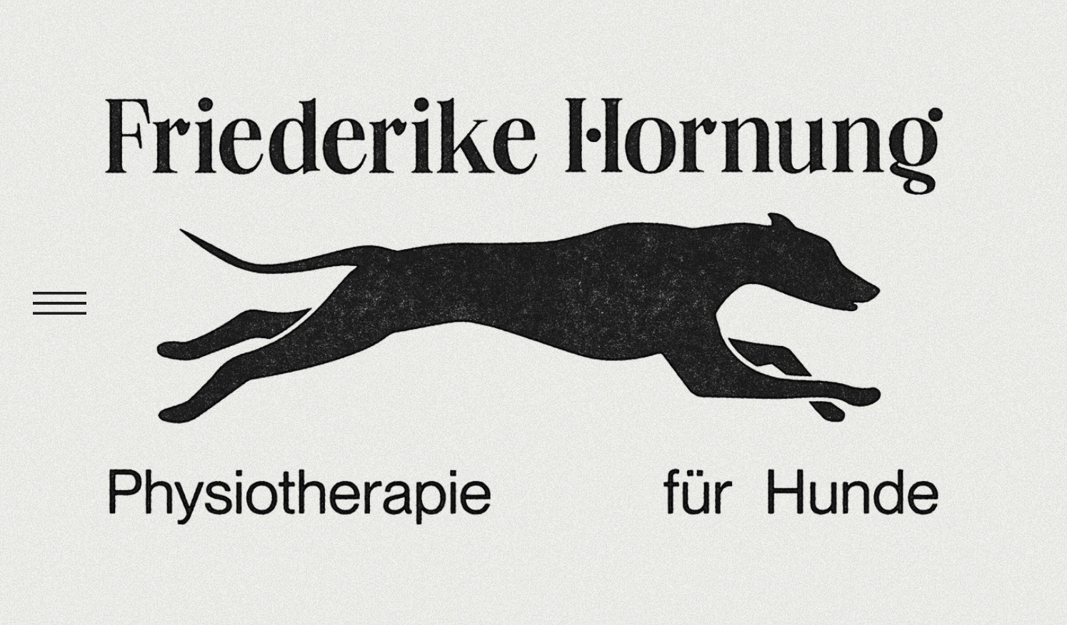
Dog physiotherapist Friederike Hornung teamed up with designer Lukas Lögler to differentiate her site from typical veterinary websites. Lukas rose to the occasion with an unconventional vintage-style hero image: a textured silhouette of a dog mid-leap. This hero image encapsulates a healthy dog’s essence, embodying the vitality and movement that Friederike’s unique therapeutic work focuses on. The design’s novelty immediately engages the audience, boosting user interest and retention rates.
2. Food Nerd Rockstar

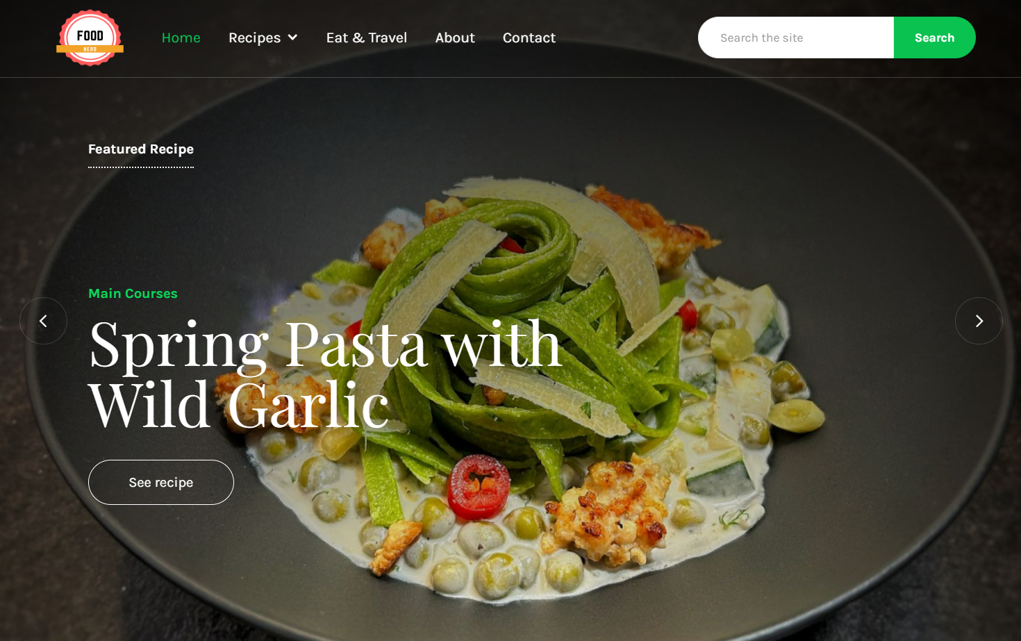
Recipe site Food Nerd Rockstar’s homepage, crafted by designer Eggnita, captivates visitors with a carousel of four full-width hero images, cycling leisurely through four distinct food shots. The eight-second interval between images gives visitors ample time to appreciate the culinary handiwork on display. A slow-fade transition between images and a subtle zoom-out animation creates an enticing visual experience that allows visitors to savor the food with their eyes. The design carefully incorporates color choices, too — a dark gradient overlay on each picture ensures the menu bar’s readability and the dishes' harmonious green and white colors harmonize with the site’s overall color scheme.
3. Sugar Ridge Ranch

Sugar Ridge Ranch provides accommodations for vacationers intending to bring their horses along. The website’s hero image, chosen by Laura Moore, immerses visitors directly into the prospective experience: a beach excursion on horseback. It quickly communicates the business's value proposition, encapsulating the service's allure in a captivating visual. This imagery aligns with the ranch’s unique selling point and instantly engages the target audience.
How to find great hero images on a budget
While hiring professional photographers to capture bespoke visuals is ideal, it might not always be feasible, especially if you’re on a tight budget. Fortunately, free web design resources are plentiful, offering abundant high-quality stock photos online.
Start your search for a hero image with any of these options:
- Unsplash is an image library offering over a million high-quality creator-submitted photos, all free for personal and commercial use. A paid subscription unlocks access to more than five million images
- Pexels and Pixabay, owned by graphic design platform Canva, have over a million free stock photos, videos, and audio files each
- Burst, Shopify’s stock image collection, is a good source of photos with models from diverse communities
- Picmelon is an excellent choice for unconventional and artistic photos
- Glyphs offers filter options by gradients to match your site’s color scheme
- Create your own hero images by editing your original photos in a design tool like Canva or Photoshop
Capture your brand’s essence with a hero image
Getting the hero section of a website right means that users’ first impressions won’t be their last. To learn more about other aspects of the hero section, try our Webflow University tutorial, which covers structure, text elements, HTML tags, and hero image placement, or learn how to add an image in HTML.
For even more hero image design ideas, browse our templates by topic or check out what other designers are doing in Made in Webflow.


