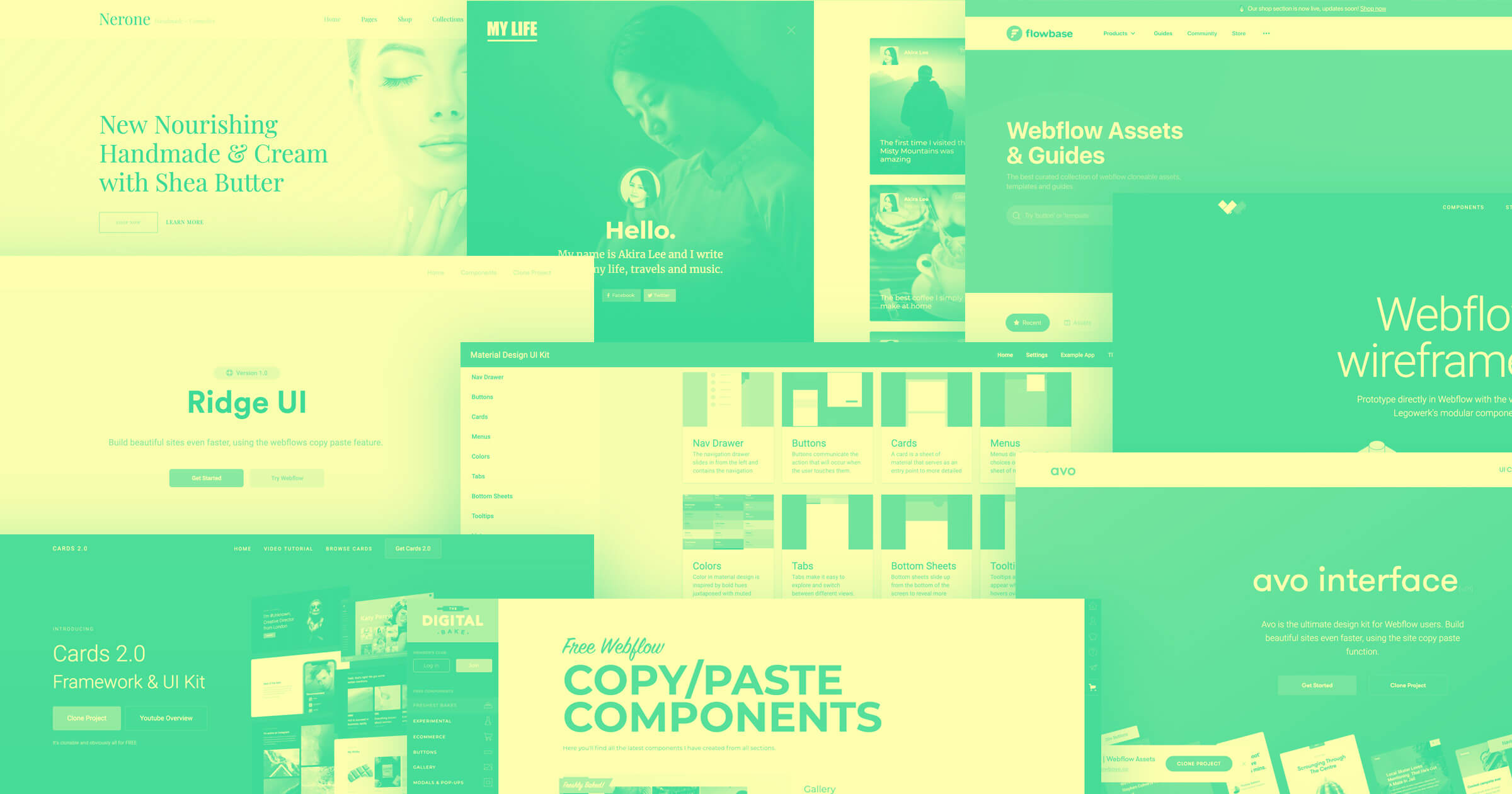
There's a wealth of resources for web designers — including website wireframe templates and UI kits — to make your design process more efficient. Maybe you need buttons, blog templates, or product pages. Or maybe you need a simple wireframe to present layouts to clients.
16 website wireframe templates and UI kits for web designers
Here are 16 UI and wireframe kits that will help you build websites faster:
1. EmeraldKit
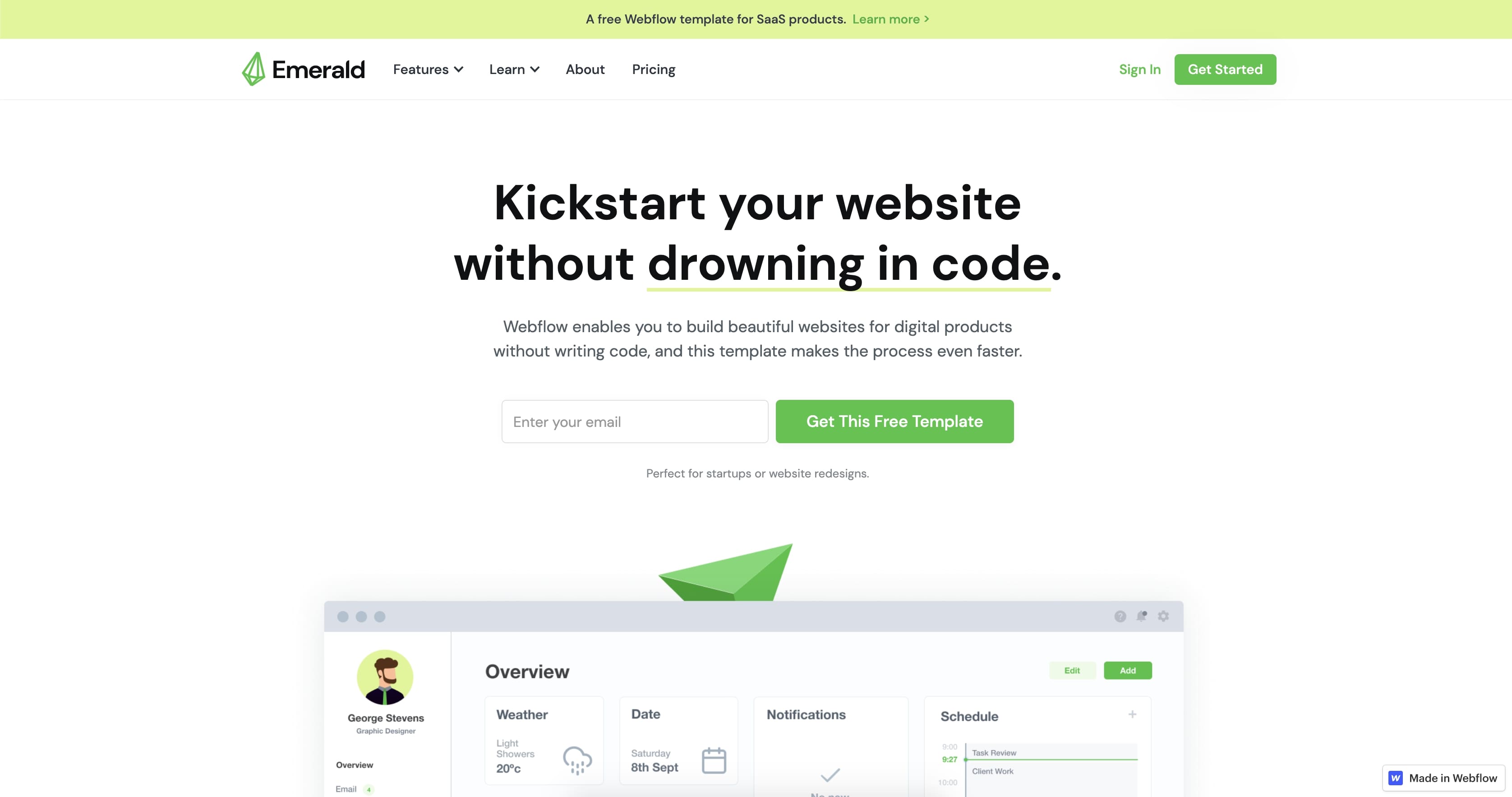
EmeraldKit is a free SaaS marketing website template. It offers multiple sections that are easy to edit and customize to your likely. Included is also a design system that allows you to organize your colors, text, and other design elements across your website.
2. Cards 2.0 Framework and UI Kit
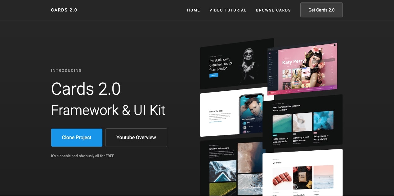
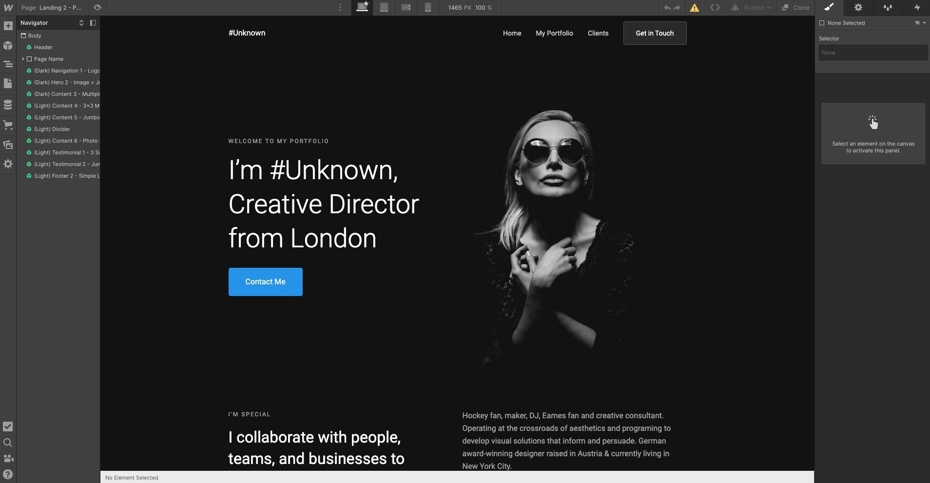
It’s nice to have a collection that gives you all the building blocks to create an entire website. Whether you need a template for a biography page, a hero card, or a premade layout for a portfolio landing page, the Cards 2.0 Framework and UI Kit is a great choice.
With over 100 different symbols and elements, there’s no shortage of elements to assemble into your own designs.
3. Avocado
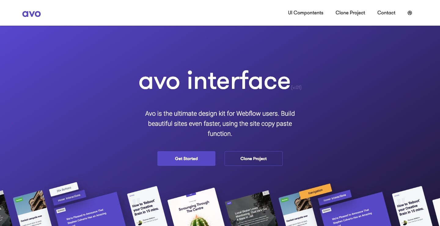
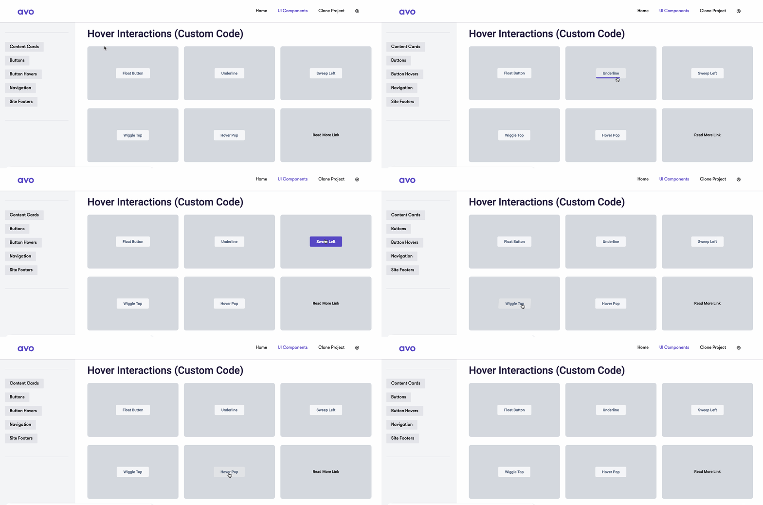
Avo offers a practical set of UI elements including content cards, navigational items, and footers. Most notable are the buttons with various animations that really bring them to life on hover. These buttons require some custom code, but Avo walks you through the process, making it easy to pop these into your own Webflow layouts.
4. Legowerk
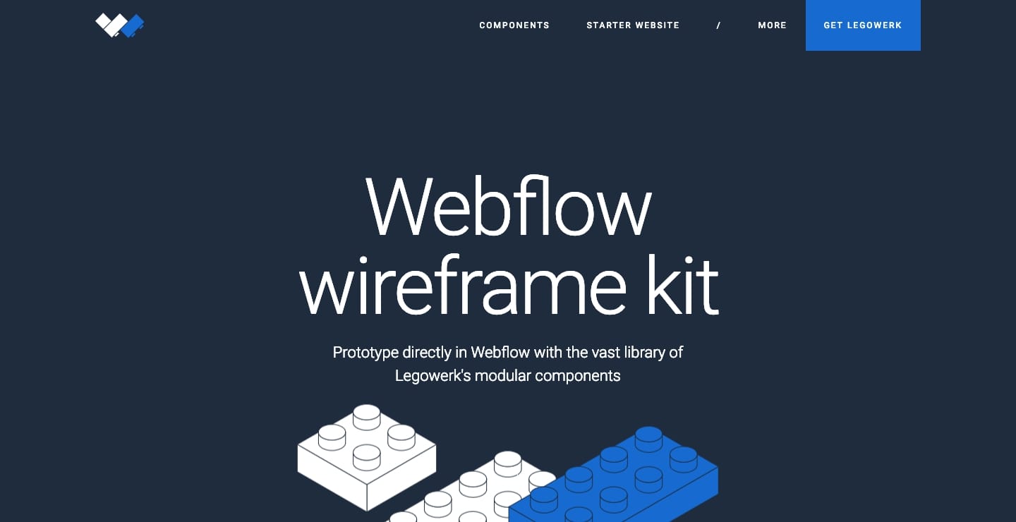
Any major web project needs a wireframe. Wireframes work as a guide to show a team how the content will come together and where elements like images, calls to action, and navigational options will be integrated.
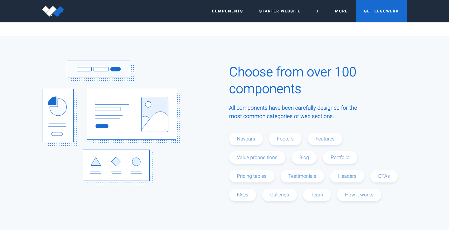
Legowerk offers a wireframe kit that is simple, yet (lightly) stylized. One of the advantages of using tools like this with Webflow is that you end up with a living blueprint. Instead of a static representation that needs to be recreated, you can jump in and add content and visual elements into the design framework you’ve already built.
5. Material Design 1.0 UI kit
If you’re not familiar with Material design, check our Introduction to Material Design.
If you need a quick refresher — Material Design is a set of design practices published by Google in 2014. Think Google Play and its card-based layout, or the icons and buttons of Google Maps. Material Design is all about usability.
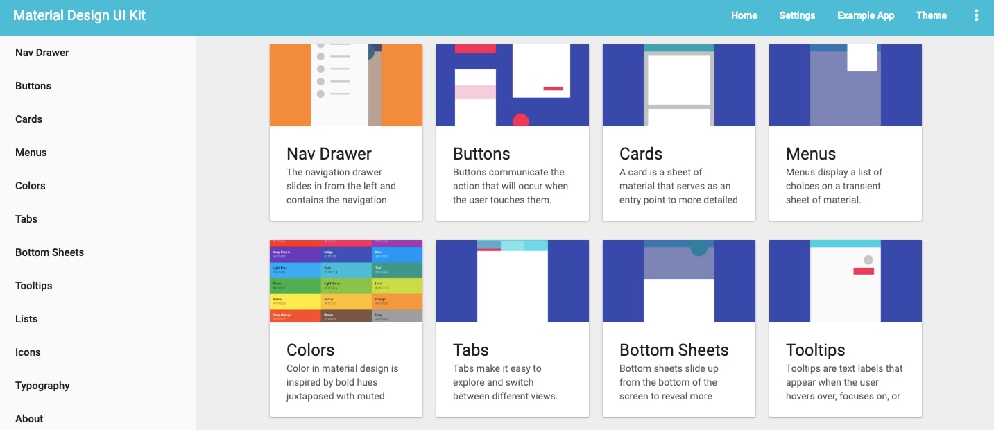
If you’re creating a project based on this approach, the Material Design 1.0 Kit has all the essential elements you’ll need, including including cards, nav drawers, and typographic sets.
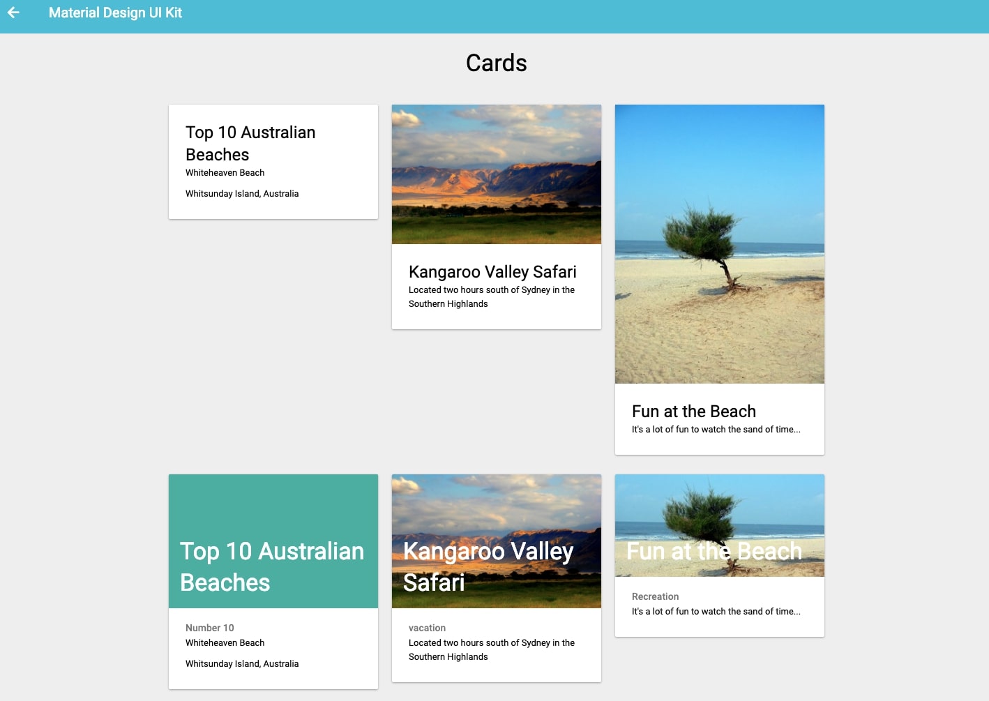
Card-based layouts are one of the signatures of Material Design. The Material Design 1.0 UI Kit gives you all you’ll need to create them — though it’s worth noting that Material has entered a 2.0 phase, so you may need to add a lot of corner radius to those cards!
6. Ridge UI
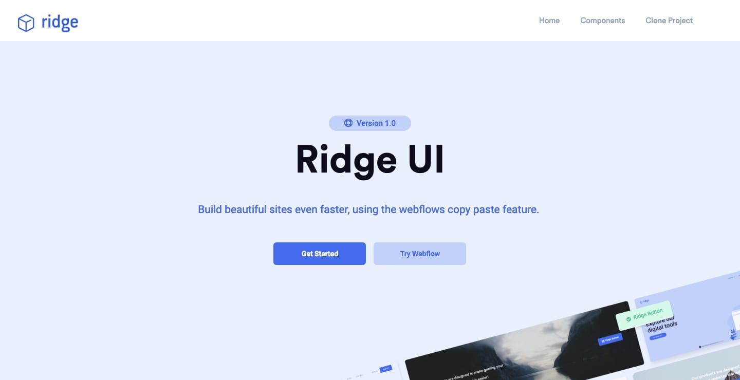
Ridge UI gives you buttons, navigational components, footers, and other essential elements that can be copied and pasted into Webflow. The elements are great as-is, but Ridge UI encourages designers to style and customize elements to suit their own tastes and projects — an important part in any web designer’s journey. Deconstructing how elements are assembled and injecting a personal touch will teach you far more than just churning out yet another template-based design!
7. Flowbase
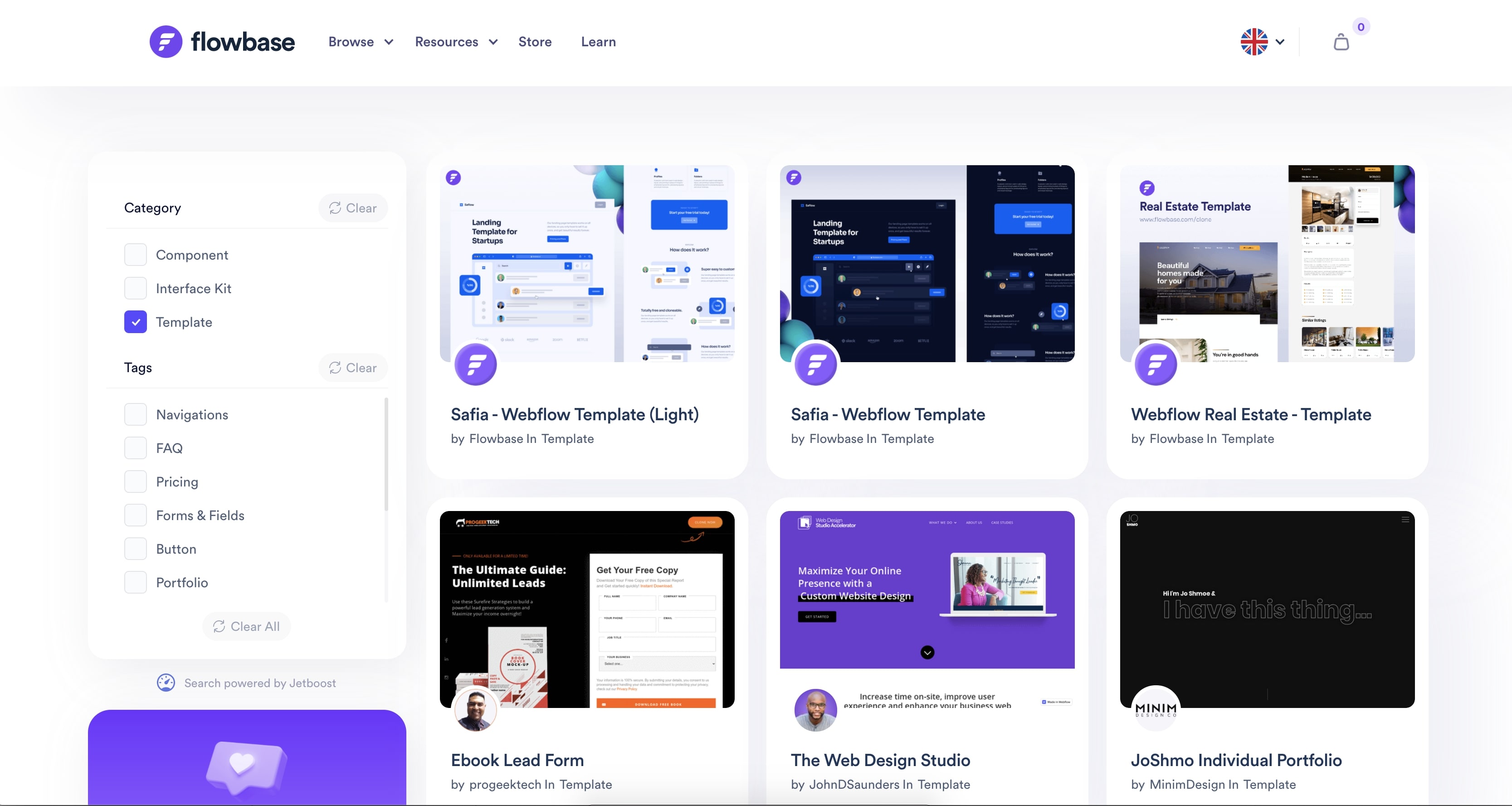
Flowbase offers a curated collection of UI kits and tutorials to sharpen your design skills. Whether you’re looking for landing page templates, grid tiles, card kits, or other types of elements, there’s something here for everyone.
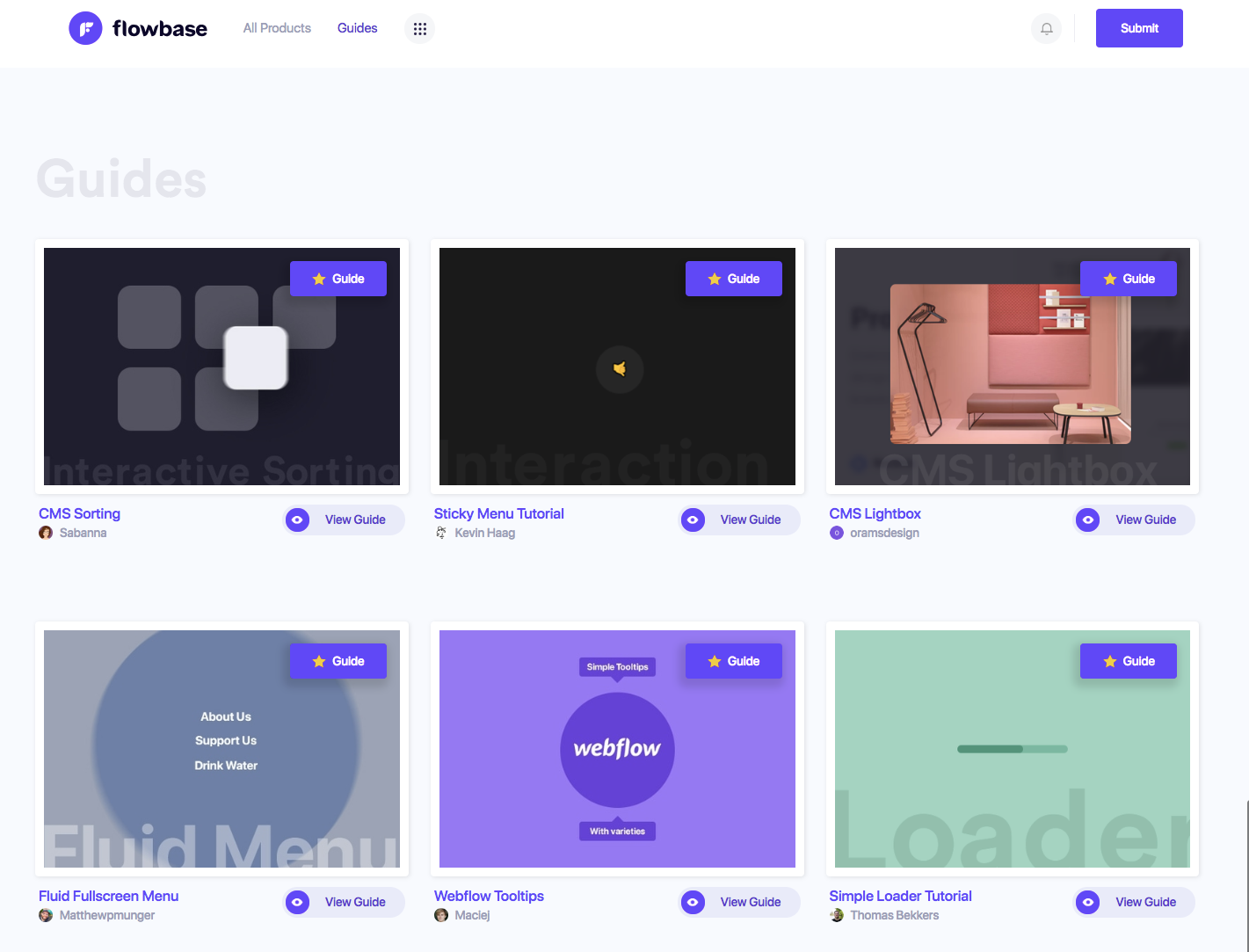
Their guides cover a range of topics from beginner tutorials about Webflow basics, to more advanced practices, like hover buttons. No matter where you’re at in your Webflow journey, there’s plenty of inspiring content.
8. Style Guide
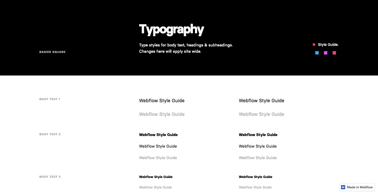
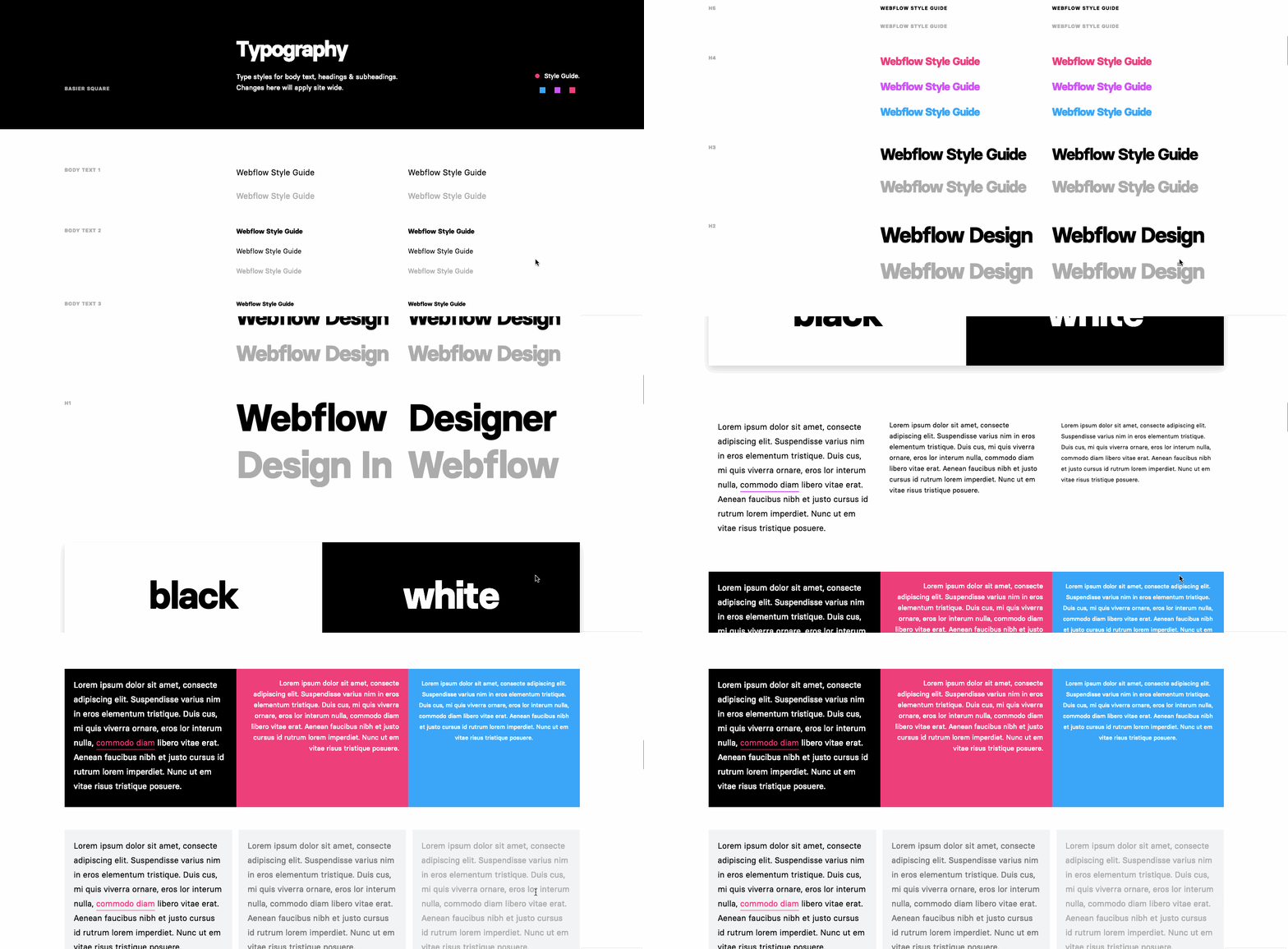
A living style guide helps teams maintain visual consistency and stay on top of style changes. Site-wide changes can be made directly in the style guide, making them super useful, especially for larger sites.
The Style Guide lets you set up styling for essential elements like headers, text, colors, buttons, links, and forms. If you’ve never worked with a style guide before, this is a great place to see how they work.


Free ebook: Web design 101
Master the fundamental concepts of web design, including typography, color theory, visual design, and so much more.
9. Digital Bake
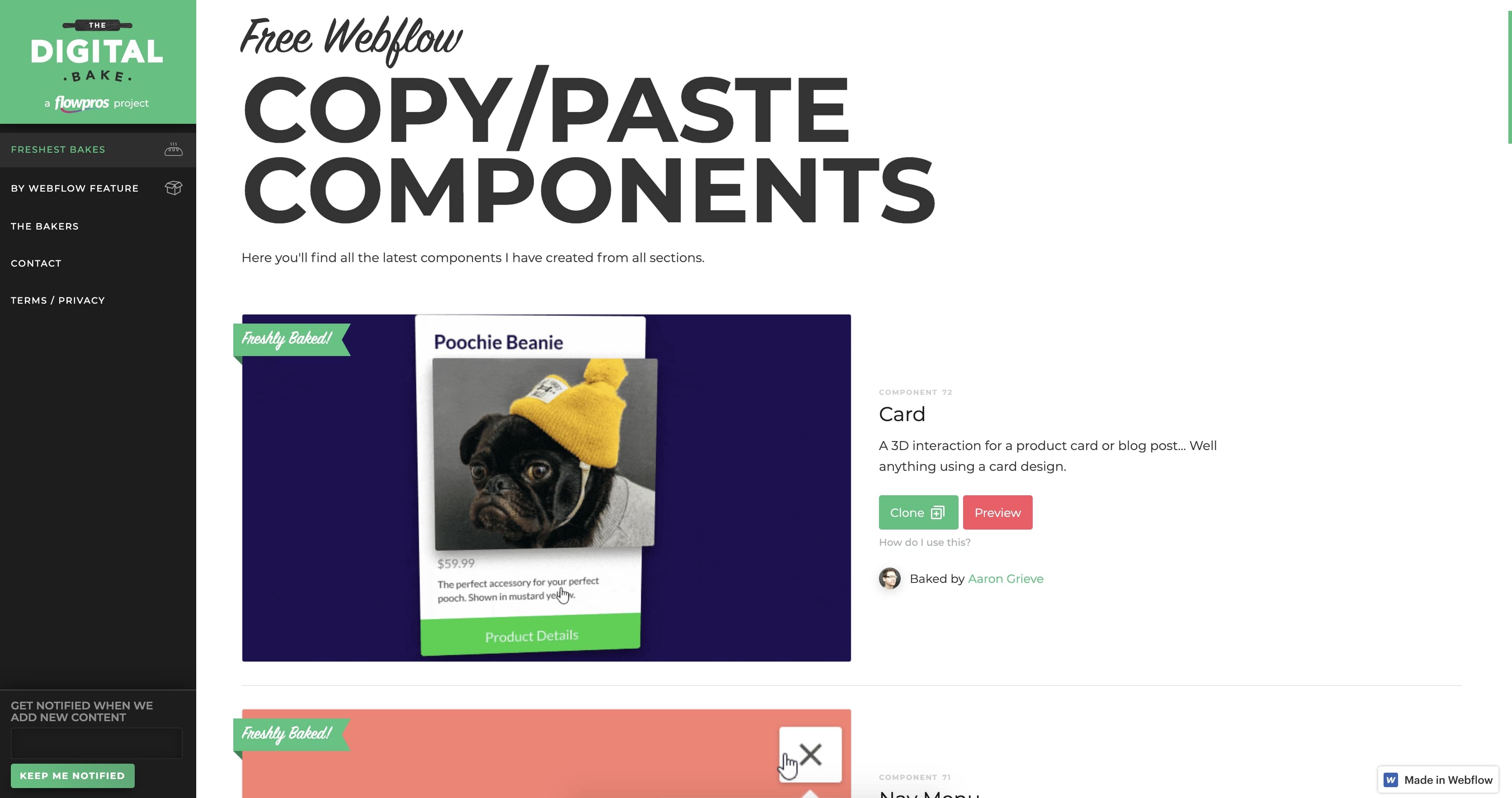
Digital Bake has been featured on our blog a few times — and with good reason. For starters, it’s a well-designed site. The left-hand navigation lists the categories of components available, making it easy to find what you’re looking for.
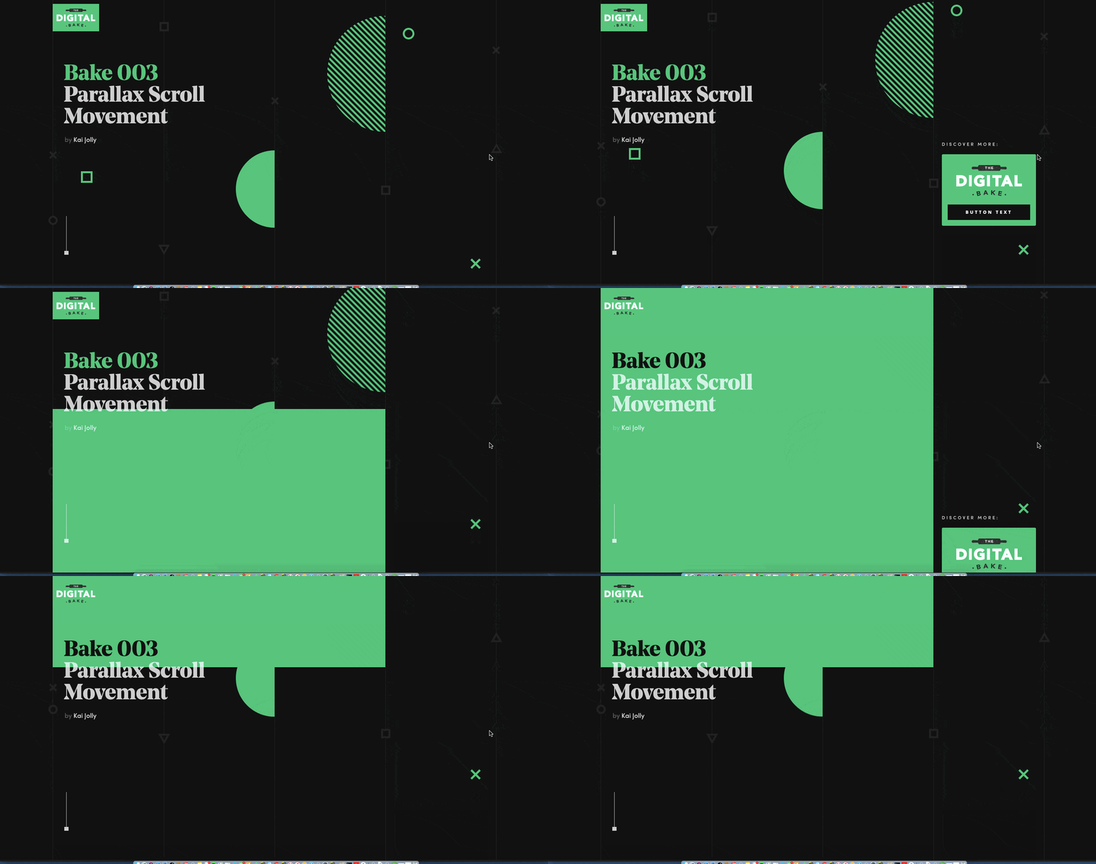
They’ve also created some beautiful elements like experimental parallax effects and a CMS-powered gallery. There are plenty of nuggets to give your designs a creative boost. Digital Bake is also generous — everything is free! We think that’s a pretty good deal.
10. Vireflow
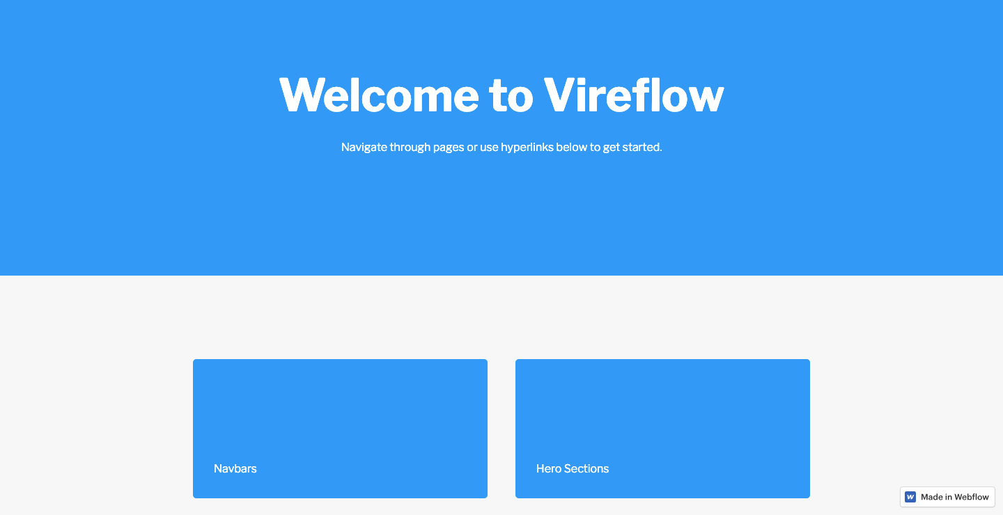
Vireflow is another great wireframing kit that’s all about big, bold blocks. It has all the necessary elements for creating wireframes including sections for content, navigation, and hero images. Vireflow helps you communicate the site layout in a straightforward way.
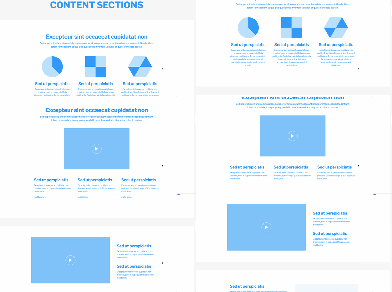
UI kits and templates from the Webflow template marketplace
Here at Webflow we also have a marketplace for UI kits and templates — some you have to buy, others are free. And with such a wide variety of templates, you’ll most likely find something that works for your next project. Let’s take a look through just a few selections that may help you with your next project.
11. Muma
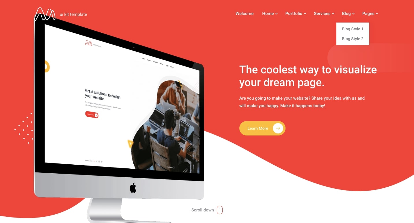
Muma is a UI kit that would work well for portfolio or agency sites needing a framework for featured projects. With 6 different homepages and 4 different portfolio layouts that harness the power of Webflow CMS, you have plenty of options.
Muma’s beautiful templates are easy to personalize with your own branding. Even just popping in your own photos and text would produce a solid site, but they offer endless opportunities for customization.
The layouts all have a clean, sharp design. The portfolio options have a nice hover animation that brings up the project name and a call-to-action button.
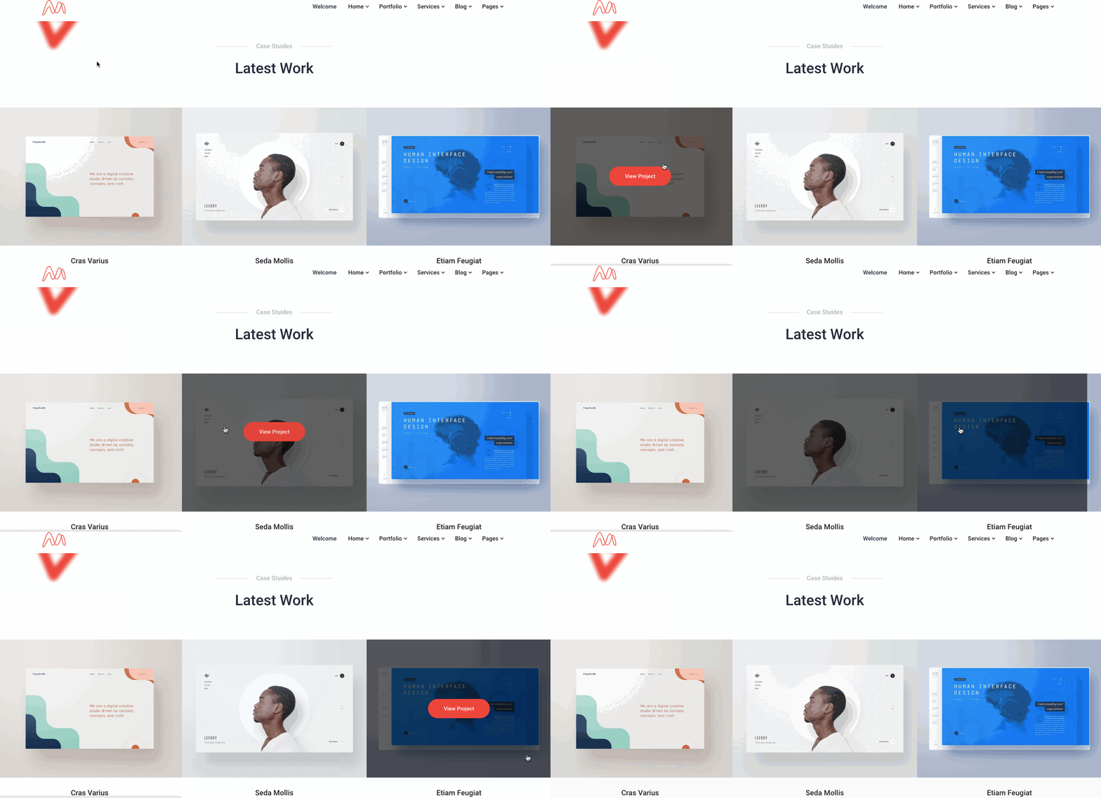
Does Muma look like the UI kit you’ve been looking for? Check it out in Webflow, add your own images, tweak the design — get experimenting!
12. ToyStore
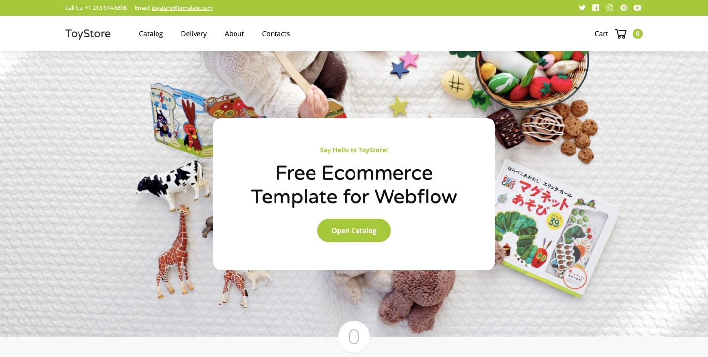
We’ve put so much work into our ecommerce platform — it’s exciting to see new online shops springing up. It’s also great to see our UI kit selection for ecommerce grow. ToyStore is a great addition to this list and a fun, whimsical template great for a baby clothing store, educational game maker, or — to state the obvious — toys!
With a playful palette of colors and plenty of rounded corners, the design appeals to parents with young children.
Looking to launch an ecommerce store that sells your own kid-friendly products? Open ToyStore in Webflow and preview your own products in this free template.
13. MY LIFE
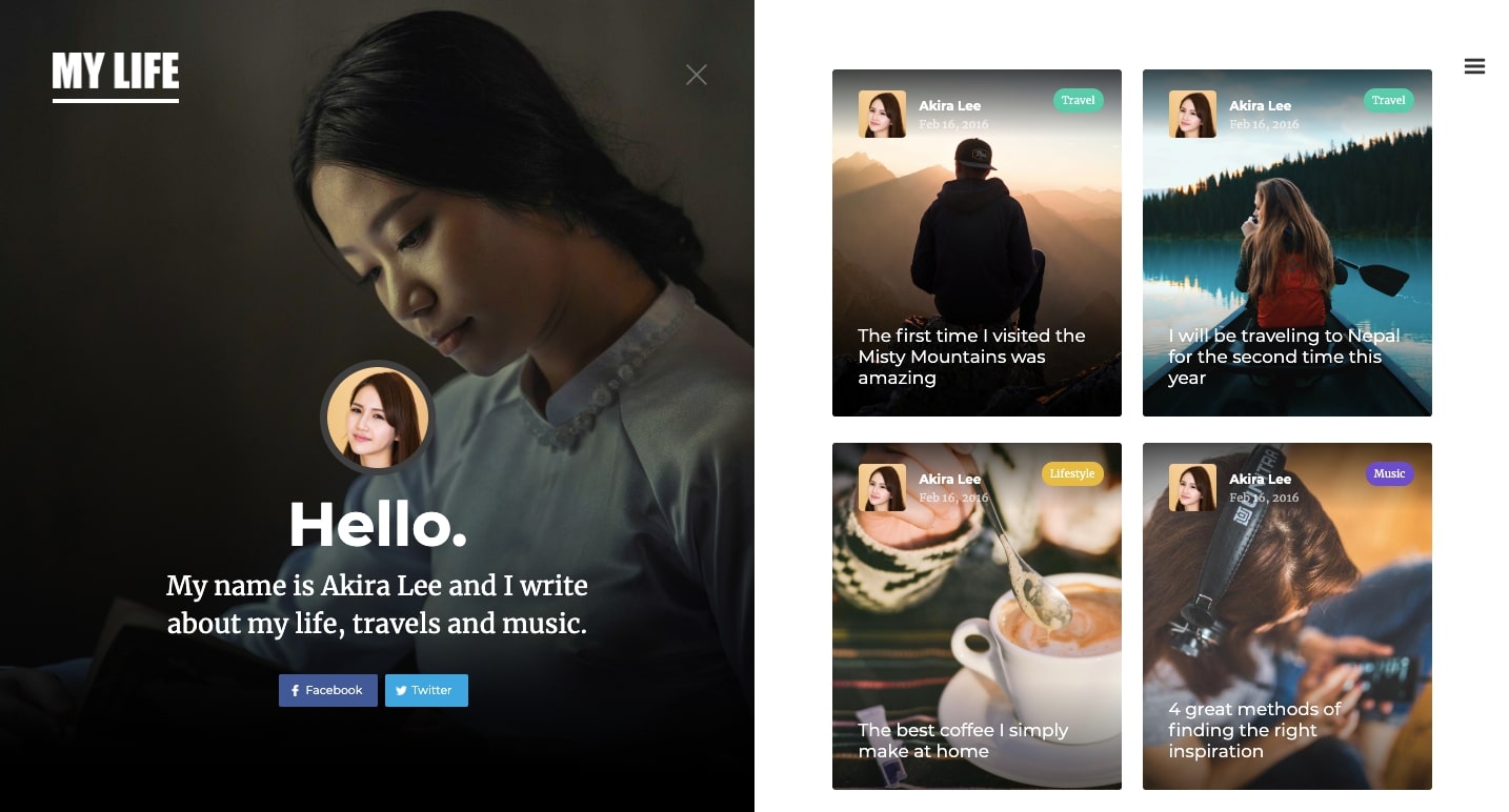
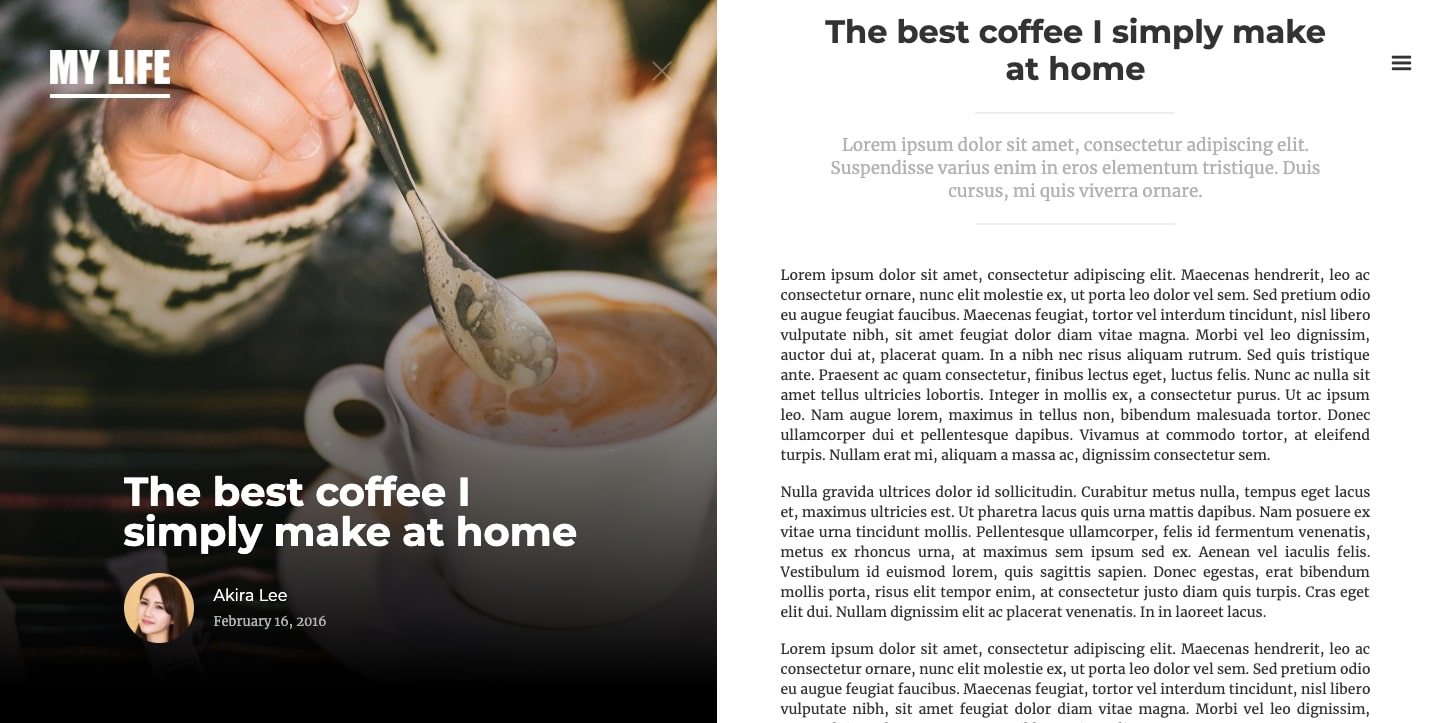
Are you an aspiring blogger who loves photography? MY LIFE is a UI template with a magazine-inspired layout. Its clean, inviting design makes adding your own content simple.
MY LIFE would be a great starting point for a blog. Test out this free template in Webflow and add your own photos and copy. If you’ve never designed anything before, MY LIFE will show you how a CMS is used to keep posts organized.
14. Cleo
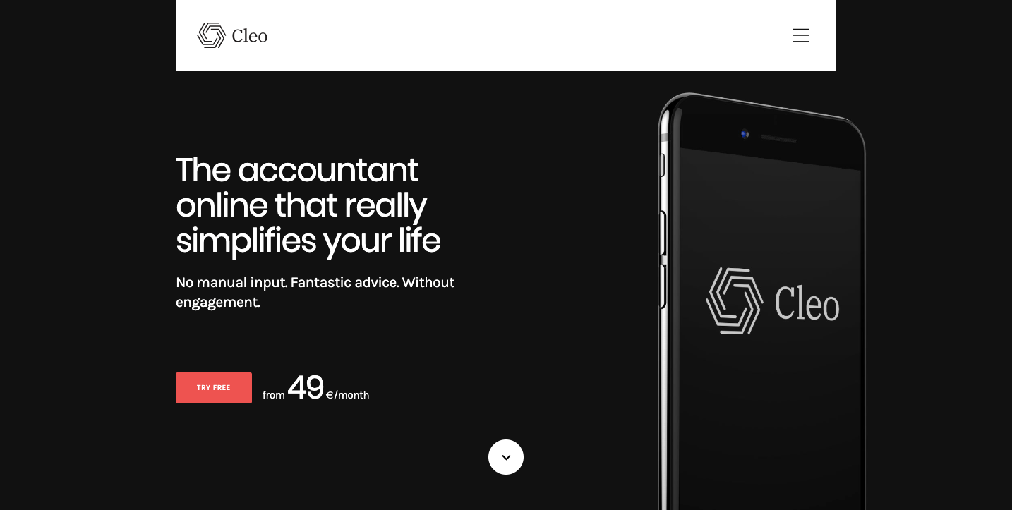
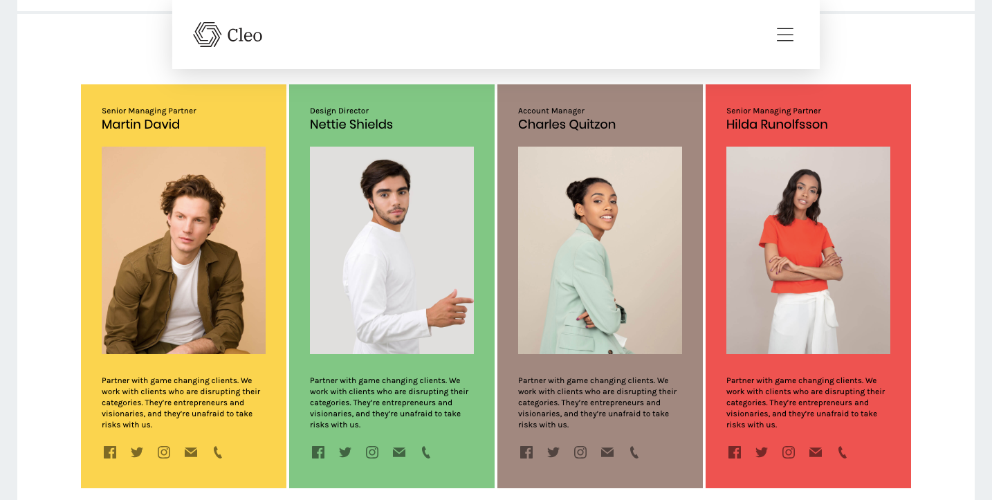
If you’re designing something for a tech company — say an app, startup, or another digital-focused business, Cleo provides a solid foundation to build on.
Why? Because it packs in 14 different page layouts, 70 pre-designed templates, and lots of components like testimonial and pricing pages that fit well with a tech aesthetic. With so many variations, you can pick and choose what works best for your design.
Take a peek at Cleo in Webflow to check out your options and the CMS components.
14. Frame
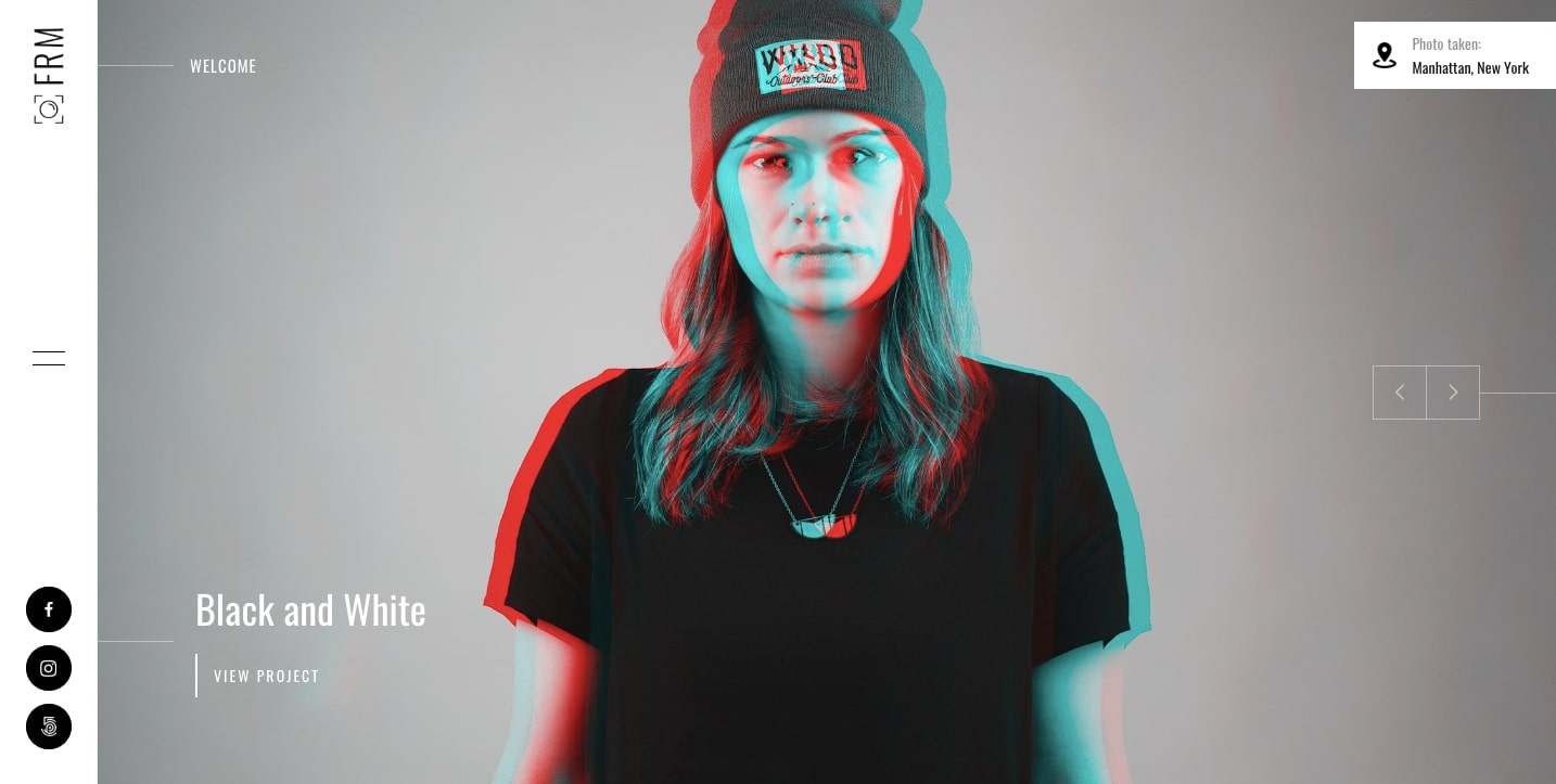
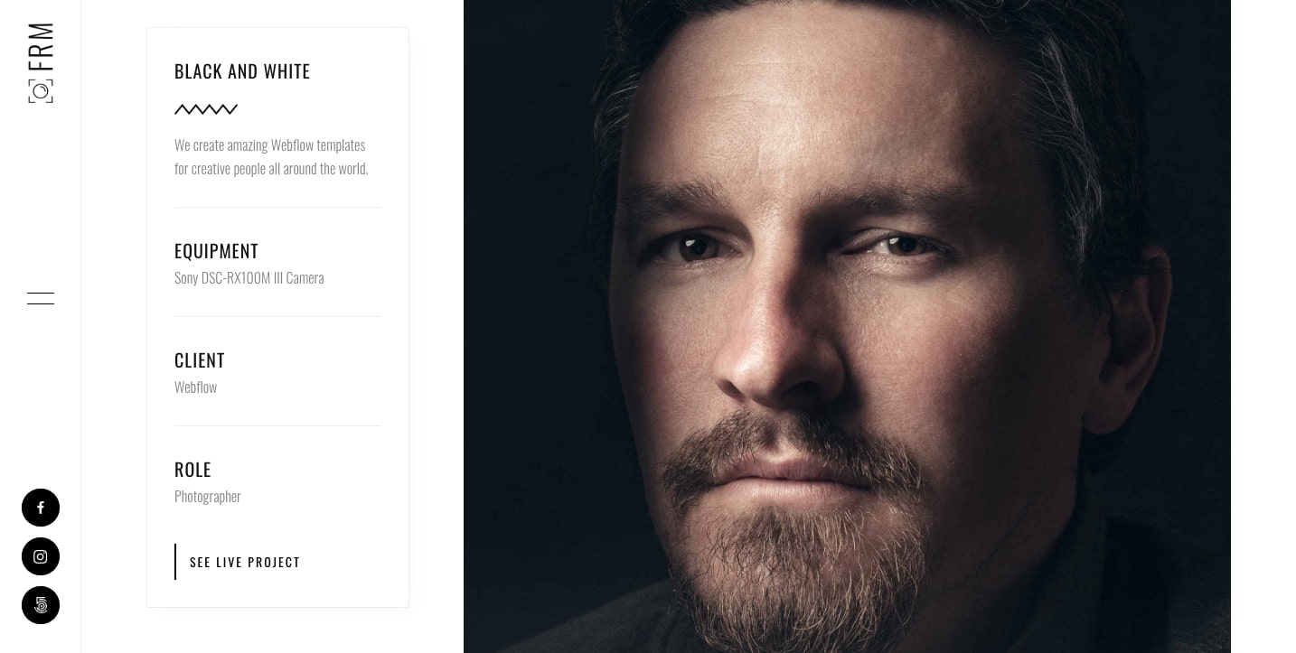
We love Frame for its selection of tasteful, artsy layout options. Whether you’re a photographer, illustrator, comic book artist, or other creative type, Frame provides a nice framework to show off your work. The project pages have a clean design to feature your work in an organized layout.
Are you looking to build a website that features your artististic pursuits? Check out Frame’s entire UI kit when you open it in Webflow.
15. Antares
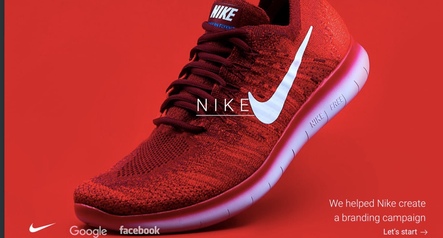
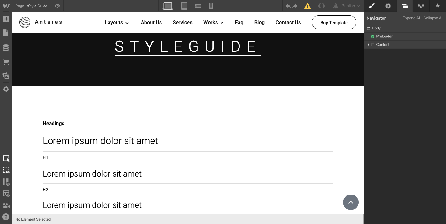
With over 120 interchangeable components and elements, the Antares UI kit offers flexibility, creativity, and a modular system that makes for a cohesive design. This template puts an emphasis on content with a choice of 2, 3, and 4-column layouts. This UI kit also has a nice library of pre-built CMS components to set up blogs, team member pages, and portfolio projects with ease.
And we love that this kit comes with a style guide page so you can make all your changes from a single place. With so many elements and components, Antares works for many different types of designs.
To see the wide selection of elements available, go ahead and open Antares in Webflow.
16. Nerone
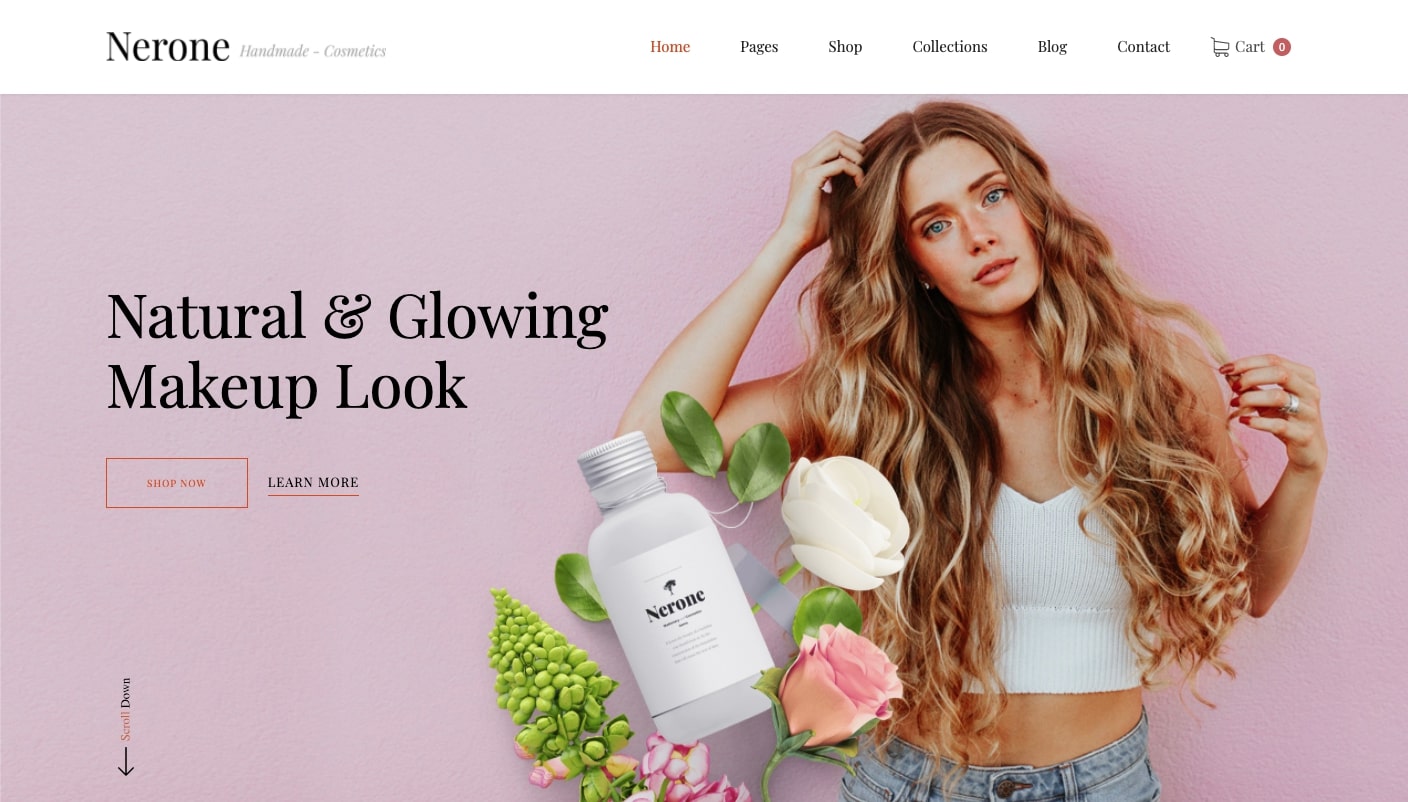
For cosmetics or other beauty-related products, Nerone is a layout with plenty of whitespace and light. Its color palette gives it the airy sophistication needed to feature these types of personal care products.
The template has an ecommerce page that carries on this same vibe of comfort and luxury, with big featured product photos and some gentle, animated effects that support the soothing aesthetic.
Hoping to launch your own line of personal care products with Webflow? Check out how Nerone is put together.
UI and wireframe kits are a great starting point
Every successful project starts with guidance. UI and wireframe tools act as a launching pad, letting you dive in and get started.
Did we miss any of your favorite UI and wireframe kits? Let us know in the comments below.


