As a product marketer at a company focused on web design, I see — and stay on the lookout for — a lot of new and interesting marketing websites. Watching these sites launch, grow, and go through redesigns is one my favorite parts of the job. Webflow’s versatility makes it the perfect choice for companies that want a platform to grow with them.
I’ve already written about how building your marketing site in Webflow is the best way to let your design and marketing team manage your web presence without involving engineering. In this post, I’ll focus on the most creative (and effective) marketing sites we’ve seen built with Webflow. We’ll take a look at what makes them stand out and why they’re so impressive.
(Ready to jump right into building your business site? Check out our course on Webflow University, which walks you through a business website build from start to finish.)
1. HelloSign
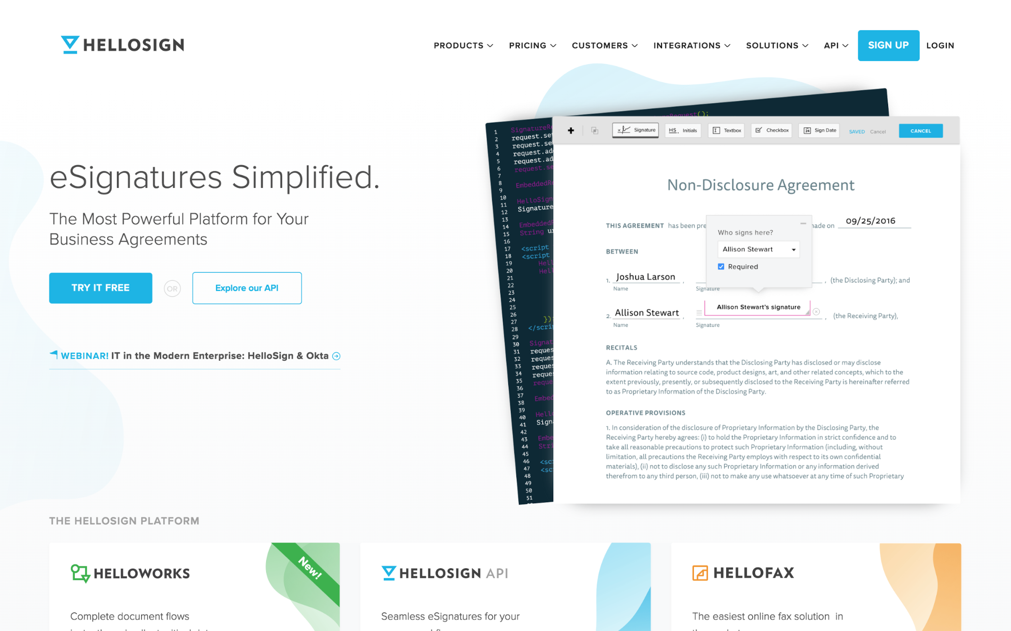
Our friends at HelloSign have been powering their website with Webflow since the beginning of 2017. We’re always pointing to their site as a great example of clean design and branding with extensive product and company information.
They’ve used clean design (namely color and illustration) to differentiate and present their core products — you can jump into more detail right below the hero of their homepage.
2. Periscope Data
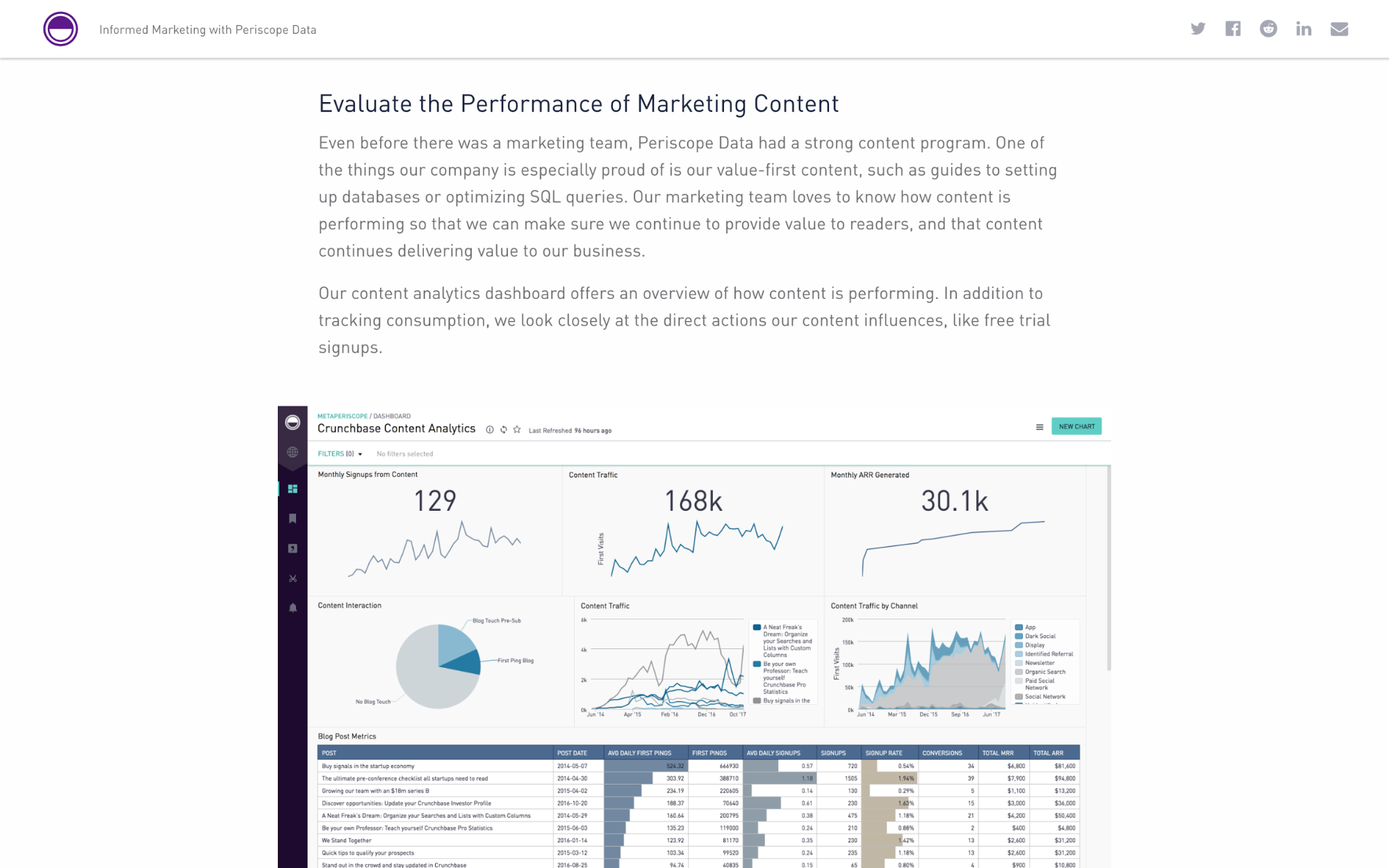
Another San Francisco based company, Periscope Data recently redesigned their marketing website, which has been with Webflow since January of 2017. We love how extensive their website content is, ranging from deep feature dives about their product to case studies and general education material.
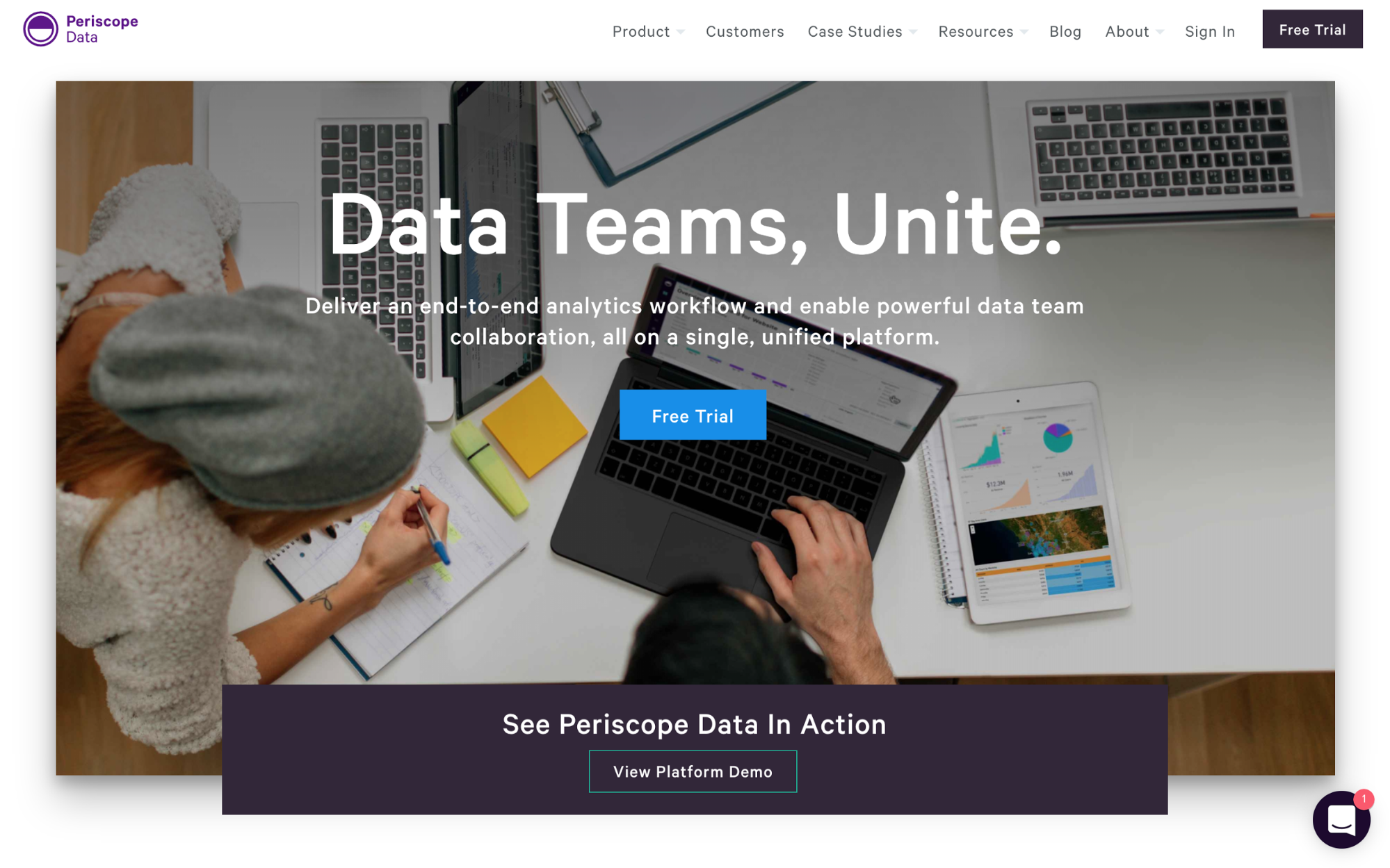
Bonus points for using Interactions 2.0 in their redesign, and a shoutout for building their company blog in Webflow too.
3. SeamlessGov
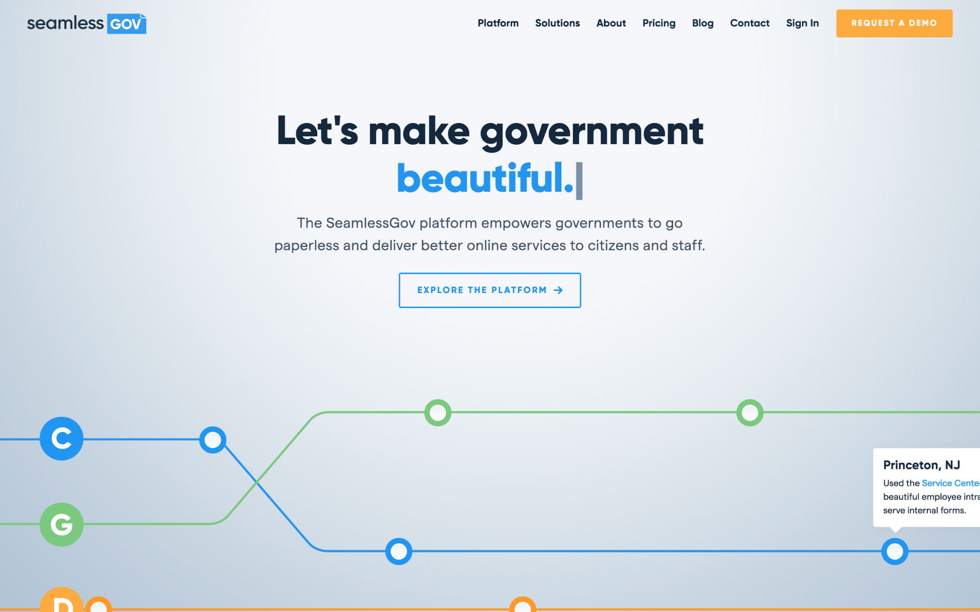
NYC-based SeamlessGov works to bring governments into the digital age. Their recently redesigned website does a great job of clearly presenting what their products do and how they can help customers.
The site features extensive product recordings, screencasts, and gifs, along with interactive elements that provide plenty to explore for customers who want to learn more. Their site does a lot to provide social proof, cite quotes from happy customers, and tie their products to their larger mission of “making government beautiful.”
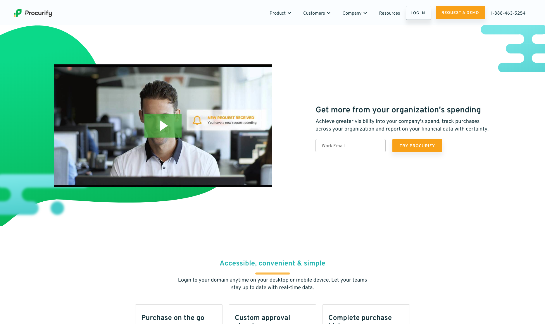
4. Procurify
Procurify has gone through several redesigns and updates since first launching their company website with Webflow — each one keeps getting better. Like others on our list, Procurify does a great job introducing visitors to the different parts of their product set with dedicated pages that all have a distinct visual language and feel.


Get started for free
Create custom, scalable websites — without writing code. Start building in Webflow.
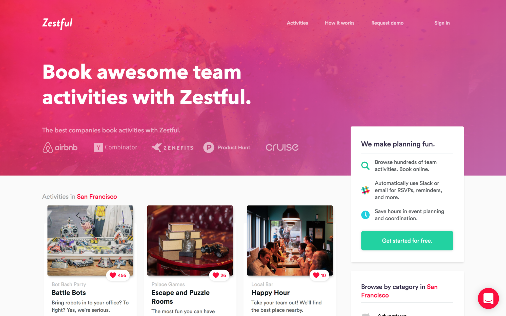
5. Zestful
Zestful helps companies book fun, unique, and local group activities available through their platform. You might expect a site like theirs to scream FUN! Well they don’t disappoint. Their upbeat vibe supports their mission to help teams socialize outside the office without the usual headache that comes with event planning.
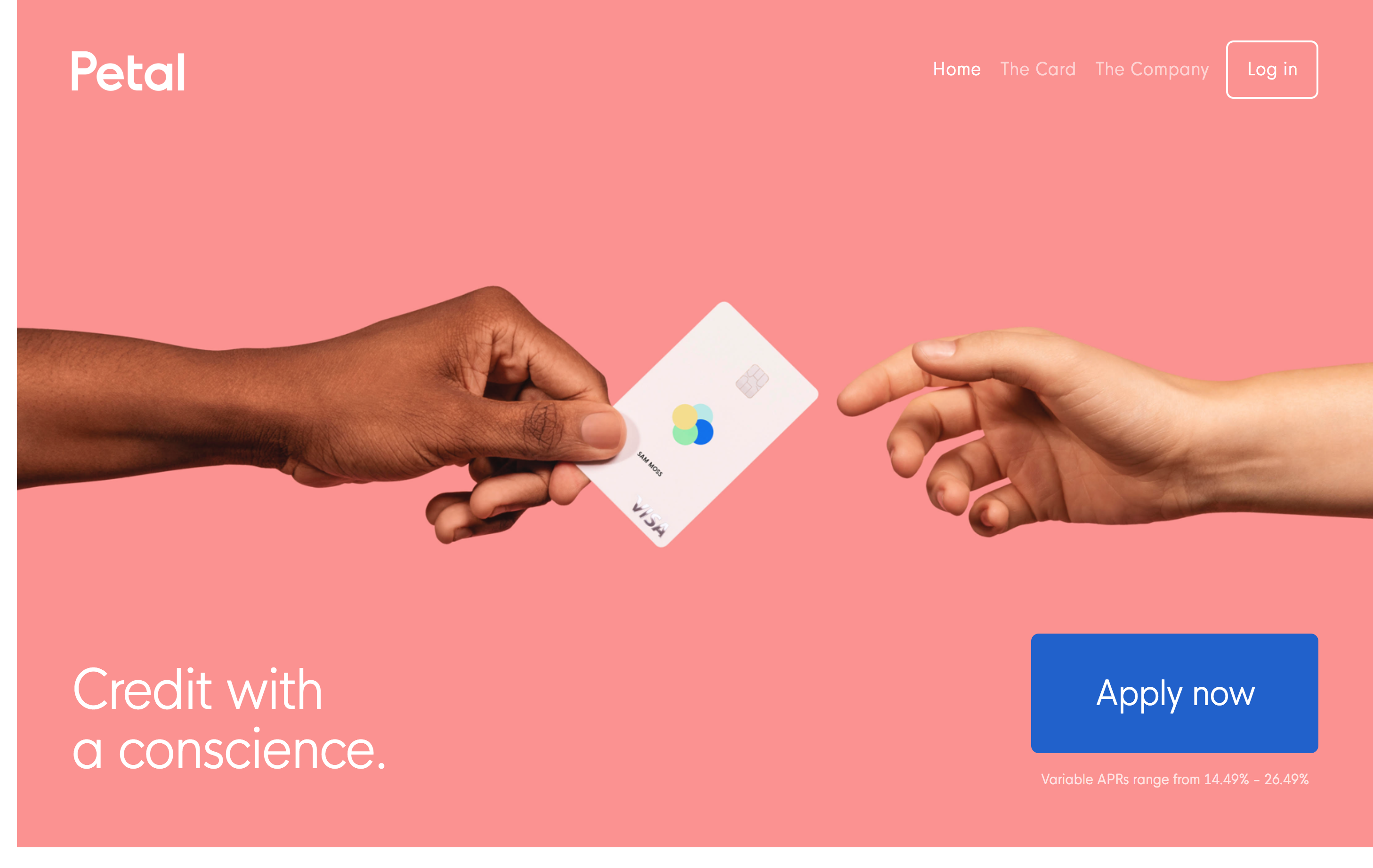
6. Petal
Petal is a younger company, but they stand out because design pervades the focus and direction of their marketing. Even their product (a new, no-fees credit card) features a stunning and unique design. Their website follows suit — it’s a breath of fresh air — with beautiful colors, generous whitespace, and clear, concise copy.
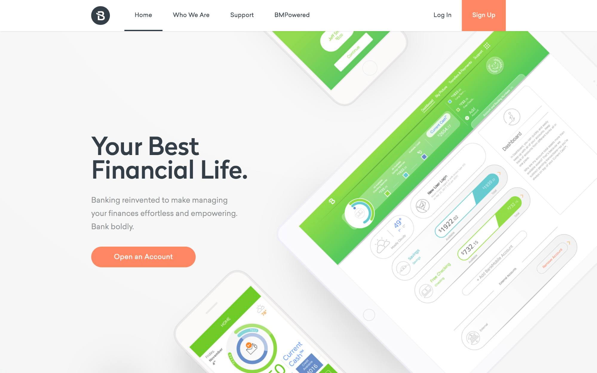
7. BankMobile
BankMobile’s website makes banking look hip and modern, as hard as that might sound. With bold colors, clearly presented information and a consistent feel throughout the site, we especially appreciate the unique horizontal scrolling section they use to walk through the UI on their mobile app.
8. Bonsai
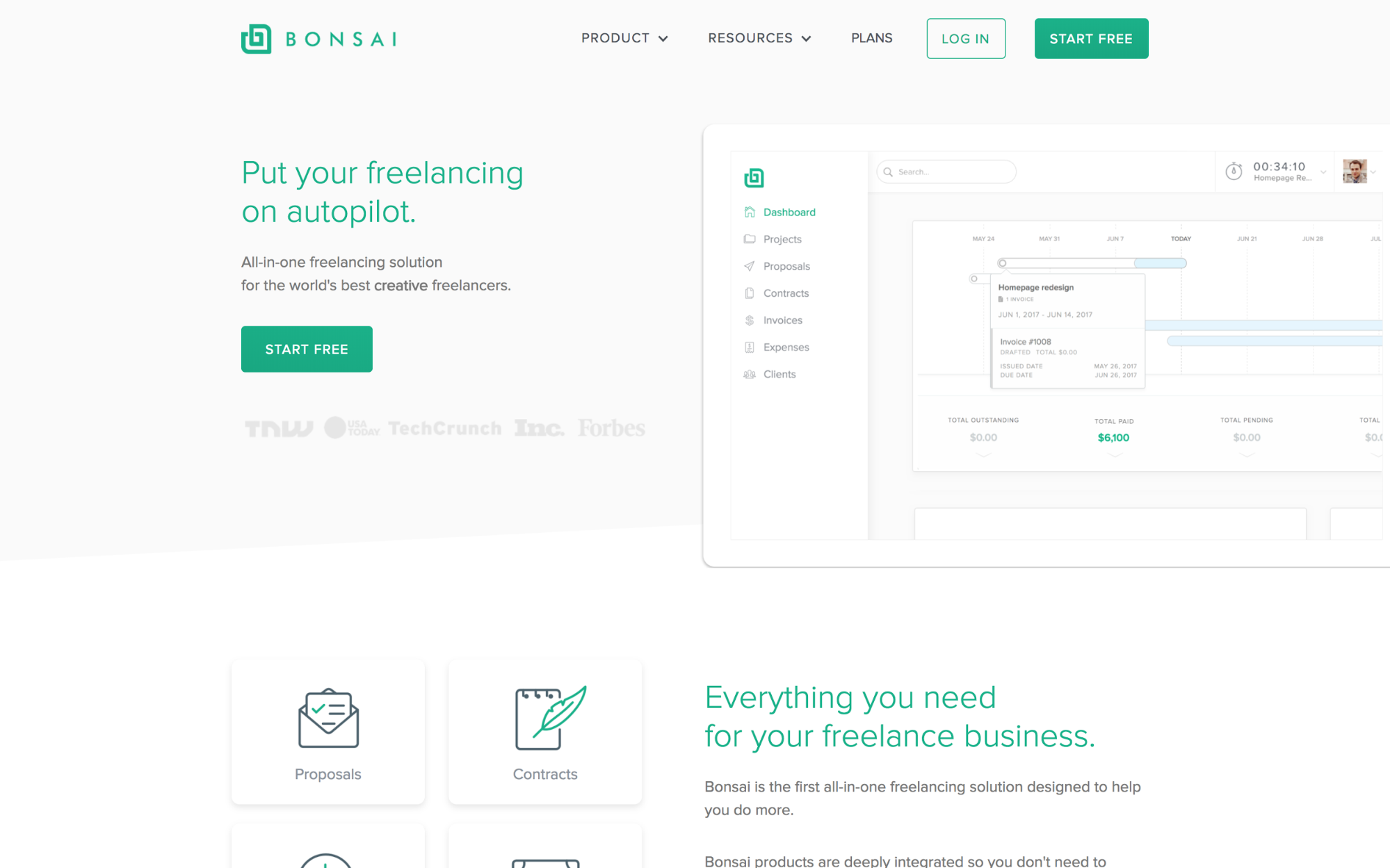
Freelancers are constantly on the lookout for new tools and products to make managing their business easier — Bonsai focuses on checking as many of those boxes as possible with tools that range from invoicing and payments to proposals and contracts. With so many features in their platform, their marketing site needs to effectively explain and differentiate how their products can help freelancers. A dedicated page for each one does just that.
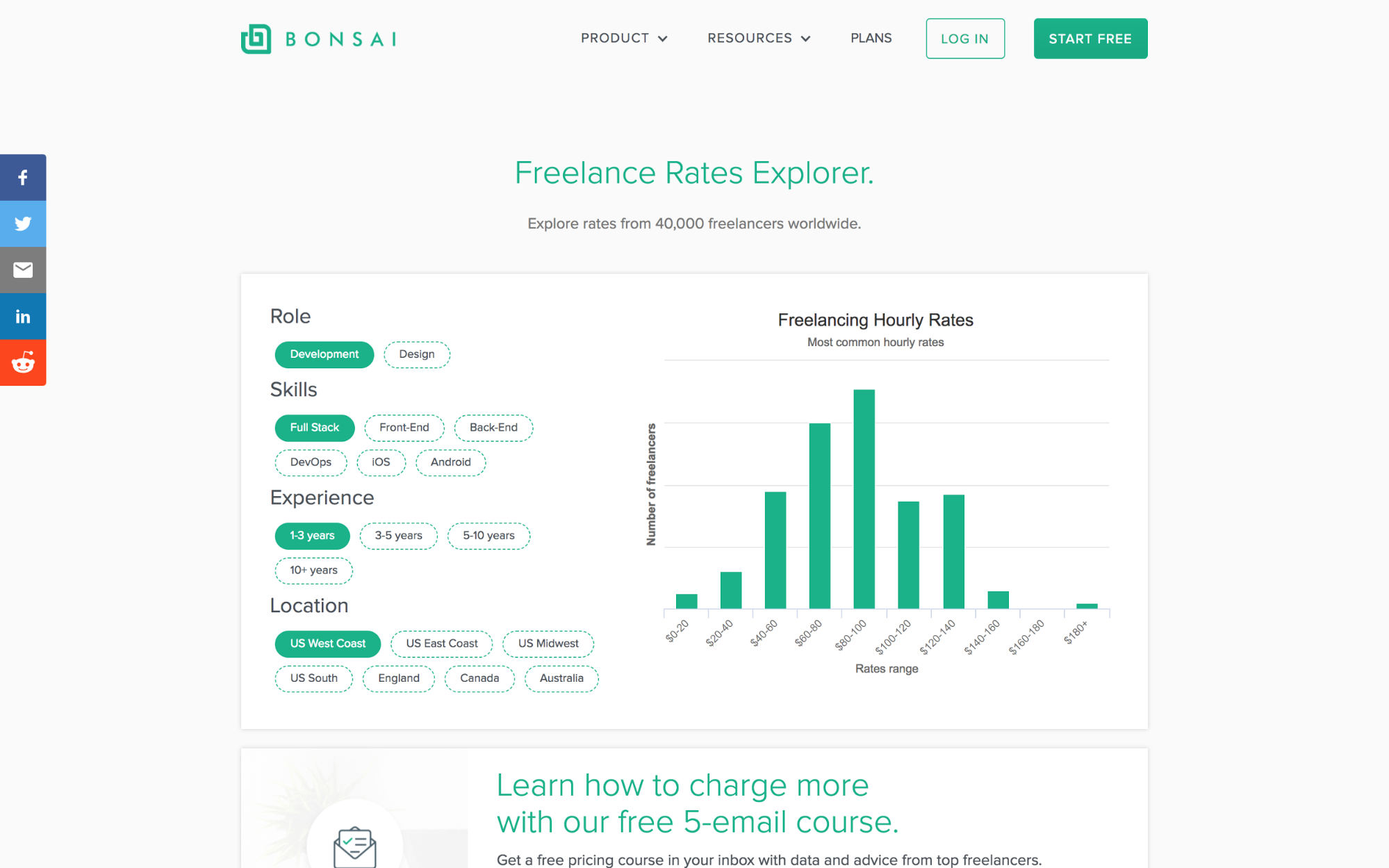
Bonsai gets bonus points for creating an impressive resource hub for freelancers. They share survey data about rates, best tools for freelancers, and the top places to find new work.
9. AltSchool
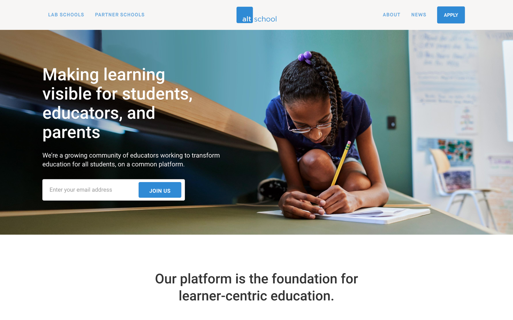
As an education partner, AltSchool has an important story and mission that underpins their work. Their website does a great job sharing their story with photography, copy, and a consistently communicated mission: to enable all children to reach their potential.
10. Homerun
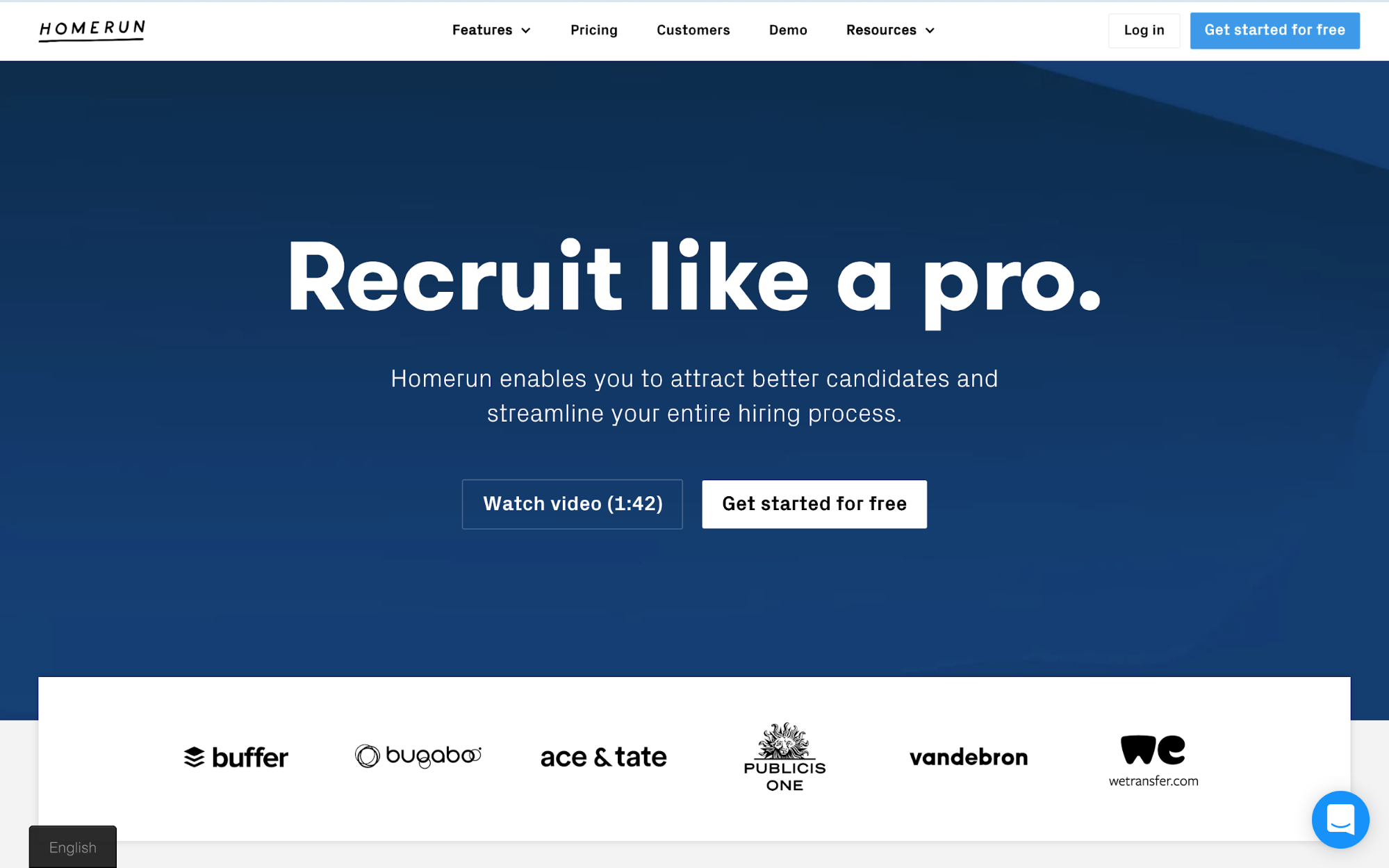
Amsterdam-based recruiting software company Homerun stands out with a bold site rich with images, colors, and text. The site clearly lays out the different aspects of the platform and how they’ve helped their customers. Bonus points for a handy localize.js integration to serve content in both English and Dutch.
11. Lattice
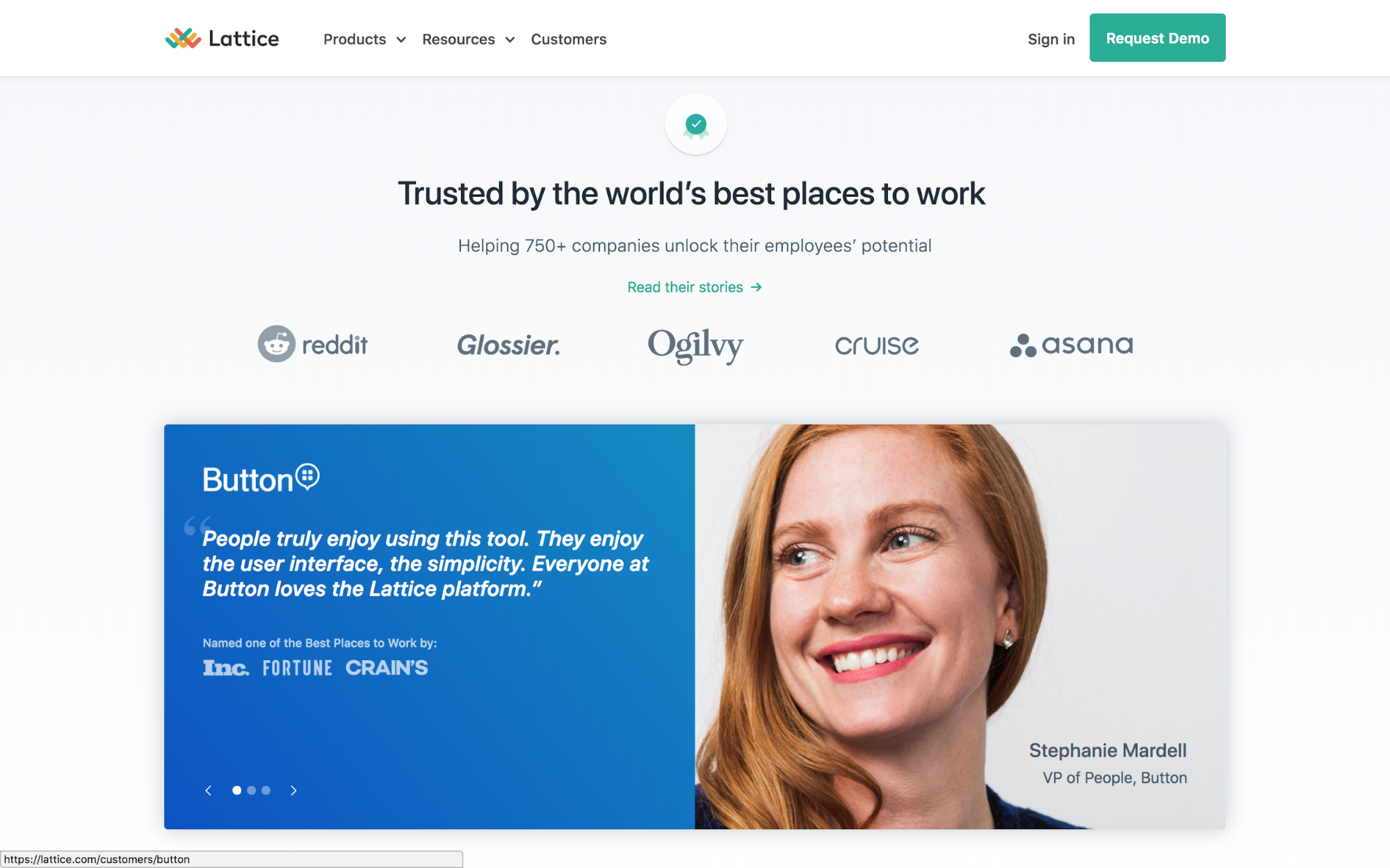
We use Lattice here at Webflow, so we were thrilled to see them launch their new site on our platform. Lattice does a great job differentiating their products and features in their navigation, along with prominent customer stories to provide social proof.
Ready to build a business site of your own but not sure where to start? We’ve got you covered. Check out our full business site rebuild course on Webflow University.
Did we miss any standouts? Let us know in the comments!


