Drawing inspiration will help you to set up your fashion site in style. Even trendsetters need to feel inspired to do their best work — just like web designers.
Fashion is all about looking and feeling good, and that same concept applies to fashion websites.
A strong and aesthetic online presence is crucial for the success of fashion bloggers and ecommerce stores alike. The global apparel market is worth over $1.5 trillion, making it one of the largest and most competitive industries in the world. In order to stand out, sites must be stunning, inventive, and current.
We've put together five examples of fashion websites for inspiration to help you create or refresh your own.
What to include on a fashion website
Creating a website that is unique and reflects the brand is important. But there are certain components a fashion website should include for optimal performance. Here are some features every great fashion website should have.
- About section. Fashion is personal, so include a section that tells visitors more about the brand.
- Modern fonts. Choose a font that matches your website’s branding and shows users that good design goes beyond fashion.
- High-quality images. Include high-resolution images to showcase the brand, clothing, or accessories.
- Responsive design. Today, many consumers browse and shop on their mobile devices, so a clean and responsive mobile version is a must.


Build websites that get results.
Build visually, publish instantly, and scale safely and quickly — without writing a line of code. All with Webflow's website experience platform.
The 5 best fashion website examples to inspire you
Whether you’re looking to draw inspiration from ecommerce websites, personal portfolios, or renowned agencies, here are five beautiful sites to inspire your fashion website design.
1. Emmanuelle
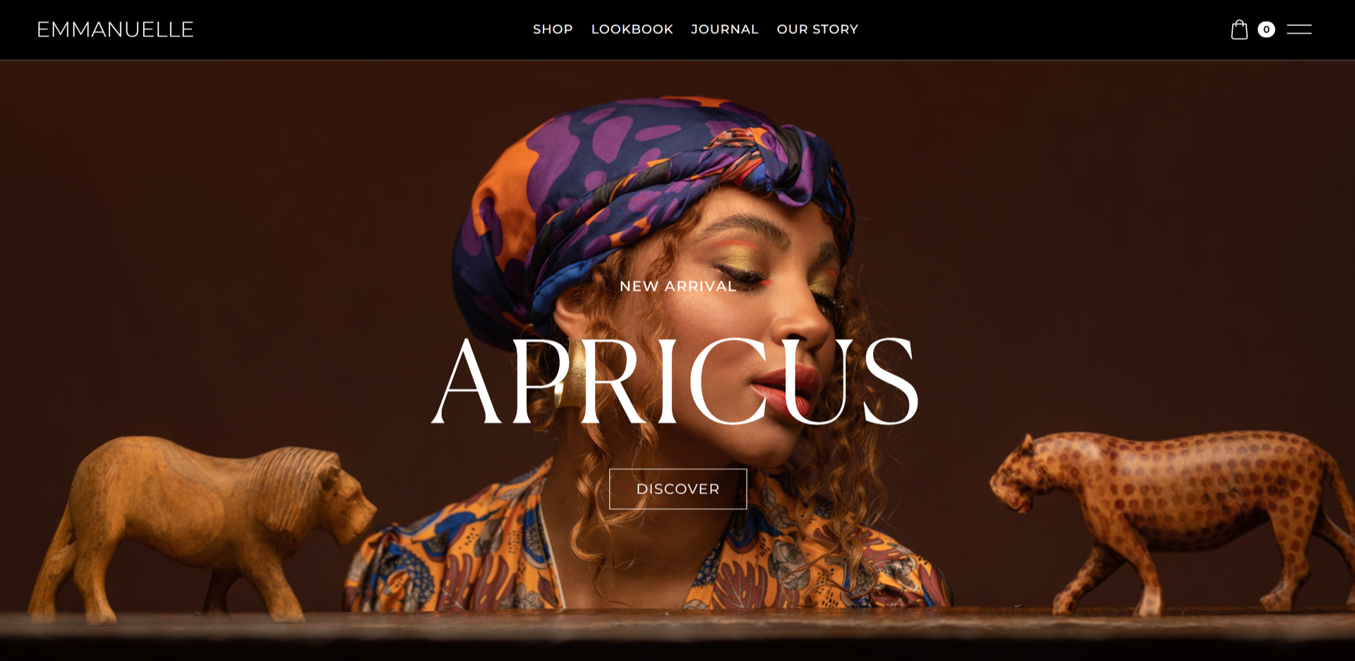
Designed by Dimitris Theofanous, Emmanuelle is a Greek fashion company that uses earthy colors and high-quality pictures to highlight the details in its apparel. Crisp photography is a must for fashion web design, and this website has a lovely mix of full-body and medium shots to emphasize the patterns, textures, and color palettes in its latest collection.
The website’s color palette includes olive greens, browns, and dark grays that complement the high-contrast white text used throughout the site. Subtle animations add a touch of life to the website, causing images to zoom and navigation links to change color when the cursor hovers over them.
Emmanuelle’s design choices blend flair and functionality to create a unique story and a pleasing user experience — each design choice elicits a timeless nod to ancient Greece and reinforces the idea of classical beauty.
2. Julie Cristobal
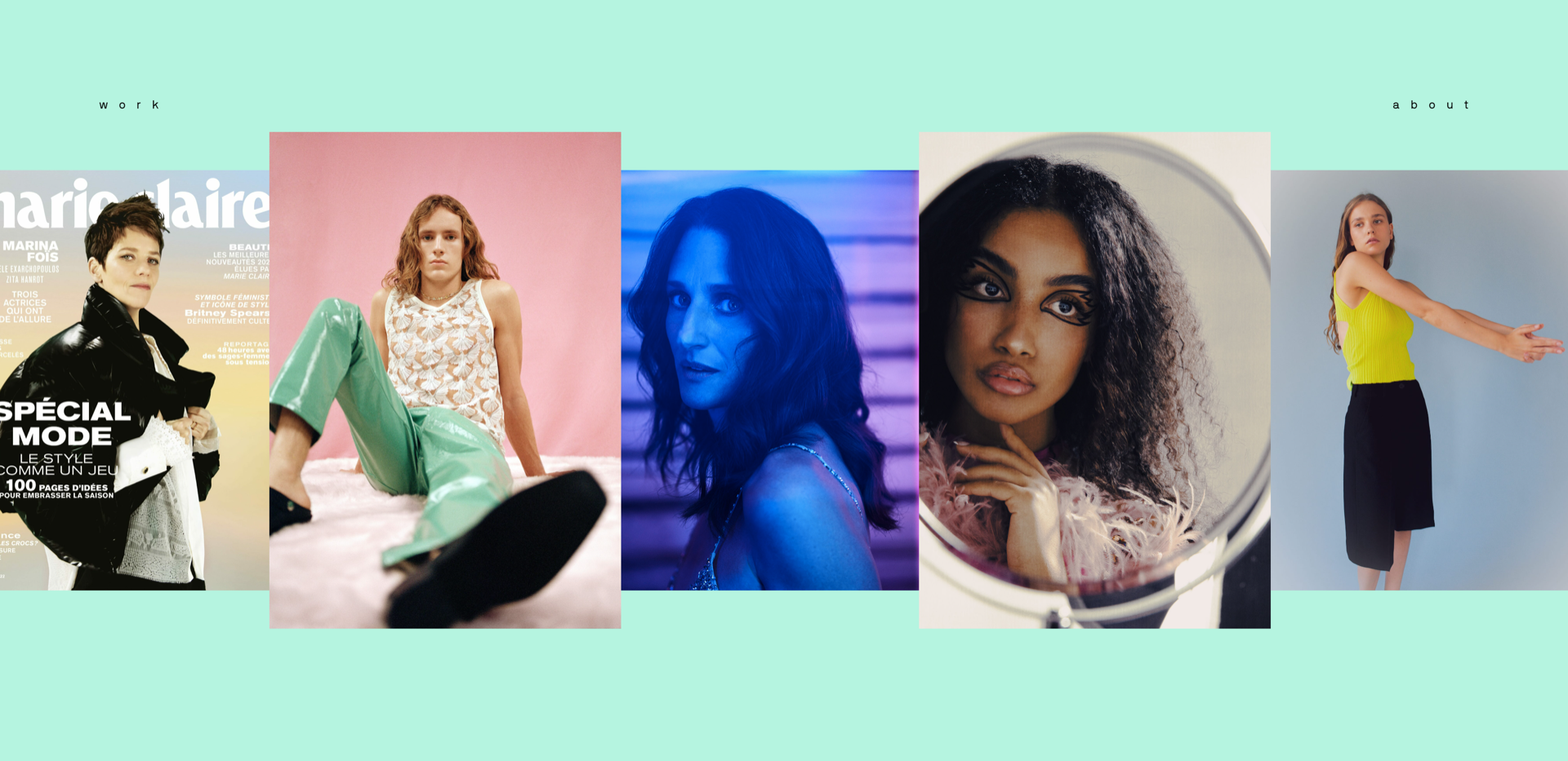
In contrast to Emmanuelle’s muted colors, Julie Cristobal’s home page is full of interactive gradients and hues. The French stylist contrasts her dynamic and complex looks with a minimalist website design.
This stylist’s portfolio allows visitors to grab and scroll through a curated collection of Julie’s work. The page makes playful use of color theory: the background transforms to a complementary color when the cursor is over an image, accentuating the design of every photo.
Each thumbnail leads to a dedicated project page featuring high-resolution images of each model and collection. There are few words on the website — photos and tasteful hues create most of the experience, letting Julie’s work speak for itself — and supporting the idea that one picture is worth one thousand words.
3. Mamé
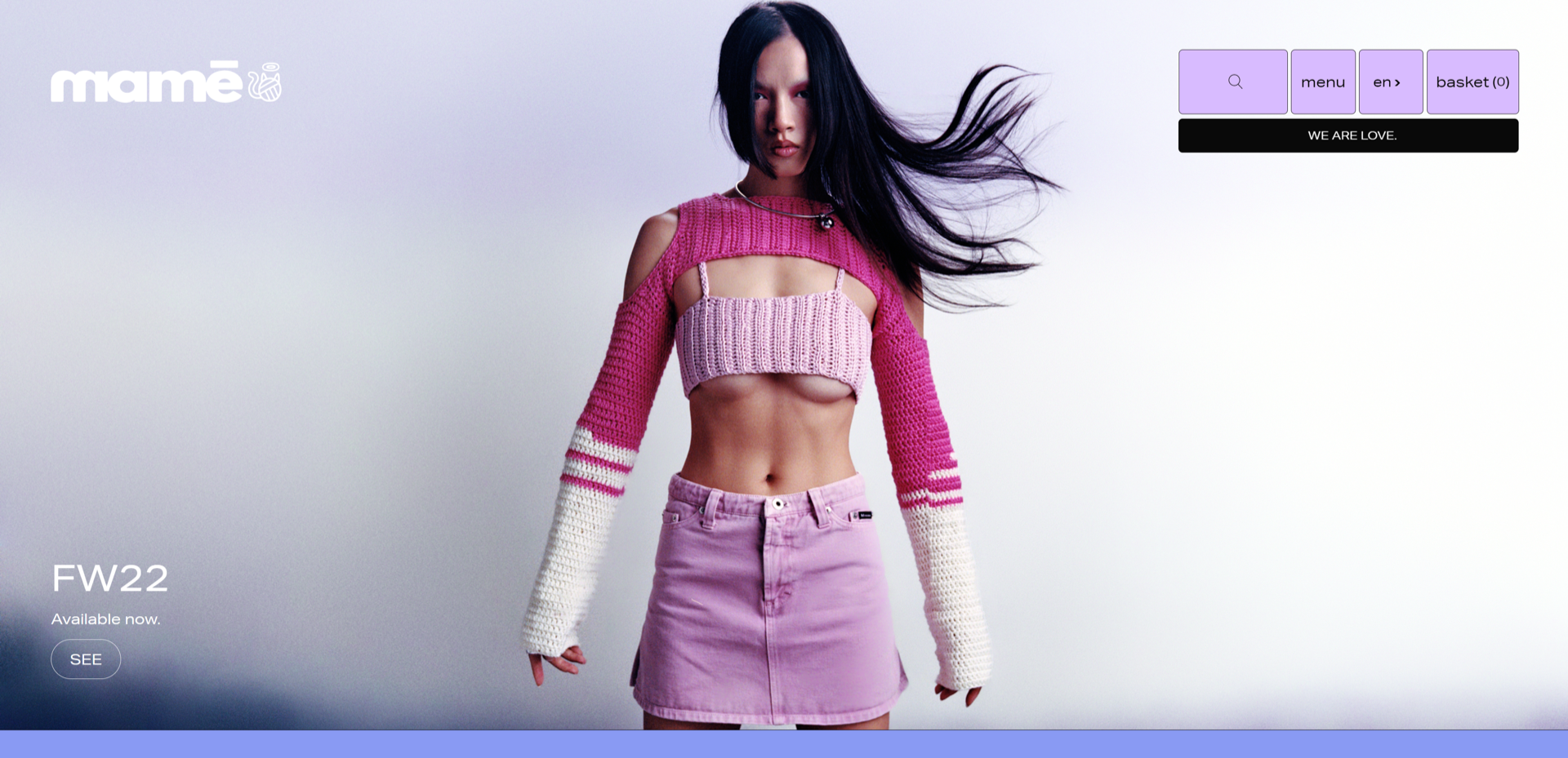
Designed by Malcolm Chambers, Mamé is a Canadian accessories website with a pleasing color palette of blue, purple, and pink shades that complement the brand’s products.
Mamé’s website uses straight lines and concentric shapes for its images, buttons, and navigation menu. The site evokes a retro feel that pairs nicely with the brand’s Y2K fashion inspiration.
The website also features an ecommerce store — as you hover over each product image, the price of the item appears at the top and the word “SHOP” follows the cursor for an appealing call-to-action.
Mamé’s uniqueness comes from its thematic style. The site’s design sticks to a single font, color palette, and background for all its images. But the user experience is so engaging these elements don’t feel repetitive — the result is a stunning fashion website design with a signature style.
4. Koyi Tsang’s Fashion Portfolio
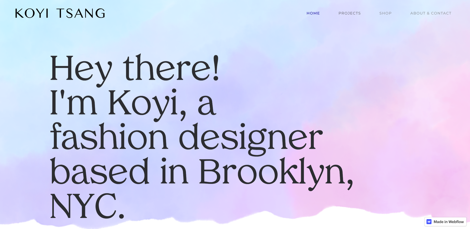
Koyi Tsang is a fashion designer based out of Brooklyn, New York. This website is her personal portfolio, showcasing her work for various clients in the fashion industry. Like Mamé, Koyi’s design inspiration stems from a blue-purple-pink color palette.
Two modern web design elements stand out on Koyi’s home page: the use of typography and whitespace. The site uses a classic serif font with a modern twist and negative space to create a unique brand identity. Koyi’s design is intentionally minimal, emphasizing the bold text and images that come to life when moused over, revealing colorful collections for menswear, womenswear, and accessories.
5. Halo Media
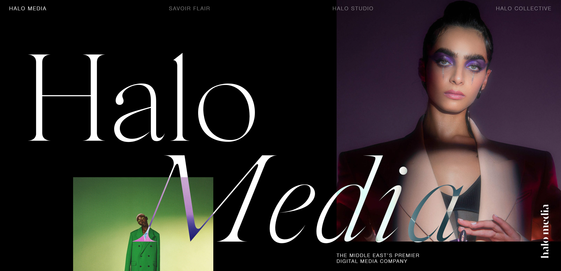
Halo Media is a Middle Eastern digital media company that works with high-end luxury and lifestyle brands, including Dior, Hermès, and Chanel. The fashion design website appears to be a seamless landing page but is actually four pages — the home page, Savoir Flair, Halo Studio, and Halo Collective.
The website’s primary color scheme is white text on a black background, but each word overlaps with imagery to create subtle gradients and inverted hues. This aesthetic creates a sense of luxury and emphasizes the outstanding nature of the pieces, which are highlighted in contrast to the monochromatic background.
This site is a masterclass in user experience (UX) design and follows several modern design trends: minimalism, interactive animations, and sleek typography.
Savoir Flair, the second page, started as an online magazine and is now a global multimedia brand for fashion. We love the use of video, followed by GIF-like animations on the magazines, and clean typography throughout. The animations reflect the dynamism of the publication’s content, while the crisp design matches the magazine’s focus on a clean, elegant approach to fashion.
Halo Studio is the fashion brand’s in-house creative agency, responsible for working with some of the world’s biggest brands. The color scheme on this page reverts to predominantly black, with floating images that have a ripple effect when interacted with — a visually engaging detail that reminds visitors of the agency’s innovative and splashy approach.
Finally, Halo Collective is its influencer marketing agency page — and our favorite of the lot. The red lettering that spells out “COLLECTIVE” stands out, and each letter collapses and falls as you scroll further down. This section is interactive — you can drag and drop every letter, picture, and paragraph. It’s engaging and fun to play with, but also speaks to the brand’s interest in talented, self-directed creatives.
Design modern websites with Webflow
Modern design trends change constantly, and not just in the fashion industry. If you want to stay ahead of the competition, you need the right resources.
At Webflow, we have a carefully curated collection of articles and guides that cover topics ranging from user experience to web design trends. We also offer all the tools and templates you need to create stunning websites in our visual web design tool; the best part is you don’t need any knowledge of coding to build a stunning site.


