

Before guests arrive at your event, they land on your website.
An event site does more than provide basic information like dates, times, and locations. Its aesthetic gives visitors a preview of the atmosphere to expect at the actual event.
Colors, typography, motion, layout — every design element works together to build excitement and inspire action, whether that’s RSVPing, buying a ticket, or sharing the event with others. With the right design, you capture attention and connect with your audience long before the event begins.
Read on to discover the elements that all great event websites share.
What are event websites?
An event website is a dedicated webpage or microsite that promotes a specific occasion, such as a festival, conference, product launch, or webinar. It tells people what’s happening, when, and where — and encourages them to take action, like purchasing tickets or RSVPing.
For many visitors, the event website is their first interaction with the host. And with the right event marketing strategy, that first visit can lead to deeper engagement — from joining a mailing list to staying involved after the event’s over.
But the end of the event doesn’t have to be the end of the experience. A well-designed event website gives people a reason to return. Some come back to relive the moment — watching video highlights, clicking through photo galleries, or simply soaking in the atmosphere again. Others revisit to access materials from a conference, like speaker slides or recorded sessions.
After the event’s over, the website becomes a way to stay connected. Visitors might return for future event dates, fresh content, or updates through email and social channels. Whatever the reason, it maintains the relationship well beyond the day of the event.
What to include in an event website
The best event websites turn curiosity into action. They captivate and convince visitors to attend and never leave important questions unanswered.
Here are the essential elements to include in your event website designs.
- Event name, date, and location. This info should be impossible to miss. Place it in the header or hero section so visitors know what the event is and when and where it’s happening.
- CTA buttons. Prominent messages like “Buy your tickets” or “Sign up for the event!” should appear early and often to drive conversions.
- Speaker or performer lineup. Headliners exist for a reason. Names and faces create buzz and convince people the event is an experience they won’t want to miss.
- Schedule or agenda. A timeline of dates and times sets expectations and helps people plan their attendance.
- Venue details and accommodation info. Visitors need to know how to get to your event, where to stay, and what to expect on-site.
- Photos and videos. Visuals spark an emotional connection and give visitors something to share that spreads the word about your event.
- Testimonials or past highlights. Social proof, like testimonials and recaps, builds trust with new attendees and shows what your event delivers. And it reinforces your reputation as an organizer. Plus, adding social media links gives visitors more ways to connect and engage with you.
- Responsive, mobile-friendly layout. Many people will browse your site on mobile. A responsive website design ensures the user experience will be consistent on any device.
10 best event websites for design inspiration
Here are 10 event website examples with effective design elements to inspire your next project, whether it’s a site for a virtual event or an on-site festival.
1. The Scotch
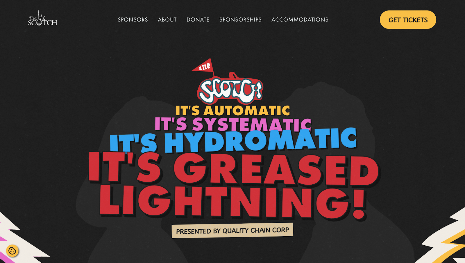
Annual golf tournament and auction The Scotch promotes Warrior Impact, a nonprofit organization that helps veterans and first responders cope with posttraumatic stress.
The website, designed by fare·well, uses a retro-inspired theme with large typography and bold colors. The nostalgic theme feels warm and approachable, while the oversized type improves readability for users who struggle with smaller fonts.
Each section follows a clear visual hierarchy: Punchy headlines grab attention, while supporting text and calls to action (CTAs) guide you forward. Instead of slick promotional visuals, the site uses heartfelt, authentic photography and video to keep the website emotionally grounded. Given the cause, it’s an excellent way to connect and convert.
2. Summer Dance
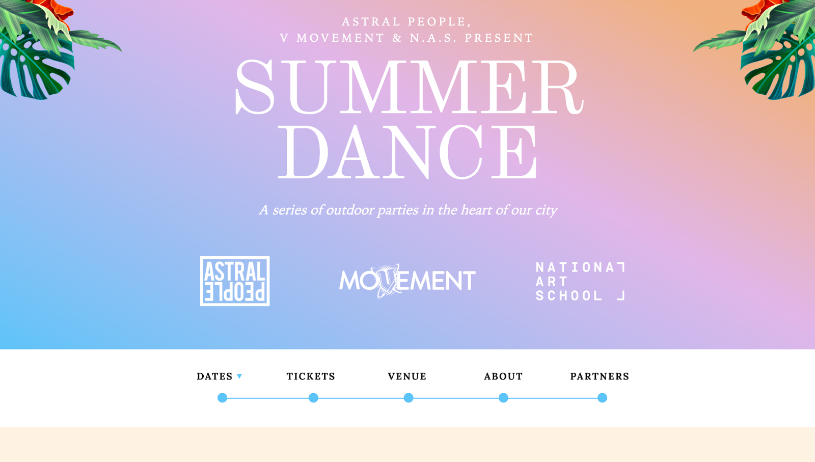
Summer Dance is a series of outdoor music events in Sydney, Australia. Designed by Spruce, the website features a warm gradient background that mimics a sunset, with leafy illustrations that add a tropical vibe.
The homepage feels like an invitation to dance under the sun from the start. It’s full of color and energy, telling you exactly what to expect and urging you to buy tickets and join the party.
Navigation is straightforward, with a sticky navbar that keeps important links visible as you scroll. Visitors can easily jump between event dates, ticket info, artist lineups, and venue details — without interrupting the flow of the site.
3. ZipForward
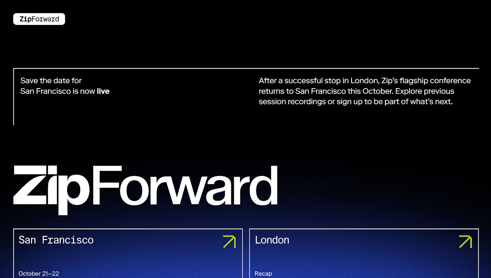
ZipForward’s event site keeps things simple with a single landing page. The bold, minimalist design puts the event’s name front and center. Clean typography, a sleek gradient, and clean lines direct the eye to important details like dates and locations, while generous spacing keeps the layout open and easy to navigate. A news-style scrolling ticker adds more context without cluttering the page.
There’s no fluff. The website focuses on what matters most — the event details — and delivers maximum clarity in a compact, user-friendly space.
4. Anyone Events
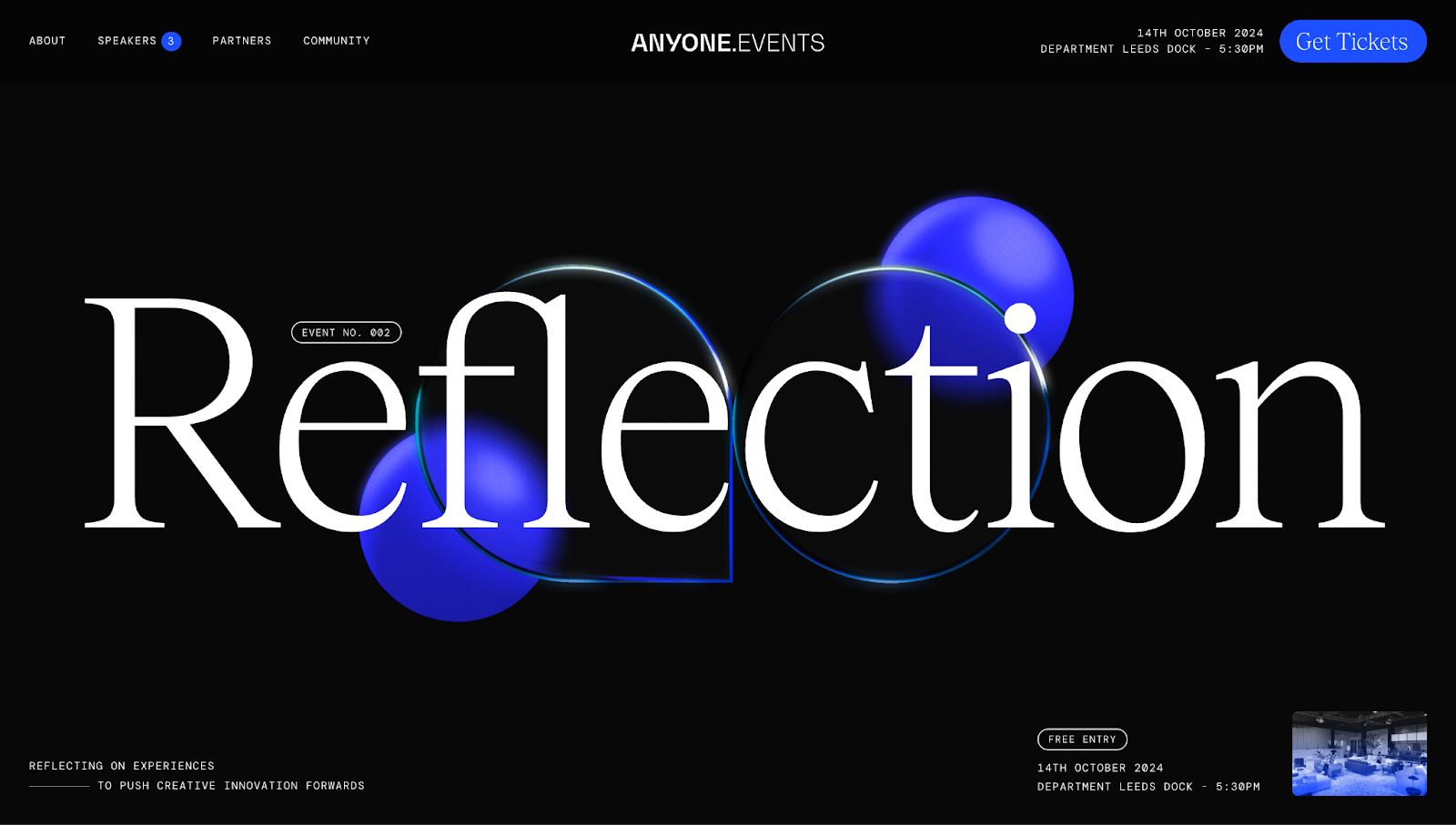
For Anyone Events’ Anyone Creative website, designer Nathan Clark used an elegant aesthetic and interactive animation to draw visitors in. The oversized typography and high contrast are easy to read, while animated bubble shapes move with your cursor — a playful way to keep you scrolling.
Hover-triggered portraits add personality without cluttering the layout and show visitors images of the event’s speakers and information about their work. The site’s black-and-white images, overlaid with soft blue gradients, maintain the sleek visual aesthetic.
With smooth scroll transitions and generous negative spacing, Nathan’s website does an excellent job creating an immersive user experience.
5. Unfold
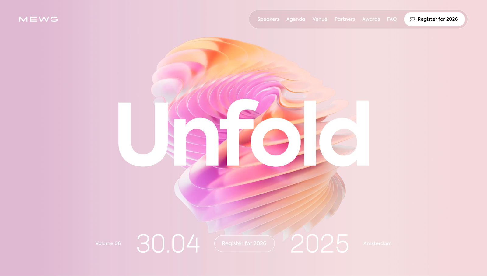
Designer Dennis Snellenberg uses a clever visual to match the event’s name — the header features an animated, flower-like graphic that unfolds on a loop behind the headline. Below the header, a brief paragraph explains what Unfold is, with large text listing the number of sessions, hoteliers, and after-parties (although there’s just one, which adds a bit of humor to the copy).
Interactive animations appear throughout the site, such as card deck-style shuffles and collapsible menus for speakers. With playful motion design, high-res imagery, and pops of color, Unfold’s website is a standout example of modern event web design.


Unforgettable event experiences
Learn how Webflow's team built an all-in-one, customizable event platform complete with on-site tools, reporting, and integrations.
6. Rebecca’s Private Idaho
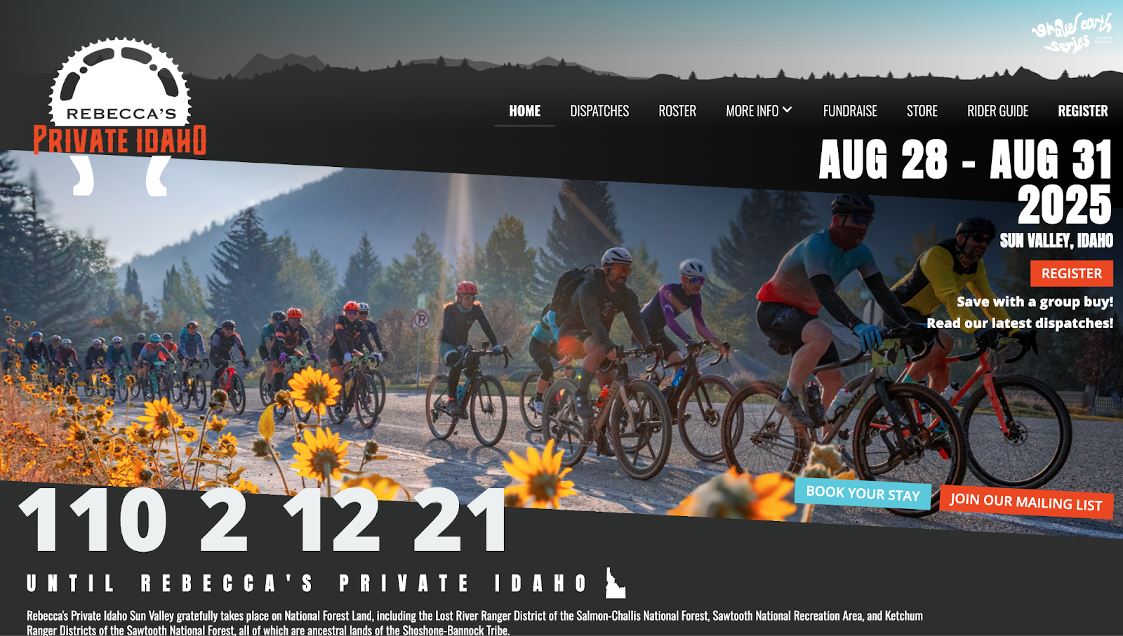
Rebecca’s Private Idaho is one of the United States’ most iconic gravel cycling races for professional and amateur riders. The event’s site, designed by Carlos Perez, captures its rugged spirit with a live countdown and high-energy imagery. Visitors can explore detailed daily schedules with route maps, Strava integrations, and terrain stats — helpful details for serious cyclists preparing for race day.
A recap video and day-by-day photo galleries feature people from all over the world enjoying the ride and celebrating hard-earned victories at the finish line. This media effectively showcases the energy of the race and gets cyclists excited to participate. Playful wording like “Baked Potato” and “Tater Tots” describes different routes while adding local flavor to the messaging. It’s an informative, community-driven, digital reflection of a fun-filled weekend.
7. Relate Conference
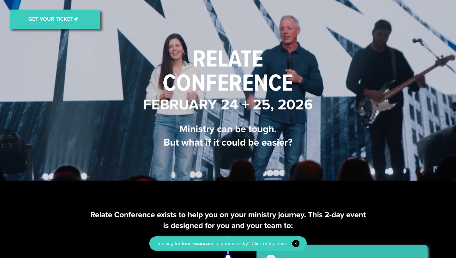
Relate Conference’s website, designed by Bayside Creative, opens with a bold question: “Ministry can be tough. But what if it could be easier?” It aims to set a personal tone and position the team behind the event as approachable and relatable.
As you scroll, progressive reveals show key event details, while a recap video, grid-style gallery, and transparent pricing provide a clear picture of what to expect and how to participate. And with the sticky “Get your ticket” button in the top-left corner, visitors never lose sight of the CTA.
8. Ephora template
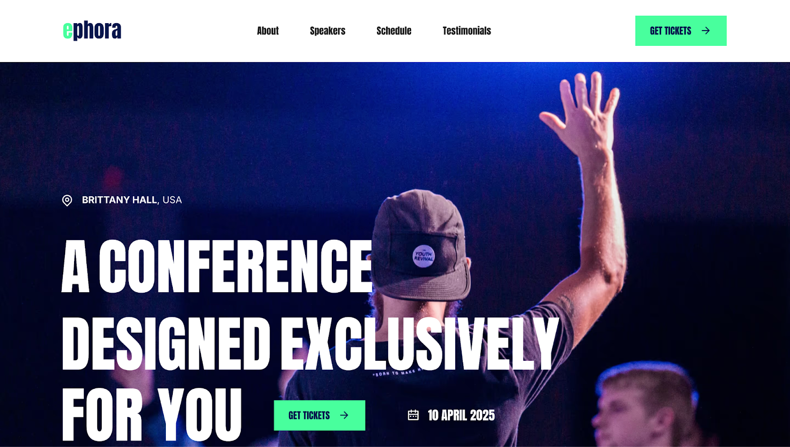
Ephora’s event website template brings the conference experience online with a clean, interactive design. flow.Samurai’s use of bold typography and smooth scroll interactions draws visitors in as they explore the speaker lineup, pricing tiers, and hour-by-hour schedule — all presented in a way that’s easy to scan and understand. Pricing appears as playful ticket shapes that add a fun touch to the site.
Tying it all together is the headline “A conference designed exclusively for you” — a message that makes people feel like they belong and encourages them to take the next step.
9. Outside Festival
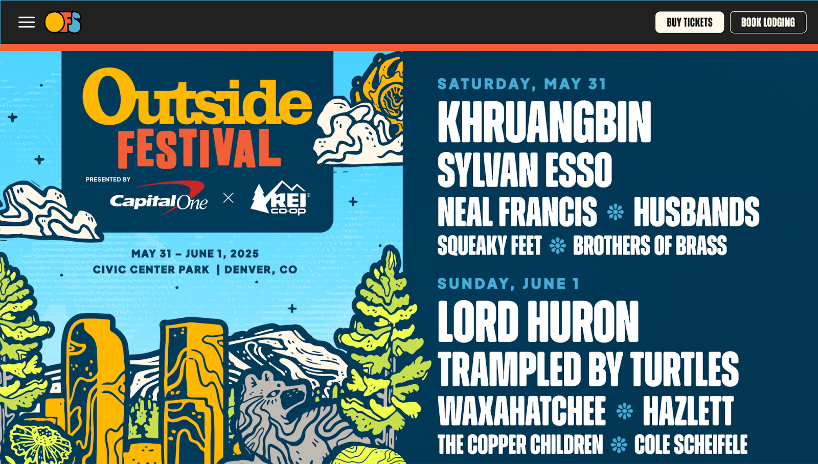
Outside Festival’s website grabs attention with its artist lineup and performance dates front and center. Playful nature illustrations suggest an outdoor vibe, while the site organizes its offerings into sections: live music, wellness sessions, documentaries, and outdoor sports. Throughout the website, interactive CTAs like “Buy tickets” and “Explore tickets” are easy to find so visitors can take action and stay engaged from arrival to checkout.
10. Credit Summer Event
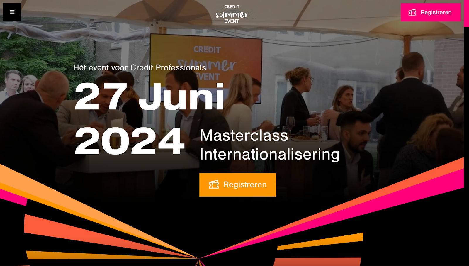
Credit Summer Event’s website opens with a background video showing scenes from the previous year’s installment that build excitement for this year’s installment. The layout pops with color but maintains a professional aesthetic with high-contrast white text on black backgrounds to emphasize details like the speaker lineup, agenda, and registration.
With its mix of fun and functionality, the Bierens-designed website appeals to financial professionals without feeling dry or dull.
Capture your event experience with a stunning website
Some events promote high-budget festivals for thousands of people, while others host online conferences for smaller groups. Whatever the size, a well-planned event deserves a well-designed website.
With Webflow, you can give your event a digital home as memorable as the experience itself. Webflow’s visual design platform lets you build pages with complete creative freedom so you can share every detail and drive ticket sales.
Make your event unforgettable — starting with the website. Explore what’s possible with Webflow.

Build websites that get results.
Build visually, publish instantly, and scale safely and quickly — without writing a line of code. All with Webflow's website experience platform.