


Small in form yet mighty in function, microinteractions are the unsung heroes of website design.
Microinteractions are subtle design elements that relay information, provide visual feedback, and improve the user experience (UX). Even though they’re small, they can make websites feel more intuitive and complete.
Say you’re signing up for a new account with a software-as-a-service (SaaS) platform. The site lists several requirements your password has to meet to be secure. Once you hit these criteria, a green checkmark appears next to the text field. With this quick feedback, you’ll know the password is safe and you can continue to the next step.
In this article, you’ll learn more about how microinteractions work in web design and discover some of the best microinteraction examples to inspire your next project.
What are microinteractions?
Coined by Dan Saffer, the term “microinteractions” refers to subtle yet impactful design elements that provide sensory feedback during on-page movements. Microinteractions encourage specific actions through animations, motion graphics, and visual cues.
Cues like clicks or hovers typically trigger microinteractions. For example, hovering over a call-to-action (CTA) button might change its color or display a subtle shadow to show its interactivity.
The primary purpose of these elements is to guide users, deliver feedback, and infuse personality into a design. By making websites more interactive, microinteractions transform ordinary actions into meaningful, memorable experiences.
15 best microinteraction examples to learn from
Here are 15 websites that use thoughtful design principles and microinteractions to highlight important content and guide visitors toward action.
1. Lando Norris

Lando Norris’ website, designed by OFF+BRAND, opens with a microinteraction that immediately tells you who he is: a seasoned driver competing at the highest level in Formula 1. This microinteraction is a hover-triggered image of Lando’s headshot, revealing or covering his face with splashes of a racing helmet depending on where you drag your cursor.
There’s also a helmet gallery that responds on hover, nudging visitors to explore the stories behind each helmet while subtly advertising sponsors and partnerships. The rest of the site uses scroll-based motion to introduce text and photos so fans and visitors feel like they’re getting a glimpse into Lando’s life instead of reading a static bio.
2. AppMail
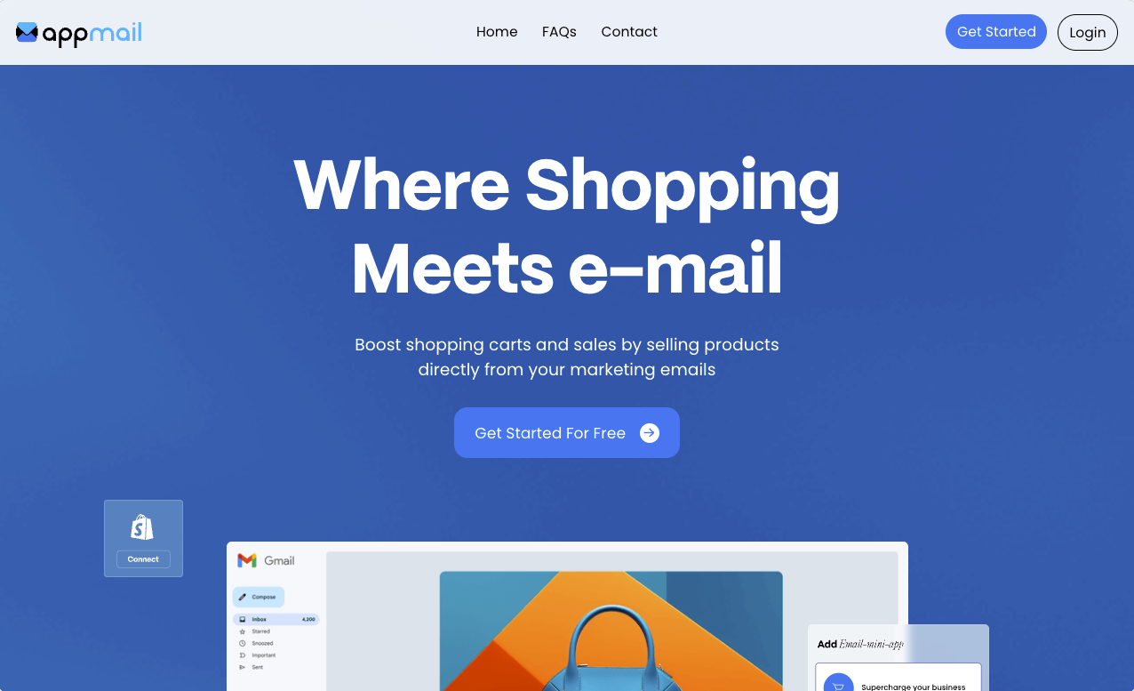
AppMail is an artificial intelligence (AI)-powered platform that lets customers purchase products without leaving their email. Joseph Berry designed their website, which features loading animations, swiping gestures, and floating elements that reflect the product’s core offering — interactive, hassle-free interfaces.
The site’s design further mirrors its messaging so potential customers better understand the brand’s identity. For instance, one header reads, “Bring an immersive experience to your marketing emails.” To the left of that phrase, a scrolling image carousel cycles through different shopping options customers might see in their emails, such as search filters and discount offers. Not only does this design choice show site visitors what future marketing materials could look like, but it also makes the website itself immersive, just like the header suggests.
3. Jomor Design
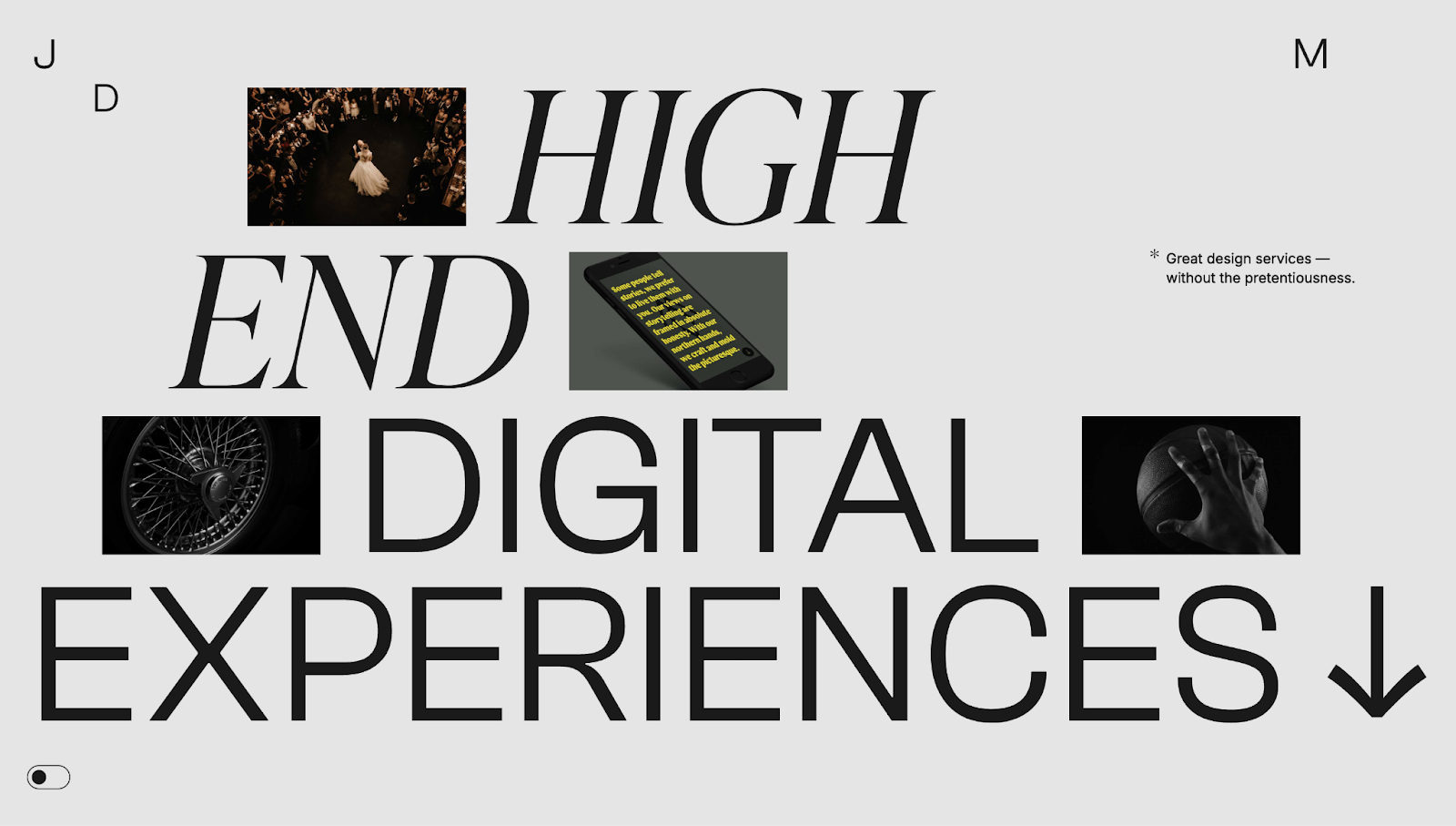
Jonathan Morin (of Jomor Design) built their portfolio website with a range of microinteractions to advertise their skills. Every strong portfolio needs examples of past work to convert potential customers into clients, and Jonathan accomplishes this by using floating thumbnails whose pictures change to show projects. It’s a clever way to highlight lots of information without taking up too much screen space.
When you first land on the page, the phrase “High End Digital Experiences” invites you to scroll down. As you do, various elements — text, images, and a video — move with your cursor. If you keep scrolling, the elements expand and stir. If you return, they retract.
Not only is this aesthetically pleasing, but all this movement and change encourages the user to continue interacting with the site, which means they see more and more of Jonathan’s work. The goal is that this exposure to Jonathan’s creativity convinces them to get in touch.
4. MinimalGoods

Designer Timothy Ricks created this MinimalGoods conceptual website. Thanks to the site’s bold typography and ample white space, it has a modern appearance. And these standard minimalist design principles stand out due to the following microinteractions:
- Section and color transitions improve navigation and readability by creating contrast between product details. Offering this information at a glance allows visitors to take in more of the website quickly, resulting in lower bounce rates and higher retention.
- Floating images provide visual cues for each section, while the asymmetrical, lopsided placement allows for negative spacing so the layout doesn’t overwhelm visitors or seem cluttered. This setup makes the browsing experience more enjoyable so people are more likely to spend time on the page and seek out additional information about the products.
Overall, these microinteractions grab attention, show each category’s value, and encourage you to explore your area of interest.
5. Glidespeakers
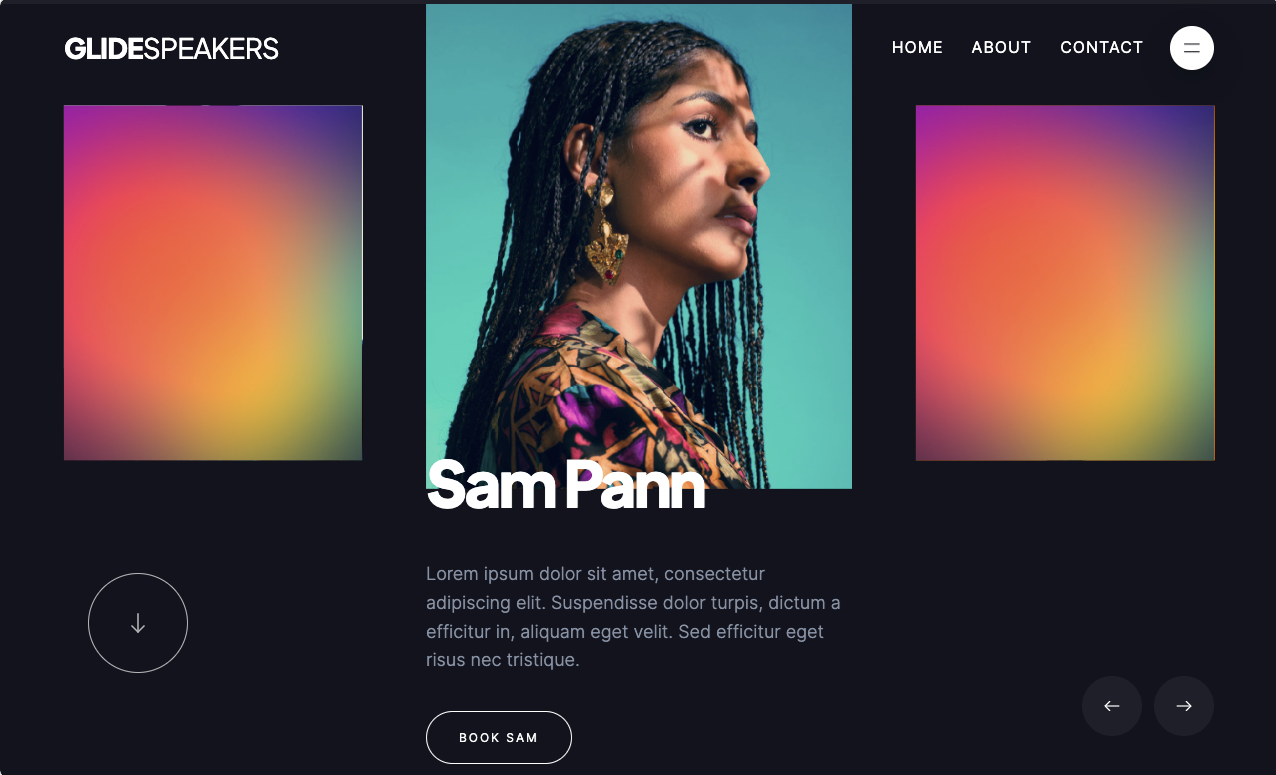
Ty Hughey’s Glidespeakers template is a conceptual page that advertises fictional speakers for hire. The site opens with a carousel describing these imaginary keynotes. As you scroll through the options, the site reveals the speaker’s portrait, name, and description — the rest of the carousel fades behind a rainbow gradient.
This design prevents you from getting overwhelmed with options and instead allows individual bios to shine. In turn, you’ll likely spend more time getting to know each speaker, find one you connect with, and book them.
6. Pitch
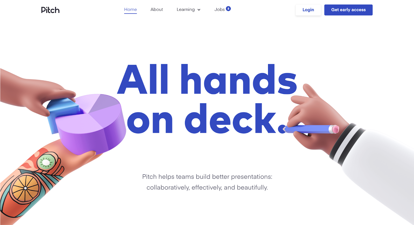
Pitch’s concept website, made by Bjorn Encuțescu, opens with a full-screen website header that reads “All hands on deck.” This hints at what’s to come: As you scroll, the hero image shrinks down to become the first slide of a presentation deck. This simple-yet-effective animation informs you about the product while providing a demonstration. If it appeals to you, you’ll likely explore further and potentially sign up for the service.
Bjorn continues to showcase Pitch’s messaging by infusing it within the website’s design language. Next to a header reading “Formatting that’s effortless,” a cartoon hand snaps as you scroll by, suggesting that using Pitch is a “snap” — simple and quick.


Interactions & animations
Learn how to animate multiple elements and bring your designs to life with rich, sequenced interactions and animations.
7. Joseph Berry
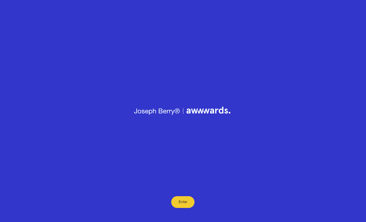
Joseph Berry’s award-winning cloneable site features a simple splash page that invites users to explore with a standout yellow “Enter” button. After tapping, the background slides open to reveal a site with multiple microinteractions:
- Floating buttons and icons with hover-activated feedback inform you of your actions so you know where you are on the site. This design makes the user experience less confusing because you’re guided throughout your journey.
- An animated play button follows the direction of your mouse, encouraging you to watch the course trailer.
- User interface (UI) card elements appear when you hover over the course modules. They stand out on the screen aesthetically while providing another large CTA to click on to explore each project further.
These modern design elements showcase Joseph’s talents and range as a designer, all of which convince site visitors that the design course is worth purchasing.
8. Qudrix
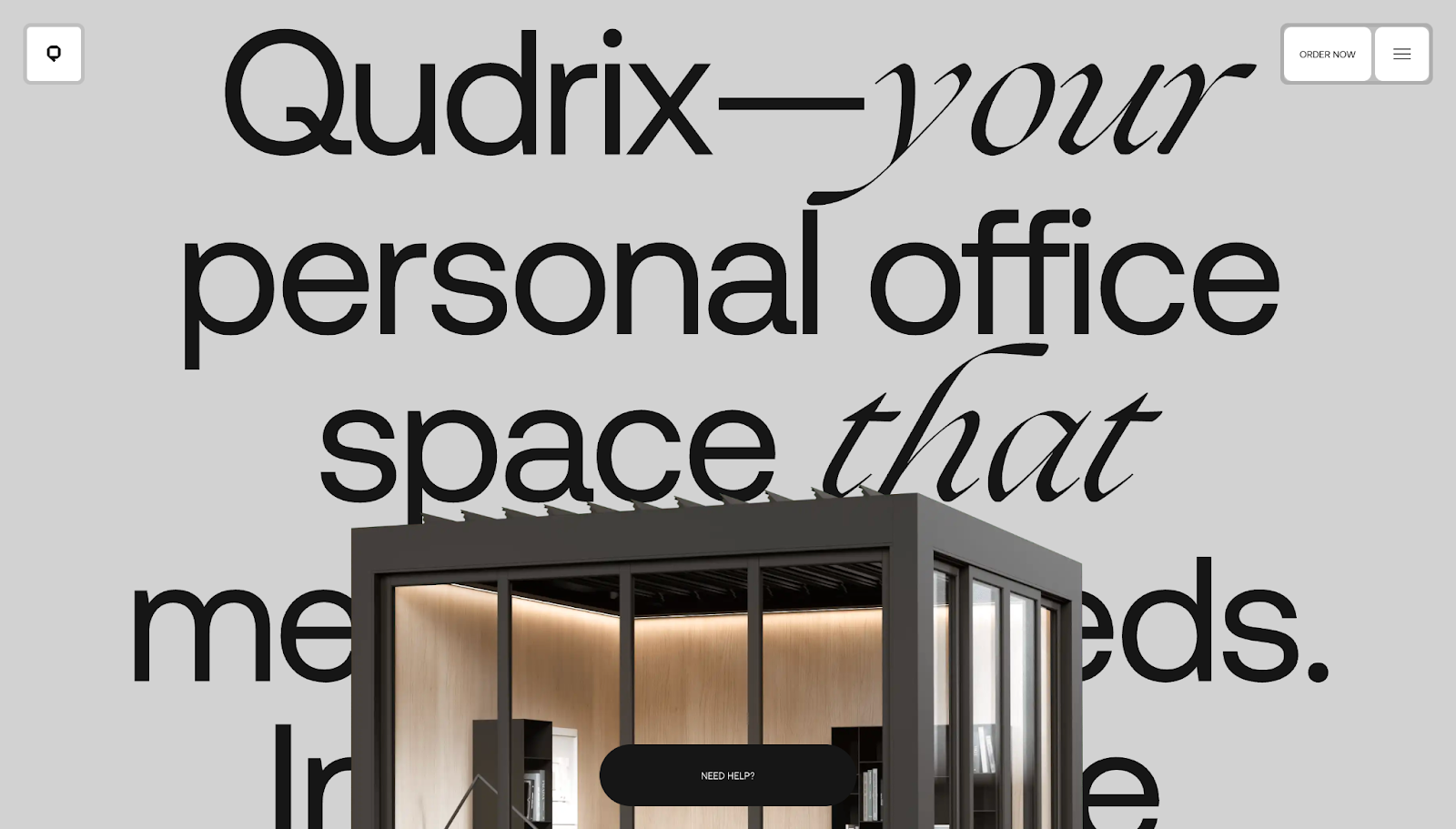
Qudrix’s website turns learning about a complex product into a playful, guided experience. In addition to the simple scroll and hover-triggered interactions on the main page, O0 Design included a “cube wizard” where you can create and customize personal office spaces in 3D to see what the final result might look like.
The “Make it yours” panel breaks down choices into simple steps — size, roof, sides, attachment, and lighting — with clear labels and radio-button states that react instantly as you click. When you change options, the live subtotal and thumbnail imagery update in real time so you can see the impact of each decision. These microinteractions keep visitors experimenting and gently move them toward submitting a request or order.
9. LOBATO
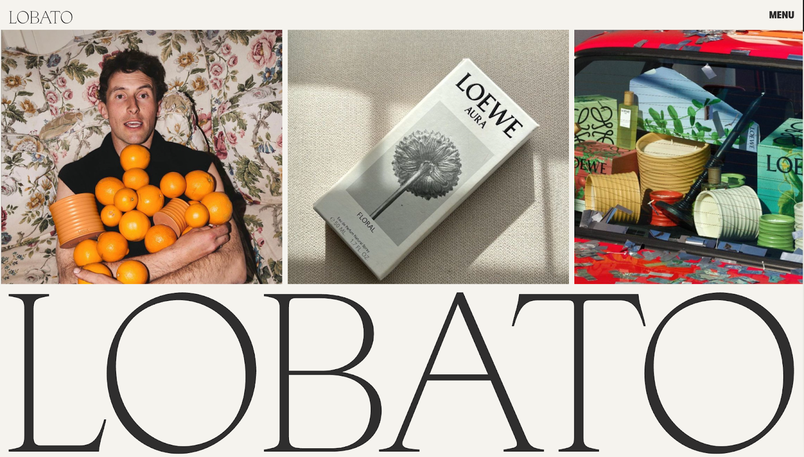
LOBATO’s website has restrained microinteractions that make its editorial-style layout feel livelier without overshadowing the content. The hero text and project images ease into view as you scroll, guiding you line-by-line from value proposition into services and then case studies.
Each element first appears as a blur and becomes clear as you move down the page. Project tiles respond on hover with gentle motion and focus shifts, showing that each case study is clickable and worth exploring. CTAs also stand out thanks to subtle state changes, encouraging visitors to get in touch for a quote or consultation.
10. Social House
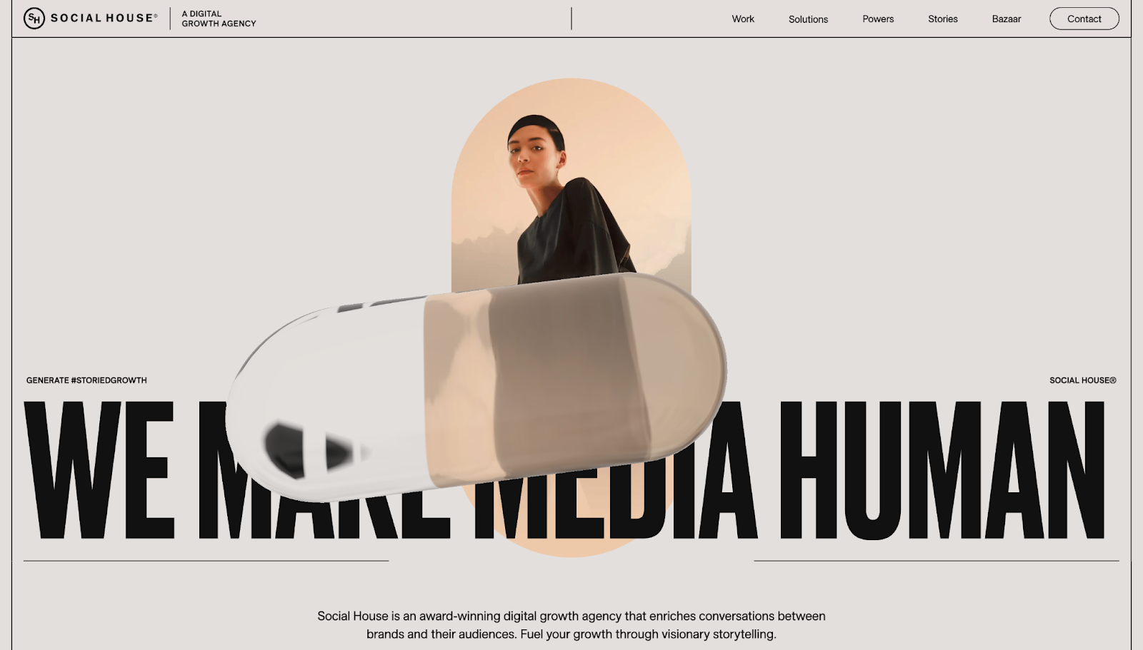
Social House’s microinteractions make its content-rich homepage easier to explore, showing how you can break heavy websites into more digestible UXs with subtle animations and motion cues. A floating, translucent pill turns attention toward the hero headline, while small hover shifts on navigation elements and CTAs tell you what’s clickable.
As you scroll, the site turns from light gray to orange to light gray again, introducing the brand’s visual identity. Sections like “This is what we do” and “Make an impact” appear through slow fades, making the reveal more interesting than a checklist of static services.
11. Dria Ventures
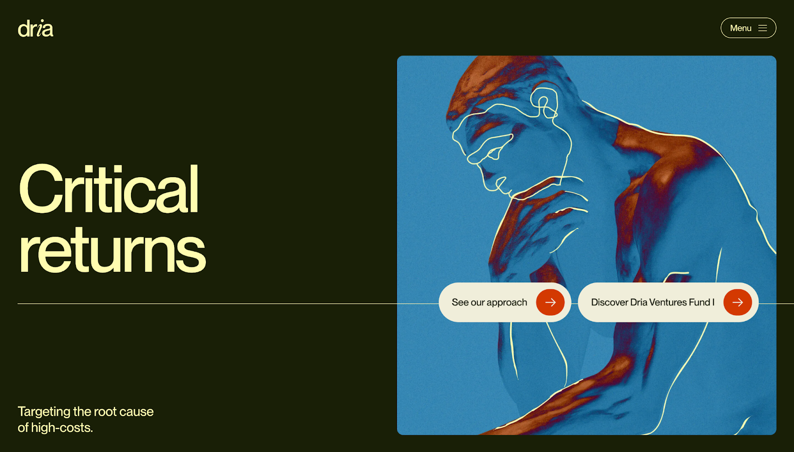
Dria Ventures’ website, designed by Paper Tiger, uses microinteractions to make a dense, thesis-driven story easier to follow. In the hamburger-style menu — tucked away in the top-right corner — the numbered navigation and anchor links respond on hover, showing visitors exactly where they’re headed.
As you scroll down, headlines, statistics, and pointers come into view in digestible chunks so the story feels comprehensible and not overwhelming. CTAs like “Our approach” and “See our companies” change color when you hover over them, inviting clicks instead of shouting for attention. Even the contact form has obvious success and error feedback, turning a simple sign-up into an effective microinteraction.
12. SCI Ventures
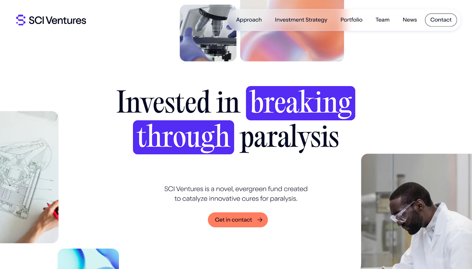
SCI Ventures’ website has minimal but purposeful microinteractions that guide visitors through a sensitive issue without making the content feel too heavy. The hero headline, mission copy, and “Get in contact” CTA button fade into view, with statistics appearing in focused blocks so the scale of the problem is obvious.
As you scroll into the portfolio, each company’s thumbnail and a corresponding arrow button respond to hover and clicks, showing what’s interactive and encouraging visitors to explore. Other CTAs change shape on hover, with arrows that become more prominent to point the way toward new pages.
13. Adnaut
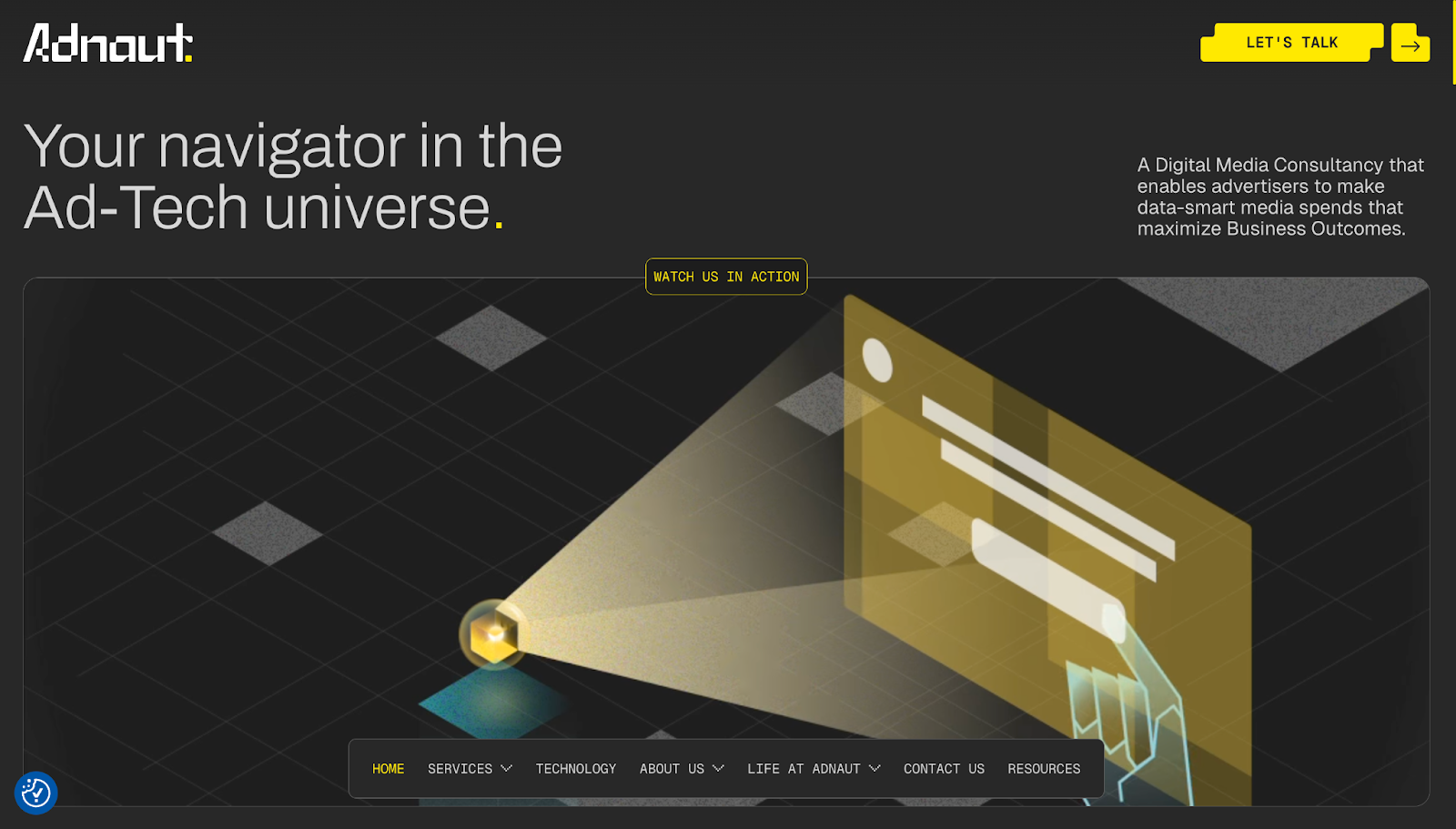
Adnaut’s site, designed by Everything Flow, has space-themed microinteractions, making its ad-tech story feel fun and exciting. The hero section uses a robot-like animation with a “Watch us in action” prompt, tying the CTA to the on-screen visuals.
As you scroll down to view the company’s five-step framework — Analyze, Plan, Activate, Measure, Optimize — each pillar reacts on hover, swapping its monochromatic palette for colors and hologram-style visuals. This microinteraction turns a normal how-to graphic into a guided walkthrough, helping people understand Adnaut’s value proposition one step at a time.
14. Guidde
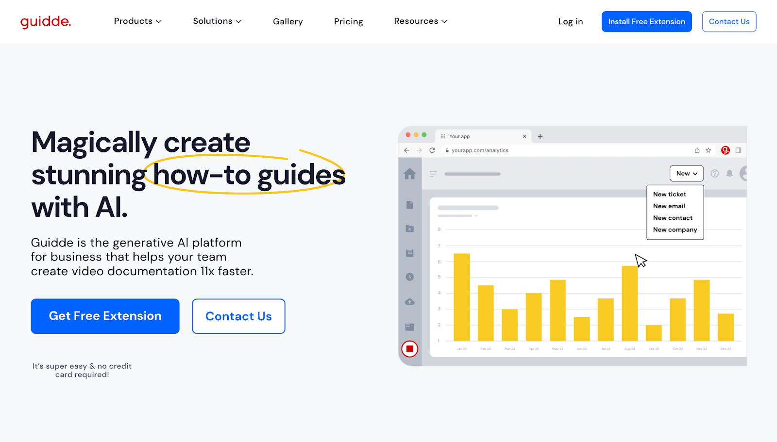
Guidde’s homepage incorporates small interactions to keep visitors moving through the sales funnel, from promise to proof to prompting action. There are many CTAs throughout the page and in the footer, giving visitors lots of opportunities to engage. CTA buttons and client testimonials are all tappable, with subtle zoom-in animations that emphasize each element.
Each CTA is also responsive on hover, giving immediate feedback and encouraging click-throughs. And there’s an introductory video right on the homepage, adding visual context while giving visitors something to interact with right away.
15. GRAPHICHUNTERS

GRAPHICHUNTERS’ website features understated microinteractions that add an interactive touch without taking away from the content. The hero area shifts out while highlighted projects slide in, emphasizing sports imagery and typography to appeal to potential clients.
After the introduction, more interactions guide you into client logos and featured picks. This section is both an ad for GRAPHICHUNTERS’ work and social proof. On the rest of the page, project cards and services blocks respond on hover with subtle movements, helping visitors understand at a glance where to explore case studies, services, and team bios.
What are the benefits of microinteractions in web design?
Microinteractions improve functionality while making user journeys more enjoyable and intuitive. They work by:
- Guiding visitors. Features like parallax scrolling, progress indicators, and validation messages help users quickly complete tasks. For example, a progress bar on a multistep form reduces confusion and motivates users to finish. Clear guidance supports customers throughout their journey so they enjoy their browsing experience and reach the end of the intended sales funnel.
- Improving engagement. Interactive elements like animated CTAs and hover effects bring a site’s branding to life. These details make the experience more immersive, keeping users interested and connected to the website’s narrative and purpose.
- Providing feedback. Responses like a subtle vibration after clicking a button or a change in element color tell users their action was successful. This real-time feedback helps close the interaction loop and shows people they can trust the website’s functionality.
- Supporting functionality. Engaging animations and effects improve the site’s interface without compromising performance. Optimized interactions maintain fast load times and smooth functionality so users browse and leave satisfied, intending to return for more.
Best practices for implementing microinteractions in web design
Effective microinteractions are purposeful in their implementation. Consider these best practices when adding microinteractions to your web and UI/UX design projects. Microinteractions should:
- Be clear and purposeful. Microinteractions should entertain, guide, and inform site visitors. Each effect should focus on a single task to prevent conflicting design choices from confusing users.
- Make branding cohesive. Define your standard design rules to maintain consistency across your website.
- Encourage engagement and delight end users. While subtlety is crucial, microinteractions can be pleasant little moments that make the user experience more enjoyable. You can use them purely to entertain visitors aesthetically and grab their attention.
- Be usable and accessible. Consider people with disabilities when designing microinteractions — no matter who lands on your website, they should be able to use it. To ensure inclusivity, provide alternative feedback (visual, haptic, and sonar) variations.
- Include well-structured information architecture. Document how each microinteraction connects to the next, and keep things tidy by deleting unused styles. This ensures the experience is cohesive and gives you a reference point when updating the site in the future.
But don’t overuse microinteractions. While microinteractions offer helpful feedback, overusing them can distract and frustrate visitors. Microinteractions should be subtle, purposeful interactions that improve the experience without overloading the interface or cluttering the design.
Level up your website with microinteractions
Microinteractions are the tiny threads that weave a website’s smaller elements into a cohesive layout. By improving usability, guiding users, and adding personality, these micro-design elements create experiences that keep people coming back.
Webflow’s visual web design tools let you incorporate microinteractions into your site — without relying on developers. Experiment with drag-and-drop animations, hover effects, and scroll triggers to bring your design to life.
Design and build interactive web experiences with Webflow’s visual web experience platform.
FAQs
What are the components of a microinteraction?
Most microinteractions have four core components: a trigger, rules, feedback, and loops and modes. The trigger starts the interaction, rules define what happens next, and feedback is how the system communicates that change back to the user.
Loops and modes determine how the interaction behaves over time — for example, a swipe animation might repeat when a page is reloaded, or it might play only on the first visit.
What’s the difference between macrointeractions and microinteractions?
Macrointeractions are longer journeys on a website, like signing up for an account or completing a checkout process. They typically span multiple steps and pages and map to key business goals within an intended sales funnel.
Microinteractions are the focused, single-moment responses inside those macro journeys, such as the hover state on a “Submit” button or an icon that animates when a task is complete. These visual and motion cues make each step feel smoother and more engaging.
What are common mistakes when designing microinteractions?
Common pitfalls of microinteraction design include:
- Too much motion. If every hover and scroll triggers a busy animation, the user experience can feel chaotic and distract from the content.
- Slow or unclear feedback. Animations might drag on and frustrate users, or it may not be obvious what changed or why.
- Accessibility issues. Relying solely on color, using low-contrast states, or ignoring reduced motion preferences can make microinteractions hard or uncomfortable to use.
- Inconsistent timing or visual styles. These can make your layout feel disjointed and dilute the website’s branding.
For best results, design a small set of reusable microinteractions, keep their animations quick and purposeful, and test them on various devices to ensure responsive design.
What actions typically trigger microinteractions on a website?
Microinteractions are triggered by common user actions like clicks, hovers, scrolls, and form inputs. For example, hovering over a button might subtly change its color or shadow to indicate it’s interactive, while clicking it could trigger a confirmation animation. Scrolling can activate progress bars or parallax effects, and form fields often provide real-time feedback as users type. These small cues enhance usability by making interactions feel responsive and intuitive, turning simple actions into a seamless user experience.
How do I keep microinteractions purposeful without overwhelming users?
The key to effective microinteractions is purposeful restraint — every animation or feedback should serve a clear function, like confirming an action or indicating interactivity. Avoid adding motion just for aesthetics; instead, use subtle transitions that feel natural and support the task at hand. Well-designed microinteractions should feel intuitive and effortless, helping your visitors navigate without distraction. When done right, visitors may not notice them individually, but they’ll feel the difference in the smoothness and clarity of the experience.
Build websites that get results.
Build visually, publish instantly, and scale safely and quickly — without writing a line of code. All with Webflow's website experience platform.