

Clients and target demographics may vary, but the same fundamental components of good website design can make any site exceptional.
As designers, we’re constantly seeking out new features and tools that increase a website's impact. And although the nature of web design is constantly evolving, certain things — like good use of whitespace, thoughtful typography, and great color combinations — are always important.
New trends are exciting to implement and play around with as well, but some components are essential for a reason. Implementing specific design trends and components with purpose can elevate any web design.
6 aspects of web design worth considering
While not an exhaustive list, these six aspects of web design should always be top of mind. As they say, learn the rules first, then learn how to break them.
1. Purpose
Before you set out to build a website, know what your client wants to accomplish with it. Maybe it’s a personal portfolio to engage new clients or an ecommerce platform for dropshipping. Whatever the purpose, it should be the source of inspiration for the overall design. And if the client offers a unique service that aligns with their mission, make sure to highlight it.
For example, a site for a veterinary clinic could feature a clean, bright, professional aesthetic with animal-themed graphics. And if part of their mission is partnering with the local animal rescue to offer pro bono treatment to rescues, that information could be prominently displayed.
On the other hand, a photography portfolio might avoid bright colors and complex elements that distract from featured photos and instead opt for a simple, understated gallery. Showcasing work demonstrates the photographer's personal style and passion along with the quality of their work — both of which aim to attract the target customer.
Overall, the client’s service or product drives the design. Whether it’s fonts, colors, or interactive buttons, ensure every aspect of the design has purpose and intention. This is the foundation of great web design.
2. Simplicity
Designs often feature numerous visual elements. When done properly, these elements add to the overall aesthetic and purpose of the site. But when haphazardly included, they can crowd the design and make it difficult for readers to navigate through the site
Strive for a level of simplicity that prioritizes fast loading times, clear navigation, and seamless transitions between pages Nearly half of website visitors abandon a site after viewing just one page — but a quick and easy experience might persuade them to stick around longer.
Rethink all elements that could negatively impact the user experience by complicating navigation or making the message or purpose of the site unclear. Remove unnecessary images, chunks of text that are too long to skim, and bright colors that distract from your navigation or CTA. Keeping things simple eliminates these issues and helps website visitors enjoy their experience more, increasing traffic and conversions.
To ensure your site is living up to its full potential, keep an eye on its performance metrics. Check out these articles to learn how to measure site performance and supercharge performance results.
3. Navigation
Aim to keep navigation elements consistent across all pages. This means keeping everything from menus to links and buttons in the same place, regardless of which page a user lands on. If your homepage design has a link to a hamburger menu in the top-right corner, it shouldn’t move to the bottom-left corner of the “About” page.
This level of consistency needs to apply across devices. If a website looks stunning on a desktop, it should look just as good on a friend’s cell phone. Optimize your pages for multiple devices, including both navigation and the responsive elements that keep pages looking great on smaller, or larger, screens. For more detailed guidance, check out our Intro to responsive design lesson.
4. Visuals
Devote time to refining design choices. Examine the space taken up by headers, ensure images are consistent in size and quality, and verify that fonts are legible. Typography, color palettes, images, and videos are all critical components of visual appeal.
A number of sites look great at a first glance, but they should provide a consistent user experience throughout. It’s important to keep fonts and colors consistent and ensure design elements complement each other.
Using web-safe fonts and ensuring your color contrast ratios meet WCAG requirements will not only make your site more visually appealing, it will also make it accessible to a wider range of visitors. Establishing a color palette for your website and setting brand guidelines for accessible fonts and visual standards will streamline your design process.
5. Organization
Organizing visual elements successfully requires knowledge of a few basic web design principles:
- Space: This refers to your website’s whitespace —the negative space free of any elements. Whitespace gives features room to breathe and helps draw focus to specific components you wish to highlight.
- Visual hierarchy: This refers to organizing your site to prioritize some features over others. If there’s something you want to give importance to, like a call to action (CTA) or a product photo you can highlight it with bold colors or place it in the center of the page. Hierarchy is designed around Gestalt psychology.
- Contrast: This refers to the relationship between multiple design elements with differences that are emphasized when shown together, like white font on a black background. Contrast is often used to showcase the importance of an element or highlight differences between two things. You can create contrast with color, size, space, and position.
- Scale: This refers to how elements are sized in relation to one another. Product images, for instance, may be larger than their descriptions or pricing. Each element needs to be proportionate to its purpose without compromising usability. So don’t make text too small or let graphics overwhelm the page.
This is just scratching the surface. For anyone looking to elevate their design skills, we recommend studying these ten effective web design trends and principles next.
6. Accessibility
With screen readers and assistive technology affecting how some visitors consume content, design becomes a critical element in ensuring they work as intended. Text and colors need to be visible for a wide range of vision capabilities. All text — including alt text for each image — also needs to work with screen readers.
Webflow’s accessibility checklist is a good start to learning what’s needed for modern devices to consume on-page content, and to ensure you’re designing with both humans and assistive technology in mind.


Get started for free
Create custom, scalable websites — without writing code. Start building in Webflow.
Designs to inspire you
Design elements are all good in theory, but let’s see them put to the test. Here are some of our favorite website designs at the moment:
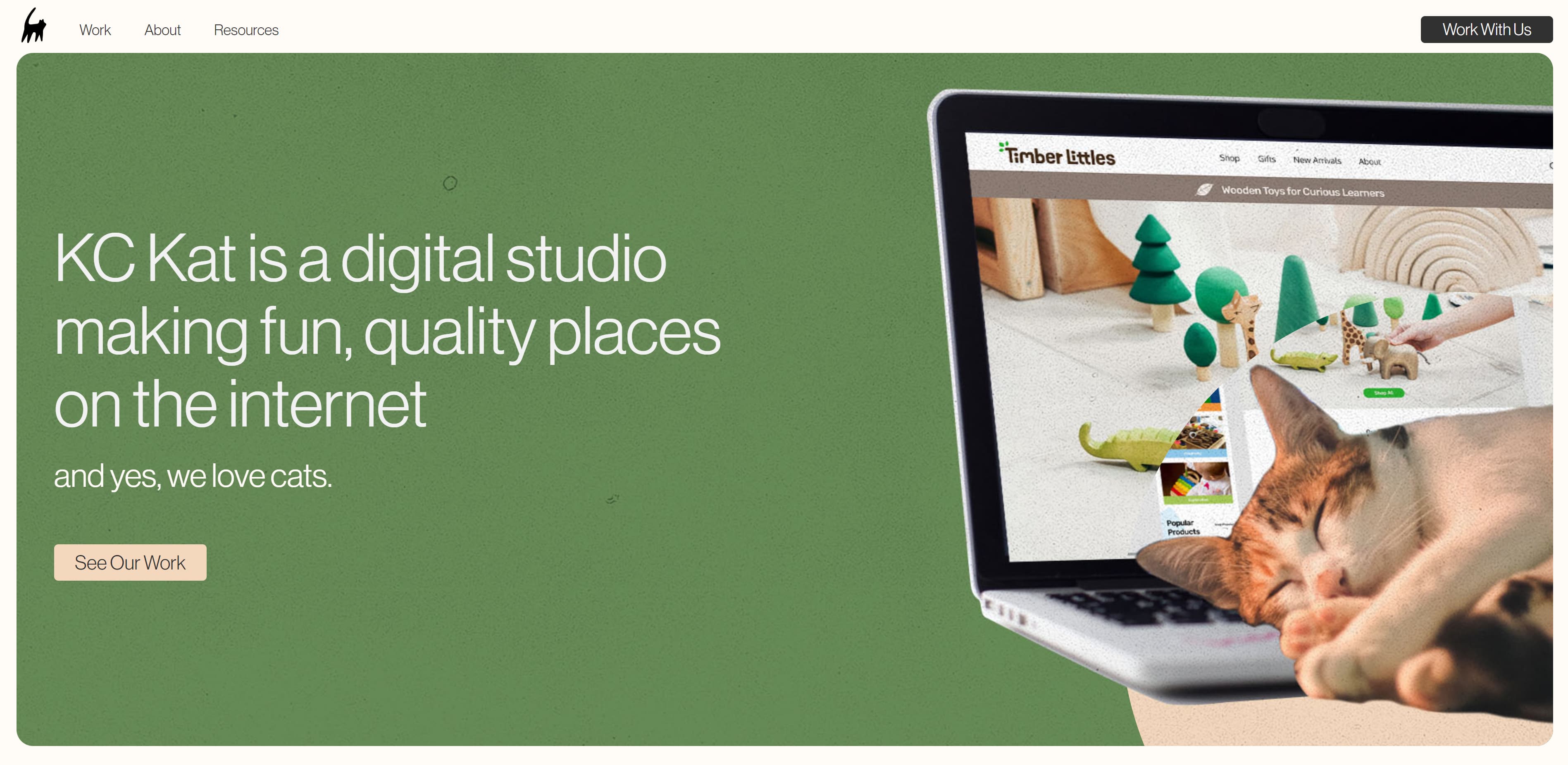
KC Kat Creative
KC Kat Creative’s interactive landing page keeps you hooked from the moment you land on the site. A large circle follows your cursor, creating new contrast (and revealing a cat sleeping on the laptop’s keyboard). Whitespace encourages your eye to float from the large text on the left to the image on the right. And we love the color palette — it’s simple, inviting, and pleasant.
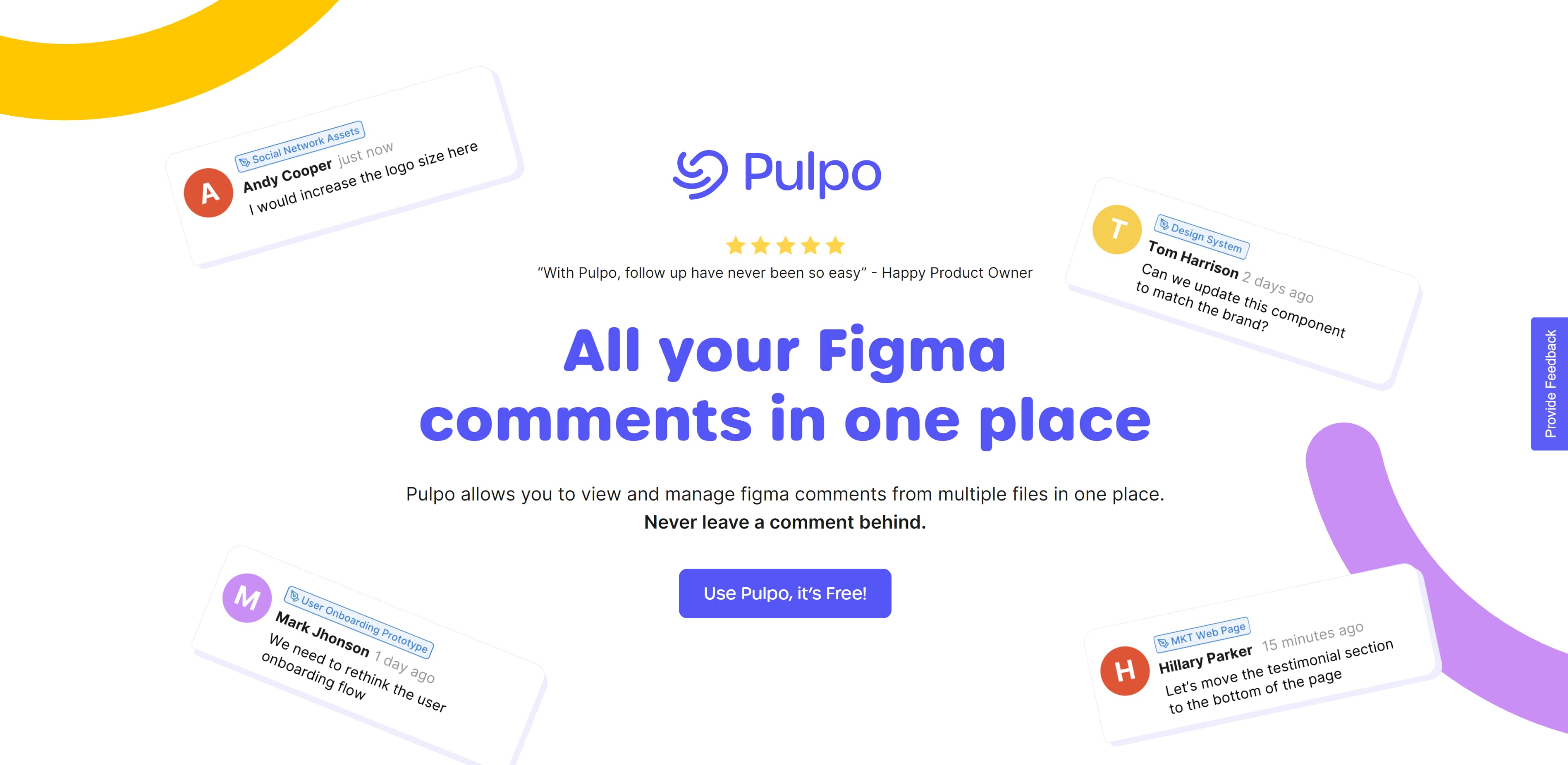
Pulpo
Pulpo’s mission is simple, and so is its design. The colors complement each other well. They’re bright, but not disruptive and they lend themselves to the playful aesthetic. The website’s animations are seamless and the use of whitespace highlights the dynamism of the graphics. Including example comments draws in potential customers by offering social proof of success.
If you’re designing to sell digital products, Pulpo is a great reference.
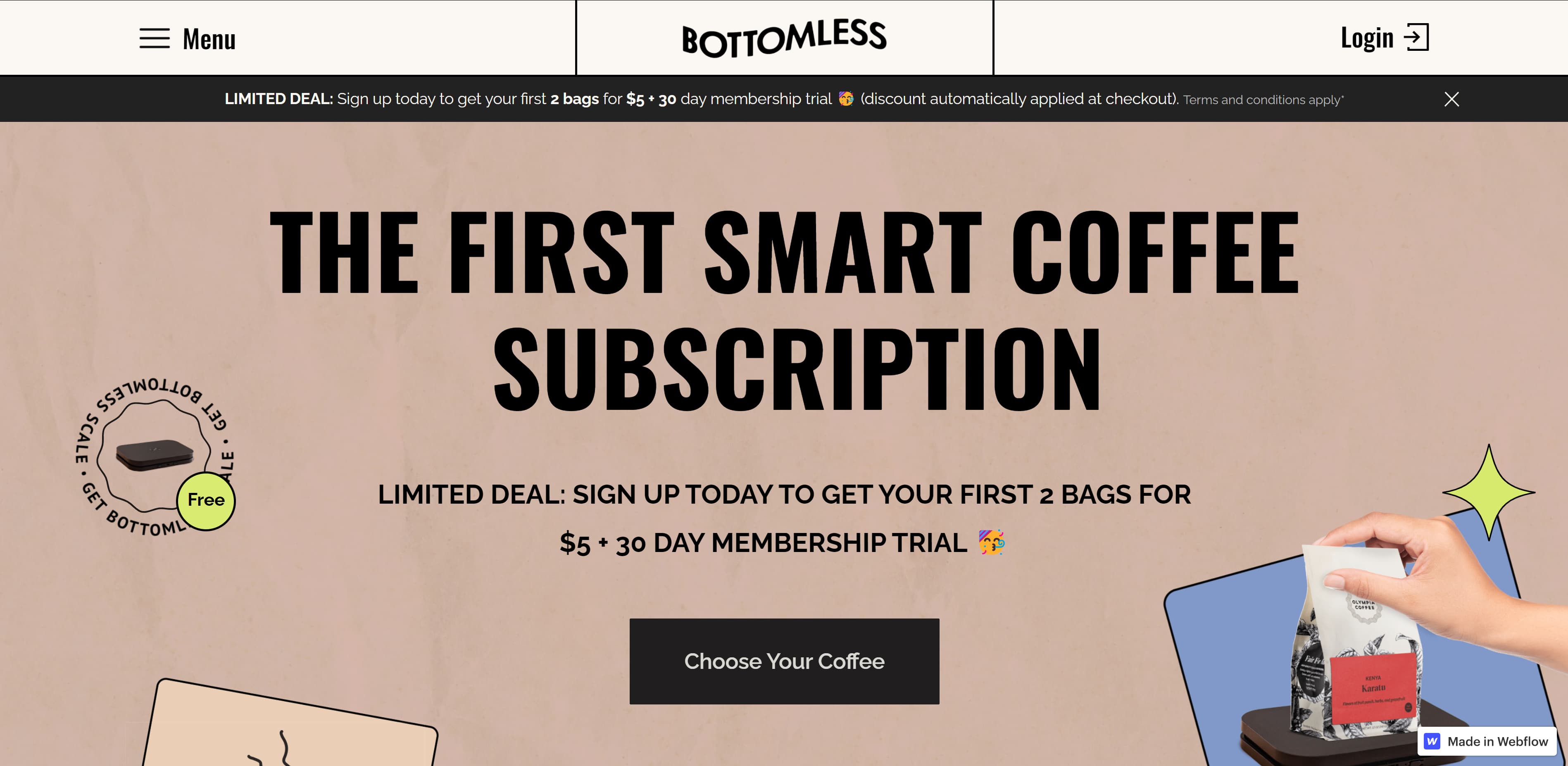
Bottomless
Bottomless couldn’t make their purpose any clearer — they provide the world’s “smart coffee subscription.” The big, bold text is the first thing you see when you enter the website. It has earthy colors that reflect the brand and the use of bold headings contrast well with other text on the page. Bottomless uses images and illustrations to align the site with the brand’s identity and navigation is intuitive with the hamburger menu in the top-left corner.
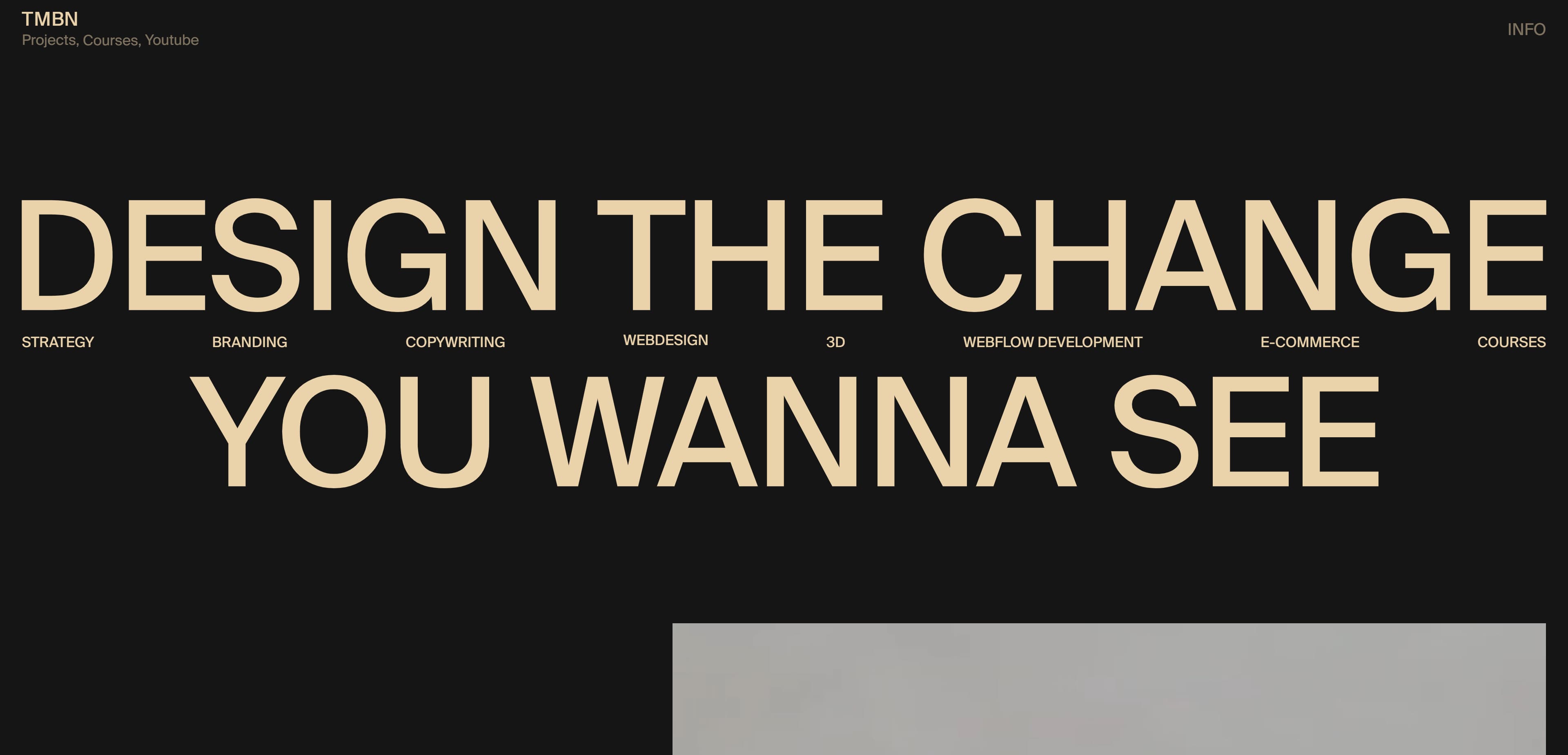
También Studio
Photosensitivity warning: This website contains flashing images and motion upon load.
También Studio has one of the best minimalist websites around. Their minimalist aesthetic is highlighted by the exceptional use of contrast, color, and space. Interactive elements are expressive without being over-the-top, and you still derive all the necessary information from the site despite few words appearing on the homepage.
Those are some of our favorite examples of good website design, but there are plenty more. If you’re looking for more inspiration, check out the most popular websites made in Webflow.
Perfect your web design with Webflow
Designing a great website takes patience and knowledge. Even experienced designers can improve on their craft — and that means learning new things at every stage in your career.
We have loads of courses, tutorials, and articles to teach you about web design no matter your level of experience. Check out Webflow University to find a free course to match your needs.