


As a designer, I try to spend as little time as possible on project management type tasks because I’d rather be doing more creative things.
I’m happy to spend several hours building beautiful color schemes but once I’ve got a palette I’m happy with, I don’t want to spend a ton of time wrangling swatches in a design tool.
Fortunately, Webflow offers a myriad of features that make project and color scheme management faster, you just need to know what to look for. You can use global swatches to change colors anywhere they appear in your design — all at once. And the built-in contrast checker clearly shows if text colors meet accessibility guidelines based on the background color.
Read on for five tips to help you manage website color schemes in Webflow and save time, so you can focus on the tasks you enjoy the most.
1. Add color swatches early
When I first started designing websites I habitually waited until too late in the process to create a color palette. It’s easy to overlook this step when you’ve got a design idea you’re inspired to test out or a deadline that’s fast approaching. But making a conscious effort to lock in your color swatches early can save you a ton of editing time later on and help keep your whole project organized.
If you’re designing a website for a client, I recommend choosing a preliminary color palette either before or at the same time you review wireframes. You can, of course, make changes if needed, but having a good foundation to work off of makes the whole design process smoother and helps ensure that you and your client are on the same page. If you’re working with an established brand, they’ll probably already have a brand color scheme for you to work with.
How to add your color palette to the Webflow designer
When you are ready to dive into the Webflow Designer, open the Style panel on the right side and scroll down to the “Backgrounds” section to locate the color picker (you can access the color picker by clicking the square next to “Color”).
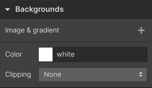
Add swatches to your web design palette by clicking on the “plus” icon at the bottom of the color picker. This will open up an additional drop down menu where you can name your color swatch. When you’re happy with the name and the color, click “Create.”
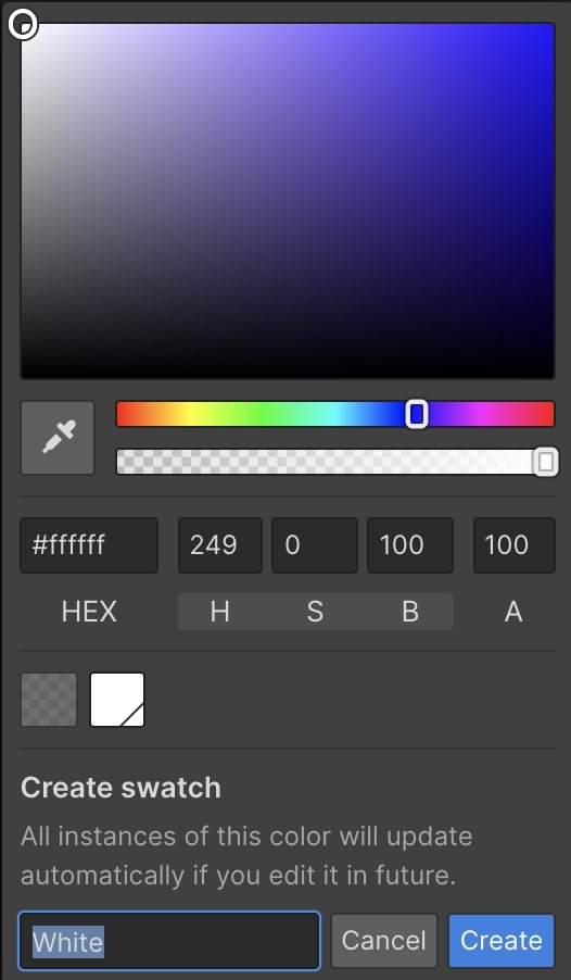
There are several ways to adjust or select colors in the color picker:
- Click and slide your cursor around the color plane
- Use hue and transparency sliders below the color plane
- Enter the HEX code of the shade you want
- Manually adjust the HSB (Hue, Saturation, Brightness) or RGB (Red, Green, Blue) and A (Alpha) input fields (if you click on “H S B” it will change to “R G B” and if you click again it will change back)
- Paste a screenshot or image of your color palette onto the Webflow canvas and then use the eyedropper tool (this is a Chrome extension)
The eyedropper tool is really handy if you want to pull a hue from a logo, or other brand asset.
2. Add extra colors to your palette
I find it helpful to consciously build a color palette that’s slightly bigger than I think I’ll actually need so I don’t have to hunt down another color that matches the rest of my design halfway through a project. Adding a few extra hues early on can give you more creative freedom when you’re “in the zone” working on a design.
How many colors should a website have?
Many designers will cite the 60-30-10 rule when you ask them how many colors you need for a website. Some may even specifically tell you to stick to three colors. According to the 60-30-10 rule, 60% of your website should be one color (your main color), 30% should be a color that complements your main color, and the remaining 10% should be your accent color. Here’s an example of the 60-30-10 rule in practice from the Conzai Conference Website Template.

The Conzai design pictured above consists primarily of black (roughly 60%) with about another 30% being white, and 10% the accent color, green (these are estimates and not exact percentages). The 60-30-10 rule is really handy because as you can see, it typically produces eye-catching results. But I’ve seen plenty of designs that bend or even completely break this rule and look stunning.

The Blue Paprika website is a great example. There are at least nine different hues featured on Blue Paprika’s website. In the screenshot above we can see that white is the main color, black is an accent color and then roughly the remaining 30% is a gradient or blend of at least seven different colors. You could also bend the 60-30-10 rule by using one color for 60% of your website, another single color for 30%, and then splitting the remaining 10% up into three analogous colors or even four tetradic colors.
3. Include tints and shades
Many websites leverage monochromatic color schemes (made up of tints, shades, and tones) to some degree. You can use shades, tints, and tones to increase the size of your palette without needing to worry too much about hues clashing. Having shades, tints, and tones handy also makes it easy to create depth or increase contrast while you’re designing various elements.

Here’s how to add tints, shades, and tones to your color scheme in the Webflow color picker. Let’s say you’re designing a website for a client whose brand colors are dark blue, white, and dark gold. To add tints, you simply need to increase the amount of white, or brightness, added to the color. To add shades of any of these colors, you need to add black to the color, or increase the darkness. Tones are created by adding gray.

Add tints in the Webflow designer by moving the picker along the color plane toward the top left corner closer and closer to white (or HEX code #ffffff). Adding tints of dark blue will give you varying hues of light blue. Since you can’t add more white to absolute white, it’s not possible to add tints of white.
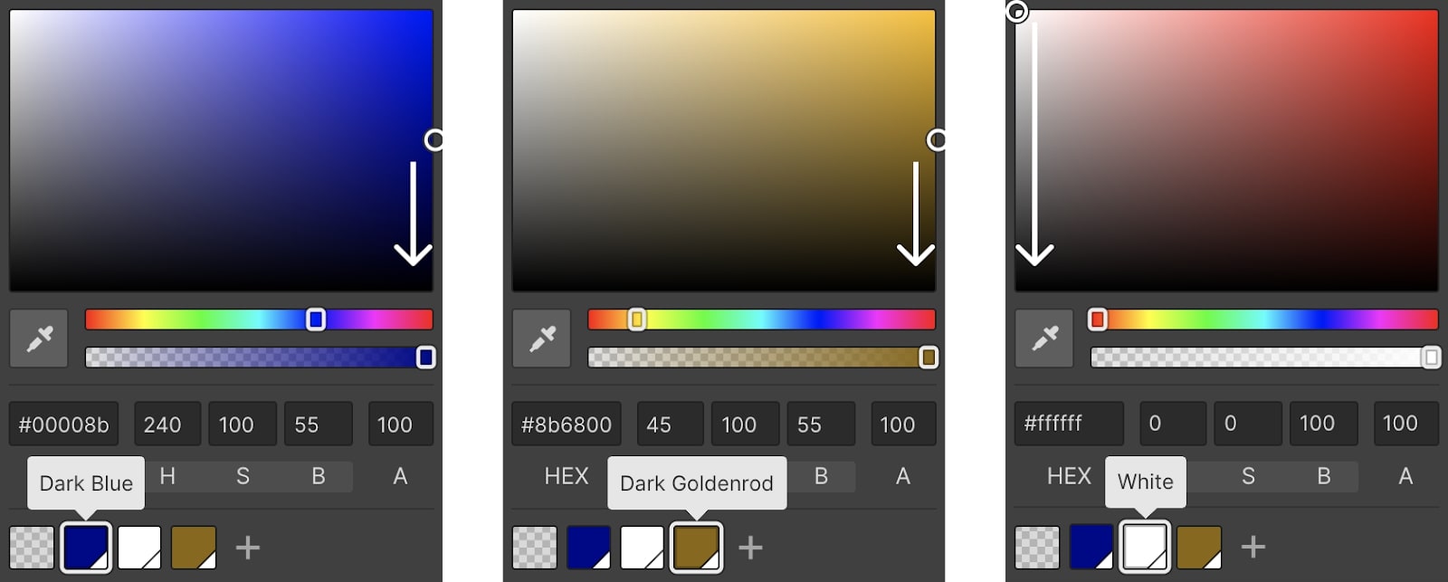
To add shades, move the picker straight down toward the bottom of the color plane (toward HEX code #000000). You can also add shades by moving the picker along the color plane to the middle-left (or toward the gray tones between white and black).

The resulting color scheme could look something like the above image, depending on how many shades and tints you want to include in your palette.


Get started for free
Create custom, scalable websites — without writing code. Start building in Webflow.
4. Use global swatches to make changes easy
Where typical color swatches make it easy to add a color you want to a particular element on a page, global swatches enable you to change a color anywhere it exists in your site (as long as it’s linked to that swatch) in a matter of seconds. This is a huge time saver if you have a client that likes to see different options or is going through a rebranding and changing up their brand colors. It’s also really handy if you’re working off of a template.
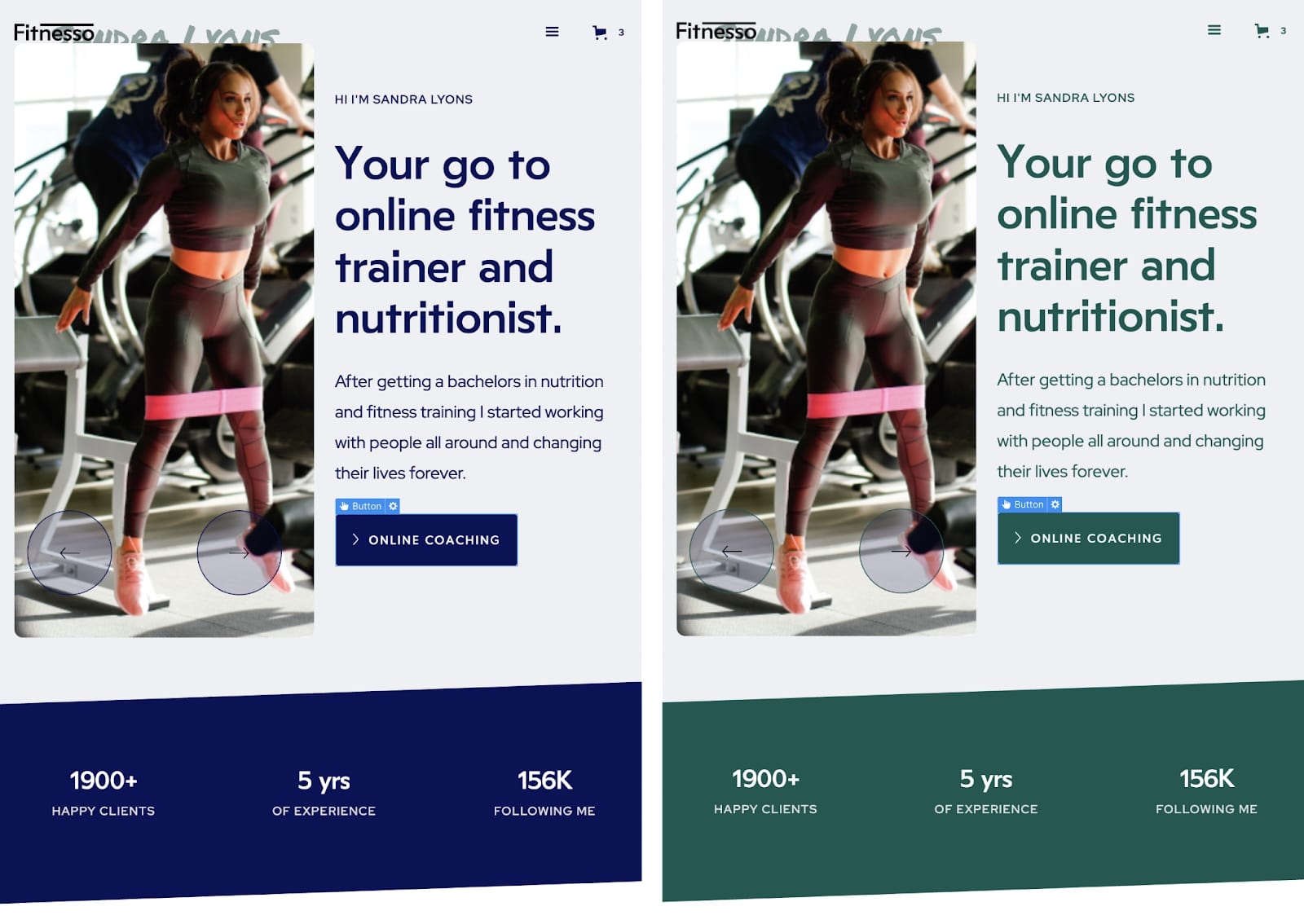
To experience the versatility of global swatches for yourself, open up the Fitnesso Website Template in the Webflow designer. Click on the “Online Coaching” button on the homepage and then click the dark blue square under the “Backgrounds” section in the Style panel, which will open up the color palette.
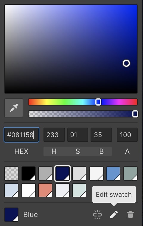
Click the “pencil” icon in the bottom right corner of the color picker to edit that swatch. As you change the color, you should see every instance of that color across the template change, not just the background of the “Online Coaching” button.
You can unlink an element from a global swatch to change the color of just that one element without affecting the rest of your design by clicking the “broken link” icon (located in the bottom right of the color picker next to the “pencil” icon). If you decide you want to reconnect that element to a global swatch, just click that color swatch in your saved palette.
5. Check contrast for accessibility and inclusivity
One of the coolest features in the Webflow Designer is the built-in contrast checker, which makes it easier to check for accessibility and inclusivity.
Contrast heavily impacts how people with vision impairments view your web design. The recommended contrast ratio for text depends on the size and weight of your font. And if your color choices don’t follow Web Content Accessibility Guidelines, some people may not be able to read or fully engage with certain parts of your website.
You can easily check if headers, paragraphs, and other text have an adequate contrast ratio in the Webflow color picker. Open the color picker under the “Typography” section in the Style panel. Just above your color palette, you’ll see a contrast ratio score.

If your contrast ratio doesn’t meet contrast recommendations set forth by the WCAG, you’ll see an indicator reading, “Fail”. Click the “eye” icon to the right of your contrast score to toggle on or off two lines on the color plane. These lines indicate where your color selector would need to pass in order to meet the minimum recommended contrast score or achieve an enhanced score. You can learn more about how this score is generated and why this is important in this Webflow University guide.
More web design project management tips
Looking for more strategies for project management in Webflow? Webflow University is a great resource for learning how to harness the power of the Webflow Designer and be sure to check out these blog articles: