Webflow employees all have one thing in common: when we’re not building Webflow, we’re building in Webflow. From content guides to solar systems, we’re pushing the boundaries of what can be built in Webflow — and we’re just scratching the surface.
Webflow employees tackle side projects that exemplify the wide world of Webflow and its many applications. In this post, I’ve rounded up a few of the coolest projects our team has built in Webflow. They’ll blow your mind, crack you up, teach you something — sometimes, all three.
1. Spaced: Trips to space — and back

“Hi, my name is Waldo and I’m a Webflow addict.”
–Waldo Broodryk, on himself.
Look no further than Waldo’s Spaced project, built for Dann Petty’s SPACED Challenge, to find proof of Waldo’s Webflow expertise — and obsession.
What inspired you to build Spaced?
“I tweeted that I'd be willing to convert a static design to a live, responsive webpage and partnered up with Mike Delsing to build the site in Webflow with a time-lapse of the process. I wanted to collaborate with someone from the design community — I vowed to give the prize to the designer if we won.”
What part of this project are you most proud of?
“Spaced has some fun, hidden features. If you click around, you might find them.”
Can you find the easter eggs in Waldo’s Spaced site?
2. Mom’s notes: Family recipes and kitchen tips
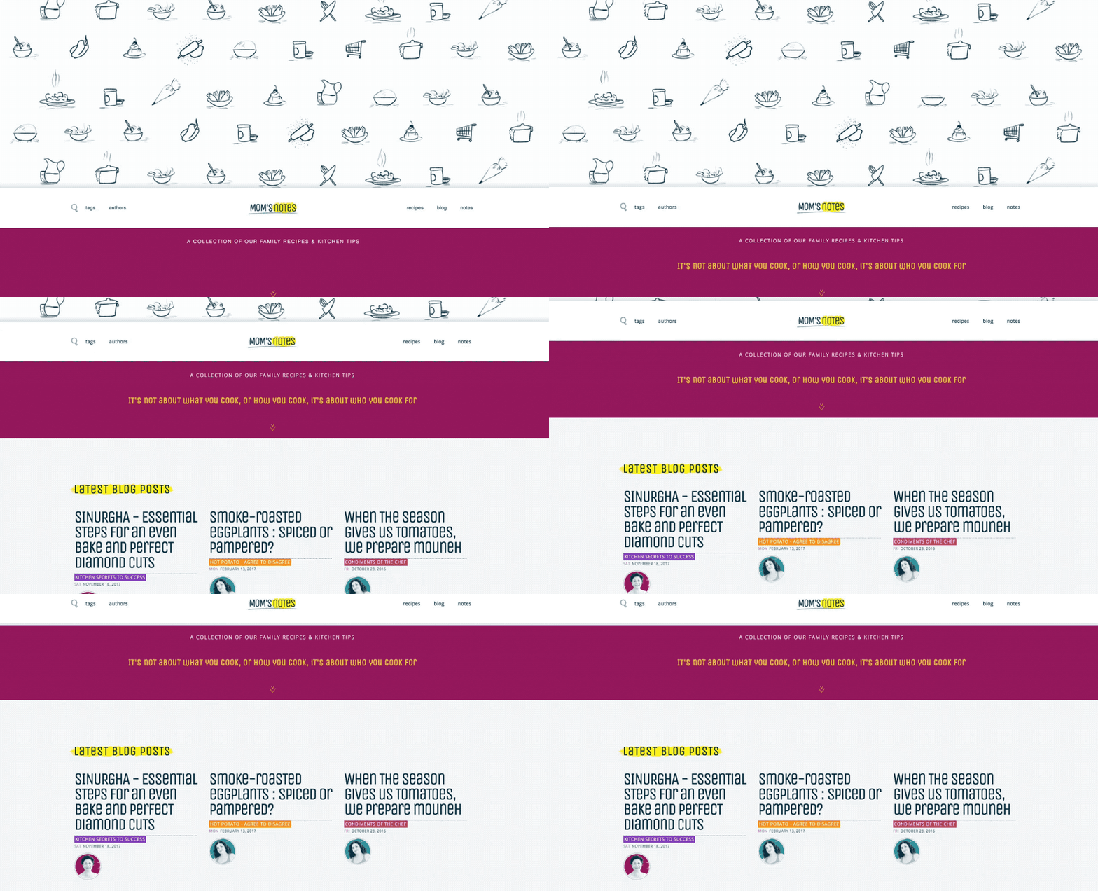
Choosing just one of Anna’s many impressive Webflow projects to showcase was an honest feat. After much deliberation, I chose Mom's Notes — a beautiful collection of family recipes and kitchen tips.
What inspired you to build Mom’s Notes?
“I always wanted to collect my mom's recipes and kitchen tips into a book. When I started to design websites, I decided to create a place online where she can share her recipes and where we, her children, can share our kitchen diaries. After years of research and gathering recipes, (and after a couple of website designs) my sister and I used our design skills to create Mom's Notes.”
What are you most proud of?
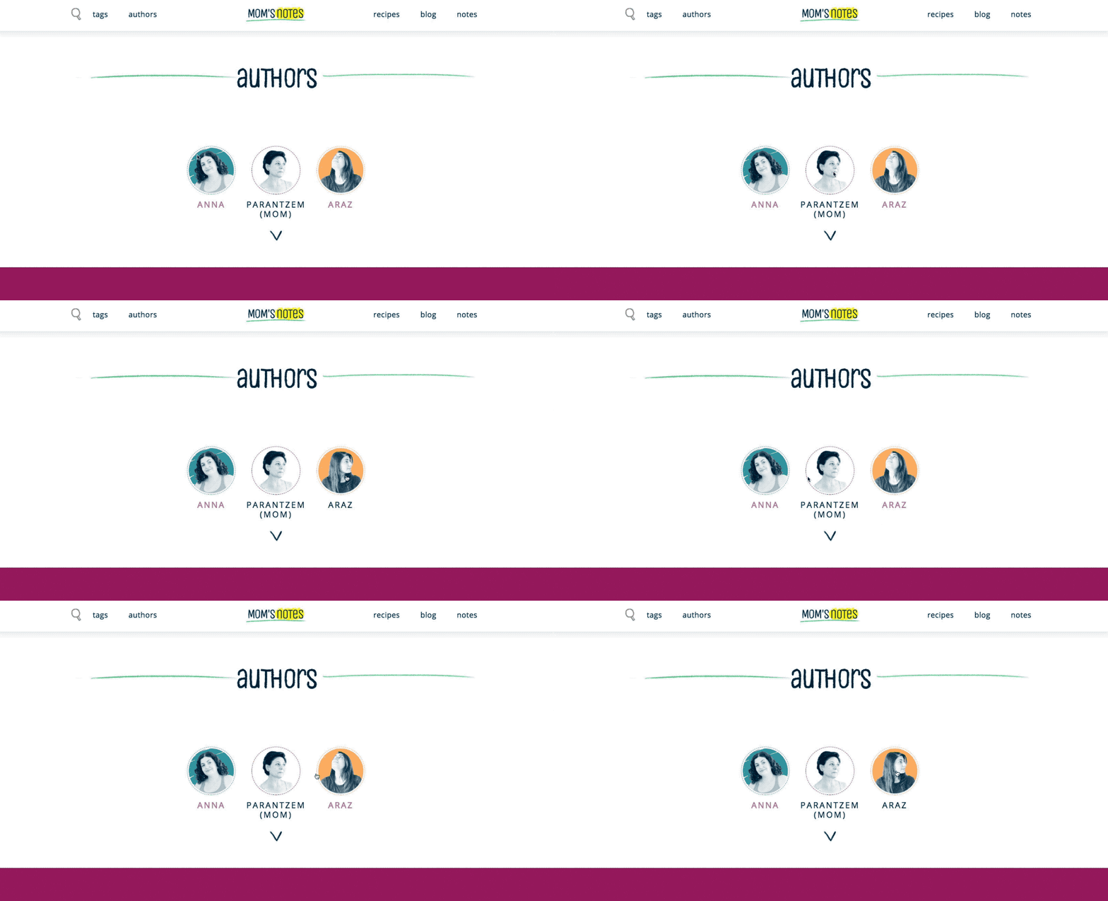
“The animated images on the Authors’ page! And just the whole project in general. Bon appétit to everyone!"
3. Manhattan, Kansas Live Weather: A live weather tracker
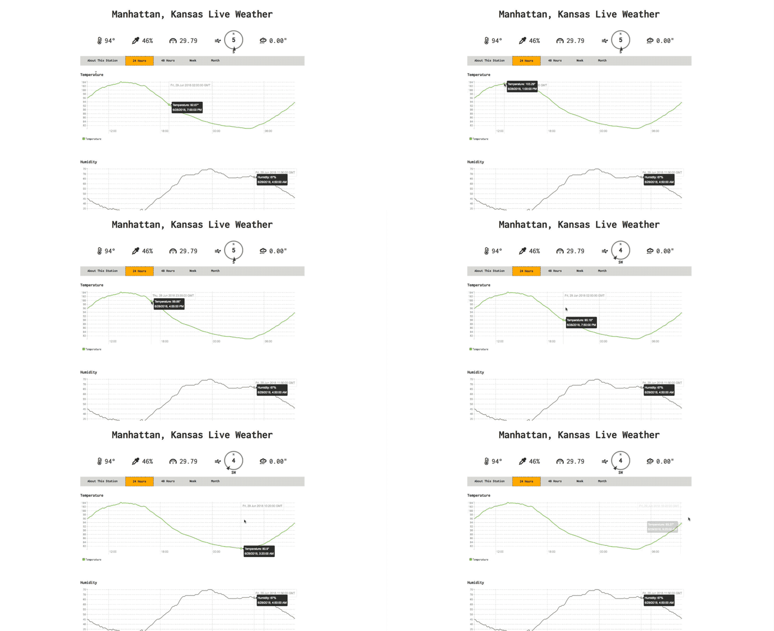
Chris Snell — or “Snelly”, as he’s known around here — is a very normal man who takes cold showers (truth) and, you know, builds weather stations in his backyard. So chill. Chris wrote the backend server software to gather live data from his backyard station and built a frontend that displays the data in real-time.
I don’t even live in Manhattan, Kansas, and I check this weather update more than my own — you can watch the weather update every 3 seconds!
What inspired you to build Manhattan, Kansas Live Weather?
“I love the weather and wanted to write my own software to measure it. When I started at Webflow, I taught myself how to use it by building the next version of the user interface.”
What’s your favorite part about this project?
“That it's a responsive site. It looks good on mobile or desktop and shows just the right amount of information for each platform.”
What’s next?
“My dream is to build a network of stations exchanging weather data in this way.”
4. Pixel Geek: A pixel perfect personal site

If the name Nelson Abalos Jr doesn’t ring a bell, his face certainly will. Nelson hosts the weekly Webflow Workshops and spends his days making sure every customer is especially successful.
Pixel Geek is Nelson’s personal site where he posts videos, random thoughts, and other projects he’s built in Webflow.
What inspired you to build Pixel Geek?
“I like having my own custom space on the web.”
What’s the best part of your site?
“My videos and rambles.”


Design interactions and animations without code
Build complex interactions and animations without even looking at code.
5. A Webflow component for YouTube background videos
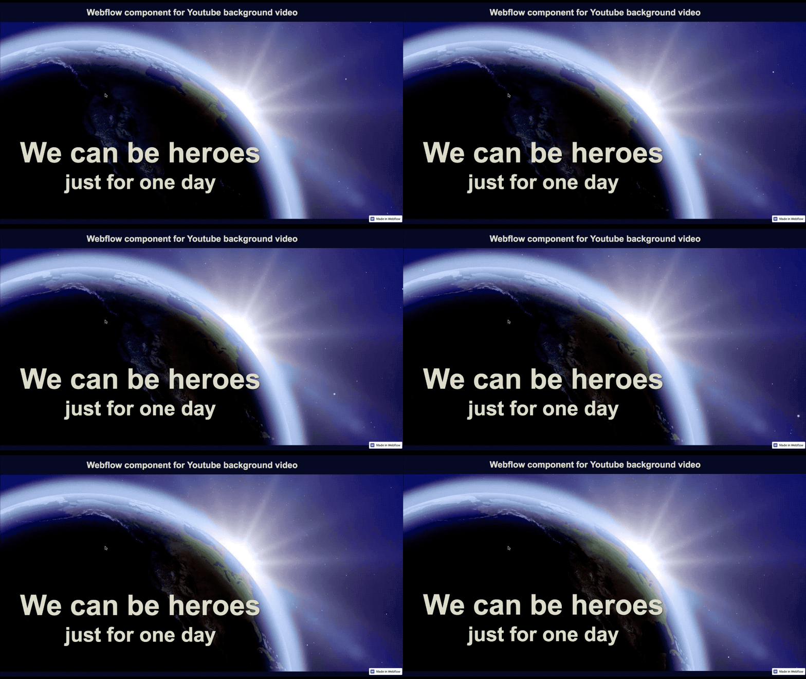
Forrest Oliphant created a Webflow component for YouTube background videos that he describes as “structure, minimal styles, and vanilla JavaScript in one copyable component.” The functionality of this component overlaps with Webflow’s background video upload, but allows for situations where it may be preferable to use a YouTube-hosted video.
What inspired you to build a Webflow component?
“I'm looking forward to people sharing and collaborating on interactive components, with scripting included. This is a test of how that flow can work: cloning the site and copying the element. I think we can make sharing components smoother, and have somewhere to share and rate individual components and component libraries.”
What’s the coolest part of this project?
“Fading back to the default background when the video is loading, paused, and looping.”
What’s next, Forrest?
“I want to experiment with simple ways for multiple components to communicate in the same page.”
Check out the showcase where you can clone it!
6. 50 States of Cheese: A map … of the mac
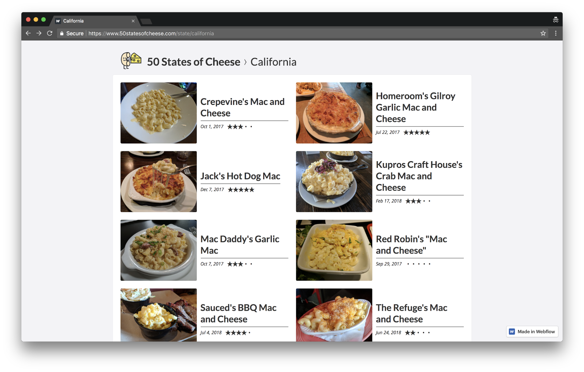
Ray and his wife, Nikki dream of travelling to all 50 states to eat mac and cheese. His blog, 50 States of Cheese, documents their progress. Ray wanted me to let you know that they haven’t made a lot of progress — yet …
What inspired you to build 50 States of Cheese?
“I thought it'd be funny to document our mac and cheese adventures. Webflow helped us take it from funny idea to domain registered and review published in about 30 min. I mean, how freaking dope is that?”
(Very dope.)
What’s the most delicious part of your project?
“All that tasty, tasty mac and cheese.”
So gouda.
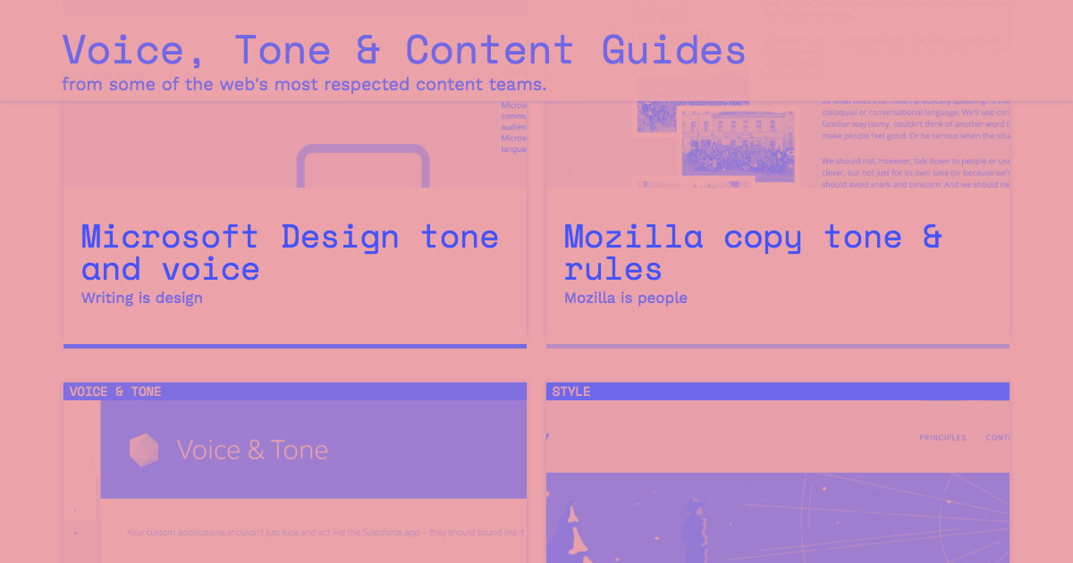
7. Voice, Tone, and Style Guides
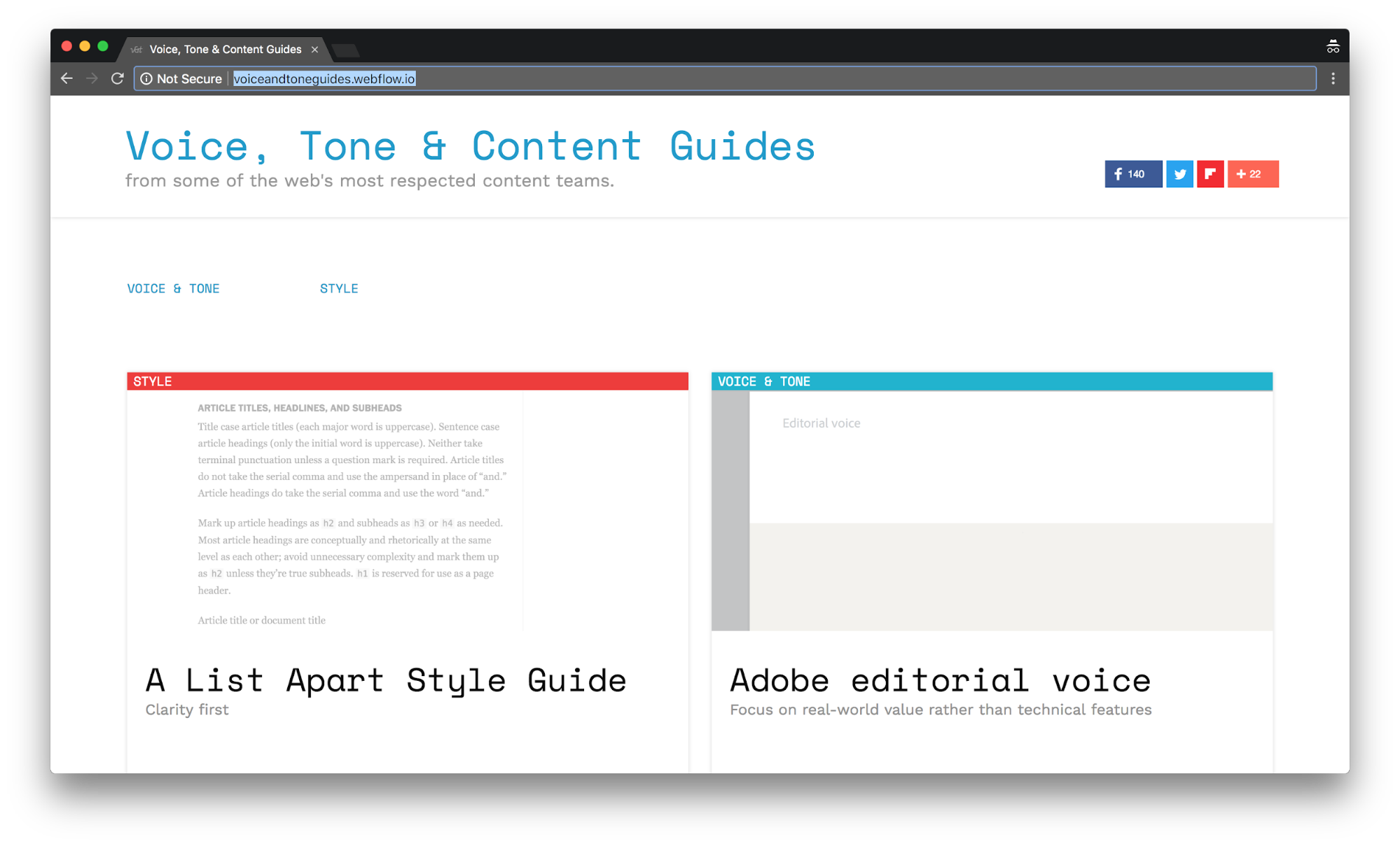
Many of you may recognize the name John Moore Williams – from his AngelList profile, of course. I kid — John is Webflow’s Head of Content and therefore the “Head of everything you read on Webflow anywhere ever. ” He’s also the man responsible for the 10+ dad jokes that get edited out of my blog posts. The irony? He’s a dad. No joke.
In all seriousness — John is one of the most talented writers I’ve had the pleasure of working with. The proof of his indisputable talent lies in the pudding of … well … everything he writes.
Dear John, what inspired you to build Voice, Tone, & Style Guides?
“When I started building Webflow's own voice and tone guide, I realized I was leaning entirely on guides I'd worked with before, namely, those at LinkedIn and Esurance. So I started looking around for other brand guides and thought others would enjoy having more examples to work from. Hence, this site.”
What are you most proud of?
“The amazing amazing content featured on the site. Some people have said nice things about the typography, too. Which is gratifying for a non-designer like me.”
8. Animated Solar Systems
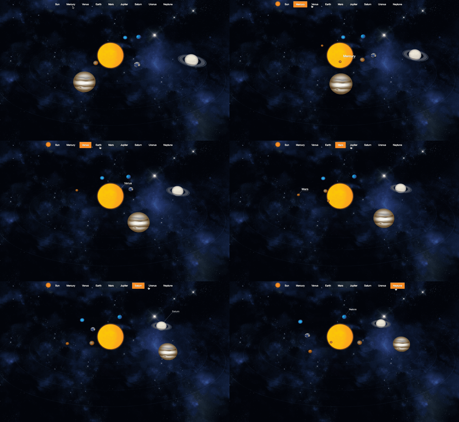
Anna’s animated solar system is another spacial site. While her son was learning about the solar system, Anna elevated the game of solar system diagrams with this site built completely in Webflow — and not a single line of custom code.
What inspired you to build the 3D Solar System?
“My 6-year-old son was asking many questions about planets — I wanted to find something interactive to show him. I came across this cool example on CodePen and decided to challenge myself to build something similar in Webflow.”
What was the most challenging part of the project?
“I built these animations in the first version of Webflow Interactions. This made it tricky to create 3D planets instead of simple 2D circles. I’m sure this would be a breeze with the new Interactions.”
9. Discotyme: A fresh music blogs
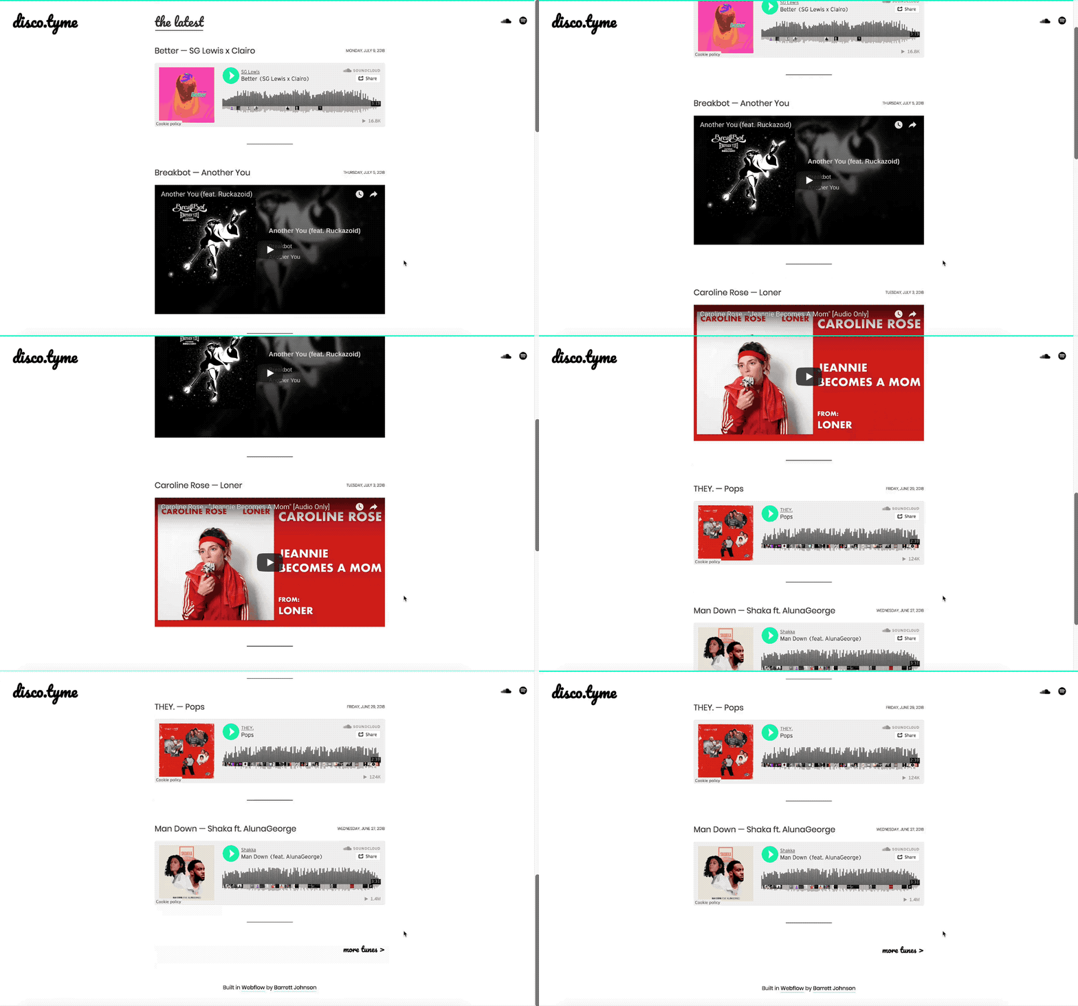
Barrett has earned the unofficial title of Office DJ due to his strong, SFW (safe for work) taste in music and dedication to hijacking the office Alexa before anyone else has a chance.
Here’s what DJ BrJ had to say about this soulful side project:
What inspired you to build your music blog?
“I started a previous version on WordPress right out of college as a fun side project — it was also my first website. After a few years, it got hacked and I lost all the content. By then, I was working at Webflow and my peers had been shaming me* to migrate the site for months. I finally started it fresh with Webflow.”
What do you love most about this project?
“As a side project, I enjoy how unambitious it is — it’s literally just like: here are my favorite songs at the moment and links to find more. Building it in Webflow allowed me to keep the design very simple.”
*Not an official endorsement of peer-shaming of those who build with WordPress.
Watch for more from Team Webflow!
In addition to loving food, and apparently space, our team shares a shyness around projects that aren’t ... well ... perfect. There are plenty of exciting Webflow projects in the works that I can’t wait to brag about.
Did these projects move you (to the moon, of course), make you hungry, make you laugh, or inspire a new project of your own? Let us know in the comments.




.png)

