Graphic design is an art that encompasses a range of techniques and styles. To be successful in this field, you’ll need to experiment to discover what makes your work stand out.
Because this is a competitive field, exploring a variety of styles is a great way to carve out a space for yourself. Designers often challenge or revamp old styles, experiment with new tools, and flow with (or against) broader design trends for 2025. Different approaches to typographic design, color, and layout further underscore the versatility and creativity that graphic design offers, making it a dynamic field for those willing to push boundaries and try new things.
Defining your identity in such a diverse field is challenging, but exploring foundational graphic design styles, their history, and aesthetic characteristics can help you forge your own distinct creative path.
What are graphic design styles?
Graphic design styles are distinct approaches that define how designers use color, typography, and layout to create cohesive visuals. Whether you prefer sleek minimalism or daring maximalism, these styles shape the look and feel of your work.
Now let’s explore 10 key graphic design styles that have shaped the creative world.
10 key graphic design styles
Here’s a collection of 10 fundamental graphic design styles that laid the foundation for graphic design as we know it today. We’ll briefly discuss the design principles of each style, then look at one example of each.
1. Minimalism
Minimalism is all about reducing design to its essential elements, focusing on clarity and simplicity. It emerged in Western art and architecture in the early 1960s as a response to ornate, decorative styles from previous decades.
By stripping away everything but what's absolutely necessary, minimalist designers aim to communicate messages with efficiency and aesthetic impact. Neutral or pastel color palettes, ample white space, and clean typography often define this style.
- Simple layouts with few distractions
- Neutral or pastel color palettes
- Generous use of negative space (the empty or blank areas in a design)
- Light sans serif fonts for optimal readability

Designer Mike Ouellette employs minimalist design in The Maker Makes, a food blog stripped down to a gray color palette, line drawings, and abundant negative space. This clean approach showcases fresh, natural food elements.
Key takeaway: Minimalism delivers clarity by focusing on only what's essential.
2. Maximalism
Maximalism is all about visual impact, guided by a “less is a bore” and “more is more” mentality. It emerged as a vivid counterpoint to minimalism, thriving on bold color palettes, exaggerated elements, and daring type choices.
Designers who embrace maximalism have ample creative freedom, but balancing it with readability is crucial. Vibrant, layered visuals can quickly overwhelm users if accessibility isn't top of mind.
- Bold, contrasting color choices
- Exaggerated design elements and typefaces
- Frequent use of abstract visuals
This style is gaining popularity among web designers who want layouts that make a show-stopping first impression and leave a lasting memory.

Designer Eloy Be infuses bold color schemes and playful interactions in Paradam Studios. The site’s vivid animations and contrasting backgrounds draw attention to their portfolio while ensuring text stands out through heavy contrast.
Key takeaway: Maximalism embraces more elements for a striking, memorable visual statement.
3. Art Deco
Art Deco is known for bold lines, rich colors, and detailed decorative elements that exude luxury and opulence. It first appeared in 1920s Paris, reacting to the softer, nature-inspired motifs of Art Nouveau.
Triangles, starbursts, and chevron patterns evoke theatrical ambiance, often referencing stage lights and grand architecture. Typography features curves, sharp angles, and strong strokes for an elegant look.
- Geometric shapes and symmetrical patterns
- Rich color contrasts for a lavish look
- Decorative flourishes reminiscent of stage and screen
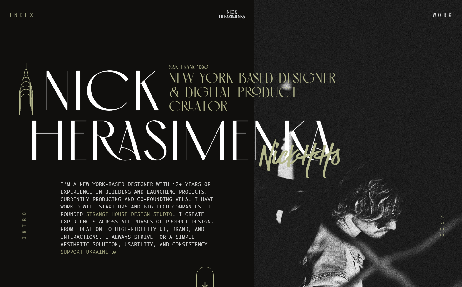
Product designer Nick Herasimenka mixes Art Deco flair with modern design by featuring an iconic line drawing of the Empire State Building. The bold color choice evokes the drama of classic stage lights, delivering a stylish, contemporary portfolio.
Key takeaway: Art Deco adds a sense of grandeur and boldness, celebrating ornamental design.
4. Geometric
Geometric design centers on shapes like triangles, circles, and squares to create order and harmony. Its roots tie back to the Bauhaus movement of post-WWI Germany and the function-led Swiss style, emphasizing clean lines and clear communication.
By using bright colors, sans-serif typefaces, and balanced compositions, geometric designs achieve both clarity and artistic expression, allowing for a wide range of possibilities in any layout.
- Use of basic shapes: circles, squares, triangles
- Bright, often primary-based color schemes
- Strong grid-based layouts

Graphic designer Ritesh Raj showcases geometric illustrations of animals that highlight streamlined curves and bold colors. The simple palette and shape-driven approach capture the form of each animal with striking clarity.
Key takeaway: Geometric design blends simplicity and precision to communicate ideas clearly.
5. Flat
Flat design focuses on two-dimensional visuals, steering clear of textures and drop shadows that mimic real-world objects. It gained momentum in the early 2010swhen brands like Microsoft, Apple, and Instagram shifted away from skeuomorphism (a design style that imitates real-world objects).
Google's material design introduced a middle-ground approach, adding subtle layers and depth, while neumorphism further experiments with combining 3D effects and flat design.Overall, this style emphasizes function and simplicity.
- Two-dimensional icons and graphics
- Minimal or no gradients
- Clean, straightforward layouts
This modern style also works well for logo design and infographics due to its clarity and emphasis on function over form.

Retro’s Under Construction animation is a perfect flat design example: everything is purely two-dimensional, with simple colors and shapes for a clear, playful look.
Key takeaway: Flat design strips away unnecessary decoration to maintain clarity and focus on essential elements.
6. Retro
Retro-style design taps into nostalgia by referencing visual trends from past decades like the psychedelic 60s and 70s, the grunge-heavy 80s, or the early internet of the 90s. This style appeals to specific audiences by evoking cultural memories.
Despite its vintage inspiration, retro design can be refreshed with modern tools to stay relevant. It honors past aesthetics while engaging today’s viewers in a fun, nostalgic experience.
- Heavily nostalgic color palettes
- Vintage typography and graphic elements
- Visual motifs from past cultural or technological ages
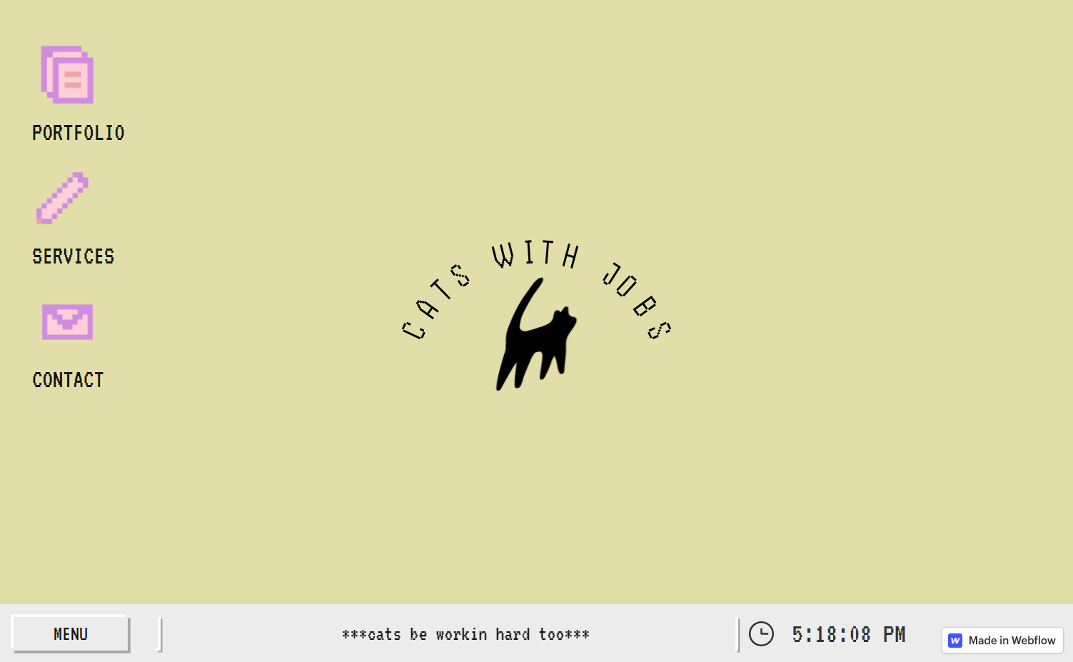
Designer KC Katalbas infuses that nostalgia in Cats With Jobs by displaying loading animations, pixelated icons, and a “shut down” menu reminiscent of 1990s computer interfaces.
Key takeaway: Retro design resonates by channeling cultural memories into modern digital experiences.
7. Corporate
Corporate design aligns with a company's brand identity, emphasizing professionalism and trust. It typically features clear hierarchies, conservative color palettes, and straightforward calls-to-action.
Most corporate designs stick to consistent brand guidelines, featuring simple palettes like white, black, and one or two accent colors.By projecting competence and success, companies build confidence with potential clients.
- Professional, straightforward layouts
- Consistency across branding materials
- Bold accent colors used sparingly
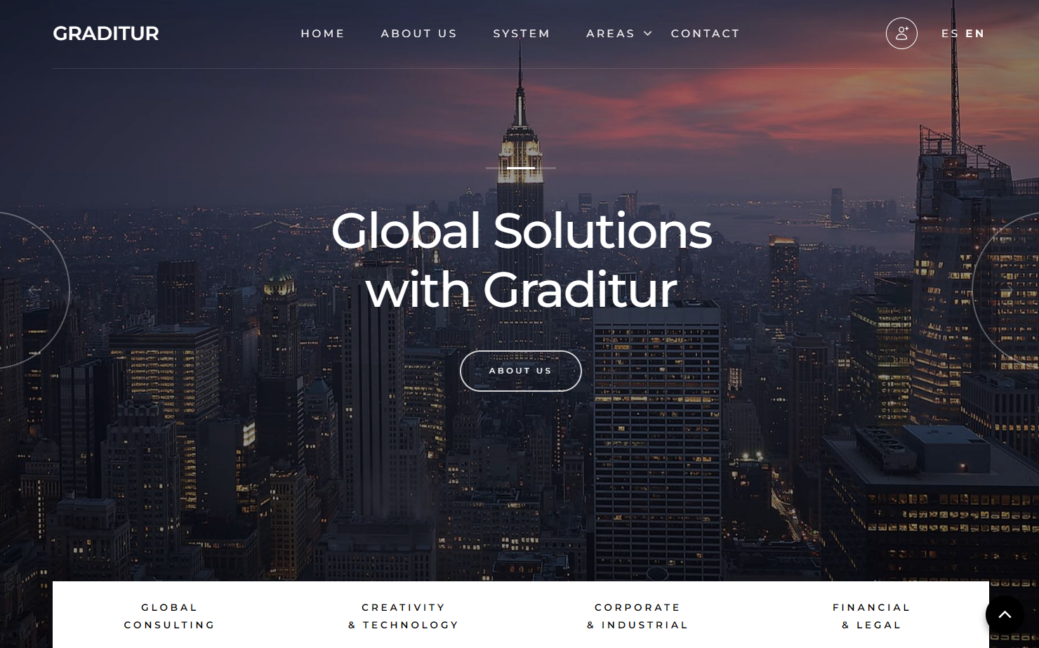
On consulting firm Graditur’s website, designer Gerson Iglesias chose a cityscape image to match the brand’s engineering and construction focus. The sans serif font communicates professionalism and competence thanks to its familiar appearance and legibility.
Key takeaway: Corporate designs showcase reliability and consistency, reflecting a company's defined brand persona.
8. Neobrutalism
Neobrutalism (or “neubrutalism”) is a modern trend inspired by 1950s brutalist architecture.It rejects refined minimalism to highlight raw, structural design elements for a stark, industrial feel.
In graphic design, neobrutalism relies on vivid color blocks, hard drop shadows, and visible gridlines. The philosophy favors substance over style, embracing a rugged authenticity that stands in contrast to smoother, more polished layouts.
- Strong color contrasts and stark backgrounds
- Visible grids and harsh drop shadows
- Brutalist, industrial-feeling typography
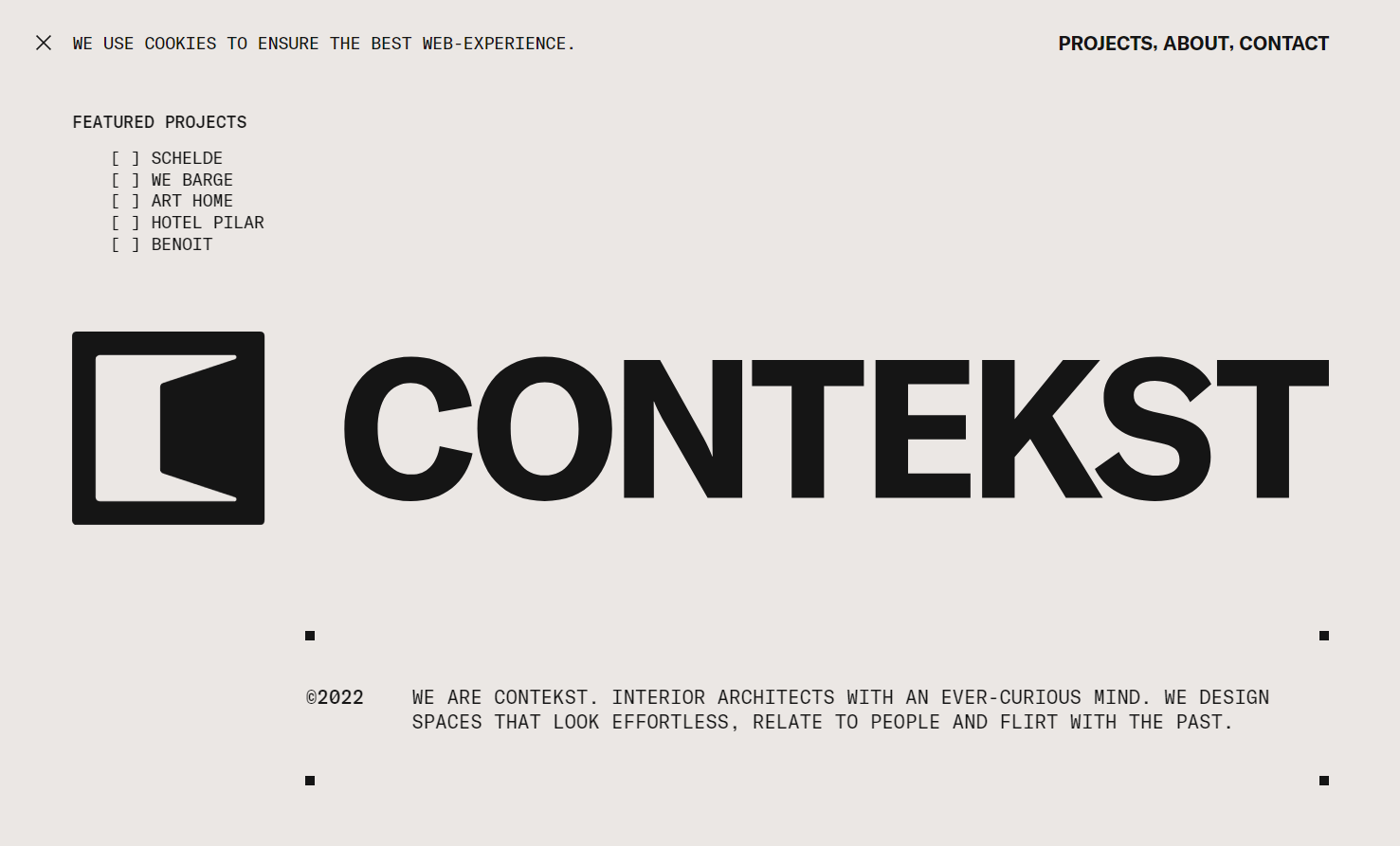
Created by Phil Bastiaans, interior architectural firm Contekst’s graphic design includes a brutalist monospace font and intentionally exposed design structures. It matches the firm’s self-description: “Creativity always trumps vanity around here.”
Key takeaway: Neobrutalism strips design down to raw fundamentals for a refreshingly bold and honest look.
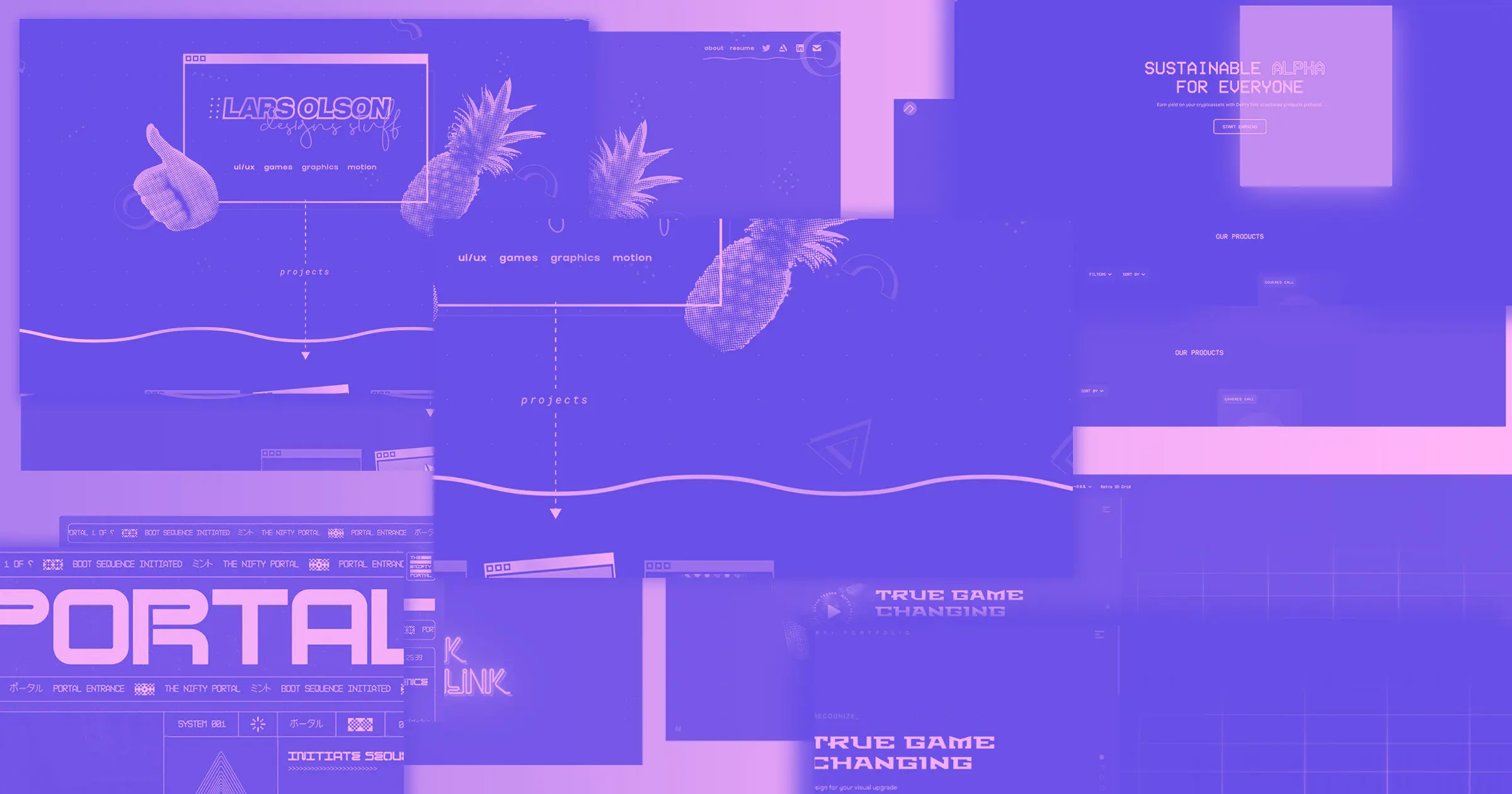
9. Media blending
Media blending mixes different visual forms — such as photography, illustration, and collage — to create multilayered, dynamic effects.By combining various platforms of visual communication, designers can introduce playful textures and leading lines into a composition.
This approach draws the viewer’s eye without overwhelming them. It often results in unique, engaging visuals that hold attention longer.
- Combines photographs, illustrations, or textures
- Layered compositions with intentional overlap
- Playful and experimental visual themes
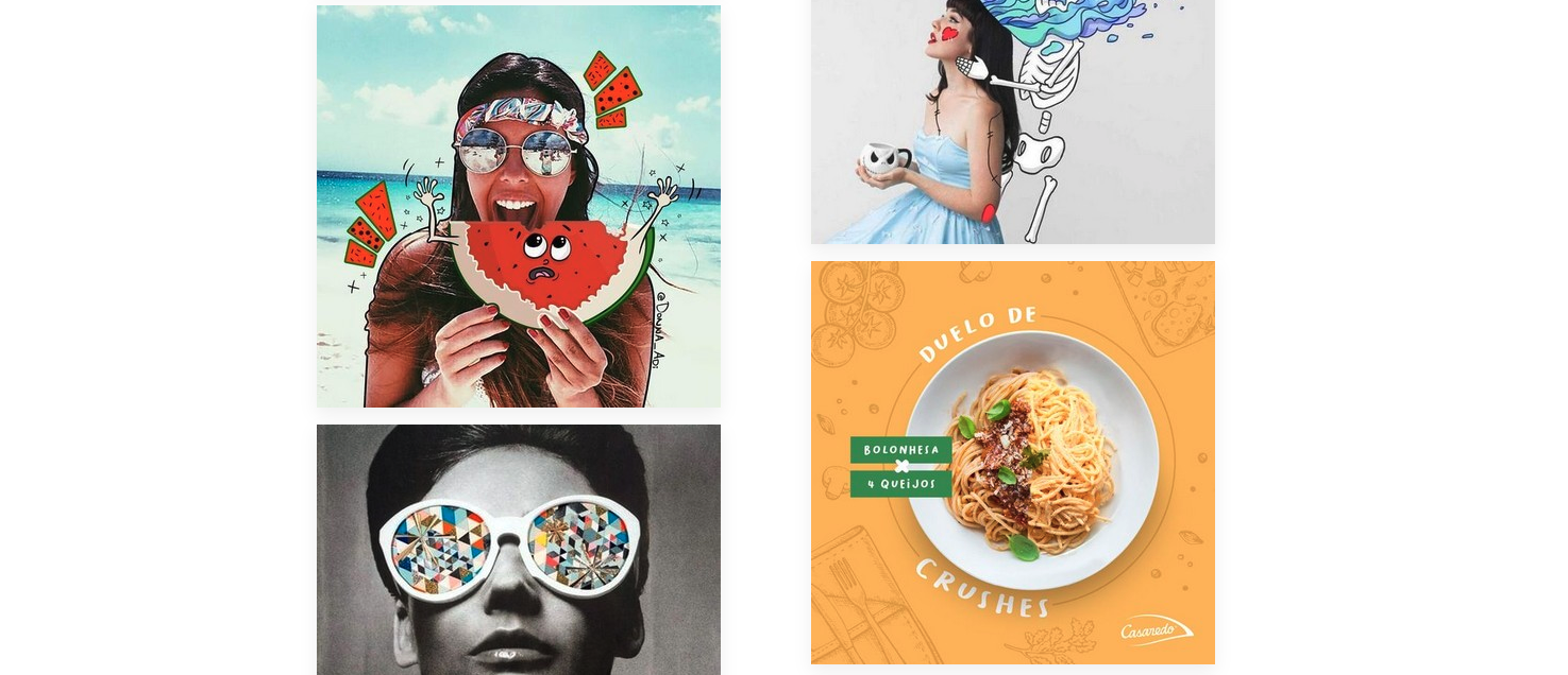
Blending illustration and photography is a common media-blending tactic, creating unique visuals that stand out in portfolios, ads, or social media campaigns.
Key takeaway: Media blending fuses diverse elements into a cohesive narrative, adding depth and intrigue.
10. Interactive media design
Interactive media design elevates traditional graphic design by using technology-driven elements like scroll animations, hover effects, and transitions. Instead of passively viewing, visitors actively engage with on-screen features.
Though it's more of a medium than a strict style, interactive media design merges visual appeal, UX principles, and storytelling. This approach guides users through a digital journey that's immersive and memorable.
- Dynamic scroll-based or hover animations
- Focus on user engagement and feedback
- Combines visual design with interactive technology
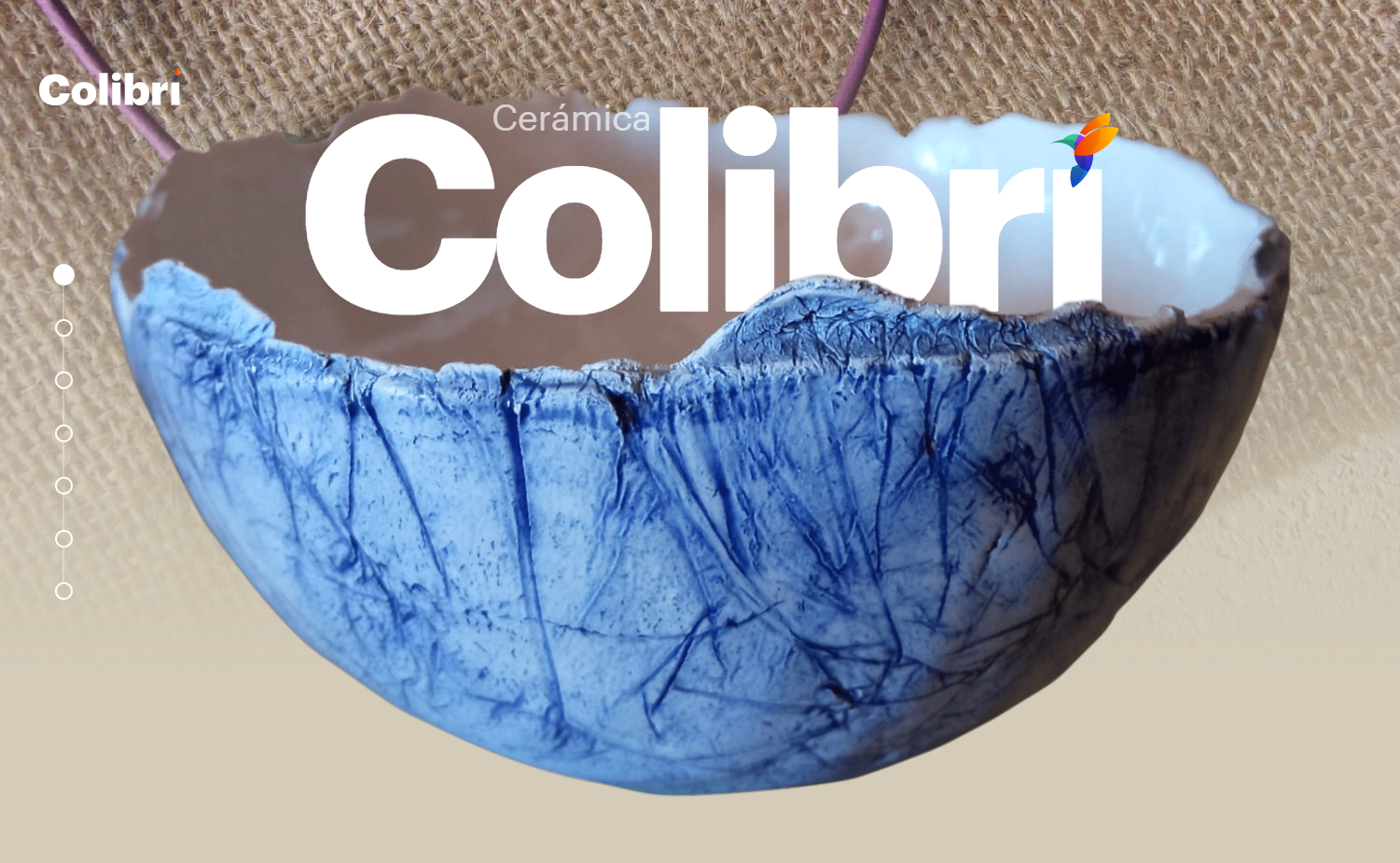
Designer Sergio Martos showcases interactive design in Cerámica Colibrí by animating text and graphics as visitors scroll, creating an engaging narrative around the artist's ceramic work.
Key takeaway: Interactive media design transforms passive viewing into a fully engaging, user-driven experience.
While Swiss style or postmodern design aren't covered in-depth here, they’re also influential movements worth exploring for extra inspiration.
Now that we’ve looked at 10 key styles, let’s see where each one truly shines.


Build websites that get results.
Build visually, publish instantly, and scale safely and quickly — without writing a line of code. All with Webflow's website experience platform.
Where each style works best
Knowing each style is just half the battle — understanding the right context for each can take your work from good to great:
- Minimalism: Great for showcasing premium products, modern portfolios, and sleek app interfaces.
- Maximalism: Perfect for creative industries, art projects, and brands seeking a bold, unforgettable look.
- Art Deco: Ideal for luxury or upscale brands, especially in fashion, architecture, or event design.
- Geometric: Works well in tech, startups, or educational materials where clarity and structure are key.
- Flat: Best for UI design, apps, and infographics that need quick readability and a modern feel.
- Retro: Resonates with brands aiming for nostalgic appeal or targeting audiences who appreciate vintage looks.
- Corporate: Suited to businesses that value professionalism, consistency, and brand authority.
- Neobrutalism: At home with edgy, disruptive brands or artistic projects that embrace raw authenticity.
- Media blending: Great for creative fields, portfolio sites, and campaigns that need a playful, layered feel.
- Interactive media design: Best for immersive websites, promotional campaigns, and storytelling-driven experiences.
With this understanding of which styles excel in certain contexts, you’re ready to refine your own design approach.
Pro tips for choosing a design style that fits you
Looking over these 10 styles, you’re bound to feel drawn to some more than others. That initial intuition is your first clue. Take a deeper dive into styles that resonate by asking yourself:
- Which themes or patterns recur in my past work?
- What design styles best appeal to the clients I want to attract?
- What’s my target industry or audience, and what styles dominate there?
- How can my style stand out from other designers in this field?
Once you’ve narrowed it down to two or three styles, experiment freely or blend them for a unique look. Combine techniques from designers you admire, and draw inspiration from everywhere — family, friends, natural and urban environments, art, and music.
To keep evolving, explore relevant graphic design blogs or other resources. Inspiration isn’t limited to the design world alone — fresh ideas can come from unexpected places.
Finally, every client project is a dialogue between your style and the client’s specific requests. Stay flexible and open to collaboration — each job will present new challenges and ways to grow.
Looking for more inspiration? Explore popular variations of graphic design in Made in Webflow for more ways to refine your style.
Show off your designs in style
Once you’ve created various designs that showcase your style, publish an online portfolio to share your work with others and attract new clients.
Whether you build your portfolio from the ground up or streamline the process with a portfolio website template, Webflow gives you powerful creative control and extensive customization options to bring your vision to life. It’s about shaping a unique experience that sets you apart — exactly where your work deserves to be.
Launch with Webflow Templates
Choose from hundreds of professionally designed website templates for any industry or style. Customize visually, launch instantly — no coding required.