Whether you’re looking to delve into another world or keep it clean and simple, this month’s projects are sure to intrigue you.
Check out what the Webflow community’s been up to.
Immersive experiences
Creative design can make site visitors feel like they’re being pulled into another world. Dive into these websites to experience a new place.
Design Made Cool
Chinmay Choudhury’s portfolio Design Made Cool promises “truly immersive and memorable web experiences” right on the homepage. Once you start scrolling, you’ll get a taste of what that means.
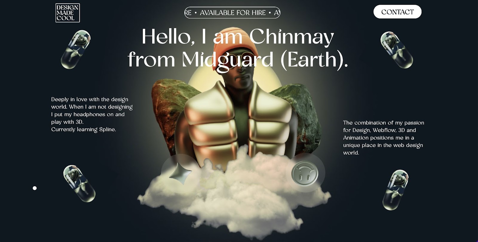
Chinmay keeps you guessing with a mix of vertical and horizontal scroll-activated interactions. Animations, 3D elements and other-worldly graphics provide a peek into Chinmay’s mind while also showing off impressive design skills.
BelArosa Chalet
The BelArosa Chalet experience starts on the website. Rather than describe the posh accommodations, this site draws you in with a series of illustrations and scroll-activated animations.

You’re treated to an illustrated view of the mountains from the infinity sky pool, a cozy room warmed by a fire, a steam room oasis, and more. The entire homepage seems to mimic a storybook, telling a tale of luxury and relaxation.
Alba
Canada-based consulting firm, Alba, opens their site with an animated cartoon of a person walking two happy dogs. These black and white illustrations (and the peppy pups) follow you throughout the website.
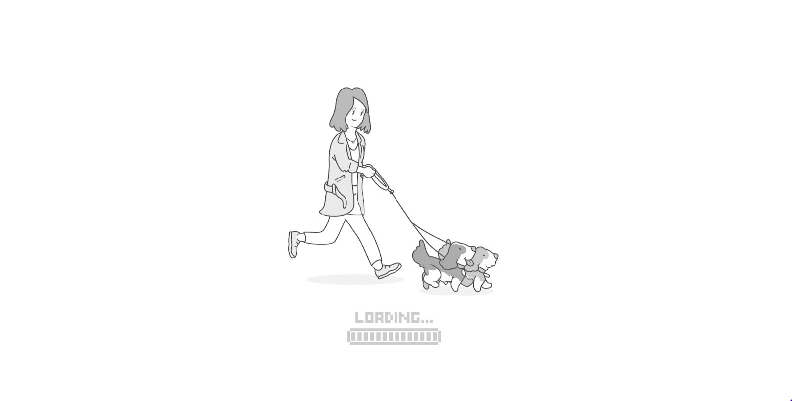
As you scroll, the view point shifts to bring you up to a building, through an office window, then back outside to a park before finishing in outer space. Alba’s site does a great job of keeping you immersed in the cartoon world. Key phrases and call to action buttons appear in color, helping them stand out amongst the grayscale illustrations.
One page wonders
Simple structure does not mean boring design. These projects pack a lot of information and clever design into a single page website.
Diego
Brand designer and Webflow developer Diego immediately encourages visitors to explore their one page portfolio with a squiggly arrow prompting you to scroll.
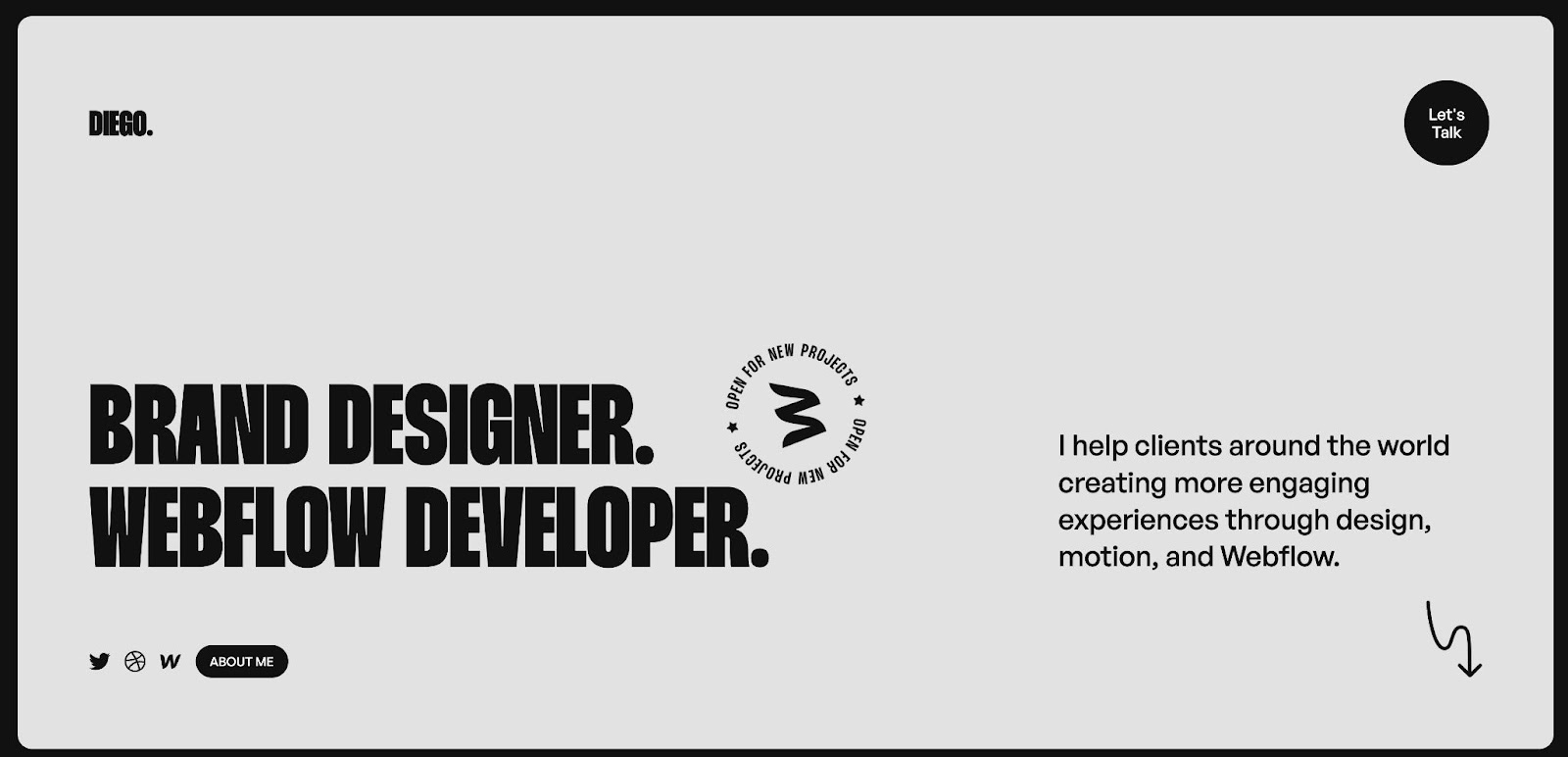
Colorful cards shuffle into place as you move through Diego’s portfolio. After several project highlights, you arrive at a straightforward summary of who Diego is next to a slider containing various testimonials. This straightforward website packs a lot of information in a clean and simple layout.
Webtimise
Youness Bennamou announces his speciality as a creative Webflow developer with large, white text that takes up the opening page of this single page site, Webtimise.
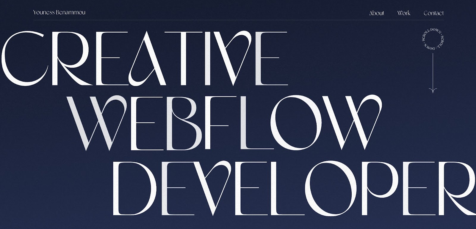
To explore Youness’s site, you can either scroll through or click on any of the menu items in the top navigation bar to skip to the associated section. Images move into place with a wave effect reminiscent of a flag moving in the wind. Youness also added a fun cursor effect with emoji eyes appearing whenever the cursor hovers over a clickable image.
The Minimalists (cloneable)
True to its name, The Minimalists project keeps it simple with four colored rectangles and a logo in the center of the homepage.
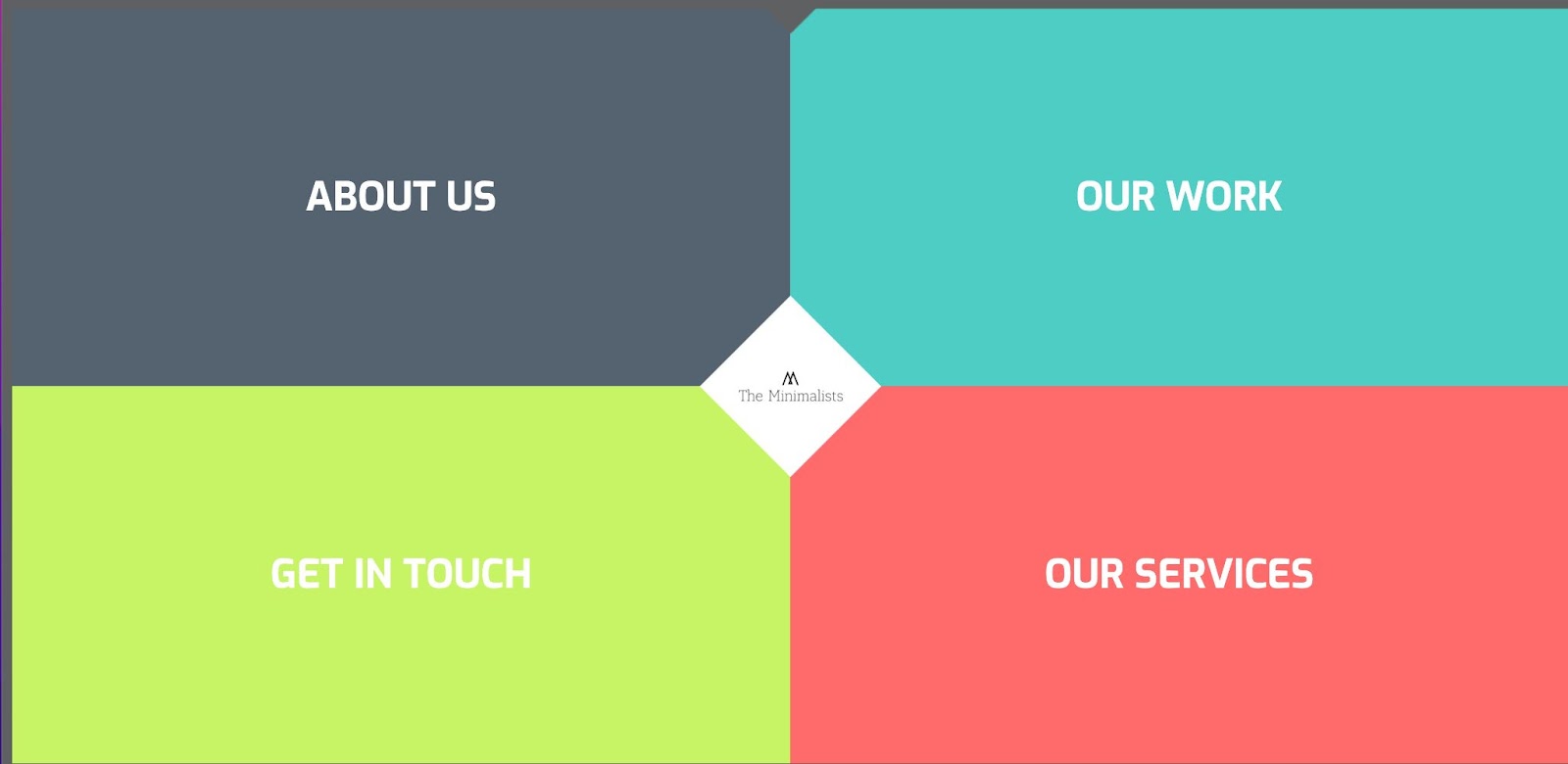
Unlike many other one page websites, The Minimalists does not require scrolling to explore different sections. When you click on a section, a card shuffles into place, filling the page with the relevant information. The clean layout and intuitive navigation make this an ideal cloneable for straightforward sites with minimal content.


Get started for free
Create custom, scalable websites — without writing code. Start building in Webflow.
Customizable views
Each of these projects provides some cool customization options that allow site visitors to adjust aspects of the website to their liking.
King Bee Creative
The King Bee Creative homepage allows visitors to select both their preferred color and dominant hand.

Color Mode allows you to choose between classic dark mode and a lighter color scheme, “Café.” Dominant Hand caters to mobile accessibility by allowing users to move the hamburger menu and associated links to the left side of the screen — ideal for left handed users on mobile devices.
Changing the logo color on scroll (cloneable)
This fun cloneable project keeps the logo text stuck at the top of the page, changing colors as you scroll down.
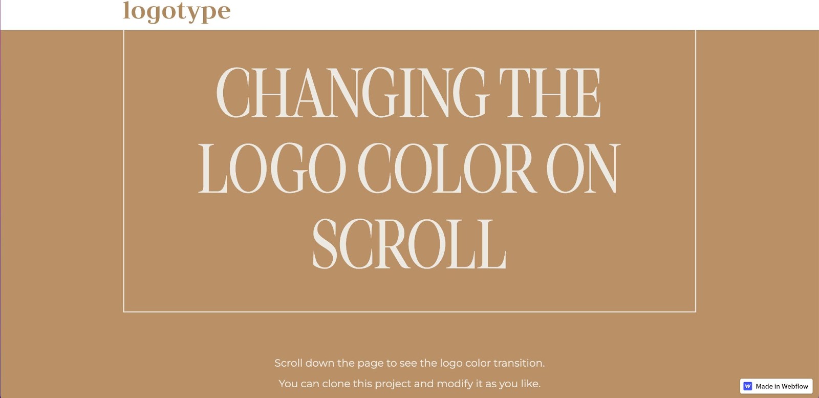
Once you clone the project, you can modify the logo and select the colors that the animation will cycle through.
Spooker Design
Vladmir Mabille’s website, Spooker Design, includes 5 different color options that you can click through on the left side of the homepage.
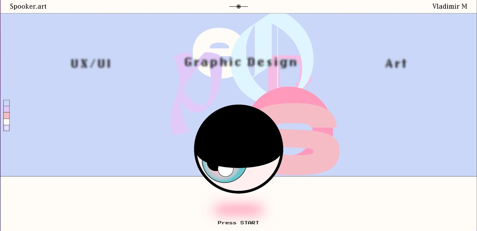
After you select your preferred background color, you can also play around with Vladmir’s hobby wall by dragging letters onto the illustrated whiteboard. These small, playful touches fit right in with Spooker Designs’ artsy, early-internet aesthetic while also showcasing Vladamir’s design skills.
Submit your creations to Made in Webflow
Every month we select a few projects to feature on the blog, so make sure you are submitting your awesome projects to Made in Webflow — we can’t wait to see what you create!


