Spring into these fresh projects that show off a range of design styles.
This month we’re highlighting projects that demonstrate strong visual branding, fun interactions, and narrative-focused navigation.
Personalized portfolios
Explore three portfolios that show off the creators’ unique styles.
Oscar Dykeman
Photosensitivity warning: flashing on load.
Oscar Dykeman’s portfolio gives off cyberpunk vibes with glitch effects, intense color contrasts, and an edgy look.
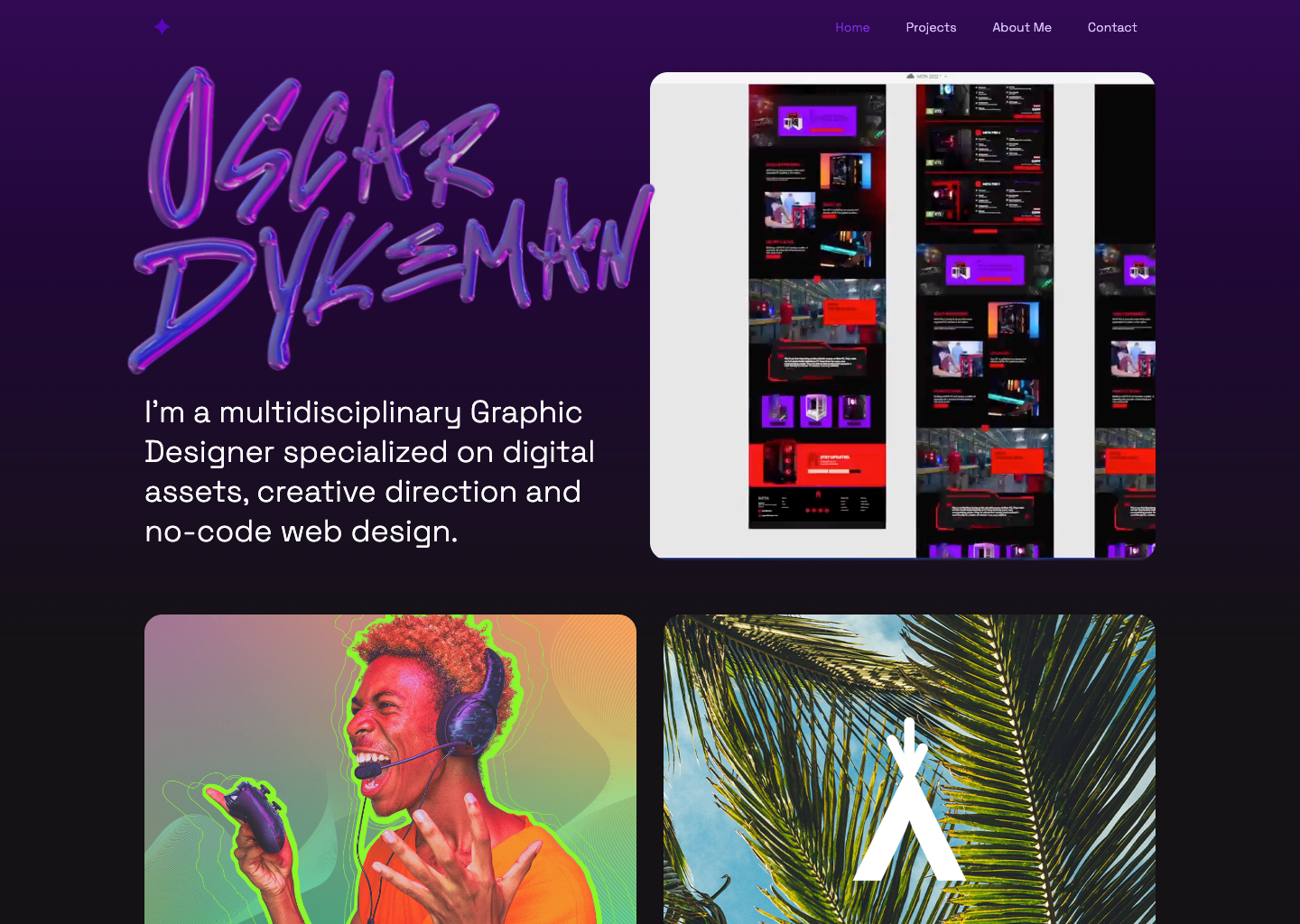
Oscar’s name appears in graffiti font balloon letters that move in response to your cursor. Previews of various projects appear as you scroll down the page, with project names appearing upon hover. Each project page includes a summary of the work alongside a quick list of the Oscar’s responsibilities such as photo composition, product 3D rendering, photo retouching, graphic design, creative direction, packaging, etc. This organization makes it simple for potential clients to quickly review Oscar’s skills, style, and results.
Pedro Matas Chaves
Pedro Matas Chaves opens his portfolio with a straightforward headline, “Multidisciplinary designer focusing on branding and digital media” and key information like his years of experience and work availability above the fold.
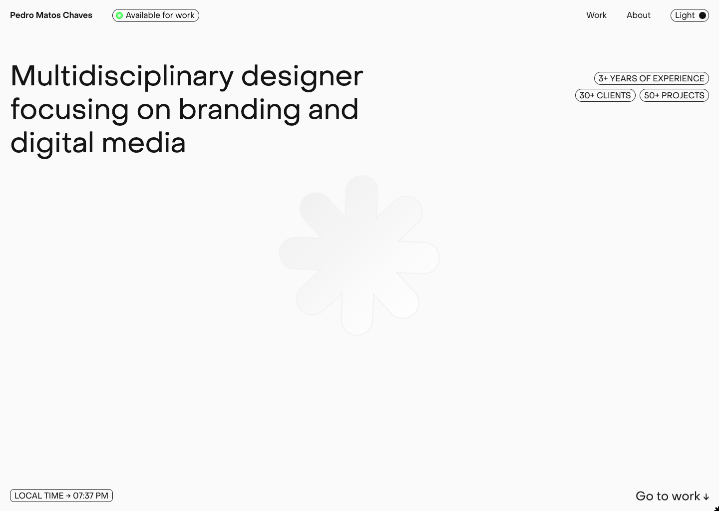
Pedro provides a clear overview of who he is and what he does right away, then encourages you to check out his work by scrolling down. To keep things fresh, he includes a few featured projects in a photo carousel. Underneath the photos, you’ll see an archive of past projects with tags like visual identity and UX/UI.
Esmeralda Studios
Enkhmaa of Esmeralda Studios adds touches of her personality with a logo made up of purple plants and an animated hand waving a peace sign on her homepage.
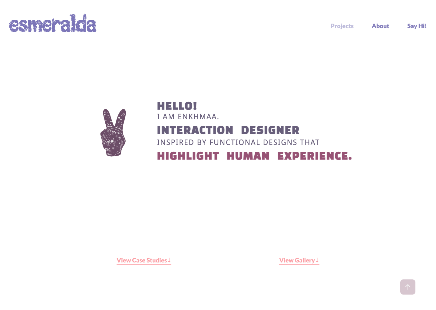
Enkhmaa breaks her work examples into two categories: gallery and case studies. Her gallery is a visual exploration of her style, without descriptions. Case studies, on the other hand, include a summary and table of contents that covers key areas like brand overview, project overview, style guide, brand mockup, UX research, UI designs, and demo videos. Organizing information in this way allows potential clients to get as much information as they desire by either reading straight through or skipping to certain sections.
Interactive cloneables
Experiment with these interactive cloneables to add cool and engaging elements to your next design.
Synth audio with playable keyboard
Design studio Roem created a cloneable synth keyboard with DuoSynth sounds that can be played with either your mouse or (computer) keyboard.
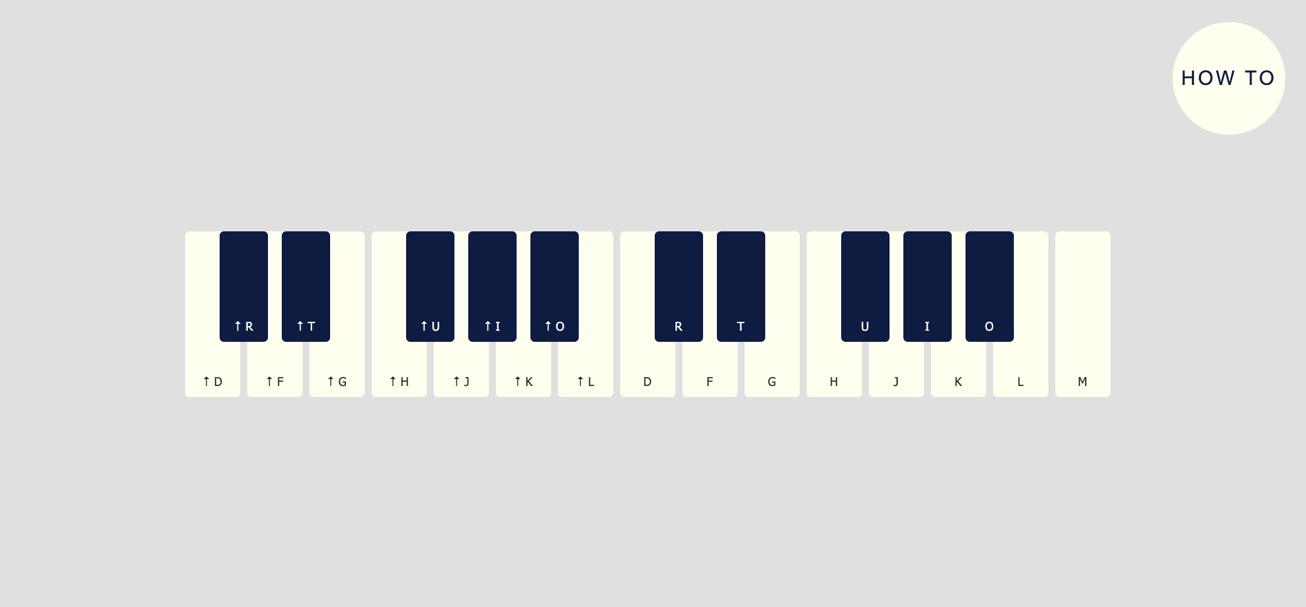
The minimal keyboard is fun to play with on it’s own, but Roem also includes an explanation for how to incorporate the keyboard into your own projects.
Cursor cut-off with background video
Eloy Be’s cut-off cursor effect project shows a window circle animated using native Webflow interactions to follow the mouse through the viewport.
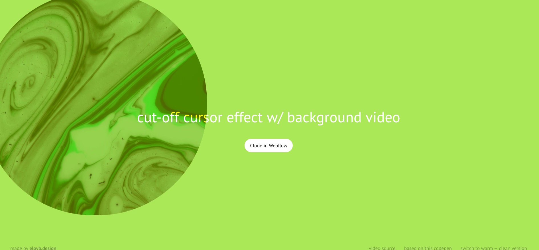
Using CSS3 blending modes, Eloy made the background visible through the window — as if you are looking through a moving portal — and displayed a mesmerizing video of green, marbled liquid. You can also switch to “warm” to change to a red color scheme.
3D Spiral Portfolio
Take the 3D spiral portfolio for a spin to see a carousel of images move in an upwards spiral.
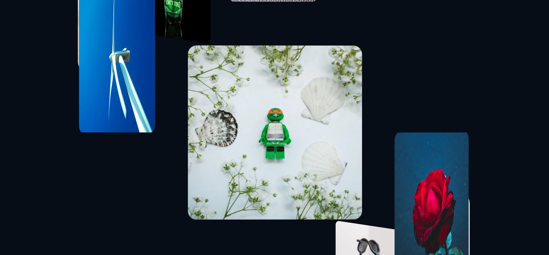
This simple but impressive interaction would work well on a portfolio site for a photographer or any other visual artist. It would also be a unique way to display various product photos.


Get started for free
Create custom, scalable websites — without writing code. Start building in Webflow.
Immersive storytelling
Take a look at a few projects that pull you in by weaving a story through design.
Fern — From dawn ‘till dusk
Navigating the website for luxury restaurant Fern feels a bit like a virtual tour that begins with a summary of the restaurant’s atmosphere followed by a large photo of the restaurant interior.
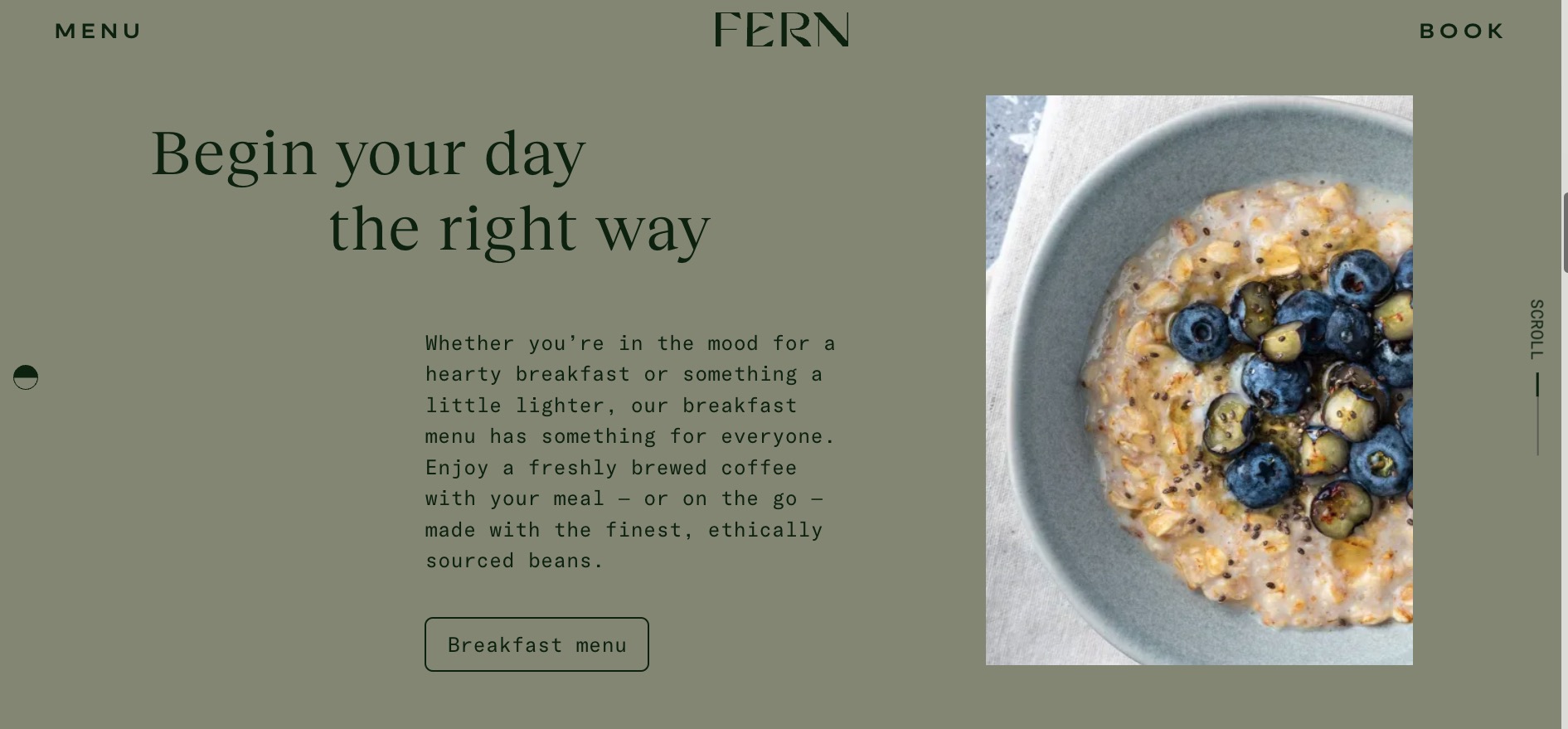
As you move down the page, you’re taken through the breakfast, all-day, and after work drink menus. The chronological order sets the scene, taking you through a day at Fern restaurant from open to close.
Full page interactive scroll animation
Ashish Kumar’s full page interactive scroll animation is a peek into a larger storytelling site project.
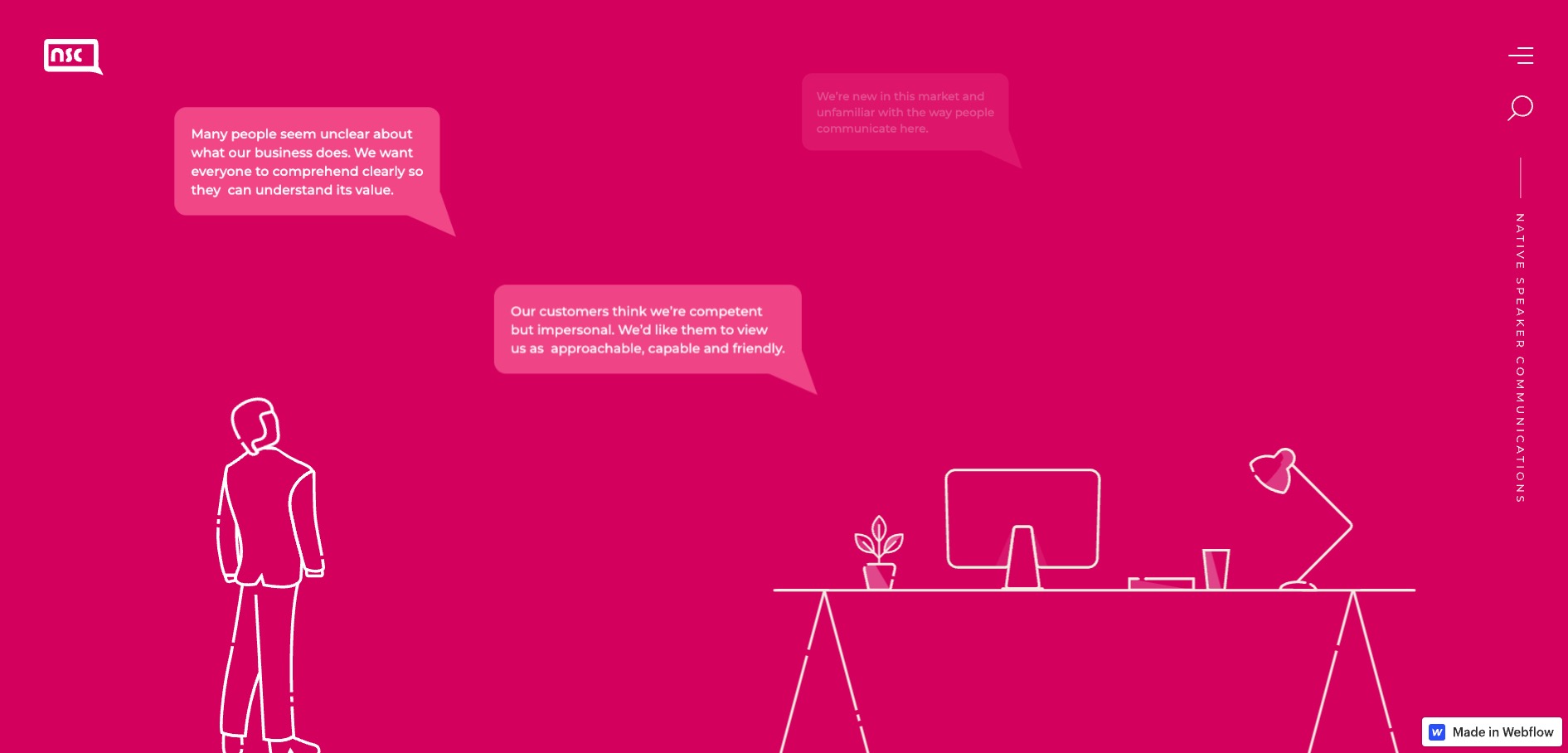
This project uses scroll-triggered interactions to make pages appear to swipe to the right or up as the background changes color. Speech bubbles also appear gradually, which projects the feeling of a conversation happening as you explore.
Finsweet-island-d3
Sean Armstrong created Finsweet-island-d3 to practice storytelling skills — and the result is a fun, illustrated site that feels like a storybook.
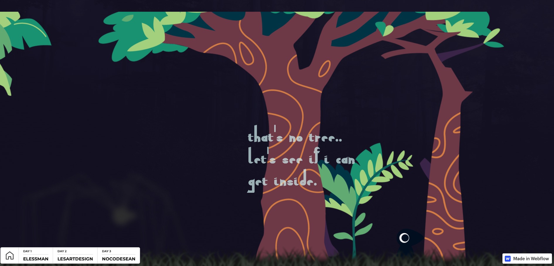
The horizontal scroll makes navigating the site feel like turning the pages of a book that moves through three chapters. You control the story movement — forwards or backwards — speed, and progression with your scroll, making this an engaging experience.
Submit your work to Made in Webflow
Whether you’ve got a full site build or some cloneable elements you’re experimenting with, the Webflow community would love to see them! Submit your work to Made in Webflow to connect with other creators and potentially be featured in next month’s round up!


