Great design doesn’t have to be flashy.
Websites don’t need to jump off the screen to keep site visitors engaged. In fact, focusing on subtle embellishments that don’t get in the way of the design is often more effective than over-the-top design.
Let’s explore a few projects that deliver an intuitive and engaging experience for visitors.
Organized ecommerce designs
Ecommerce sales rely just as much on the site design as the products themselves. Take a look at two sites that deliver a pleasant online shopping experience.
Mountain Brothers General Store
The Mountain Brothers General Store website designed by Lions Creative sets the mood with a fullscreen image of a steaming cup of coffee with a rustic farm slightly blurred in the background.
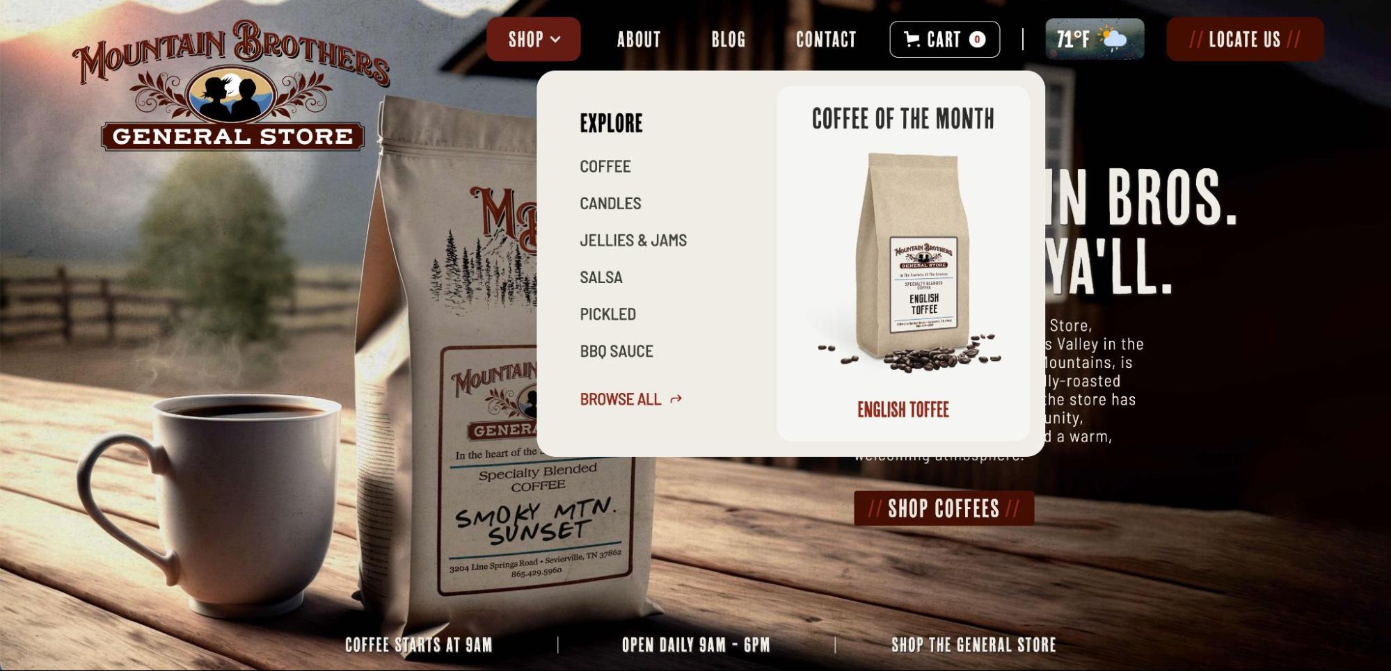
Even before scrolling, the homepage provides three direct paths to the ecommerce store — from the top navbar, a “Shop Coffees” button, and a “Shop the general store” link right above the fold. Using a dropdown menu in the navigation bar is a smart design choice as it allows visitors to jump directly to the category they’re interested in.
Each product page includes a photo, detailed description, and ingredients list. Beneath the “add to cart” button, you’ll find a few suggested products. This is a great way to promote additional items without getting in the way of a purchase.
e-Commerce website build
Everything Design’s ecommerce website for Welga is vibrant and user-friendly.
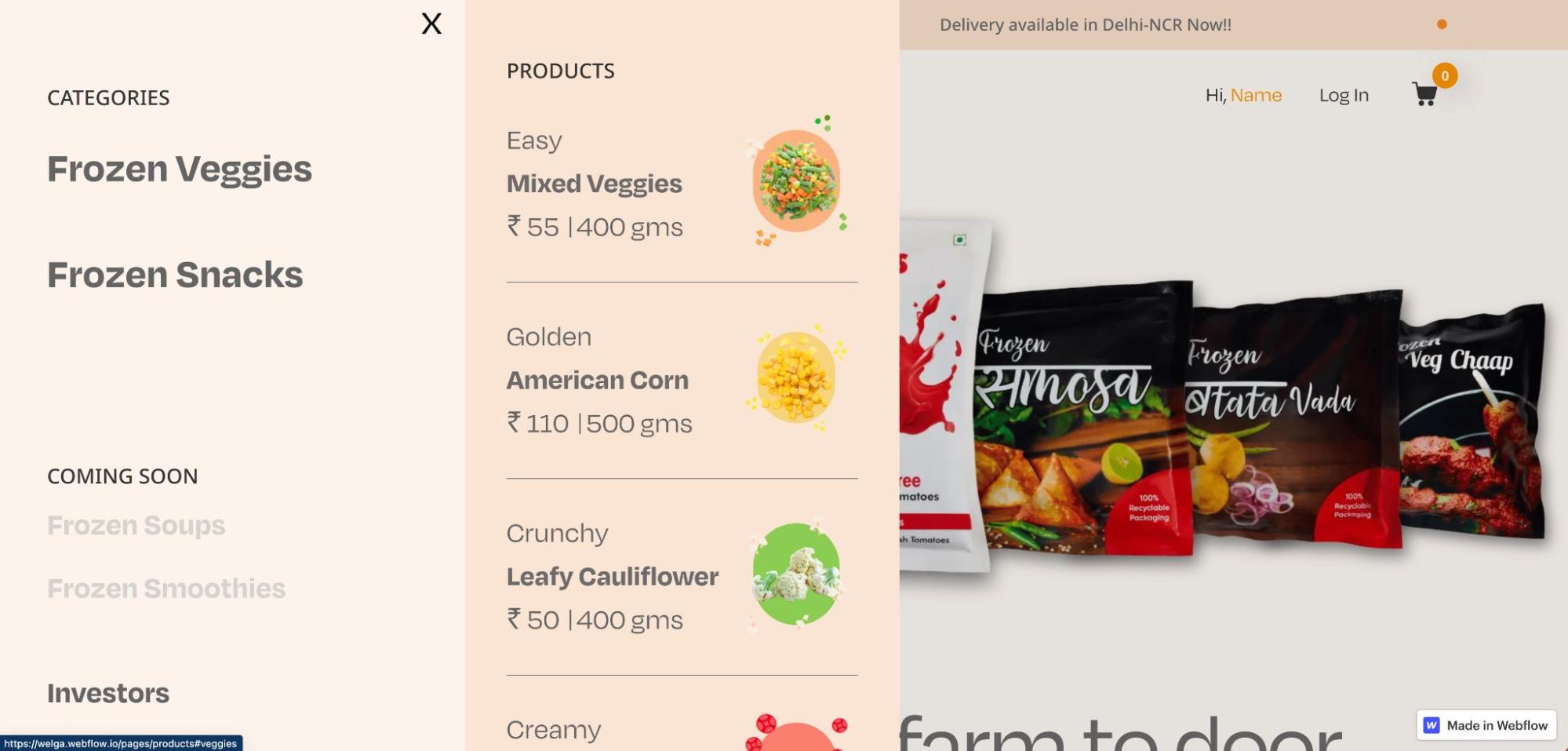
Product images are prominently displayed in the hero section. From there, site visitors can choose to scroll down and explore or click on “Products” in the navigation bar, which opens up a side menu. When you hover over a category like “Frozen Veggies,” you’ll see related products along with the size and price. Including the price in the product preview is a nice touch — and something budget-conscious shoppers will appreciate.
Quick cloneables
These simple cloneables help you add something interesting or useful into your design without having to build an element from scratch.
#82 Hypnosis
As the name suggests, #82 Hypnosis is a pleasing, almost hypnotic animation of a rainbow painting a circle and then infinity symbol.
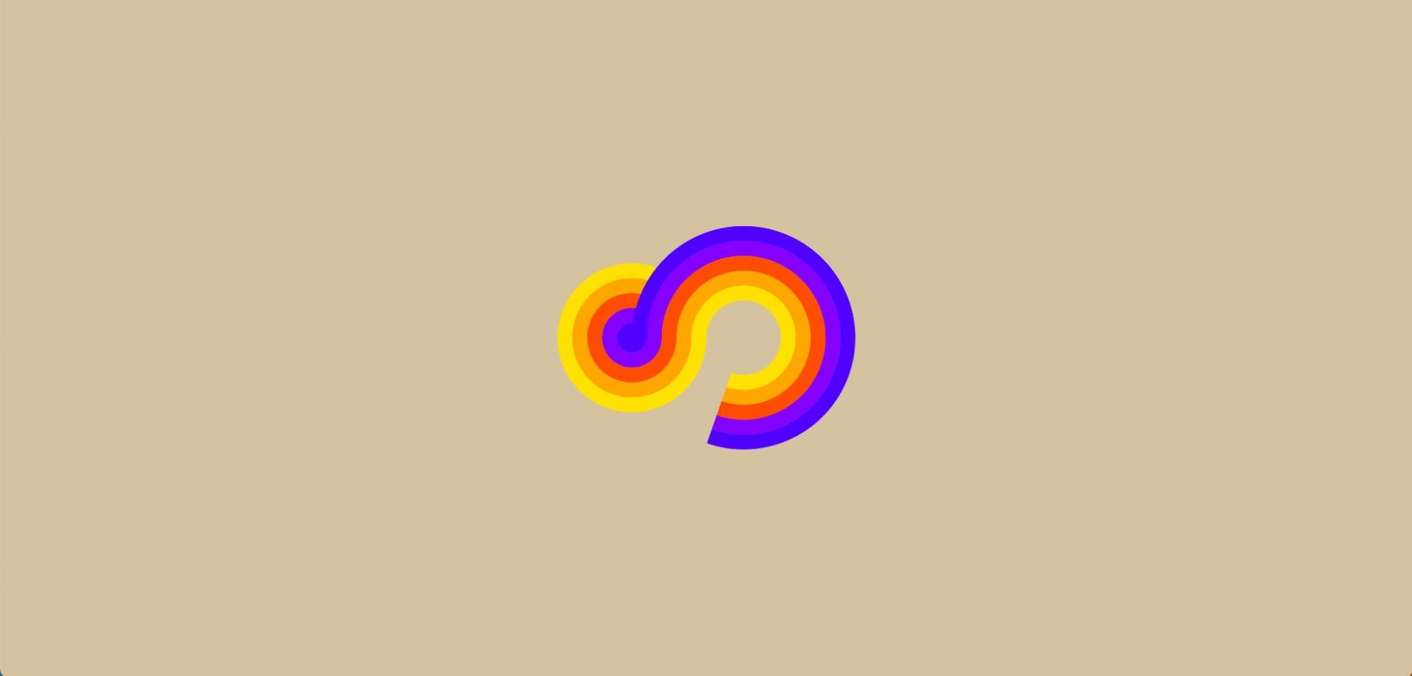
The single-element cloneable is a result of Bookmark taking on the informal challenge of creating 100 interactions in 100 days. We can see this soothing rainbow swirl as an engrossing loading animation on a website.
Project Quote Accessible Form
Contact forms are essential for any business website, but building one with accessibility in mind and ensuring the form suits specific needs — like gathering information for a project quote — can take time. Finsweet’s cloneable Project Quote Accessible Form gives you a head start.
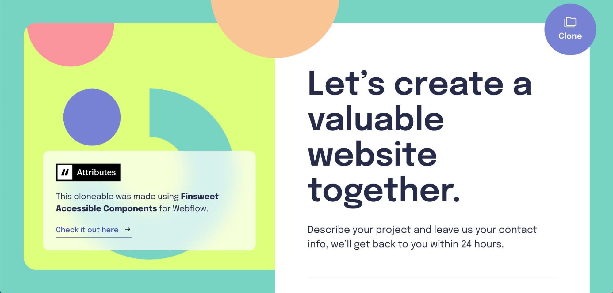
In addition to standard contact form fields like name and email, this form collects information about the type of project the visitor is interested in, their estimated budget, and size of the project. And because Finsweet built it with accessible components, the form responds to keyboard navigation.
Spotify microsite
A simple Spotify microsite cloneable by Matan Assulin makes it easy to add a Spotify preview to your Webflow project.
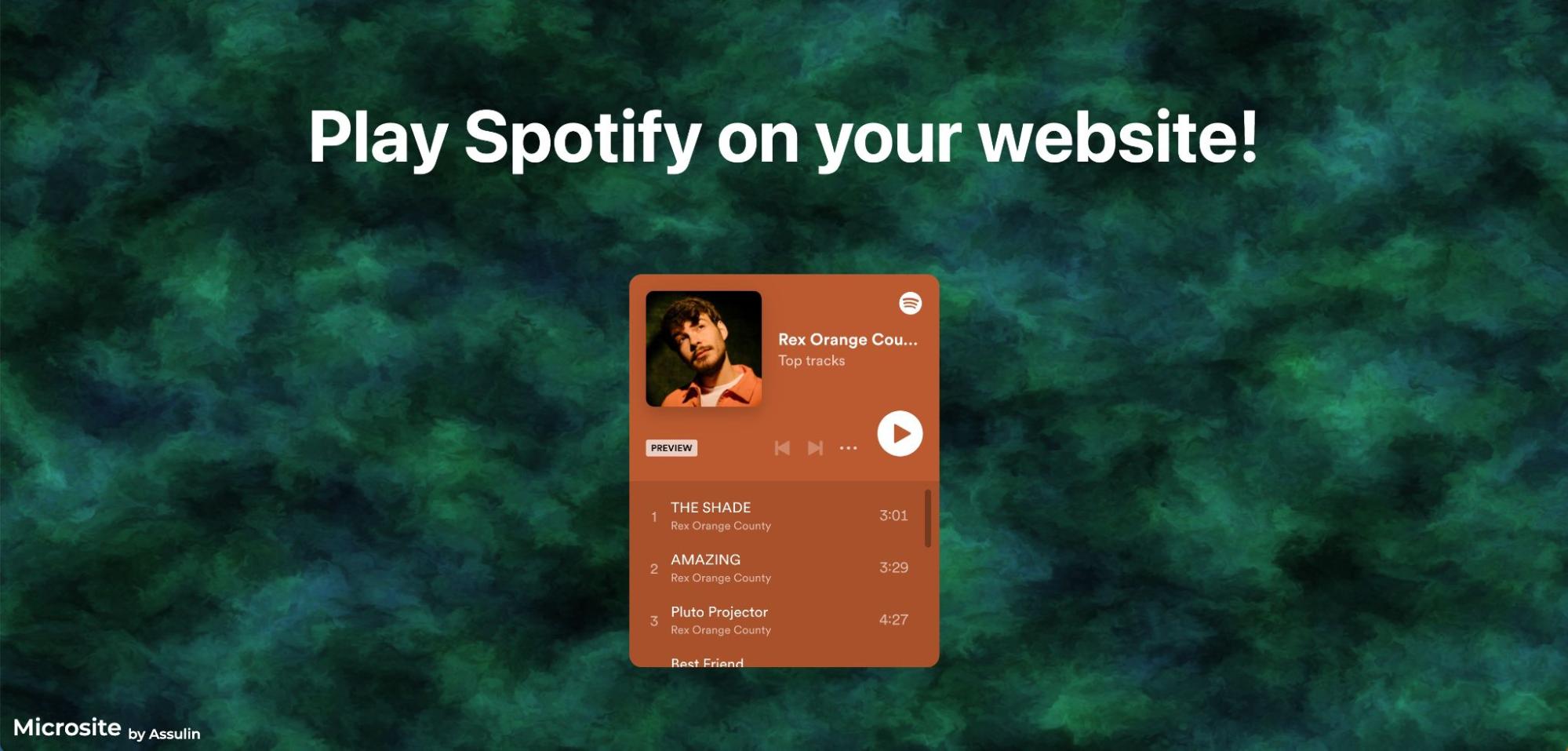
Whether you’re a musician looking to promote your own work or a creative who likes to share their latest focus playlist, music can be a great addition to your website. Because autoplaying music on your site can often be jarring or even harmful to some visitors, you can give visitors the option to preview a song on your site or open it in Spotify to hear the full version.


Get started for free
Create custom, scalable websites — without writing code. Start building in Webflow.
Smooth interactions
Interactions are fun, but they can quickly become overwhelming or distracting. These projects show off thoughtful interactions that provide a seamless experience.
Gouach
The Gouach website by Vincent Bidaux showcases a variety of scroll-triggered interactions.
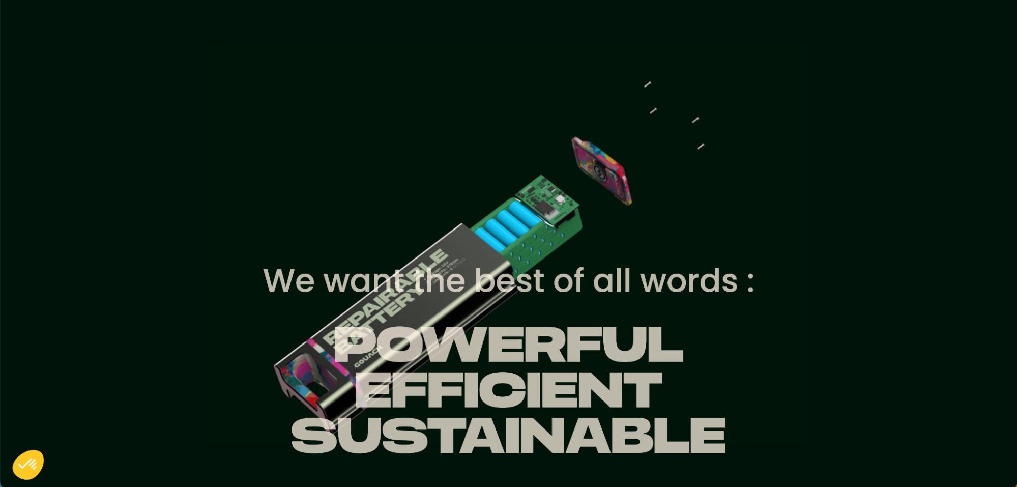
A horizontal scroll provides a screen-swipe effect in the hero section, moving from a black background to a blur of blue and neon green. Further down the page, large headlines snap into place and images seem to be pulled up from the bottom of the page as you scroll. The Gouach website also uses 3D animation and scroll interactions to show the exterior and interior of their product, a sustainable battery.
Scroll animated grid
This cloneable project, Scroll animated grid by Nube, uses a scroll to bring colorful rectangles to life.
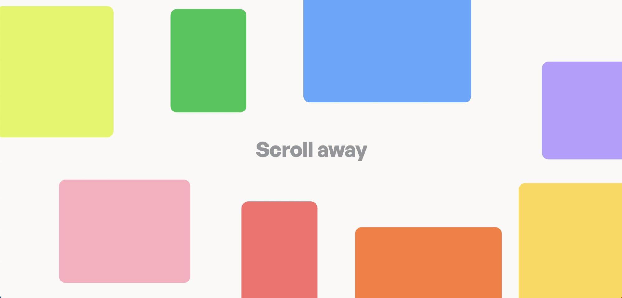
Upon load, various rectangles are scattered around the words “scroll away.” As you scroll, the rectangles slide towards the center and fit together into a grid. While the cloneable uses colors to differentiate the rectangles, this would work great for photos, testimonials, or content blocks on a website.
Macaspac Studio Portfolio
Macaspac Studio uses clever hover interactions to display their work on the website homepage.
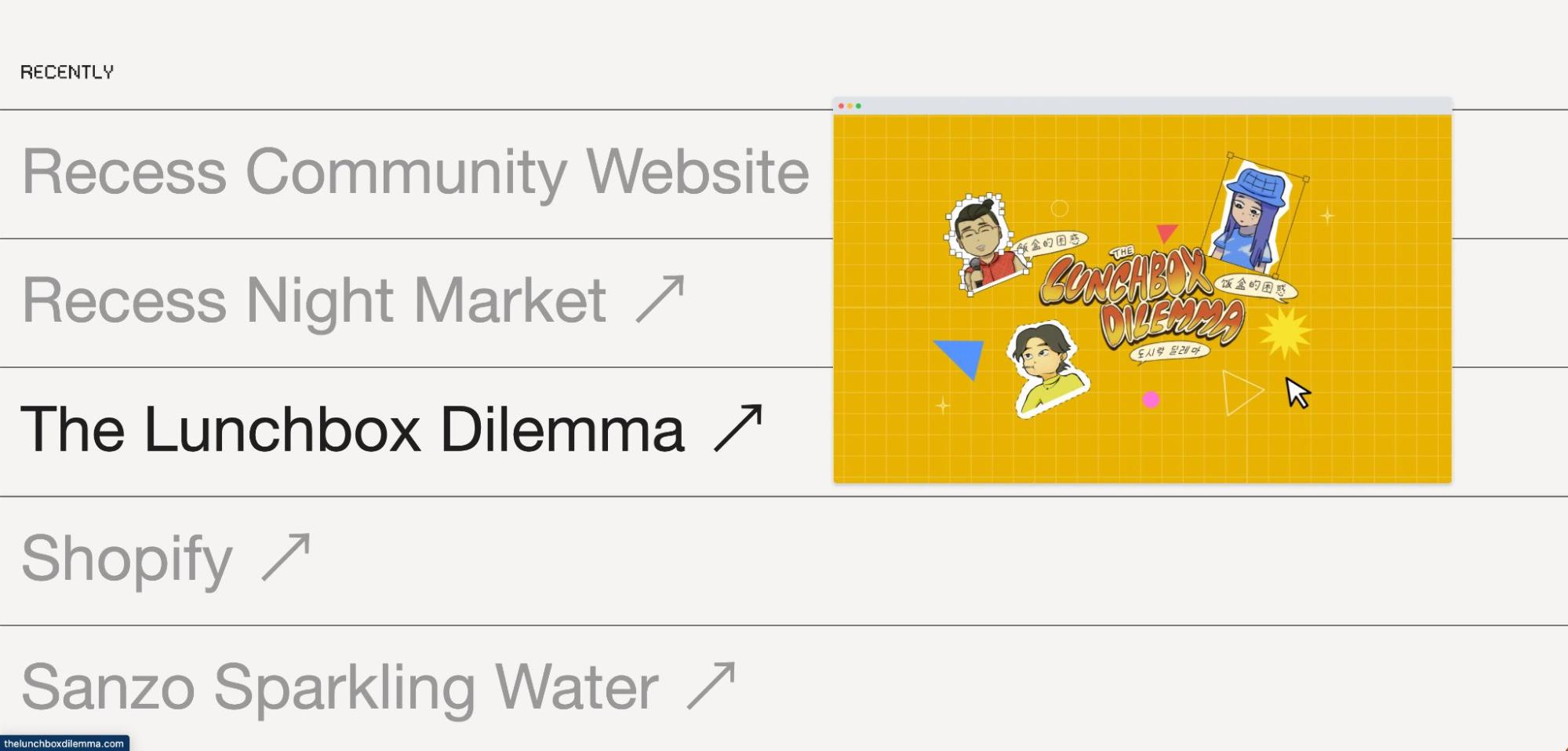
A list of recent projects shows up beneath the fold. Each project has an arrow indicating that the project will open in a new window, but hovering over the project name opens a preview image. It’s a smart way to pack several projects onto the homepage without creating visual clutter.
Ordinary Folk
Ordinary Folk’s portfolio site is full of subtle interactions that add a bit of flair without overpowering the design.
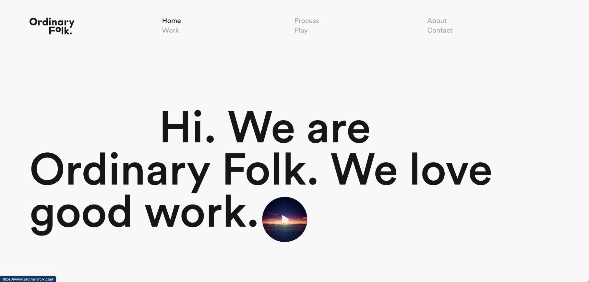
Hovering over the play button on the homepage starts an animation loop, cycling through geometric shapes and morphing into a colorful city on a grid. Clickable elements throughout the site mimic this interaction in subtle ways — a hamburger menu that turns into a X upon click, arrows that slide in and out of view, and icons that bounce or shift when a cursor hovers over them.
Show off your work
We love rounding up a few projects to highlight each month. If you have a project you’re proud of, be sure to submit it to Made in Webflow!





.jpeg)
