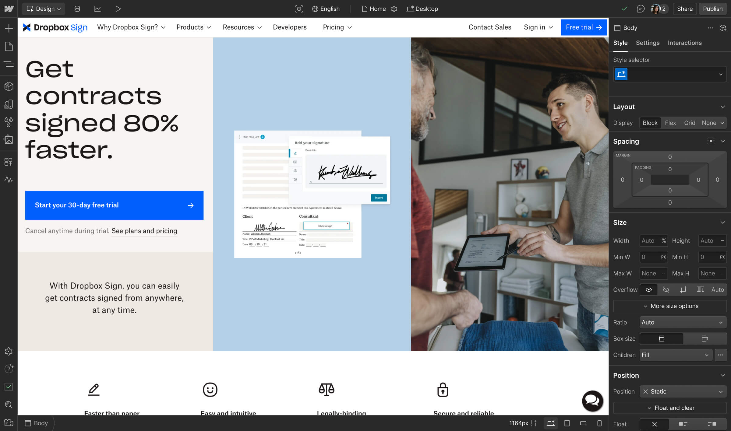
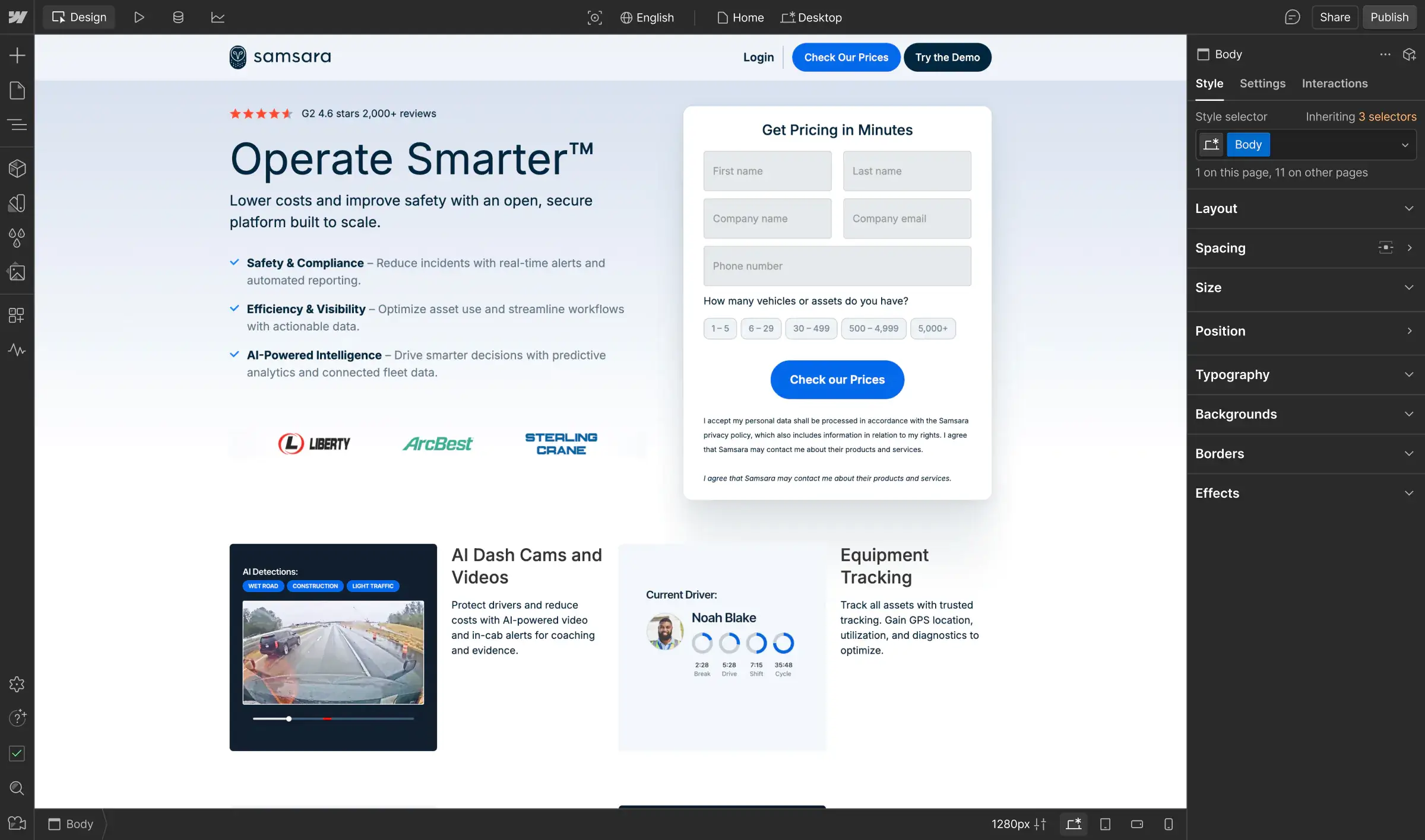
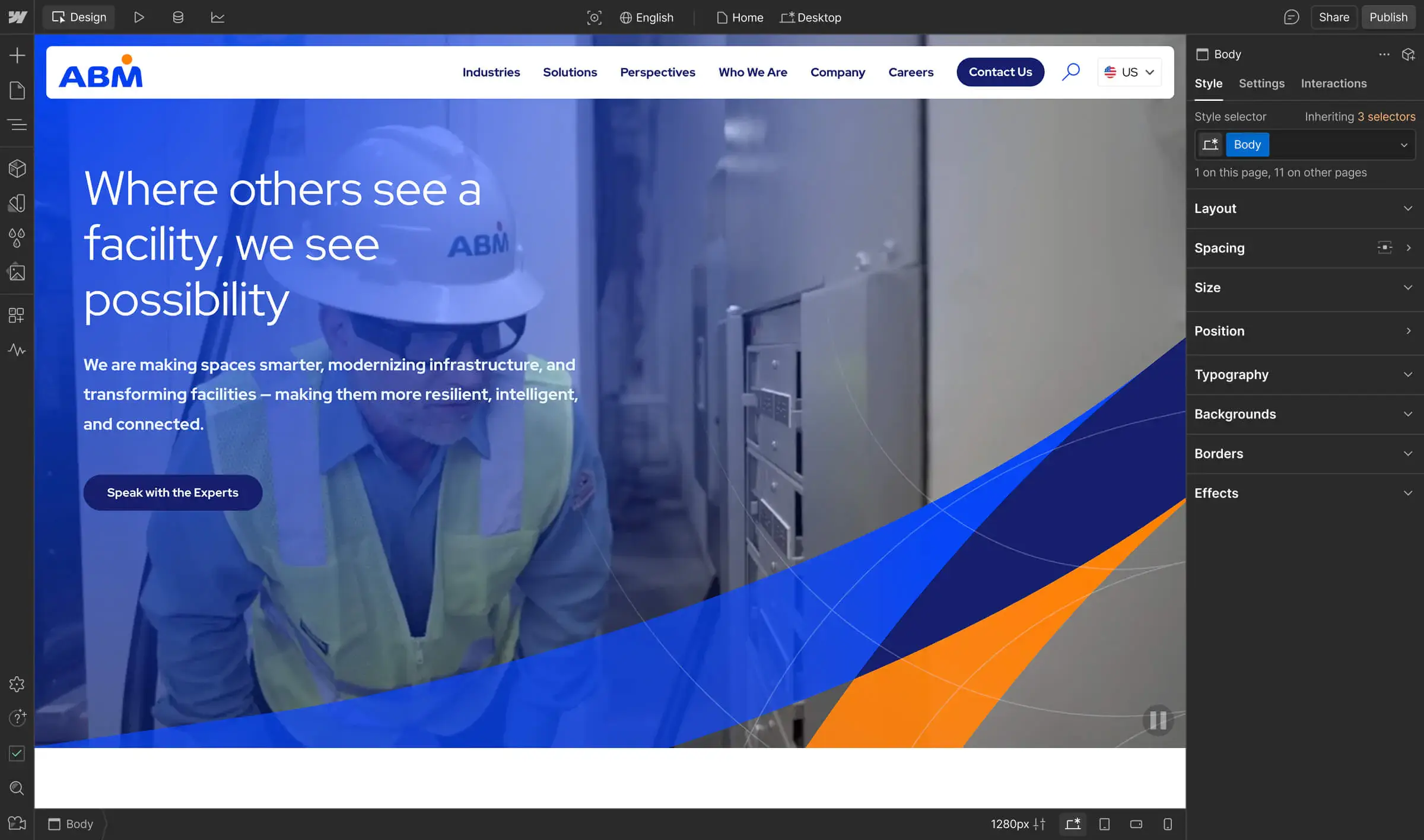
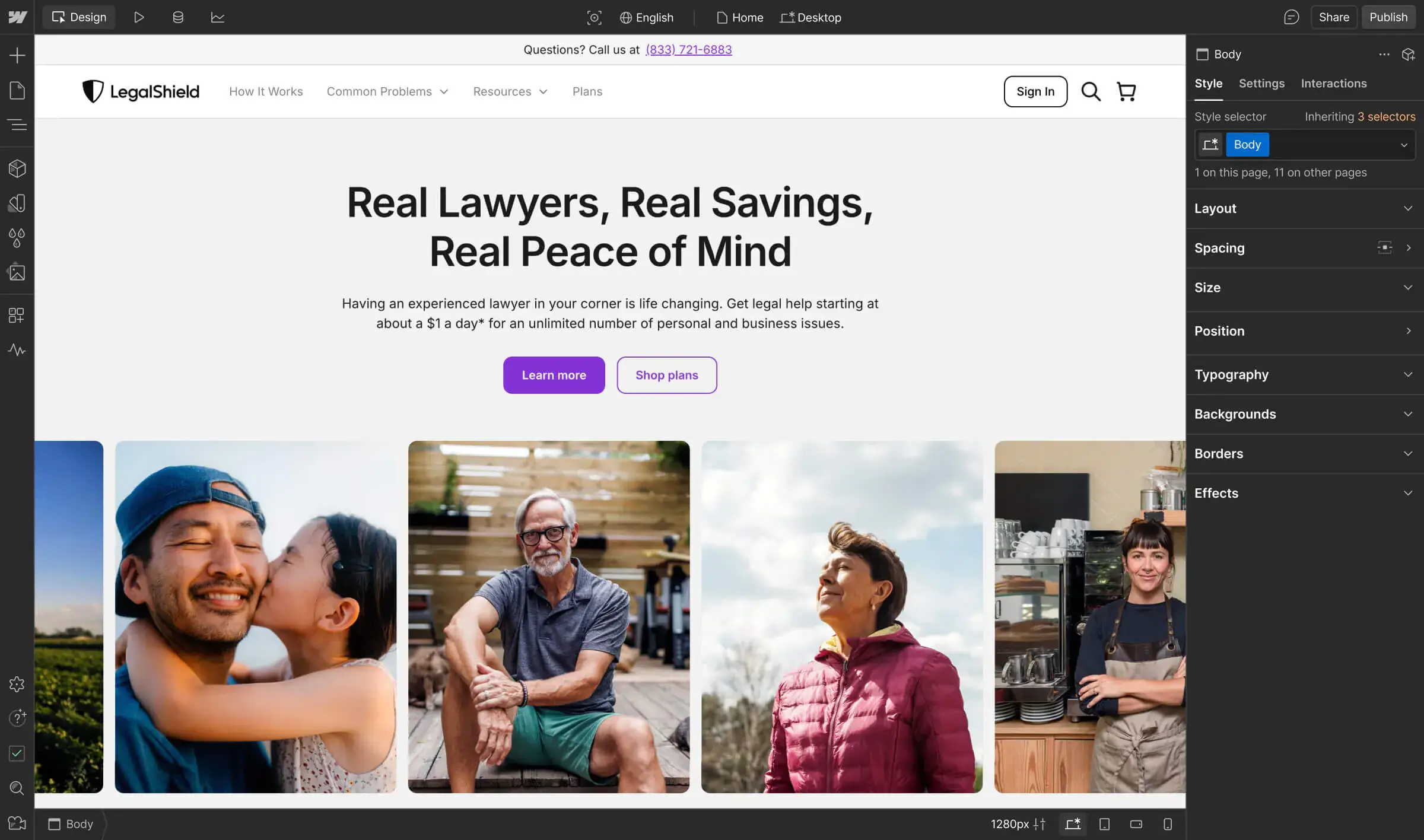
How Dropbox Sign transformed internal collaboration with Webflow
An integral part of the Dropbox suite, Dropbox Sign used Webflow to streamline development processes, empowering its design and marketing teams to deliver the most impactful services, faster.
Unlock your site’s full potential with best practices vetted by our experts. Learn the Webflow Way.
“Over the last four years, Dropbox Sign has grown from a startup to a lever for growth and a significant part of the larger Dropbox vision. Webflow has enabled us to move fast, iterate, and scale so that we can meet our aggressive business goals and stay agile when our needs evolve.”

Once a rather arduous process that required everyone to be physically in the same room with a working pen, signing a document is now as easy as logging into your computer. This is in large part thanks to companies like HelloSign. A global leader in the eSignature field since it came onto the scene in 2011, HelloSign gives millions of customers the tools to securely automate and manage their most important business transactions.
Acquired by cloud computing giant Dropbox in 2019, HelloSign was reintroduced in 2022 as Dropbox Sign. Enabling small businesses to scale effectively by making the eSignature process seamless, Dropbox Sign frees up employees from manual tasks so they can focus on more important work like selling, managing relationships, and hiring.
Behind the scenes, Dropbox Sign’s own internal efficiency was hindered by traditional web development processes that caused misalignment between design, marketing, and engineering. Updating site content became a big bottleneck because every little tweak had to go through product engineers—which meant it would often take at least three weeks to make changes. Marketers were frustrated; designers had no ownership over the brand; and developers had to spend valuable time working on trivial updates.
Enabling innovation at scale, while freeing up developer resources
With Webflow, innovation at speed is a huge benefit. We can now push changes or bring out a new feature in a week instead of a month.
Justin Johnson, Web Developer, Dropbox Sign
Historically, engineering sprints drove the main marketing site for HelloSign (now Dropbox Sign). Developers would be working hard to finalize features prior to launch; but at the same time, marketers needed to create assets to promote that same launch. Growth projects tied to revenue took precedence over content initiatives, but because the team lacked tools that would enable them to be more autonomous, everyone was frustrated by slow-moving processes. It was challenging to drive deadlines or even incur small changes because everyone relied on developer expertise.
To bring the website under the full control of the marketing team and free up developers to focus on the core product, Dropbox Sign made the move from an engineering-managed custom-coded build to Webflow Enterprise in 2020. With more efficient processes and the content team now owning their CMS, the Dropbox Sign team has cut down the number of tickets it assigns to developers by 67%. With freed up developer resources, the team can now focus their efforts on process improvements and technical builds, like redesigning their pricing page and shipping features faster.
During the orchestration of the official rebrand from HelloSign to Dropbox Sign in October 2022, the team relied on Webflow to streamline the cumbersome tasks. For example, updating all references of the word “HelloSign” to “Dropbox Sign” for 1,000 pages in 21 different languages, using Webflow's global code tags to build a script that was editable on every page, significantly simplifying the technicalities of the rebrand to two months.
The Dropbox Sign team also leans on their dedicated Account Team for strategic expertise and guidance. “Whether we’re working on bigger projects like the full-site rebrand, or less-conventional ones, our Webflow Account Team has been an integral part in setting us up for success,” Justin says.
Working better together to build web experiences 4x faster
Pre-Webflow, collaboration existed solely at cross-functional meetings. Now, collaboration is core to our team structure, workflows and shared goals.
Justin Johnson, Web Developer, Dropbox Sign
Today, Web Developer Justin Johnson is responsible for the functionality and performance of the website. “It was eye-opening to see all the capabilities within the Webflow Enterprise scope,” he says. Justin and fellow Web Developer Briahna Santillana are embedded in the 40-person Dropbox Sign marketing department and work closest with the three-person content team. Being part of the marketing org provides important context for the developers, giving them agency and ownership over requests.
The world of engineering can often feel like one long list of to-dos, but Webflow builds in a natural feedback loop that allows for more symbiotic partnerships. “We’re able to control our channels and work with cross-functional teams to achieve our goals together in Webflow,” Briahna says.
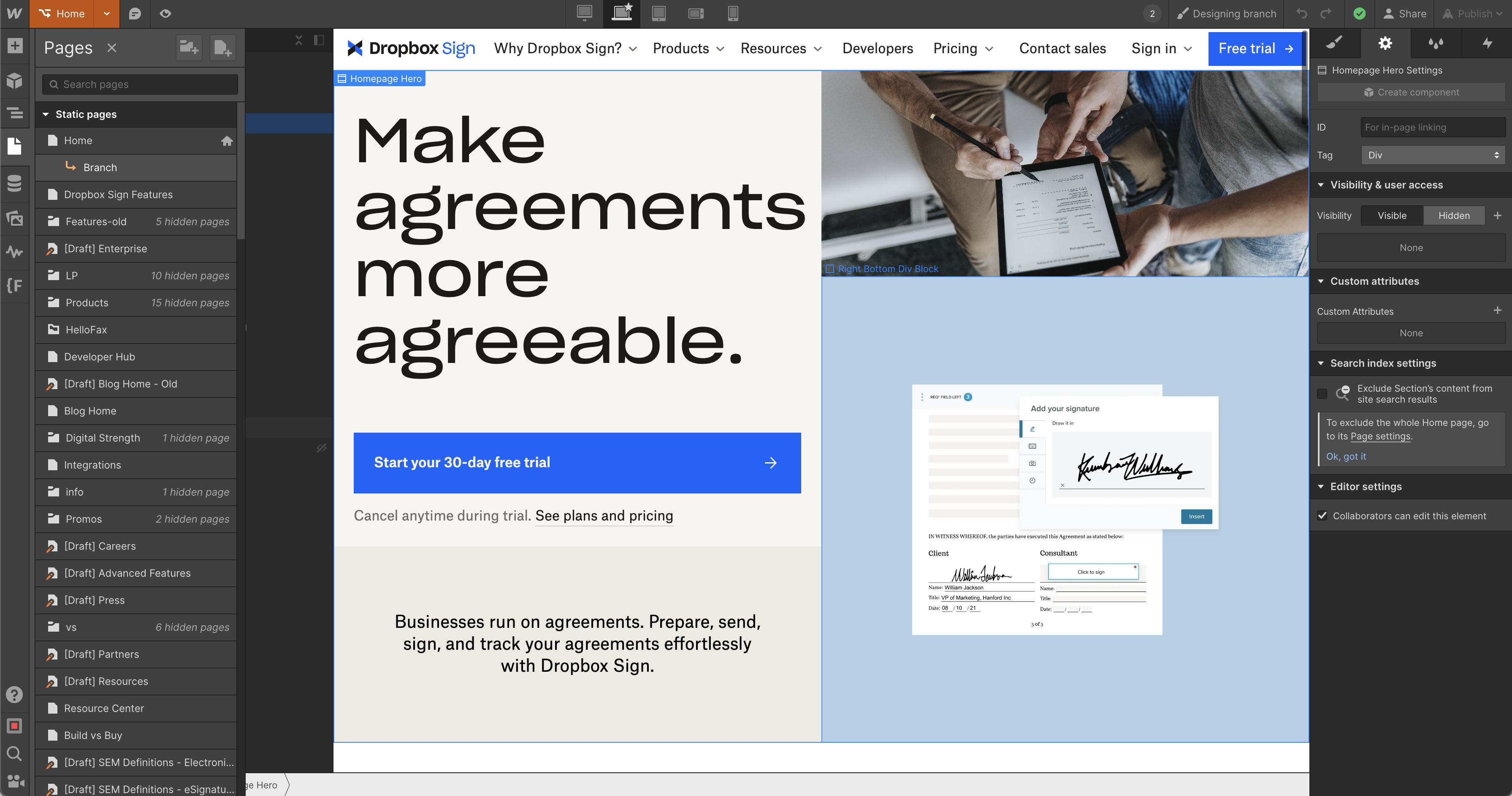
To further increase efficiency, the Dropbox Sign team also leverages Webflow Enterprise feature, page branching, which allows teams to work on different pages of their site simultaneously. “Page branching has had an overwhelmingly positive impact on productivity and has allowed for a more collaborative team effort in shipping site updates quickly,” says Briahna. The Dropbox Sign team can now build web pages in one week or less instead of one month.
Building an intuitive Resource Center to support ambitious growth goals
With Webflow, I can move fast without having to reach out to a developer every single time I need something. Once marketers realize this is the world we could live in, they’re going to feel so empowered.
Cory Shrecengost, Content Marketing Manager, Dropbox Sign
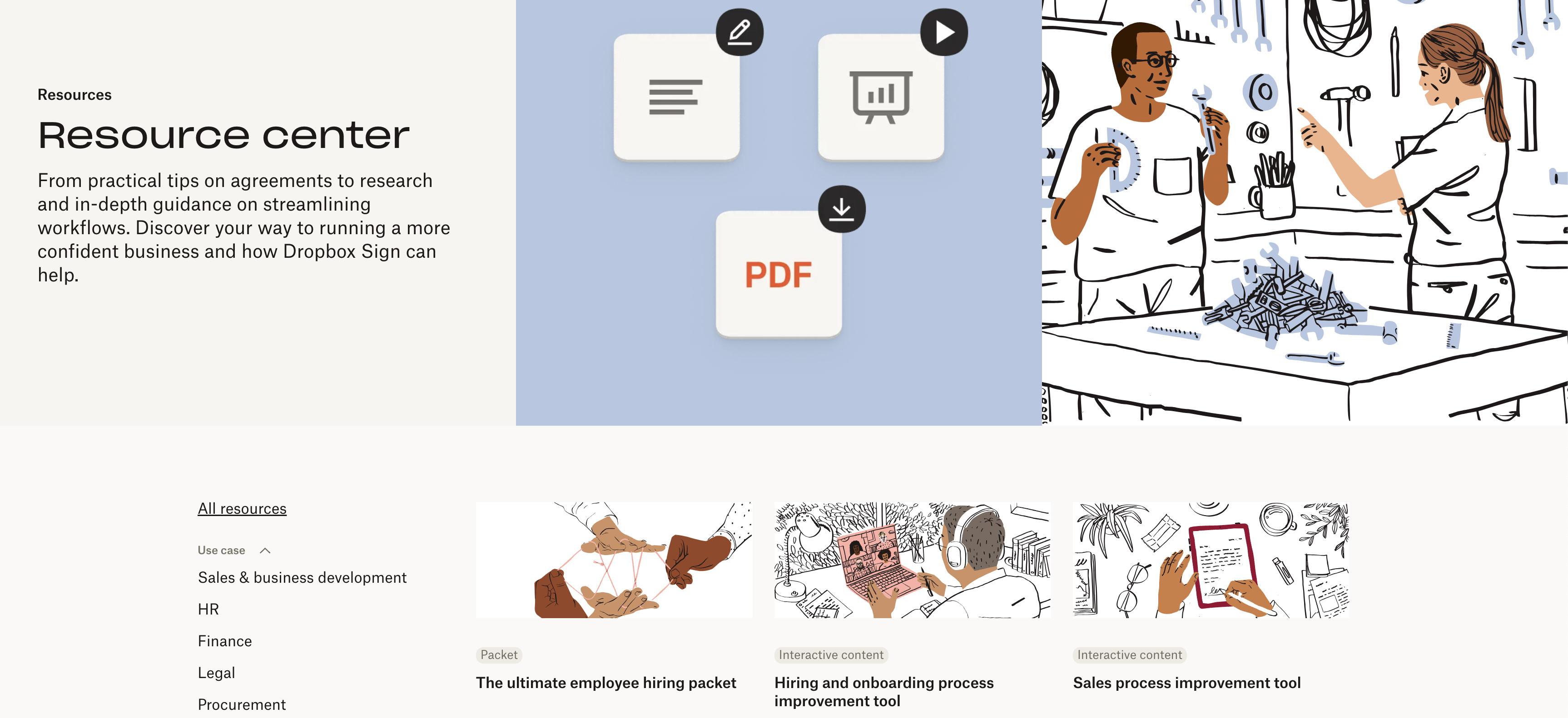
As the teams worked to integrate the HelloSign site into the Dropbox family, they realized they had a variety of marketing resources—ebooks, webinars, infographics—in disparate digital locations. Split across multiple CMS collections without a unified structure or visual language, these resources were often inaccessible outside of specific marketing campaigns. In order to ramp up content production and drive more downloads, the team needed to quickly bring all assets into an intuitive Resource Center that was simple for readers to browse and easy to manage.
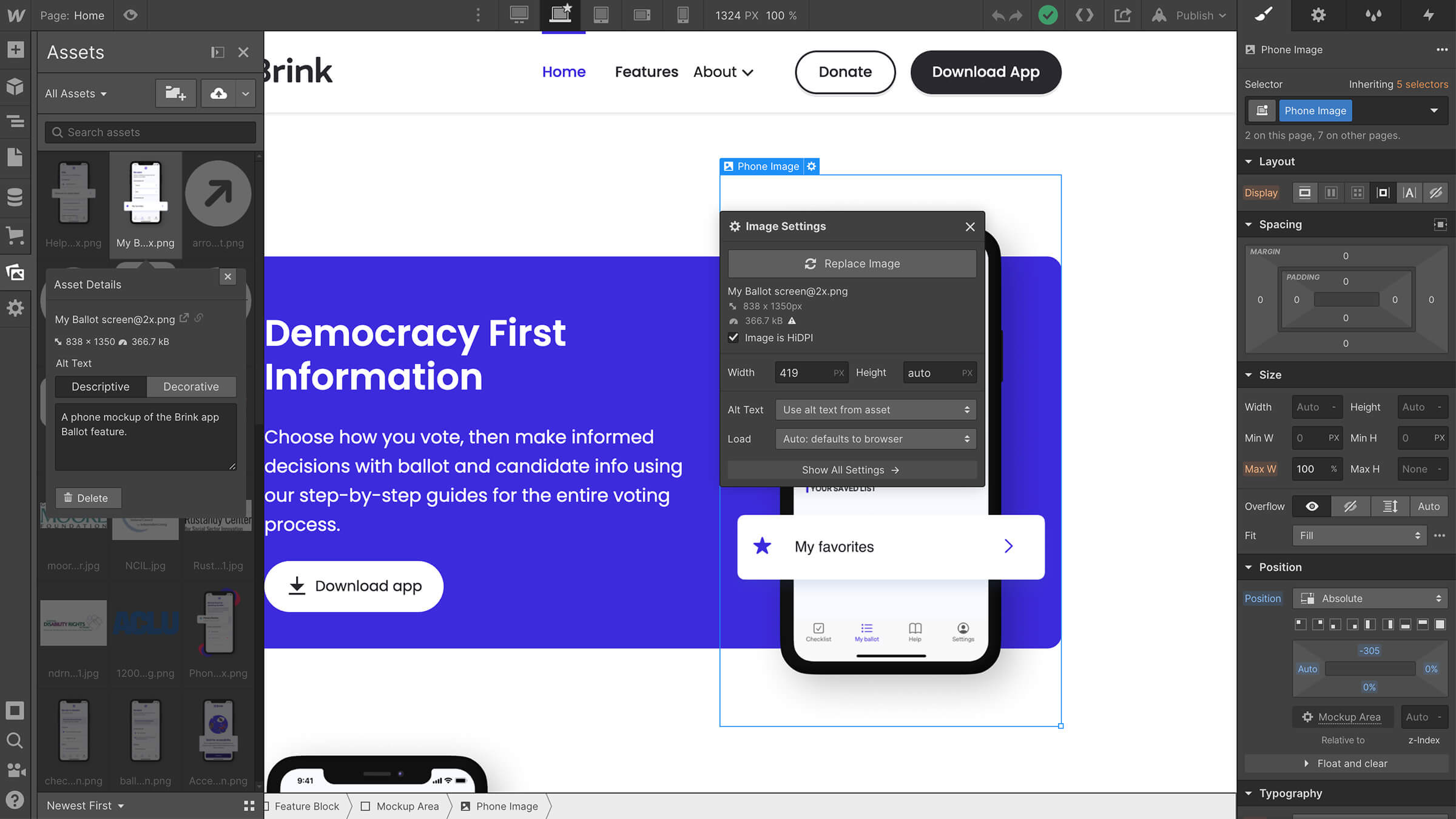
Dropbox Sign’s design team started by creating templates for both the Resource Center “hub page” as well as individual pages. Since those would leverage Webflow’s CMS templating, the designs included a variety of style and content options that the team could swap accordingly based on resource type.
“We leveraged Webflow’s CMS to ensure the new collection was as flexible as possible for the content team, while also tying in the styling options that our designers provided,” Justin says. Working in a visual-first tool like Webflow helped the developers better communicate with the designers. “We could make adjustments so smoothly in Webflow,” says Justin. “It felt like the developers and designers were speaking the same language.”
The Resource Center was completed under schedule in six weeks, and thanks to the simplicity of the new system, both content publishing and demand-generated content downloads have more than doubled year-over-year.
Working smarter to empower millions of customers
Webflow ultimately allows us to focus on building products that make our customers’ work easier and more streamlined, while making our internal processes more efficient and collaborative.
Justin Johnson, Web Developer, Dropbox Sign
Today, Dropbox Sign’s marketing, development, and design teams can work quickly and in tandem to optimize content every week, test new journeys and CTAs, and update old content to align with search intent. Everyone is naturally more engaged in the quality and depth of work. “With Webflow, it’s less problem-solving and more implementation. Having more time for new, fun challenges is energizing,” Justin says.
Long term, as the company grows its multi-solution offerings and starts to work with and develop more AI powered tools, the Dropbox Sign team looks forward to making work even more seamless for users. “Webflow ultimately allows us to focus on building products that make our customers’ work easier and more streamlined, while making our internal processes more efficient and collaborative,” he says.
As Dropbox Sign has evolved its workflows to deliver a cutting-edge product, they’ve relied on Webflow to bring Dropbox’s vision to design a more enlightened way of working to life.
Explore more Enterprise stories
Explore more stories
Get started for free
Try Webflow for as long as you like with our free Starter plan. Purchase a paid Site plan to publish, host, and unlock additional features.
Try Webflow for as long as you like with our free Starter plan. Purchase a paid Site plan to publish, host, and unlock additional features.


