


Crafting a homepage is like preparing a business’s online welcome mat. It must be inviting and easy to navigate, encouraging visitors to stay and return.
While visually appealing website homepage design is key, the best homepage designs serve a deeper purpose — they communicate brand identities, drive conversions, and deliver an outstanding user experience. A well-constructed homepage actively bolsters search engine optimization (SEO), steers digital marketing efforts, and bridges the gap between visitors and the business’s social media presence.
When crafting an impactful homepage, exploring examples of homepage design is a valuable starting point. Here are nine website homepages that impress us.
9 standout homepage designs for all types of businesses
These nine homepage design examples use just the right combination of visuals, interactions, and copy to get their visitors scrolling and clicking.
1. EightyOne

Louie Alexander’s design for the EightyOne agency website instantly captivates visitors with its seamless integration of video and scroll-based interactions. A thin sliver of video within the O in EightyOne, which begins the same size as the other letters, cleverly transitions between excerpts from the agency’s video advertisements. Scrolling enlarges this video player, engaging users and drawing interest. Moving past this hero image navigates visitors through a range of the agency’s notable campaigns, with highlights including national sports teams, UNESCO, and a nonprofit women’s refuge.

Nestled between panels of attention-grabbing videos and images, a clever message stands out: “We’re saving this spot for you.” This statement subtly and playfully communicates the agency’s eagerness to collaborate with visitors, adding a personalized touch. Those daring to click on another panel labeled “Don’t click on this” are met with a witty call to action: “Your curiosity got you this far. Want to join the team?” These lighthearted interactions exemplify EightyOne’s innovative branding approach and reflect their creative spirit, setting an inviting tone that extends from their homepage into every aspect of their work.
2. Factory
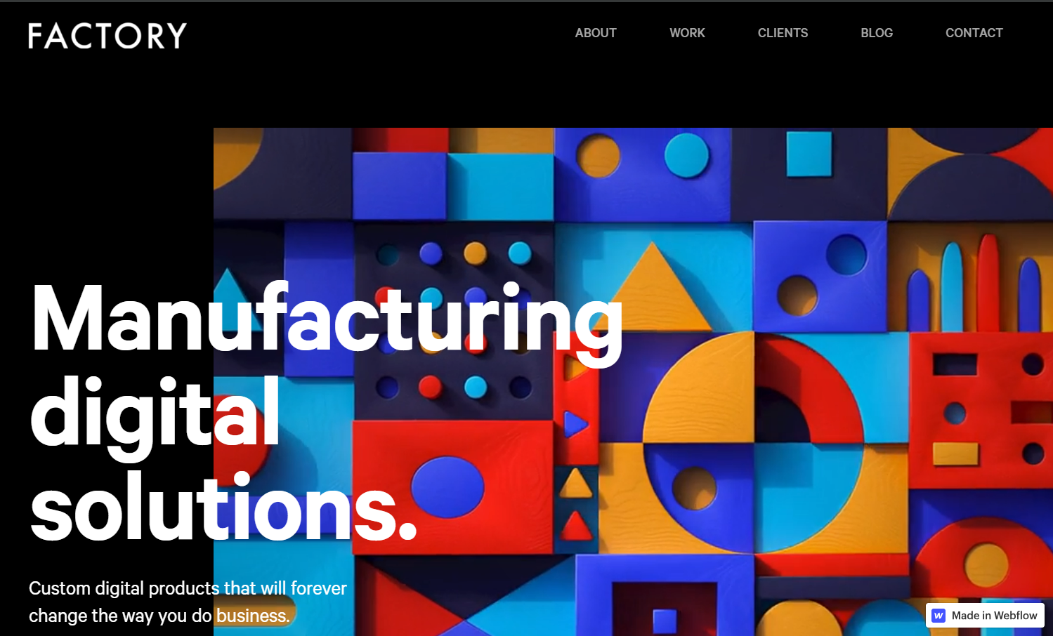
Factory’s website, designed to reflect their chic approach to custom software for manufacturing companies, captivates from the first click. The software as a service homepage, crafted by Reload Agency, kicks off with a striking animation of colored blocks moving up and down — a clear nod to manufacturing, modeling, and inventive solutions. A scroll down reveals an essential outline of Factory’s collaboration process with clients — vital when marketing a service — followed by a selection of previous projects showcased as animated cards.
The site’s black-and-white color palette emphasizes the vibrant colors in the imagery. Its responsive design also ensures aesthetic appeal and functionality across multiple devices.
3. Kihealth
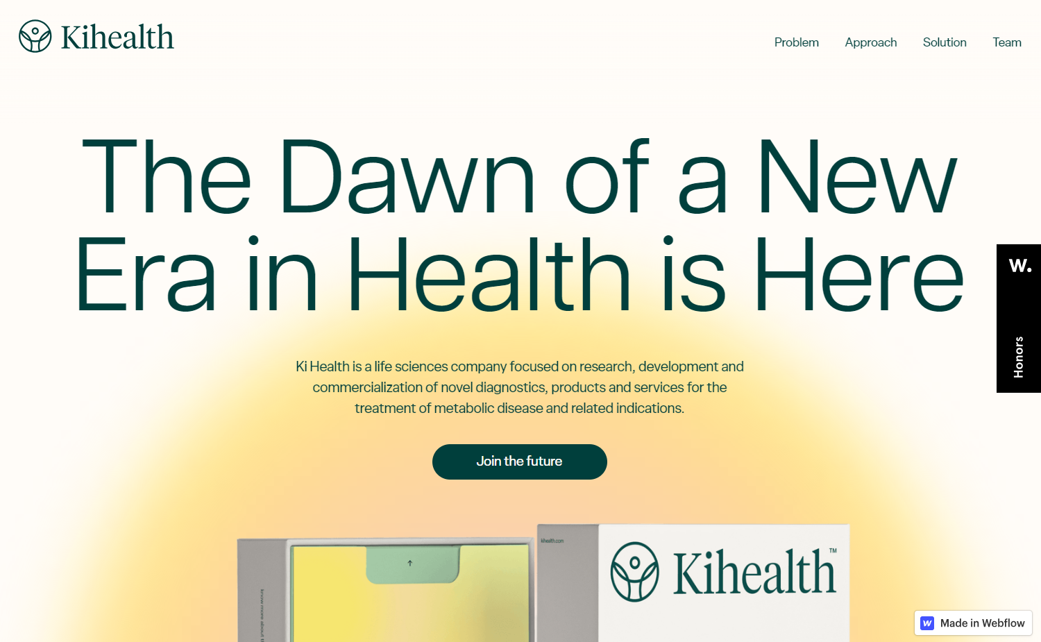
Kihealth, a diabetes testing company with a novel approach to early diabetes detection, conveys their unique value proposition through a striking website design crafted by the creative agency Brightscout. Breaking the norm of using the company’s name as the title tag, Brightscout opts for a punchy headline (under 40 characters) in the large header that serves as the site’s opening and homepage title. The minimalist design and simple color palette create a clean and uncluttered look, allowing users to concentrate on the core message: “The dawn of a new era in health is here.”
4. gabi+skin
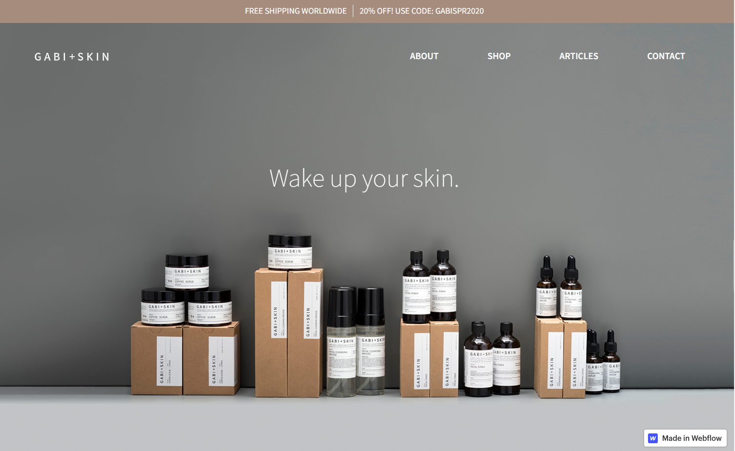
Taiwanese skin care brand gabi+skin greets visitors with a pop-up offering a 20% discount, an offer that stays unobtrusively at the top of the screen even after users dismiss the pop-up. The ecommerce site, designed by Level, features a simple design with a neutral color scheme and minimalist layout, providing a calming experience when visiting the online skin care store. Each design component, from the homepage banner to individual product imagery, reflects careful curation to maintain a pristine, distraction-free homepage.


Get started for free
Create custom, scalable websites — without writing code. Start building in Webflow.
5. Firebrand
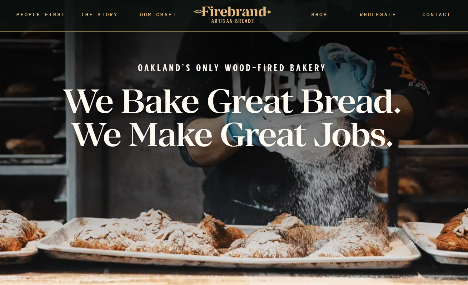
Firebrand’s homepage, designed by Majorminor, uses slow-motion background video to capture the artisanal charm of this small business. The long, single-take slow-motion video of a baker sprinkling powdered sugar on croissants ensures an immersive yet comfortable viewing experience, communicates a sense of luxury, and articulates the meticulous care the bakery staff invests into their work. To keep visitors’ attention and to emphasize being Oakland’s sole wood-fired bakery, a mesmerizing background video of a gently burning fire graces the area beneath the footer.
To enhance this great homepage’s symmetry, a navigation bar layout featuring a central logo and menu options spans the top of the page.
6. Leadfocus
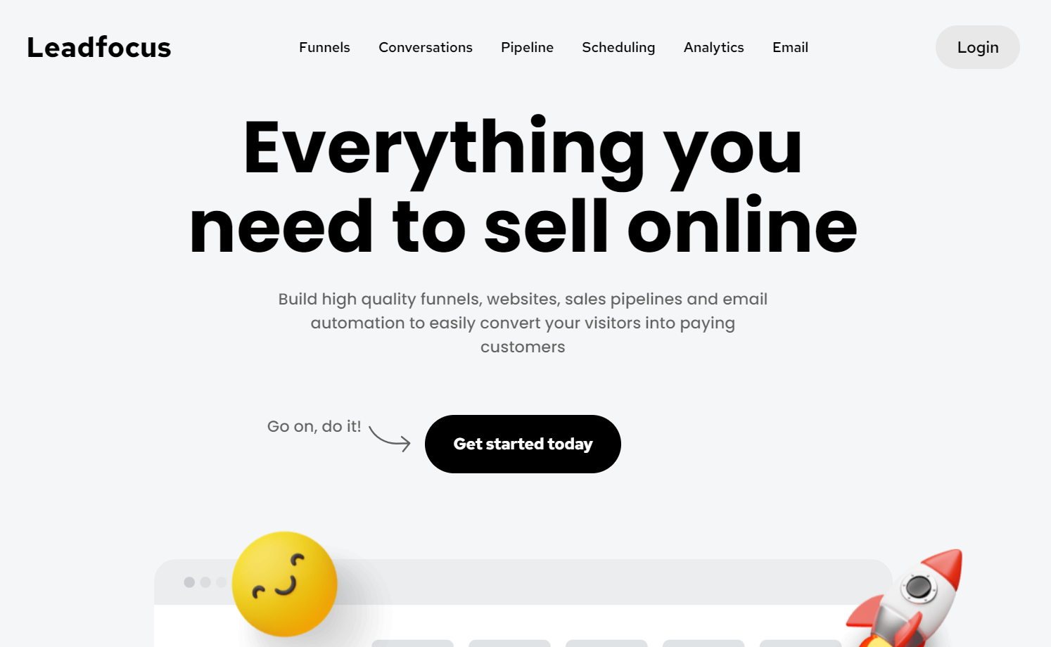
B2B marketing service Leadfocus infuses their homepage with a friendly brand voice realized through 3D emojis, captivating animations, and finely tuned copywriting. The site’s designer, Diego Toda de Oliveira, strikes a balance between casual enthusiasm and polished professionalism in the copy. This jovial tone deviates from the typical gravitas and reliability messaging of B2B sites. It effectively and cheerfully conveys Leadfocus’ aim to bring simplicity and joy to clients’ business marketing. Bright hues, generous white space, legible typography, and transparent pricing information converge to create a compelling and on-brand homepage design.
7. Maple
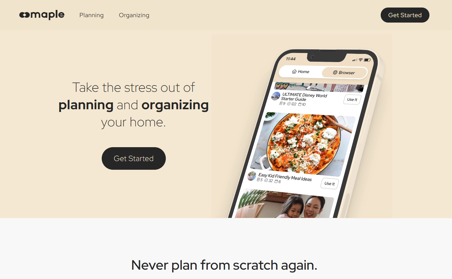
Home organization app Maple seeks to alleviate the pressure of planning and organizing for busy parents and guardians. Maple’s website, designed by Joel Grenier, mirrors the app’s streamlined approach with a minimalist top menu bar and a comprehensive footer for additional site navigation. The two main menu options, planning and organizing, reflect the app’s core offering: unifying meal planning, trip coordination, purchases, and calendar organization. Emphasizing the app’s solution to a common problem — the stress of managing family events — the empathetic copywriting positions Maple as the ideal solution.
8. Rathbones
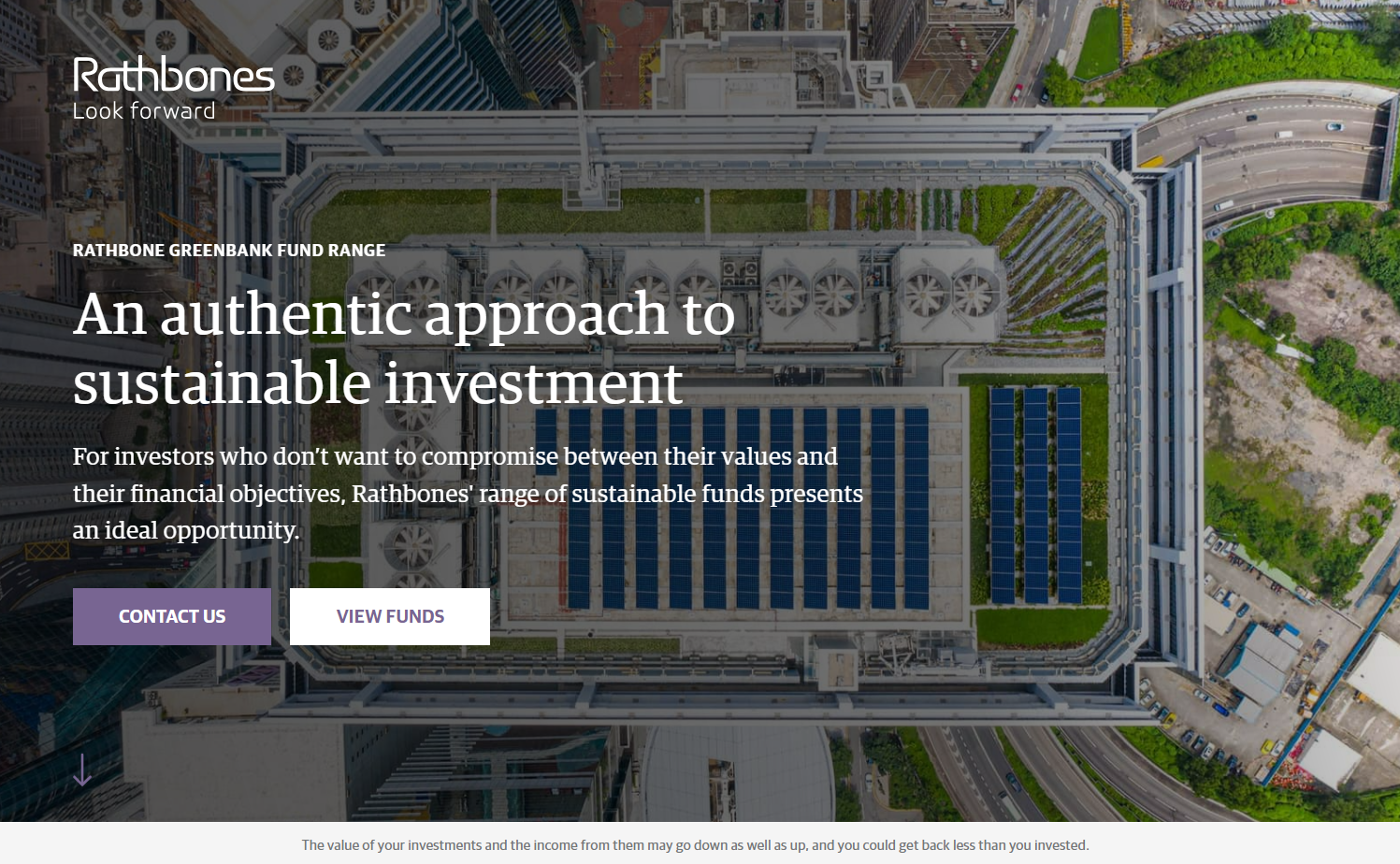
Rathbones’ homepage, crafted by Proctor + Stevenson, encapsulates the fund’s sustainability ethos through thoughtful imagery and typography. A hero image showcasing a building adorned with rooftop solar panels and vegetation visually reflects the eco-friendly future that the firm’s investments aim to foster. The combination of two fonts — Guardian Egyptian and Guardian Sans, originally designed for The Guardian newspaper — imbues the site with a solid, institutional ambiance while tacitly borrowing the newspaper’s gravitas. Call-to-action buttons with sharp corners lend a crisp, professional touch.
9. Homebound
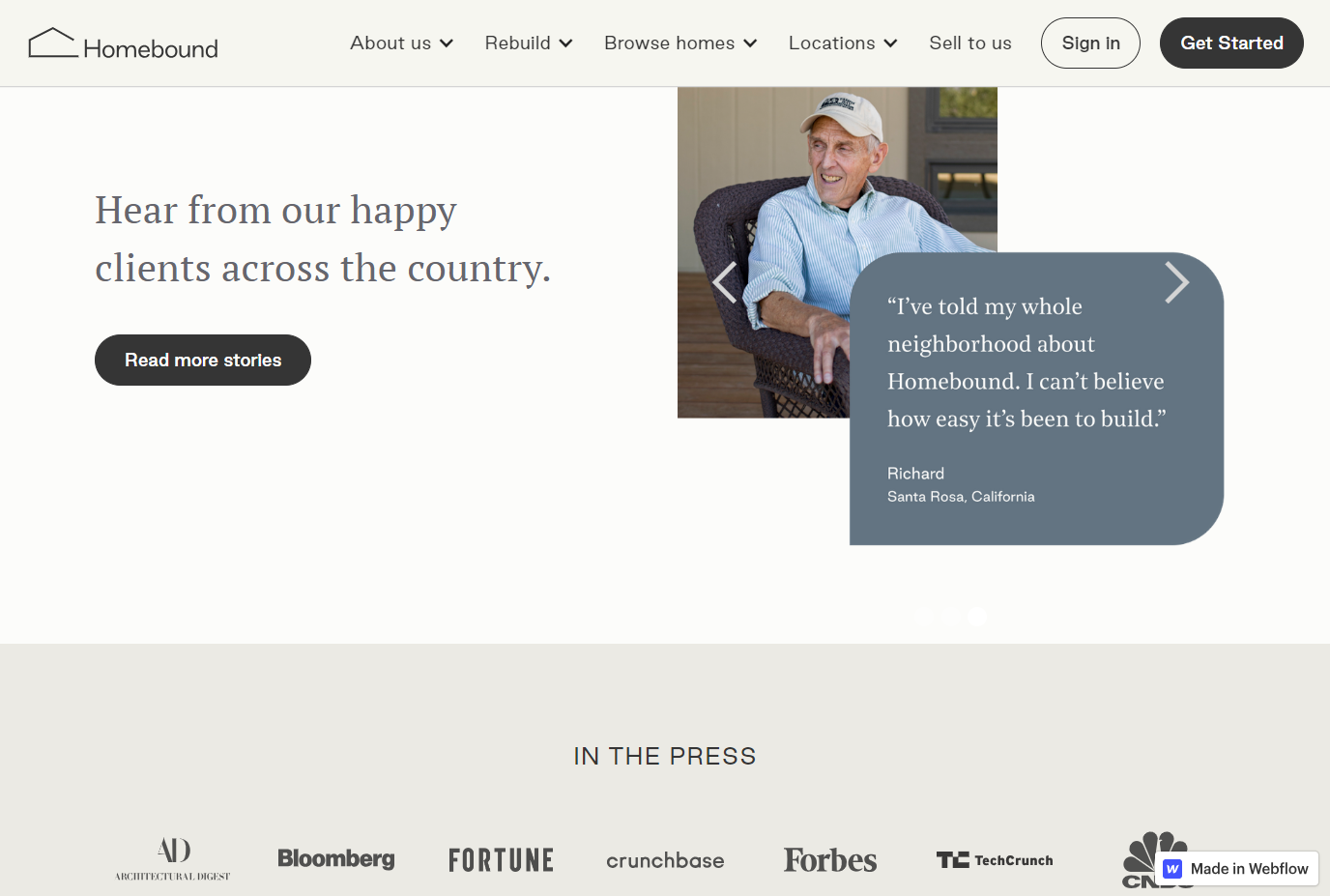
In crafting the website for Homebound, a real estate and homebuilding company, Seattle New Media harnessed social proof by including satisfied customer testimonials enhanced by their photographs. This approach fosters a sense of personal connection for site visitors, helping them feel like they’re hearing from a real person. The homepage also reflects Homebound’s modest approach by subtly showcasing scaled-down logos of prominent media outlets that featured the company rather than making them the central focus. This presentation speaks to the company’s firm confidence in their products, suggesting that Homebound does not require overt press endorsement to substantiate their quality.
Use Webflow to create a homepage that feels like home
For additional homepage design inspiration, browse the 2,000+ diverse Webflow templates created by experienced Webflow designers, check out our top 16 website picks for this year, or visit these 18 fantastic sites for web design inspiration. And to see how changing design trends influence a homepage over time, explore the fascinating history of the Apple homepage.
Whether your design lends toward current design trends or timeless classics, the goal remains: create a homepage that encourages visitors to return time and time again.