


Moving your eyedropper tool a few centimeters impacts how potential customers interact with your CTAs.
Call-to-action (CTA) buttons must stand out on your website and guide visitors toward a specific action, like signing up for a newsletter, buying a product, or downloading a resource. The color you choose determines how many people notice your button and whether it effectively entices them to act.
Read on to learn about color psychology in modern web design and how to choose the right CTA button colors to increase clicks and conversions.
Color theory 101
Color theory is a framework of design principles that explains how colors interact and influence perception. It revolves around the premise that different combinations and colors evoke certain emotions. By understanding how the color wheel works and the relationships between primary, secondary, and tertiary colors, you can better predict how different colors and hues impact someone’s experience with your site.
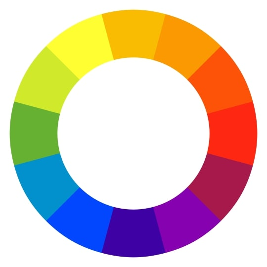
Colors next to each other on the wheel, like blue and green, are analogous and typically create a harmonious and soothing effect. For example, warm colors like red and orange are adjacent on the wheel and generally evoke passion, urgency, and power. Conversely, cool colors like blue and green are associated with growth, reliability, and tranquility.
Complementary colors sit opposite each other on the color wheel, contrast sharply, and draw attention — like blue and orange.
Then there are color tints, shades, temperature, and saturation — all of which affect a visitor’s experience with your site.
For instance, high saturation can make a CTA button’s color more vibrant and attention-grabbing so it stands out on a page. And you can use tints and shades to create a visual hierarchy, with the most important elements in brighter colors and secondary designs in subdued shades. These shades establish a logical flow and guide the visitor’s attention to CTAs or other elements you want to emphasize.
The importance of call-to-action button colors
In web design, button colors directly affect visitors’ attention on and interaction with site components. For instance, bright, vibrant colors stand out against neutral backgrounds like black and white, prompting visitors to take notice. This visual impact guides people toward desired actions as they browse, like signing up for a newsletter or buying a product.
When choosing colors for CTA buttons, consider how those colors influence perception and behavior. Colors evoke specific emotions and associations, which you can leverage to support the CTA’s intended action.
The effectiveness of different CTA button colors also depends on your target audience, brand’s visual identity, and goals. Consistent color choices across your website reinforce brand recognition and ensure the CTAs stand out. And testing different color options can determine which colors resonate best with your audience, leading to more clicks and engagement.


The modern web design process
Discover the processes and tools behind high-performing websites in this free ebook.
The best colors for CTA buttons
Before creating CTA buttons, you need to know each color’s psychological impact. Here are the most impactful colors and how they work in modern design:
- Red. Red is a bold, attention-grabbing color. It’s ideal for time-sensitive actions like “Schedule a consultation!” or “Register for the webinar now!” Red stands out against neutral and cool-toned backgrounds, immediately capturing the eye and encouraging quick decision-making.
- Blue. Blue is among the most common branding colors (think X, Facebook, and LinkedIn). It’s a soothing color that helps users feel secure and comfortable about taking next steps like signing up for a service or filling out a form.
- Green. Apart from CTAs related to learning or progress, you can use green buttons for environmentally focused actions. Green often signals “Go,” encouraging exploration or subscribing to resources like webinars and whitepapers.
- Yellow. Yellow is an uplifting color that represents optimism and warmth. Its high visibility makes CTA buttons stand out, especially against darker backgrounds. But be careful with the button’s brightness, or it may feel overwhelming and unreadable.
- Orange. Orange combines red’s urgency and yellow’s optimism to make CTA buttons that radiate enthusiasm and energy. It stands out without being overly aggressive and effectively promotes new products, discounts, and limited-time opportunities.
- Purple. Purple signifies creativity and luxury, which are often associated with premium products and high-quality offerings. It’s a less conventional choice for CTA buttons but can work if you want to differentiate your brand from more common colors like green and blue.
- White. While it lacks the striking appeal of brighter colors, white is ideal for minimalistic designs and straightforward CTAs where the focus is on messaging rather than color. It also stands out against dark backgrounds and works well if the surrounding page elements are colorful or busy.
- Black. Black conveys power and authority. It makes a striking impression when combined with high-contrast surrounding colors. As a darker color (like purple), black suits luxury and premium brands. But it also adds a touch of elegance to minimalist themes, especially with brighter accents from another color.
- Ghost. Ghost buttons are transparent or translucent with an outline. They blend into the surrounding design and encourage visitors to focus on the button’s text. Ghost buttons are best for secondary CTAs or landing pages with bold background images because they might not stand out enough for your primary CTA and could get lost in a simple, image-free site.
5 tips for choosing the right CTA button color
Here are five tips to help you strategically select and incorporate the best button color into your CTAs and website design.
1. Match your brand’s messaging and style guide
The color of your website’s CTA buttons should align with your style guidelines. For example, if your brand’s visual identity includes eco-friendly colors, choose a shade of green that complements your existing color palette to reinforce this identity. Similarly, if your business emphasizes innovation and your main brand colors are blue and yellow, using a vibrant yellow CTA button against a blue background maintains brand consistency.
2. Maintain CTA consistency across your website
Consistent colors attach a specific emotion or action to a design element, helping site visitors instantly recognize CTAs. If your primary CTA color is blue across the homepage, landing pages, and contact forms, people will naturally associate it with the action stated on the button.
You should also consider a secondary color option to differentiate primary and secondary CTAs. For example, you can use blue for a primary CTA like “Request a demo” and white for a supplementary CTA like “Learn more.”
3. Test different color options
A/B testing allows you to test two website versions with altered button design elements. Experimenting with different hues helps you understand what color stands out the most against your design and what resonates best with your audience.
Red buttons might immediately draw attention and clicks for seasonal sales, while green instills confidence for trial sign-ups. Regularly optimize your CTA button colors to align with your visual identity while maintaining audience relevance.
4. Use contrast
Color contrast is important for visual accessibility because a clear contrast helps as many visitors as possible see, read, and interact with your buttons. Use tools like the Web Content Accessibility Guidelines (WCAG) or Webflow’s accessibility checklist to verify whether your CTA button, font, and background colors meet acceptable contrast standards.
Your CTA button color must contrast against its background and surrounding elements to draw attention. The font color inside the button should also contrast with the button’s fill color to improve readability. For example, a dark blue, purple, or black button with white text stands out if the page’s background is primarily light or neutral.
Using clearly contrasting colors for CTA buttons is especially essential on content-heavy websites because clear differentiation between foreground and background colors ensures the CTA isn’t lost.
You can also offer a toggle to switch your website from light to dark mode and have CTA buttons change between colors from opposite sides of the color wheel.
5. Keep the background uncluttered
An uncluttered backdrop focuses visitor attention directly on the CTA, which helps it stand out and encourages clicks. Avoid placing CTAs over busy images and patterns, and pair clean backgrounds with high-contrast buttons to improve visibility.
For example, you might use a solid white background for a vibrant green “Download our whitepaper” button and place it toward the top of your site where fewer images and text blocks exist.
Optimize your CTAs with Webflow
There’s no best or universal color for CTA buttons. By understanding and applying color psychology to your design, you can guide visitors toward meaningful actions that contribute to your bottom line.
With Webflow, you have the creative freedom to design and optimize websites without relying on developers. Plus, a flexible content management system allows you to refine your CTA buttons so they always deliver maximum impact. Get started with Webflow today to design and optimize a high-converting website.

Get started for free
Create custom, scalable websites — without writing code. Start building in Webflow.