Big brands are experts at wielding their well-known color schemes to create the unexpected, here’s what you can learn from them.
When you visit the websites of famous brands like Facebook, The Home Depot, or McDonald's, the color schemes you see aren't a surprise. But creating a great brand color scheme is just the first step — savvy companies know how to strategically apply their color schemes as well.
Let’s explore the color palettes of well known brands and discuss how different color combinations and even color psychology can influence how consumers perceive brands.
9 brand color schemes and lessons you can learn from them
McDonald's
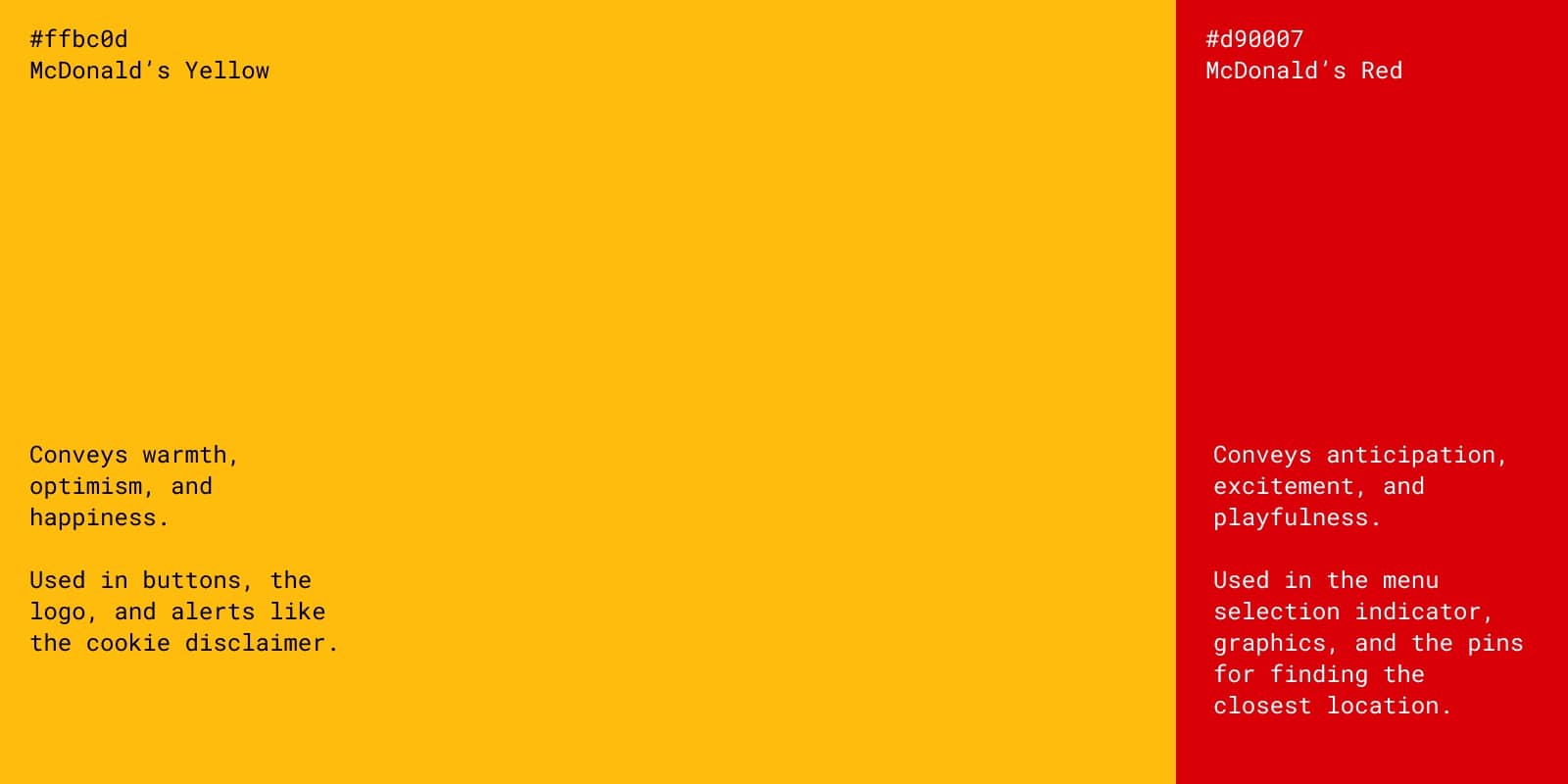
Primary color scheme
McDonald’s Yellow #ffbc0d
Conveys warmth, optimism, and happiness.
Used in buttons, the logo, and alerts like the cookie disclaimer.
McDonald’s Red #d90007
Conveys anticipation, excitement, and playfulness.
Used in the menu selection indicator, graphics, and the pins for finding the closest location.
The classic McDonald's combination of red and yellow is the same color scheme as many other fast-food companies. So much so that it has spawned its own folk theory called the ketchup and mustard theory, which states that red and yellow are so popular among fast-food restaurants because:
- Yellow communicates quickness and is visible at long distances (i.e., from the road).
- Red can have physiological effects like stimulating your appetite and quickening your pulse.
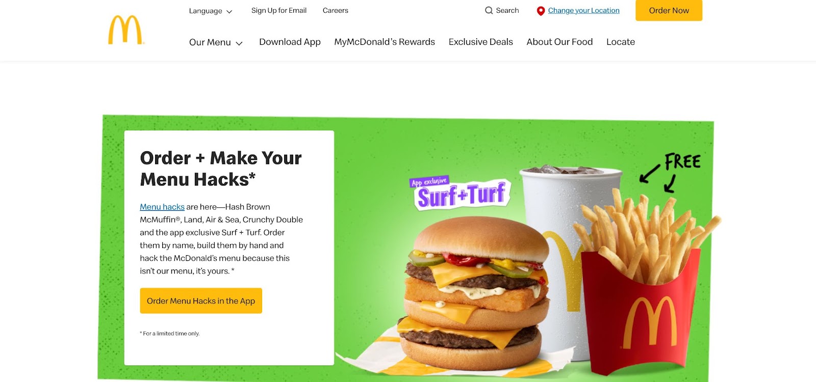
In 2019, McDonald's introduced a new visual identity that upended this classic color combo by swapping the hierarchy of red and yellow. Instead of the yellow-on-red design we all grew up with, McDonald's made a "sunshine yellow" their main color, and demoted red to a supporting role.
With this new visual identity, McDonald's hopes that:
- Yellow communicates warmth, optimism, and happiness
- Red conveys anticipation and excitement
- Supporting colors, like teal and pink, tie a sense of playfulness to their associated products
The McDonald's website uses yellow wherever they want you to take action, like the "Order Now" button. Red appears sparingly, indicating a sense of place as a menu selection indicator or a pin for finding the closest location.
Takeaway: If you have a tricky color in your brand scheme, like an aggressive red, use it sparingly to communicate something specific, like a sense of place or a desire to take action.
Apple

Primary color scheme
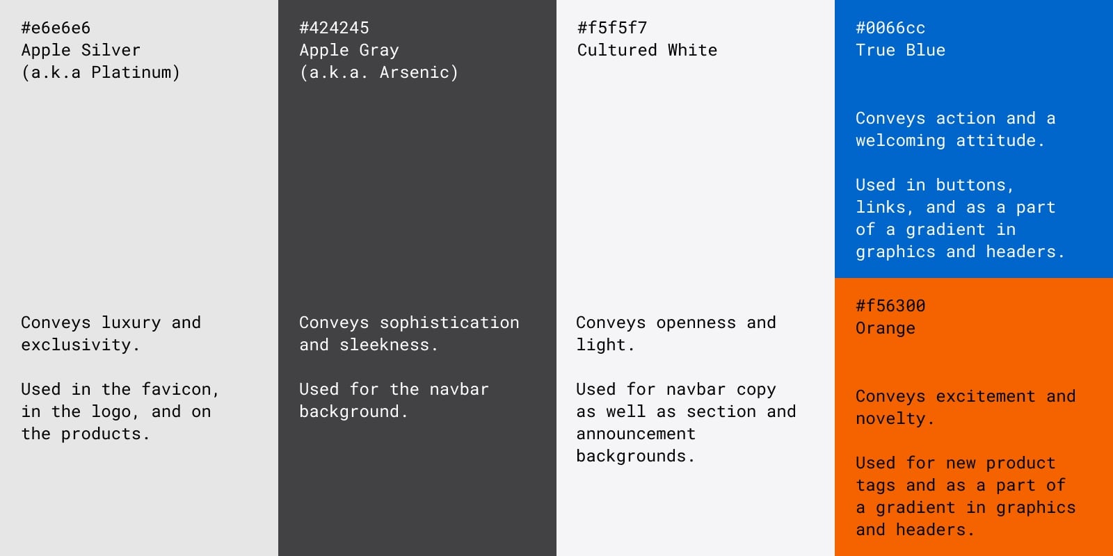
Apple Silver (a.k.a. Platinum) #e6e6e6
Conveys luxury and exclusivity.
Used in navbar copy, the favicon, in the logo, and on the products.
Apple Gray (a.k.a. Arsenic) #424245
Conveys sophistication and sleekness.
Used for the navbar background.
Cultured White #f5f5f7
Conveys openness and light.
Used for navbar copy as well as section and announcement backgrounds.
Accent color scheme
True Blue #0066cc
Conveys action and a welcoming attitude.
Used in buttons, links, and as a part of a gradient in graphics and headers.
Orange #f56300
Conveys excitement and novelty.
Used for new product tags and as a part of a gradient in graphics and headers.
Apple has relied on minimalism to communicate a sense of luxury and elegance since its inception. In one famous 1978 ad introducing the Apple II computer, they came right out and said, "Simplicity is the ultimate sophistication."
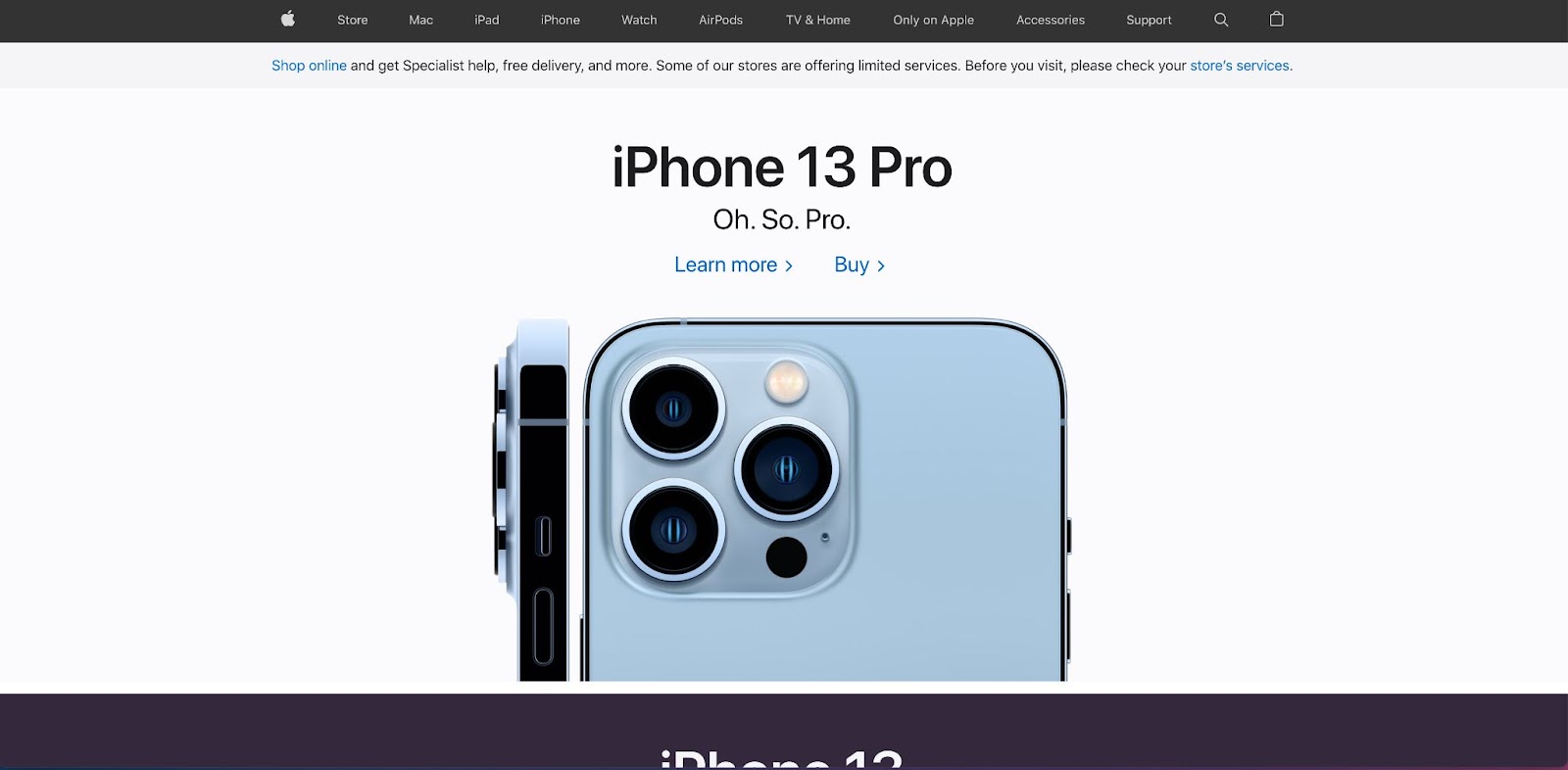
Apple doesn't need extra flourishes to sell their work. The fundamentals, executed simply and expertly, are enough. Apple's minimalism also serves the more practical function of putting their products front and center. The core neutral color scheme makes the hero images stand out.
In the screenshot above of Apple's homepage, a glossy closeup of the new iPhone 13 Pro grabs your attention. The simple, expertly crafted lines of the phone and its camera are the first thing you see with craftsmanship as the focus. The background colors on Apple’s website serve as a framing device for the products themselves.
Takeaway: If you're working with a neutral brand color scheme, use it to frame the quality of your product or service.
UPS
Primary color scheme
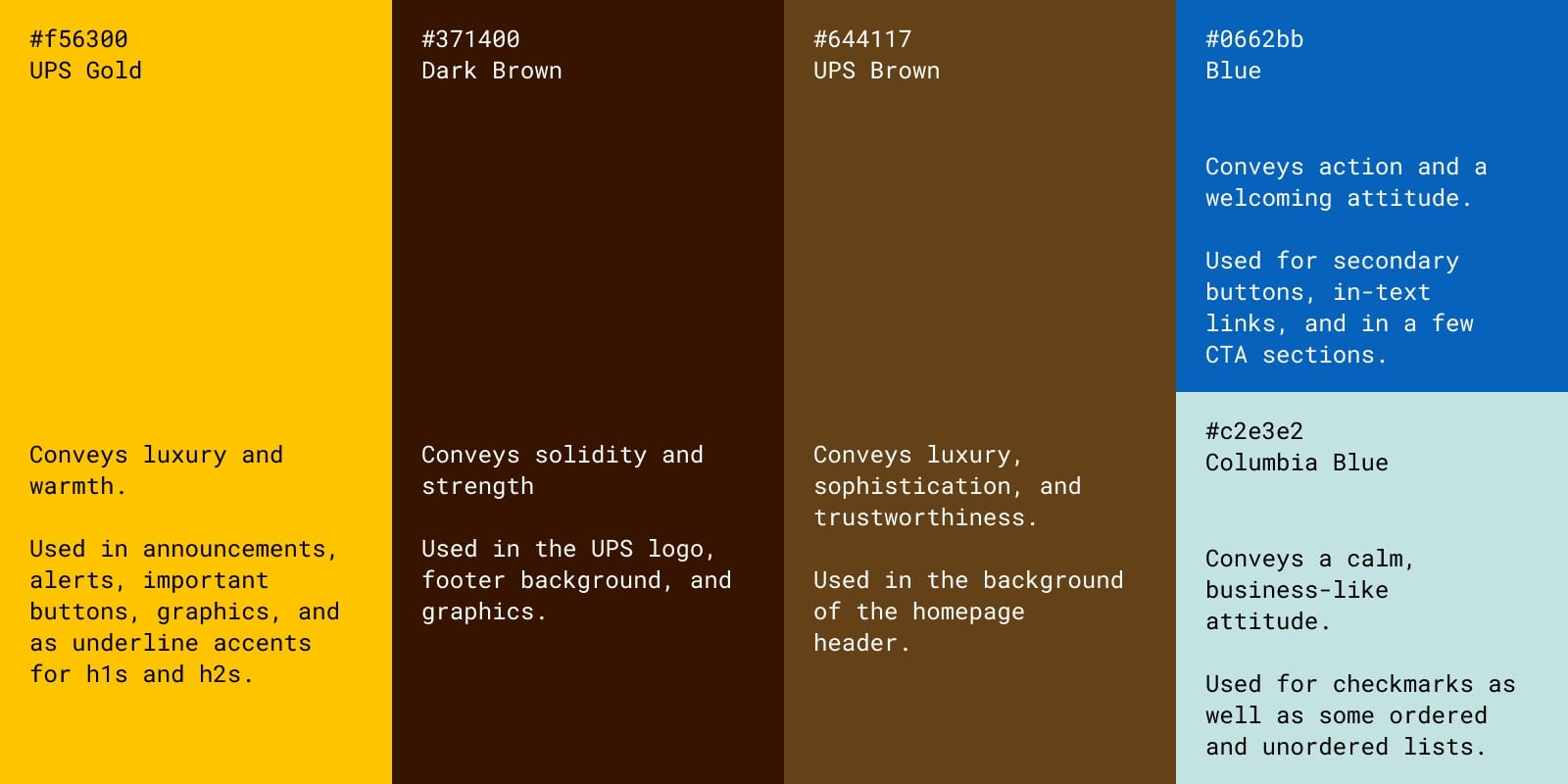
UPS Gold #ffc400
Conveys luxury and warmth.
Used in announcements, alerts, important buttons, graphics, and as underline accents for h1s and h2s.
Dark Brown #371400
Conveys solidity and strength
Used in the UPS logo, footer background, and graphics.
UPS Brown #644117
Conveys luxury, sophistication, and trustworthiness.
Used in the background of the homepage header.
Accent color scheme
Blue #0662bb
Conveys action and a welcoming attitude.
Used for secondary buttons, in-text links, and in a few CTA sections.
Columbia Blue #c2e3e2
Conveys a calm, business-like attitude.
Used for checkmarks as well as some ordered and unordered lists.
UPS and brown are so synonymous that their tagline is "What can brown do for you?" They even went so far as to trademark the use of UPS Brown, originally named Pullman Brown.
Back in 1919, UPS chose brown because it represents "class, sophistication and professionalism." Which makes sense — brown is the color of soft leather, polished hardwood, and rich chocolate. It communicates a sense of comfort and trust, almost saying, "relax, we've got this."
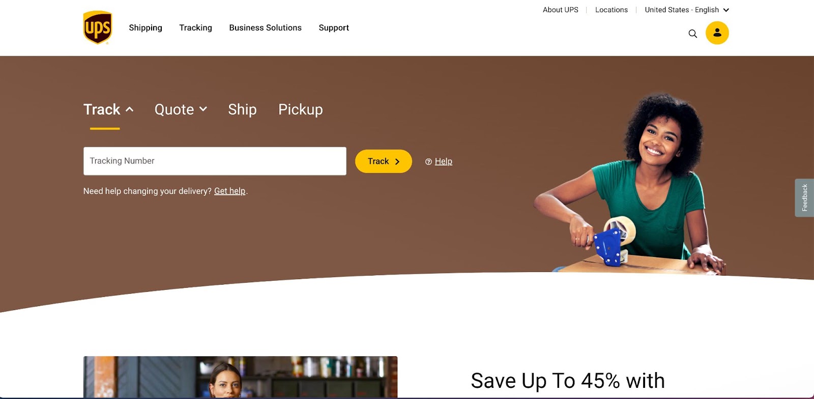
Considering this history, it makes you wonder why UPS Brown only appears in the hero image on the UPS website. Why doesn’t a color so closely tied to UPS’s brand recognition have a significant presence on the company website?
The answer may come from the digital format. UPS Brown still appears prominently in UPS's physical presence — the uniforms, the vehicles, the merchandise, and their stores — because physically, in person, it still carries a luxurious, trustworthy meaning. But that physicality doesn't quite translate to the digital screen. It's too neutral and soft of a color to draw attention. And if it appears too often, the site runs the risk of looking like a muddy mess.
Instead, UPS relies on their other core color, gold. Much like how McDonald's swapped their primary and secondary colors, UPS brings their historically secondary color to the forefront to adapt their brand to a digital format. UPS gold still carries much of the same luxurious meaning of UPS Brown with the added benefit of also standing out and drawing the eye to where UPS wants it to go.
Besides UPS Brown and gold, UPS uses the darker brown of the UPS logo in the footer and in the occasional graphic. Blue appears as secondary CTA buttons, lower in the hierarchy than yellow buttons. Finally, a businesslike Columbia Blue appears in ordered and unordered lists to indicate important steps to a process or requirements.
Takeaway: Legacy brand colors don't always translate well to a digital presence. Lean into your secondary/complementary colors if the core brand color isn't working.
Starbucks
Primary color scheme
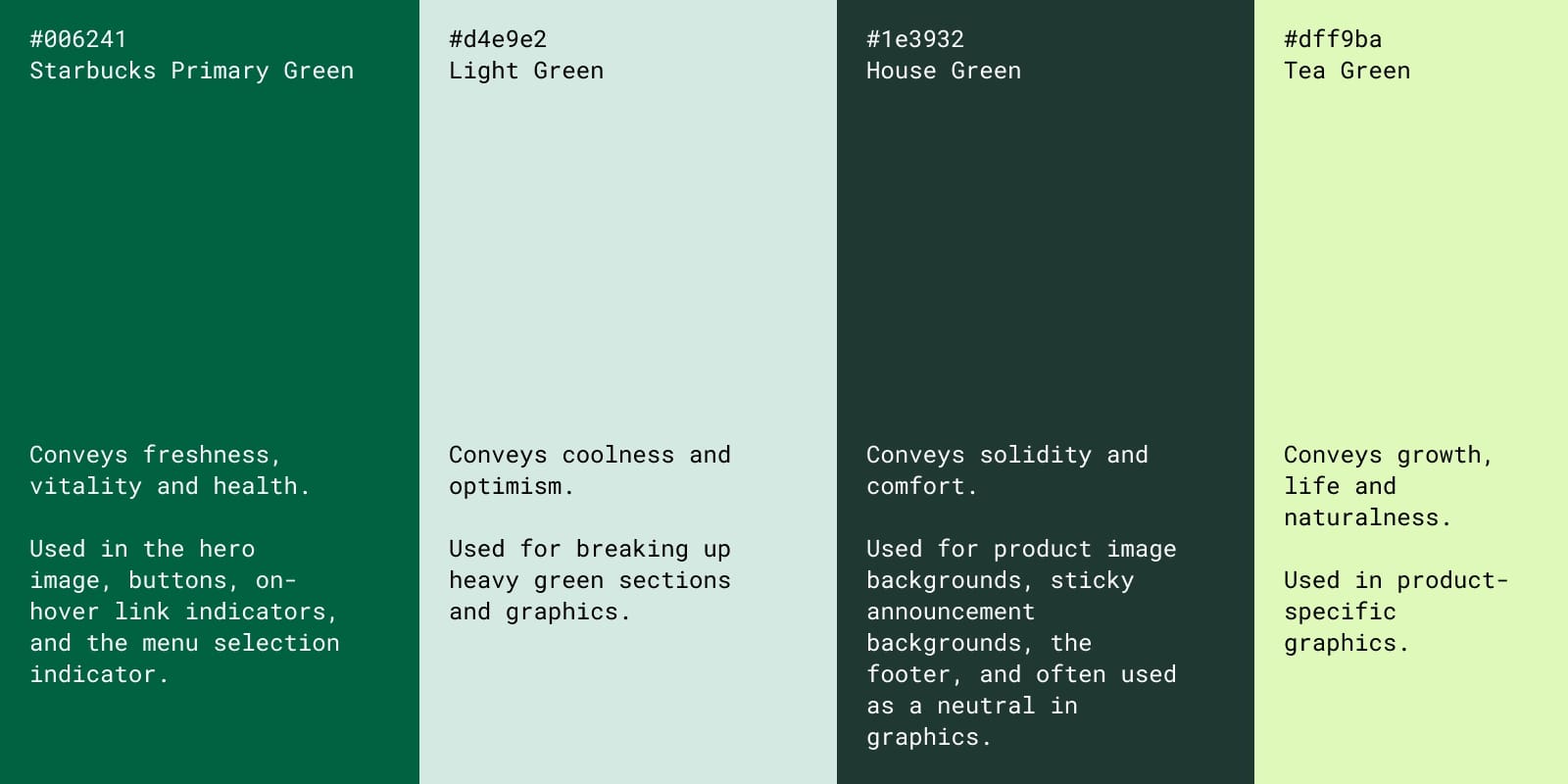
Starbucks Primary Green #006241
Conveys freshness, vitality and health.
Used in the hero image, buttons, on-hover link indicators, and the menu selection indicator.
Light Green #d4e9e2
Conveys coolness and optimism.
Used for breaking up heavy green sections and graphics.
House Green #1e3932
Conveys solidity and comfort.
Used for product image backgrounds, sticky announcement backgrounds, the footer, and often used as a neutral in graphics.
Accent color
Tea Green #dff9ba
Conveys growth, life and naturalness.
Used in product-specific graphics.
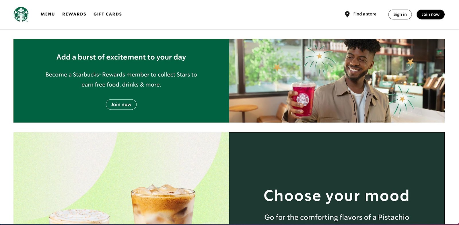
Starbucks is a quintessential Seattle brand and has worked hard to tie itself to the lush greenery and alternative culture of the Pacific Northwest. As it has grown into the largest coffeehouse chain in the world by far, Starbucks has gone all-in on a monochromatic green color scheme which they say "nods subtly to our heritage and propels us into a global future."
Monochromatic color schemes aren't always easy to pull off, but Starbucks manages to do so by using three different shades of green, each of which serves specific purposes. As the name suggests, Starbucks Primary Green is the primary indicator of the Starbucks brand used in the logo and the hero image. It's the first color that greets the reader.
Starbucks then uses House Green as a neutral in the background of product images and in the background of a few sections. Light Green's sole purpose is to break up the blocks of other greens and provide a calming presence. Finally, Tea Green is all over the graphics, providing a spark of life and energy. With these clear roles in mind, Starbucks manages to avoid an onslaught of green and create a pleasant, calming design that stays true to their original brand philosophy.
Takeaway: If you use a monochrome color scheme, assign specific, clear roles to each color.
The Home Depot
Primary color scheme
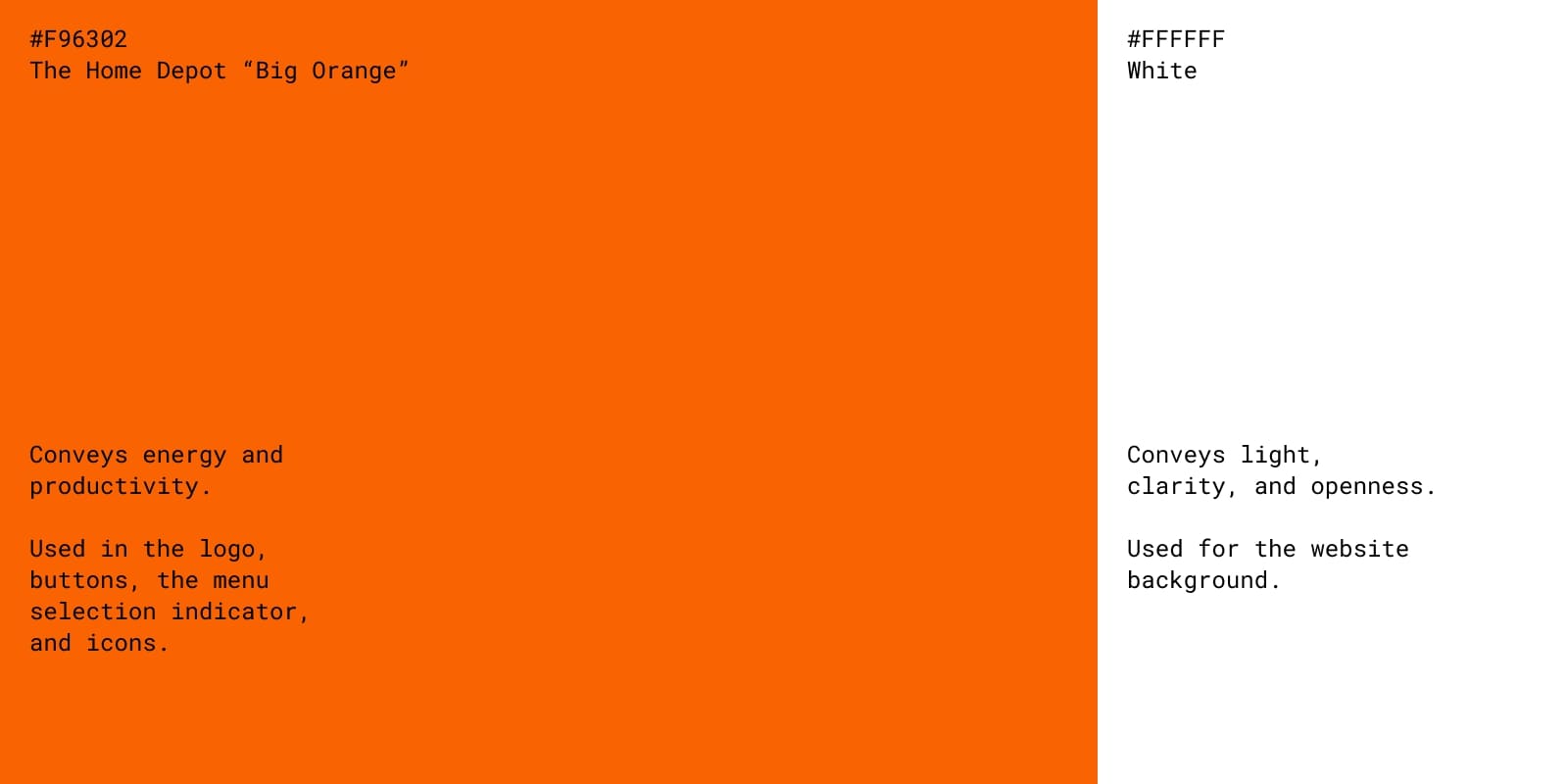
Orange #F96302
Conveys energy and productivity.
Used in the logo, buttons, the menu selection indicator, and icons.
White #FFFFFF
Conveys light, clarity, and openness.
Used for the website background.
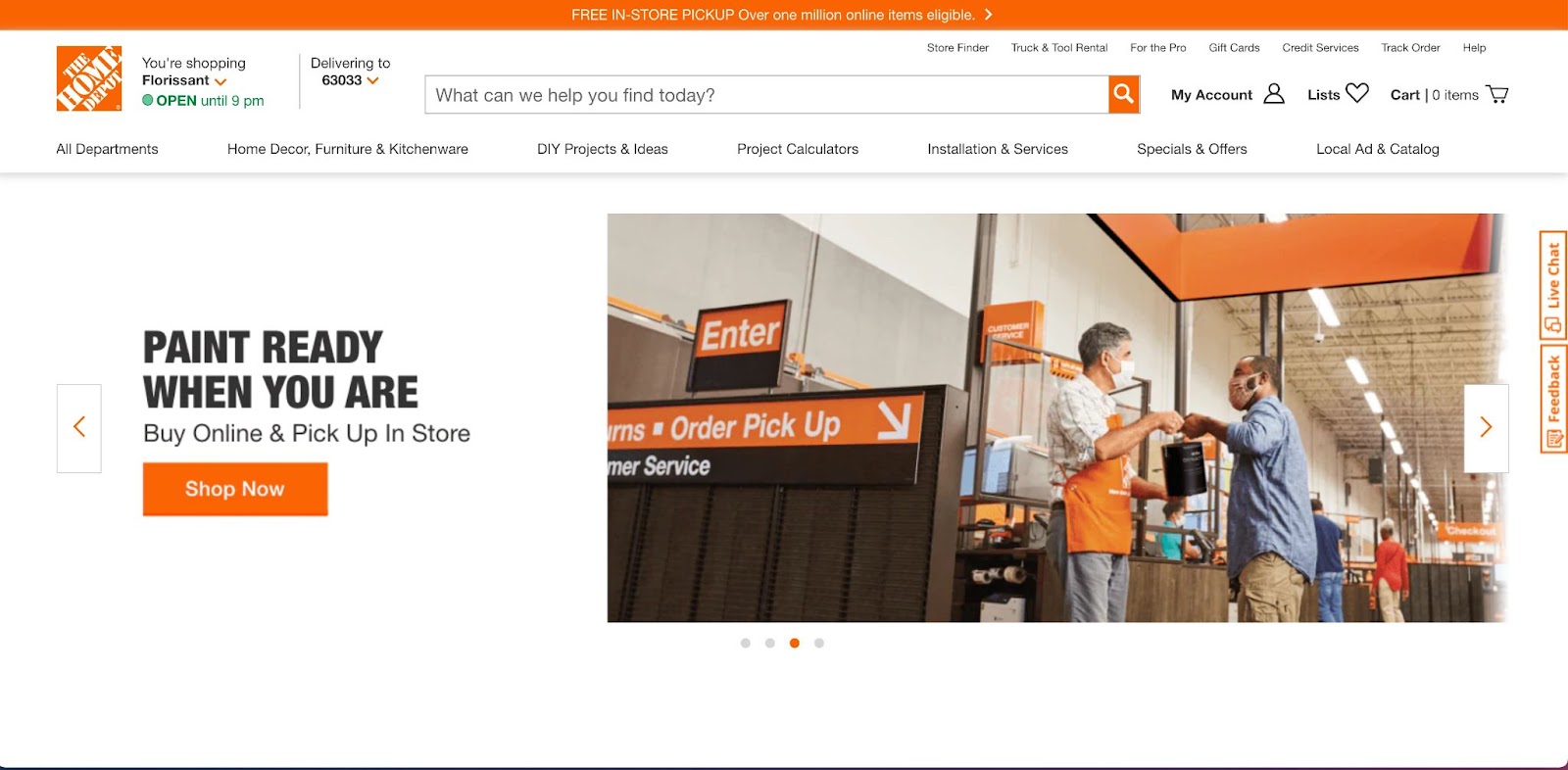
Opposite of Starbucks on the monochromatic color scheme spectrum is The Home Depot, who almost exclusively uses their signature "big orange" on their website. There are no other shades, just one loud orange.
Before opening their first store in Atlanta in 1979, The Home Depot hired Canadian designer Don Watt to establish their branding. Watt chose orange because it represented energy and value. He also imagined orange aprons would turn employees into "beacons" within the store itself.
The Home Depot needed iconic, eye-catching branding because their store was a new concept in the late 70s. The founders, Bernie Marcus and Arthur Blank, had the idea for a one-stop DIY shop where you could purchase everything you need for a big project in one trip. A new idea needed an unexpected, bold color choice that primed the public to pay attention.
Nowadays, The Home Depot is the largest home improvement store in the US and uses "big orange" to stand out from the pack. They make its loudness central to every part of their communications, including the website.
Takeaway: If you use a single color in your color scheme, it needs to be bold and stand on its own.






Get started for free
Create custom, scalable websites — without writing code. Start building in Webflow.
Snapchat

Primary color scheme
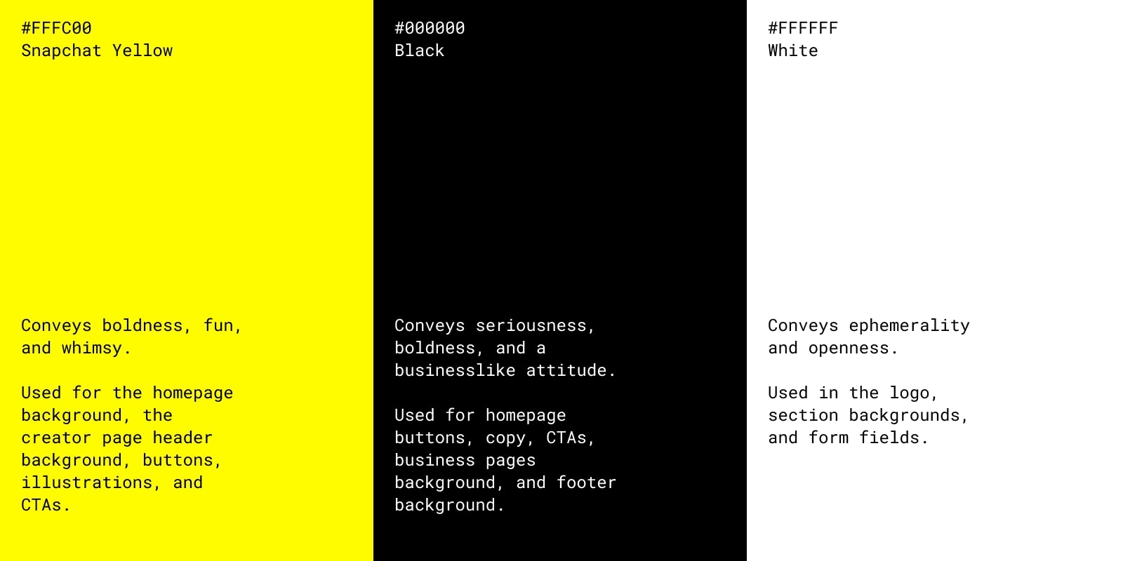
Snapchat Yellow ##FFFC00
Conveys boldness, fun, and whimsy.
Used for the homepage background, the creator page header background, buttons, illustrations, and CTAs.
Black #000000
Conveys seriousness, boldness, and a businesslike attitude.
Used for homepage buttons, copy, CTAs, business pages background, and footer background.
White #FFFFFF
Conveys ephemerality and openness.
Used in the logo, section backgrounds, and form fields.
Snapchat, with its yellow and black, is another example of a company that uses a bold color scheme to stand out. Their website is almost entirely yellow, black, and white — a classic high-contrast color scheme associated with bold, attention-grabbing messages (e.g., road signs, sports teams, and caution tape).
Co-founder Evan Spiegel said the inspiration for the highlighter yellow came from their initial research. None of the top 100 apps were yellow, so they picked it as their main color and made it central to their brand identity. They don't have a deeper reason for it, which aligns with Snapchat's whole ethos of having fun and not overthinking things.
But that doesn't mean Snapchat didn’t think things through. The company has put a lot of thought and effort into balancing out their website's color scheme to communicate different messages depending on the page you're visiting.
Their homepage smacks you in the face with a yellow background, which screams whimsy and fun. The buttons and copy are black, standing out in contrast to the surrounding intensity.
As you navigate deeper into the site, the roles of the colors swap. On the Advertisers and Developers pages, black takes over as the main color on the navbar, header, and in the background of some sections (or the entire page for the Developers pages). Yellow serves as the accent, living in illustrations and calling attention to CTAs and buttons. Black helps communicate that Snapchat is a major technology business that can drive real business results on the more serious pages. It just so happens to also be a fun social media app.
On the Creators pages, yellow maintains its role as the primary color, but it's toned down compared to the home page. There's a balance between black and yellow on these pages, which aligns with creators' needs — they need fun tools to work with and a solid foundation for monetization.
Takeaway: Even if you have a simple color scheme, you can use it to speak to multiple target audiences by emphasizing one color over another.
Netflix
Primary color scheme
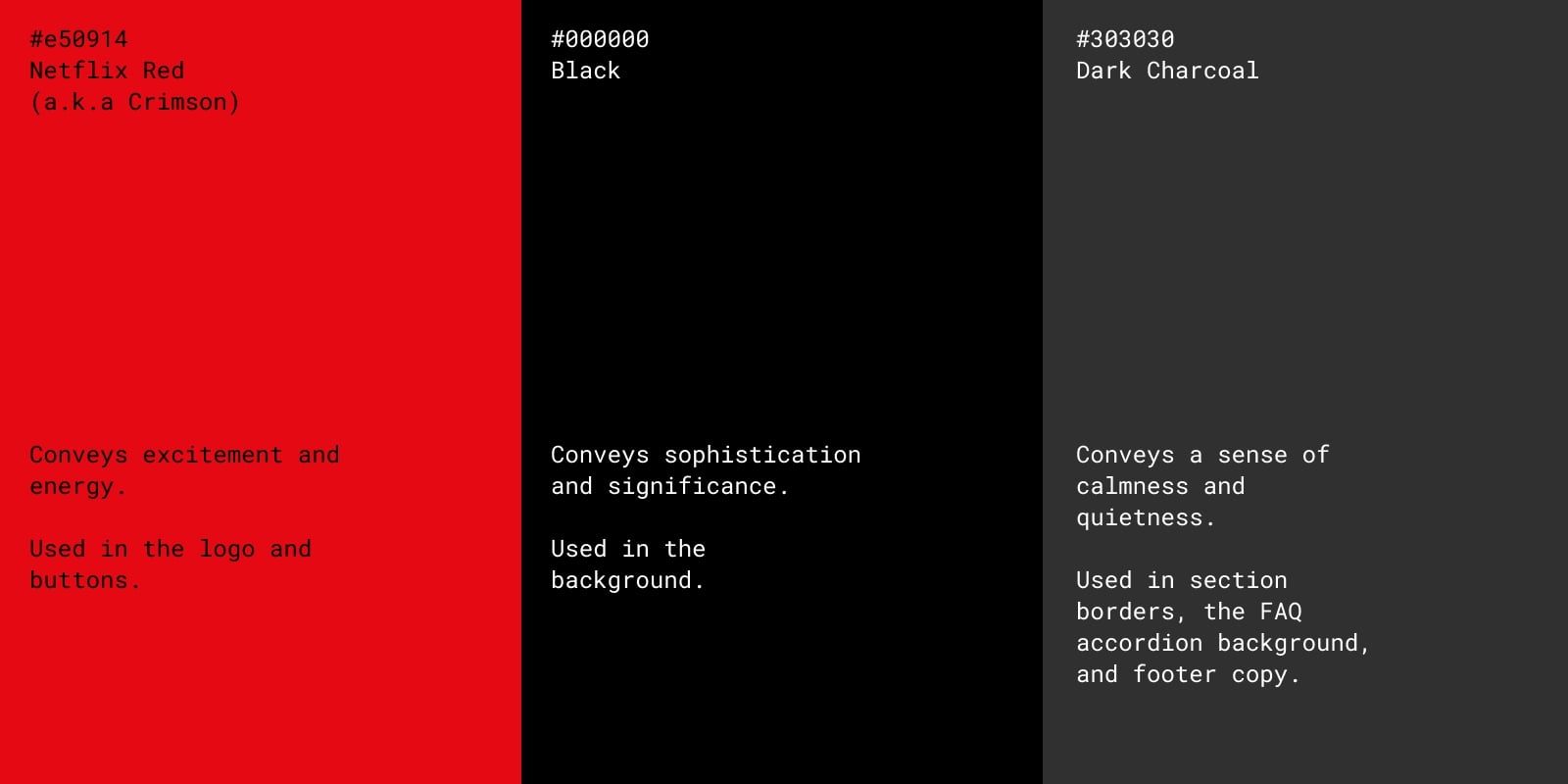
Netflix Red (a.k.a. Crimson) #e50914
Conveys excitement and energy.
Used in the logo and buttons.
Black #000000
Conveys sophistication and significance.
Used in the background.
Dark Charcoal #303030
Conveys a sense of calmness and quietness.
Used in section borders, the FAQ accordion background, and footer copy.
Netflix takes a lot of cues from traditional theater colors, with their red hearkening back to red velvet curtains. According to TikToker designsecretsss, red is a favorite color for theaters because it’s the first color the human eye loses sight of in low light conditions, allowing the audience to focus on the screen or stage. The black and dark gray are also inspired by the theater, denoting a sense of significance and quiet.
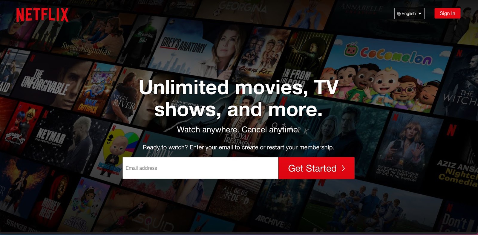
All these choices combine to set the stage for the main attraction — Netflix's content. Netflix uses red to drive actions like “sign in” or “get started.” Black and Dark Charcoal let the audience know that the show is about to start. Altogether, Netflix uses its color scheme to evoke the look and feel of a theater, but in your home.
Takeaway: Your color scheme can evoke a specific feeling or a place, like a theater, to communicate your main value proposition without using any copy.
Mastercard

Primary color scheme
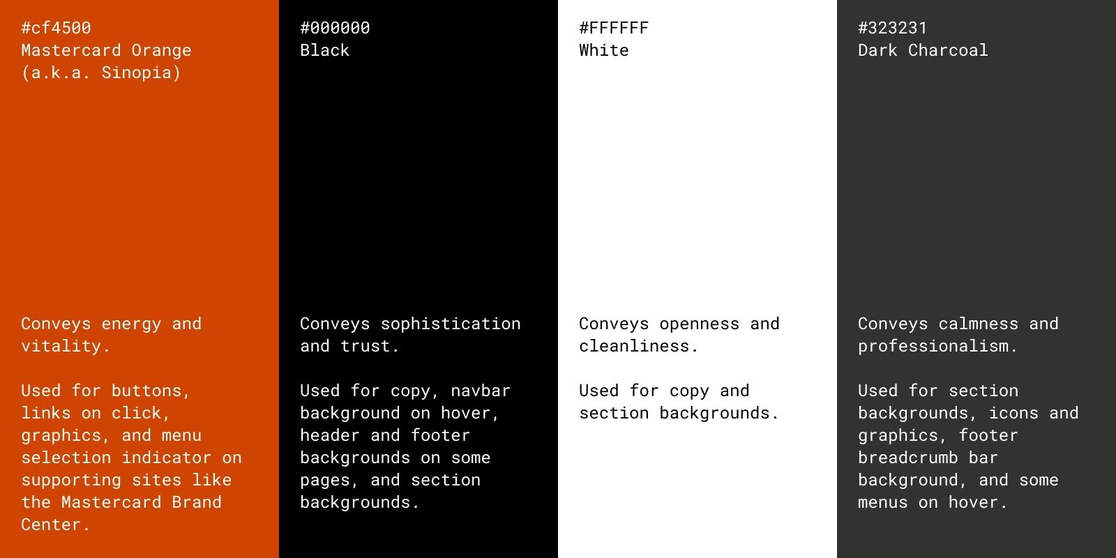
Black #000000
Conveys sophistication and trust.
Used for copy, navbar background on hover, header and footer backgrounds on some pages, and section backgrounds.
White #FFFFFF
Conveys openness and cleanliness.
Used for copy and section backgrounds.
Dark Charcoal #323231
Conveys calmness and professionalism.
Used for section backgrounds, icons and graphics, footer breadcrumb bar background, and some menus on hover.
Accent color scheme
Orange (a.k.a. Sinopia) #cf4500
Conveys energy and vitality.
Used for buttons, links on click, graphics, and menu selection indicator on supporting sites like the Mastercard Brand Center.
One of the things that sticks out most about Mastercard's website is the absence of its brand color scheme of red, orange, and yellow. But these colors still loom large over the website design if you know what to look for.
In 1960, MasterCard (then called Master Charge) rolled out its new logo of two overlapping red and yellow circles. The original inspiration was drawn from the company's expansion to foreign markets, mainly Japan. The two circles represented the joining of two worlds — East and West. In 1979, when Master Charge rebranded itself as MasterCard, brand consultants Siegel+Gale defined a new meaning, where the circles represent the "interaction between customer and credit card" to create something new.
MasterCard has recently increased its reliance on this Venn diagram with a complete rebrand in 2016 and even dropped the MasterCard wordmark in 2019. Now, MasterCard's brand is all about the red, yellow, and orange Venn diagram. So why don't we see more of these colors in their web design?
Just as red and yellow create orange, the customer and MasterCard come together to create an experience. These experiences, like tropical vacations and family reunions, are what MasterCard's website focuses on — not the MasterCard itself, but what the card makes possible. These experiences are what the orange represents. In this way, orange is ever-present on the site, if only emotionally.
Takeaway: Your brand color palette can inform your design and communicate your core brand message even with very minimal presence.
Facebook
Primary color scheme
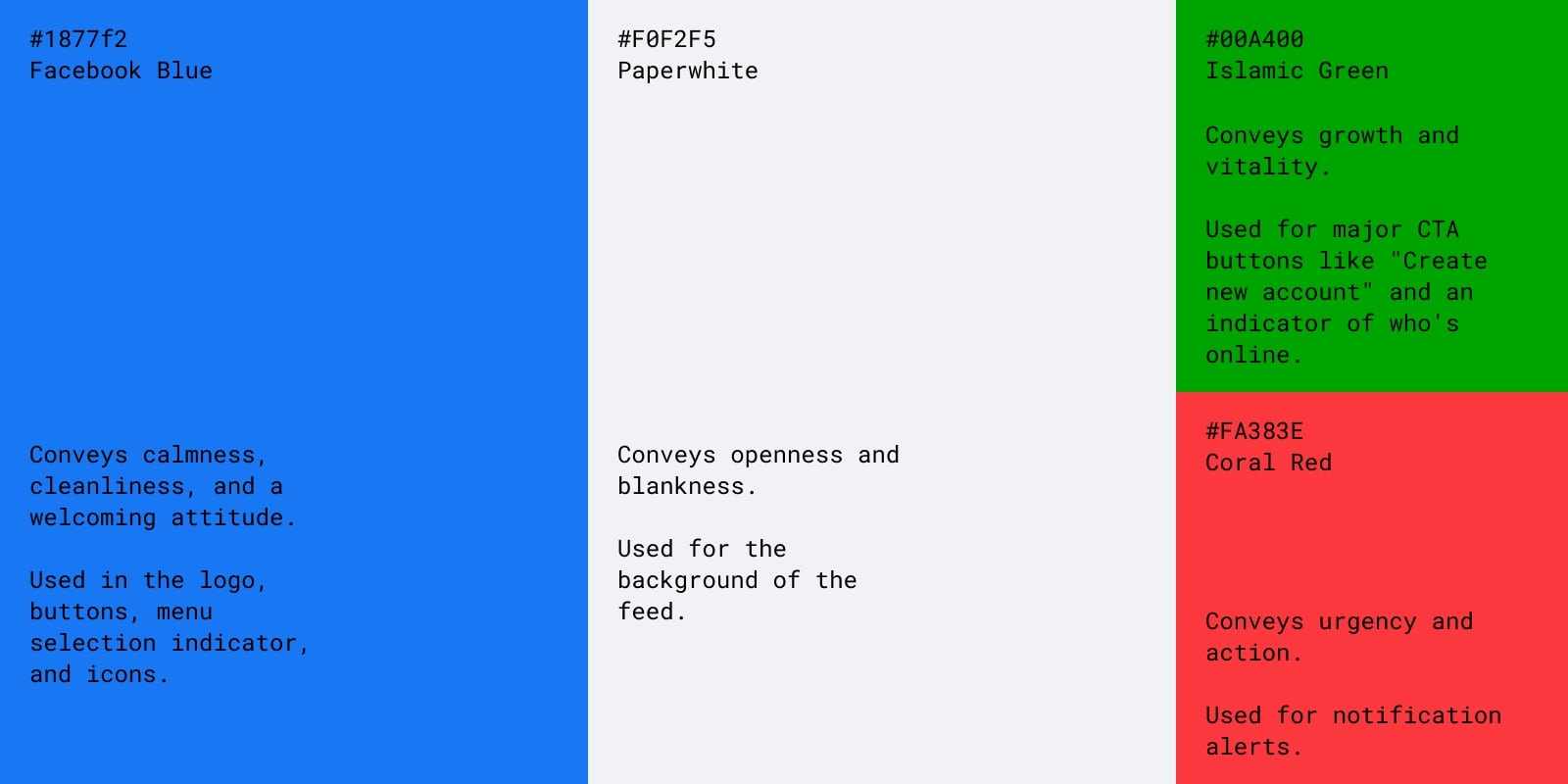
Facebook Blue #1877f2
Conveys calmness, cleanliness, and a welcoming attitude.
Used in the logo, buttons, menu selection indicator, and icons.
Paperwhite #F0F2F5
Conveys openness and blankness.
Used for the background of the feed.
Accent color scheme
Islamic Green #00A400
Conveys growth and vitality.
Used for major CTA buttons like "Create new account" and an indicator of who's online.
Coral Red #FA383E
Conveys urgency and action.
Used for notification alerts.
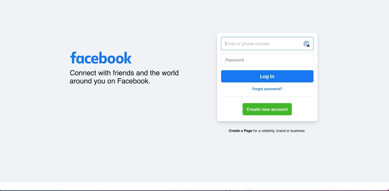
Since the beginning, "Facebook blue" defined Facebook’s brand personality. But in recent years, they’ve been separating itself from the color blue.
If you look at Facebook’s branding website today, they say, "We believe people can do more together than alone. That's what Facebook is all about. People. Not the color blue." They go on to say, "Our color strategy reflects the product itself, where people's colorful content sits on a white background."
Facebook has fulfilled these ideas in their current design. Blue serves as a connecting thread appearing in the logo design, in icons, as buttons, and more. No matter what you're looking at, blue is in the periphery. The posts in the feed now live on what Facebook describes as "paperwhite," which they say adds warmth. This color scheme aims to center user and user-generated content while still maintaining a recognizable "Facebook stamp" on everything.
Takeaway: If your goal is to host user-generated content, keeping your primary color in the periphery will maintain your brand presence.
Creating your website's color scheme
Your website color scheme is not just about the colors you choose but the way you use those colors. You can make the colors central to your design like Snapchat and The Home Depot or let them recede, becoming framing devices like Apple and Facebook. Or, you can come up with your own strategy.
To learn more about color scheme meanings, check out the following resources:
- Color theory for designers: a beginner's guide
- 10 color meanings: the psychology of using different colors
- The Designer's Dictionary of Color
Ready to experiment? Start a Webflow project today.
