Selecting a life coach isn’t as simple as picking a name from a list.
If you want a coaching website to win over potential clients, everything from the site navigation to the organization of the content needs to make site visitors feel confident in the specific coaching services offered.
What makes a good coaching website?
Successful life coaching websites assert your personal brand as a coach and tell visitors what you do (and what sets you apart). Coaching websites should also:
- Host relevant information. Provide potential clients with important information about your services, including pricing, packages, and specialties.
- Embody your brand. Use web design that represents your brand and philosophy to assert individuality and stand out in a crowded industry.
- Build trust. Include a testimonial section to share success stories and prove why potential clients can trust you.
- Link to other channels. Give visitors the option to connect or learn more about you via other channels, like email, social media, or a scheduled consultation.
4 life coaching website examples
The best life coaching websites start with a vision. Take a look at these examples to spark some ideas for yours.
1. Joél Thika
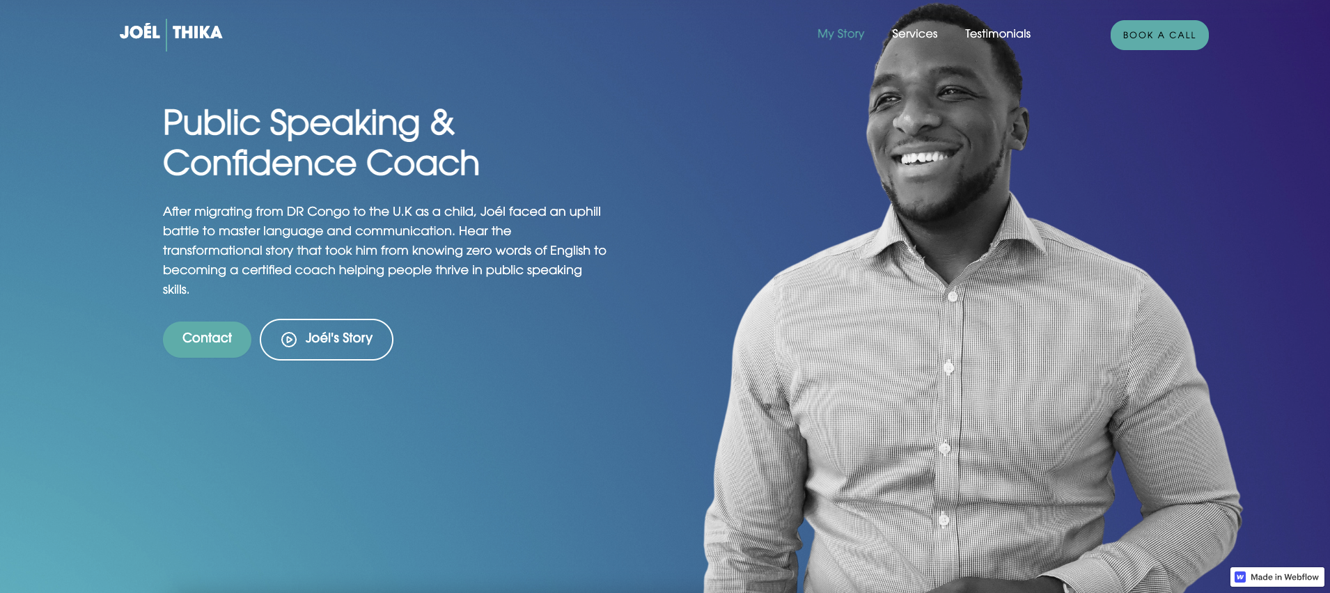
Joél Thika is a public speaking and confidence coach. His portfolio is a single landing page with a brief bio, a portrait, and a header describing his services. These features tell visitors who Joél is right off the bat: an immigrant who struggled with English before mastering the language. His background could resonate with potential clients who’ve felt the same way.
In a banner below Joél’s bio, recognizable names like the BBC, Adidas, and the United Kingdom National Health Service highlight his previous speaking engagements and collaborations to reinforce his credibility as a life coach.
Below the list of services, testimonials praise Joél’s work and speeches. This social proof helps convince visitors who need additional nurturing. Email and social media links at the bottom of the page also prompt further inquiry from potential clients, letting them know Joél is available to answer questions.
On a single page, Joél demonstrates his credibility, displays real endorsements, and gives visitors all the info they need to book his services.
2. Mindful Living
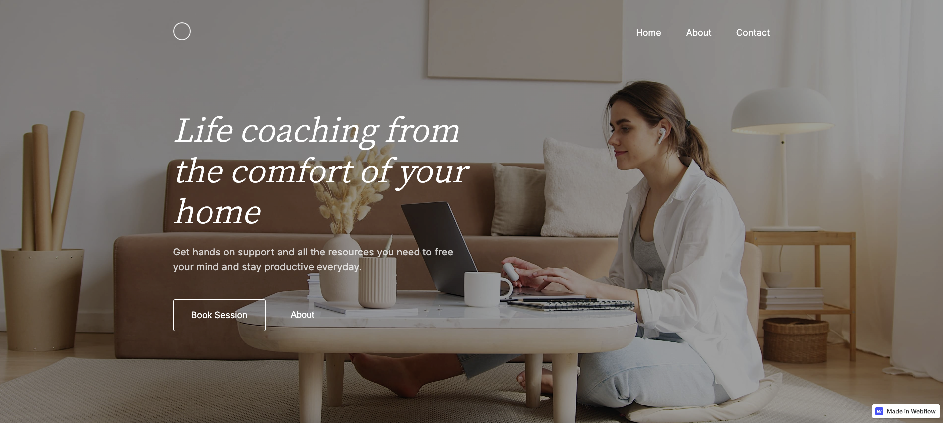
Mindful Living is a sample of a life coaching website from designer Josephine Heide. The muted colors, sparse navigation, and clear heading offer a minimalist design that doesn’t overwhelm. By sticking to the basics, Josephine creates an online space that echoes the calming tone clients can expect from a wellness and life coaching business.
The background photograph — a person sitting at their computer in a tidy living room — highlights the business’s selling point: at-home services. The homepage also has a concise call-to-action (CTA), a link to an “About” section, and a button encouraging bookings. The rest of the landing page uses warm colors and ample whitespace.
As you scroll down, the words “pause for a moment” appear on an image of a mug and book resting as white sheets. The image expands to fill the page, mimicking a deep breath. It’s a clever design choice for a coaching website that promotes relaxation and recentering.
Josephine’s sample website creates a cozy, orderly design that speaks to potential clients.


Build websites that get results.
Build visually, publish instantly, and scale safely and quickly — without writing a line of code. All with Webflow's website experience platform.
3. Dave Southern
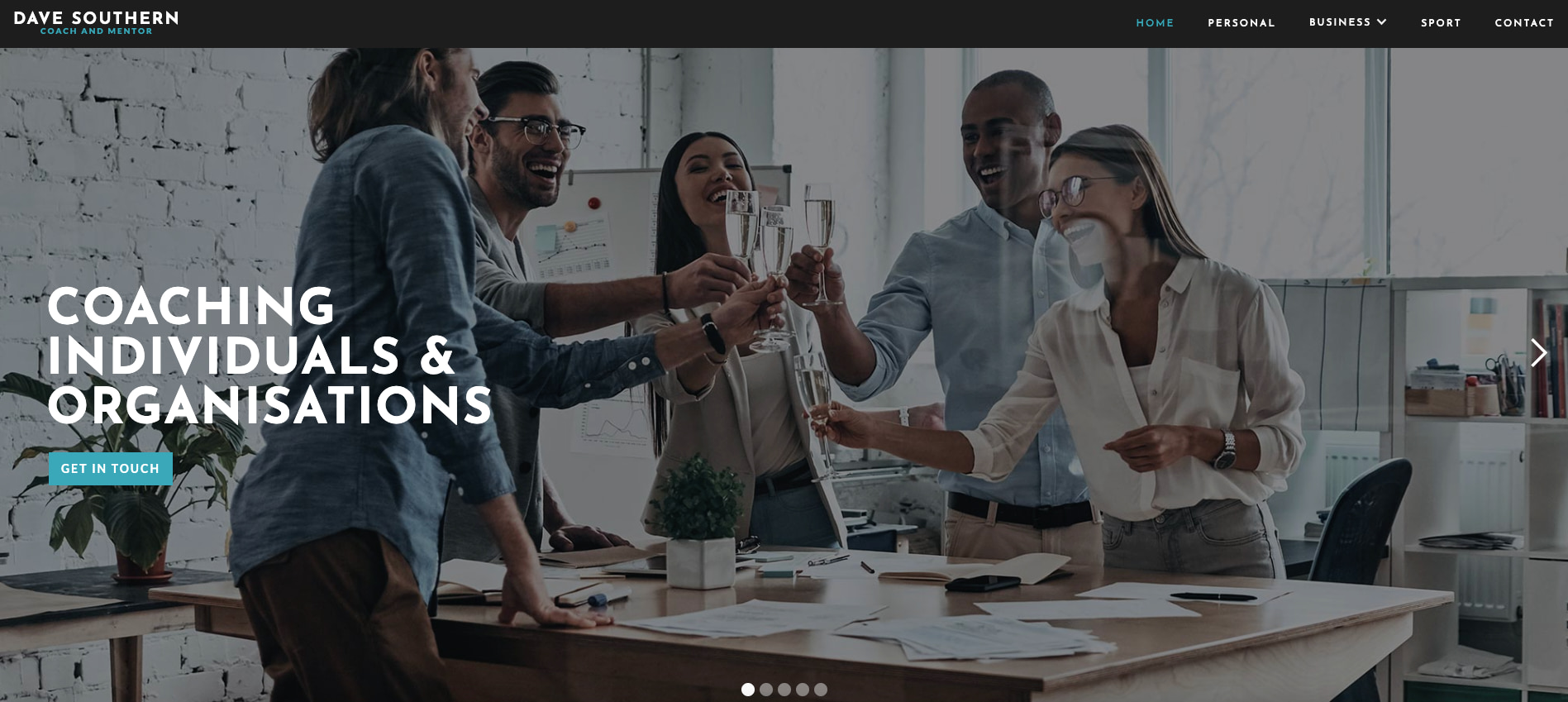
Dave Southern is a coach and mentor who segments his services into three categories: personal, business, and sports. Each of these options is clearly defined in the top navigation bar, making it easy for potential clients to select the right path.
An image carousel on the homepage also separates his services by specific goals like gaining a better work-life balance, achieving professional goals, and improving one’s health and wellbeing. Each image also has a teal “GET IN TOUCH” button so potential clients can reach out right away if the goal resonates with them.
Instead of overwhelming visitors, Dave presents his services one by one with quick CTAs to streamline the user experience and drive conversions.
4. The Freemans
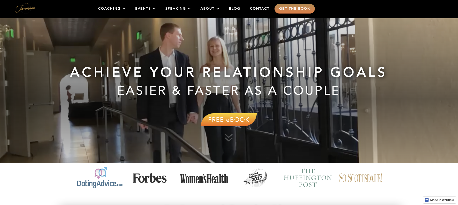
Jocelyn and Aaron Freeman are a married couple that run a couples coaching business together called The Freemans.
A looping video header plays footage of the Freemans speaking at conferences, interacting with clients, and walking through past events as a united pair. Considering their target audience includes couples who want to succeed together, this is an effective approach. The footage follows the “show, don’t tell” approach — showcasing what potential clients could achieve through their coaching services.
This site’s most impactful section is “The results,” where happy couples share their success stories after working with the Freemans. Displaying these wins offers proof of their skills, boosting credibility and increasing sign-ups.
With a clean design and footage from real events, the Freemans’ website immerses potential clients into their world. They know their niche — couple-to-couple coaching — and embed it in every element, showing clients exactly what they can do.
Take your coaching brand to the next level
A successful coaching website shows and tells. It informs users, provides social proof, and answers questions that lead to conversion. The best life coaching website templates do all of these things well, giving potential clients multiple avenues to continue the conversation and sign on for services.
Learn how to create a coaching website through the Webflow 101 crash course or get a headstart with a coaching website template.


