


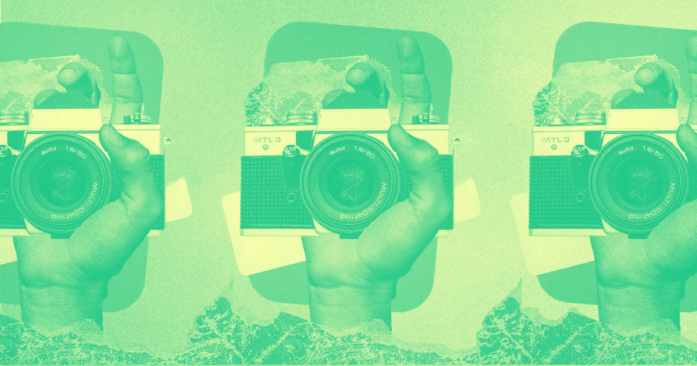
A professional photography website is a must-have if you want to attract new clients and build a thriving photography business.
But today, simply having a website isn’t enough — you need a visually appealing website with a great user experience (UX). Studies have found that “88% of online consumers are less likely to return to a site after a bad experience.”
Fortunately, investing in a website with great UX can yield excellent returns. Forrester found that every dollar invested in UX brings back an average return of $100. Here we explore how you can build a photography website with great UX that wins you clients, whether you’re an independent photographer looking to build your own website, or a designer creating a photography website for a client.
Define your target audience
As a photographer, the very thought of narrowing down your target audience might cause you to bristle.
I get it—what artist wants to limit their potential clients? But defining your target audience shouldn’t be about limiting potential clients, but rather help you connect with each of your ideal clients in a meaningful way.
As you go through this process, try answering these four questions:
- Which types of clients have paid you the most for your services?
- Which types of photography in your portfolio could you charge the most for?
- What type of new clients would you most like to work with?
- Which type of photography do you most enjoy shooting?
These questions should help you define the types of clients you’d like to attract with your website.
Determine your conversion goals
Once you’ve clarified who you want to visit your photography site, get specific about what you want visitors to do. If you offer highly customized services, maybe you want site visitors to fill out a contact form. If you’re an educator, perhaps your conversion goal is to have users sign up for a class.
You can see an example of how conversion goals affect design choices in photographer Nathan Phua’s website. Every gallery is optimized for conversions with a button at the top of the screen that takes visitors to the contact form.
Large businesses with hundreds or even thousands of pages on their website often have multiple conversion goals, but for smaller sites, it’s a good idea to set just one or two conversion goals. The more things you ask a visitor to do on a single page, the more confusing the UX can become. Simplicity goes a long way to providing a great UX that gets you the conversions you want.
Purchase a domain
There are several sites where you can purchase your own domain, including Dynadot and Name Cheap. If you already have a Webflow account with a site plan, you can purchase a GoDaddy or Google domain in the Hosting tab under Custom Domains.

If you have a single target audience, try looking for an SEO-focused domain aligned with that audience. For example, if you’re a wedding photographer in Southern California, the domain ‘socalweddingphotography.com’ or ‘socalweddingphoto.com’ could give you a boost in organic search.
On the other hand, professional photographers with multiple target audiences often use their name or company name as their domain because it offers lots of flexibility. If you’re having trouble coming up with ideas, try playing around with a domain name generator.
Map out the structure of your photography website
It’s a good idea to lay out the sitemap you want before jumping into design even if you plan to use a template rather than designing your own photography website from scratch. It’s easy to stray off course while combing through beautiful photography templates or assigning photos to individual galleries if you don’t have a map to guide you.
I like to map out my site structure the analog way (using a pencil and paper) because it makes a predominantly digital process a little more hands-on and reduces my screen time. But there are plenty of awesome sitemap design tools like Octopus or Gloomaps out there if you prefer to work digitally.

Here are some common pages to consider:
- Homepage
- About me page
- Gallery or photography portfolio (with subpages for different types of photos)
- Contact page
- Pricing page
- Blog
- E-commerce or online store
Depending on your conversion goals, you may also want to create a separate page for testimonials, awards, gallery showings, or tutorials.


Get our 100 video course on web design — for free
From the fundamentals to advanced topics — learn how to build sites in Webflow and become the designer you always wanted to be.
Design your website
Now it’s time for the fun part — website design! Whether you plan to use a template or design from a blank canvas, be sure to check out Made in Webflow for inspiration. Webflow also offers a bunch of stunning photography website templates at varying price points that make for a great jumping off point.
While you’re working, be sure to keep these four key points in mind.
1. Make sure your design is responsive
Your website needs to look good on any device — from a 27” monitor down to a smartphone screen. This is a vital component of delivering a great UX and studies have found that more than half of website visitors won’t recommend a business if its mobile site isn’t well designed.

Luckily, Webflow simplifies responsive web design. In the Webflow designer, you can easily see what your site looks like on different devices using the breakpoint buttons at the top or by sliding the tab at the right edge of your canvas.

Changes you make to your base breakpoint (the one with the star) affect all views. You can also make changes specifically for larger or smaller devices which will cascade down or pass up to additional breakpoints intuitively. So, if you make fonts bigger in the tablet view, those changes will cascade down to cell phone views, but won't pass up to desktop views.
2. Pay attention to image size and file type
Make sure you’re using optimal image sizes and file types. Generally speaking, JPG and PNG files are best for photographs and SVG files are best for logos, illustrations, and vector images. When it comes to image size, bigger is not better. Your goal should be to upload the smallest image that will look good.
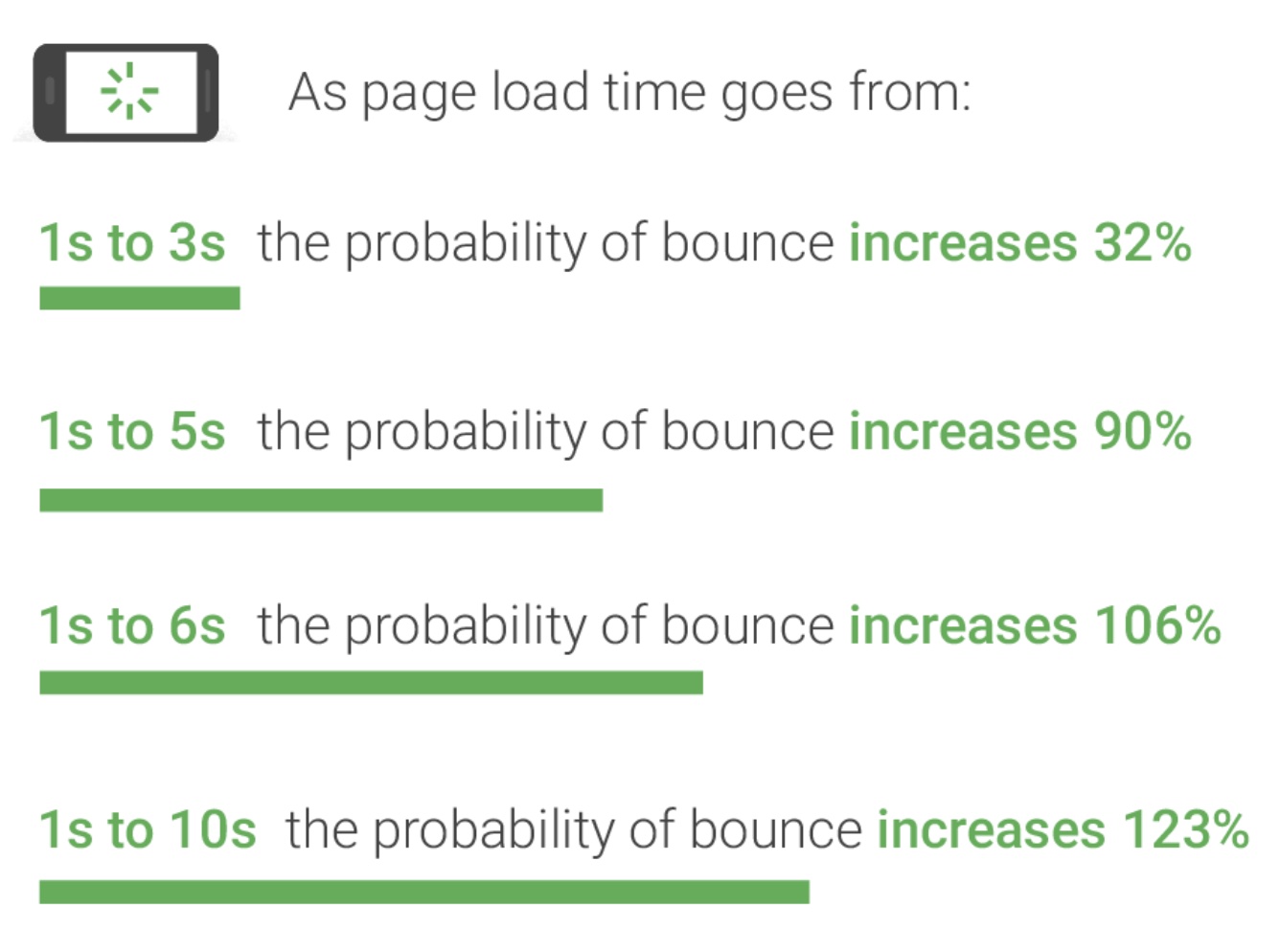
27-inch Apple iMac computers with 5K Retina display have a resolution of 5120 x 2880 pixels, so anything over ~5K pixels is likely overkill. Most images with a width closer to ~3K pixels will look just fine on larger screens, and the costs can greatly outweigh the benefits if your image is too large. Photos that are too big can negatively affect SEO performance, increase load times and bounce rate, and create a poor UX.
To ensure images are sized properly on any device, Google recommends serving responsive images. This can be a tedious process but using a photography website builder like Webflow that automatically optimizes inline images can save you a lot of time. Note that if you are using Webflow, you’ll still need to manually upload background images in the correct file size for each device and add them at each breakpoint.
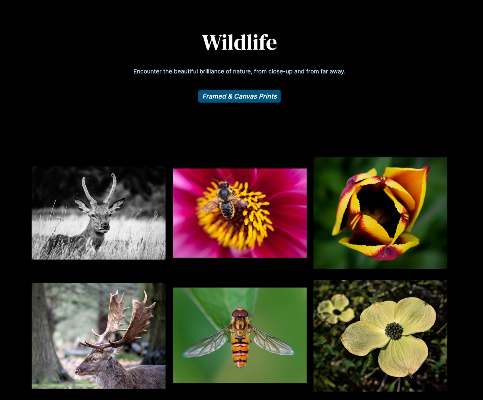
3. Aim for image quality over quantity
Choose only your best individual images and think about how your online portfolio as a whole shows off your range. Website visitors have extremely short attention spans. You run the risk of losing your audience if you overload them with too many slight variations of photos from the same shoot.
According to research conducted by the Nielsen Norma Group, “To gain several minutes of user attention, you must clearly communicate your value proposition within 10 seconds.” If you’re having a tough time deciding what to cut, enlist the help of some friends or social media followers. Conduct a poll to see which images get the best response.
When it comes to exactly how many images you should have in photo galleries, there’s no one right answer. Alex Vita of Foreground Web studied the websites of more than 100 famous photographers and found that the “sweet spot” for gallery size is approximately 15 to 20 photos, but the study notes that gallery sizes actually varied from 3 images to 335. The key is to share only your best work and make sure there’s variation.
4. Optimize for SEO
Follow SEO best practices to help your site show up in search engines. No matter what kind of website you’re designing, you should make sure every page has well-optimized title tags, meta descriptions, and proper heading structure.
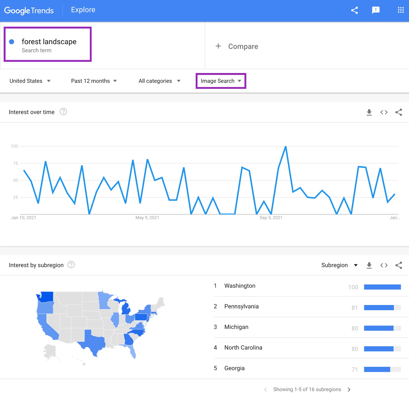
According to Moz, images are presented for more than a quarter of Google searches, which is good news if you want your photography website to show up in search results. You can use Google Trends to search potential keywords and see what’s trending specifically in Image Search. Familiarize yourself with best practices for Google Images and don’t forget to add alt text for all of the images on your site. Alt text isn’t just important for SEO, it’s also essential for accessibility and inclusivity because it is used by screen readers.
Photography websites typically don’t require a lot of text, which can make it hard to rank in Google search. Adding a blog can be a great way to boost SEO because it’s a natural way to add more text to your site. But publishing enough well-optimized blog content to make a difference in organic growth is a large time commitment, so consider whether or not this is right for your website.
Proof and publish
Once you’ve got a version of your website that you’re happy with, do some testing before you hit the publish button. Get a few current clients or friends to check out your design and give feedback. This step is invaluable for maximizing your UX.
Once you’ve made final edits based on test group feedback, you’re ready to share your design with the world.
Want more tips for building beautiful responsive photography websites? Visit Webflow University for courses, lessons, and tips that will take your designs to the next level.