Striking websites possess a distinctive wow factor. They’re visual delights where every pixel has a defined place and purpose.
But translating this concept into a tangible design yourself can prove challenging. When your project doesn’t align seamlessly with your vision, drawing inspiration from aesthetic examples can be invaluable. To learn from the sites, analyze them, break down the experience, and unravel the innovative techniques weaving their captivating narrative together. The insight you gain from doing this — plus healthy doses of creativity, good design judgment, and technical skills — will help you turn your aesthetic website visions into reality.
How to create a website that turns heads
Despite differences in individual design styles or website purposes, certain elements consistently contribute to aesthetic web design:
- Negative space. Designers who create high-quality work let their designs breathe with plenty of white space, evoking a calming effect on the user and enhancing the clarity and digestibility of on-screen content. White space also directs attention to critical site elements, optimizing the user experience (UX) and overall site navigation.
- Typography. Deliberate typographic design choices evoke specific emotional and mental associations in site visitors, shaping the user experience. By selecting appropriate font styles, sizes, and colors, designers can effectively communicate brand personality and ensure information is aesthetically pleasing and legible.
- Composition. Designs with exceptional composition have an intuitive, easily understandable feel. A solid layout instills visual hierarchy, emphasizing the importance of certain elements and fostering a logical flow of information.
- Color. Like typography, colors create emotional and mental associations, so mindful color choice is critical. Despite the frequent use of muted colors or grayscale in many attractive websites, bold colors can be equally effective if you don’t pack too many into a small space.
Remember that rules — while necessary — also allow for creative deviations, and bending one or two can create a memorable visual experience.
8 aesthetic websites to visit for ideas
Here are eight websites to inspire your aesthetic taste. These remarkable examples combine beauty with functionality to create a superb user experience.
1. Cabanana Atelier
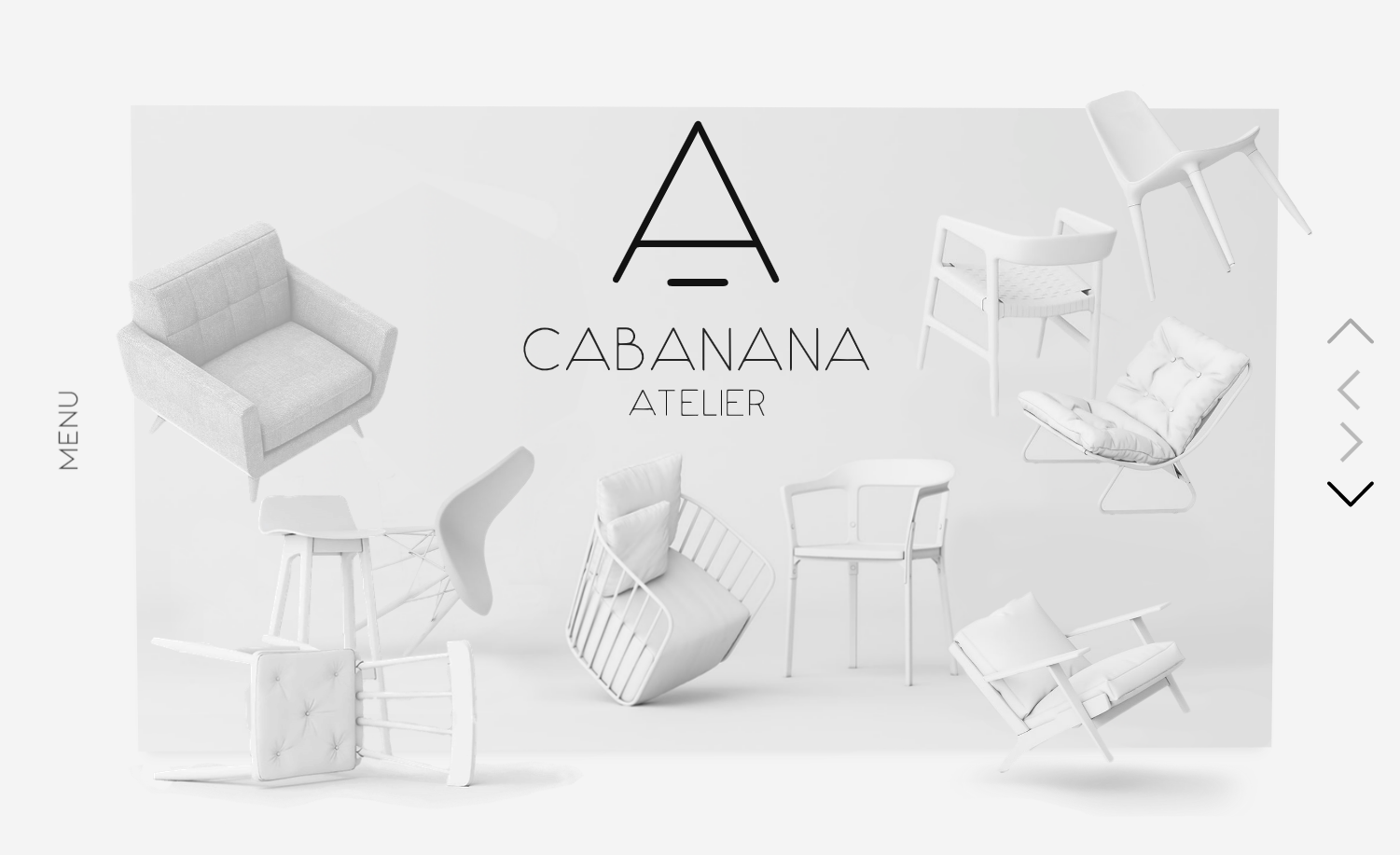
The delicate graphics and grayscale color scheme of Cabanana Atelier’s landing page give it an airy, dreamlike aesthetic. In this minimalist website, designer Phil Pereira Whitfield uses shadows and image pop-out effects to make the chairs look like they’re floating in three-dimensional space. This impression intensifies with a subtle parallax effect that moves the chairs farther apart as visitors scroll down.
The website is presented like a design magazine, inviting readers to browse through a careful curation of interior design set pieces. Emphasizing the architectural details of their designs, furniture renovations, and layouts through large images aligns with Cabanana Atelier’s mission of helping visitors discover beautiful and comfortable spaces.
2. House of Idlies
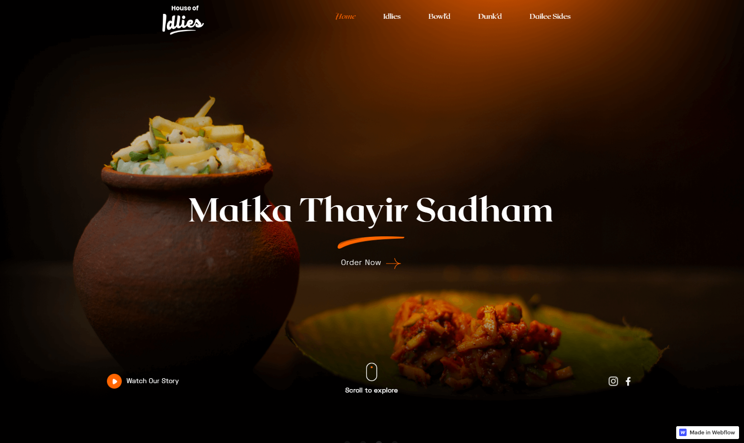
When building a restaurant website, the goal is to stimulate visitors’ appetites, and few methods achieve this better than professional photography of tantalizing food. Designer Harish Anand Ramamoorthy strategically places artistic photos at the forefront of this design for Chennai-based restaurant House of Idlies, opting for a black, white, and orange color scheme that complements the colors in the food images.
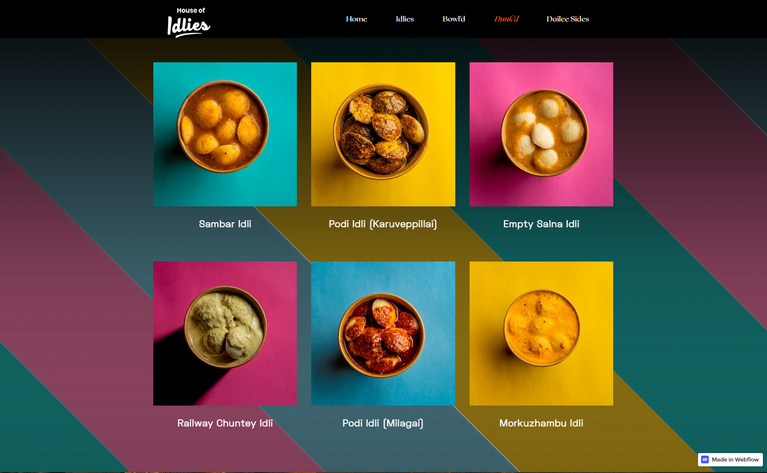
The vibrant color palette of pink, blue, and yellow instills a retro feel for the restaurant’s Dunk’d brand. The design choice aligns with the nostalgia captured in the about us section of the site, where the owner shares fond childhood memories of enjoying these savory rice cakes on the train. The clever use of color likely awakens similar sentiments in many visitors, helping them forge an emotional connection with the product.
3. Snig Digital
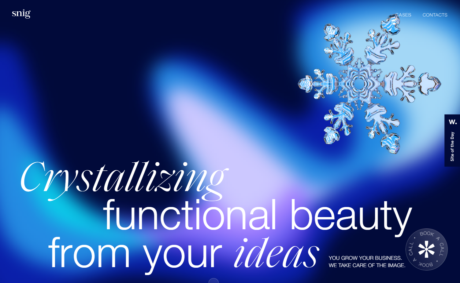
Design agencies naturally sport visually striking websites, but Snig Digital’s site elevates pretty aesthetics to another level. The word “snig” means “snow” in Ukrainian, and the agency’s website design plays on the idea of snow in various ways.
A custom preloader sets the stage for the icy theme. Immediately upon loading, a gorgeous animation of a snowflake blossoming before the visitor’s eyes shows off the designer’s skill. The design further evokes a frosty ambiance with a glassmorphism effect layered over the background animation’s shifting pastel colors, reminiscent of polar lights behind frosted glass.
Despite the myriad animations, background color changes, and scrolling effects, the webpage’s content doesn’t overwhelm viewers and remains entirely legible. By ensuring the immersive content remains accessible, Snig backs up their UX and design experience with substantive evidence.
4. Cleverswim
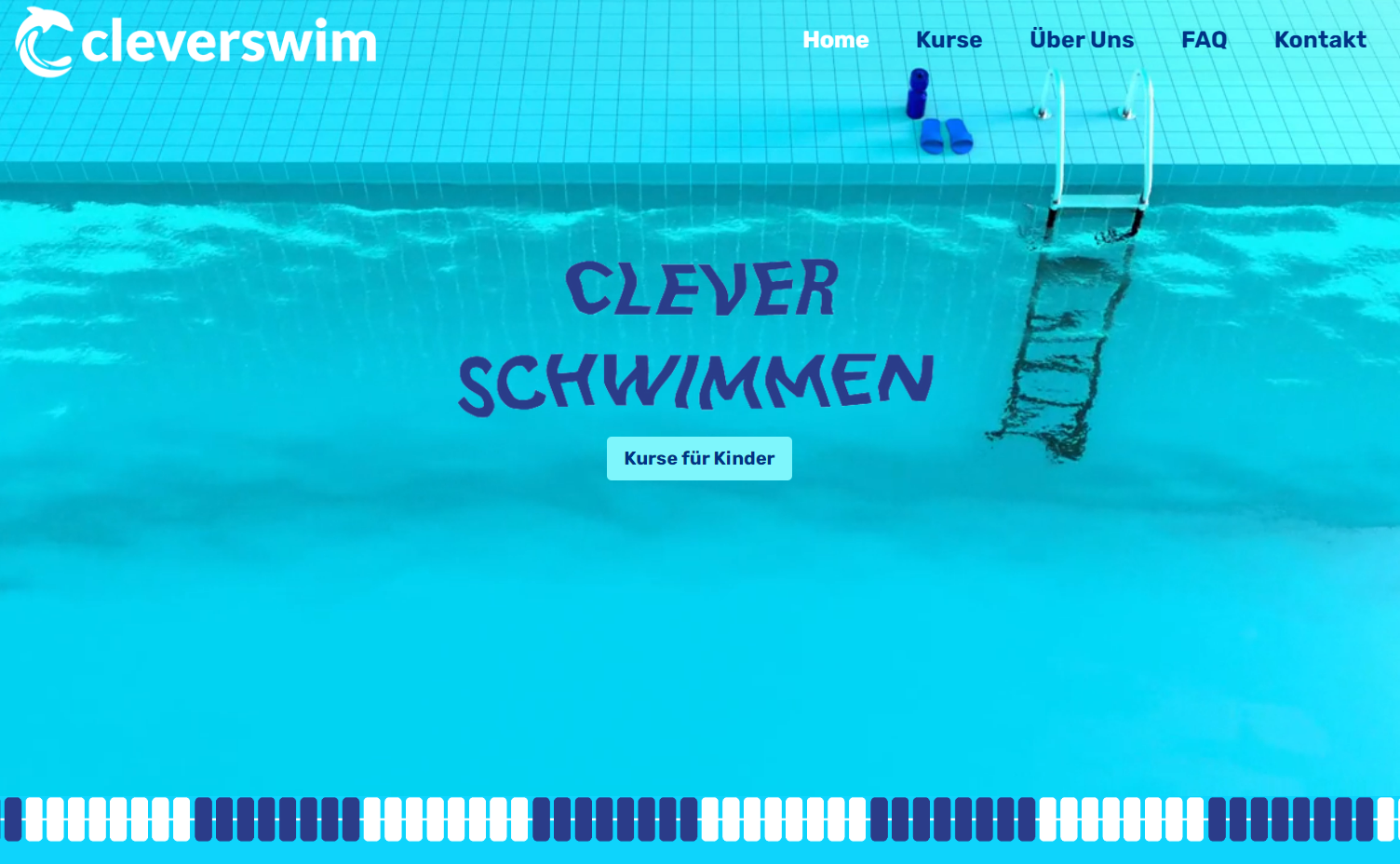
Designer Sandra Junker brought company founder Kevin Wedel’s concept to life with this charming small business site. The site for Cleverswim, a swim coaching business for kids, greets visitors with an immersive full-page animation of a pool with gently rippling water.
The site employs playful animated swimming aids with googly eyes to signify the different class groups (beginners, advanced, and professional). The cohesive blue-and-white color scheme and section dividers styled to resemble swimming lane dividers effectively turn the entire site into a vast virtual swimming pool. This playful representation evokes a sense of fun, excitement, and familiarity that resonates with swimmers (and parents) to instill trust and engagement with Cleverswim’s instruction services.


Get started for free
Create custom, scalable websites — without writing code. Start building in Webflow.
5. HEROES
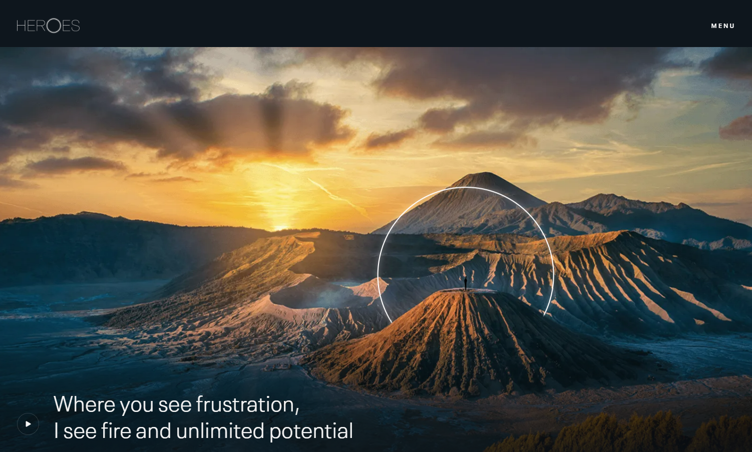
The website for HEROES, Jeroen Kaatee’s leadership coaching business, is a study in light and space. Design team We Met Before uses epic landscape photos, elegant hover interactions, and scroll-triggered animations to express Jeroen’s motto: “You can’t start a fire without a spark.”
An animated white spark against a black background leads visitors step by step through the coaching process. In contrast, the background color of the testimonials section lightens from black to light gray as users scroll down, symbolizing the heightened consciousness Jeroen hopes to activate in clients.
6. Resonant Link
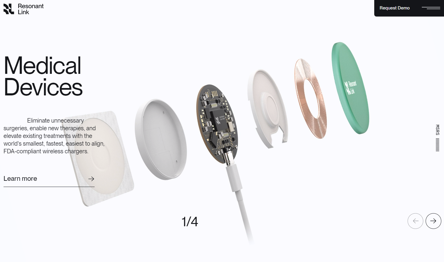
Wireless charging technology firm Resonant Link uses their website to showcase the power of their product in four contexts: medical devices, industrial and material handling, electric vehicles, and consumer electronics. Design firm Paper Tiger rose to the challenge by creating a clean, smooth animation for each that captures the elegance of the technology and gives site visitors a peek inside the devices.
Trust and transparency are paramount for businesses operating in the healthcare industry. Resonant Link’s exploded views and smooth visuals captivate and inform, but they also reinforce the company’s commitment to openness. They allow potential customers to gain a deeper understanding of their product’s inner workings, as well as instill confidence in their charging solutions.
7. Nik Heimlicher Music Production
![Nik Heimlicher Music Production site showing a black-and-white photo of Nik playing an electric guitar. A white illustration over the photo highlights the guitar’s borders.]](https://cdn.prod.website-files.com/687e8d1b96312cc631cafec7/68c48a251269b4f9c5eface6_64d420c706031227c301b710_64c98f61a96ba16f41fda5b1_FMrqwcxyQXTeAnSzyhBZbBHULTbnAhhhwIODDYCGD89UgDAwYZZmgIzq-1x-qqWqMkGcDCIG9MFe0pLbw6q02xldS_x9sszOPQyysfUW-7yufu-LfeEuSgZhhaQobgPbGyE_KovE2HOXxj7Rdm5j6A.png)
Janis Oppliger’s design for Nik Heimlicher Music Production’s website embraces an exclusively grayscale color scheme. Instead of using vibrant color splashes for visual intrigue, Janis introduces white Lottie animations that ripple across and enhance core images. The user experience is enhanced with additional unique elements, such as an interactive custom hamburger menu resembling sound mixer sliders and a guitar neck graphic whose strings appear to loosen as users scroll down the page.
By showcasing Nik’s identity and artistic flair, this design provides an engaging experience that draws visitors in and leaves them with a lasting impression.
8. Hidden Hills Villas
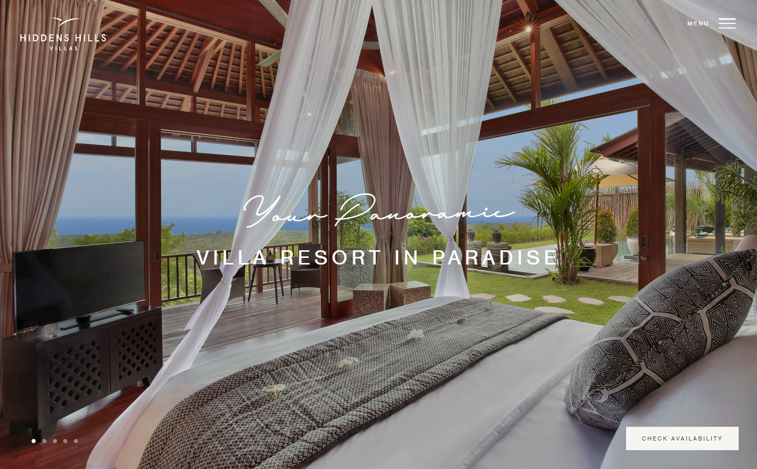
Travel and tourism websites rely heavily on their images for success and user engagement. The ecommerce website for Hidden Hills Villas, a luxury resort in Uluwatu, Indonesia, immerses visitors in the feeling of being a guest by showing them what they’ll see from inside their villa.
The Kane Baker design team’s careful typography choices cultivate a fresh, inviting aesthetic for the site. The landing page features the classy font pairing of handwriting font Marison Brieny and uppercase Nimbus Sans. The team keeps the Nimbus Sans caps as headers throughout the rest of the site, pairing them with the graceful serif font Caslon Pro for body text. To enhance the site’s overall spacious feel, the design team added extra kerning (space between letters) on top of the spacing built into the fonts.
Create a unique, aesthetic site with Webflow
To build a site as beautiful as these examples, take notice when a site has a visual impact on you and try to deconstruct the underlying design choices. Then take those insights and use them to create something unique and distinct.
Fortunately, with Webflow, you can create something that looks classic but still nods to a design trend or two. Webflow’s drag-and-drop interface helps you focus on the visuals by automatically creating clean CSS and HTML code as you work, giving you more focus to spare for aesthetics. You can browse our responsive website templates to find the right look or DIY one from scratch with Webflow.