


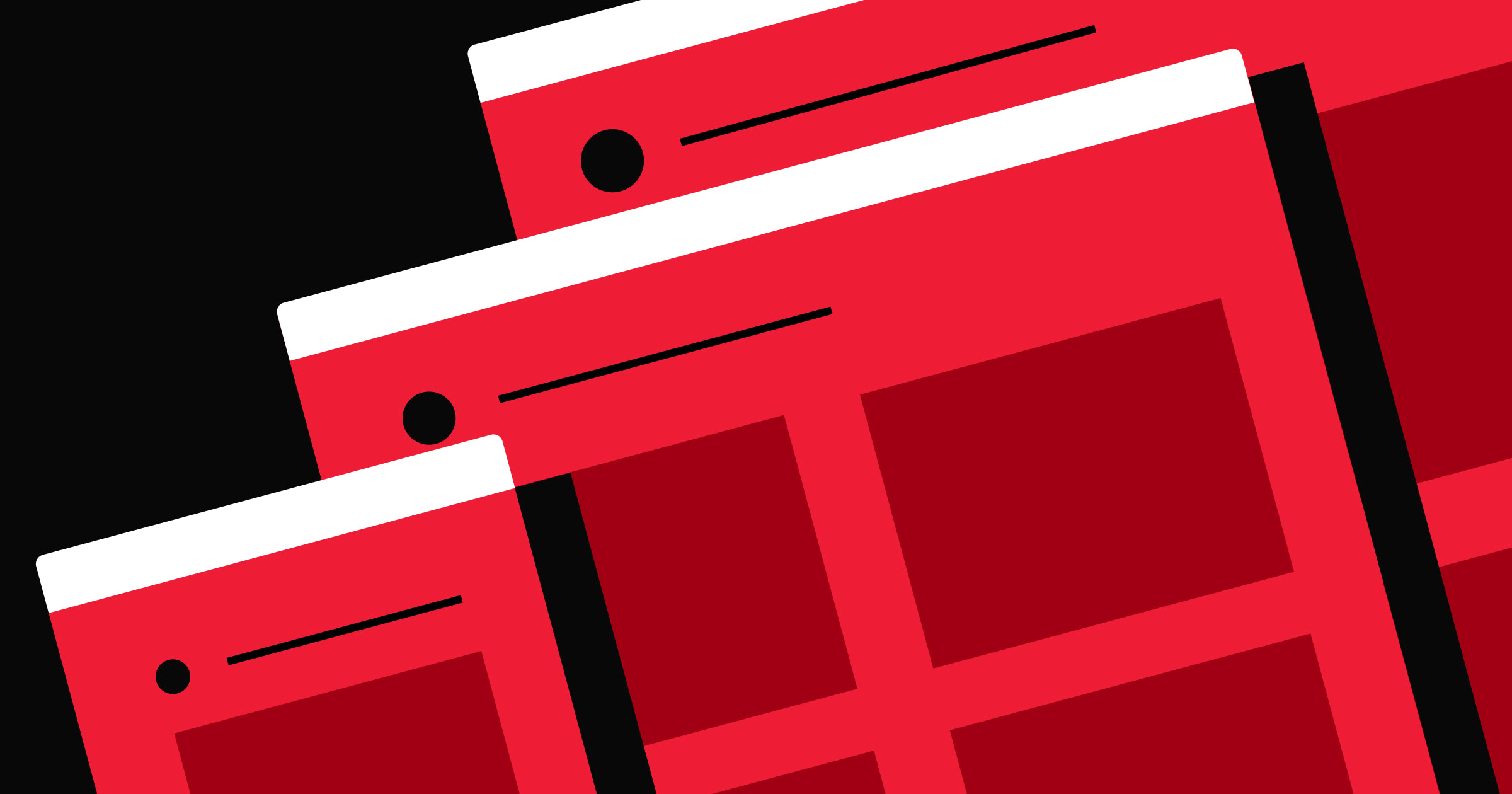
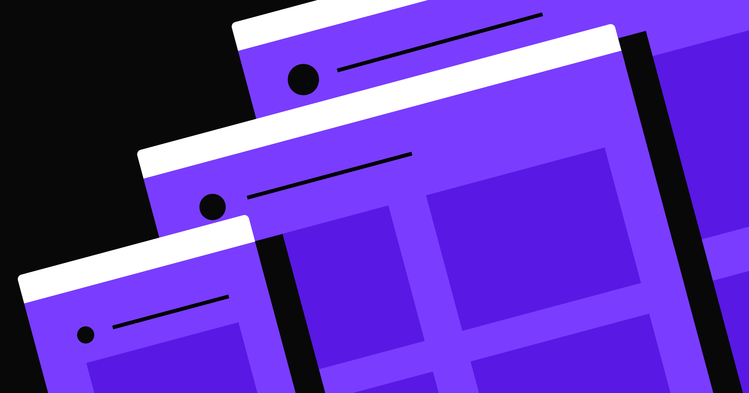
Follow composition and layout principles to arrange site elements with intention.
When creating visual media like blog pages, ecommerce websites, and marketing portfolios, you need to consider the big picture. Properly situating design elements on a page can transform isolated components into an intentional arrangement. And well-composed sites don’t just look better. They also communicate a sense of professionalism, encouraging viewers to trust and interact with your brand.
Discover why composition in design makes websites more appealing and successful, plus learn best practices for creating effective layouts.
What’s composition in graphic design?
Composition in graphic design involves organizing visual elements to create a cohesive user interface (UI). You must consider essential components — like text, images, and buttons — that guide viewers seamlessly through content to make sure the most important information stands out.
Good composition also makes a design effective for any platform or channel you present it on. Whether a website, mobile app, or social media graphic, a well-composed design ensures clarity, engagement, and visual appeal. Strategically arranging elements can create a harmonious balance between usability and aesthetic value, leading to more impactful and memorable designs.
What are layouts in web design?
Website layouts are like blueprints specifically tailored to create an appealing, intuitive site framework. A well-planned layout dictates details like elements’ sizes, placements, and interactions by following critical composition principles.
To create an effective design layout, you must consider the following visual components:
- Images such as photos, illustrations, and icons capture viewers’ attention and encourage interest in your website. These components reflect your brand identity, and you can use them to break up text-heavy pages and convey information at a glance.
- Text elements include headings, subheadings, and body copy. Well-formatted and strategically placed text improves readability and ensures the most critical content stands out.
- Lines are visible or invisible borders that separate sections, define spaces, and provide structure to guide visitors as they browse.
- Shapes like circles, ovals, rectangles, and squares are ideal for button designs because they contribute decorative detail and eye-catching contrast so visitors don’t skim over important signposts.


Ultimate web design
From 101 to advanced, learn how to build sites in Webflow with over 100 lessons — including the basics of HTML and CSS.
8 composition rules for effective website layouts
Good composition creates a seamless, logical flow that improves readability and navigation. It affects how people perceive and interact with your website, impacting everything from first impressions to conversion rates.
Follow these eight rules to create successful website compositions and layouts.
1. Use leading lines
Leading lines are visual paths that guide a visitor’s gaze through your site. They can be visible, like borders and dividers, or implied, such as a shape’s edge or negative spacing. These lines direct attention to essential elements, like headings and calls to action (CTAs).
For example, a landing page might have an image of a road converging toward a CTA button at the center of the page.
2. Create a hierarchy using scale
Organizing elements by importance creates a functional visual hierarchy. This structure guides visitors through content in a logical order to ensure they notice the most critical information before browsing the rest of the page.
Imagine a typical website — its homepage likely has a large, bold headline at the top to grab attention, followed by subheadings and body text. Through this hierarchy, the title delivers the main message, encouraging viewers to read on for more details.
You can create compelling visual hierarchies by arranging elements in a logical order of importance, typically through varying sizes. Larger elements attract more attention, while visitors perceive smaller components as less important. Make headlines significantly larger than the body text and use a different font for significant information like updates and promotions.
3. Balance elements
Balance is how you distribute visual weight across a layout. There are two main types of balance in design: symmetrical and asymmetrical. Symmetrical balance arranges elements evenly around a central axis, creating an orderly appearance. Asymmetrical balance uses different elements of varying weights to create visual tension while maintaining a sense of harmony.
Even though you want to highlight critical parts of your site, you don’t want to create an overwhelming sense of visual imbalance. Ensuring no part of your site’s design feels oppressively heavier or more dominant than others results in a clearer and more pleasant viewing experience.
For example, you can use asymmetry to create visual interest — place a large image on one side of the page with smaller text boxes on the other to maintain a dynamic equilibrium, like Eleken’s website does. It also uses a heading with smaller text and a CTA button to create a visual hierarchy.

4. Apply the rule of thirds
In graphic design, the rule of thirds involves dividing your layout into a 3-by-3 grid and placing critical elements along the lines or intersections. This placement creates a more interesting composition than when you center all elements, and it ensures you have the right alignment and enough white space surrounding eye-catching elements.
Proper alignment makes layout designs neat and organized and supports a logical website structure. For instance, making sure text and images align with a webpage’s left margin results in an orderly appearance and helps people follow content as intended.
You might apply this rule by placing a product image off-center along the grid’s bottom-right square, with text and a CTA button in the bottom-left corner.
5. Leverage contrast
Differences in properties like color, size, and shape create contrast, making specific design elements stand out on a webpage. You can use contrast to establish visual focal points that highlight important information and guide a viewer’s path.
Use a bold, bright color for a CTA button against a muted background to ensure the CTA captures attention without getting lost in the surrounding content. For example, Grain’s website has a large banner with two CTA buttons: “Try for Free” and “Book a Demo.” One button is black with white text, while the other is white with green text. Both sit against a green background, contrasting well with high readability.

6. Be mindful of white space
Space, also called white space or negative space, is the empty area between design elements. It allows the components to “breathe” and avoids cluttering content so people can focus on the most crucial elements.
A minimalist portfolio website might use white space around project images and descriptions to make the content stand out as a primary selling point. For example, Mark Noble’s portfolio website, MN Studio, has enough white space between each company logo in its clientele section to emphasize each symbol without them overlapping. There’s also adequate space at the top and bottom to separate this section from the ones above and below.

Similarly, you can use white space to highlight important information like CTAs and contact buttons. However, avoid excessive spacing because your site might appear unfinished in those areas.
7. Prioritize proximity
While white space helps specific design elements stand out, leaving excess space makes the layout feel like there’s a gap. Instead, placing relevant elements in close proximity communicates their relationship and leads to a cohesive design.
On an ecommerce website, for example, grouping a product image with its description and price helps shoppers quickly find and comprehend critical information. Clarity like this guides people’s decision-making processes, directing choices like whether to add the item to a shopping cart or wish list.
8. Use repetition
Repetition in design involves consistently placing the same components throughout a layout for clarity and cohesion. Standardizing your site’s colors, fonts, and shapes reinforces your brand’s visual identity and creates a unified look.
For example, use the same button style and color for all interactive elements. You can create a style guide to provide a consistent user experience across your website.
Compose your layouts with Webflow
Modern design principles elevate your site’s compositional layouts, ensuring it’s visually appealing and user-friendly for visitors. By applying these principles, you can create designs that stand out and leave a lasting impression on your audience.
With Webflow, you have visual-first design tools to bring your creative vision to life. With tools like a flexible grid system and customizable templates, you can create cohesive layouts that follow composition best practices.
Start creating captivating websites with Webflow today.
Get started for free
Create custom, scalable websites — without writing code. Start building in Webflow.