An effective digital footprint is about more than aesthetics — it involves consistency, brand representation, and harmonious design.
Every online interaction shapes your brand — even minor inconsistencies can erode trust and dilute your identity. Design nuances, the subtleties of color choices, and the cadence of your brand voice play fundamental roles in crafting memorable user experiences.
And since online impressions form within seconds, every detail, like a button’s hue or your choice of header font, is important. To ensure cohesion across all platforms, website style guides are an indispensable tool.
Key Insights
- A website style guide sets rules for color, typography, and UI components to maintain visual and content consistency.
- It streamlines collaboration, speeds up design, and builds a cohesive, trustworthy brand experience.
What’s a website style guide?
A website style guide is a document that outlines a brand’s online identity. It systematically details design elements (typography, color schemes, visual standards) and brand guidelines, ensuring every aspect aligns with a brand’s vision for itself.
What’s the purpose of a website style guide?
Beyond establishing uniformity in website aesthetics, a website style guide establishes a seamless user experience. As people navigate your site, consistent design elements, defined by the design style guide, offer them a smooth, intuitive journey.
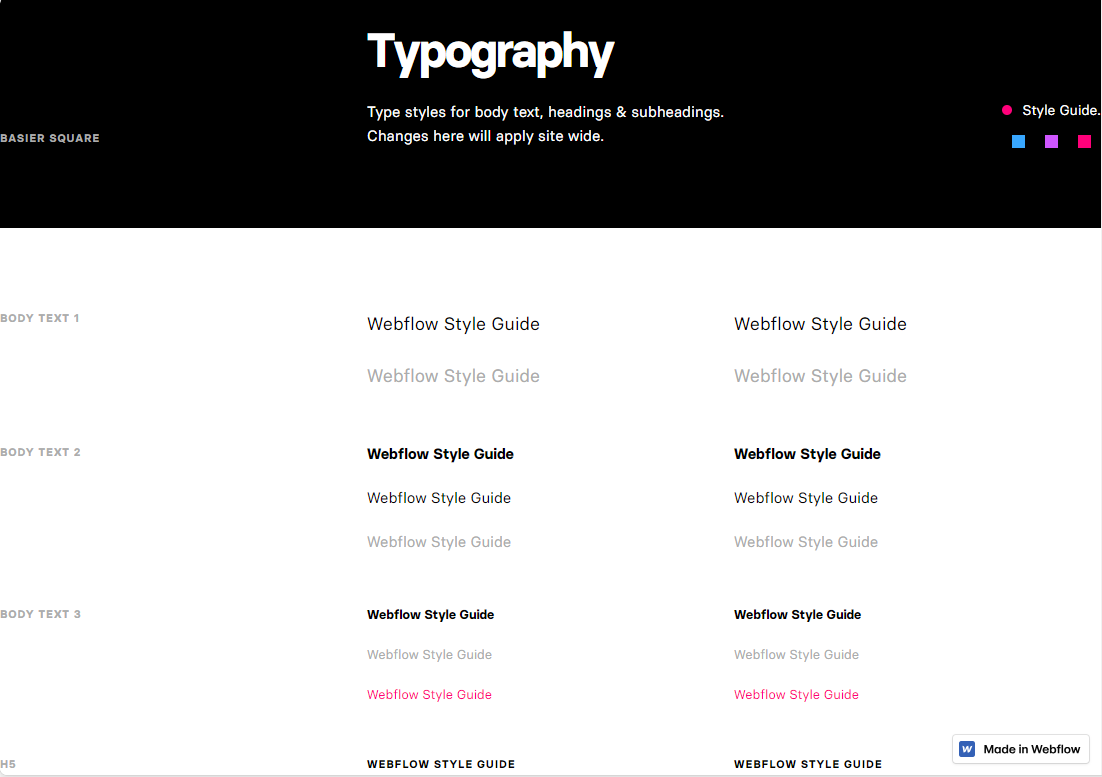
For example, a typography style guide that specifies font types, sizes, and spacing keeps content legible and engaging while reflecting your brand’s tone and reinforcing its identity. Proper typography in web design also shapes how visitors perceive and connect with your content by guiding them to crucial information and calls to action (CTAs). Thoughtful typography choices also build credibility, making users more likely to trust and interact with your brand by signaling your attention to detail and professionalism.
A website style guide, which is a core component of a larger overarching branding style guide, aligns webpage design elements, such as colors and images, to resonate with your brand’s ethos and mission. So a brand championing sustainability might opt for images that showcase nature, while a tech company might lean toward sleek product photography and modern urban landscapes. Similarly, a wellness brand might opt for a calming blue color palette to evoke peace and tranquility, while an energetic startup could use vibrant reds to signal excitement.
These deliberate and informed design choices, guided by the style guide, create a cohesive visual narrative and forge deeper emotional connections with users, solidifying your brand’s identity and driving engagement.
Benefits of creating a website style guide
Creating a style guide before you design a website guarantees consistency, speeds up decision-making, and promotes a unified user experience that balances aesthetics with functionality. Here’s how a website style guide improves your site’s development and design.
Streamlines designs
Instead of constantly revisiting design choices, teams can quickly reference the guide for clear directives to:
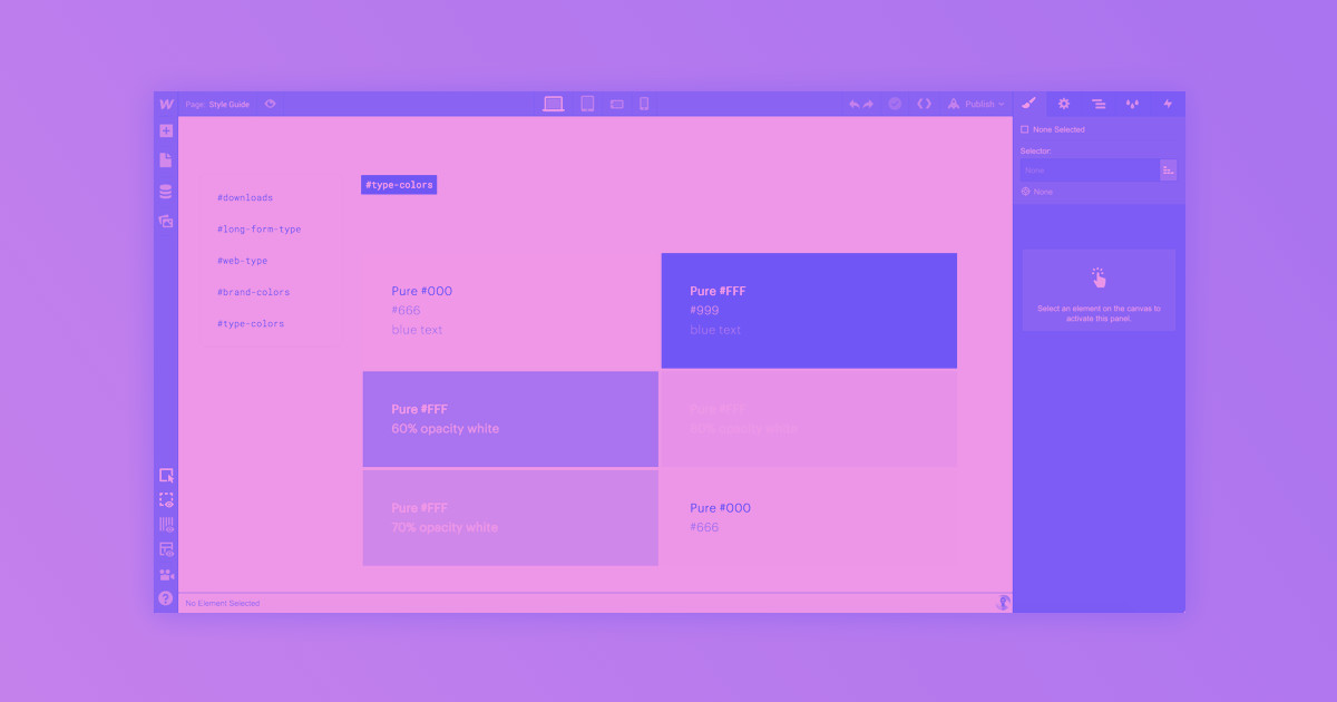
- Eliminate ambiguity. A detailed style guide outlines precise specifications for every design element, like the exact shades and hex codes for colors and the typefaces for headings and body text. This clarity helps teams avoid guesswork and work more confidently so they can steer clear of creative roadblocks.
- Accelerate design revisions. By acting as a definitive reference, the style guide promotes consistency across all design aspects, like spacing and layout. This accelerates the design process by reducing frequent revisions to ensure rapid and accurate results.
Enhances collaboration
Clear guidelines enable collaboration, especially when a project involves multiple roles and contributors. This is because they:
- Provide a unified vision. By laying out standardized design principles, a style guide ensures every team member takes a consistent approach toward the same goal. This fosters cohesive branding and guarantees that the final website presents users with a consistent and professional image.
- Minimize design inconsistencies. Vague directions can lead to misunderstandings, causing inconsistencies in the final design. By clearly specifying design requirements, a style guide prevents misinterpretation and fosters focused, productive collaboration among team members.
Provides brand cohesion
Disjointed visual designs can confuse and alienate users, but a style guide prevents this by:
- Harmonizing brand messaging. Rather than focusing solely on website visuals like logos and specific graphics, a style guide ensures every element — like button styles and your copy’s tone — complements others, providing a consistent experience across all webpages.
- Boosting user confidence and recognition. Cohesive designs help users trust your brand because they find reliability in familiar visuals. By consistently applying design elements, brands make themselves identifiable and memorable, enhancing user confidence and loyalty.
How to create a style guide for your website: 6 steps
Every website style guide will differ, and tailoring it to your brand’s unique needs and characteristics is essential. To create an effective, impactful, and personalized style guide for your site, follow these six steps.
1. Study and understand your brand
Begin by exploring your brand’s history, vision, and values. This foundational understanding ensures your style guide authentically captures the brand’s essence. So if your brand emphasizes sustainability, every design choice should reflect this principle, whether that looks like earthy color tones or icons representing green practices.
2. Establish typography and color rules

Typography and color articulate brand identity and influence the legibility of website content. A luxury brand, for example, might use an elegant serif font paired with a subtle or monochromatic color palette to convey refinement and exclusivity. Conversely, an artisanal bakery might use fonts that look like handwriting and a pastel color palette to emphasize their homey, handcrafted appeal.
Establish rules for both by specifying font pairings, families, weights, and sizes, and dictating your website’s primary, secondary, and accent colors. This solidifies your brand’s identity and ensures it evokes specific emotions in visitors.
3. Define brand voice and imagery
A clear brand voice anchors your content, humanizing your brand to convey its unique personality. To define your brand voice, revisit your mission, vision, and core values, then summarize these attributes into a series of adjectives, like “professional,” witty,” or “compassionate,” and choose all that resonate with your brand.
From there, highlight preferred language styles, decide whether to use industry jargon, simple language, or a mix, and create sentence and phrase examples that embody this voice. This offers clarity and provides a foundation for your team to build on.
Remember: Imagery communicates faster than words. Establish brand-aligned visuals by outlining:
- Image styles. Specify whether images should be real photos, illustrations, or a combination, and detail the desired mood or setting. A travel agency might prefer vibrant, outdoor scenic shots, while a bakery might prioritize high-quality product shots.
- Color schemes. Outline how your established color combinations translate into imagery. If you’re a health and wellness brand, use colors that lean toward serene, blue backdrops or vibrant, earthy greens.
- Representation. Specify whether images should showcase a variety of ages, ethnicities, and other demographic factors relevant to your brand’s ethos.


Bridging the design to development gap
Learn best practices for integrating the workflows between design and development in this free webinar.
4. Detail iconography and user interface elements

Carefully curating icons and other user interface (UI) elements, like buttons, forms, and sliders, enhances navigation and engagement by simplifying the user experience.
When selecting ones for your style guide, start by identifying your platform’s core actions and themes, like shopping carts for ecommerce sites or profile badges for community forums. Then, select universally recognizable icons for them to ensure they align with your brand’s identity. If your website leans toward a specific design language, like minimalism, use icons that align with this style throughout. This uniformity simplifies user interactions and reinforces a singular brand image.
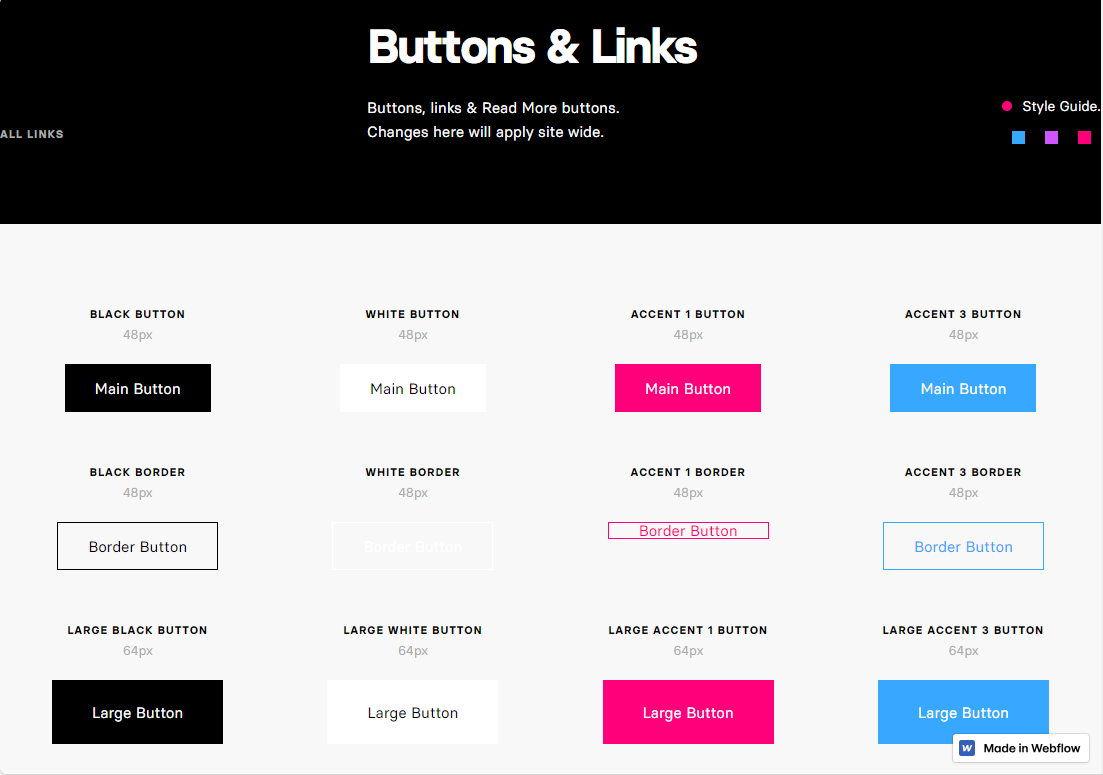
The same principles hold true for UI components. If your style dictates blue, rounded buttons for primary actions, provide exact specifications — the shade of blue, the border radius, and the chosen font. By leaning into detail, you orient design and development teams to produce harmonized results.
5. Guide interaction and user navigation
Detail how interactive elements like buttons, hover effects, and animations should appear and function.
If your brand identity is minimalist, your style guide might dictate subtle animations and a streamlined navigation menu. In contrast, a skin care brand targeting younger demographics might choose bold, attention-grabbing animations.
The design of input forms, whether it’s a quick email sign-up or an in-depth survey, should also be outlined in your style guide. This ensures your website communicates your brand’s identity while prioritizing user-friendly navigation.
6. Dictate layout and spacing principles

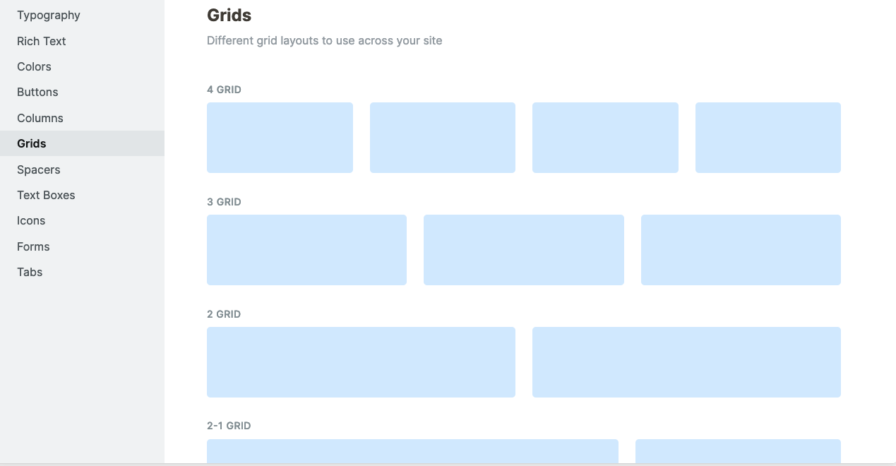
Define your website’s structural layout by choosing appropriate grid systems, setting patterns for different pages, and establishing a visual hierarchy. Identify which elements captivate users first and establish where your content should flow. This lets you create pages that naturally organize your content and guide users through it seamlessly.
For spacing, outline the specific distance that elements should have between margins. This attention to detail enhances readability and accessibility by eliminating visual clutter. A polished appearance also conveys professionalism and fosters user trust by signaling your attention to detail and dedication to the user experience.
Enhance your brand’s identity with Webflow
Ready to create your website’s style guide and harmonize your site’s design? Explore free, downloadable resources to maximize your website’s success, browse over a thousand site templates designed by our talented community, and visit Webflow University for free courses on web design and development.
Don’t leave your brand’s identity to guesswork. Harness the tools and resources on Webflow to create a living website style guide and digital platform that resonates with your brand identity. Tools like our Designer and commenter roles make it easier to collaborate on designs while adhering to your website’s style guide. Get started building your website — and its style guide — with Webflow today.

Get started for free
Create custom, scalable websites — without writing code. Start building in Webflow.


