An intuitive website structure paves the way for a smooth visitor experience.
A user-friendly website structure guides visitors through logical pathways so they quickly find what they need, boosting satisfaction and conversions. Think of your navigation menu as a map — if it isn't well-structured, people get lost and leave your site.
In this article, you'll learn how to create a clear, intuitive structure that keeps visitors engaged and helps them explore your content seamlessly.
What is website structure?
Website structure, or website architecture, is the organizational design of your site's pages. It involves categorizing content into a layout that's understandable, accessible, and predictable. Navigation should be intuitive so visitors can find what they're looking for quickly.
Imagine walking into a bookstore and seeing all the books piled into a corner—it's tempting to leave instead of sifting through titles. Your experience is smoother if they're organized alphabetically or by genre.
A site without a clear structure creates the same issue. Poor structure is the reason 34% of visitors leave a page, so set a clear layout to help people find what they need easily.
Key elements of website structure
Think about navigation menus, content hierarchy, and internal linking as the foundation of your site. Focusing on these components helps ensure visitors can find what they’re looking for and your content remains well-organized.
What are the types of website structures?
Part of the beauty of web design is that there’s no one-size-fits-all structure. But if you’re looking for inspiration, these are the three most common structures.
Sequential model
The sequential navigation structure (or linear model) places webpages in a single logical sequence, one page or step after the other. This model works well for creators who want to showcase a brand, product, or service with minimal content.
In a sequential structure, the site visitor can go directly to the next step when they’ve learned what they need to know from the previous one. Once they’ve chosen an offering from the home page they can learn more about it on a secondary page and then convert on the next. They only move on once they’ve found what they need.

Hierarchical model
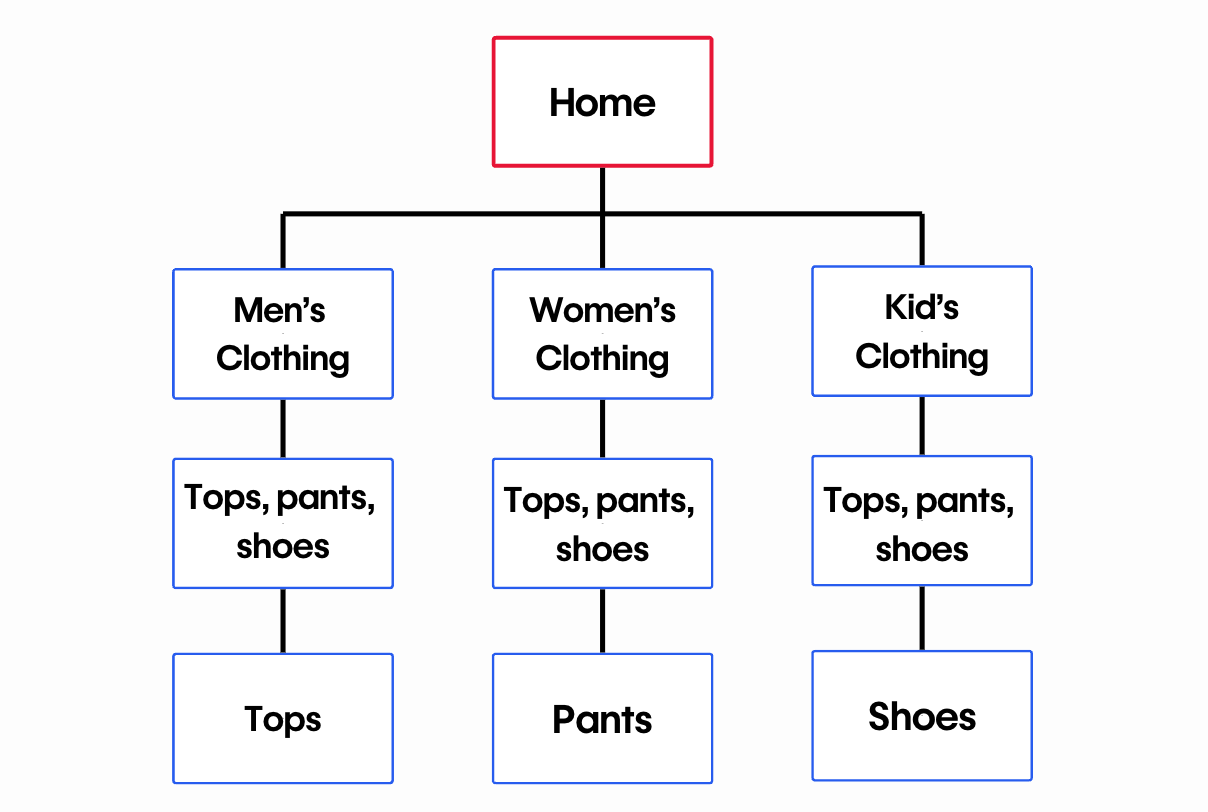
The hierarchical structure, aka the tree model, takes a top-down approach to guide visitors from a general page, like a homepage, to more content. General pages are also called top pages, while pages with specific content are subpages or child pages.
This model works best for content-heavy websites. The hierarchy for many ecommerce websites, for example, becomes more specific from the top page down. You’ll find increasingly specific products as you move down the hierarchy. A clothing store, for example, likely has several categories, each with unique subcategories.
Webbed model
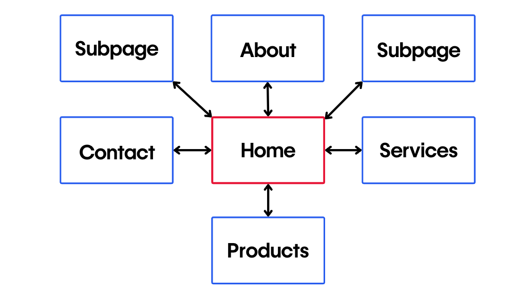
The webbed model’s name comes from its net-like structure. It connects the landing page or homepage to subpages through internal links. The difference is these links aren’t hierarchical or nested — each internal link is available at all times. In the webbed model, site visitors can access any other page from the page they’re currently on.
This model is best for smaller websites with fewer pages. A portfolio with a couple categories and a minimal navigation bar is a good example. With the navigation at the top of every page, visitors can move between information at any point.
How to build a good website structure: 5 tips
Regardless of the structural model, well-designed websites have a smooth and intuitive user flow. Here's how to plan a website structure that delivers this experience:
1. Research the competition
Find websites with a similar function and target audience. Put yourself in a casual user's shoes and note what they do right and wrong.
You'll find most competitors in your niche using the same structure. For instance, online portfolios often use webbed models, letting you see how visitors move through the site so you can build a user-centric layout.
2. Identify your structure
List the main categories and subcategories your site needs. Once you see everything, pick a structure that fits the number of pages you'll have.
For a single-product ecommerce business, a linear model keeps visitors focused on your offering. If you have multiple categories and samples, a hierarchical model can guide users to specific sections.
3. Build a user flow diagram
A user flow is a diagram of the experience from start to finish. Decide if you want users to make a purchase or sign up for a newsletter, then map each step they'll take to get there.
This step-by-step view ensures you won't miss anything when you create your website structure.
4. Use internal linking
After you set your structure, give users a clear way to navigate your site. Along with a navigation bar, add helpful links on subpages that guide people to relevant information, like connecting an “About” page to your portfolio or linking similar products on product pages.
When you anticipate where visitors want to go, you build a stronger network of links throughout your site. Include internal links on high-value pages like “About” or “Services” to point users to related content.
5. Create a sitemap
An HTML sitemap is a visual representation of every page on your site, like a table of contents. It shows where each page belongs, making it easier to see what should be most accessible.
If you publish your sitemap, visitors can also use it to move through your site more efficiently.
Identifying common issues
Watch out for broken links, confusing category names, or pages that can't be reached from your main navigation. Spotting these problems early helps you fix them before they frustrate your visitors.


The modern web design process
Discover the processes and tools behind high-performing websites in this free ebook.
Website structure examples to inspire you
We’ve compiled examples of logical, hierarchical, and webbed models to help you map a website structure for your project.
Sequential structure: James Williams

James's online portfolio is a great example of a linear website structure. The website guides visitors through the most recent work. A “Get in touch” button subtly exists in the header, and they close the homepage with a more prominent call-out, encouraging visitors to reach out without overwhelming the site with CTA buttons.
The linear model works for this portfolio website because potential customers can only take one action: getting in touch. This makes the linear model a good choice for new businesses and service providers that have a single function.
Hierarchical structure: Meau.co
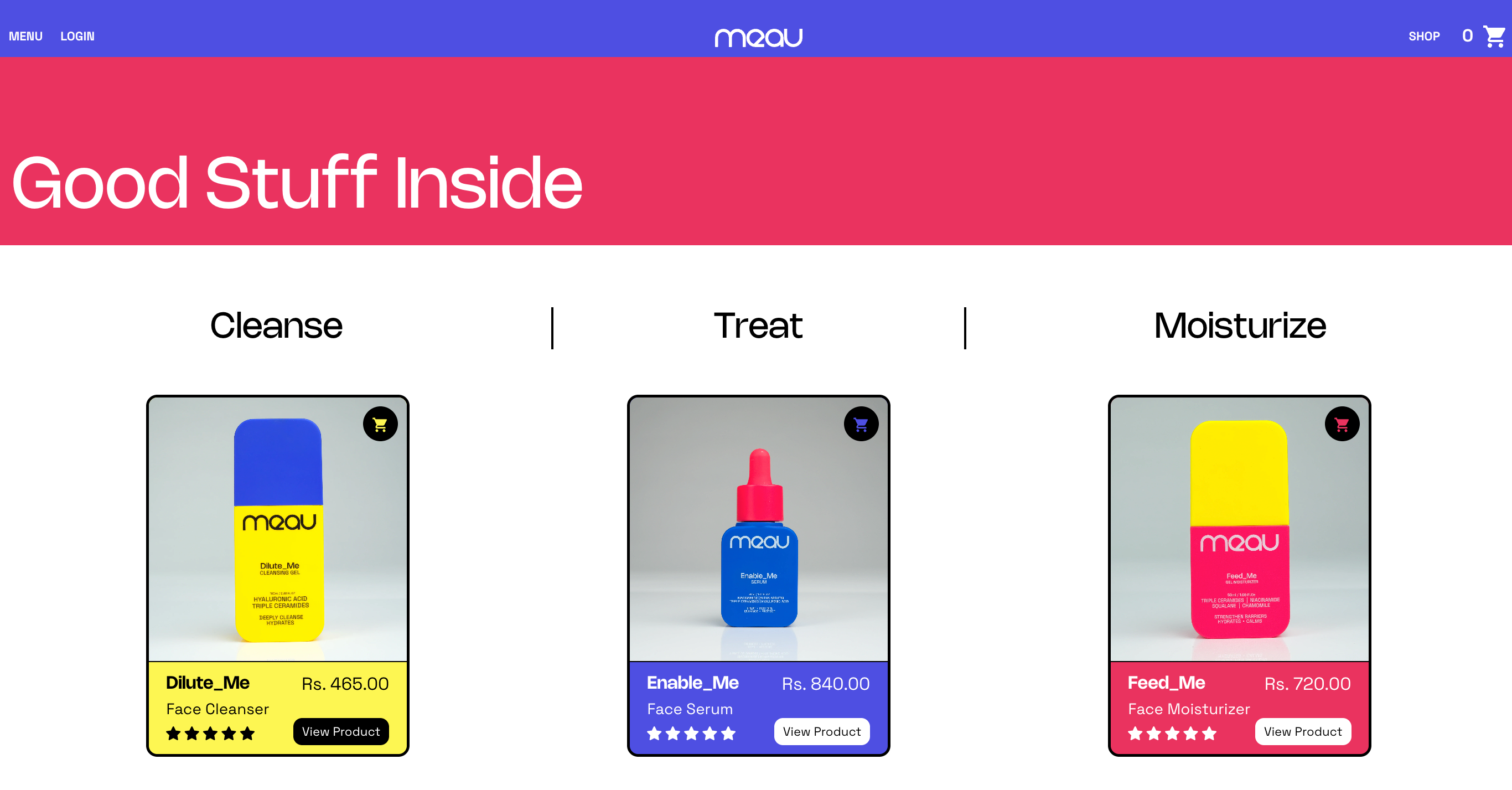
Meau.co's store uses a hierarchical model to sell their skincare products. The main navigation bar leads to three site sections: Shop, About, and News.
Once someone starts browsing through products, they can navigate to a product details page — another layer in the hierarchy. Meau.co's online store is a prime example of basic hierarchical navigation.
Webbed structure: Daniel Gamble
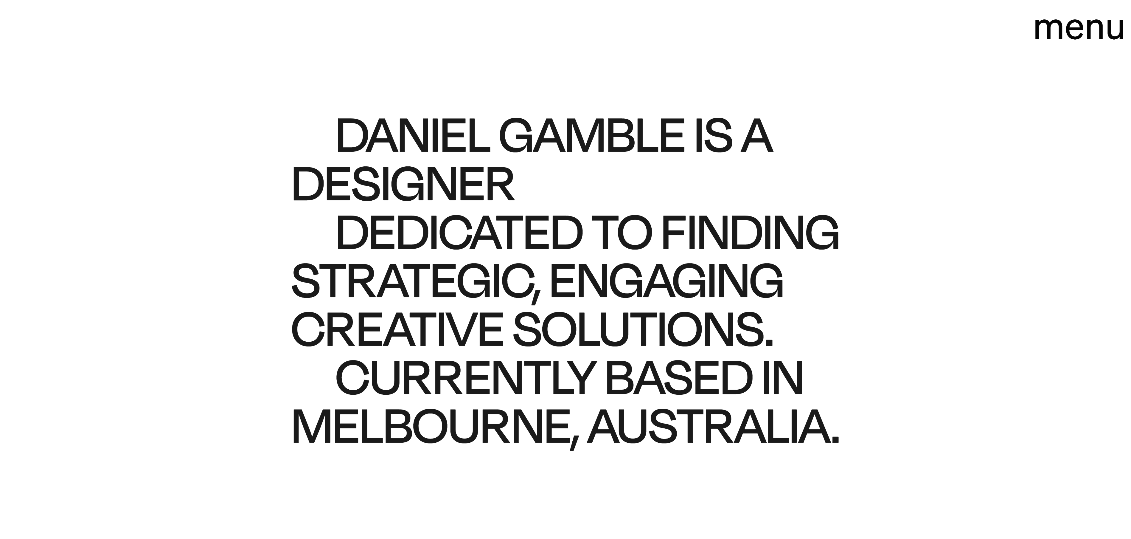
Daniel Gamble’s portfolio has a minimalist design and a navigation menu to match, with only five options: “About,” “Process,” “Work,” “Services,” and “Contact.” The site is a single landing page that displays the categories in order as the user scrolls down. It might seem like a linear model, but the main menu in the top-right corner makes this a webbed model.
The menu button is always on the page, so visitors can navigate to different sections to learn more. With a modest menu of a few internal links, visitors are never more than a click away from something new. This simple portfolio displays everything you’d need to know about Daniel’s work.
Enhance your site’s structure
An organized structure makes your website more intuitive for first-time visitors. They’ll find sought-after information even if you have hundreds of pages.
With Webflow, discover resources and templates to help you build stunning websites with optimized structures. Plus, you can find examples of successful designs from other creators to inspire you.
Start from scratch or improve your current design — whatever the case, we’ve got you covered.

Get started for free
Create custom, scalable websites — without writing code. Start building in Webflow.


