

Create high-quality contact pages that impress clients and encourage potential customers to get in touch.
A lot of effort goes into designing a user experience (UX) that reliably brings website visitors to the contact us page. To get your clients’ prospects over the finish line, this crucial page must also be carefully designed, with every element focused on encouraging visitors to reach out.
In this article, we’ll discuss the elements and best practices that make contact pages effective. We’ll also provide 14 examples of contact pages built by top designers to inspire your own projects.
What are key elements of a contact us page?
Let’s start with the basics — here are five elements every successful contact us page should include:
- Contact form. Contact forms help visitors get in touch faster, especially when they are short and clearly explained. In most cases, the contact form should be placed at or near the top of the page for maximum visibility.
- Contact information. Even if you’re using a form, you should provide a separate list of contact details, such as phone numbers and email addresses, for visitors who prefer to reach out via other channels.
- Social media links. Include links to the client’s social media channels so prospects who aren’t ready to commit have a place to learn more and stay engaged.
- Clear call to action (CTA). Many visitors who land on the contact page still need a nudge, so make sure there’s a prominent, specific CTA inviting them to take the next step.
- Response time estimate. Set clear expectations by giving visitors a reasonable estimate for when they can expect a response.
What are best practices for an effective contact us page?
The above elements are a good start, but how you design the page itself matters just as much as the features you include. Here are several best practices for creating your contact page.
Make the contact page accessible
Each contact page must be highly visible, so finding it shouldn’t be a barrier that frustrates visitors. This page should be featured in the navigation menu, and you may want to use a sticky menu so the contact option is always visible.
After that, place CTA buttons throughout the website’s design to guide readers to the contact page at key interaction points. For example, you might place “contact us” CTAs at the end of FAQs and on pricing pages.
Use clear text for your CTA links
Keep design elements that point visitors toward the contact page short and clear. “Contact us” works well; you might also try “Contact sales” or “Get in touch.”
You can be more specific, too — “Schedule a demo” works well on service websites, while “Contact support” may be appropriate on contact pages mostly meant for existing customers. What’s important is that visitors can read the text at a glance and know exactly where it will take them.
Provide a physical address and map
If the business has one, you can include a physical address to convey credibility to website visitors. Even if most people will never visit that location, an address and a map widget show people that they’re dealing with a legitimate company.
Plus, these elements can improve local search engine optimization by helping search bots show the contact page in relevant “near me” results.
Answer common questions proactively
A contact page can do more than encourage people to reach out — if you add an FAQ, it can also answer common questions, providing quick answers and cutting down on repetitive inquiries.
You can also proactively answer concerns that might prevent visitors from filling out a contact form, such as:
- What’s the estimated response time?
- What level of commitment am I making?
- What’s the email address I should expect messages from?
- Which documents should I submit along with my message?
Optimize the contact page for mobile devices
Finally, be sure to test your contact us page design on mobile devices, so you know it remains readable and usable on smaller screens. You’ll also need to test the contact form on various devices and in multiple resolutions.
After all, if visitors have to switch over to a desktop to understand or use the contact page, you’re more likely to lose them. Fortunately, you can tackle this step efficiently with a responsive website builder like Webflow.
What are the benefits of crafting a quality contact page?
Before you start designing, it’s important to know what a well-built contact page can do:
- Streamline communication. By providing details such as phone numbers and email addresses, the contact page offers a low-effort way to reach out and encourages visitors to connect via their preferred channels.
- Improve trust and credibility. A contact page with accessible, accurate information conveys transparency and reassures prospects that the business is legitimate.
- Enhance the UX. The best contact pages play a pivotal role in the overall UX by establishing an end goal for important CTAs.
- Increase conversions. With the right design and content, a contact page can significantly improve conversion rates by smoothing the path from interest to commitment.
14 contact us page examples for inspiration
These 14 contact us page designs illustrate how to put the elements and best practices we’ve discussed into action. Each offers lessons you can apply to your projects.
1. Public Eye

The contact page for Public Eye offers a bit of humor alongside a clear, well-organized form. Visitors are also invited to skip the form and send emails if they prefer, which provides multiple options.
As for the form, it does a good job of focusing on critical information, with specific fields that matter to the business, such as “Budget Range” and “Ideal Launch Date.” These details help the company triage requests as they come in and respond with more accurate solutions.
2. Make Build
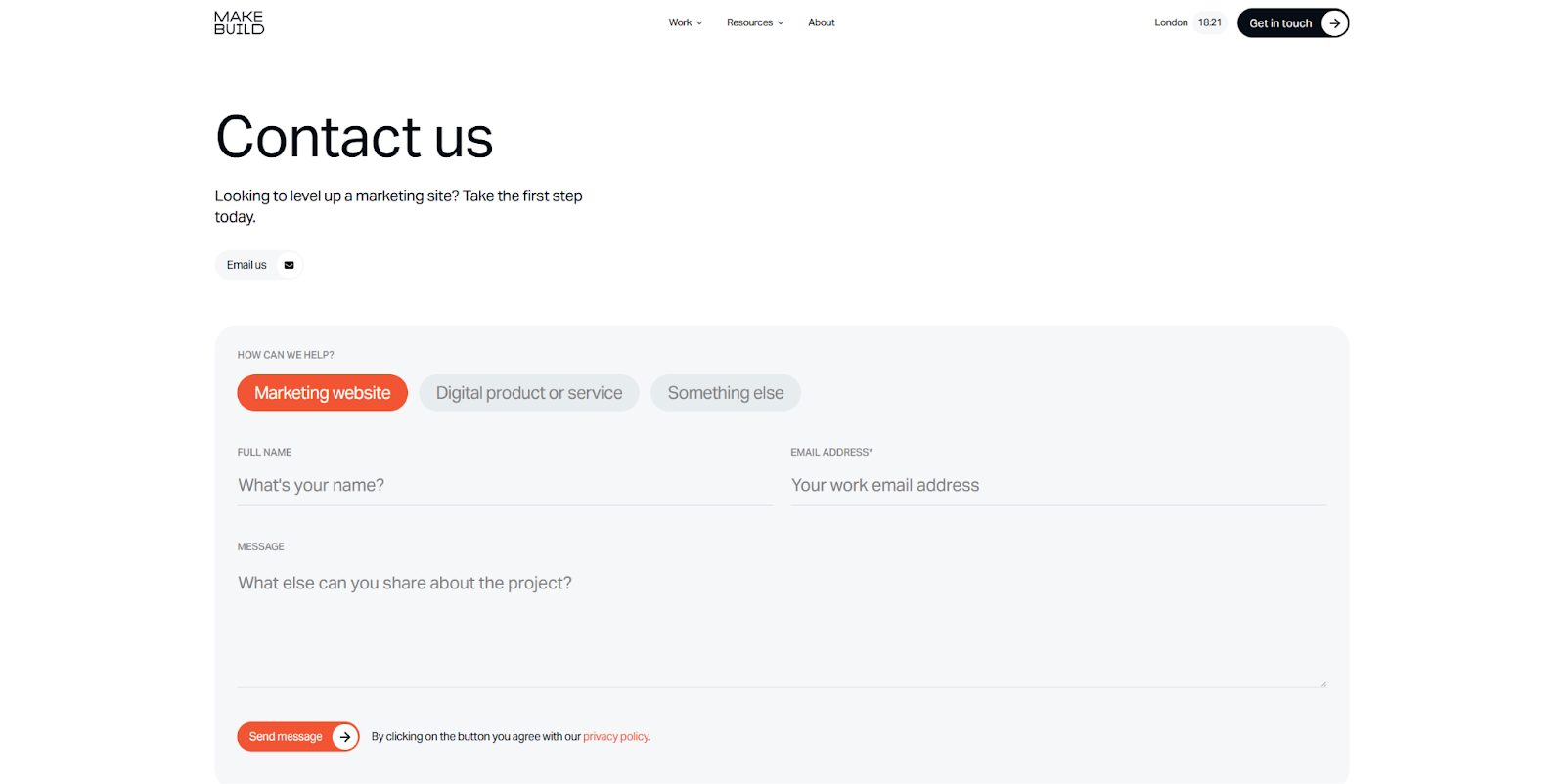
Make Build pared their contact form down to three fields and one three-option selection under “How Can We Help?” This makes the form less intimidating, though it also means the business has to rely on each sender’s ability to state important factors clearly in their message. In addition, the contact form is integrated at the bottom of the homepage and linked to in the sticky navigation menu at the top of every page. This provides an ever-present contact option, so the next step in the company’s conversion funnel is always accessible.
3. Pocus
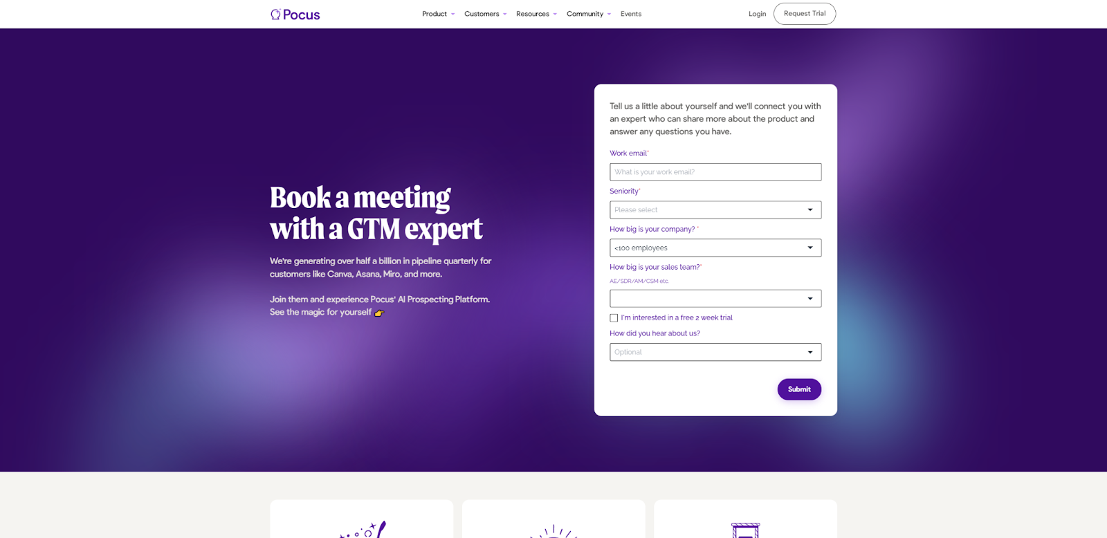
Unlike many examples on this list, Pocus doesn't include a freeform “Message” field; instead, it opts for four drop-down menus and an email field. This makes the form much faster to fill out, reducing friction that might otherwise cause visitors to leave.
This page also differs depending on which CTA a user follows. If you select “Book a Demo,” for example, you’ll get a checkbox to indicate that you’re interested in a free trial, while the version of the page that “Request Trial” leads to omits that element. This context-sensitive approach tells visitors the business is aware of their experiences so far and interested in their specific needs.
4. Float
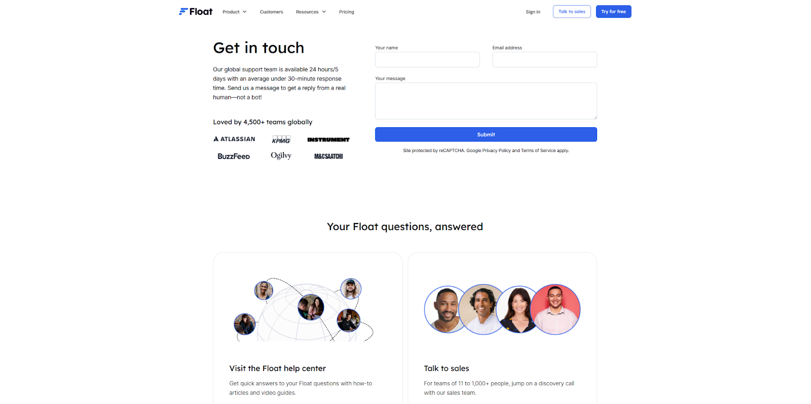
Float has two contact us pages. The first is as lightweight as possible, with just three fields for the visitor’s name, email, and message, and you’ll find it by selecting “Contact Us” in the site’s footer. Then there’s a separate page specifically for reaching out to the business’s sales department. There are more links to that page, which is designed for contacting the support team and promises responses from real people in under 30 minutes. This information lets people know what to expect and assures them that the company values their communication and time.
5. Deduxer

Deduxer built their contact form in Webflow, and it’s designed to match the website’s branding and tone, so it feels cohesive with the other pages. You’ll find the contact page by clicking a CTA labeled “Say Hello!” that triggers an animated transition. Every field in the contact form is introduced as though you’re filling out an email template, which feels familiar and interactive. Plus, the FAQ at the bottom of the page can answer some immediate questions. Overall, this results in an approachable experience that attracts high-quality inquiries.
6. Flow Sparrow
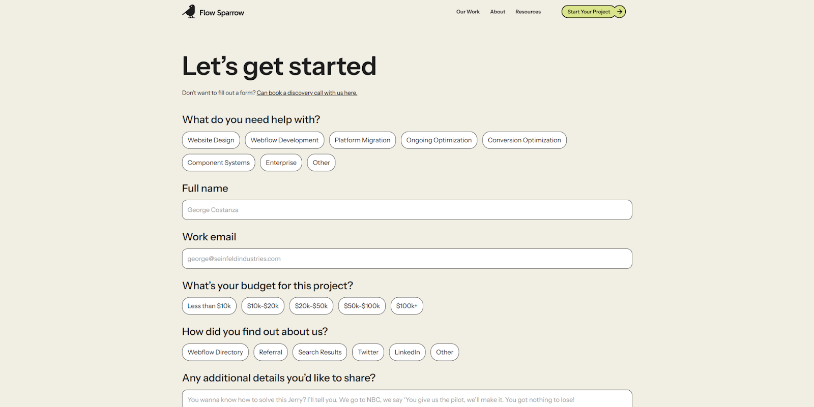
Flow Sparrow is a Webflow Partner that specializes in scalable, purpose-built website designs. Their agency site’s form includes typical fields like “email” and “message,” but also has selectable buttons that help narrow down what visitors are looking for. The budget options are especially interesting — by providing ranges, the agency makes sure visitors don’t feel pressured to put down numbers they might have to commit to. This eases common concerns and encourages communication, since most inquirers are likely in the early stages of project planning.


Show off your work.
Choose from fully customizable portfolio templates built for creatives. With Webflow, you can design, refine, and publish a standout portfolio — without writing a single line of code.
7. Mitzu

Mitzu's contact page begins with a calendar widget that lets visitors book 30-minute meetings immediately and even shows the name of the person they’ll meet with. This calendar is separate from the contact form below, which helps funnel inquiries to the right places. Meetings are available for sales questions and onboarding support, and the contact form provides a catch-all for other inquiries. This two-pronged approach helps the business triage messages upfront, saving time while letting visitors know relevant teams are ready and available to meet their needs.
8. Mural
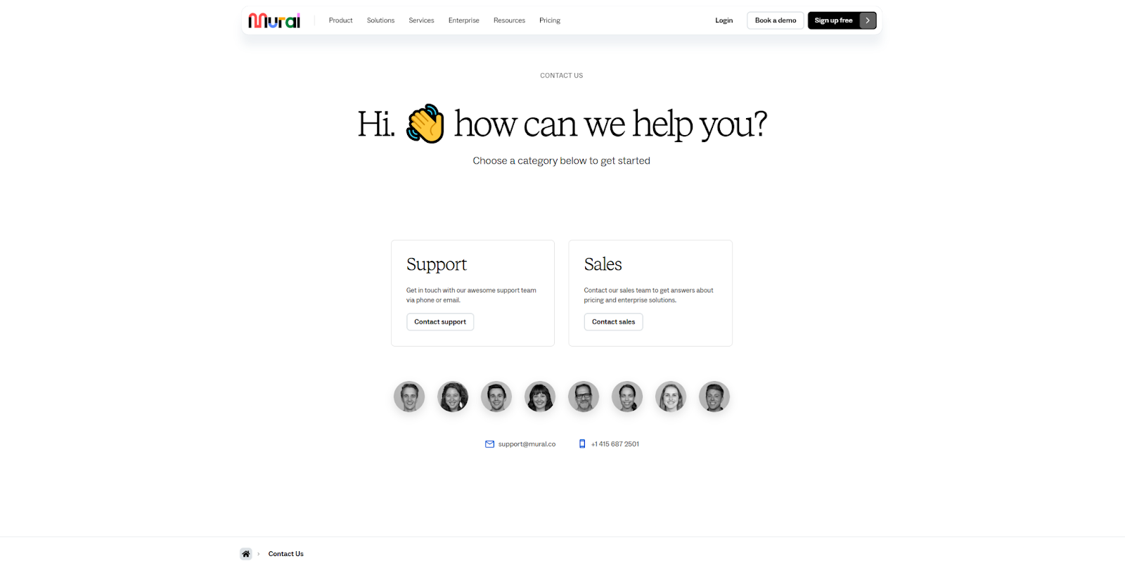
Mural splits their contact form into two branches, with options to contact their support or sales teams. Each choice takes visitors to a different form that asks for basic contact information, along with more specific details like “Job role” and “Company.”
Having a contact page hub like this provides scalability. If the company needs to add new channels for common inquiries, they can just add another card to the hub page rather than designing brand-new CTAs or widgets throughout the site.
9. Fourth Floor
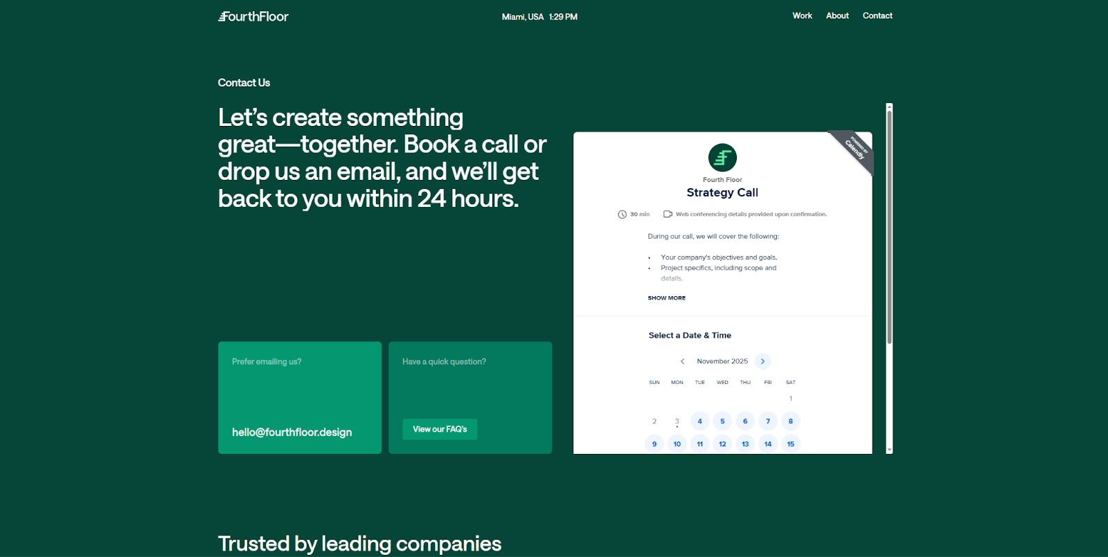
Fourth Floor checks all the boxes on their contact us page, providing a response time estimate, multiple ways to get in touch, and an FAQ link. The bottom of the page holds links to the company’s social media and Webflow Partner pages, and the contact form sets clear expectations for scheduled calls.
Threaded through the middle of the layout is social proof — a list of leading companies the business works with. This element reassures visitors that the team on the other end of this form is experienced and reputable.
10. First Influence
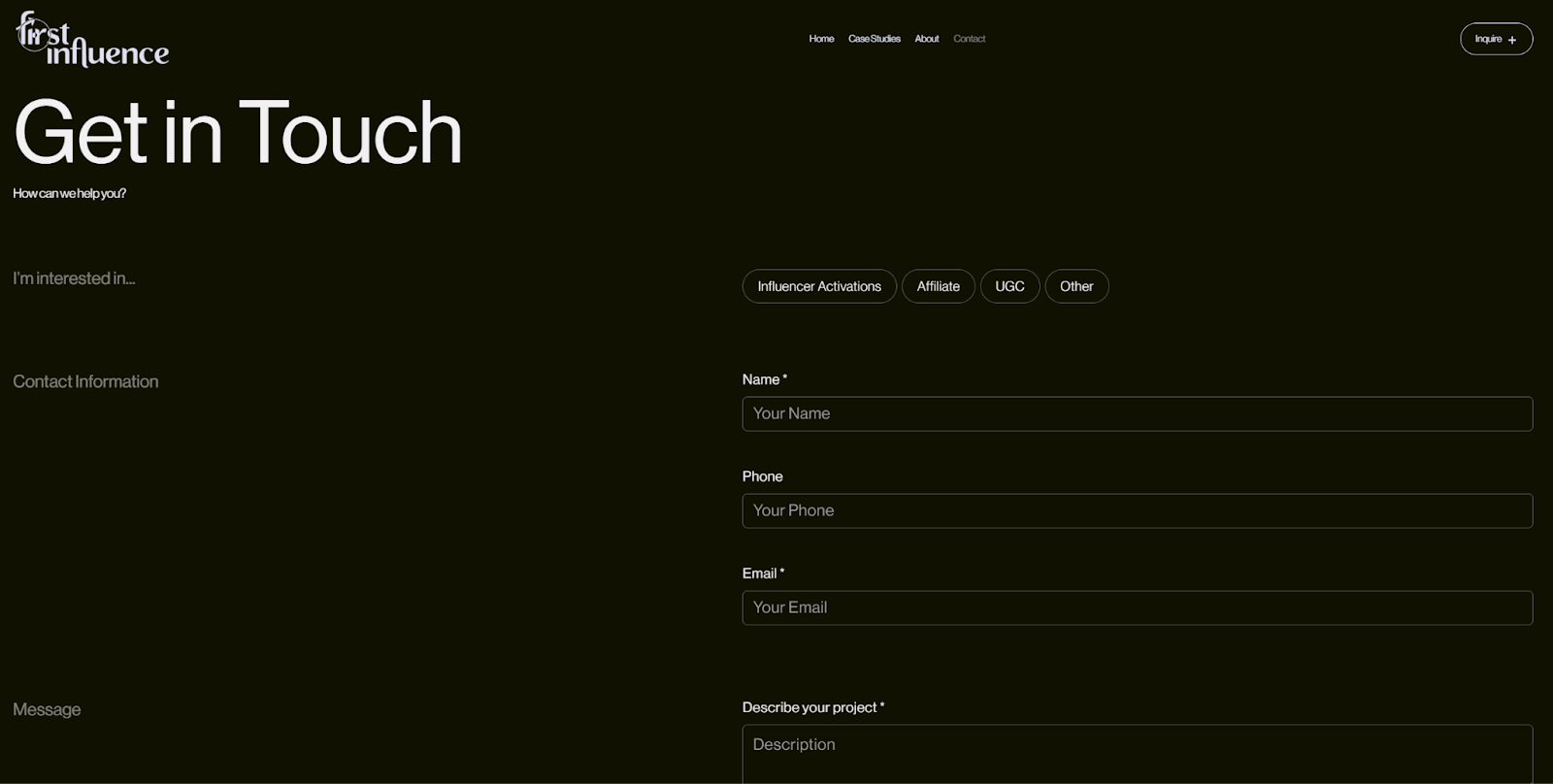
First Influence takes a straightforward approach to its contact us page, with a convenient form that only has four fields and one multiple-choice subject option. If visitors don’t want to fill out the form, an “Inquire” CTA at the top of the page offers the company’s email address as an alternative. The page also includes a physical address, demonstrating that this is an established business with a real-world location. That’s fairly rare in the influencer agency market, so the contact page shows attention to the inquirer’s preferences and displays one of the company’s distinguishing characteristics.
11. Fintech Studio
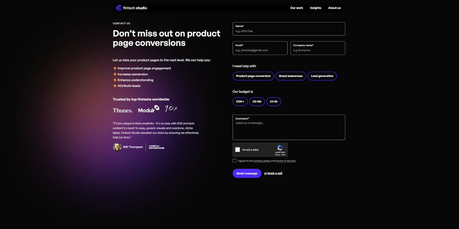
The Fintech Studio website by Purple Banana was built as a “bold, high-impact Webflow site,” and the contact us page fits into that overall design. Thanks to dark mode aesthetics and an elegant color palette, the page is just as inviting to look at as it is to interact with.
The contact form offers a few noncommittal, hard-to-categorize topic options, allowing for noncommittal and hard-to-categorize inquiries. There’s also a “Book a call” link at the bottom of the page, which funnels more prepared prospects to the next step in the sales funnel.
12. Ruul
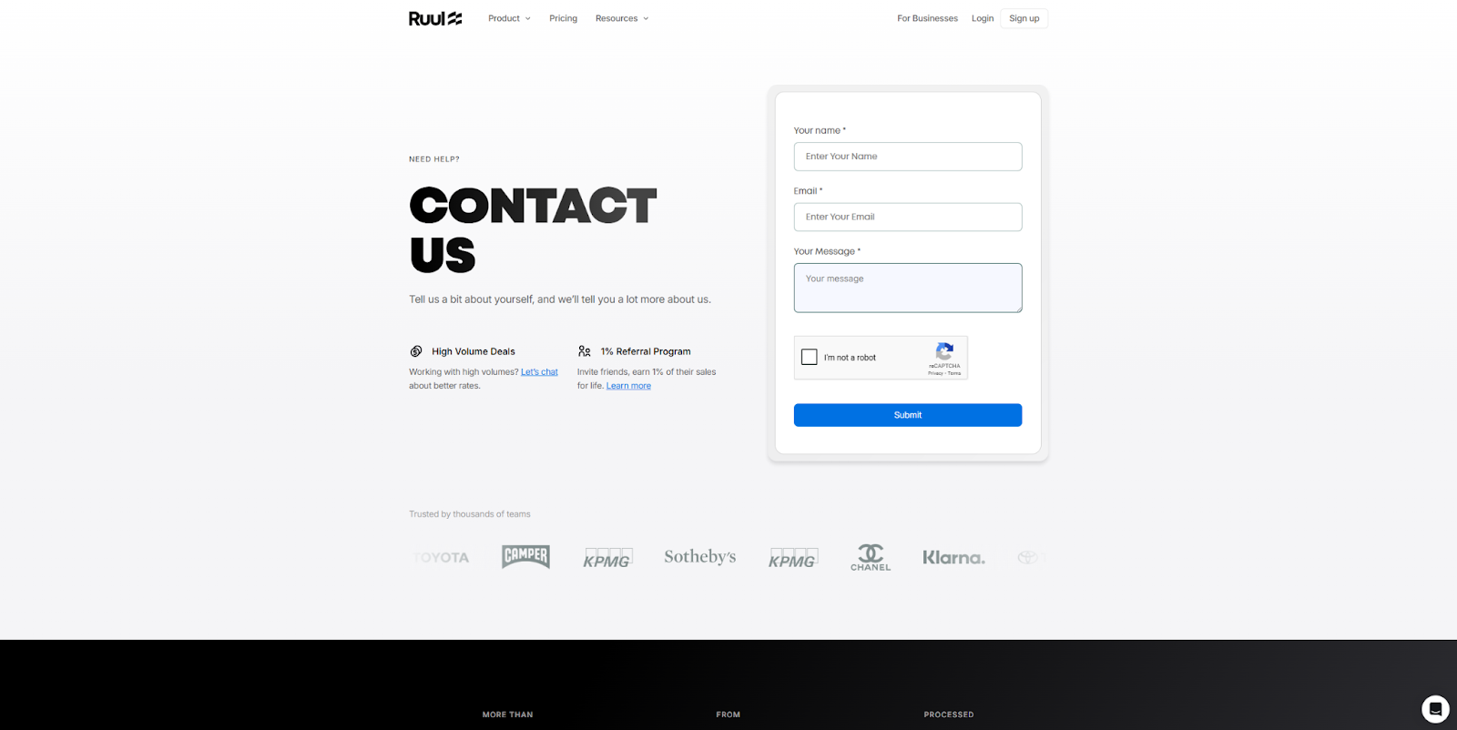
The contact form for Ruul is very streamlined, with just three fields. The real highlight is the experience around that form. Two value propositions on the left side of the page offer compelling reasons to reach out, each with a link to learn more — for example: “Working with high volumes? Let’s chat about better rates.” Meanwhile, the social proof below features recognizable client logos as reasons to trust Ruul, and the physical addresses and phone numbers beneath reinforce that impression of credibility.
13. OFF+BRAND
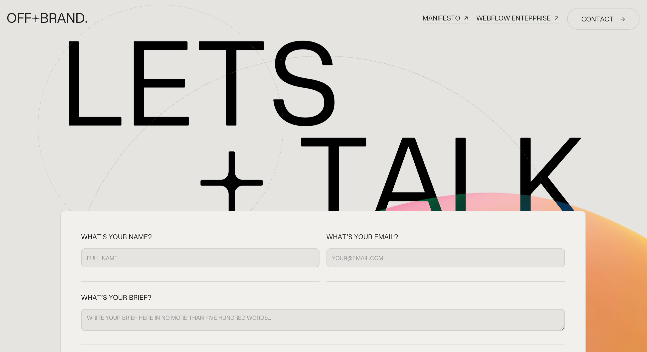
OFF+BRAND’s website is an excellent example of what an experienced Webflow Partner can do with the platform. The contact us page demonstrates how a visual-first design process results in an engaging layout that leaves a memorable impression. The page and contact form have the same features as many other entries on this list, but the branded styling and smooth animations make them feel like core elements rather than afterthoughts. It’s common to view a contact page as just a functional tool, but this example is a reminder that creativity can make this element as compelling as a landing page.
14. OSOS
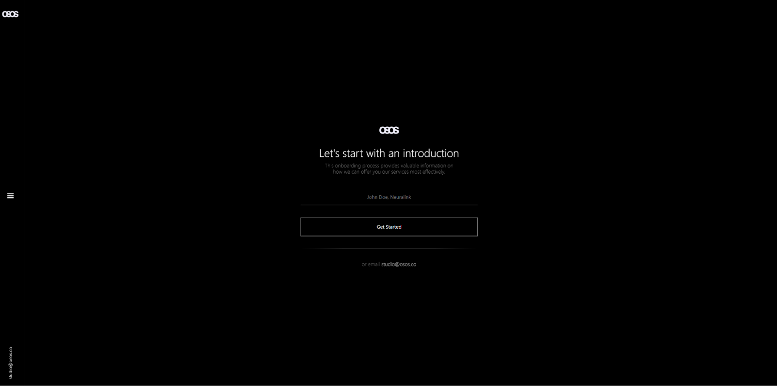
The OSOS website, designed by Marcel H., uses immersive animations to engage visitors across its pages, including the contact section. The contact form isn’t static — it’s a step-by-step wizard that collects all the information the company needs in brief chunks. This approach allows them to create a branching set of interactions and curate the experience depending on each visitor’s choices. If you have a broad audience with very different use cases or common questions, this example demonstrates how to personalize your contact page.
Fully customize your contact us pages with Webflow
The contact page is the heart of many websites, a place where prospects and customers can go to engage directly with the business. So it can’t be an afterthought — it should be highly visible and aligned with the company’s branding. An effective contact us page also conveys important information concisely and helps visitors get in touch quickly.
That’s a lot of elements to get right, and it may take some experimentation to perfect your contact us page designs. But Webflow is here to assist, with form and survey integrations that help you design, test, and publish contact forms in various styles and for multiple use cases. You can fully customize page structures to match your vision, and add complex components and interactions that enhance your designs.
Get Webflow to create high-quality, conversion-focused contact pages and custom websites.
Build websites that get results.
Build visually, publish instantly, and scale safely and quickly — without writing a line of code. All with Webflow's website experience platform.