

Creating an artist website presents a unique opportunity to combine an artist’s speciality with creative web design.
For creatives, working on an artist’s web design can be an exciting opportunity. You get to show off a fellow artist’s designs and enjoy more creative freedom than when designing business sites for law firms or a SaaS company. And most artists already have a well-developed aesthetic, so you’re not starting from scratch.
The goal of an artist website is to build brand awareness, showcase the artist’s style, and potentially offer a way to purchase artwork. Visitors should be impressed but not distracted by the artwork so they can find important elements, like purchase buttons and Contact pages.
Why is having a personal website essential for artists?
A dedicated artist portfolio website is a hub that presents an artist’s work and gives visitors all the information they need, like purchasing and exhibition details. Artists can link to this information from other verticals — like social media and email — to increase their online brand presence and site visibility.
Artists with portfolios can also present their work without being constrained by the Instagram gallery format or needing to produce short-form videos for TikTok.
What are some creative design ideas for artist websites?
Whether you’re building a personal website like a portfolio, a nonprofit arts organization page, or a commercial gallery site, here are 10 web design ideas to help you show off your client’s work.
1. Let the art take center stage

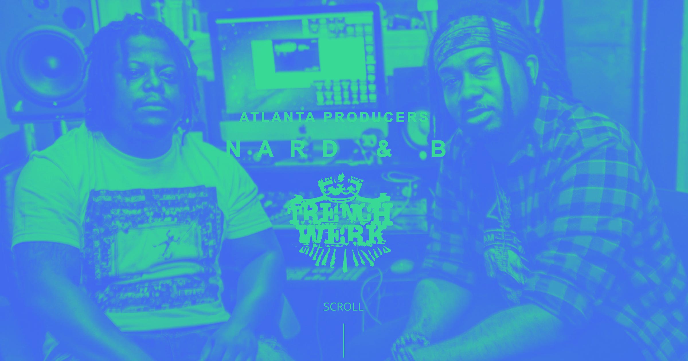
Renowned graffiti artist Banksy’s site uses whitespace and high-quality images to draw attention to each piece of artwork on the site.
Aside from offering navigation to Q&A, Licensing, Shows, and Hotel, the sidebar menu groups Banksy’s artwork into two categories: Outside (his famous street art) and Inside (indoor art in various mediums). Clicking on one of these options opens a series of photos set to change every five seconds, giving visitors enough time to appreciate each piece while trying to keep them engaged. This also means the site can present a wide range of art to suit different preferences and reach a larger audience.
2. Make the viewer a co-creator

Unlike Banksy’s no-frills site, Danish art gallery Kunsthal Charlottenborg’s The Female Gaze exhibition site is all about interaction. The homepage opens with a video explaining the exhibition’s concept: a response to the “male gaze,” which characterizes male artists’ portrayals of women throughout history. They invite visitors to take the place of artist Peter Ilsted in his painting “Young Girl Preparing Chanterelles.” Visitors can click to change the model’s pose, background, lighting, and painter’s position.
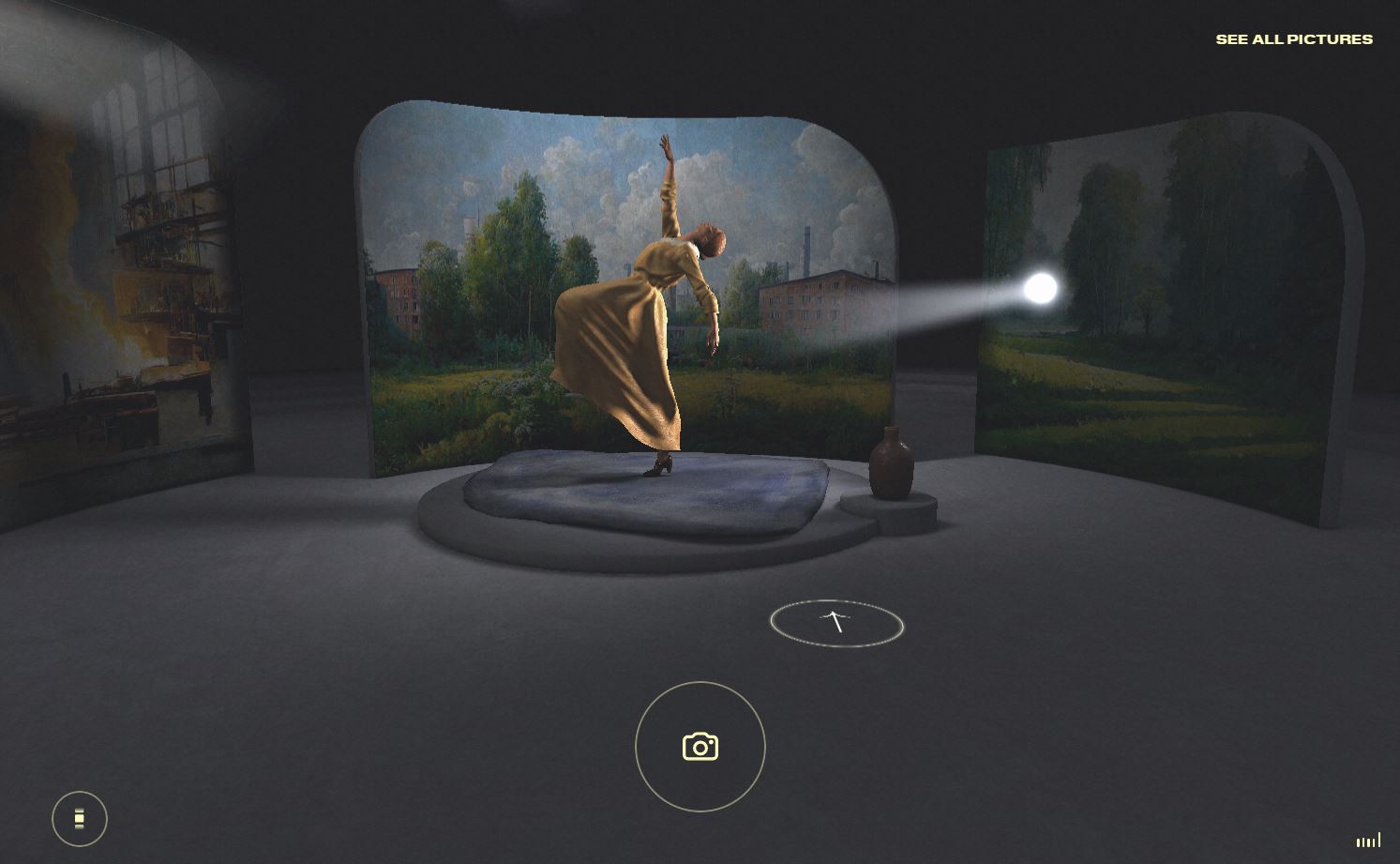
Visitors create their own artwork, then view how other visitors chose to “paint” the woman. This interactive experience completely flips our usual browsing behavior on art sites, which is to passively scroll through artwork. This immersion helps us understand the artist’s point: Every artwork expresses the creator’s perspective, and this perspective can be altered to understand the subject of a piece in a new way. Plus, playing around with this is fun, so people might linger longer and take in more of the artist’s brand — one more reason this site is effective.
3. Use artwork as a background image
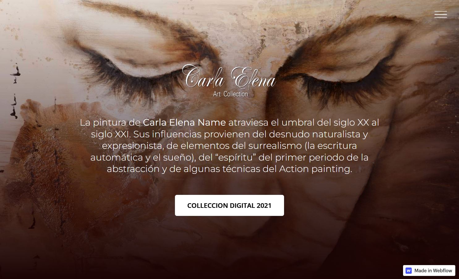
The designer for Carla Elena Name’s site, Luciano Olguin, uses one of Carla’s paintings as a background image, instantly immersing visitors in her work’s earthy, spiritual feel. Viewers who enjoy this style are immediately drawn in to explore more.
The artwork for this Mexican artist’s website is an adapted version of one of her NFTs, shaded darker toward the bottom to increase the contrast with the CTA button, making visitors more likely to notice and click on it.
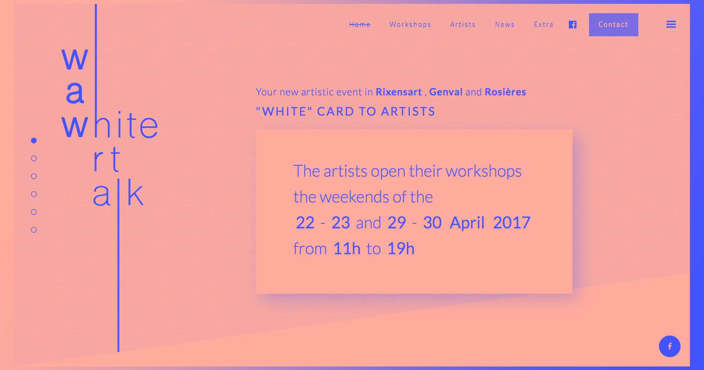
4. Play with unexpected transitions
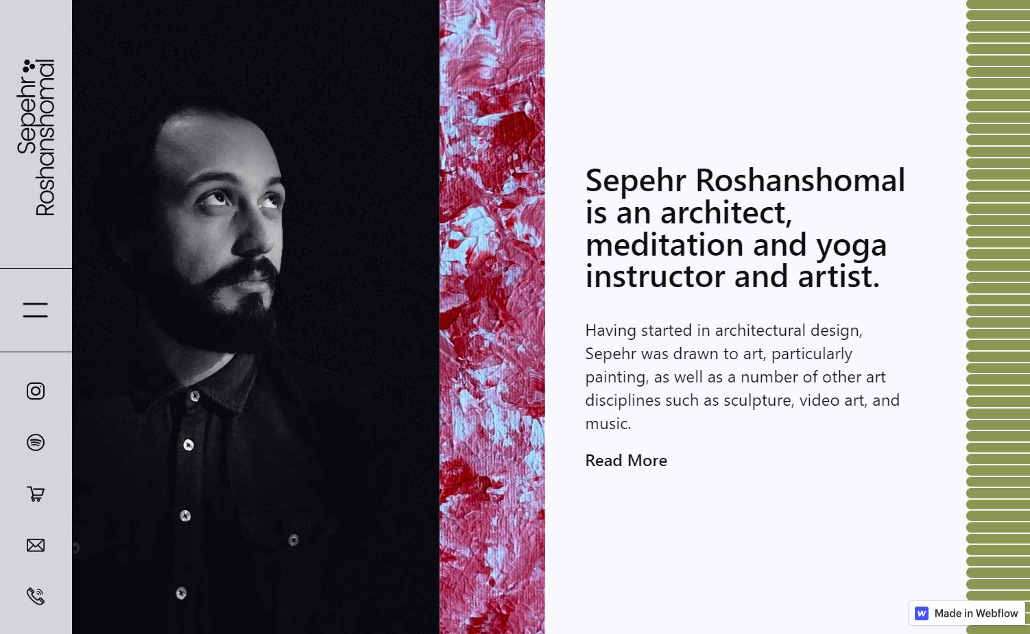
Turkish artist Sepehr Roshanshomal’s site designer, Ozge Keles, uses fun animations and interactions to surprise and delight visitors. The homepage shows a full-page artwork, but scrolling down makes the work shrink to a single vertical bar between his photo on the left and a short introduction on the right. Visitors immediately discover everything he offers to decide whether they’d like to get in touch or not.
The user experience becomes increasingly interesting as visitors continue scrolling. On the desktop site, moving down the page causes viewers to scroll horizontally, subverting visitor’s expectations and engaging them further.
5. Make your portfolio easy to navigate
Artist portfolio websites should show off the work while expressing the brand so visitors recognize the artist’s style.
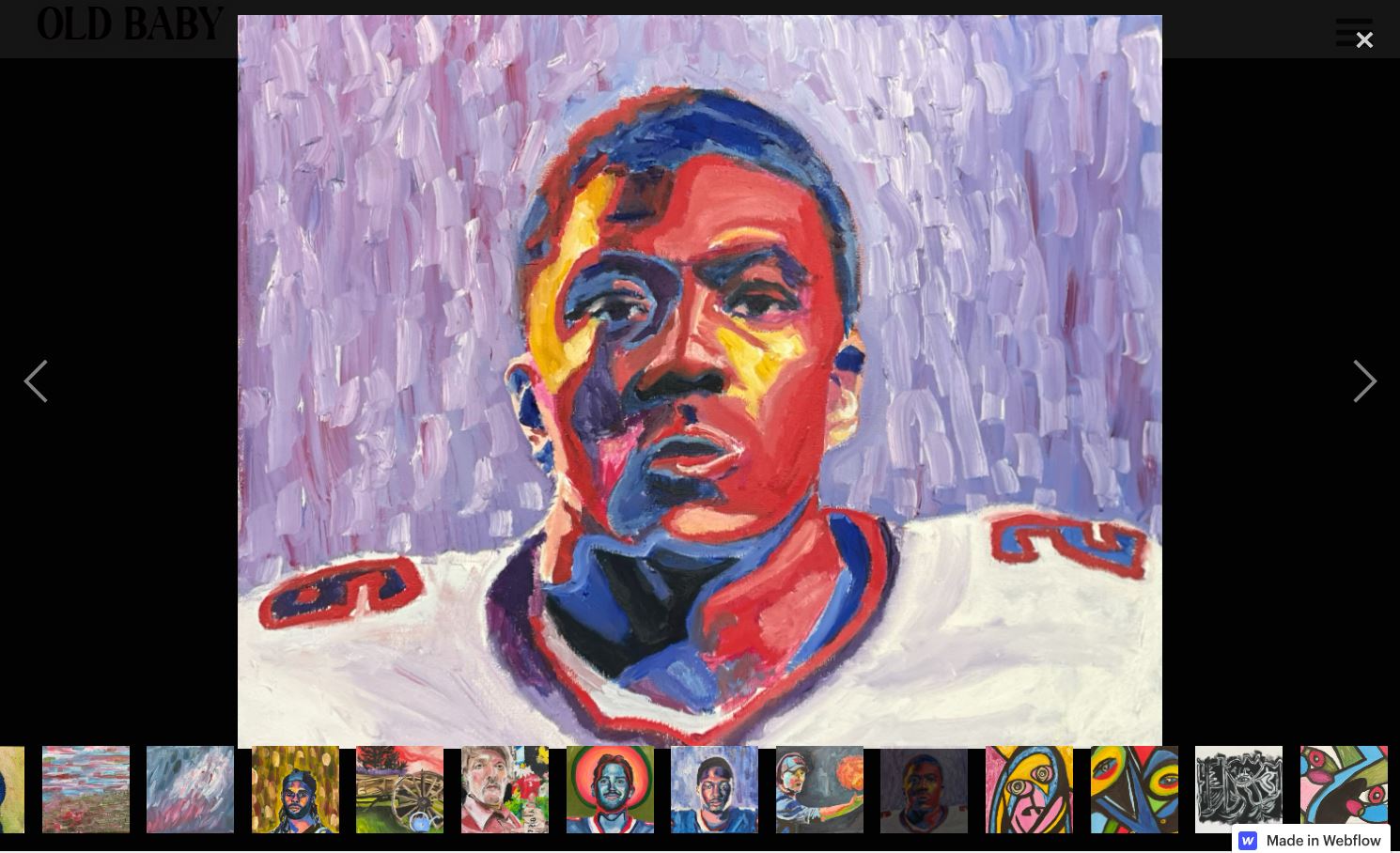
Mystic Ether Design does both beautifully for Old Baby, the New York-based artist Ben Denegen’s online portfolio. Each high-quality image appears against a black background that lets the bold colors in the artist’s style dominate. Visitors can scroll through full-size images using the arrows on either side or go to thumbnails at the bottom of the screen to click on one capturing their attention.
The photos in Ben’s portfolio don’t change on a timer, which allows visitors to appreciate each painting’s details and move through at their own pace, like you would at an art gallery. This subtly suggests he has exhibition experience and, thus, provides highly professional artwork.


Build websites that get results.
Build visually, publish instantly, and scale safely and quickly — without writing a line of code. All with Webflow's website experience platform.
6. Make buying fun
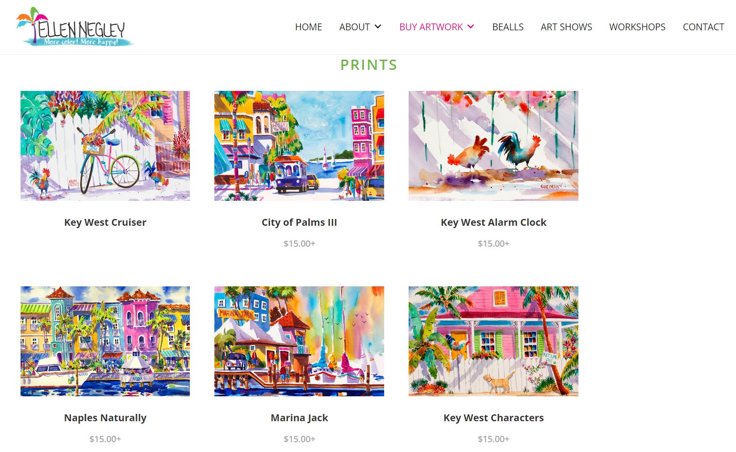
Watercolor artist Ellen Negley's bright, cheerful style captures her native Florida background. To showcase this, the designer presents her products (prints, originals, and T-shirts) against a white background that adds brightness without distracting from the focus — her work.
Clicking on a gallery item takes you to a page where Ellen shares her thoughts on the painting: its inspiration, the techniques she used, or a fun fact about the location. The descriptions are full of enthusiasm, matching her motto “More color! More happy!” and strengthening brand presence on the site. The colorful images and language make buying Ellen’s art seem fun and exciting — if you own a piece, you add more color and happiness to your life.
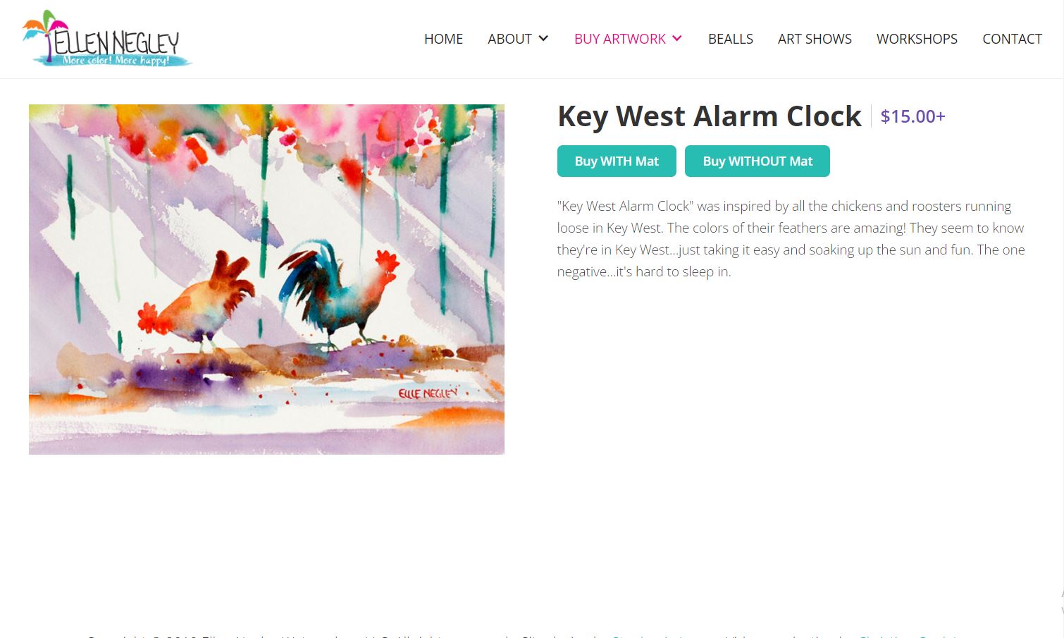
Clicking on one of the “buy” buttons takes customers to Ellen’s Etsy online store. But the site risks losing potential buyers by adding a step to the checkout process. If you’re building with Webflow, consider incorporating an ecommerce store directly into the artist’s website to increase conversions.
7. Spruce up your About page
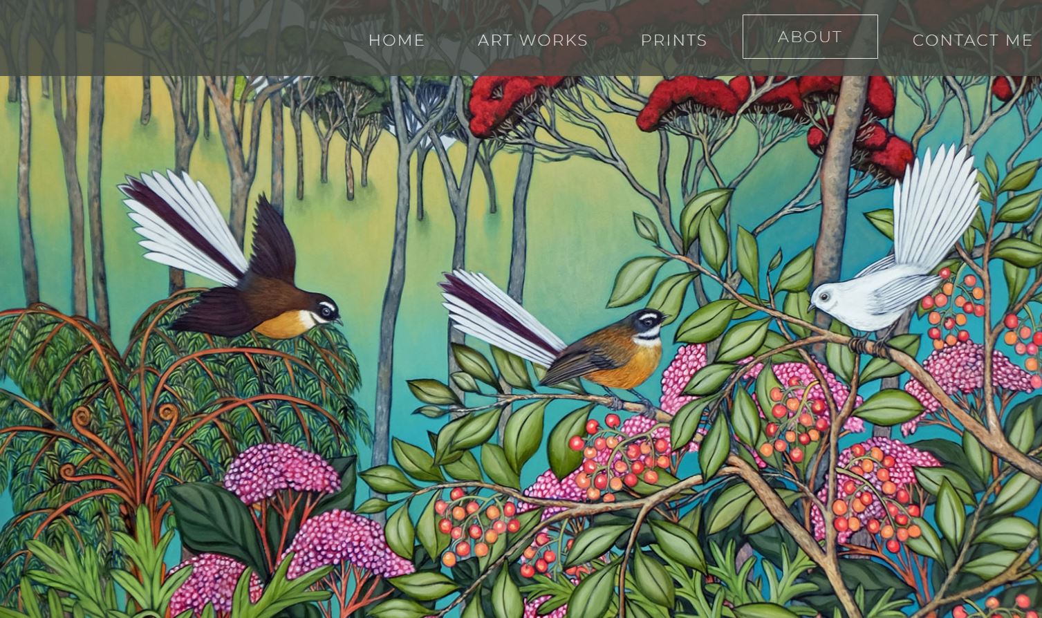
Tracey Gordon, the designer for New Zealand artist Clare Reilly, opens the About page with a full-screen version of Clare’s painting “Glad Tidings From the Inner Land” so visitors connect her work with her story. Scrolling down takes you to a few paragraphs about the feelings she wants to capture in her work, her story as an artist, and her motivations for painting.
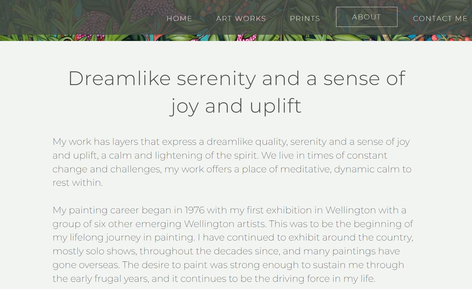
These few paragraphs give context and meaning to the paintings on the site, helping visitors develop a personal connection to Clare’s work. If they buy a piece, they’ll recall her artistic history and method and feel they know her better than if the piece had no context.
8. Show examples of commissioned work
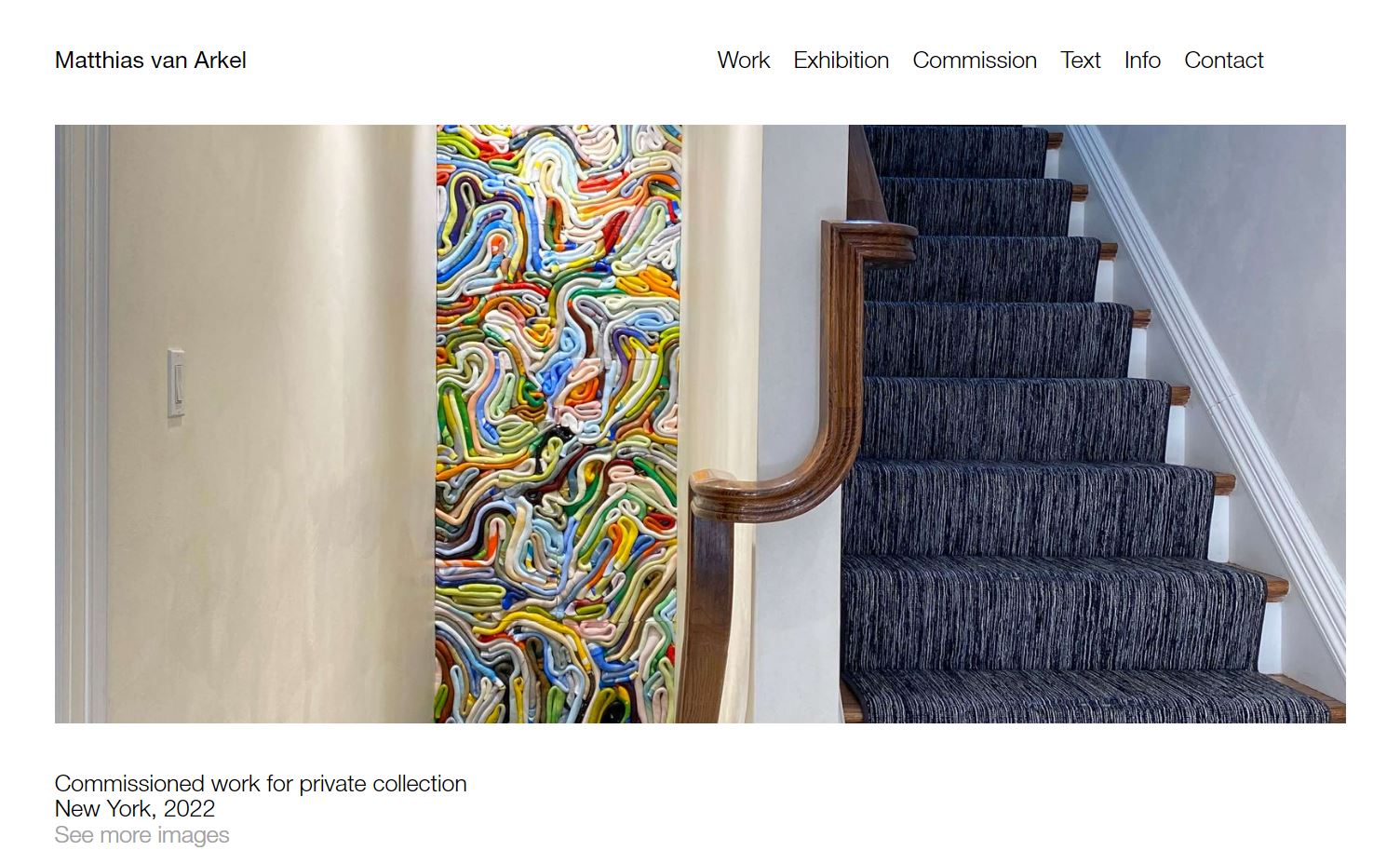
LOD, the designer for Matthias van Arkel’s site, includes several photographs of commissioned works Matthias has created for private and public display. This allows visitors to imagine what one of his artworks would add to a home or public space. It also confirms he does custom pieces.
The sleek, modern design of Matthew’s site — lots of whitespace and simplistic fonts — also perfectly showcases his colorful, textured artworks. This draws focus to his commissions to assure viewers he’s available to make more pieces in this style.
9. Include a blog
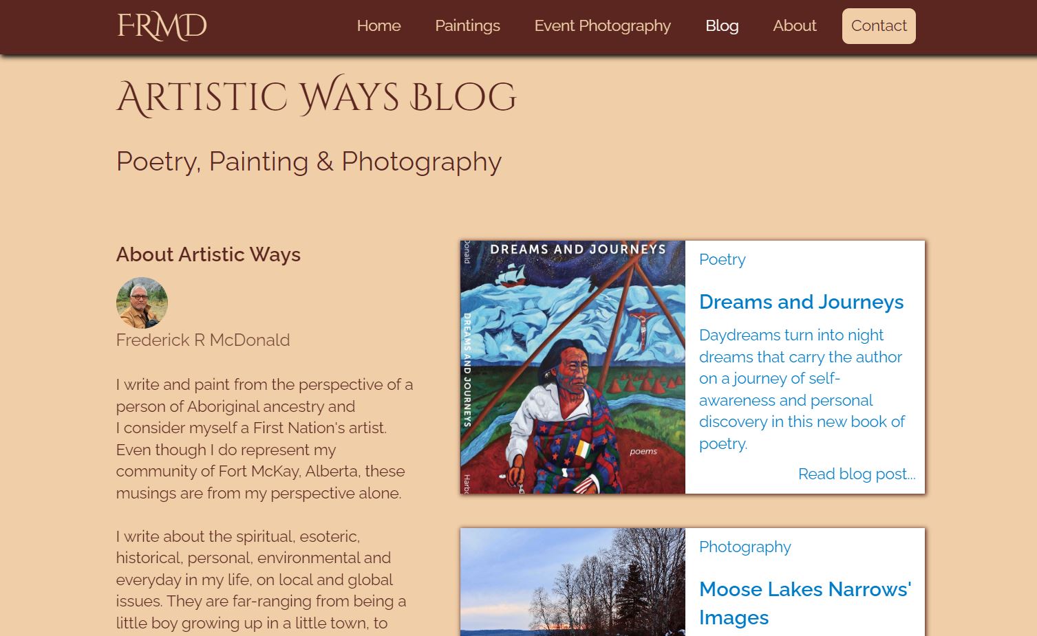
Frederick R. McDonald is an international, award-winning painter, poet and photographer, and a member of the Fort McKay First Nation. Site designer Mireille Sampson incorporated a blog to share Frederick’s paintings, poetry, and photography. Blogs allow artists to deepen relationships with their fans by offering new content and sharing deeper details about their motivations and creative process.
Be sure to check with the artist about how they plan to use the blog. If they’re not interested in writing, it may not be a good fit. Or, if they’re a sporadic poster, consider removing publish dates so the blog doesn't seem inactive.
Blogs also improve a site’s search engine optimization (SEO). An artist who wants to bring in traffic from Google searches could incorporate keywords they want to rank for in blog content. If your client wants to rank for “contemporary painter Boston,” for example, they might post content using this keyword and other relevant terms.
10. Help visitors find what they want
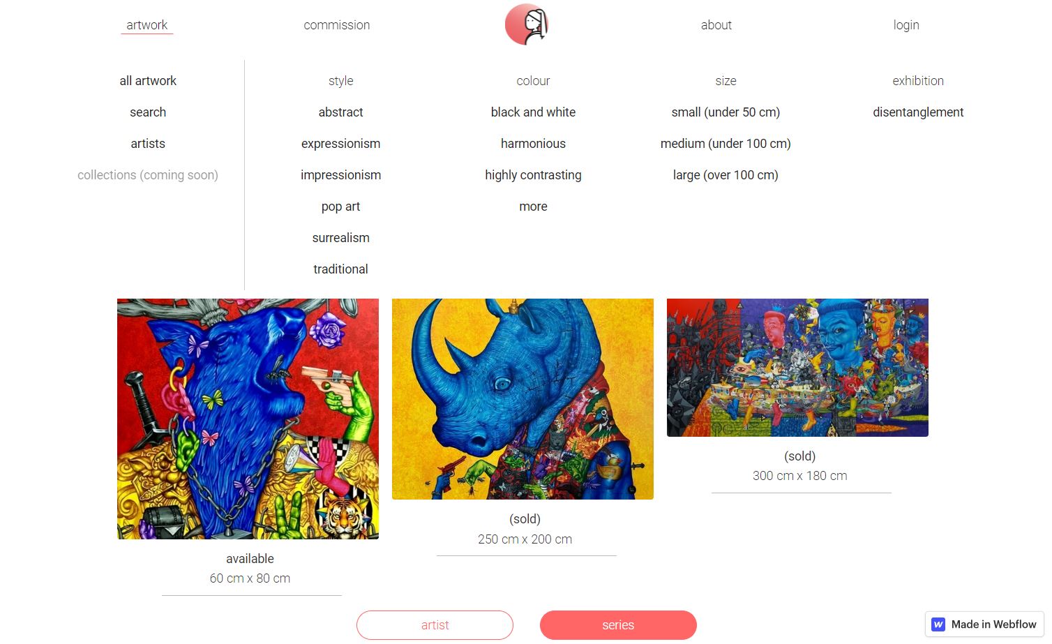
If your site sells a large number of paintings, consider allowing visitors to filter and sort the images so they don’t have to click through everything to find a piece of art that matches their taste. People are always more open to purchasing something when it’s easy to do so.
Exhibitt is a gallery showcasing the work of Thai artists with diverse styles. Their site, designed by Ken Meta, provides filter options for artist, style, colors, and size, maximizing the chances visitors find what they’re looking for and purchase.
How can you make a strong first impression with your artist site?
Artist sites are a great opportunity to collaborate with another creative person on design choices you often have to work out yourself, such as color scheme and layout.
For more artistic design inspiration, check out the best artist websites created by Webflow-community designers and our artist website templates.
Launch with Webflow Templates
Choose from hundreds of professionally designed website templates for any industry or style. Customize visually, launch instantly — no coding required.