


Leverage data visualization tools to transform business intelligence into actionable insights.
Visualizing data helps teams turn complex analytics into actionable insights they can use to make data-driven decisions. The best data visualization tools fast-track this process, offering powerful features that simplify vast databases into accessible, interactive graphs. There are several options available, but selecting the right one from the start is essential — ideally, you’ll only integrate all your data sources once and then use a single dashboard to manage them.
Read on to learn more about these helpful tools and explore the best ones on the market.
What is data visualization?
Data visualization is the process of transforming complex data sets into pie charts, scatter plots, and graphs to make information more digestible. Data visualization tools help you create these visuals quickly and precisely. Without these crucial business intelligence tools, you could spend days or weeks carefully merging data sources, creating spreadsheets, and drawing graphs.
Here are a few more benefits of using data visualization tools:
- Improve personal/team understanding — Presenting data through graphs, charts, and graphics helps every team member quickly digest and interpret information.
- Notice crucial patterns — Data visualization makes trends immediately clear compared to rows of numbers in a spreadsheet.
- Make better decisions — With visible trends and variations, you can quickly pinpoint areas of opportunity or concern and make targeted decisions to address them.
- Effectively share information — Data visualization tools can tailor presentations for different audiences.
- Create interactive experiences — Interactive visualizations offer a personalizable experience that lets viewers explore data in responsive, innovative ways.
What top-notch data visualization tools have in common
Taking in and visualizing vast quantities of data requires incredible computing and graphical processing power. Both have come a long way with the advent of AI, dedicated graphics cards, and lightning-fast processors. As a result, the market for data visualization software is booming. You have many options, but the best visualization software includes the following features:
- Several visualization options like scatter plots, bar charts, and graphs to help you explore information in the most relevant way for any data set.
- Actionable insights and recommendations from AI-powered tools.
- Interactive visuals that you can filter and sort in real time to extract precise insights.
- Batch ingestion that can process multiple data sources simultaneously.
- Dashboards that present high-level insights on an accessible, interactive homepage.
- Comprehensive documentation that demonstrates how to use the software efficiently and troubleshoot potential errors.
The best data visualization tools for business
Here are 12 great data visualization software options available today.
1. Google Analytics

Google Analytics is an industry-standard analytics platform that integrates with most platforms such as Webflow and WordPress. It supports importing data from various spreadsheets or databases. This solution is lightweight, meaning it’s easy to learn but limited in its features and visualizations.
Pros:
- Customizable dashboards let you curate a high-level view of your data.
- Real-time reporting to see immediate website activity, enabling quick responses to trends or campaign performance.
- Audience insights and segmentation show breakdowns of visitor demographics, behaviors, and interests.
Cons:
- Limited visualizations offer only a few ways to represent your data.
- It prioritizes web-based analytics, such as web traffic and search performance. It won’t help you track other business intelligence data, like spending or revenue.
2. Venngage

Venngage specializes in infographics. It’s a great choice for enhancing your internal communications and customer-focused content like newsletters, blog visuals, and social media posts. With an extensive library of customizable templates, stock photos, and icons, Venngage provides useful tools for crafting compelling visuals customized to your needs.
Pros:
- Several visualization options like charts, timelines, and maps provide various ways to represent data and understand trends.
- A library of plug-and-play assets like templates and icons helps you create visuals for presentations quickly.
Cons:
- Very little data processing happens in Venngage. While you can import spreadsheets to fill in visuals, Venngage won’t help you process or analyze them.
- Pricier than alternatives, like Excel or Google Sheets, which can do the same things, just without the assets or automated features.
3. ChartBlocks

ChartBlocks is a user-friendly tool that lets you turn data into personalized charts and graphs without coding. The tool offers many ways to change how your data looks, including colors, fonts, and layouts. ChartBlocks aims to make it easier for you to visualize your data, even if you're not an expert in data analysis or graphic design.
Pros:
- A dedicated data platform like ChartBlocks helps you avoid the need for multiple tools.
- Several visualization options, such as pie charts, scatter plots, and line graphs, provide all the traditional options for data visualization.
Cons:
- No insights or predictive tools are included with ChartBlocks. It’ll help you visualize the data, but you must analyze the findings yourself.
- Lack of advanced features: As a tool designed for non-technical users, ChartBlocks may not offer advanced customization that more experienced data analysts might need.
4. Google Charts

Google Charts has an expansive gallery of popular visualization options, from simple line charts and graphs to maps and complex hierarchical trees. While it’s a free platform, you’ll need a foundational understanding of JavaScript and some CSS knowledge to tweak and personalize the content. With outputs in HTML and SVG, Google Charts is also compatible across different browsers and operating systems.
Pros:
- Interactive visuals let your audience filter tables and charts to show precisely what they want to see.
- Accessible dashboards combine visualizations into a unified view to display related information side-by-side.
Cons:
- A steep learning curve means you’ll need an experienced data scientist to manage and create visuals with Google Charts.
- Complex integrations and code are necessary to import data from other databases, such as your CRM or marketing platform.
5. Whatagraph

Whatagraph is a marketing-focused visualization platform. It gathers data from various sources, automatically combining it to streamline the reporting process and trim time spent on weekly or monthly summaries. Its intuitive drag-and-drop interface further simplifies the creation process, though those well-versed in data analysis may desire more output flexibility.
Pros:
- An intuitive dashboard makes navigating and managing your visualizations simple.
- Broad compatibility ensures you can import data from any platform, tool, or file.
Cons:
- Opaque pricing means you must meet with a consultant to get a quote.
- No insights or predictive tools are included. Whatagraph makes analyzing data yourself simpler, but it doesn’t feature any AI tools to automate tasks.


Unifying web design and data
Discover how using Hubspot's powerful CRM with Webflow can enhance customer experiences and drive your business growth.
6. Zoho Analytics

Zoho Analytics promotes real-time collaboration, allowing teams to quickly share and act on insights for immediate process optimization and cost management. Dynamic dashboards present comprehensive views for cross-referencing financials and KPIs. An AI assistant forecasts future trends and points out potential opportunities for quick gains.
Pros:
- The unified platform enables automatic integration with all Zoho tools to import, process, and manage data across their platform.
- AI insights provide actionable recommendations from Zoho’s AI-enhanced features.
Cons:
- Complex integrations and plugins are necessary to have Zoho Analytics work with databases outside the ecosystem.
- Expensive premium plans unlock all the features you need to collaborate and share your data visualizations.
7. Databox

Databox provides a comprehensive view of your finances, marketing campaigns, and ongoing projects. By automatically calculating campaign returns on investment, Databox helps you quickly assess and compare your effectiveness against competitors, giving you a competitive advantage.
A dedicated support team is available throughout onboarding, training your in-house analysts. If your team needs external expertise, the Premium plan provides direct access to a seasoned Databox business analyst.
Pros:
- Seamless integrations with other platforms like Google Analytics ensure data flows smoothly from one database to another.
- Customizable dashboards that help you get the most out of Databox by focusing on the most relevant metrics.
Cons:
- Dynamic pricing means you’ll pay more depending on how many data sources you use.
- Slim AI tools offer only basic automation features, like generating summaries.
8. Tableau

Tableau distills vast data sets into detailed visual stories, making it simple for your team to understand and present business intelligence. The platform’s intuitive drag-and-drop interface and natural language processing capabilities let users interact with an AI bot for data queries. This accessibility broadens Tableau’s appeal, even to those without deep data analysis expertise.
Pros:
- AI-powered insights can predict outcomes and provide data-driven recommendations.
- Comprehensive data capturing can help you access data about marketing, website performance, and finances.
Cons:
- Expensive licenses drastically increase the cost for each person you add to an account.
- It’s slow to ingest large datasets because it processes data exclusively in the cloud.
9. Sisense

Sisense delivers tailored business analytics, empowering companies to process vast data volumes and visualize them on interactive dashboards specific to each firm. The platform’s natural language capabilities simplify data queries for beginners, but anyone familiar with coding can use code-first solutions to customize the system to meet specific business needs.
Pros:
- Workflow automation features let you automatically import, clean, and process data as you collect it.
- Several AI features, such as generative AI and automated data preparation, make the platform more accessible for beginners and more comprehensive for experienced data scientists.
Cons:
- Opaque pricing information means you must meet with a consultant to get a quote.
- Cloud processing slows data ingestion, and you can avoid it only through a complex installation process.
10. Infogram

Infogram lets you craft interactive visualizations, dashboards, and social media content. Its ready-made templates and intuitive drag-and-drop user interface make it ideal for those less familiar with design and data science. You can also upload a brand kit to create visuals with consistent branding elements, such as colors, logos, and fonts.
Pros:
- It combines infographic and report creation to establish an all-in-one platform for all your data visualization needs.
- AI-powered tools help you select the best visualization for your data and automatically generate content for it.
Cons:
- Limited customization features give you little control over visual presentation.
- You can’t download visuals without paying for premium subscriptions.
11. Microsoft Fabric

Microsoft Fabric is an integrated analytics platform that combines various data services, including data visualization capabilities. While not primarily a data visualization tool, Fabric incorporates Power BI for creating interactive dashboards and reports. This all-in-one solution allows users to ingest, process, analyze, and visualize data within a single environment, streamlining the entire data analytics workflow.
Pros:
- End-to-end analytics capabilities within a single platform.
- Advanced visualization options explore data in new ways beyond traditional pie charts and bar graphs.
- Built-in machine learning and AI capabilities provide timely insights.
Cons:
- Requires subscription to the Microsoft ecosystem. Fabric works best when you commit to handling all your data using Microsoft’s suite of tools.
- Convoluted documentation can make learning the platform difficult.
12. Datawrapper
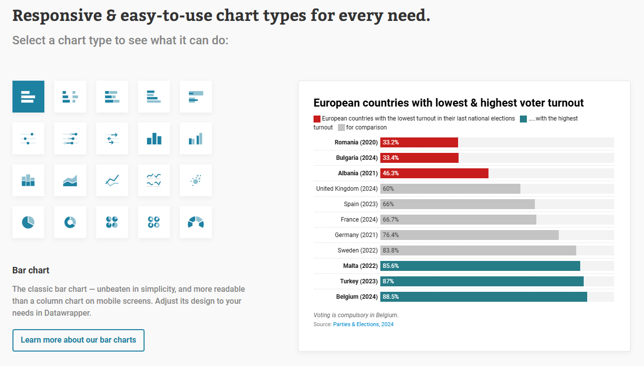
Datawrapper organizes reports and dashboards into an accessible data library and gives you the tools to generate intricate visualizations. It supports over 20 chart, graph, and map types and lets you export them in various formats. Datawrapper visuals render well on any device, with responsive designs for tablets, desktops, and smartphones.
Pros:
- Premium customer service features like tailored themes and branding make Datawrapper experts part of your data science team.
- Automation features help you import data, generate reports, and output visualizations with a single clic.
Cons:
- Expensive pricing plans make Datawrapper best for large enterprises ready to invest large sums of money.
- Limited data merging features mean you’ll need to merge many of your data sources yourself before uploading them.
Webflow Analyze: Native analytics & data visualization

Webflow Analyze is Webflow’s native analytics solution that presents valuable data about your site visitors’ experience. It’s an all-in-one solution that gives designers and marketers all the real-time information they need to make data-driven decisions about your site. Here are the features that make Webflow Analyze the best choice for your data visualization needs:
- Native support offers crucial information about your website traffic and performance from within the platform, meaning you won’t need complicated plugins or integrations.
- Page insights tell you which interactive elements users click on, how long they stay on a page, and which pages they visit most often.
- On-the-fly UI tabs show you relevant data about the page you’re working on from within the Designer.
Transform data insights into powerful digital experiences
Leveraging data visualization tools helps you turn your data into actionable, informative charts and graphs that give you the necessary information to make data-driven decisions. There’s no better use case for that than your website, where details about traffic sources, interactions, and engagement inform critical design choices.
To take control of your website data, try Webflow Analyze and Optimize. You can track user behavior and create personalized user experiences to maximize every impression and drive genuine audience engagement.

Build with Webflow
Webflow Enterprise gives your teams the power to build, ship, and manage sites collaboratively at scale.