


Websites can look and function very differently across devices, which is why it’s so important to consider how everything from visuals to navigation functions on various devices, screen sizes, and even internet connections.
Designing websites that provide a similar user experience (UX) for a wide range of devices and scenarios can be challenging for web designers and developers.
Familiarizing yourself with adaptive versus responsive design helps determine which method is right for your users and website content.
What’s responsive design?
Responsive design means a single website layout functions for desktop and mobile viewers, as web page elements "responsively" adjust to fit the screen they’re viewed on.
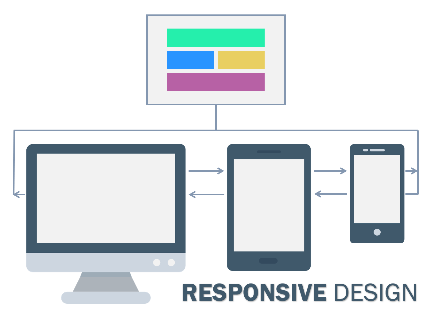
The trick to constructing responsive sites (typically made in HTML and CSS or HTML5 and CSS3) is using queries to target breakpoints — areas where a site adjusts to different device widths. These breakpoints scale images, wrap text, and adjust the layout to fit any screen.
This design style considers all user interfaces (UIs) as one. The UI design and content seamlessly adapt, and you only have to construct a single layout design.
What’s adaptive design?
For adaptive sites, designers create numerous fixed layouts to match the device a site is viewed on.
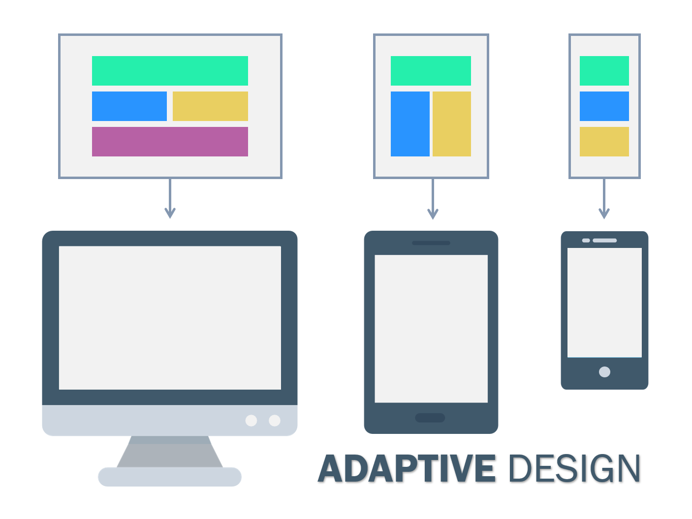
Adaptive design uses distinct layouts for multiple screen sizes, usually with templates for each device’s resolution. Designers often develop layouts for the six most common widths: 320, 480, 760, 960, 1200, and 1600 pixels. Tablets, smartphones, smartwatches, and monitors often have unique resolution ranges, so content must adapt to these to be viewed properly.
Adaptive sites use the CSS queries of responsive design but have JavaScript-based enhancements to change the website's HTML markup based on the device's capabilities. This is known as "progressive enhancement." This design style doesn't require multiple designs — just layout templates stored in a single location.
Adaptive versus responsive design: 5 differences
Both adaptive and responsive web designs meet users’ scaling needs, but they differ in five important categories:
1. Layout
Responsive: The device or browser window dictates the way a single layout displays. The UX design adapts to Chrome, Bing, Firefox, and Safari and to Windows, macOS, Linux, or other operating systems.
Adaptive: The client’s device or browser predetermines which layout to populate. The server detects factors like device type and operating system and sends the correct configuration.
2. Load time
Responsive: While moderately slower than adaptive designs, most website creation software provides features that speed up responsive layouts. These allow static and dynamic images to automatically scale to fit every device and resolution.
Adaptive: Adaptive layouts are generally considered faster because only the necessary assets transfer to each device. These layouts are even quicker when viewed on a high-quality display, allowing images to load faster.
3. Difficulty
Responsive: With only one layout across devices, responsive designs require more up-front work. This includes paying extra attention to CSS organization to ensure functionality across screens.
Adaptive: Each device class needs its own layout, so there’s more work overall. You can use the same elements in layouts, but you still need to design each one separately.
4. Flexibility
Responsive: Like all websites, responsive websites need general maintenance. But responsive layouts don’t need to be updated when the marketplace offers new screens.
Adaptive: Screen sizes and resolutions change constantly. Adaptive layouts can "break" when not optimized for a screen’s resolution. You must frequently create new layouts to account for changing technology.
5. SEO-friendliness
Responsive: Google recommends and rewards sites that use responsive design. Mobile-friendly websites tend to rank higher on search engine results pages (SERPs) since half of user traffic comes from mobile phones.
Adaptive: Adaptive designs are tricky regarding SEO because you must update and optimize for every layout.


Why your design team should use Webflow
Discover how design teams are streamlining their workflows — and building better experiences — with Webflow.
Advantages and disadvantages of responsive design
Responsive design is perfect for small- to medium-sized companies and new businesses because it’s budget-friendly and requires fewer resources. It’s also great for ecommerce industries because it’s comprised of text blocks and images — what most ecommerce sites are made of — providing a smooth customer shopping experience.
Let’s dig deeper into the specific pros and cons of responsive sites.
Advantages
Seamless experience
Regardless of the device type — desktop computer, mobile, etc. — visitors get the same UX. This might instill a feeling of familiarity and trust when they transition between devices and immediately recognize the site.
Fewer maintenance tasks
A responsive design reduces the time and effort required for maintenance because it uses the same content across all devices. This leaves more time for essential tasks like A/B testing, customer service, content development, and more.
Improved crawling and indexing
Google uses bots (also called crawlers) to download and index website content. For example, if the crawlers successfully note which keywords are relevant to your content, Google can then determine where to place that content in SERPs tied to those relevant terms. Ranking higher means gaining increased visibility since most users only click on the first few results.
With only one version of the content, crawlers only have to scan your page once. This improves crawling efficiency and increases the chance you’re indexed and placed appropriately for the keywords you want.
Disadvantages
Slower page loading
Responsive sites must first pinpoint the device or browser and then load elements appropriately, which can result in slower load times.
Difficulty integrating advertisements
Ads have to accommodate all resolutions, so while your website will flow from device to device, ads may not configure correctly.
Advantages and disadvantages of adaptive design
Adaptive design is best for existing complex sites that require a mobile website version. It’s also recommended for speed-dependent sites or creating a highly targeted experience, like adaptability to someone’s location, connection speed, and more.
Generally, adaptive designs are ideal if you want more control over how a site shows up for each user. But here are some pros and cons to consider:
Advantages
Highly targeted for each user
Optimizing individual devices means visitors will likely have a positive UX. For example, you can adapt to a visitor's location and connection speed, to deliver specialized content, such as search results tailored to their region and lower-resolution images for slower connections.
Faster load times
Only the version of the site visitors actually need loads, which means it loads faster. You can also include lower-resolution images and videos for devices with less computing power.
Optimized for advertising
With adaptive sites, you can gain mobile device data on your customized layouts to optimize advertisements based on user data from smaller screens.
Option to reuse code
Adaptive design keeps legacy code in place, which is especially handy for complex website designs since you don’t have to rewrite everything every time.
Disadvantages
Labor-intensive to create
Adaptive design requires more work because technical aspects, such as where to put CTA buttons or how to organize navigation bars, have to be considered for each individual layout.
More work to maintain
You must update each layout version individually and keep up with changing screen resolutions.
Expensive
Adaptive web design requires more development, maintenance, and technical support resources.
Create an agile site with Webflow
As technology continues to introduce more and more screen resolutions into the market, choosing between adaptive versus responsive layouts depends on the immediate needs of your business. Luckily, Webflow’s templates have responsive web design worked in, ensuring smooth transitions and image loading no matter the device.