


Good design means grid-based design. (Most of the time.) By using the grid, you get visual consistency in your pages, you add logic to your layouts, and you respect a set of rules that makes your work easier and your results better.
Good design means grid-based design. (Most of the time.) By using the grid, you get visual consistency in your pages, you add logic to your layouts, and you respect a set of rules that makes your work easier and your results better.
Find out how to make flex containers play nice with Webflow’s native grid system, and build more logical layouts.
What is a flexbox in CSS?
Flexbox is a super powerful layout tool in CSS that allows you to create expandable content on a web page — particularly rows and columns. Before flexbox, web designers used floats to break content outside of traditional block-level elements on a page. Floats are problematic because they require you to perform various workarounds and hacks. Flexbox streamlines this process, allowing you to build great layouts with ease.
CSS grid vs flexbox: What's the difference?
CSS grid is another powerful tool that makes it easy to create awesome layouts. But, it raises the question: Does CSS grid replace flexbox? Not exactly. CSS grid can do things that flexbox can’t do, and vice versa.
Here's the big difference between these two tools:
- Flexbox — Used for lining things up in one direction
- CSS grid — Used for lining things up in two directions
If you want a more in-depth comparison of these two tools, check this CSS grid and flexbox cheat sheet for tips and tricks.
Some elements of Webflow use the grid naturally, others … not so much. Especially the flex containers. Let's see how you can modify your flex containers to force compatibility with the grid.
Webflow uses a very common and convenient 12-column grid. You can’t customize that (yet!), but a 12-column grid proves fairly flexible since you can divide it by 2 or 3.
Many designers will tell you to use an odd number of columns for your grids, and that's not a bad thing. An odd number of columns can push you to do things you haven't done before, and keep you from building overly symmetrical designs.
But every constraint you face translates to an opportunity — just look at haiku. It’s a rigid form that requires a specific number of lines (three) and syllables (usually, 17). And yet poets have been writing haiku for thousands of years, producing numerous classics.
So today, we’re going to focus on making flexbox-powered layouts work with Webflow’s built-in 12-column grid. But first, let’s get to know that grid, shall we?
The Webflow grid
Webflow features a native grid system for each of its device breakpoints:
- Desktop: 12-column 940px
- Tablet: 12-column 724px
- Smartphone (portrait and landscape): 2 column variable width
You can turn the grid on and off, and choose between light and “filled” overlays, in the lower left of the Designer.

Soon after you dive into Webflow, you come to realize how important the Container element is. Like the native grid, it’s 940px wide on desktop, and it’s always centered relative to the browser. It's always on the grid. On every breakpoint.
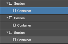
So to build a basic layout in Webflow, add a Navbar, then a section (which is full browser-width), then a container nested inside the section. And repeat.
That way, when you start adding elements to a container, they’ll start at the beginning of the grid. Each column is 60px wide, with a 10px gutter on either side. So if you give those elements sizes like 60, 140 etc, they’ll always fit the grid.
Designing with the grid
Using grids can take a bit of concentration. You need to deal with the gutters, decide where to put your margins, how to use padding, etc. Often, you’ll wonder whether you should align the container or the content to the grid.
The answer? The content. As often as you can, align your content (be it copy, images, or videos) to the grid.
That way, if your content is wrapped in boxes (divs), you’ll align the boxes with the gutters, then pad the content to fit the columns.
Experience the unprecedented ease, speed, and power of CSS grid layout in Webflow — with all-new on-canvas controls.
Experience the unprecedented ease, speed, and power of CSS grid layout in Webflow — with all-new on-canvas controls.
The column element and the Webflow grid
Have you ever noticed how designing with the container element and DIVs differs from designing with the column element and DIVs? That's because the column element takes the grid into account by default.
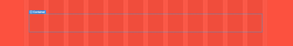
To see how, let's drop a column element into our container:
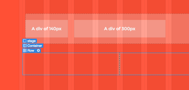
See how it begins in the middle of the gutter, 10px before the container above? The thing is, we placed this column inside a container, and yet it begins outside it How does that work?! To see, let's give the row a class and check out its default properties.

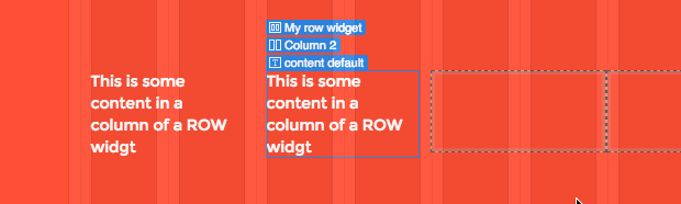
Did you see it? The rows within a column element have -10px margins left and right by default. And the columns?

The columns come with a 10px padding left and right. So there we have it: our container wraps around the gutters and our content starts on the grid exactly.
Flexbox and the Webflow grid
The columns element is powerful because of the layout control it offers, plus, you get options for how it will behave at different breakpoints.
Now, you've probably heard that flexbox gives us another way to deal with columns, and since it's pure CSS, it's even better for responsive design. And if you want that third column in your three-column layout to appear first on mobile, just set it to reverse order and voilà! Amazing.
But flexbox containers aren't well-equipped to deal with the grid by default.
They don't account for the grid and the gutters. They always start right where you put them, just like a standard DIV. So you can't just drag a container in, set it to display: flex, and start nesting divs like they were columns. Especially if you want the columns to have a visual representation, like a colored background or visible border.
(Oh, and forget using containers with display: flex, because you can't alter their margins, even by adding a class. Use DIVs.)
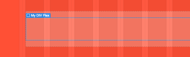
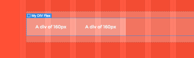
Here’s a flex div inside a container.
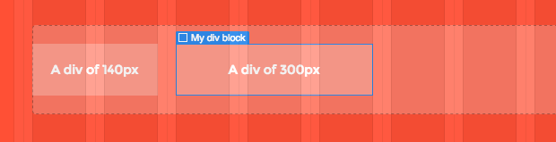
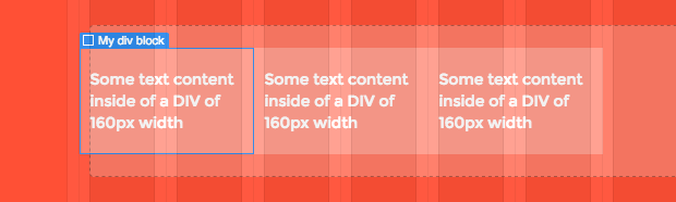
Let's put two 160px-wide divs inside like they were columns.

Doesn’t quite work. My first div should be 10px thinner, and then I won't be able to style its background like the following one. This wasn't the case when we used a column element.
So let's do to the flex element what Webflow does with columns: unwrap it from the grid with a -10px margin left and right.
There we go! We now have a flex container with divs acting as columns inside. One unique class for those DIVs and they're always in the grid. We can now use them as columns.
Wrapping up
Why is having a unique class important? For maintenance, simplicity, and most importantly, for working with the CMS. When you're dealing with elements in a Dynamic List, you don't have the luxury of adding special classes to the first and last element to account for the grid. You want a solution that works all the time, in all cases.
The grid matters. And Webflow gives us all the tools we need to deal with it. Start by activating the grid overlay and leaving it on all the time. If you don't, you'll stick with giving elements spacing values that adhere to no underlying logic.
Open your past projects, activate the grid overlay, and see how you can improve their layout. Everything should be aligned to the grid, from lengthy text blocks to small buttons. By using the grid, you’ll allow yourself to leave big chunks of layout unused, for breathing space. Breathing spaces only work when they fit the grid.
And by working with the grid, you have a reason to put things where they are. That way, it's much easier to answer questions from your client, and to stand behind your design choices.
Sign up for a free Webflow account and start designing today.


