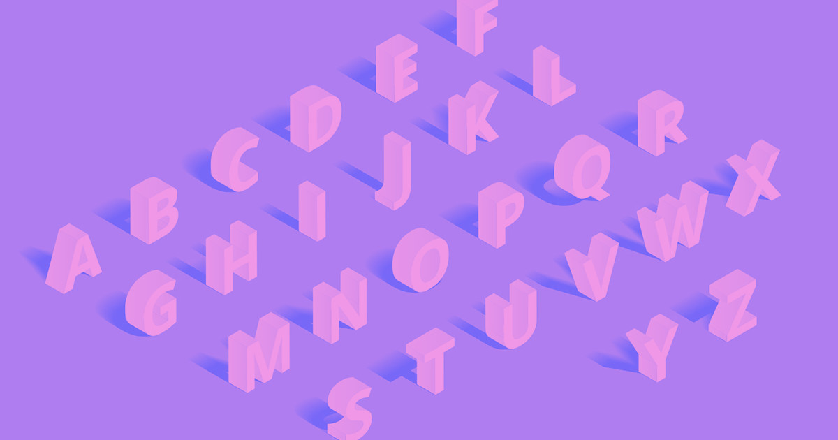


Finding the perfect font pair among thousands of existing options can be daunting.
Font pairings play a crucial role in creating visually appealing and harmonious web designs that catch viewer attention and clearly communicate the website’s message. With so many fonts out there, it can be hard to know where to start. Luckily, with online font pairing tools curated by humans, artificial intelligence (AI), or both, your ideal font combinations are just a few clicks away.
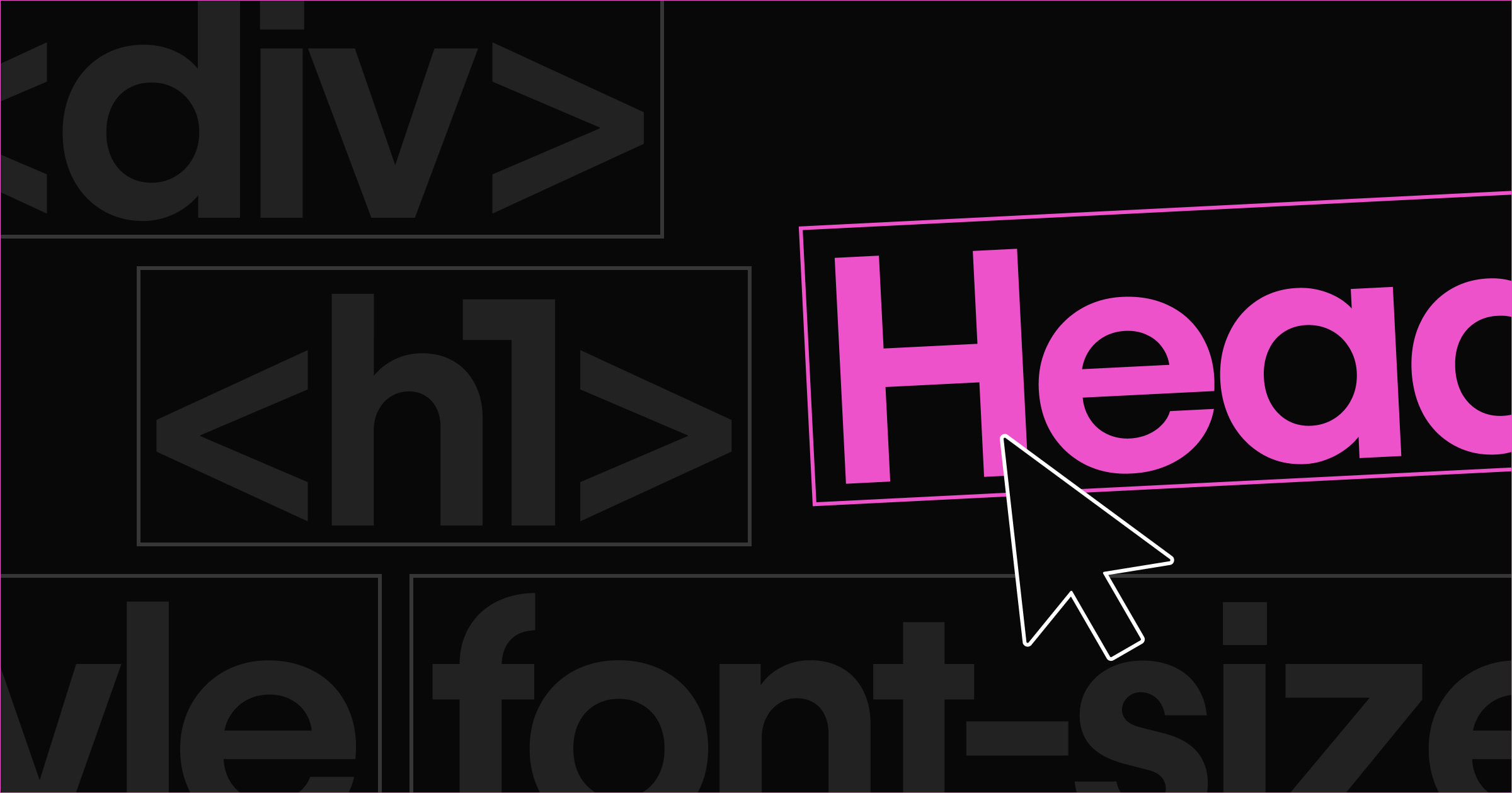
Which types of fonts combine well?
Font pairs (or combinations, if three or more fonts are involved) harmonize with one another to produce a visually pleasant and unified experience. While digital font galleries and generators can quickly offer a variety of pairing options, it’s also useful to understand the basic principles of what makes a good font pairing.
Follow these four general guidelines to achieve strong font combinations.
1. Choose fonts that evoke similar associations
To create a cohesive visual experience in your design, select fonts that arouse similar emotions and mental associations. This careful selection helps you avoid creating a disjointed aesthetic due to conflicting visual cues. For example, pairing a modern font with a vintage font could create a fragmented or dissonant feel.
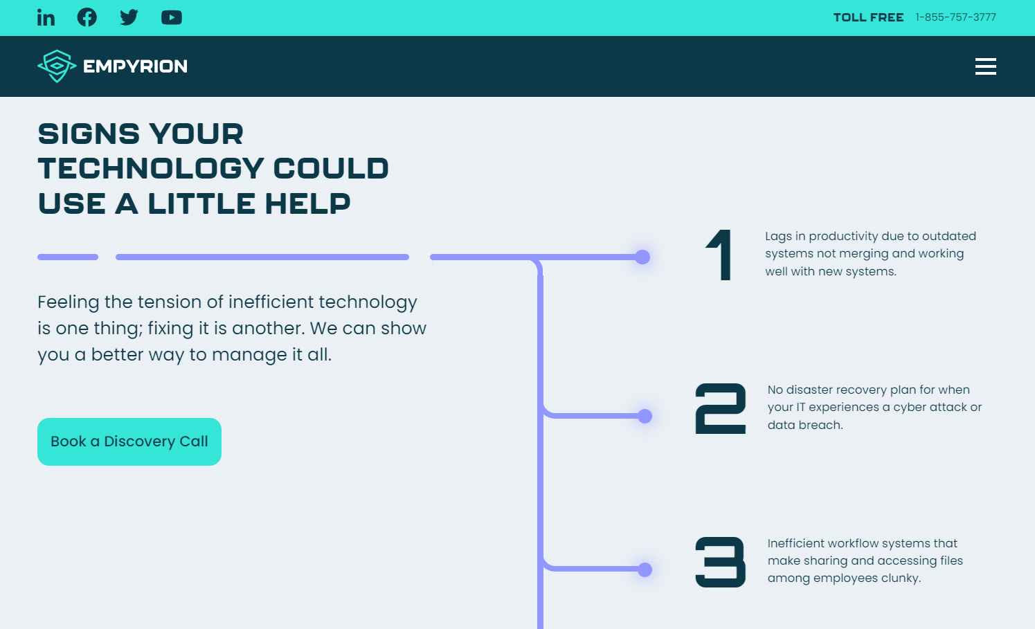
KHULA design studio’s site for Empyrion Technologies demonstrates harmony using three fonts, each contributing to a high-tech look. The squared sans-serif Kallisto for headings sets a modern and industrial tone for the site with its blocky, robust structure. Orbitron styles the numbers, infusing a touch of futuristic tech with sharp angles and clean lines. Poppins, a highly legible geometric sans-serif, serves as the body text, tying the site together with its balanced geometry.
2. Select moderately contrasting fonts
Using overly similar fonts can create a monotonous or disorienting experience, as slight variations between fonts become visually disruptive. This lack of variety can also confuse the visual hierarchy, blurring the distinctions between headings, subheadings, and body text.
For an optimal user experience, pick fonts that share some — but not all — of the following features:
- x-height
- Glyph width
- Stroke width (weight)
- Shape
When these features work in tandem, they preserve visual consistency but add enough variety to maintain interest and clarity.
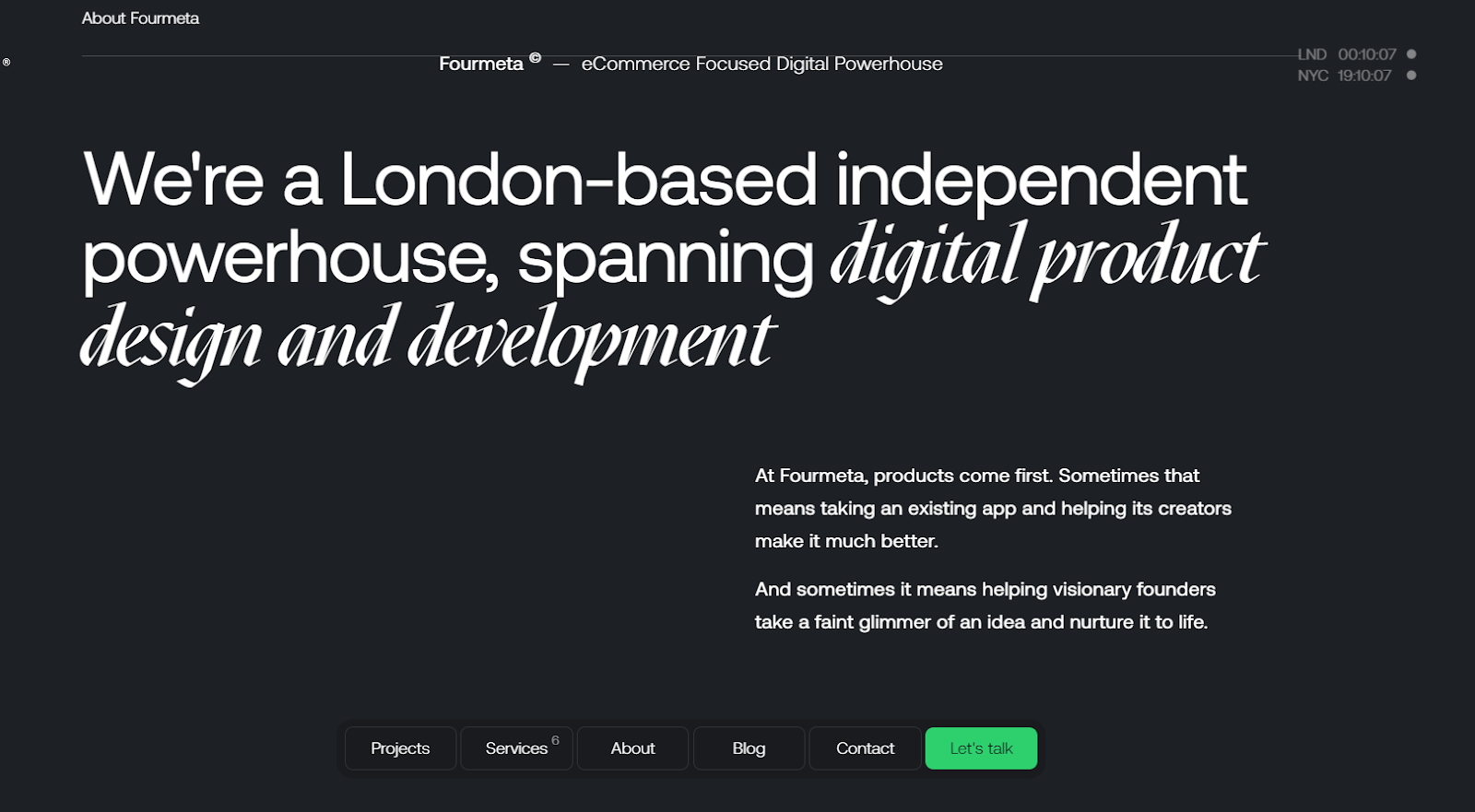
For example, design team Fourmeta uses two moderately contrasting fonts on its homepage: sans serif Aeonik for the majority of the text and Mazius Display extra italic to highlight important words and phrases. These two fonts work well together because of their similar x-heights and contrasting glyph shapes.
3. Pair eye-catching display fonts with neutral counterparts
Pairing two busy fonts can visually exhaust viewers, leading to disinterest, disengagement, or even site abandonment. Plus, display fonts are often illegible at smaller sizes, making them hard to read as body text. If the heading’s font has lots of personality, pair it with a neutral (and highly legible) font like Roboto, Helvetica, or Open Sans for body text.
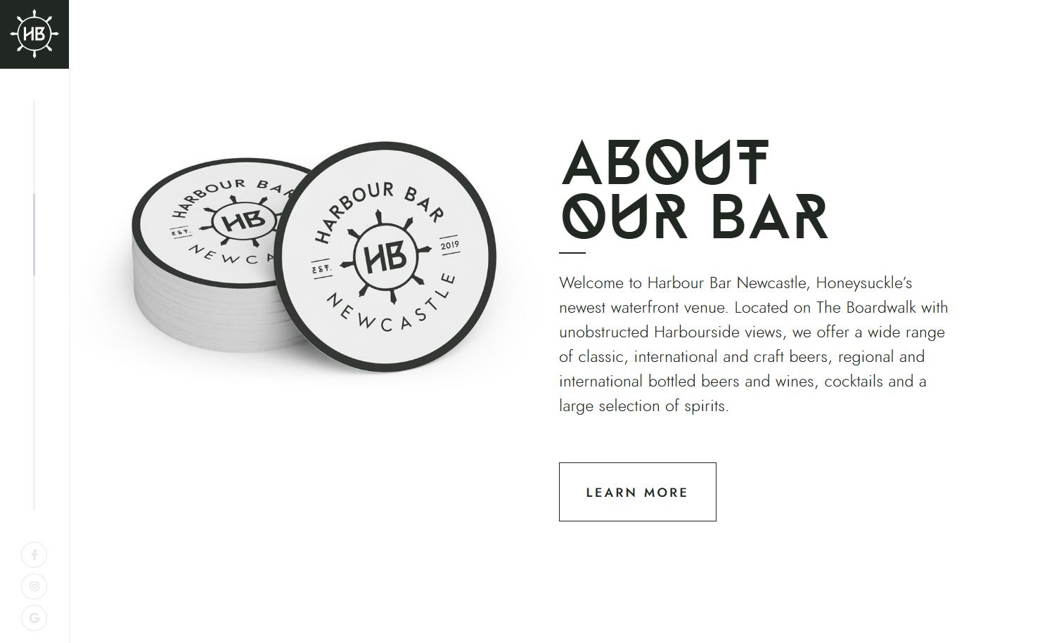
Mark Taggart’s design for the Harbour Bar website uses the unique but abstract display font Neptune to highlight the restaurant’s sea-inspired branding. Mark pairs Neptune with the neutral geometric sans-serif Jost to minimize cognitive load for users.
4. Vary size and weight within one font family
Using a single typeface across the entire site can achieve visual consistency but risks obscuring the visual hierarchy. Differentiating text through varying sizes and weights mitigates this risk and ensures each site section has its emphasis while maintaining cohesion. For a balanced approach, pair fonts from the same superfamily, like Merriweather and Merriweather Sans, as designers specifically created these fonts to complement each other.
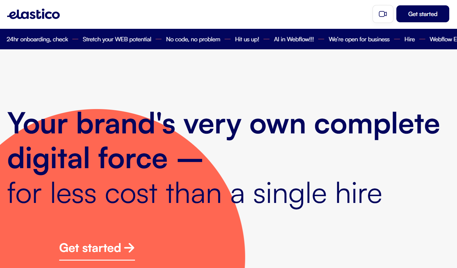
Branding agency Elastico’s website uses only one typeface throughout: highly legible sans serif Satoshi. Web design team Snowhouse Studio shows a clear visual hierarchy through variations in line weight (bold and regular), size (78pt, 32pt, 40pt, and 15pt), color (blue, pink, and white), and case (uppercase only and sentence case).


Get started for free
Create custom, scalable websites — without writing code. Start building in Webflow.
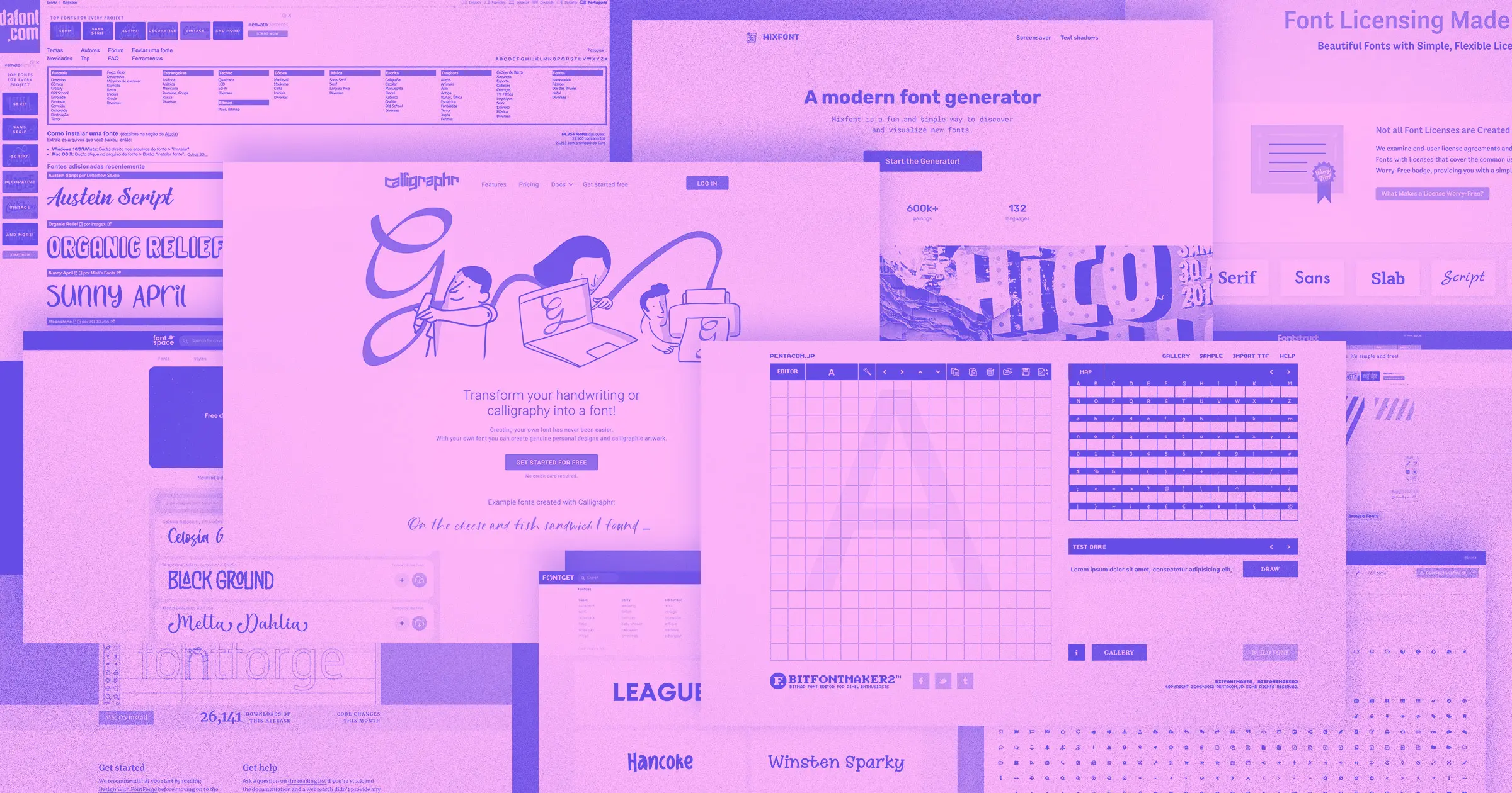
5 of our favorite web font pairing tools
These five font pairing tools are built for experimentation. Use them to play around with typefaces, weights, sizes, and spacing until you’ve found the right combination of each.
1. Fontpair
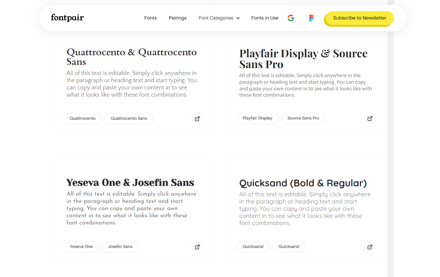
Fontpair uses an interactive approach and presents 100 hand-selected fonts with editable fields. This feature allows you to paste your text and preview it in a specific font. The font pairing website also includes a dedicated page for each font with a brief description and samples of all available weights.
2. Archetype
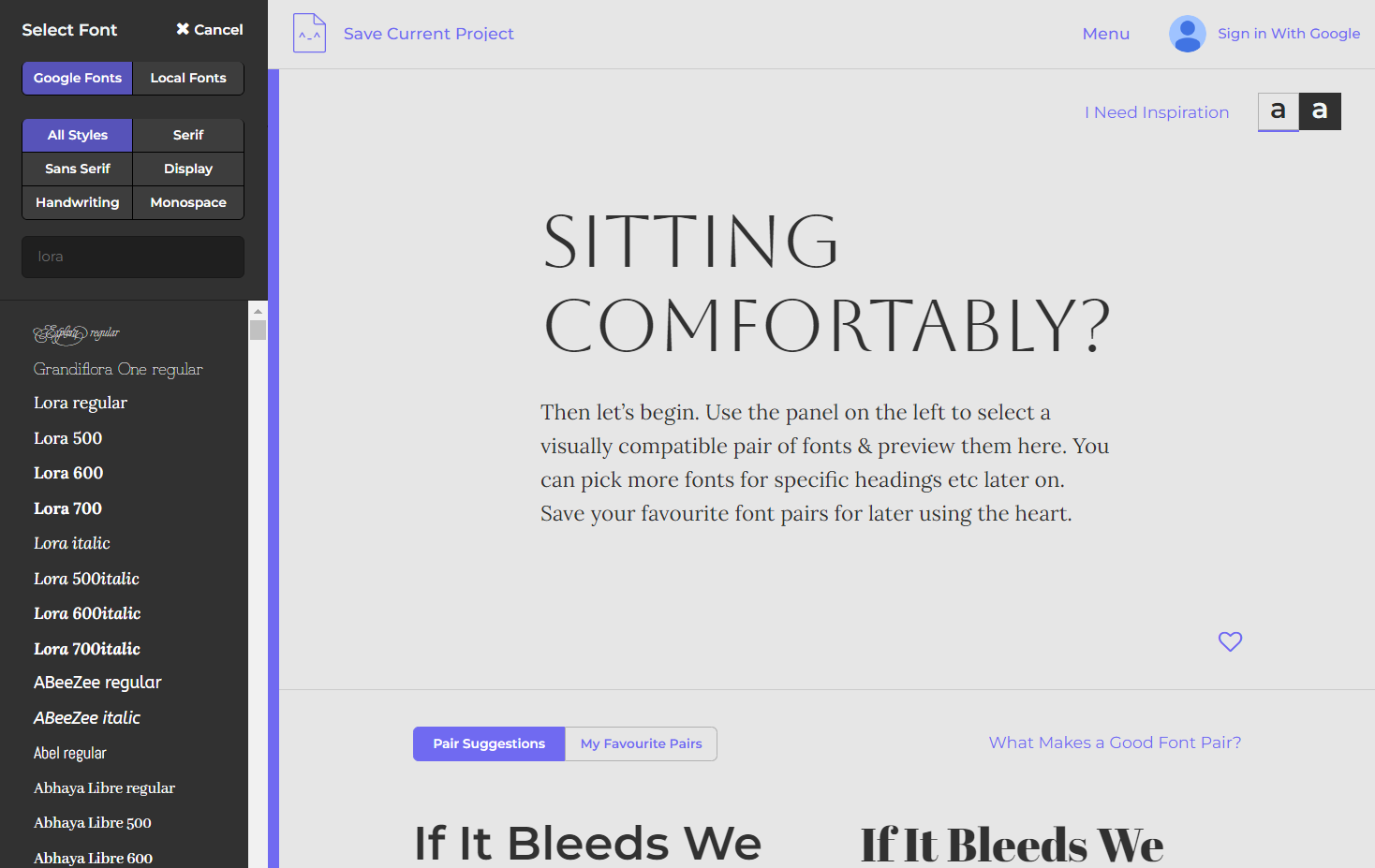
Archetype provides an interactive space for typography styling and spacing in the browser, with the option to export the results as CSS code. A search function lets you discover matching fonts, including the option to search by name or style categories such as serif, sans-serif, display, handwriting, and monospace. A light and dark mode toggle provides a dynamic preview of typography selections against different backgrounds.
3. Monotype
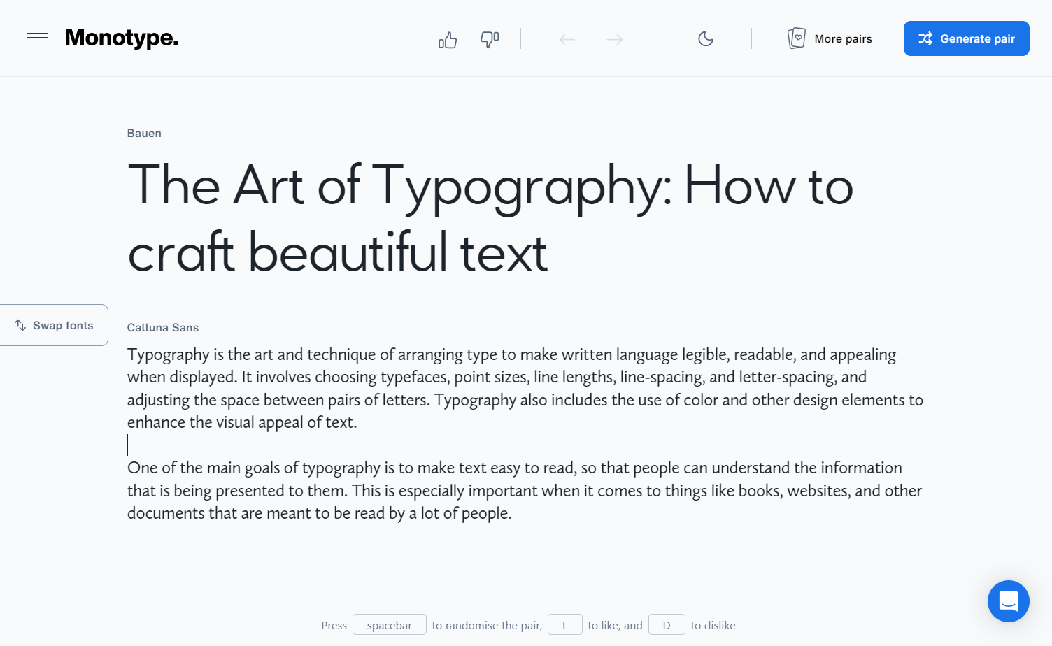
Monotype’s font playground offers editable fields for both heading and body text. This feature lets you simultaneously generate both fonts or set one font while browsing alternatives for the other. While the library presents a large collection of highly legible fonts, the possibilities for unique display fonts with personality are relatively limited.
4. Design.ai
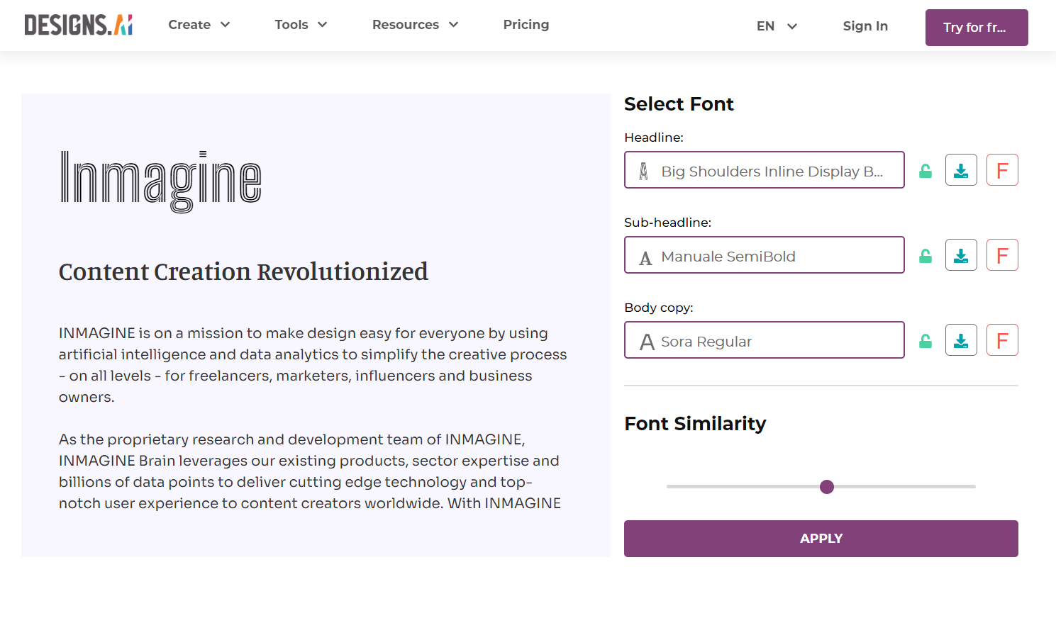
Design.ai’s free font matching tool uses AI to automatically generate matching fonts for headings, subheadings, and body text. Like with Monotype, you can lock in one or two preferred fonts while generating the rest. Design.ai also offers a font similarity slider that gives you control over the generation process by adjusting the contrast level between fonts.
Although the font library offers plenty of browsing and search options, you may have to try several different AI-generated pairings to achieve the results you want.
5. Fontjoy
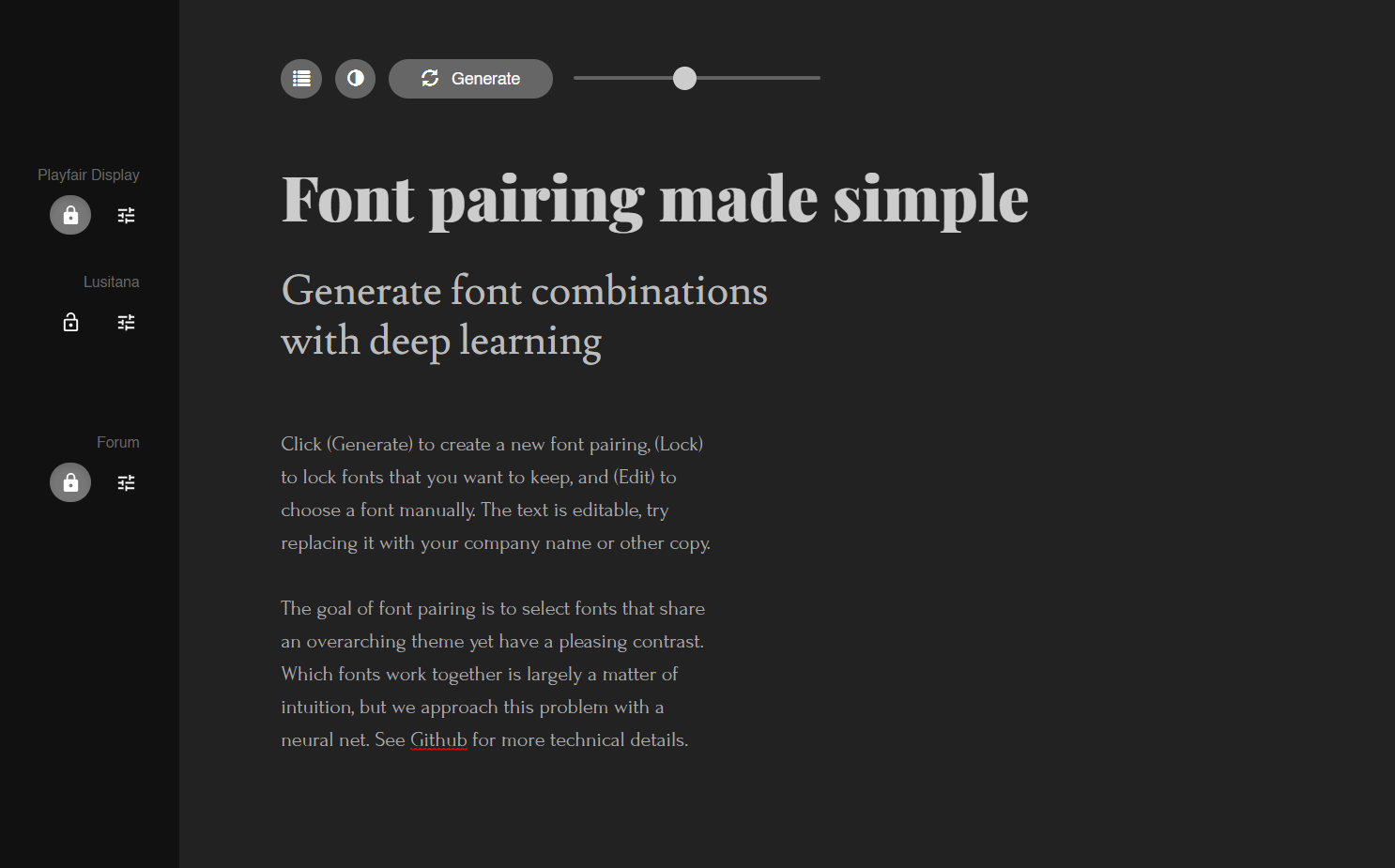
Fontjoy’s AI font generator stands out as this list’s most comprehensive and user-friendly option. It supports three levels of text hierarchy and automatically generates 1–3 fonts simultaneously, depending on how many font options you lock in. Echoing Design.ai’s features, it includes a slider to nudge the generator toward either more or less similar fonts. Additional features include light and dark modes, a list of the top pairings for a given heading font, and a sizable searchable font library.
Show off your perfectly matched fonts with Webflow
For more font selection and layout ideas, check out our resources on how to pick the best font for your site and our selection of seven great examples of typography in web design.
Once you’ve identified the perfect font pair, use the Webflow Designer to experiment with sizes, weights, and spacing without writing a single line of CSS code. When working with typography in the Designer, visit our advanced web typography tutorial to learn how to apply text fills, check color contrast, and maximize text accessibility.
Whatever your next web design project is, Webflow’s font customization options and responsive web design will make it stand out. Get started using Webflow today!