

See a handpicked selection of the best Google fonts for websites and our pairing suggestions for them.
The font choices you make when building a website make all the difference in keeping your content readable on different screen sizes. You also want to pair your fonts well to establish a clear visual hierarchy in your layouts.
Instead of spending hours on Google Fonts, mixing and matching typography elements for your website, check out the following list to find the best fonts and font pairings without all the guesswork.
20 popular Google fonts
The most popular Google fonts are well-liked for good reason: They’re readable, scale well, and offer a touch of character to your text. The following are 20 of the best Google fonts for website design, because they’re all optimized for legibility and accessibility.
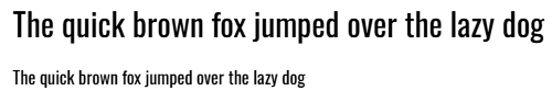
1. Open Sans
Open Sans is an extremely versatile sans serif typeface. While not bold or particularly elegant, it’s highly readable and generously spaced. That means it’s a popular choice for blogs and educational websites because it makes long-form content easier to read. It’s a free, open-source typeface with several font options, from Light to Extra Bold. Pairing Open Sans fonts is easy — it can work anywhere.
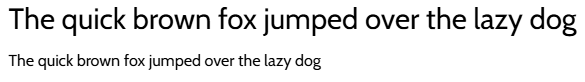
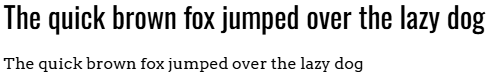
2. Alegreya
Alegreya is a serif font with a modest elegance that adds a touch of class to your text. Its consistent stroke weight helps with legibility, but the spacing is a little tight. Some letters, like the “F” and “T” in the above image, hang over other letters, which saves space but leads to some letters running together. It’s best used for headings, where the larger font sizes ensure readability.
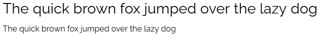
3. Roboto

Roboto is as legible and versatile as Open Sans, but with a little less spacing and a slightly bolder stroke weight. It’s good for long-form content and body text. As with Open Sans, it’s a somewhat basic choice for headings, where more interesting fonts would add character to your layouts.
4. Anek Latin
Anek Latin is a sans serif font that, despite its lack of embellishment, adds a touch of character to your text. It uses generous curvature, making it stand out more than Open Sans or Roboto. Yet it isn’t so unique that you couldn’t pair it with either as a heading font.
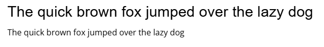
5. Montserrat

Montserrat is a sans serif font that scales well due to its wide letters and spacing. It will use up all the space in your text block, but it keeps content readable even on very small screen sizes. That makes it a strong choice for UI text in navigation menus or buttons, though designers should avoid using it in long-form content since it’ll make text blocks appear even longer.
6. Lato

Lato is a sans serif font that’s heavily bolded and evenly spaced. It’s excellent for dark-mode websites, where the brighter text needs thicker lines to contrast against the dark background. Its even spacing helps to keep it readable even at small sizes, so it’ll also work for body text. It’s a fine choice for headings, but you could select something similarly bolded, like Oswald or Arvo, to add more character.
7. Poppins

Poppins isn’t as whimsical as its name suggests, but it does offer a clean, readable typography that won’t strain readers’ eyes. Like Montserrat, it’s a poor choice for long-form content, where it’ll make a paragraph look like a wall of text, but it can work well for headings, especially if you pair it with a subtly serifed font like Alegreya to add a touch of character.
8. Oswald
Oswald is a unique font with tight, tall lettering and cramped spacing. Its bold stroke weight keeps it readable, though not quite legible enough for body text on small screen sizes. However, it’s a strong font for headings and UI elements in dark-mode websites, where the thick lines contrast well with the background.
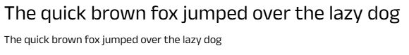
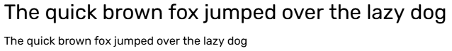
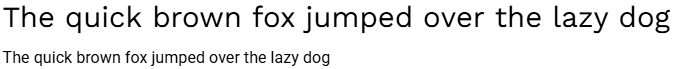
9. Raleway
Raleway is a serif font with just a few modest embellishments. Its subtle character makes it a solid choice for headings, and thanks to its spacing, it also works for body text. If you have a more elegant font for headings, Raleway can enhance that appeal in your body text without making it unreadable on smaller screen sizes.
10. Mulish

Mulish is a plain sans serif font that isn’t as overused as Open Sans or Roboto. It’s a great choice for designers who need a readable, generously spaced font for long-form content, but who want to avoid the more standard options. It’s an uncommon choice for headings, though, where you’ll want to pick something that grabs your readers’ attention.
11. Rubik
Rubik is a bold sans serif font that works best in UI elements like navigation menus and buttons, where the thick stroke weights provide a good contrast. That also makes it very readable as body text in dark mode websites, and it pairs well with similar options, like Merriweather.
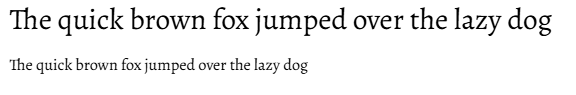
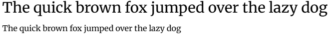
12. Playfair Display
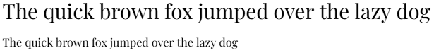
Playfair Display is a serif font with an elegant, classic appeal. The entire Playfair font family pairs well together. For example, you can use Playfair Display for headings and regular Playfair for body text, even for long-form content. It’s reminiscent of printed typography, so it works well for blogs and websites with a particular theme, like a writer’s portfolio or a premier design studio homepage.
13. Cabin
Cabin is a bold sans serif font with tight spacing that makes for good legibility and versatility. It’s a little plain for headings, but it makes a great font for text blocks or long-form content, where the thick stroke weight reduces eye strain for long reading sessions. It pairs well with other bold fonts like Merriweather and Arvo, but don’t hesitate to contrast it with an elegant font like Alegreya to add more character.


Ultimate web design
From 101 to advanced, learn how to build sites in Webflow with over 100 lessons — including the basics of HTML and CSS.
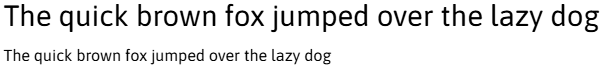
14. Merriweather
Merriweather is a popular serif font thanks to its subtle elegance. Unlike Alegreya, it uses equal spacing so letters don’t hang over one another or run together, giving it better readability. The thick stroke weights and wide curves make it a great display font for titles and headings, especially when paired with a sans serif font like Cabin or Rubik.
15. Asap
Asap is a unique sans serif font that combines generous spacing with slim letters and a bold stroke weight. It pairs very well with Oswald because it shares some of the same traits, but is a little shorter. Together, they optimize readability on a dark-mode website, with Asap for body text and Oswald for headings.
16. Spectral
Spectral is a serif font with varying stroke weights and wide spacing. Its classic appeal pairs well with other elegant fonts, like Playfair Display. If you pair it with another serif font, use Spectral as your body text since the generous spacing improves readability. If you pair it with a sans serif font, use it for headings to help them stand out.
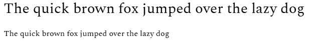
17. Arvo

Arvo is a popular font because of its versatility and excellent readability. It’s a serif font that resembles typewriter typography, complete with a bold stroke weight and equal spacing. That makes it great for dark-mode websites, where you can use it for headings or body text. However, its unique appearance doesn’t match well with elegant fonts like Alegreya or Raleway — you need a similarly bold font, like Lato or Cabin, to keep a consistent style.
18. Nanum Gothic

Nanum Gothic is a sans serif font with variable spacing and wide curves. Some of the linework is difficult to read on small screen sizes, so it isn’t great for body text. However, its uniquely spaced appearance makes it a smart choice for headings, especially when paired with another wide-spaced sans serif font like Asap or Montserrat.
19. Teko

Teko is a blocky sans serif font with sharp lines, tall letters, and a bold stroke weight. Its tight spacing makes it a poor choice for body text, but it’s very useful in UI elements like navigation menus and button text.
You can use it for your largest headings, but you’ll need something with more spacing for smaller headings and body text. Its unique appearance makes it difficult to pair, but Arvo and Oswald will work due to their similarly thick lines.
20. Work Sans

Work Sans is one of the most basic sans serif typefaces you can find, but that works in its favor. It offers excellent readability that scales well to any screen size, thanks to its wide letters, even spacing, and plain appearance. It’s great for documentation websites and business services where designers want professional typography.
It also pairs well with most fonts, since it doesn’t have distinguishing characteristics that could disrupt the style offered by other typefaces.
Fonts that pair well together
With the above Google fonts in mind, you can start making combinations to create impressive pairings. Check out these combinations that provide consistency and character while keeping text legible:
Arvo and Oswald
With Arvo as your heading font and Oswald for body text, you get a font pairing that optimizes readability at any screen size or for any color palette. It’s great for dark-mode websites, where the thick lines create enough space to contrast the background while the slight embellishment of Oswald gives your text some character. You can even carry Arvo over to your UI elements to maintain consistency.
Playfair Display and Raleway

Playfair Display makes a great display font for headings and titles when combined with Raleway for body text. They’re both serif fonts, but while Playfair Display uses varying stroke weights, Raleway doesn’t, making Playfair appear more readable on small screen sizes. You’ll want to use Raleway for your UI elements for the same reason. That way, UI buttons and navigation menus are still readable even on mobile screens.
Work Sans and Roboto
For a purely professional, no-nonsense website, Work Sans and Roboto make a great combination. Work Sans is best as the heading font, with its generous spacing and thick lines, while Roboto makes all your body text perfectly readable.
What this font pairing lacks in character, it more than makes up for in readability, which readers will appreciate in long-form content like documentation or blog articles.
Merriweather and Rubik

Merriweather and Rubik come together neatly with their even spacing and thick lines. Merriweather's touch of style gives your headings and titles character, while Rubik ensures your body text can scale to any screen size. It’s a versatile font pairing that can work in almost any website design, especially minimalist websites that favor understated elegance.
How to choose the right fonts (and why it matters)
Selecting the right font pairing is crucial in keeping your website readable and responsive. Here are a few tips that’ll help you select fonts that play well together:
Typographic hierarchy
A perfect font combination creates a distinct and intuitive hierarchy to the text on a page. Select display fonts that draw visitors’ attention to headings and calls-to-action first, and use more plain typefaces for body text that fills in the space between. This visual distinction showcasing the texts’ importance is key to creating a website that’s able to convert visitors.
Font compatibility
Most fonts have one or two distinguishing features, like varying stroke weights or wide spacing, that make them more or less compatible with other fonts. Nanum Gothic, for instance, wouldn’t pair well with Teko because their spacing is so different. While your font pairings should offer some variation, the differences between fonts should be subtle, just enough to differentiate them based on their role.
Responsive scaling
Always test your font choices on various screen sizes to verify legibility. Some fonts, like Playfair Display, look great on a desktop screen, but the varying stroke weights make for very thin lines that are hard to see on small screens. Use elegant typefaces like Playfair for headings and titles, where they still have space to breathe.
Bring your fonts to life in Webflow
Choosing the right font for your website provides an opportunity to highlight your brand, message, and style. If you want to experiment with several fonts to find the right pairings for your unique web design, Webflow can help.
Create text styles and change them freely to try different combinations. Once you find the perfect match, every container that uses those styles will update in real time. You can even upload custom fonts to see if your dream pairing matches your new website build.
Learn how to add Google Fonts in Webflow to get started.
Get started for free
Create custom, scalable websites — without writing code. Start building in Webflow.