


Figma has gone from new player to design industry all star in no time. But like most design tools, it stops short at the prototyping phase. In this post, we’ll show you how to keep the magic going by turning your designs into fully functional websites with Webflow.
Figma to Webflow step by step process
So you’ve created an awesome design in Figma, or have been given one from a designer, and now it’s your job to build it out in Webflow. If this transition is new to you, fear not: Figma’s very similar to design tools like Sketch, but there’s a few features that will help you get up and running quickly.
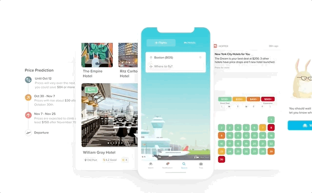
For demonstration purposes, I’ve used the awesome Hopper.com designs that the team over at Narative Co open sourced. The site is vibrant, fun, and has some great interactions.
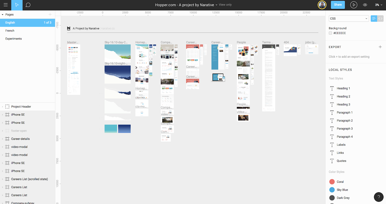
I based this demo site on a forked Figma file and a simplified version I created.
Now. Let’s get started.
Step 1: Create your Webflow project
The first step in creating a site in Webflow, is to create a new project. This works just like creating a Figma file, so nothing too complex here. Just click the blue button in the top right corner, and start from scratch.
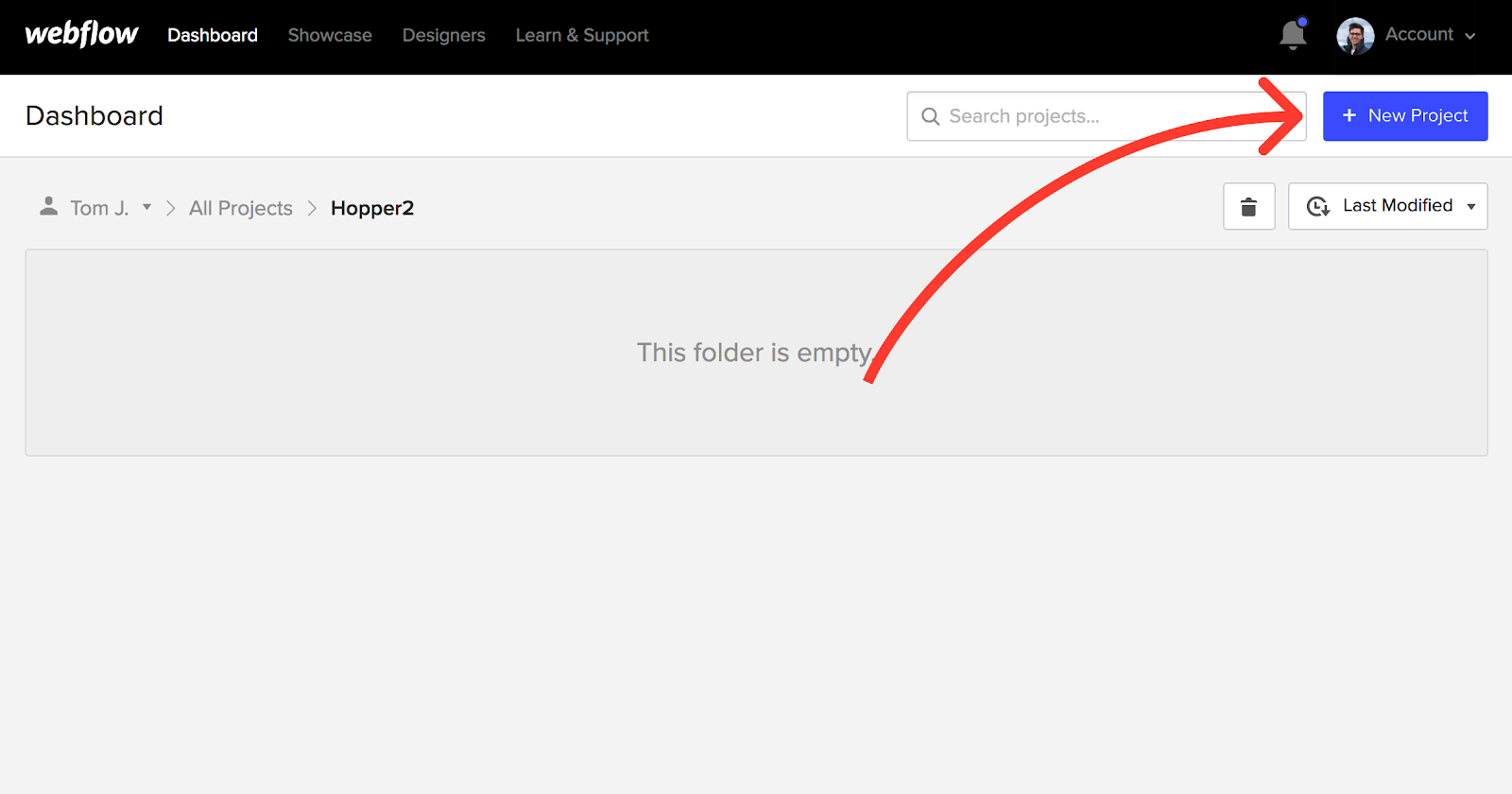
If you plan to make other sites in Webflow in the future, I find it best to keep things tidy by making a new folder for every project I work on. This categorization follows the Figma project structure, so if you’re familiar with that, this will be a breeze.
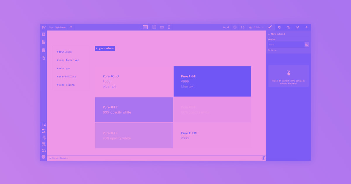
Step 2: Create your global styles / style guide
The first thing I do in a new site is define my global styles. Global styles are all of the default things that every website needs, like paragraph style, headings, and link appearance. The Hopper Figma doc has a complete style guide, but if your project doesn’t, you might want to make one so that all your base styles are good to go.
Clone this HTML tags template to kickstart your style guide.
For the Webflow side, I almost always copy and paste this HTML tags template into my sites to use as the base for my style guide. To do that, clone the site above. You’ll be taken directly into the canvas of that project, and from there you can copy elements over to the new site you just created. You could also just build on top of the template, but I always like to start fresh.
Pro tip: To make copying and pasting from the HTML tags template into your new project easier, open each project in a separate tab — yep, you can run two Webflow sessions simultaneously.
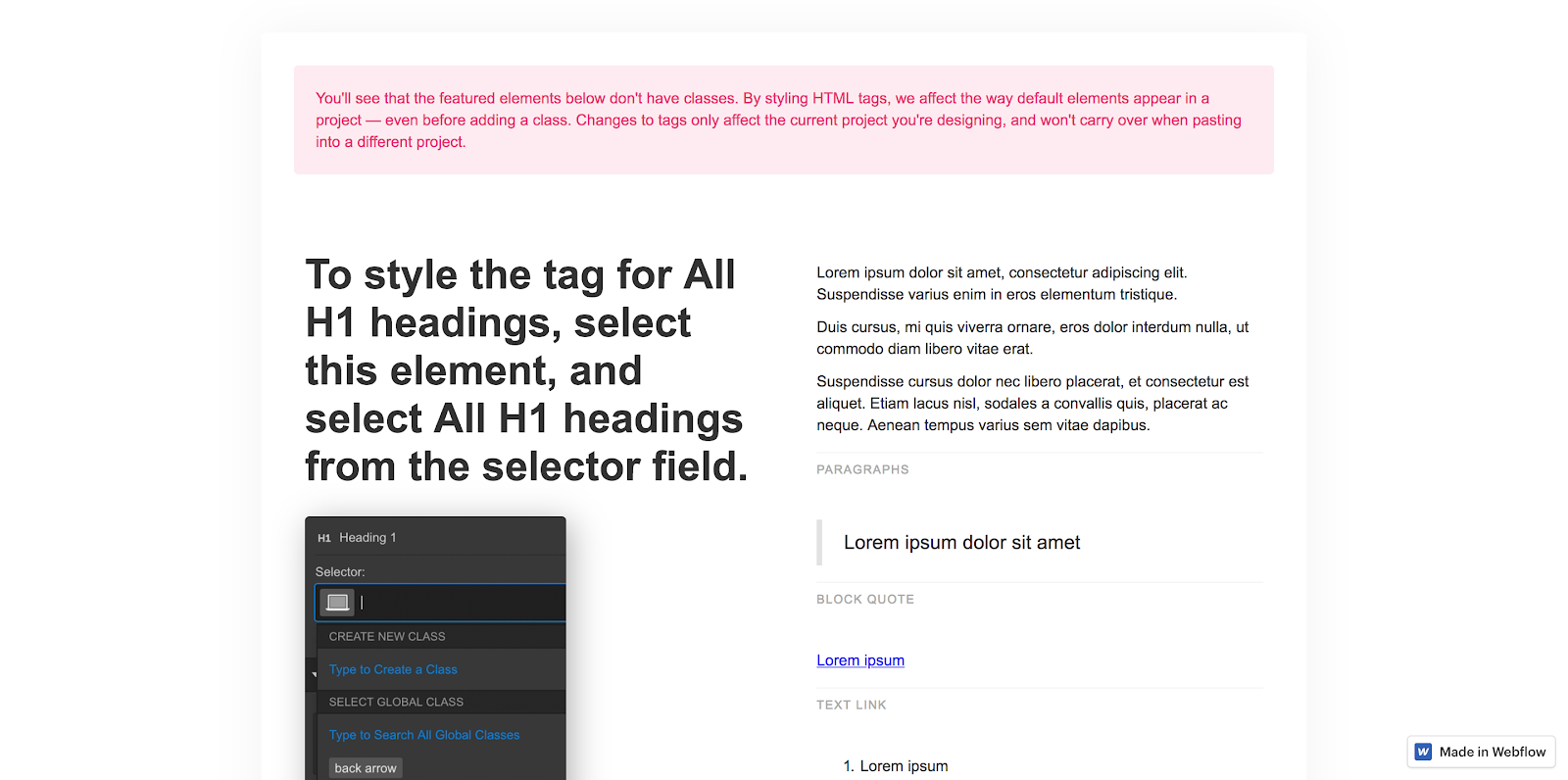
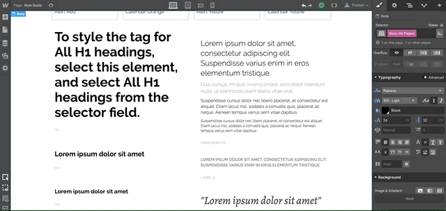
To define a global style, select the element on the canvas and click into the class selector field in the top right corner of the screen. If the element you’ve selected can be defined globally, you’ll see a purple-ish option with “All” in the tag name. (Examples: Body (All Pages), All H3 Headings.) It’ll look like this:
Styling base classes both saves you work and keeps your site’s stylesheet lightweight and more manageable down the line. You can skip any of these elements if you want, but I would strongly recommend you at least define the base font style on Body (All Pages). This will save you a ton of time down the road, as you’ll only have to define your font once, and it’s super easy to change later, should you or your client change your mind.
If your base paragraph is defined, here’s how easy font changes will be:
Speaking of custom fonts, if the one you’re using isn’t in the default list, now’s a good time to jump into the project settings and, if it’s a Google Font, select it from the list.
If it’s not a Google Font, upload the TTF or OTF file and to select the weights you want.
Pro tip: Fonts are large, so if you want to optimize the performance of your site, select as few weights as needed. A couple hundred kilobytes may seem like chump change, but it’s best to cut weight whenever possible to get that load time down.
Now, back to the style guide. If you’re using the template I recommended, this should be a snap. Just define everything on the page to match your Figma file. If you’re using the Figma team styles, it’s helpful to keep things organized in a similar fashion.
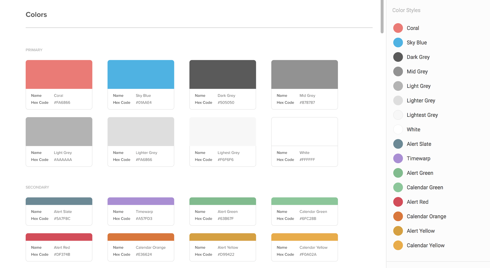
Once the basic styles are defined, it’s a good time to add all your custom colors. If you have one or two, this is a quick process, but if you have a lot, this can be tedious. I usually do this by adding a color-block div, and then changing its color over and over until all of my swatches are in Webflow.
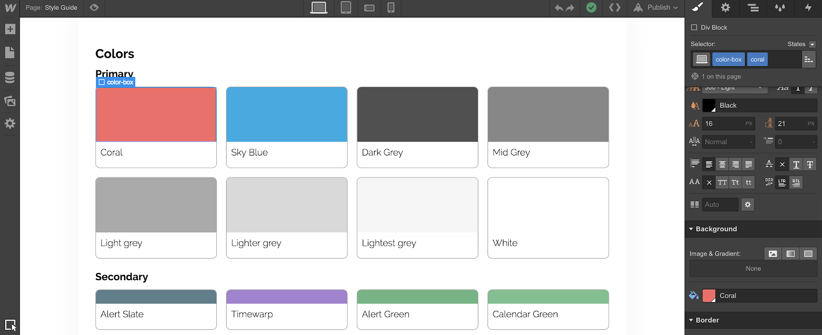
As you do that, be sure to make your colors global by clicking the “Global” checkbox. You’ll know they’re global if you see a little triangle in the lower-right corner of the swatch and a prompt to name it.
Step 3: Export your assets
Now that you’ve got your global styles defined, it’s time to export all of the assets from your Figma file.
If you’ve been diligent about marking images, icons, and other assets for export as you were working, simply hit Command/Control + Shift + E with nothing selected to bring up the export dialogue. Hit the export button, and after it’s done, Figma will ask where to save all those awesome assets. If you want to restrict what you’re exporting, like only the assets on a specific parent frame, select that frame and use the same shortcut.
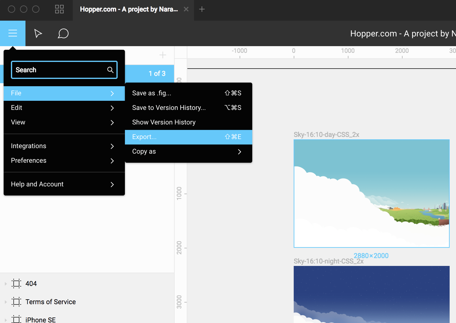
Once those are all exported, you can find the correct file folder and simply drag them into Webflow, or open the assets panel, click the upload button, and select them that way.
Pro tip 1: Continuing in the vein of building a performant site, I’d recommend dropping all your PNGs and JPGs into tinypng.com or another compression site. Yes, it adds a few steps, but you can save tons of load time for your site. A tiny site is a happy site.
Pro tip 2: If you use forward slashes in your Figma layer names, when you export, Figma will auto create subfolders for you. So, instead of “icon-back”, try naming your layer “icon/back”. It can save a ton of time.


Figma to Webflow
Learn our design process from concept to completion and build a site from scratch using Figma, Cinema4D, Lottie, and Webflow.
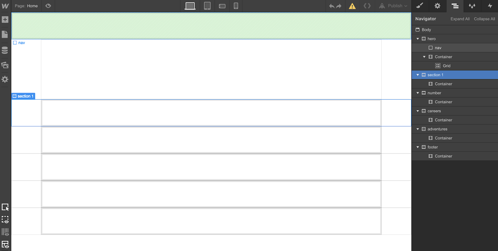
Step 4: Div-frame your site
Next, I like to do something I call div-framing. To do this, I look at all the bigger groups/frames of my Figma file, and try to replicate them with divs in Webflow. You can skip this step if it’s not helpful, but it keeps me organized in the long run.
For the Hopper site, I also added containers to each div section that isn’t full-width, as that’s how most of the original file was defined.
Once you have those divs on your canvas, give each a unique class name. There’s no need to define these classes yet, but you’ll want to go to the settings tab and give each an ID. This comes in handy later if you’re going to add anchor links to your site.
You can also use the grid element (or set your div’s display property to grid) on your site, if you want to. I’m not going to go into best practices for grids here, but Webflow's landing page tutorial using grid will get you up to speed if you want to explore grid.
Step 5: Style your content
Styling your classes is both the easiest and most difficult part of Webflow. It’s super easy to start, but it can be challenging to keep things clean in larger sites.
I wrote a lot more about this in my series showing how to build an agency website, which might be helpful. Be sure to keep your classes generically named, clean, and as minimal as possible.
For example, instead of naming something “Black Hero Text,” try creating a combo class of “All H1 Headings” + “Black Text” instead. This will allow your heading 1 class to deal with size, weight, and positioning, regardless of color. Then you can add a secondary class to change color (or other properties) for your specific use case.
Another thing I find myself doing when going from Figma to Webflow, is making changes to the layout to make things easier to implement. I’m almost always the designer and the developer, so I can make those decisions, but that might not be true for you.
Either way, here’s a word of advice: Don’t try to match your Figma file pixel for pixel. I know, I know — everyone’s all about pixel perfection. But if you’re a designer, this is your chance to see how what you thought would be any easy layout is actually more trouble than it’s worth.
No matter how familiar you are with making websites, things behave differently in code than they do in design tools. In Figma, moving something is as simple as a drag and drop, and each element can live in its own little world, never impacting others. But that’s not the way the web works.
If you’re not the designer, this won’t be as easy to do. I know from personal experience that we designers always want 102% percent accuracy in our designs, but sometimes there has to be a little give and take. Webflow may give you a better way to articulate how complex some things are to implement.
If you’ve got a good rapport with your designer, be sure to involve them in these decisions, and use Figma’s commenting features to your advantage. I find that we understand visuals better than code, so what may be hard to explain in code may be easy to explain and articulate in the Webflow design.
No site I’ve ever designed in Figma and then built in Webflow has been exactly the same. Maybe this will also be true for you.
Step 6: Interactions
Your site may have some complex interactions, but tools like Figma will only help you out so much with that, as most everything will be flat. And unless you have another prototyping tool, you may have nothing but Webflow for interaction design and implementation.
The good news: Webflow is actually one of the best interactions design tools out there. If you’re the designer on your project, there’s no need to make your interactions in Principle, Atomic, InVision Studio, etc. You can just do it right in Webflow.
I won’t get into the interaction design weeds here, as this interactions and animations course is a thorough resource.
That said, it’s worth noting that interactions fall into two different categories:
- Interactions that happen per class, such as when you hover over a button or when an element is clicked, and
- Interactions that are more complex, and involve multiple classes and/or elements
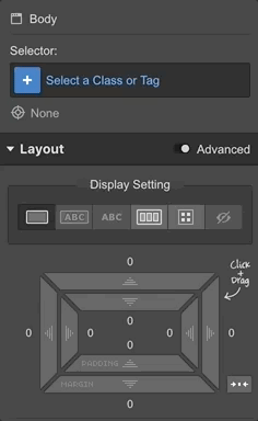
The Interactions panel is great for the latter. For the former, you’ll want to select your element’s state from this dropdown, change its attributes, and then ensure that you have the appropriate transition applied when that class changes the property that you’ve defined.
Step 7: Work your way to mobile
Webflow is not mobile-first, and although you may think that way with your projects, don’t — I repeat, don’t — design the mobile breakpoints before you go to desktop.
You see, the “desktop” version of your site is less a specific viewport than it is a lack of a viewport definition. All the paddings, colors, fonts, flex properties, etc., that you define on this viewport will flow downwards, but can never go upwards. (And that’s true as you step down the smaller breakpoints as well.)
This is very similar, in concept, to how components behave in Figma. You define a master component, and its attributes will flow to all component instances, which in turn can be overridden — but it’s impossible to overwrite a master from the instance itself. If you wanted to do this in Figma, you’d have to go to your master component. Think of your desktop viewport in that way, and you’ll be halfway there.
Often, sites are totally different on mobile and on desktop. This can get confusing quickly as you’ll be constantly tempted to hide and show elements per breakpoint. You can hide elements in Webflow by changing the display property to none.
Pro tip: I always use the landscape (3rd) viewport as if it’s my main mobile viewport. Mobile devices these days are getting bigger and bigger, so I find it’s helpful to start a little above the narrow width of the last viewport. If it works on landscape, then it will work on portrait. You don’t have to do it this way, but I find that fewer differences between those two viewports makes a site easier to maintain.
Step 8: Publish and refine
The view of your site inside the Webflow Designer is, in my experience, about 95% to 99% accurate to what it will look like in the real world.
Once you’re comfy with the state of your site, publish it and test it on:
- Your phone (and the other major mobile OS, if you can)
- In other browsers, and
- In as many different environments as possible
Resize those windows as much as possible to see if it breaks. And if you have the option, use an emulator like BrowserStack to render your page on devices and in viewports that you can’t replicate on your own. Just keep in mind that emulators don’t always do the best job — the real thing is inevitably better.
Also, if you’re using custom code or embeds, now is where you’ll have to start making sure they’re all set up properly, as they don’t render inside the Webflow Designer. For some sites, this will be its own process. For others, this may not be a concern at all.
Wrapping it up
Webflow and Figma are my two favorite design tools. They enable teams to experiment in ways we’ve never been able to before. With Figma, you gain the ability to collaborate with designers, developers, clients, and product managers all over the world and all at once with a single source of truth, never having to worry about updates or saving files.
With Webflow, that workflow doesn’t have to end with the rectangles — you get to log in, build amazing websites and products, and then share and riff off those source designs, keeping the good times rolling.
If you’re working on a team, you’ll already start to see the benefits of a collaborative tool like Figma. Now with Webflow added in, you can finally own the process and actually see your designs turn into the real thing.