


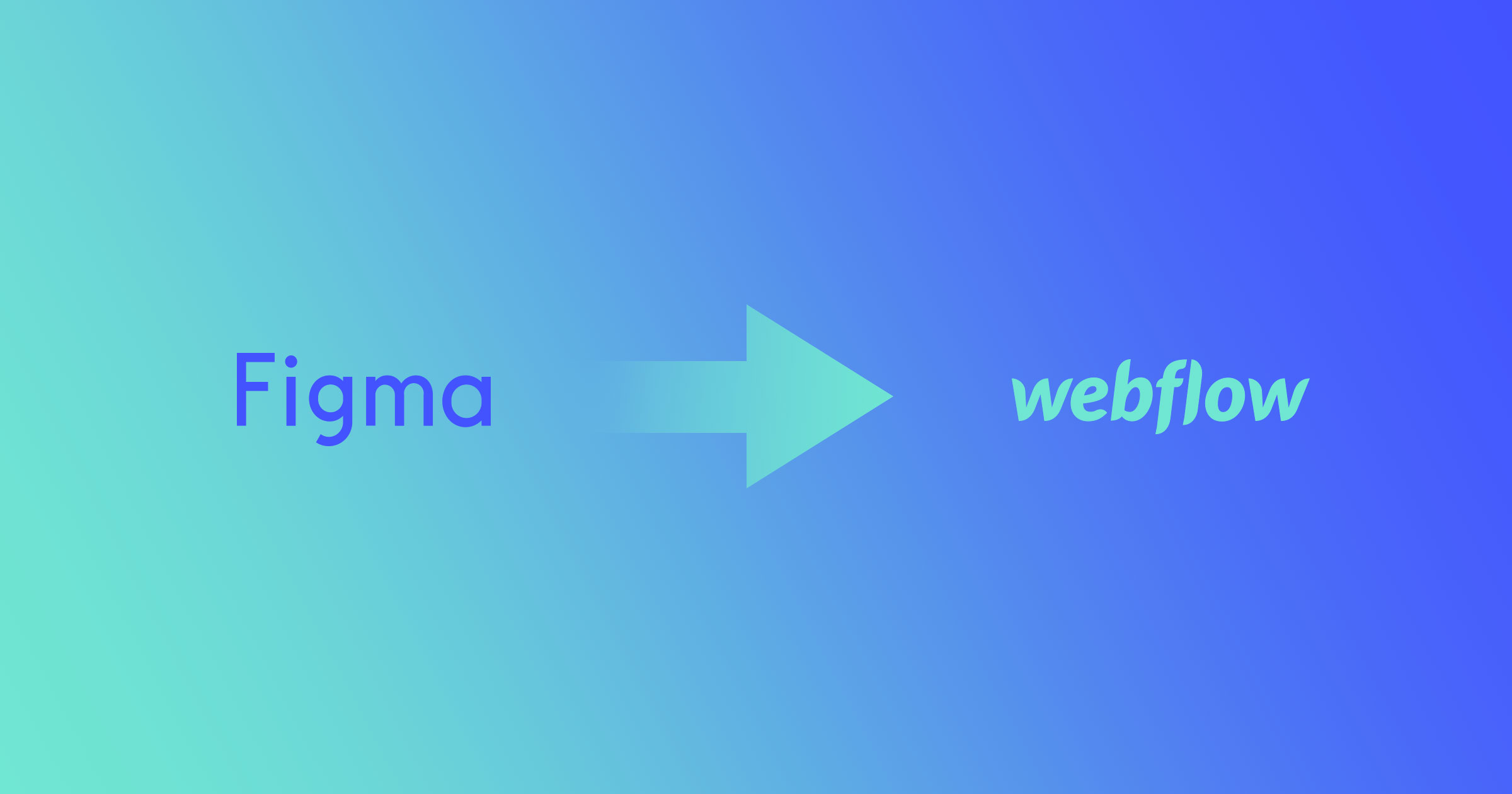
Web designers have a difficult time. An amazingly awesome career filled with unbounded creativity, but difficult nonetheless. Something a little less difficult? Taking a wireframe from Sketch to Webflow.
What app — out of the hundreds in existence — is the best choice to present your web design ideas? I’ve asked this question far too many times, and finally found the answers in Sketch and Webflow. Sketch allows me to present ideas and Webflow allows me to bring these ideas to life. The combination of these tools has completely changed the way I create, present, and bring my ideas to fruition.
Do you want to do the same? Here’s how to streamline the Sketch to Webflow design process to save you time and enhance your designs.
Preparation: Create the Sketch design with Webflow in mind
Before you start designing in Sketch, you’ll want to make sure you know how to best optimize the design for transfer to Webflow. For example, Webflow, unlike Sketch, Photoshop, and Figma, uses the box model.
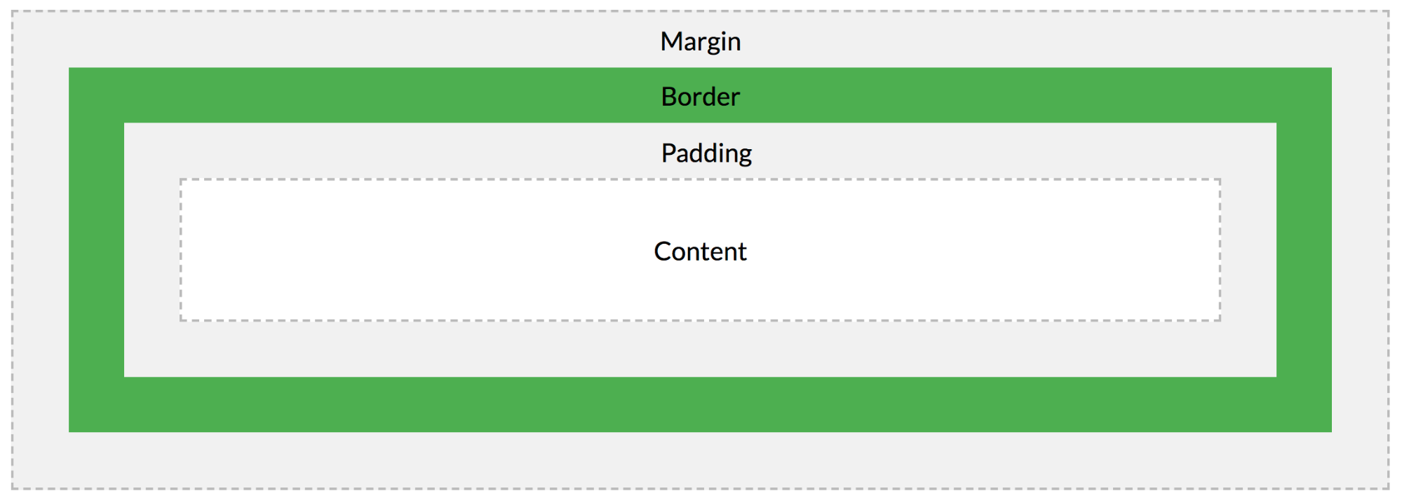
What does this mean? The space between elements is set by their margins and the space between a button’s text and its box is set with padding. This powerful and just-works™️ layout mode is important to think about while you’re creating your Sketch design because, in most cases, the space between elements on the web is set by their margins.
So, how do we prepare a Sketch design that’s optimized for the box model? Let’s start with the plugin combination of Paddy and Sketch Measure.
The Paddy plugin allows us to apply padding to one background layer (either a shape layer or a symbol) of a group. The background layer will then automatically resize itself by whatever amount we specify. This allows us to maintain strict padding for buttons, symbols, and elements that will later be recreated in Webflow.
I'm sure you've discovered Sketch's context menu CSS grabber. It's really just CSS notes. Each block is called out by a preceding comment using the layer's name.
The Measure plugin, however, allows us to generate an HTML page with a single click and inspect every design detail, including CSS styles, offline.
So, go ahead and add Paddy and Sketch Measure to your plugins before we get started. I’ll wait here for you!
Done? Great. Let’s get started.
Step 1: Set padding in Sketch
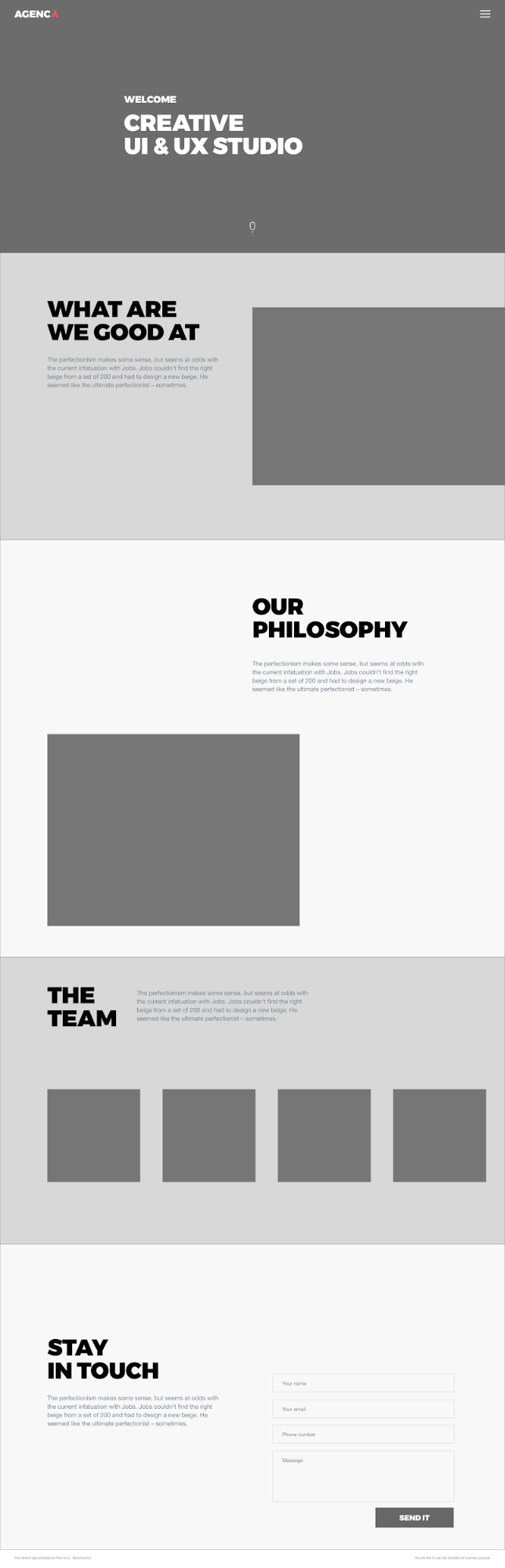
For this walk-through, we’ll use a template by Felix Cruz to demonstrate the Sketch-to-Webflow process.
First, let’s use the Paddy plugin for any elements that require specific padding. Elements that have this requirement are typically buttons, input fields, cards, and sections. This is because we want to have a standard padding for all elements like these. The form button, for example, will need set padding:
Step 2: Extract assets with Sketch Measure
Next, to prepare your images for use in Webflow, let’s make them exportable.
We do this by first applying your settings for Measure and then clicking Spec Export. This will generate an index file that allows us to inspect all the design details — including the CSS styles. The assets will also be saved in a ZIP file that we’ll need to use for the Webflow site.
You’ll notice that the use of Measure also makes it easy to provide your team with accurate measurements quickly and easily. Super-handy if you hand off your design work to devs.
Step 3: Add fonts
Now we’re ready to add our assets to a new Webflow project. Let’s open our Webflow project, select the font tab in the project settings, and add our fonts. These can be Google fonts, Typekit fonts, or your own fonts. For this project, we’ll add the Roboto font weights of 100, regular, and 900.
Pro tip: only select the weight(s) you need when uploading fonts, or selecting from Google. Every font weight adds to the site’s file size and load time.
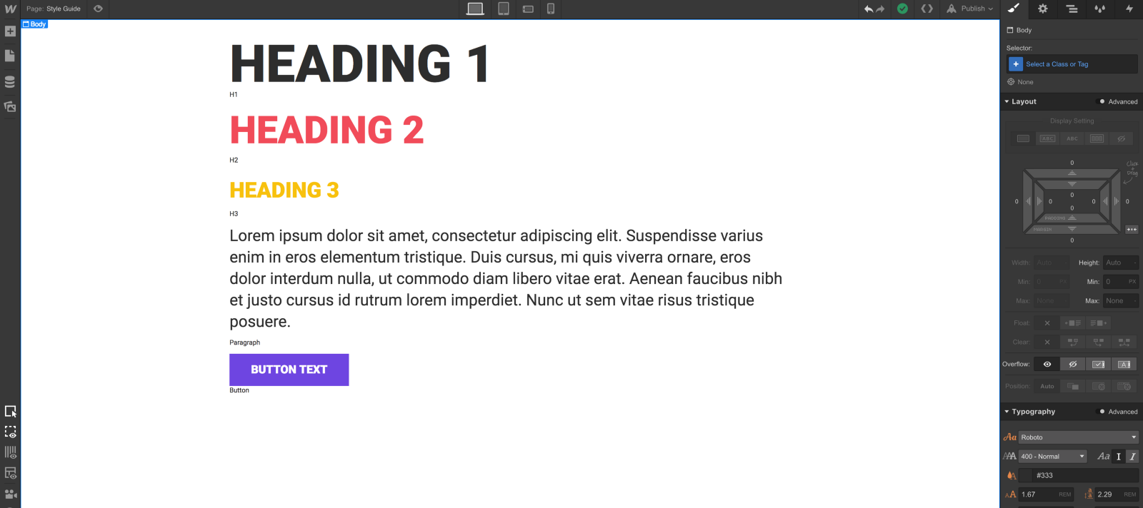
Step 4: Create your style guide
Next, we’ll create a style guide in Webflow. Instead of spending a lot of time updating a color throughout the whole document in Sketch, we’ll use global colors.
In Webflow, we simply save a swatch as “Global,” which allows us to make sweeping changes to entire projects. This lets you make updates with ease and save you the common headache when your client changes their mind about button color. Trust me, I’ve been there.
Now, the layout of the style guide is completely up to you. It can be as neat or as messy as you’d like. For our purposes, we’ll keep it simple so that it’s easier to navigate.
While creating our style guide, let’s remember to think in relative, not fixed units. This means that an element’s size should be considered relative to other elements, such as the browser or parent element. While this requires a new way of thinking for some, it ultimately ensures that your page, and the elements within it, are responsive across various devices.
For this reason, we’ll use percentages (%), viewport width (vw), or viewport height (vh). Each of these units allow our elements to adapt with the browser, unlike pixels. Because their actual size changes depending on the viewport size, this makes them great units for responsive design.
I would suggest taking a quick read of Ire Aderinokun’s “Viewport vs Percentage Units” to learn when to use which relative unit.
Now for font size, we’ll use rems.
Now, let’s make a section for each element. Each will have at least:
- Headings. I’ll style global selectors (i.e., “All H1 Headings”) for each heading level, rather than creating unique classes for each. This keeps my code cleaner.
- Paragraph. Make sure to select “All paragraphs” here too.
- Buttons and their states (hover, pressed, and focused)
- Text links and their states
- Colors. We’ll save all brand colors as global swatches so we can easily apply and, if needed, update them across my site.
Once we’re done, we’ll add elements to their appropriate sections on the canvas.
Pro tip: make the style guide a symbol
If we turn our entire style guide section into a symbol, it’ll be easier to add or delete from any page. This allows us to have a style guide right on the page for reference.
Step 5: Upload images
In the Webflow Designer, we’ll open the Assets panel to add our images from Sketch Measures’ export. We can add these by either dragging and dropping them into the Designer, or by clicking the upload button. Either way, we can upload the images in a large batch.


Get started for free
Create custom, scalable websites — without writing code. Start building in Webflow.
Step 6: Build global elements
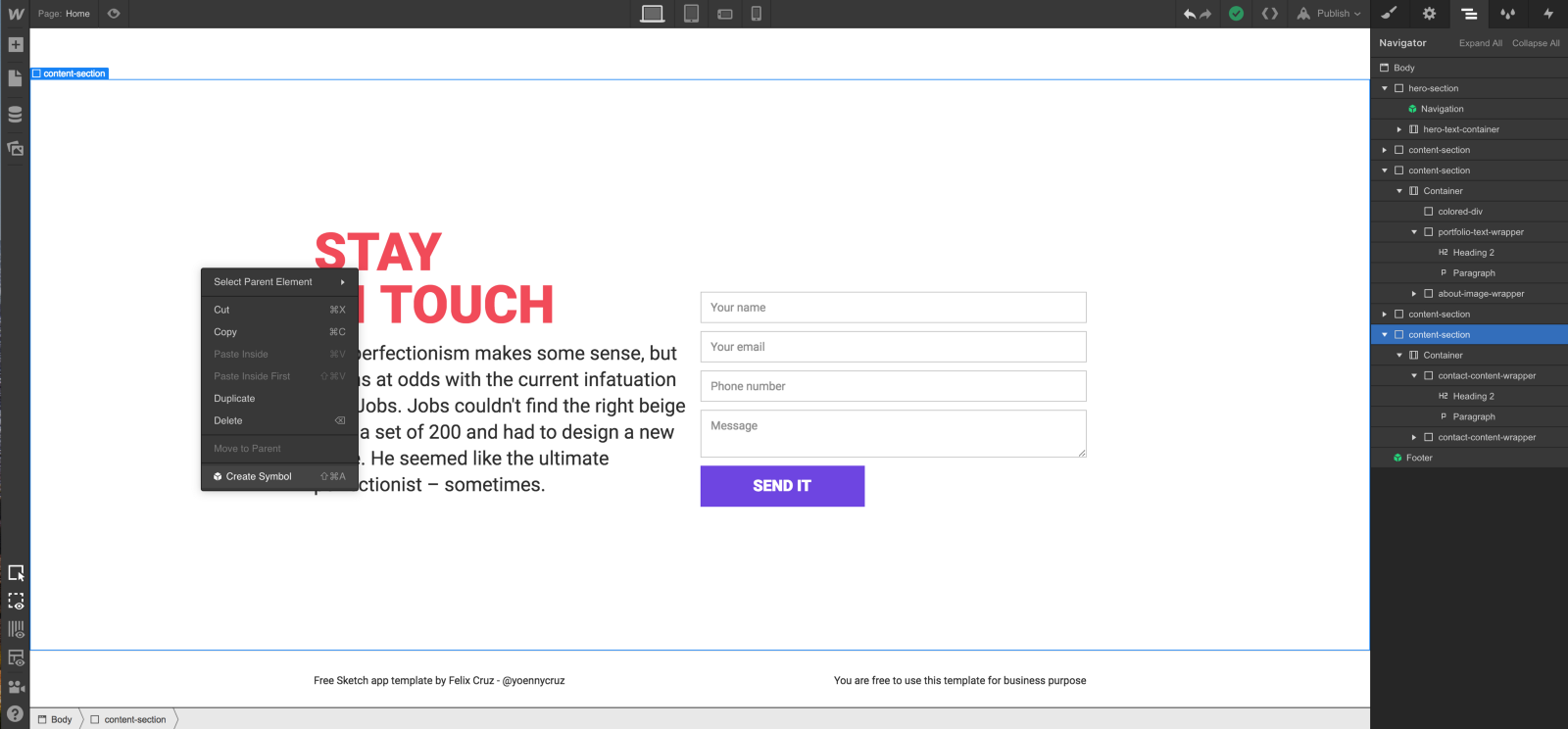
The navigation, footer, contact form, and modal elements shouldn’t change from page to page. To make sure of this, we’ll make each into a Symbol. This should all be done with atomic design in mind.
Symbols turn any element into a reusable component. This means that any changes made to a Symbol will update all instances of that symbol. Magic.
Creating symbols will also allow us to add our global elements to each page right when we need them, speeding up the design process significantly.
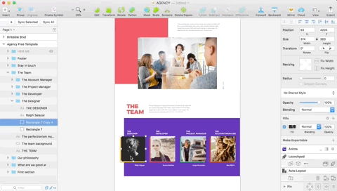
For this project, we will create global elements of the navigation, contact, and footer Symbol to use within any page.
First, let’s take a look out our navigation Symbol. The navigation Symbol consists of the Webflow navigation element. With a few tweaks to the class names and CSS values (wrapping the navigation in a flexbox wrapper), we have made it our own.
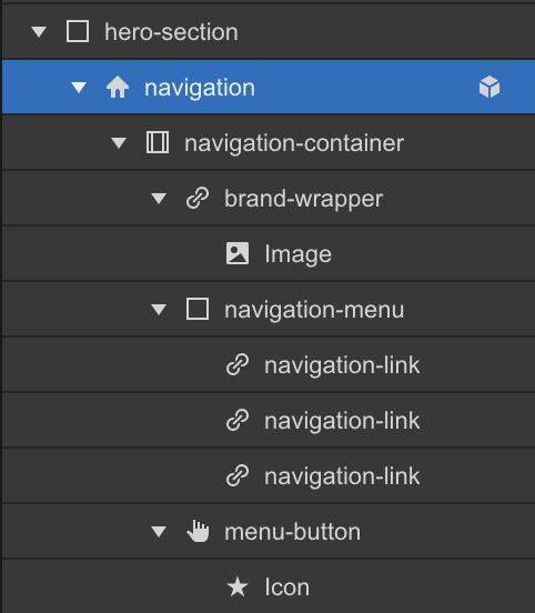
Pro tip: use a custom naming convention for your classes
I always name the elements whose CSS I change. It’s great that Webflow automatically adds a class name, but having control of the naming convention is the best way. A foundational naming convention leads to a speedier design process. Saving specialized names also makes it easier to extend a style.
In this website, for instance, we have styled a div element that highlights a headshot. Each highlight element is a different color, so each receives a specialized name as an extension of the first highlighted element, named “Square background.” The second color in the palette, then, would be named ”square-background two.”
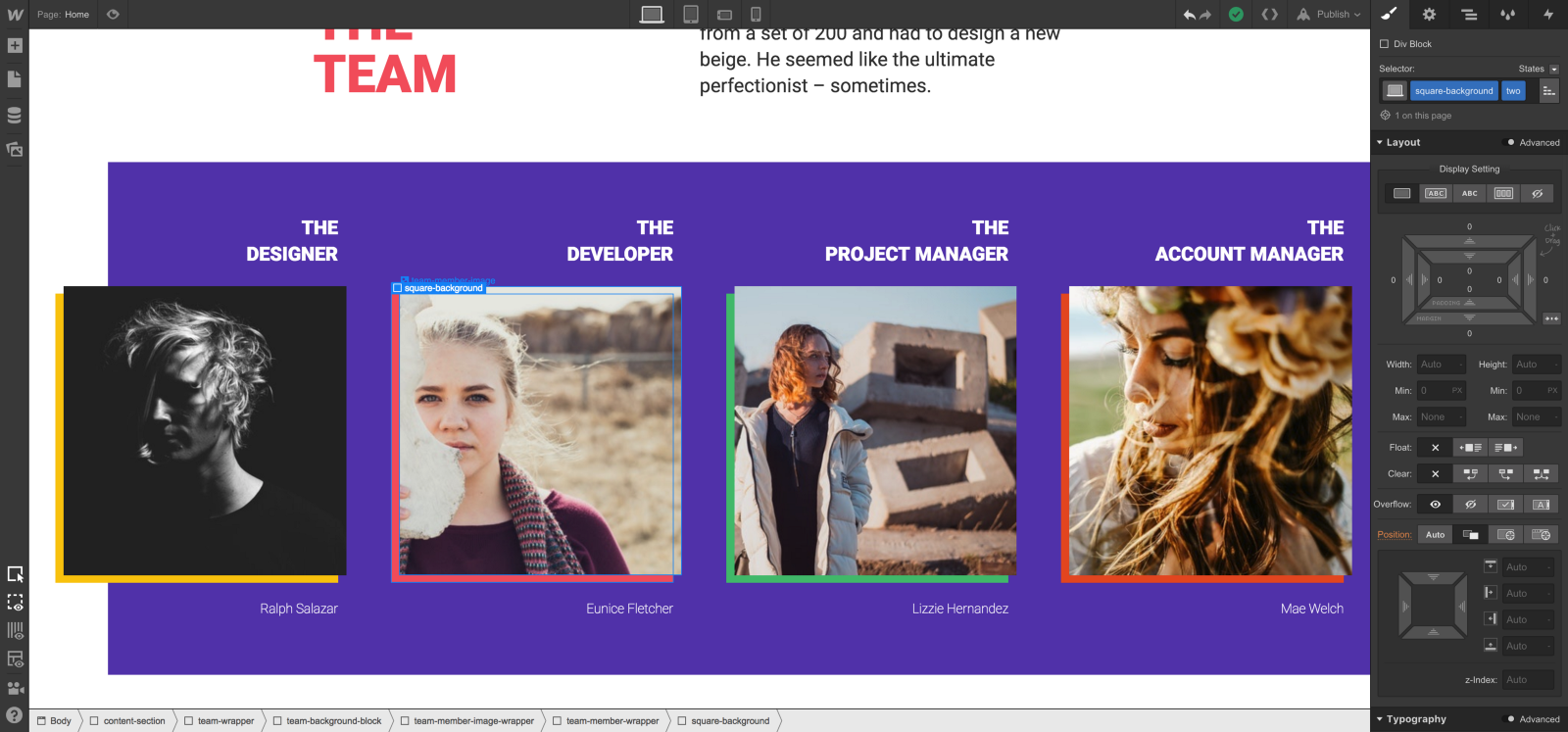
This combo class may now be used throughout the site.
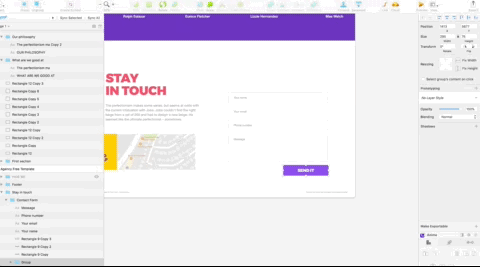
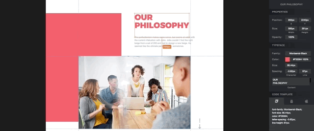
Now, we’ll move onto the contact Symbol. The contact Symbol consists of two “content wrappers” at the lowest level, then a container, and a content section containing them. The content section element is a standalone element of functionality with a heading. A rule of thumb I stand by: sections should logically appear in the outline of my content.
For instance, our outline consists of the hero section, the multiple general content sections, and lastly the footer section. You will notice that our CSS naming convention follows this outline as we have the “hero-section” and the “content-section” classes below that.
Lastly, let’s look at the footer symbol, similarly consisting of two “content wrappers,” a container, and a section which contains all three.
Step 7: Build out the rest of the site
Now that we’ve added the base, our workflow is rolling! Knocking out the rest of the template will be a cinch.
Our assets, basic styles, and fonts are complete, and we’re ready for the fun stuff.
First, we’ll add our style guide Symbol to the page — it’s more simple to reference when we can see it.
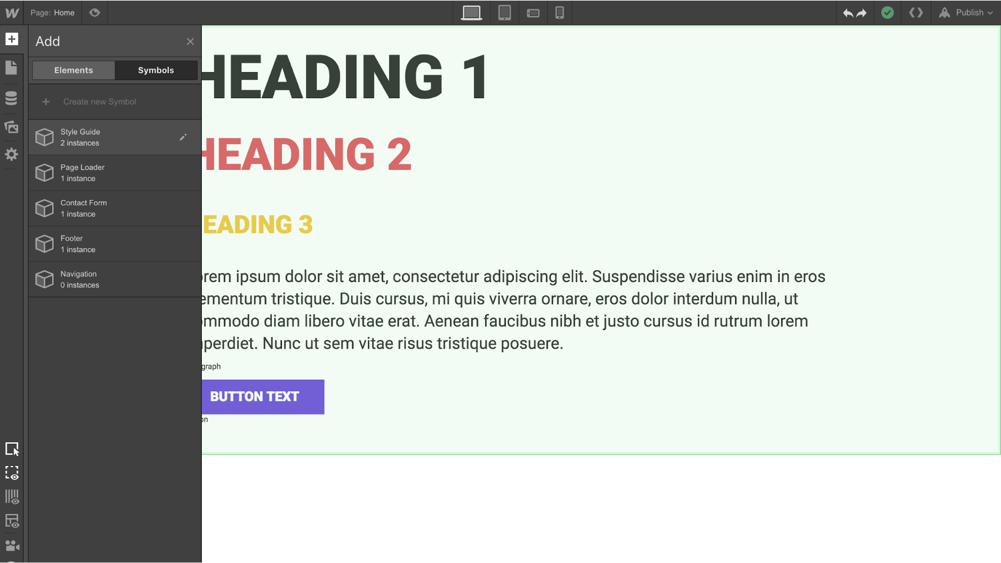
This style guide will be guiding star as we create our site. There’s not much to it, but it contains all the global elements we’ll reuse throughout the site.
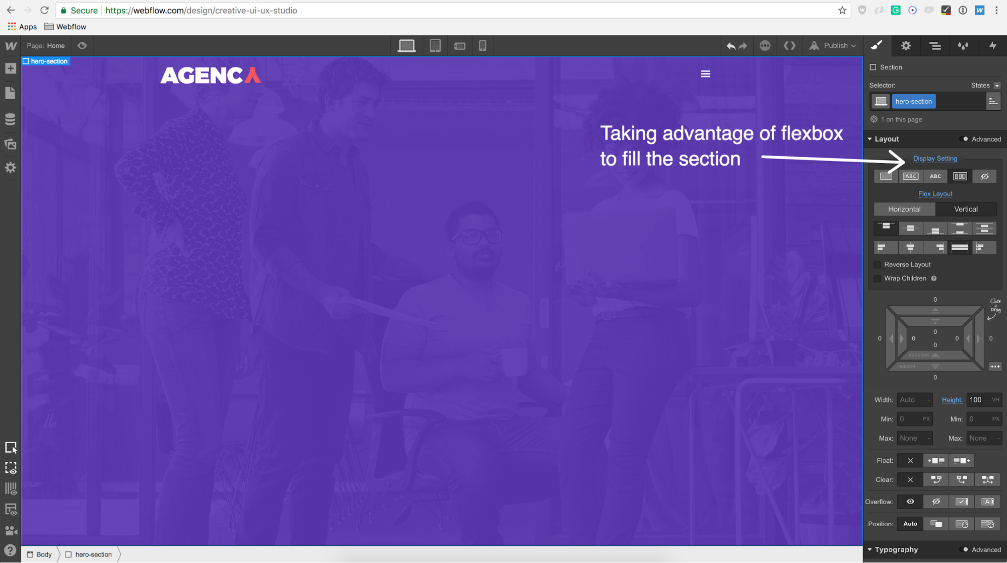
Now, we’ll create our hero section which contains some style guide elements. Our hero section will take advantage of 100 vh and flexbox by having a vertical flex layout with align:stretch so the contents fill the section.
Next, we’ll add our hero content. Notice the yellow Welcome text is the same as the global H3 we previously created.
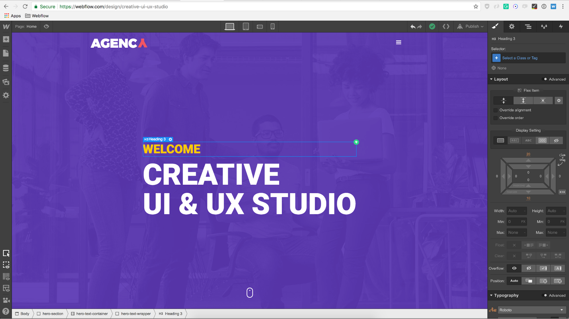
Then, we’ll use the global H1 for our “hero-heading” text, but change the color to white. Easy enough!
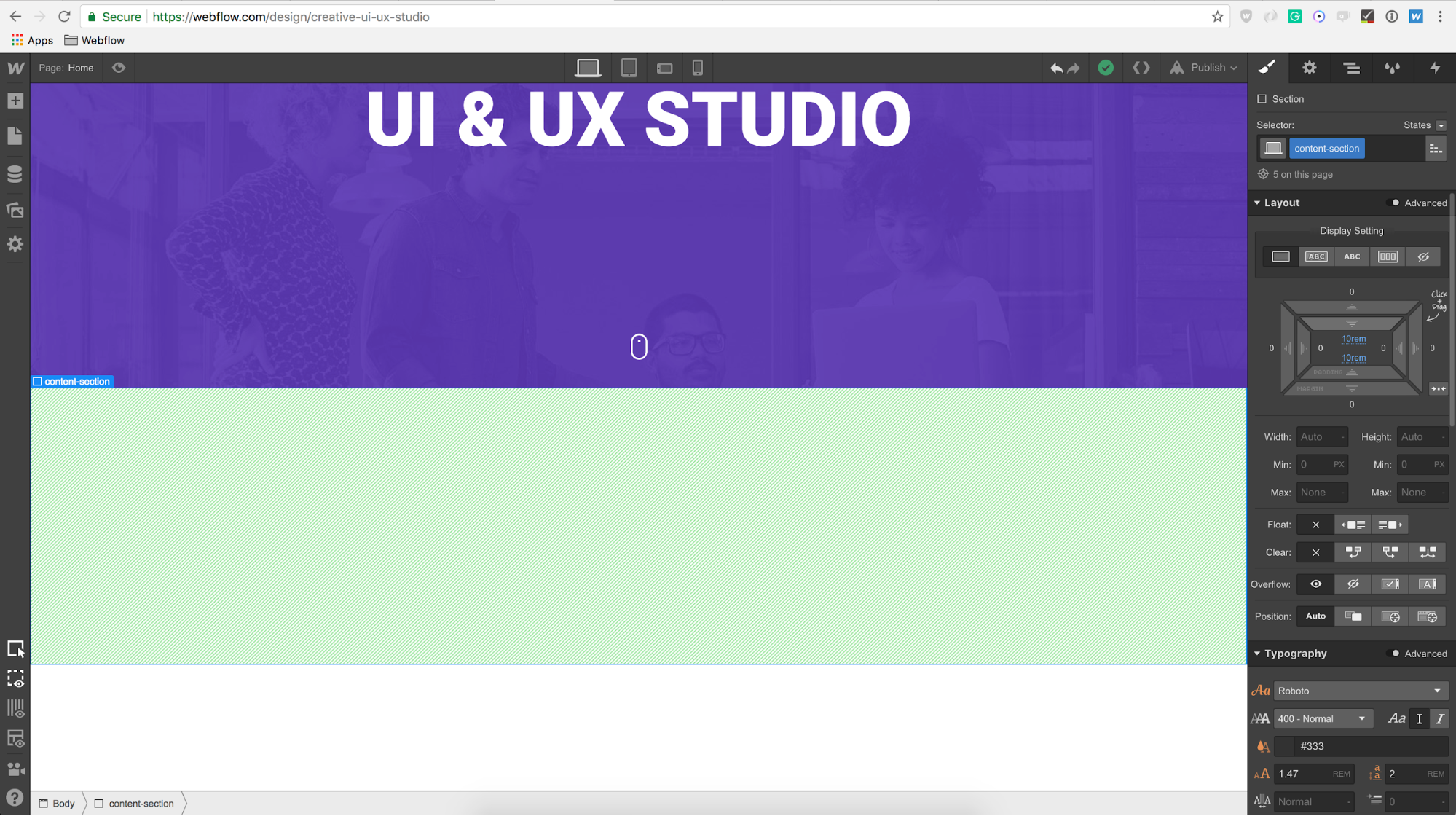
Below the hero section, we’ll begin adding the general content within our “content-section” element. Each content section will have the same amount of padding (10 rems of top and bottom padding for our content section) so that our style remains cohesive throughout the site.
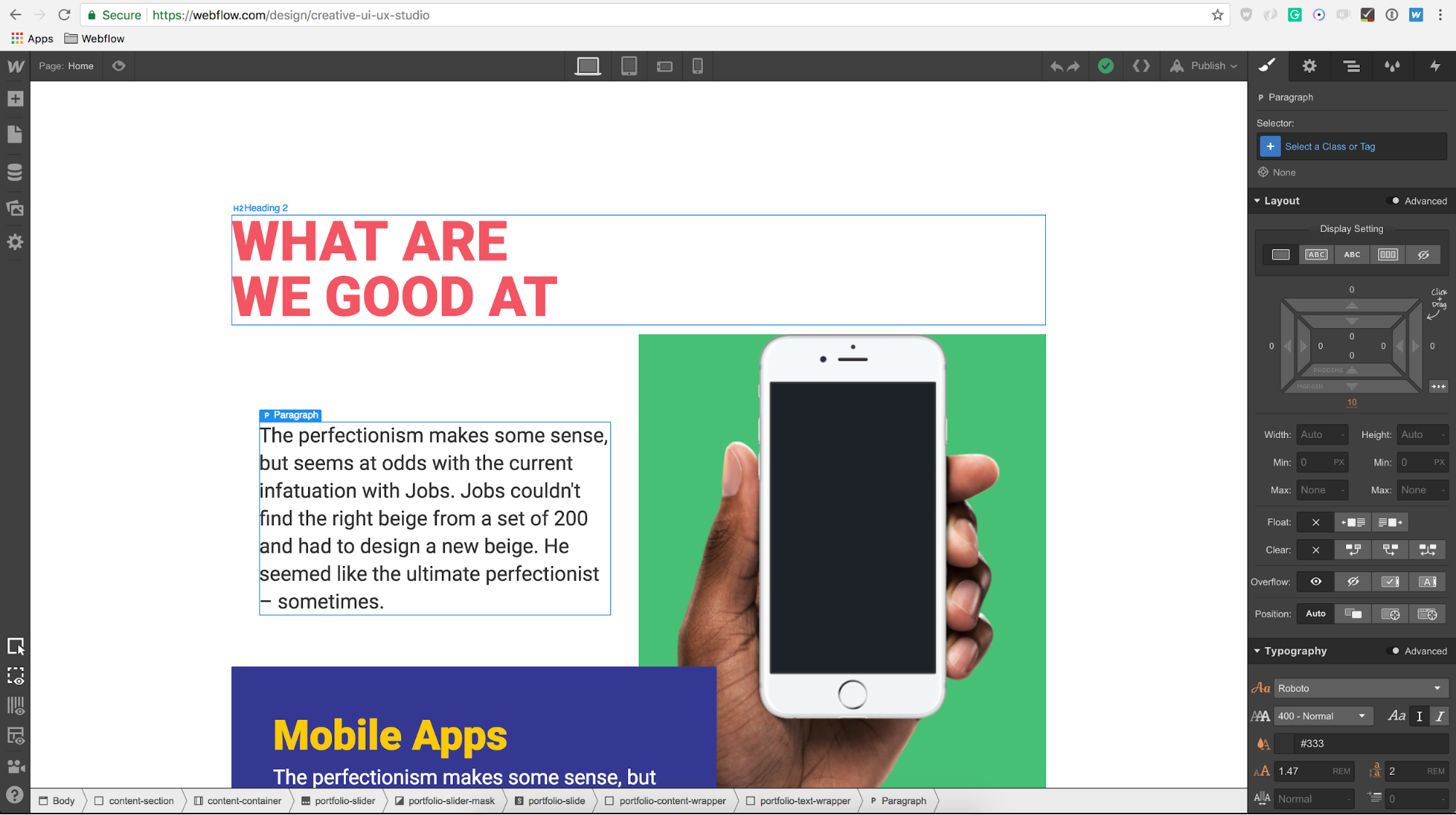
Because we did a lot of the heavy lifting within our style guide, we can reuse elements like our H2 and paragraph elements within our content sections. So awesome!
And finally, we’ll create our contact form and footer. Making sure we select them to be Symbols as they’ll be reused throughout the site on other pages.
I encourage you to think outside of the box with Webflow’s unique capabilities — animation, full-blown responsiveness, and fixed positioning, just to name three.
The designs completed in Sketch are by no means the final form of your work. And by no means are you obliged to follow them strictly. In Webflow, you’re designing in production. Everything you see on your canvas within Webflow is ready to come to life on the web, and I can’t wait to see what you build!
Have a look at the site structure at my share link.

From Sketch to Webflow
Hopefully, this walkthrough was informative and helpful. With the right tools, such as Sketch and Webflow, I can bring a site mockup to life with ease. And now you can too!
Now, question for the pros here: have you tried designing in Webflow directly? When I’m designing websites, I rarely do the full page comps in Sketch. Most times I start in Webflow directly.Even when I'm using Sketch, I just do some visual exploration around certain components to get a feel for the visual design. Everything else is faster in Webflow.
Up for a challenge?
Clone this site, make it your own, and share it with us when you’re done.
Imitation is the ultimate form of flattery, after all … I’m already blushing :-)