


Save space by making your navigation bar into an intuitive hamburger menu.
A hamburger menu tucks your website's navigation behind a compact icon in the corner of the screen. Web designers use it to conserve space, especially for mobile apps where screen real estate is limited. But a hamburger menu can also enhance desktop designs. It reduces visual clutter, creates more room for content, and offers an opportunity to reinforce your brand through animation, styling, and icon design.
What are website hamburger menus?
Hamburger buttons typically consist of three stacked horizontal lines that form a menu icon. Clicking the hamburger icon reveals the website’s navigation bar, where users select the page they want to visit. Some designers also incorporate it into a tab bar to group additional options or pages under a single menu icon.
Hiding navigation menus behind a hamburger icon keeps them out of view when not needed, giving users more screen space to focus on content — that’s why they’re a common feature in responsive layouts. On smaller screens, like tablets or mobile devices, the layout automatically hides the full navigation bar and replaces it with a hamburger menu.
Pros and cons of hamburger menus
Hidden menus help conserve space in your layouts, but they come with trade-offs. Here are a few factors to consider before using a hamburger menu in your designs.
Pros
- It’s another opportunity to add style. You can customize the hamburger menu with color, motion, or icon styling that complements the rest of your visual designs.
- You’ll gain more space in your layouts. Because users only need the navigation bar when they’re actively using it, hiding it when they aren’t gives you more room to prioritize content.
Cons
- It adds a step to the user experience. Hamburger menus require users to click or tap before seeing navigation options, which can slow them down. To justify the extra step, use the freed-up space to highlight content or interactions that matter most.
- It’s less accessible by default. To meet accessibility standards, hamburger menu icons must be reachable via keyboard (like the Tab key) and screen readers. Without these adjustments, some users may not be able to access your website’s navigation.
7 hamburger menu examples
Designing a hamburger menu offers freedom to add your unique style. From animated transitions to unexpected icon styling, small details turn a standard navigation icon into something fresh.
These seven examples show how designers customize hamburger menus to stand out while keeping them familiar and user-friendly.
1. Pico Play

Pico Play specializes in building attractions for theme parks and leisure destinations. Their website, designed by emd:digital, features a hamburger icon with a classic structure and a unique twist. Positioned in the top-right corner, the icon changes the cursor upon hover — a small but effective cue that encourages interaction. It’s a thoughtful example of adding visual flair to a hamburger menu without sacrificing clarity or accessibility.
2. Incredible Marketing Plus
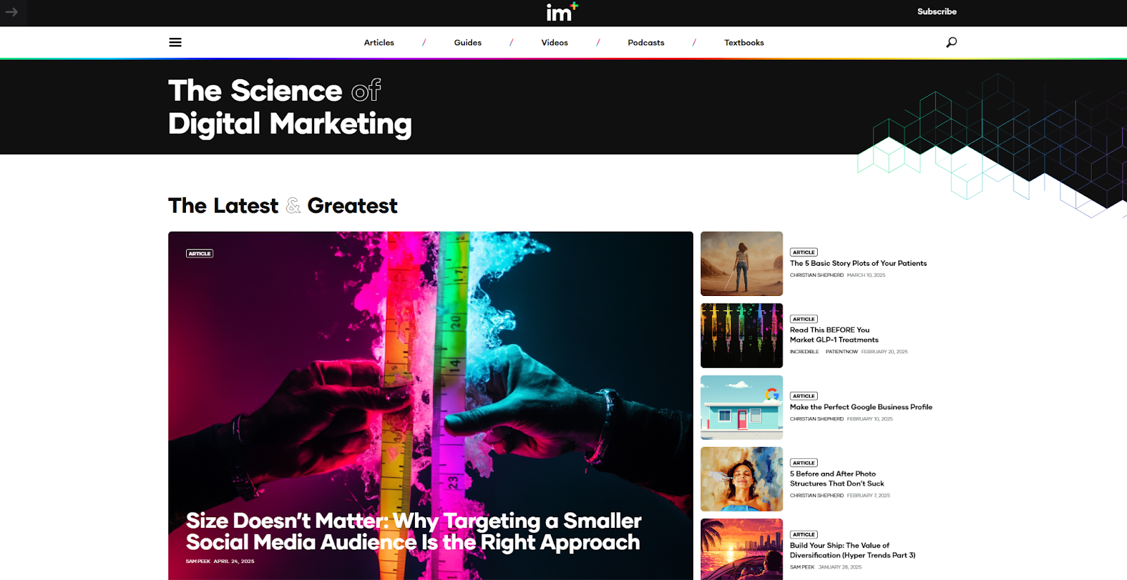
Incredible Marketing Plus provides academic research and digital marketing materials for the medical field. Rather than relying on a single navigation method for their website, the design keeps both a traditional navigation bar and a hamburger menu visible, even on the mobile layout. On larger viewports, clicking the hamburger menu reveals a curated list of popular articles alongside the main navigation. It’s a smart approach that turns a common interaction into a way to highlight content users might otherwise miss.


Webflow Interactions with GSAP
Unlock visual-first motion development, a new horizontal timeline interface, reusable interactions, and more.
3. The Flow Party
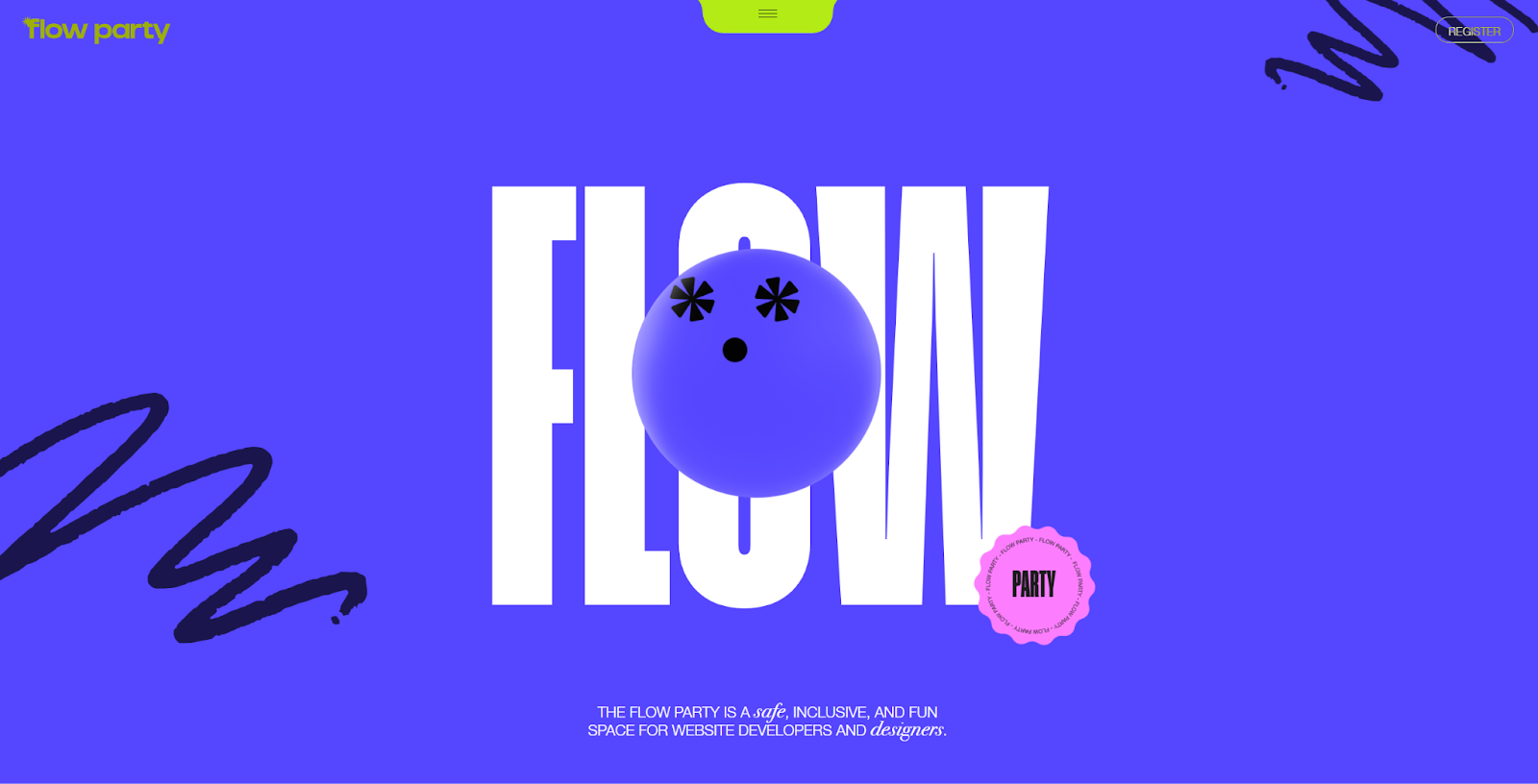
The Flow Party is an online space where digital designers share ideas and inspire each other. Founding member Joseph Berry designed the website and incorporated the familiar hamburger menu for navigation, but put it in a nontraditional location. Instead of placing it in a corner, Berry positioned the hamburger menu at the top-center of the screen beneath a hidden dropdown menu. It may feel less intuitive, but everything else about the interaction is familiar. If you try out a similar layout, be sure to use an accessibility testing tool to confirm it works with adaptive keyboards and assistive tech.
4. Pancake Web Studio
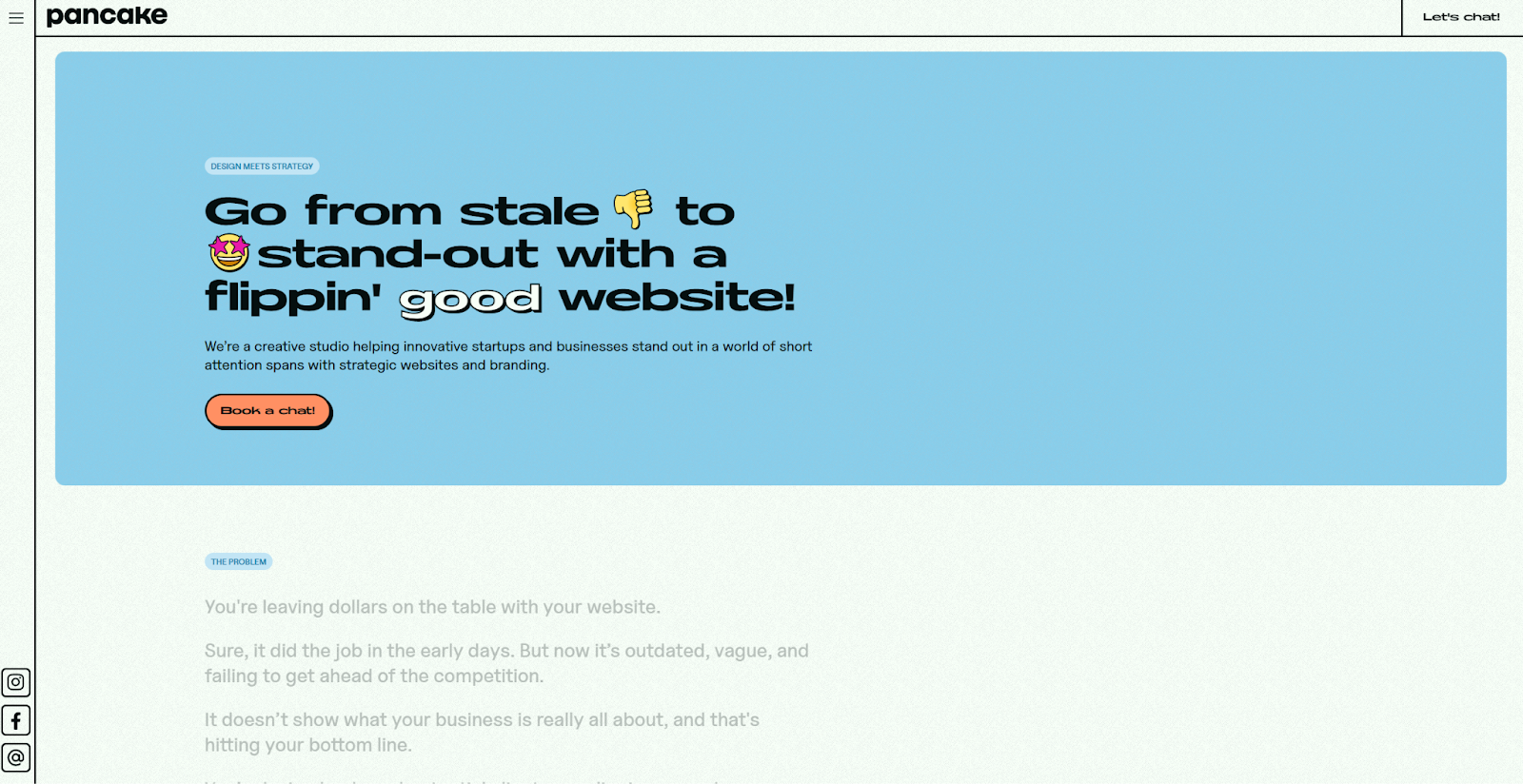
Pancake is a web design studio run by a small team of bold designers. The hamburger menu, set in the website’s top-left corner, opens a large, vibrant navigation menu styled with a bold color palette. Social media icons appear alongside the menu in the same sidebar, which stays fixed as you scroll through the homepage. It’s an effective way to showcase design prowess while keeping the focus on the studio’s portfolio.
5. Golden Retriever
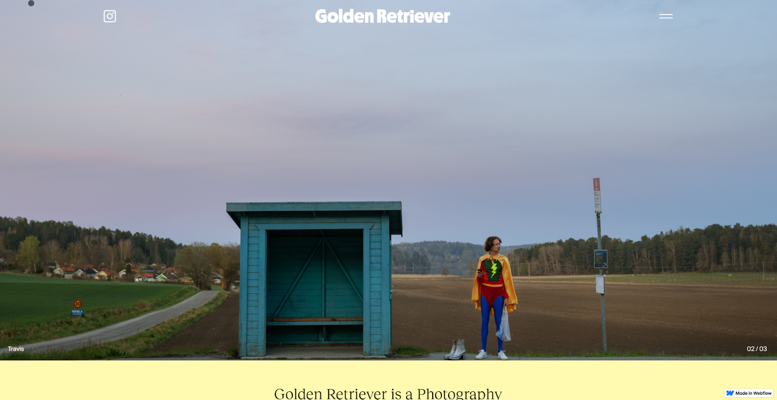
Golden Retriever is a photography and post-production studio that’s all about retro-inspired style. Designer Robby Albright reimagined the hamburger menu icon, using two horizontal lines instead of three to give it more of a sandwich-like look. As the background shifts, the icon adjusts so that it stays visible and accessible. It’s a subtle detail, but a smart move for websites with bold or changing colors, where strong visuals might otherwise overpower or hide the navigation.
6. Hustle Jar
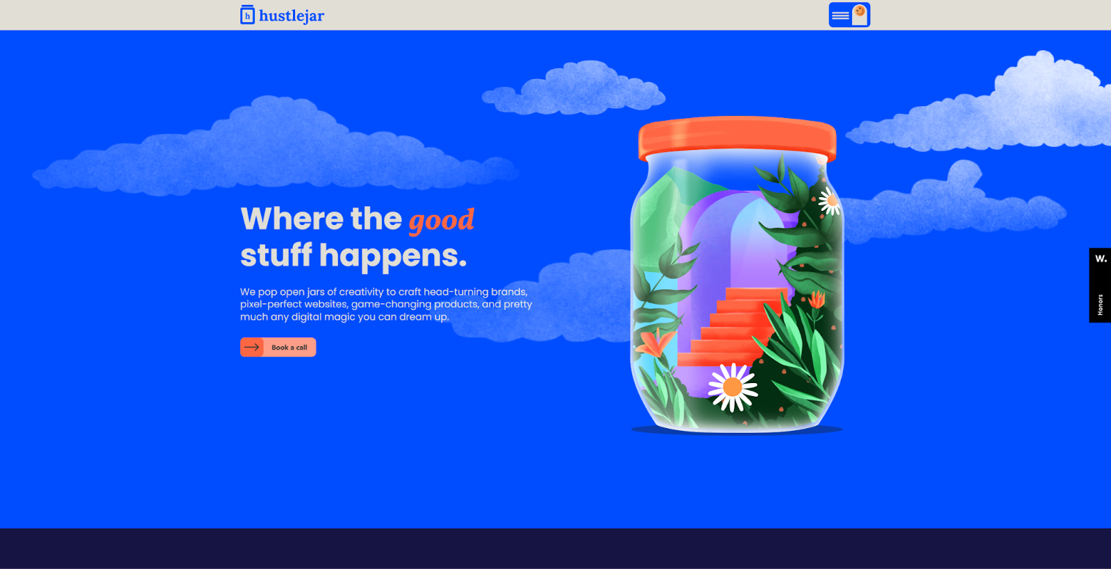
Hustle Jar is a brand design studio that specializes in building creative, bespoke identities with a bold edge. Their website, which the studio designed themselves, mirrors that spirit, and the hamburger menu is no exception. A bouncing smiley face icon appears alongside the menu trigger, and each navigation item features a playful, custom illustration. It’s quirky and unexpected but still recognizable and accessible, a strong example of how to balance personality with usability.
7. Sweven.design

Sweven.design made a subtle departure from the standard hamburger icon when creating their website. Instead of the usual three horizontal lines, this version uses two at a stair-step angle, and they're animated to transform as the navigational menu appears. It’s a sleek, engaging detail that reflects the website’s modern aesthetic while preserving enough color contrast and familiarity to keep it accessible.
How to build a custom hamburger menu
If you use a hamburger menu, treat it like any other design element — with intention, consistency, and creativity. Here are some tips for building a hamburger menu that adds function and personality to your user interfaces.
Make it unique, but not unrecognizable
A hamburger button icon may be just three horizontal lines, but there’s still room for innovation. You can adjust spacing, customize colors, or add subtle animations when the navigation menu opens. But don’t stray too far from the standard look — if users don’t recognize the icon, they may not know it leads to navigation.
Keep it consistent
Whatever styling you choose for your hamburger icon, keep it consistent across your site. While the placement and style might change from project to project, using the same location, shape, color, and animation within a single website helps visitors know exactly where to look every time they open the menu.
Test for accessibility
Once your hamburger menu is functional, check its accessibility using an ADA testing tool. Make sure adaptive keyboards, screen readers, and other assistive technologies can identify and interact with it. Otherwise, some users may hit a dead end, which can lead to frustration or drop-off.
Connect it to your design system
Use icons, animations, or microinteractions from your design system to style your hamburger menu. This reinforces the connection between your navigation and the rest of your design system, while adding an extra touch of polish. A consistent visual language encourages interaction and helps tie navigation to the broader user experience.
Streamline navigation with the right menu choice
Hamburger menus simplify navigation and save space across different screen sizes. They also offer the opportunity to add engaging visual flair. While they’re handy in mobile layouts and other responsive contexts, more designers are now incorporating them into desktop sites as well to reduce visual clutter, focus attention on key content, and create more intentional browsing experiences.
To explore how others are using hamburger menus, visit the Made in Webflow showcase. You’ll find the examples featured here, along with many more community-built designs. Use them as inspiration to experiment with navigation styles, icon treatments, and menu interactions in your own layouts.

Build websites that get results.
Build visually, publish instantly, and scale safely and quickly — without writing a line of code. All with Webflow's website experience platform.