

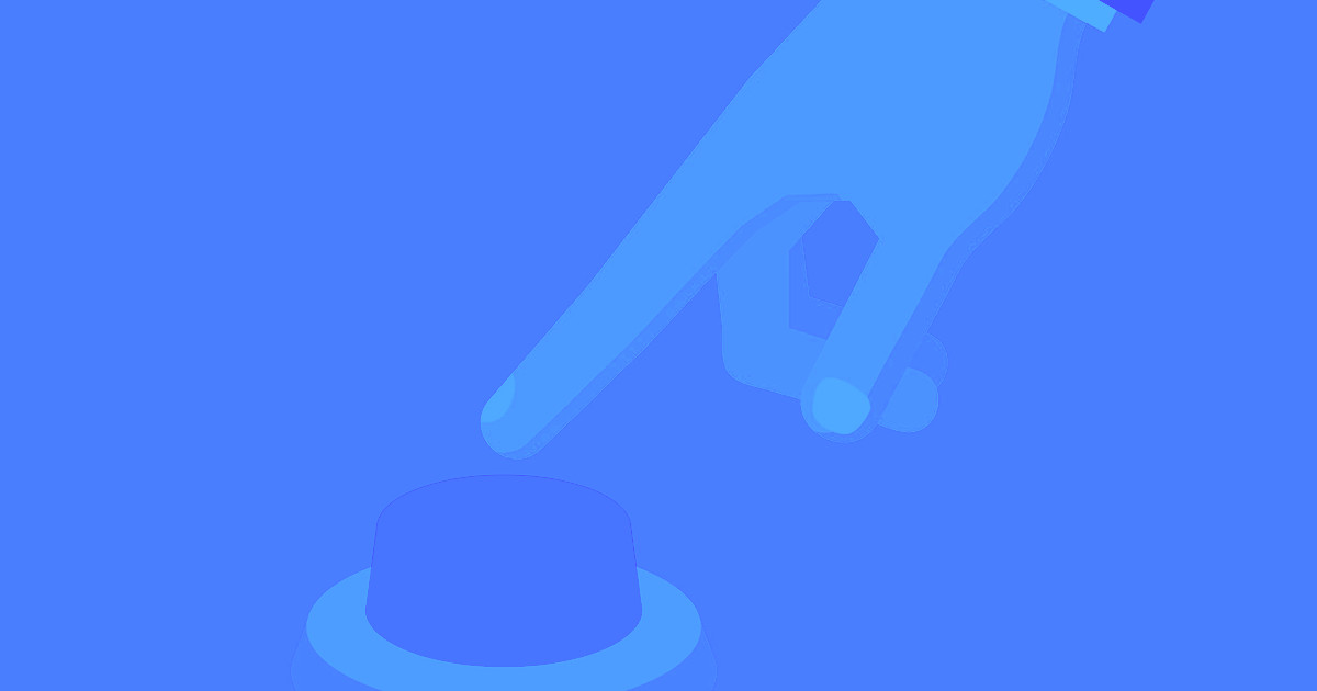
If you've ever wanted to have a panel slide on to the screen after someone clicks a button, we've got you covered.
Showing and hiding an element on click is a very common interaction, and one that we showcase on our Interactions page.
So how did we do it? We’ll show you. Just follow these steps, and check out the live version in your Webflow account.
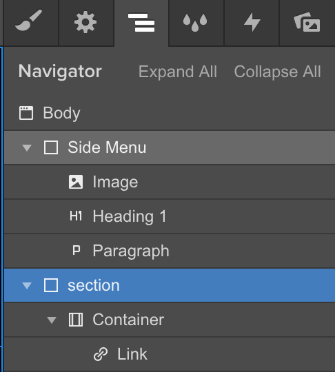
Step 1: Add the elements of the interaction
For this interaction, we’ll need a button to trigger the interaction and our menu, which requires a div block.
Step 2: Style the elements
You can style your elements however you’d like, but remember to create clear, memorable class names so they’re easy to remember later.
For this example, we’ll call our div block “Side Menu” and give it the following styles:
- Fixed Position: Right (To keep it pinned to the right of the screen)
- Height: 100% (So it covers the full height of the screen when expanded)
- Width: 30%
- Background-Color: Black

Step 3: Add and style elements in our side menu
For this example, I’ll add an image, a heading, and some paragraph text—but you can feature anything you want here, from a navigation menu to an author bio.

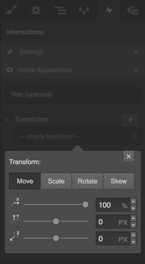
Step 4: Add an interaction to our side menu
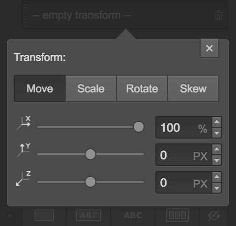
To keep the side menu off the screen on load, we need to add an initial appearance, and set it to move 100% to the right (so 100% of it will be off-screen).
Step 5: Add an interaction to the button
To make the button the trigger for the interaction, we also need to give it an interaction.
Select the button, choose the Click Trigger, check the “Affect different element(s)” box, and type in “Side Menu.” Now each of the following interaction steps will affect the side menu, not the button.
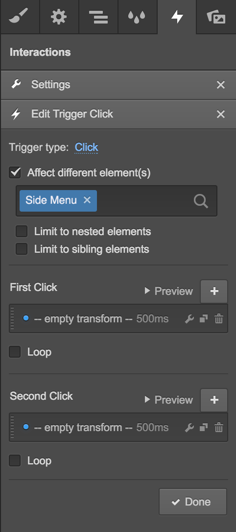
Step 6: Add a first click
In this case, the first click will trigger the side menu to slide in from the right of our screen. For this step, we’ll simply move the menu back to its original on-page position, at the default speed of 500ms.

Step 7: Add a second click
The second click will move the side menu back off of the screen. So in this step, we’ll move the object back to its initial appearance — 100% to the right.
Step 8: Done!
And there you have it! Now in the live preview we can see that clicking the button will cause the side menu to move out from the right. Clicking it again will cause the side menu to move back — perfect!
Want to see this example for yourself? Open it in your Webflow account.


Design interactions and animations without code
Build complex interactions and animations without even looking at code.
Want to go beyond basic show/hide interactions? This video introduces Webflow Interactions, the same tool you’ll use to create click-triggered menus, overlays, and dynamic UI behaviors without writing code.


