

The contact experience is often the last thing on a designer's mind when creating a website — and this needs to change.
The contact page or section is (usually) one of the most important parts of your entire website. It embodies the connecting point between you and your website’s visitors.
If you’re a freelance designer, or work in any business that needs leads, this could be the start of a valuable partnership (and hold huge monetary value).
So why is this experience often left to the last thought? Shouldn’t we invest as many resources in it as we do our homepages?
To create an effective contact experience, you need to strike a balance between navigation and form design. Your navigation needs to make it easy to find your contact form or page. And the form needs to be easy to understand and ask the right questions.
With that in mind, here are a few unique methods of giving people access to your contact form, along with examples of the patterns in action.
Contact tab / panel
A contact tab or panel can be a really effective way to present your contact form. Not only does it make navigation easy (because it doesn’t take the user to a new page), but it also uses a hint of interactive design that separates it from your average contact page.

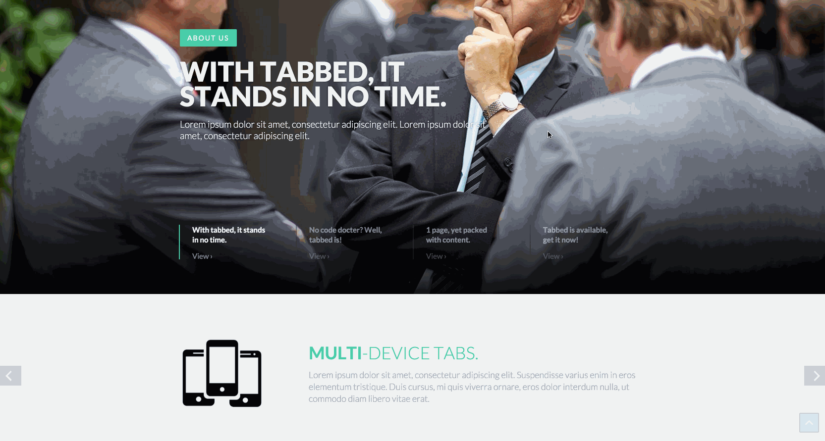
FlyCMS template
This Webflow template does a great job of subtly introducing you to a rich contact section.
Wherever a person is on your site, they’re just a click away from a wealth of ways to get it touch. Instead of sending the user to a new page, the Fly CMS template gives people everything they need in a simple and elegant slide-up panel.

Essential template
Another popular Webflow template, Essential offers an even more unique contact interaction by displaying a sticky Contact button at the bottom of each page. When someone clicks, they’re greeted with a nicely designed contact form and useful contact information.

Mill template
You can also slide your contact form in from the side of the page. The Mill template uses a slide-out interaction to make getting in touch easy, without taking up too much screen real estate.
Full-screen contact overlays
I love the idea of using overlays. They not only bring contact info instantly into view, but also isolate the experience so the viewer can focus on one thing: contacting you.

Codrops overlay examples
The popular design blog Codrops has put together a fantastic demo for full-screen overlays. You can easily recreate any of Codrops’ examples in Webflow, and just replace its content with a form or your contact info. To get started, follow our pop-up modal tutorial, and just give your “modal” a position of fixed full. (It’ll take some more tweaking with our Interactions panel to achieve some of Codrops’ designs.)
Contact sections
Sometimes your design doesn’t call for interactions or fancy slide-out contact forms. This is where a simple anchored contact section might shine. Often used on one-page websites, you can also add a contact section as the final call to action on every page of a multi-page website. Then just add a Contact link in your main nav and anchor it to each page’s contact section (like FlyCMS).
Instead of sending people to a new page, give them an easy-to-access form or contact experience at the bottom of the page instead. This way, they can read through the whole page before they reach out, or go straight to the contact section via the Contact link in your main nav.
How do you help people get in touch?
Does one of your websites feature a unique contact experience? We’d love to see it! Share it with us on Facebook or Twitter!


Free ebook: Web design 101
Master the fundamental concepts of web design, including typography, color theory, visual design, and so much more.