

Modern technology websites require modern designs.
From colors and fonts to whitespace and layouts, today's technology companies push the boundaries with their products, as do their websites.
Technology companies don’t just refer to large enterprises like Apple, Samsung, and Google. Sites like TechRadar, Gizmodo, and Engadget, which cover the latest digital trends and technology news, also have sleek and innovative sites to attract viewers.
The best technology website designs engage a targeted audience while showcasing cutting-edge technology through appealing visuals, interactive elements, and smooth performance. Read on to discover prime examples and why they work.
The 8 best technology website designs to inspire you
From minimalist designs to lively animations, here are eight technology websites that implement modern web design practices well.
1. Global Tech Trends

The Global Tech Trends site (designed by kvalifik) showcases reports covering technology and its influence on business, science, and innovation. Innovation Centre Denmark and TechBBQ collaborated to highlight how seven centers — Munich, Bangalore, Shanghai, Seoul, Tel Aviv, Silicon Valley, and Boston — identified technology trends.
The website is primarily dark-themed but doesn’t lack color. The imagery stands out, balancing vibrant hues amidst the black background. Each project is divided according to various themes, such as “Green,” “Life Science,” and “Space & Mobility,” so you know which city is responsible for a specific initiative.
You can use the search bar or filter projects according to title or location, helping with navigation. Each design slightly expands as you hover, offering a subtle interaction, while arrows guide you to read further and explore each project.
2. Kassow Robots
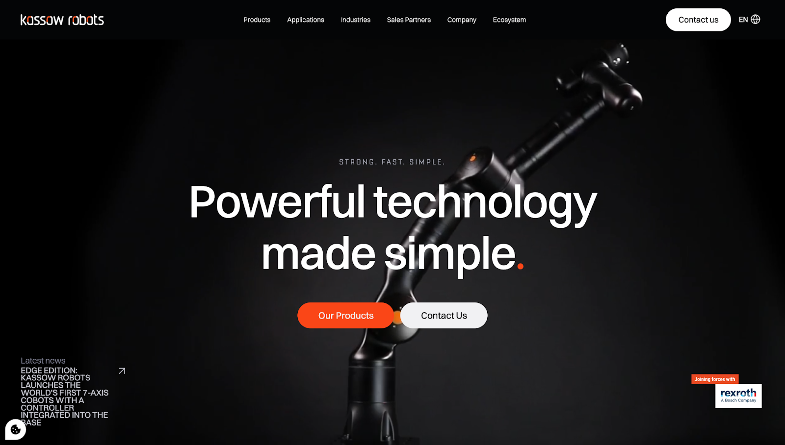
Kassow Robots is a robot manufacturer that helps companies automate and streamline production. This site (designed by Simon De Ridder) has a home page banner featuring a video that demonstrates how Kassow's robots work. A black, white, and orange palette accentuates the buttons and text to reinforce Kassow’s visual identity.
For further insights, the site has schematic-style graphics illustrating the benefits of the company’s products, followed by in-depth model specifications and case studies showing Kassow Robots in the real world. Near the bottom, a “Watch” button cleverly reveals an embedded YouTube advertisement.
The landing page requires a long scroll, but the website’s floating menu remains at the top of the screen to help with navigation. The language button in the top-right corner allows you to toggle between English and Dutch, showing Kassow’s dedication to localized content.
3. Eonix
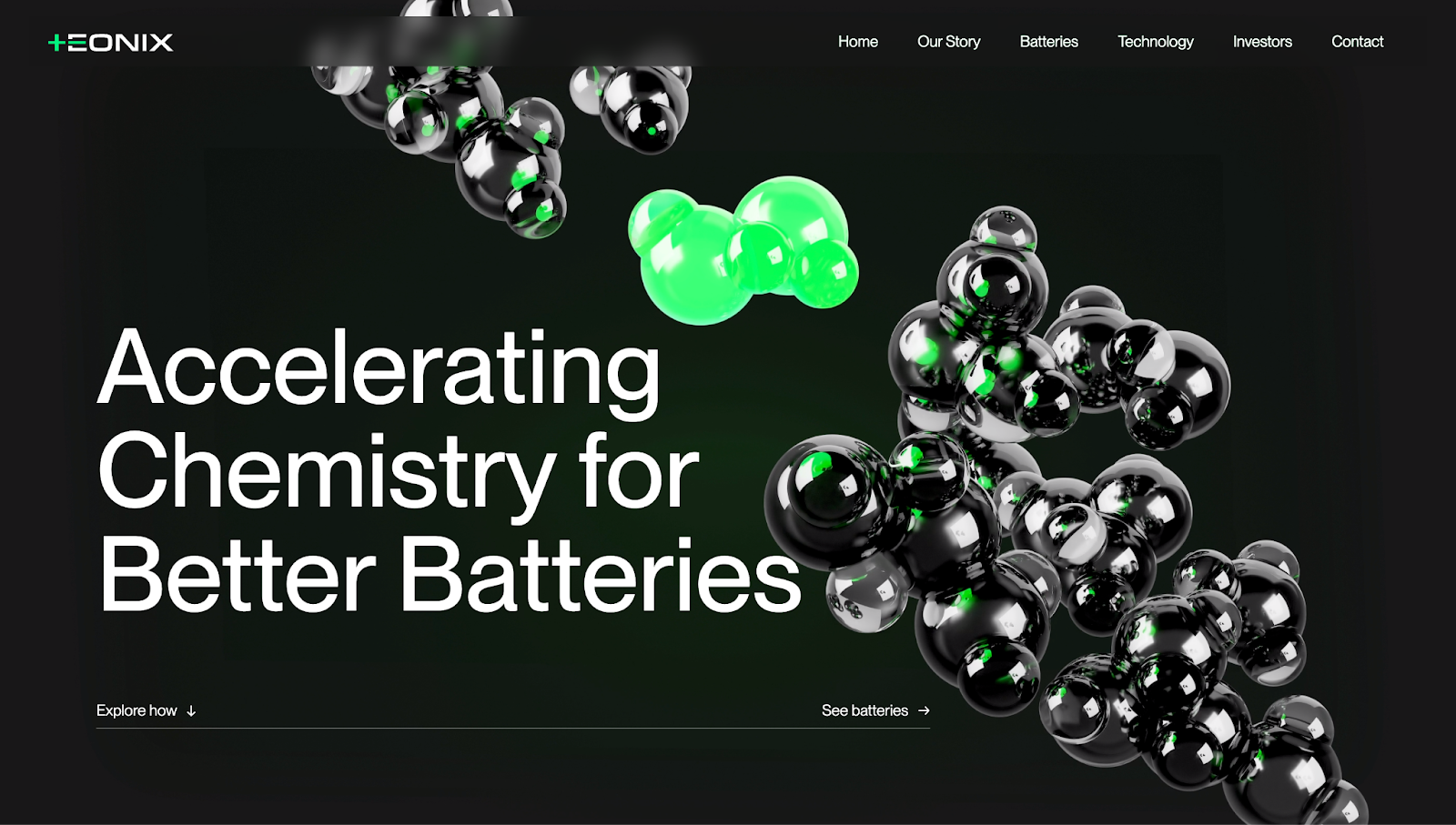
A similar theme for many technology websites on this list is a two or three-tone palette displaying the brand’s colors. This modern website design trend helps maintain a consistent brand image throughout the website and across multiple platforms. Eonix (designed by Dunclyde) does the same with a white, green, and gray scheme. But instead of plain colors, the website adds gradients to text and backgrounds to avoid a monotonous appearance.
This website exemplifies minimalist design with flat designs, sans serif fonts, sharp lines, and generous whitespace. The icons and 3D images also pop off the page — an excellent way to display information while maintaining visual appeal. Green lighting in the site’s nooks and corners emphasizes the company’s products — batteries — and uniquely showcases its offering, tying creative design with product demonstration.
4. Elementus
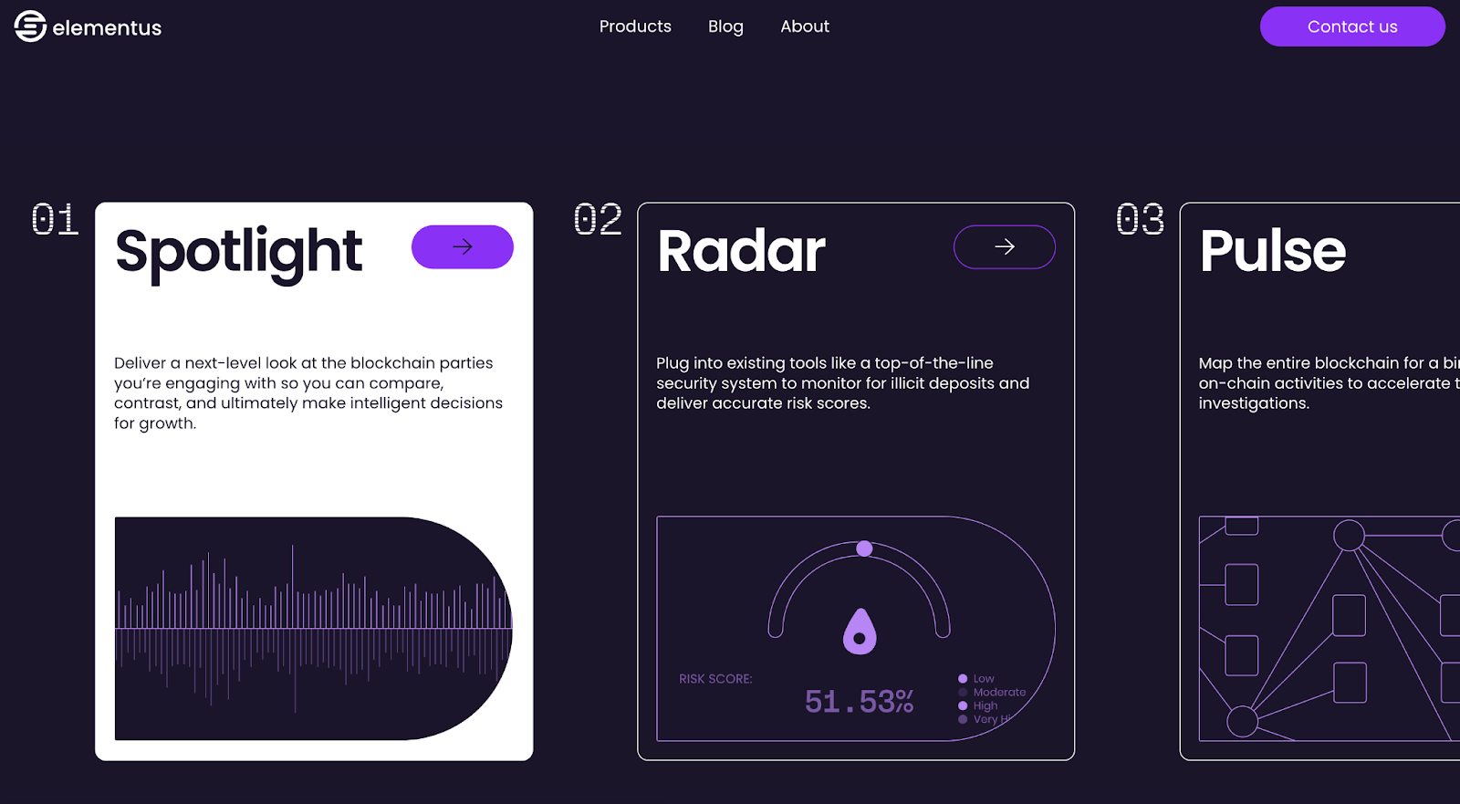
Designed by Paper Tiger, the website for Elementus has shades of purple, white, and gray. The user interface (UI) is split into multiple parts, like “Values,” “Products,” and “Solutions,” with the three colors alternating as each section’s background to distinguish them and increase readability.
Scrolling reveals subtle interactivity and animations. Text, icons, and graphics appear and settle into a neat organization of spaced-out elements to improve viewability. A two-tier scroll effect also engages the audience while showing Elementus’ clients and customers, with the upper line moving from right to left and the bottom moving the other way.
Unlike the previous three websites, Elementus uses the Poppins font throughout the UI, showing how this font is a core part of its style guide. The design proves you don’t need multiple elements to create an attractive website. Instead, a cohesive and consistent design language can reinforce your brand identity.


Webflow Enterprise
Trusted by over 300,000 of the world’s leading brands, Webflow Enterprise empowers your team to visually build, manage, and optimize sophisticated web experiences at scale — all backed by enterprise-grade security.
5. Exicom
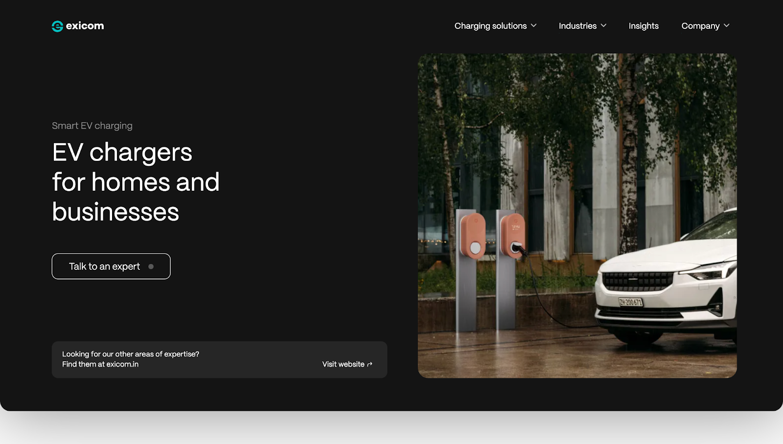
Exicom supplies smart electronic vehicle (EV) charging solutions for home and corporate use. This website, designed by Saddle, sports a lightweight design with a prominent hero image showcasing the company's products. Bold, clear headings, subheadings, and statistics help visitors understand Exicom's value proposition.
The website uses high-quality imagery and icons to visually represent different solutions. A clear, stacked menu structure also guides visitors to key sections like products, industries, and company information.
Like Elementus, Exicom prioritizes one font throughout the site (sans serif). The negative spacing combines with a well-organized, grid-style layout to ensure every element shines, allowing you to view each feature without feeling overwhelmed by the next.
6. Decodable
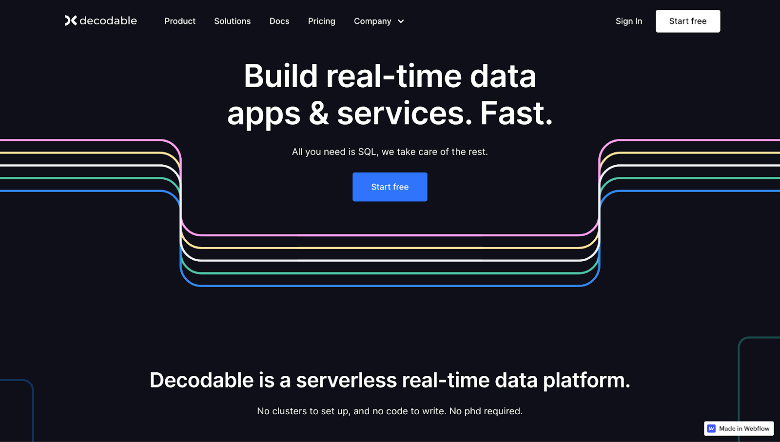
Decodable is a startup that helps companies build and release applications. Despite the initial dark banner, the site — designed by Brightscout — bursts into playful colors and graphics, inviting you to interact with elements and explore the site.
For example, the color combination of green, pink, and blue is immediately apparent, but it comes alive in the website’s second section, “Why Decodable.” The three pillars here, “Connect,” “Build,” and “Manage,” each have an animation with matching colors to improve legibility and navigation. When you click on a box, a subtle shadow highlights your selection so you know where it is.
Other sections, such as “Product” and “Solutions,” have the same animation style, providing a consistent visual feel to the browsing experience.
7. Factory
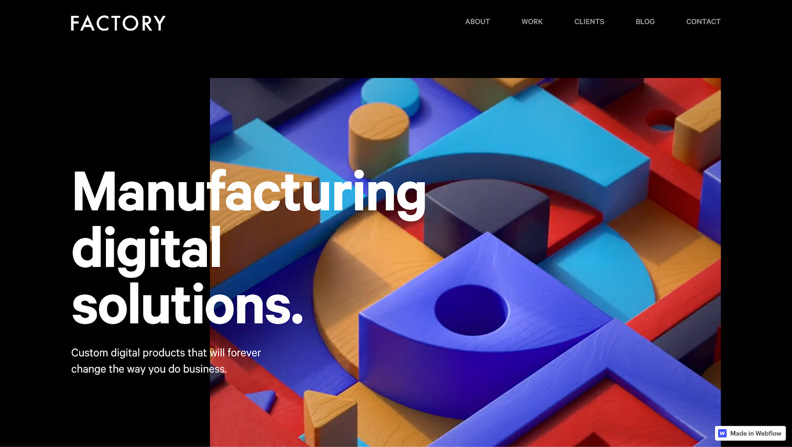
Reload Agency’s Factory site centers a hero visual that’s a video of moving parts and pieces, matching the copy overlaying it: “Manufacturing digital solutions.” Scrolling turns the black background white for a short stint and returns to black — an animation that grabs attention without overwhelming viewers.
Moving further down shows another animation: a tracker scrubbing a numbered timeline, accompanied by changing thumbnails. Go back up, and the process reverses. Each animation is interactive, encouraging visitors to engage with site elements.
This interactivity continues with the next section, highlighting customer success stories. Scrolling creates a stacking effect, with each image piling onto the previous one. After five stories, an “All clients” CTA invites you to explore other case studies.
Near the bottom, another video caps off the landing page. You don’t have to go back to the top to reach the site’s other sections — a footer allows you to visit Factory’s social media channels, work, about page, and blog, making navigation convenient.
8. Somatic Technologies
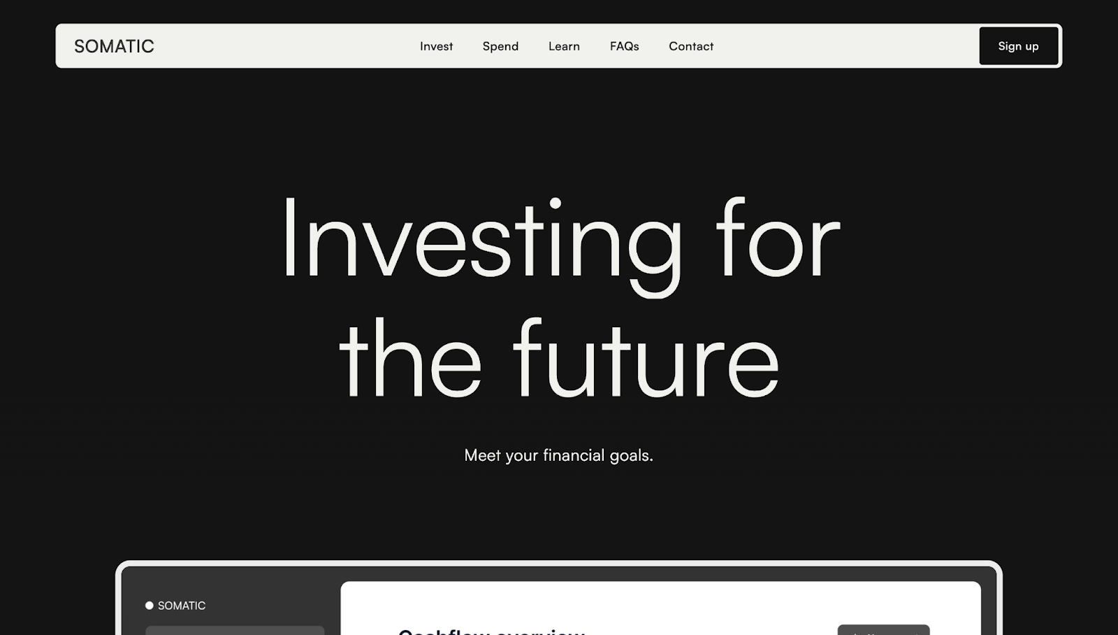
Somatic Technologies is a financial technology platform for tracking investments. The landing page for this site (which was designed by Katarina Escobar Dobrijević) is divided into five sections: Invest, Spend, Learn, FAQs, and Contact. These are prominent on the site’s sticky navigation bar, allowing you to quickly navigate to any section regardless of where you are on the site.
The grid-style layout is varied to break monotony. Each section has complementary yet unique visuals, from card-like blocks to interactive graph animations to friendly images of people from the company’s mentorship program.
The landing page ends with a prominent “Book a call” CTA button, an FAQ with neatly stacked questions, and a lead capture contact form. And the final messages, “Enjoy financial clarity” and “Meet your financial goals” reinforce Somatic’s value proposition and encourage visitors to sign up for the mailing list.
Frequently asked questions
Which color palettes, fonts, and use of whitespace work best for modern tech websites?
Modern tech websites often succeed by embracing minimal, high-contrast color palettes (typically two to three core tones) that reinforce brand recognition without overwhelming users. These color schemes are often paired with gradients or subtle animations to add visual interest while keeping the focus on the product. Sans serif fonts like Poppins, Inter, or Roboto are popular choices because they offer a clean, approachable feel that renders well on all screen sizes. Generous use of whitespace is also essential, creating breathing room around headlines, buttons, and feature sections. This clarity and visual balance help streamline the browsing experience and convey a sense of modernity and professionalism that’s crucial in technology branding.
What navigation patterns should a technology website use to improve UX (sticky nav, search, filters, localization)?
High-performing tech websites prioritize navigation patterns that reduce friction and improve discoverability. Sticky navigation bars allow users to move between sections without needing to scroll back to the top, while clear sectioning and anchor links break up complex content. On product or solution pages, filters based on category, industry, or location can empower users to find relevant content faster. Search functionality should be visible and responsive, often with autosuggest or filtering capabilities. For international brands, localization features like language selectors and regionalized content — placed in the header or a clear menu — demonstrate global awareness and improve usability across markets.
What makes a technology website design "high-converting" today?
A high-converting tech website guides visitors seamlessly from first impression to action. This means combining bold visuals — such as 3D illustrations, interactive demos, or sleek motion graphics — with clear value propositions and focused calls to action. Every interaction should reinforce credibility, whether through security badges, customer logos, or concise feature explanations. Conversion-focused tech sites also use psychological cues like urgency, social proof, and benefit-driven copy to motivate engagement. Most importantly, the experience must be intuitive, fast, and mobile-friendly — ensuring that visitors understand your technology's value and know exactly how to take the next step, whether it’s signing up for a demo, subscribing to updates, or exploring integrations.
Transform your technology website with Webflow
Whether you’re looking to publish a tech blog or advertise your latest products, a user-friendly and visually appealing website is essential to turn visitors into prospective customers.
Webflow offers a visual-first design environment for coders and non-coders alike. You can also design websites with third-party platforms like Figma and other UI/UX design tools and launch them with Webflow.
Start designing and grow your online tech business with Webflow.
Get started for free
Create custom, scalable websites — without writing code. Start building in Webflow.