

A good page loading animation stops visitors from bouncing while the website buffers — but great ones entertain, impress, and showcase the brand.
Most web designers understand the weight of first impressions. But even with a captivating homepage to set the tone, judgment often starts at the first click.
If a page seems unresponsive during loading, even momentarily, it can discourage visitors and cause them to bounce, steering them toward competitors.
Enter loading animations. Also known as preloaders, these website animations activate during site loading and offer visual cues to maintain engagement, reassuring visitors that the site is working and processing.
While preloaders don’t change the site’s actual load time, they reduce the perceived load time — a more crucial aspect for enhancing the user experience. Besides combating bounce rates, especially for sites without lightning-fast load times, page loading animations also set the brand tone, gently ushering users into the aesthetic and thematic vibe of the site before the main content surfaces.
Here’s how to tap into the potential of preloaders.
How to use page loading animations on your site
To integrate a loading animation, consider your software, design, and duration options.
Choose a software package
Evaluate animation software options based on their capacity to deliver lightweight, professional-looking animations that integrate smoothly into the website and prevent visitor drop-offs due to bulky or clashing animations. If you design with Webflow, we recommend the Lottie or Adobe After Effects integrations for their power and simplicity.
Select a loading animation design
When selecting a design, factor in brand identity and industry relevance. People visiting a creative agency with a playful brand voice, for example, might want to see the designers’ skills showcased in a fun animation. However, visitors to a lawyer site may prefer a simple, professional design.
When choosing a loading animation design, consider these common types:
- Counters: Simple number mechanisms often counting up to 100%
- Spinners: Circular indicators that rotate to show progress
- Progress bars: Linear indicators that fill up as the site loads
- Geometric animations: Shapes and combinations that add visual interest
- Animated logos: Sequences showcasing the logo’s formation, highlight, or placement
- Words: Terms meant to evoke brand associations in visitors
- Animated illustrations: Characters or scenes, including avatars or animated micro-stories
Simpler visual styles, such as counters and spinners, work best for professional or corporate websites where a straightforward approach aligns with the brand identity. Styles of intermediate complexity, like animated logos and words, offer versatility fitting brands in various industries, like tech startups or creative agencies. More intricate animations resonate well with playful brand identities and creative sectors, where demonstrating higher design skill levels can set the brand apart in industries valuing innovation and detail.
Set a loading animation duration
Choose animations that align with the site’s loading time. Infinite loop animations, such as spinners, typically vanish once the page finishes loading. However, it’s advantageous to let one-off, brief animations — such as animated logos or illustrations — play entirely, even if the site finishes loading before the animation ends. These animations entertain or inform visitors during the wait and often convey branding or storytelling elements integral to the site’s message, and prematurely ending them causes users to miss out on the experience.
Progress bars and counters pose a further challenge because site load times vary across devices and situations. For example, a progress bar halting at 50% can confuse users. Instead, consider accelerating the animation to 100% upon page load completion to maintain a cohesive user experience.
Loading screens: 5 best practices
For a loading animation that improves the user experience rather than getting in the way, follow these five best practices:
- Keep the animations lightweight. Avoid creating a loading animation that’s slow to load itself. Instead, choose efficient file formats, like CSS or SVG, and tools like Lottie to ensure animations load quickly.
- Incorporate branding. Loading animations offer prime opportunities to showcase the brand’s voice, identity, and colors. While animated logos stand out, subtly incorporating distinctive brand elements also underlines the brand’s identity, transforming passive waiting time into an immersive experience. This effectively uses every moment users spend on the platform, enhancing their connection with the brand.
- Perfect the concluding transition. Experiment with keyframes to craft a seamless shift from the animation to page content. Set a trigger to hide the animation when the page finishes loading, and consider fading out the animation or overlaying it with a slide-in transition to bring in the page.
- Stick to a clear message. A central theme or message throughout the loading animations delivers a cohesive brand narrative. This consistency builds trust and recognition by eliminating potential confusion that can arise from mixed messages, fostering more engaging and reassuring interactions.
- Avoid overcomplicating. While entertaining animations enhance the user experience, remember the primary goal: delivering content. Visitors come to a site for content, not an extended animation. Animations add flair, but they shouldn’t replace efforts to optimize website load time.


Interactions & animations
Learn how to animate multiple elements and bring your designs to life with rich, sequenced interactions and animations.
12 loading animation examples to inspire you
Here are 12 website animation examples that provide inspiration for a breadth of industries and types of sites.
1. Eonix

Design team Dunclyde keeps things simple and elegant with their loading animation for battery technology company Eonix. The site’s preloader displays the word “loading” to the screen’s left side and is accompanied by a progressively extending green line showing the site’s loading progress. The line’s green shade aligns with the brand’s color scheme, and the line’s design mirrors the horizontal green element in Eonix’s logo.
2. Matteo Fabbiani

Web designer Matteo Fabbiani showcases a straightforward count-up number in white against a stark black backdrop on the bottom right corner of this portfolio site. Once the counter hits 100, it gracefully slides down, revealing the website’s homepage. This minimalist approach highlights Matteo’s design philosophy and engages visitors with a clean user experience, setting the tone for the following content.
3. Chicago CryoSpa
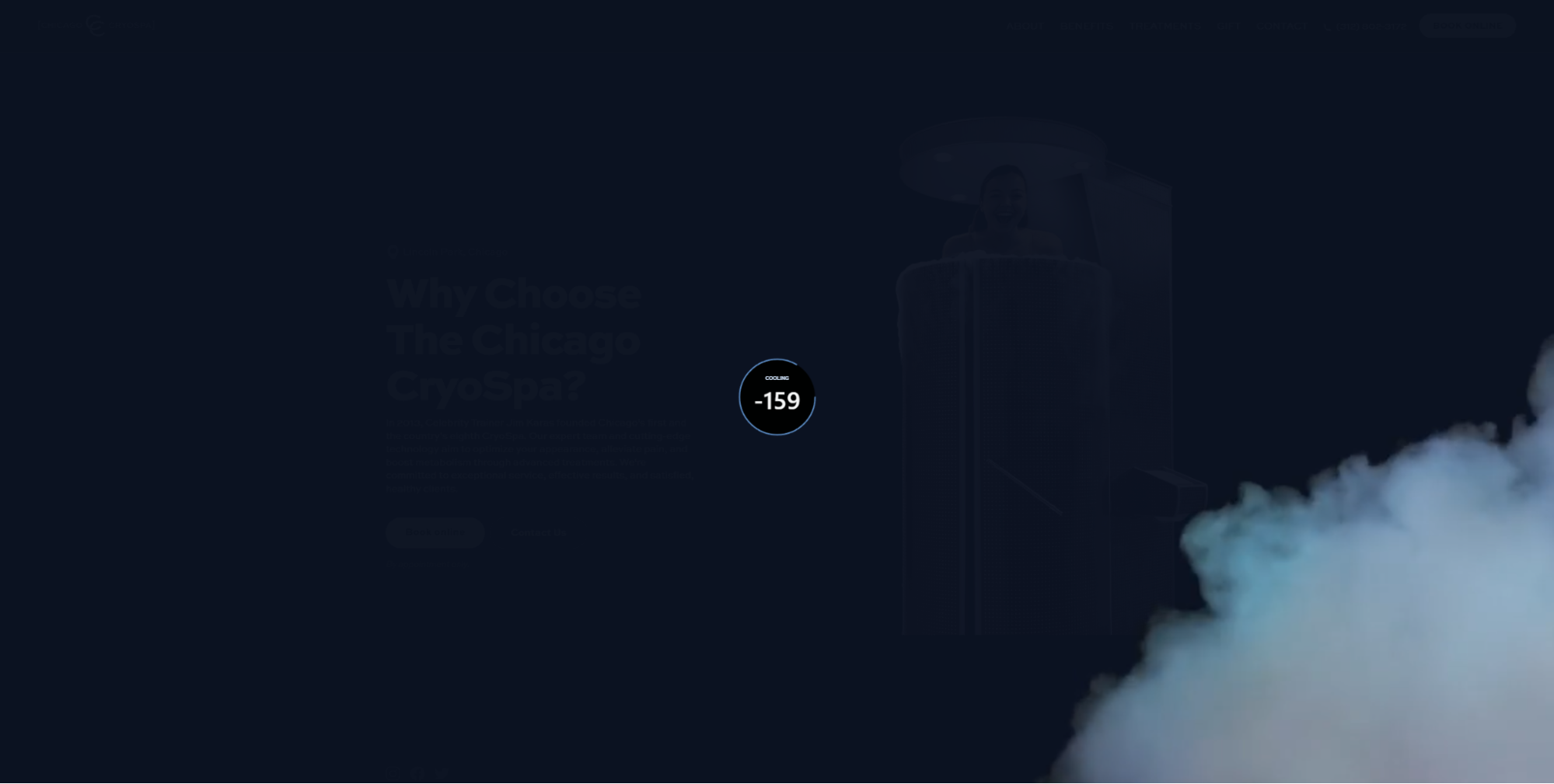
Prism Design Studio innovatively reimagines the classic counter in their design for the Chicago CryoSpa cryotherapy clinic. Instead of counting up to 100, the preloader counts down from 70 to -240, mirroring the dramatic temperature drops of the frigid cryotherapy chambers. This unique approach captures visitors’ attention, seamlessly merging brand identity and user intrigue.
4. Jay Bell

Lauren Harris uses a geometric loading animation for Jay Bell’s art and photography portfolio. Four small white squares in the center of a black screen spin and converge, harmonizing with the site’s black-and-white theme and the framing of the showcased artworks. Aligning the preloader with the site’s aesthetic provides a consistent visual journey for the viewer, elevating the user experience.
5. JORIS

Designed by CleverMellow, the site for brand design leadership firm JORIS also has a geometric loading animation. White orbs materialize against a black backdrop, expand, cluster, and then disappear at a single focal point to reveal the company’s logo. These animated circles resonate with JORIS’s circular logo, echoing its design, while the animation’s bold and assertive motion introduces the brand’s confident style. This circular motif is carried through to the site’s cursor — a black dot superimposed atop a vibrant yellow circle that follows movement — ensuring that the branding and design remain cohesive from entry through navigation.
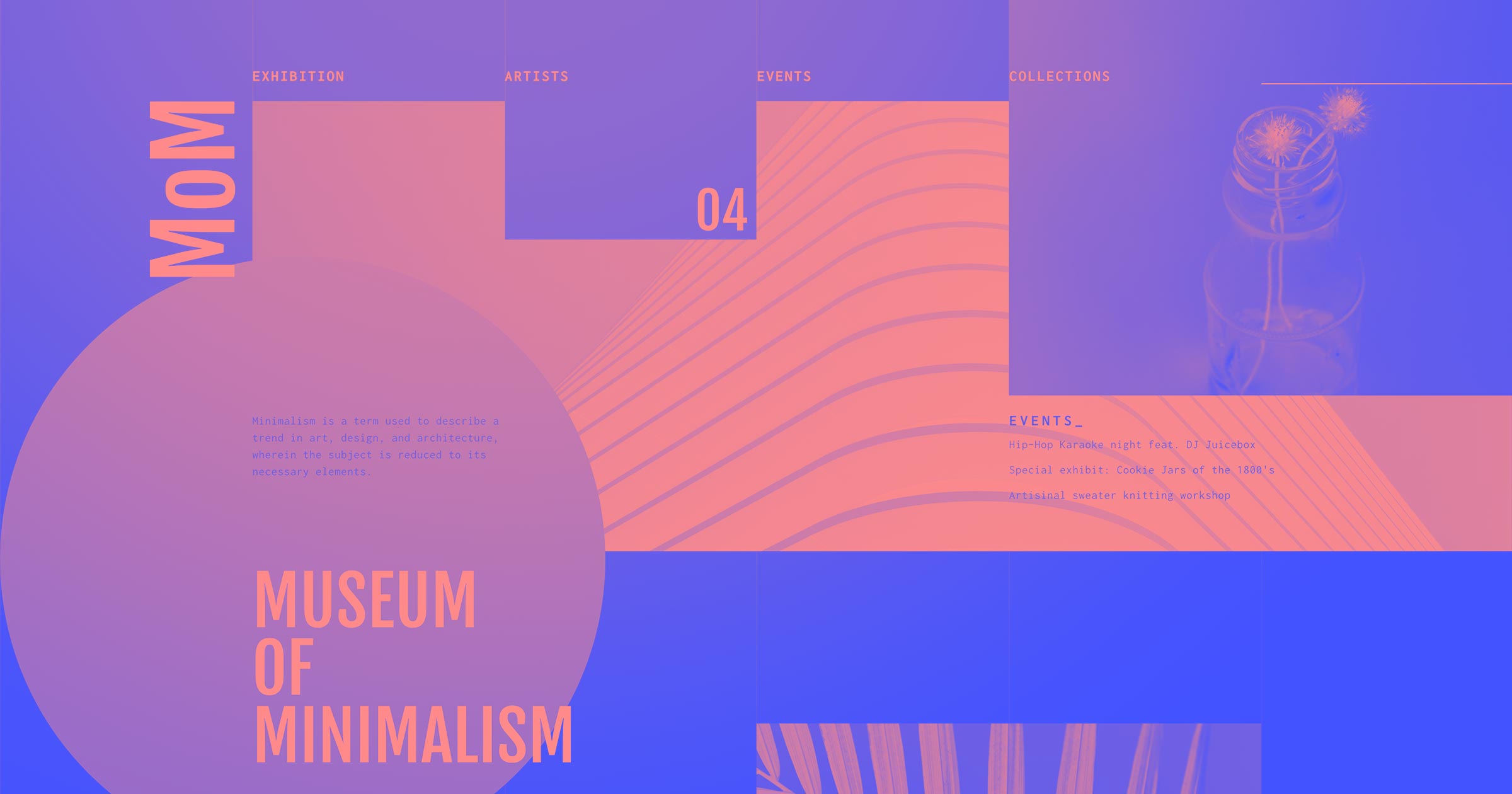
6. The Circle & The Square

On The Circle & The Square’s personal creative website, the artist duo showcases a loading animation rooted in their signature elements — a red square and a green circle. This simple animation fluidly transitions between these two shapes, depicting them as separating or overlapping. It’s a visual dance mirroring the collaborative nature of their work that also reinforces the interconnectedness of their individual contributions. Such design consistency subtly conveys the harmony and synergy between the two artists, making the website more memorable.
7. Glow Flow Yoga by Nina Park

Design team Ocrism Studio leverages Nina Park’s Glow Flow Yoga logo in their preloader design. The animation features a highlight circling the logo, functioning like a spinner, while the embedded flower motif gently rotates. This dual movement creates a serene, meditative ambiance that reflects the calm and focus that yoga promotes, effortlessly bridging branding and user experience.
8. Sundown Studio

Jordan Gilroy’s loading animation for design studio Sundown’s website showcases three words in the brand’s signature red and orange hues: environments, experiences, and content. This textual animation engages visitors and communicates the studio’s core offerings. Sundown also employs these distinct colors in their favicon, website design, and overall branding, immediately establishing a unified brand presence from the loading page.
9. Scream Truck
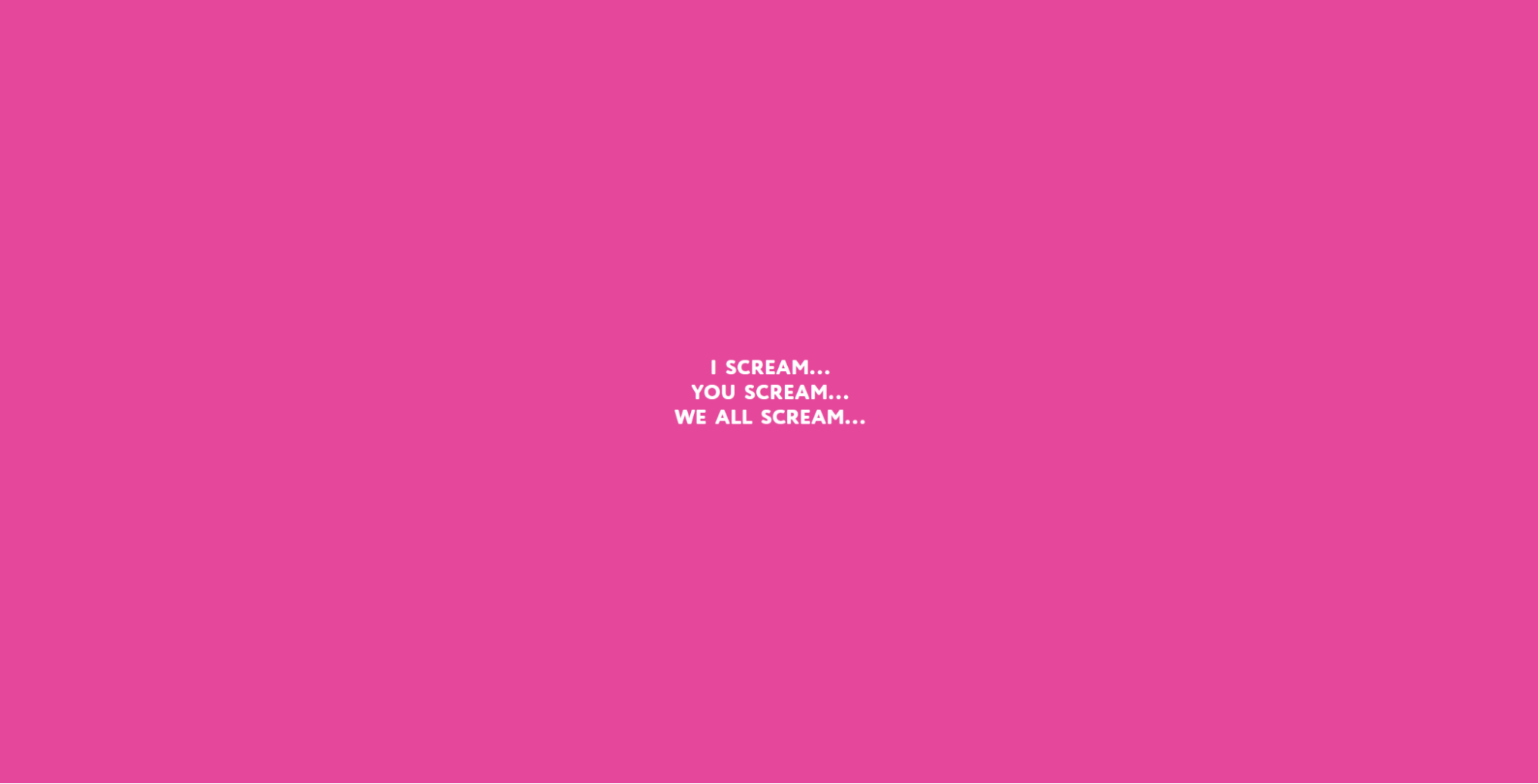
The loading animation for Scream Truck, a pandemic-born ice cream truck company, cleverly plays on the saying, “I scream, you scream, we all scream ... for ice cream!” This animation, designed by Josh Jacobs, introduces the company’s vibrant, bright-pink color palette and spirited brand voice, keeping visitors engaged with the unfolding text sequence. By purposefully omitting the last line, visitors naturally complete the phrase “... for ice cream!” in their minds, heightening anticipation for what’s next as the homepage is revealed.
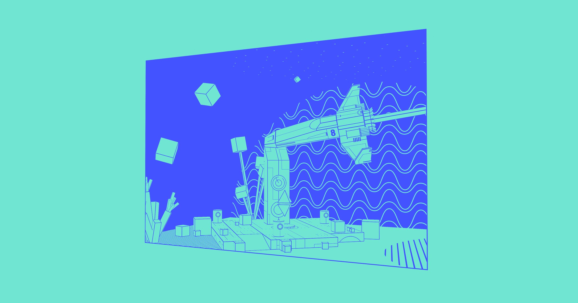
10. A Glance at Space

Matan Ben-david’s design for A Glance at Space, an exhibition site at the Bloomfield Science Museum in Jerusalem, features a cute loading animation of a cartoon telescope scanning the site’s starry backdrop. A Hebrew phrase below the telescope, translating to “looking for a star,” complements the telescope and further fosters a sense of curiosity, setting up a feeling of friendly inquisitiveness that’s a perfect match for a museum site.
11. Henry Ludlam-Steinke
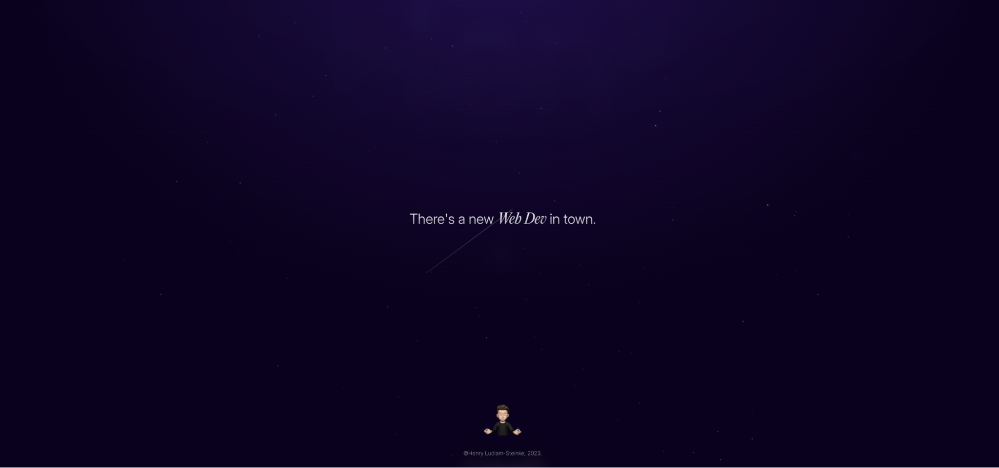
In a portfolio branded as Hen3, Henry Ludlam-Steinke showcases a loading animation highlighting design skills and unique style. The preloader features the playful text “There’s a new web dev in town,” gives viewers a taste of the site’s galactic theme through a star-filled background, and introduces Henry’s avatar. As users move their cursor, a spotlight tracks it against a backdrop of shifting stars, tying the celestial theme together and enhancing engagement on the loading screen through interactive elements.
12. Crunchy Cashews

Crunchy Cashews, an Indian cashew producer, has a beautiful loading animation crafted by design team Minimal Tweaks that tells a micro-story about harvesting cashews. The animation transitions from a cashew plant budding to cashews forming, then spiraling downward to settle on a leafy bed, echoing the brand’s logo. As well as impressing visitors with its complexity, this animation reminds them that cashews are a natural product.
Experiment with website animations in Webflow
Webflow’s drag-and-drop interface and animation integrations let you experiment with different loading animations to discover what works. If you’re not ready to create a custom preloader, you can start by browsing the cloneable loading animations available on Made in Webflow.
When you have a preloader you’re happy with, consider using a pared-down version when transitioning between pages on the site to keep the site’s design language coherent. And to find out more about animations and transitions, head over to Webflow University for tutorials, tips, and assistance.