Human-centered design places people at the forefront of the design process.
Integrating human-centered design (HCD) techniques into digital design work make the results uniquely accessible, appealing, and enjoyable to use.
Designer Stephanie Ng, for example, uses HCD principles to create beautiful and empathetic designs. When designing an interactive media management course for Centennial College, Stephanie started by asking department heads and instructors about the context in which students come to the course. She learned that most are international students who are probably feeling anxious and unsure about online learning.
She then created personas, mapped user journeys, talked to students to iteratively improve her design, and conducted extensive accessibility testing. The result is a beautifully organized, user-friendly course that makes online learning a fun and interactive experience and sets graduates up to make a positive impact in their field.
This is the promise of HCD: to create a positive experience that then ripples out to have positive outcomes for the wider community.
What’s human-centered design?
Human-centered design focuses on the person and their wants, needs, and feelings. With its focus on people and their needs, HCD can help you create even more engaging and useful experiences for website visitors.
Like user-centered design (UCD), HCD involves listening carefully to the people that your product will serve throughout the whole design process. But while UCD focuses on the end user in isolation, HCD zooms out even further to consider how the product will affect people’s daily lives, families, and communities.
Human-centered design vs. user-centered design
While they’re technically two separate approaches, human-centered design and user-centered design are similar. Both:
- Prioritize usability over ornate technological features
- Use empathy to understand user needs, perspectives, and experiences
- Incorporate user feedback throughout the design process
- Involve iteration and rapid prototyping to refine and create user-centric solutions
- Incorporate a variety of research techniques to uncover user needs and preferences
But there are a few subtle differences. In general, human-centered design employs a broader perspective. It considers the end user as an individual influenced by their social, cultural, and physical surroundings rather than someone solely navigating a user flow.
Human-centered design extends the principles of user-centered design to encompass a more holistic view of the user, going beyond their interaction with a product or website.
Here’s how it differs from UCD:
HCD integrates the broader emotions and contexts influencing a user’s life
Consider a health app — while a UCD approach might focus on easily inputting data and metric tracking, HCD would also explore users’ feelings about their health, the emotional challenges of tracking certain health metrics, and the societal and environmental factors affecting their health decisions.
HCD captures the systemic factors impacting the user experience
UCD focuses on enhancing the direct interaction between the user and the product, but HCD aims to understand all factors, both directly and indirectly related to the product, that influence the user’s experience and decisions.
Consider a transportation app. While UCD conventions might streamline booking and payment processes, HCD would take into account how the app fits into a user’s daily routine, their safety concerns, environmental considerations, personal budgeting, and even how cultural or physical factors influence transportation choices.
HCD encourages deeper, more empathetic understanding
While UCD encourages designers to segment users based on demographic factors such as age, gender, location, and cultural background, HCD directly involves users in the design process to understand the broader context of their lives. This includes understanding their needs, goals, pain points, and emotions beyond their interactions with the product. Doing so leads to more intuitive and personalized user experiences, and products or services that genuinely enrich users’ lives.
The 4 principles of human-centered design
Don Norman, one of the most lauded practitioners of HCD, identifies four key human-centered design principles in an essay on his website.
1. Solve the root issue
In the HCD framework, the details of a design are all part of a larger whole. Understanding your design as a holistic system rather than a collection of isolated parts helps you track problems to their sources. Taking the time to identify and target the root cause helps you avoid wasting time on quick-fix solutions that hide or relocate the problem.
To get to the root cause — which Don says is often an issue with the person’s environment, poor task design, or a misunderstanding of key contextual factors — he recommends asking “Why?” repeatedly until you hit the bedrock issue.
For example, let’s say a web designer from the U.S. is working on a site for a dentist in the Netherlands. The site analytics reveal a high bounce rate coupled with a low average time on site, so people are clicking to the site and then leaving almost immediately.
A designer working within a traditional framework might try to fix the problem by making the homepage more attention-grabbing — perhaps adding an animation and including more photos of perfect teeth. But an HCD-style investigation would reveal that there’s a cultural mismatch: People in the Netherlands don’t want to see bleached white teeth because they look fake — so all the bleached smiles on your homepage are turning them off. After consulting with Dutch website users, you’d realize they’d prefer a professional-looking page that focuses on practical concerns, like information about opening hours and a search function.
2. Focus on people
HCD begins with a deep curiosity about the people who’ll be using the product. Digging deep into the goals and motivations of these people requires continuous user research. To understand their context, include questions like these:
- Who will interact with the product?
- Who else will be affected by the product? (For example, in a healthcare setting, patients might be the only ones directly interacting with an app — but the results of these interactions may indirectly affect family members, healthcare professionals, and insurance companies.)
- What physical and social environments will they be in when they use the product? How might these affect their ability to use it?
- How do people in this social group usually perceive products like this? Are there any prejudices to overcome or knowledge gaps to fill?
Keeping the wider social ecosystem in mind when designing the site allows you to build websites that are people-first rather than tech-first. It can be fun to experiment with fancy features, like background videos, custom cursors, and scroll effects, but the first priority in human-centered web design is providing site visitors with exactly what they need while generating the most positive outcomes for them and the community.
3. Understand everything as a system
In HCD, everything is connected to everything else. One of the designer’s main jobs is understanding how each part of the system affects the others.
For example, when building a lawyer website, your user research might reveal that many visitors are first-time arrestees urgently looking for information about their case. To address this need, the mobile version of the site might include a prominent click-to-call button, enabling people to immediately connect with an attorney during critical arraignment hearings.
By recognizing the interplay between the website, the justice system, and the needs of recently arrested people, the design delivers an impactful solution that enhances the user experience and addresses their legal concerns.
4. Iterate and test
Good designers know human behavior is complex and dynamic, which makes it challenging to predict how individuals will interact with a design. That’s why HCD’s best practice is to quickly build and test a series of possible solutions in the form of prototypes. This helps identify problems early and saves considerable resources down the line.
It’s best to approach these rapid cycles as experiments rather than framing them as tests that your design will pass or fail. Through each iteration, you’ll gain valuable insights irrespective of the outcomes, with incremental advancements leading to noticeable improvements.
3 phases of the human-centered design process
According to design and consulting firm IDEO, HCD has three main phases: inspiration, ideation, and implementation.
1. Inspiration
In this phase, designers pinpoint the problem that their design will solve and conduct research to understand the issues more deeply. They’ll often start by reading about the field or industry they’ll be working with. That knowledge will allow them to conduct thoughtful interviews with people in the target demographic to find out more about their needs and desires. If it’s realistic to do so, some designers also choose to join the target community for a while to have these experiences firsthand.
2. Ideation
In this phase, designers connect the initial design problem with the insights from their research to come up with possible solutions. This process might involve grouping key insights according to theme, mind mapping, rapid prototyping, and hands-on user testing. As with UCD, HCD favors tight design cycles and repeated iteration to find out what works and what doesn’t.
3. Implementation
In this phase, designers take the final product and figure out the best way to launch it. This stage usually includes seeking funding, finalizing the supply chain (in the case of physical products), developing a pitch, launching the product, and setting up systems to monitor and improve the product continuously after it’s been released into the wild.


Ultimate web design
From 101 to advanced, learn how to build sites in Webflow with over 100 lessons — including the basics of HTML and CSS.
How to integrate human-centered design into your web designs
Observing the entire HCD process in a finished design isn’t always easy, but there are always recognizable traces in the final product. Here are some suggestions to help you apply HCD principles and some human-centered design examples that demonstrate the tips in practice.
Test the site on a wide range of people with diverse needs
Human-centered designs are for all types of people, so use a diverse cross-section of future users to test your designs. Deliberately seek out people with different cultural and linguistic backgrounds, ages, and accessibility needs. When creating a site, follow accessibility design guidelines, and use an accessibility checklist to avoid accidentally leaving a group of users underserved.

Berlin-based creative agency HENKELHIEDL actively incorporates accessibility and inclusivity in their design for the FESTIVALFRIENDS website, an association for independent performing arts groups in Germany.
The site offers options for simplified language to make the content accessible and understandable for a wide range of users, including people with cognitive and learning disabilities. HENKELHIEDL also includes a toggle for sign language that integrates videos to communicate the site’s contents for people who are deaf or hard of hearing.
For visual accessibility, the site’s plain colored backgrounds contrast clearly with the black text. These color choices enhance legibility for people with visual impairments who might find reading low-contrast text challenging.
Show how your product or service fits into the wider community
A human-centered website exists as part of a community. Highlight the ways your product or service brings people together and its positive effects on groups, relationships, and physical environments — not only its benefits for individuals.

The Tulsa Birth Equity Initiative is a nonprofit organization that provides pregnancy and birth support to Black families in Oklahoma with the goal of reducing preventable birth- and pregnancy-related deaths in the state’s Black community. This site, designed by Pixelida, is a warm, welcoming community hub that serves as a meeting place for healthcare professionals, expectant parents, and the broader Black community in Tulsa.
The TBEI landing page shows family photos arranged casually, as though they’re hanging on a fridge. This design gives the impression that the community is one big loving family and encourages hesitant new visitors to reach out for support. The thoughtful microcopy on the two CTA buttons — “Find support” and “Offer support” — also communicates that this is a strong community where people offer and receive help freely.
Make it fun
Human-centered design isn’t just about making things easy to use — it’s also about pleasure and delight. Human-centered web design helps people express their innate playfulness by adding novel animations and interactions that make visitors feel good while exploring the site.

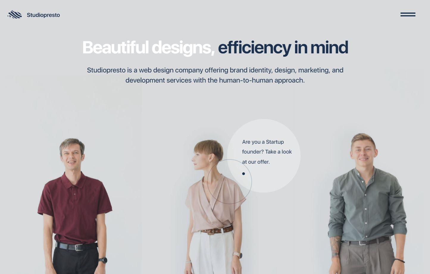
The website interactions crafted by the Ukrainian design team Studiopresto are playful and positive. First, the landing page opens with individual images of the three designers that change position and facial expression when you hover over them. When you scroll down, the designers raise their arms and pull down the next section of the site as though it’s a set of window blinds.
These whimsical interactions reflect the studio’s human-to-human approach. They allow you to interact with the designers individually, which breaks the ice for new clients and serves as a natural lead-in to interacting with the designers more directly.
Design for everyone
The human-centered approach starts and ends with humanity: the strengths and individuality of the people using your site, your empathy and humility as a designer, and the wider community encompassing them all.
Integrating principles of HCD into your website designs will allow you to harness your visitors’ input and insights to craft something greater than the sum of its parts. Learn more about HCD principles, including user testing and leveraging analytics and targeting tools, by visiting Webflow University. Access free lessons on web accessibility, how to create interactions and animations, and more to create a platform that exceeds your users’ expectations.

Get started for free
Create custom, scalable websites — without writing code. Start building in Webflow.


.jpeg)


