Keeping end users in mind is a must when designing for the web. But how well do you really know what people want? User-centered design takes away the guesswork by incorporating user feedback at every stage of the web design process.
Usability matters. Just ask the man who accidentally bought 60 pairs of reading glasses because he couldn’t see the quantities on the screen.
User-centered design (UCD) ensures the design is actually usable for its intended audience by involving users from start to finish. This allows designers to tailor products to users’ needs — not the assumptions or preferences of the designer. As a bonus, this strategy saves time and money and ultimately yields higher-quality web designs.
Even if your website appears to be functioning well, there’s always room for improvement. For example, philanthropy platform Every.org seemed successful based on donation amounts. But when their design team looked at screen recordings of user behavior, they saw visitors rage clicking multiple times on the donate button and then leaving the site. Equipped with this information, they improved their user flow and saw a 29.5% increase in donations. That’s the power of user-centered design in action.
What is user-centered design?
User-centered design involves understanding users’ behaviors, needs, and preferences through research and then applying that information to guide the design process. A development approach that originated in the field of human–computer interaction (HCI) in the 1970s, UCD applies to any design work, whether you’re designing furniture or mobile apps.
While UCD takes a holistic approach to design, user experience design (UX design) creates intuitive and efficient user experiences by designing interfaces, interactions, and user flows. UX designers leverage user-centered design principles and techniques, such as consulting end users during the design process to better understand their needs and preferences. Unfortunately, many designers overlook this step, as conducting user research is resource intensive. However, false assumptions about user needs can lead to developing products that seem promising on paper — but ultimately fail.
UCD involves a larger layout of resources during the design process, but it saves time and money for two reasons: First, user tests at the early stages of the design process pinpoint issues that you might not otherwise notice until later, allowing you to course-correct before investing too many resources. And second, incorporating user feedback at every step helps develop web designs that consumers are ultimately more likely to engage with — leading to increased sales and conversions.
The 4 key principles of user-centered design
Following user-centered design principles protects your projects from inadvertent bias and ignorance about user needs. Here are four principles central to the UCD process.
1. Empathy
Being able to perceive things from the user’s point of view is the cornerstone of user-centric design. Empathizing means understanding your target audience’s needs, desires, abilities, and constraints and incorporating them right from the start. For example, a website might accommodate older adult users by using a larger font size and streamlined user interface (UI) design elements, such as bigger buttons, expanded form fields, and more prominent calls to action.
2. Data-driven decision-making
People with different skills, ideas, and habits will use your website and products, so relying solely on assumptions and intuition can lead to design decisions that don’t meet your users’ needs and preferences. This is why data-driven decisions are crucial to UCD.
By leveraging website analytics tools and A/B testing, you can collect aggregate data about user behavior and even watch recordings of actual users navigating the site. Analyzing this data allows you to tackle user pain points and create a site welcoming to all users.
3. User involvement throughout the whole design process
All successful design processes incorporate the user at some stage. They might draw on market research, conduct usability testing prior to release, or deliver a minimum viable product and iterate based on user feedback. UCD deliberately incorporates the user throughout the whole design process.
To include end users in the website design process, you might establish mini design-build-test cycles so you can continuously receive and incorporate user feedback into each draft of your web design.
4. Alignment of business goals with users’ needs
Most user-centered design outputs broadly align with business goals: Consumers are more likely to be satisfied and engage with the website, increasing sales and building brand recognition. But you can also align goals on a more micro level.
For example, in website design, you could align a business goal to boost sales with a user goal to save time by streamlining and improving your checkout processes. Or you could work toward expanding your email marketing list by providing users with valuable content upon sign-up.
The user-centered design process
The classic user-centered design process has four phases, each of which recenters the user:
Phase 1: Specify the context of use
Aim to deeply understand the user’s needs and preferences to guide the web design. When conducting user research, consider the following questions:
- Who will use the site?
- What are their desires, goals, needs, capabilities, and limitations?
- What will the user environment be like?
- How will users feel while using the site?
You can get answers to these questions through user interviews, focus groups, surveys, contextual inquiry (visiting a person in the target environment and talking to them about what they’re doing), and field research (observing people’s behavior). Website analytics tools and A/B testing tools are great ways to observe users’ needs and preferences when navigating a web design — especially if you don’t have a budget for in-person interviews and focus groups.
Phase 2: Specify business and user requirements
Determine the user goals you want to focus on and how your design will help users achieve them. Conduct interviews with stakeholders involved in the web project to learn about the company’s goals, requirements, and limitations or challenges, such as budget constraints and regulatory requirements. Follow up with even more user research to dive deeper into what users need and desire from the website and any difficulties they’re currently experiencing.
Phase 3: Generate design solutions
Explore several different options for your web design. These could come as sketches, storyboards, wireframes, mockups, user journey maps, user flow diagrams, or prototypes.
Phase 4: Evaluate designs
When you’ve identified your most effective design solution(s), build a high-quality prototype and conduct usability tests. Put the tester in the same position as the end user and have them complete target tasks like navigating through the prototype site, filling out forms, or making a purchase.
During usability testing, record:
- User comments
- Emotional reactions like frustration or satisfaction
- Time taken to complete the task
- Common errors and error rates
Be sure to include a broad cross section of users when testing. Focusing your tests on a narrow slice of your target market — like a specific demographic or geographic location — risks introducing bias and tailoring the design to a small subset of users. For example, one study found that for Black users, the error rate of automated speech recognition software is nearly double that of their white counterparts, while a passport photo recognition system in New Zealand rejected an Asian man’s photo with the error “subject’s eyes are closed.”


Build websites that get results.
Build visually, publish instantly, and scale safely and quickly — without writing a line of code. All with Webflow's website experience platform.
How to apply user-centered design to websites
Even if you have a limited budget for research, you can still gather valuable insights and feedback from users. Here are some simple ways you can incorporate UCD into your web designs.
1. Follow accessibility best practices
Incorporate accessibility best practices into your design to allow as many people as possible to use your site comfortably.
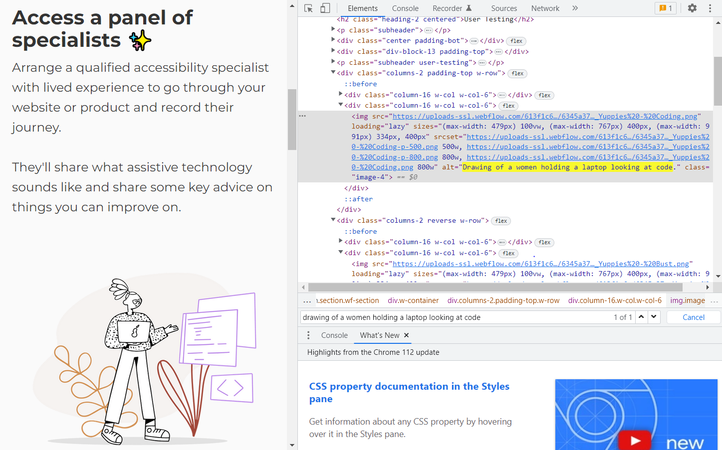
Maximizing a website’s accessibility includes ensuring all images have alt text, displaying motion warnings, avoiding parallax effects, and using inclusive language. To cover as many elements as possible, use an accessibility checklist during the design process. In the testing phase, include users with a range of accessibility requirements.

For example, the Hello Access site, designed by Steven Male, includes alt text for all images so users accessing content through screen readers don’t miss out on any information.
2. Use the principles of visual design to guide users through each page
To help each user build a mental model of the site content as they click and scroll through, use the main principles of composition in design: Create a visual hierarchy to guide users through the site in a logical order, and establish cohesion through repeating elements. Use contrast to highlight important information and white space to make site navigation easier.

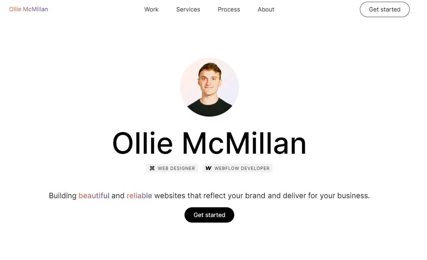
The landing page of Webflow designer and developer Ollie McMillan’s portfolio site is a good example of user-centric design. Ollie establishes a clear visual hierarchy on the page by using different font sizes and text positions, drawing attention to his name and mission of building beautiful websites. White space focuses attention on the center of the screen and his call-to-action (CTA) button.
3. Design with different types of users in mind
Prioritizing the needs and goals of site visitors involves anticipating and providing a clear path to achieving them. To achieve this, make navigation bars, menus, and other UI elements simple and intuitive. If you have multiple types of users, map out a different user journey for each type.

Canadian mental health startup Inkblot Therapy caters to multiple target markets simultaneously: individuals searching for therapists, organizations looking for employee well-being programs, and therapists looking for clients. Designer Ben Celinski accommodates new visitors who have little or no information about the service through a navigation bar that provides clear entry points for each demographic.
4. Tailor the user experience
In user-centered design, the focus is on determining what your users want and creating designs that meet their needs. For example, user data for an ecommerce site might reveal a particular browsing pattern or preference for specific products. You can apply these insights to structure the site’s layout to support these browsing patterns and optimize search and filtering options to make it easier and more enjoyable for users to find what they’re looking for.
![Greeting card site showing cards in the thank-you category.]](https://cdn.prod.website-files.com/687e8d1b96312cc631cafec7/68c493eb7896cdecaf6bcd12_6480cf54822d6be6ac243938_647eb00f9daae9e4fd1cc509_7a63daa8.png)
As part of the design for the Twigs eco-friendly paper goods site, designer Eric Koenig includes a category filter that allows users to browse greeting cards by category. Most people buying greeting cards have a specific occasion in mind, so this filter helps them browse the most relevant options.

The My Little Loves Wax Co wax melts website, designed by Gravita, allows users to check multiple scent category boxes simultaneously. These prospective customers are less likely to have a specific scent in mind and more likely to come in with broad preferences, making this category arrangement ideal for browsing.

If you’re looking to build your own house, chances are it won’t be an impulse buy — you’ll want to think through the process carefully. Jonathan Morin, the designer of the Dvele website, provides an interactive experience to build an ideal new home. The site introduces visitors to the brand and involves them in the design process in an entertaining and low-stakes way, opening the door to a potential purchase.
5. Use self-paced learning for complicated products
Presenting too much information, too many options, or an overload of tasks can cognitively overwhelm people, causing them to lose interest. If your product will be unfamiliar to most users or requires complicated explanations, incorporate self-paced learning into your website so visitors can go at their speed.

For plant-growing equipment site GrowTech Solutions, explaining a complex new product to site visitors is a must. To do this, site designer Redis Agency incorporates self-paced learning through hover effects: Users hover on the plus signs over a diagram of the product to expand the information about each feature individually.
Use design techniques that show users they matter
At the end of the day, companies that genuinely care about their customers will have customers who genuinely care about their products. As a designer, you can help ensure this happens by incorporating users’ needs, wants, and feedback at all stages of your design process.
You may even find that user-centered design is just a starting point. If your design will address broader social challenges, consider exploring human-centered design. And to give your users more freedom of choice, take an ecosystem design approach.
Whatever type of design approach you take, you can use Webflow’s visual site builder to create a stunning site that’s easy and enjoyable for users to navigate. Get started with Webflow today.


.jpeg)


