Finding effective design workflows can be a bit of a challenge and often requires significant back-and-forth communication between clients, designers, and developers. But it doesn't have to.
Mockups aren't the best solution
Before I tell you about the awesome solution, let me paint a picture of the not-so-cool problem.
Designers generally create site designs using Photoshop or Illustrator—using multiple layers and files to show different pages, hover states, and screen sizes. Then, after repeated discussion between stakeholders (and awaiting approval), designs are either implemented by the designer, or passed off to an unrelated developer.
Back-and-forth is required when they ask for clarification on your design details, when they ultimately point out technical limitations, and simply when they deviate from the design as prescribed. Depending on the extent of the changes, the client might have to get involved again, leading to a sometimes annoying three-way push-and-pull.
This is inefficient. Repetitious back-and-forth can easily increase development time several-fold. The remedy, as you may have guessed, is to replace mockups with a fully-functioning prototype—in this case, an actual interactive website. This is tremendously powerful because working prototypes are:
- Closer to the final product, so it's faster to go from approved design to final site.
- In the same medium as the final product. So everything you build into your prototype can be achieved with HTML and CSS, unlike Photoshop.
- Visual and interactive. Clients, and people in general, find it difficult to visualize a final product based off static images alone.
- Better for implementing responsiveness. You can open the prototype on various devices and show/test them directly without blindly assuming your design breakpoints are reasonable in real-world environments.
- More interesting and exciting for the client. You can add interesting animations and UI (user interface) flourishes to liven up the design. Given Webflow's powerful Interactions features, this is oftentimes a really fun, no-brainer add-on.
Let’s dive into these benefits and explain why they’re so valuable to you, your client, and your general sanity as a designer. The more you can appreciate live prototypes, the more you’ll get into the habit of efficiently using them, and the happier your clients will be.
Related reads: The best Photoshop alternatives (free + paid)
Prototypes are closer to the final product
When a prototype is approved by the client, it’s incredibly fast to wrap up the site and have a final deliverable because the prototype was nearly deliverable to begin with. This is significantly faster than having to then either contract a developer to implement your designs in code, or doing it yourself. Avoid making the site twice, once in Photoshop, and once in code.
Consider how, when using Photoshop, you can create design elements that aren’t actually feasible using HTML and CSS—potentially forcing you to redesign them when you begin building the real site. Depending on how big the change is, this could even require getting approval from the client again—which can not only could increase development time, but could also make them lose confidence in you. Using HTML and CSS to create a prototype ensures that everything you design is possible in the final product.
There also won’t be any surprise for the client when the final product and the prototype look almost identical, which isn't the norm when translating static mockups to websites. Fonts are particularly notorious for rendering differently in Photoshop and the web, which oftentimes leads to last-minute font changes that might not “feel right" to the client. This leads us to:
Prototypes are easier to visualize
Visualizing a final product can be extremely difficult. Sure, designers can easily visualize a final product from a mockup. The average person, however, has trouble seeing beyond a simple representation in order to appreciate potential for beauty and functionality.
This is where working prototypes really shine. Instead of handing your clients a series of PSDs, images, or drawings—where everything is static and lifeless—give them a living example they can play with.
It’s important to let your clients click on buttons and links so they can see how they change and where they link to—rather than handing them a folder of PSDs they need to navigate to get the whole story. The easier it is for clients to appreciate your design work, the happier they are, and the more agreeable they’ll generally be to work with.
Prototypes make designing for responsiveness easier
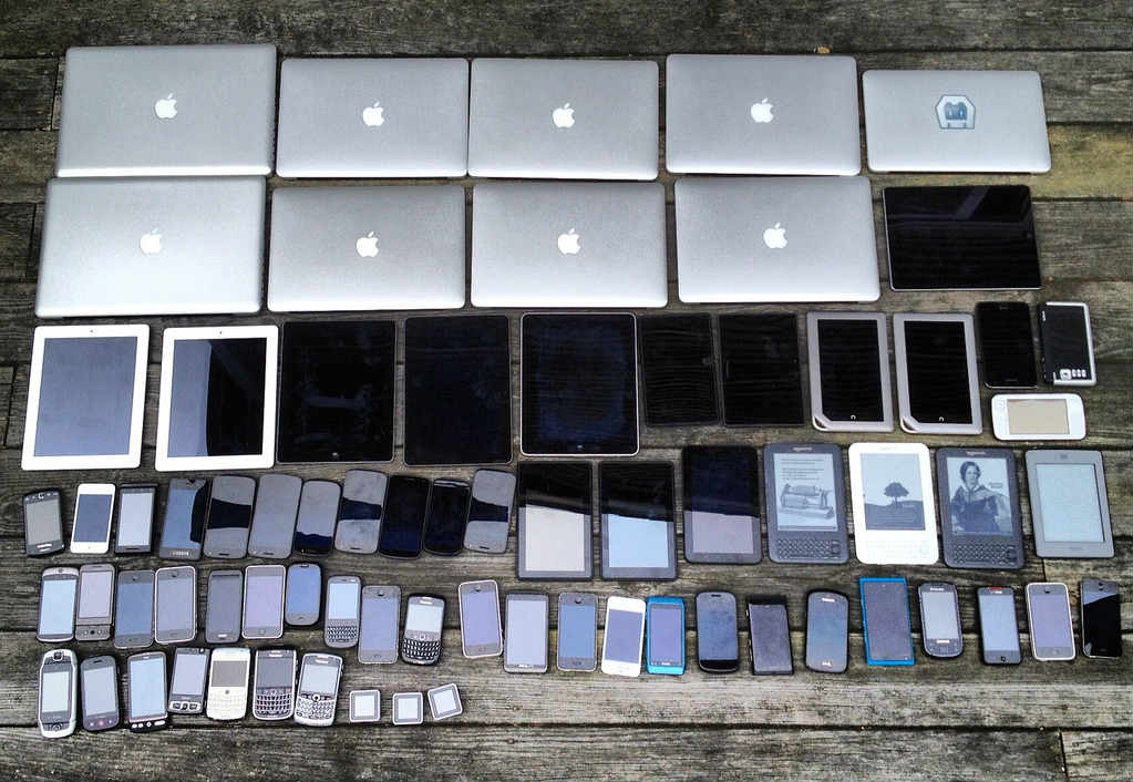
Gone are the days where we opened up Netscape to view web pages 990px wide and laid out a site using a series of tables. It’s 2017, and people now browse the web on screen sizes ranging from 3" to 100", in various aspect ratios, orientations, pixel densities, and resolutions. Just look at some of the possible devices that might be accessing your site:

As you can see, we simply cannot create a single fixed-width design and expect that to meet the demands of our clients anymore. Without mobile-friendliness, user experience will suffer for 50% or more of the visitors coming to your site. In fact, Google now penalizes sites for not being mobile-friendly.
But you know that. That’s why you create a minimum of two PSDs, one for mobile, and one for desktop, and maybe a couple more for tablets, and landscape vs. portrait orientations. That’s a huge improvement, but also a lot of work.
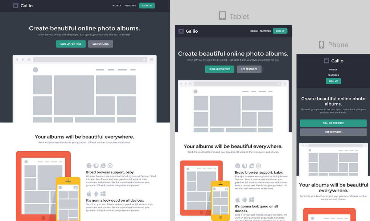
In contrast, building a prototype using a mobile-friendly framework like Bootstrap (a free collection of front-end design tools for rapid website creation) makes it simple to create a site that’s responsive from the start. But, you're a designer, and you might not like to code. Not to worry, we’ll address that momentarily.

How to create functional, high-fidelity prototypes
Perhaps you don’t currently use working prototypes because a) they generally take longer to make, b) you aren’t very savvy or confident with HTML and CSS, and c) it’s slower for you to iterate on. Unfortunately, however, more of b) also leads to more of a).
You’re a designer. You know how to design things using tools like Photoshop, yet the actual coding of your websites often ends up in the hands of a developer. On the surface, that sounds kinda crazy. And you might think your hands are tied.
But that’s actually not the case. There’s no complex logic or mathematics involved in learning HTML and CSS, like there is in true programming with languages like Javascript, C++, or Ruby. The basics of HTML and CSS can be learned in a day. HTML is a simple way to structure page content, and CSS is a series of property-value pairs (color: red, display: none). Not overly complicated. Mastering them, however, does take some time thanks to some of its peculiarities. But, considering the benefits of a working prototype, it’s well worth the effort. Check out Codecademy’s HTML and CSS course to get the basics down for free.
Remember, only you appreciate the nuances. Small details are what take a design from good to great. Don’t let those ever get lost in translation.
The zero-coding route
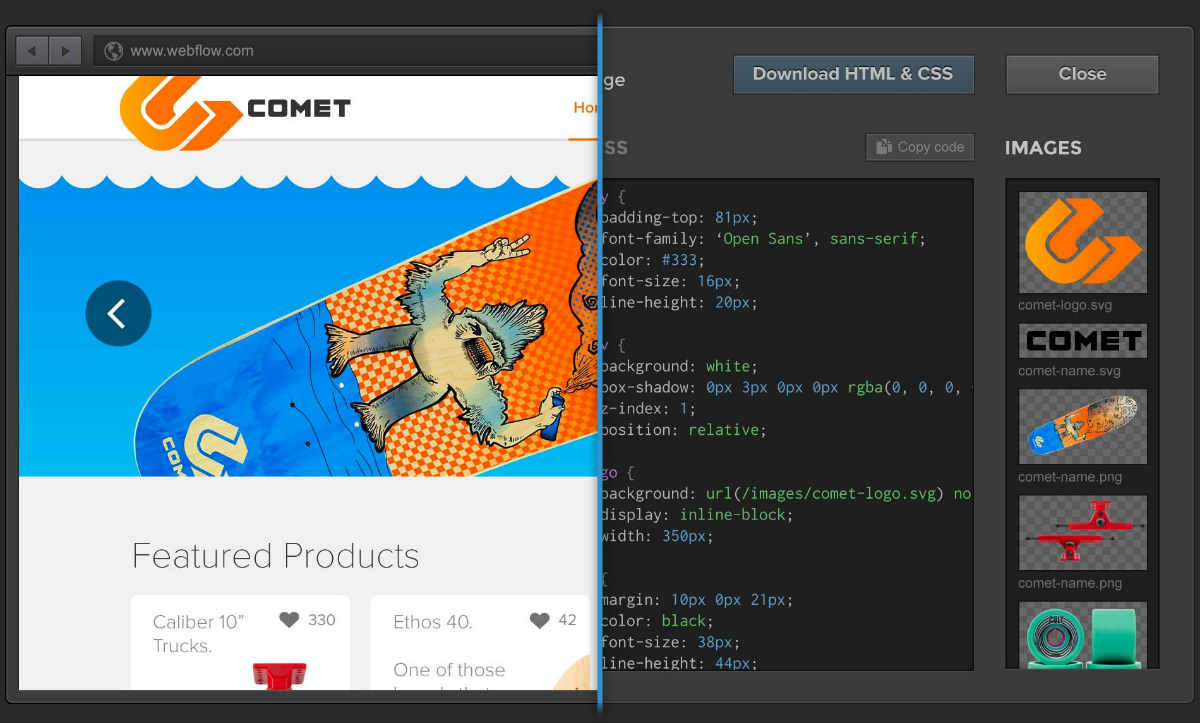
If you’re not looking to code (understandable), or simply want to drastically improve the client/designer back-and-forth, the best alternative is a WYSIWYG (what you see is what you get) site builder. There are several out there, such as tools that convert Photoshop designs into HTML and CSS (or at least try to) and the tool I love to use for my freelance work, Webflow. A pro tool like Webflow allows you to design and distribute a website using a graphical interface, rather than lines of code in text-editor—an experience much closer to what you’re already used to in Photoshop!
.png)
I use Webflow to design and build functioning websites. It has an interface that's easy for me to quickly master: You can drag and drop elements onto the page (including fully customizable widgets such as contact forms) and alter spacing, colors, fonts, positioning, and more.
Webflow uses the mobile-friendly, front-end framework Bootstrap at its core—making basic responsiveness nearly automatic for me. I only have to perform a tiny bit of visual customization. I can also quickly swap between four standard mobile device sizes to preview, test, and customize responsiveness far above and beyond what coding with Bootstrap provides.
Animations and transitions that work across all modern browsers and mobile devices are also a snap using Webflow's Interactions—allowing you to add spice to your site in seconds. No coding required.
When you have your working prototype ready, you can easily send your client a preview link to interact with in real-time. This doesn’t push the site live – only you and whoever you share the private link with will have access. This lets you work in privacy, and receive feedback from any clients you choose.
Lastly, once you’re ready to go public, you can push the site live through our hosting platform, or export pristine HTML and CSS code to use anywhere. You’re not locked into using our platform if you don’t want to be. Create the design, export the code, modify/customize it as you wish, and host the site anywhere. This is true professional web design from scratch.

Wrapping up
Working prototypes offer huge benefits over mockups, and can significantly improve the designer workflow. With designs that work from day one, you can reduce back-and-forth and recapture what it is you love about design.
To create these prototypes, you’ll need to learn how to create basic, functioning websites, which leaves you with the options of either learning to code or using a visual site builder. Coding offers complete customization, and requires no tools other than a text-editor, but learning it takes time.
Professional-quality site builders, like Webflow, offer a more designer-optimized interface similar to Photoshop. Webflow also has mobile-friendly templates that you can work off of if you want to get a headstart on projects.
Taking either route will allow you to reap the benefits of working prototypes, and will remove expensive developers (Sorry, developers! We still love you!) as much as possible from the equation — maximizing your own freelancing revenue and ensuring your designs are exactly the way you want them.


Get started for free
Create custom, scalable websites — without writing code. Start building in Webflow.


