If you thought you’d seen it all when it comes to websites — these January 2022 sites are going to change your mind.
Bold, colorful, and innovative design was the name of the game for this past month, with the Webflow community showing off their interpretations of personal portfolios, a pizza restaurant website, and even an interactive game (!!!) from Made in Webflow.
Here’s our rundown of some of our favorites from this past month.
1. OK Micah
Kicking off 2022 is OK Micah — a design studio that helps brands “break the binary,” and create innovative and unique websites and designs. Their work has been featured in publications like Vogue, InStyle, Allure, Essence, and Paper Magazine.
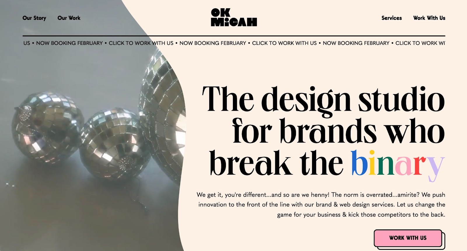
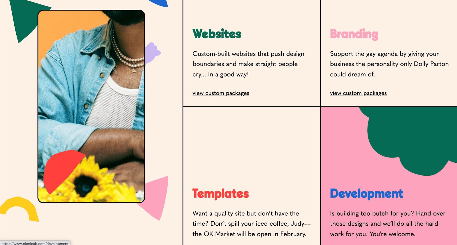
With bright colors and thoughtful animations — OK Micah’s site brings the fun, and more importantly shows the joy and whimsy that they bring to client work as well. In particular, we love how the OK Micah site really embraces their own unique voice. From Dolly Parton to supporting the gay agenda — the site copy is full of humor, sass, and dare we say it — fabulousness.
When marketing to potential clients, it’s important to show a unique point-of-view to set your business apart, and let potential clients get to know you. A great way to do this is through the copy and voice — and OK Micah is a great example to refer to.
2. Kinsey Gross
Kinsey Gross is a designer and illustrator from Seattle who works full time as a product designer at Pioneer Square Labs and does client work on the side.
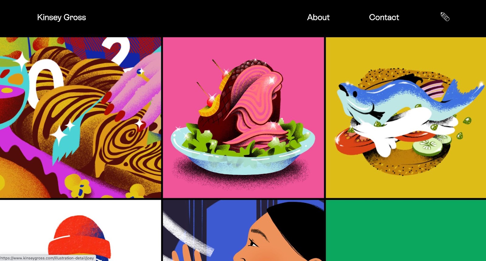
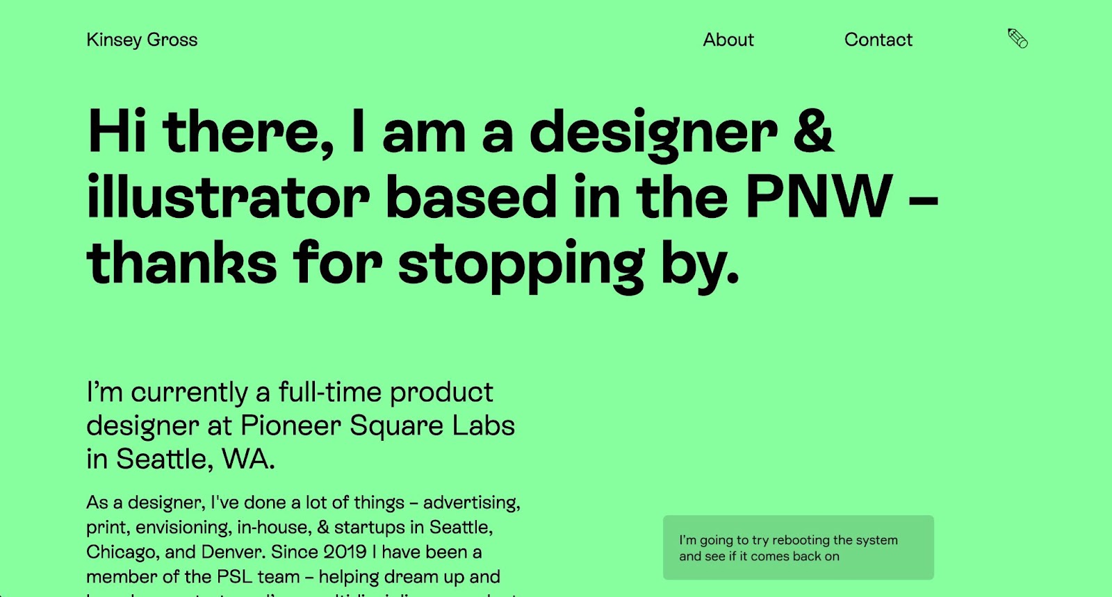
Kinsey’s work is eye-catching and we love the simple and streamlined layout. This site is the perfect platform to feature Kinsey’s illustrations and show off their work without too many distracting design elements.
On pages that don’t show their work, Kinsey uses a bold lime green to almost mimic the colorfulness of their illustrations while still balancing the overall simplicity of the site.
3. 24th Pizza and Meatballs
Have you ever seen a website for a pizza restaurant that looked this good? Portland-based 24th Pizza and Meatballs pairs a vintage pizza shop with a modern design approach.
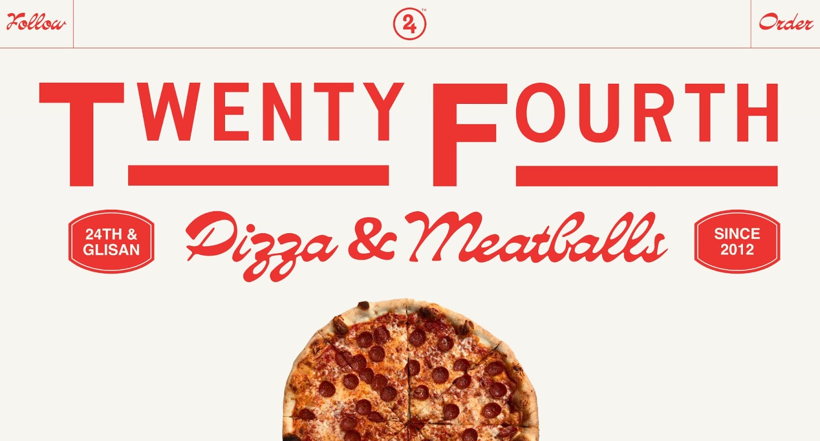
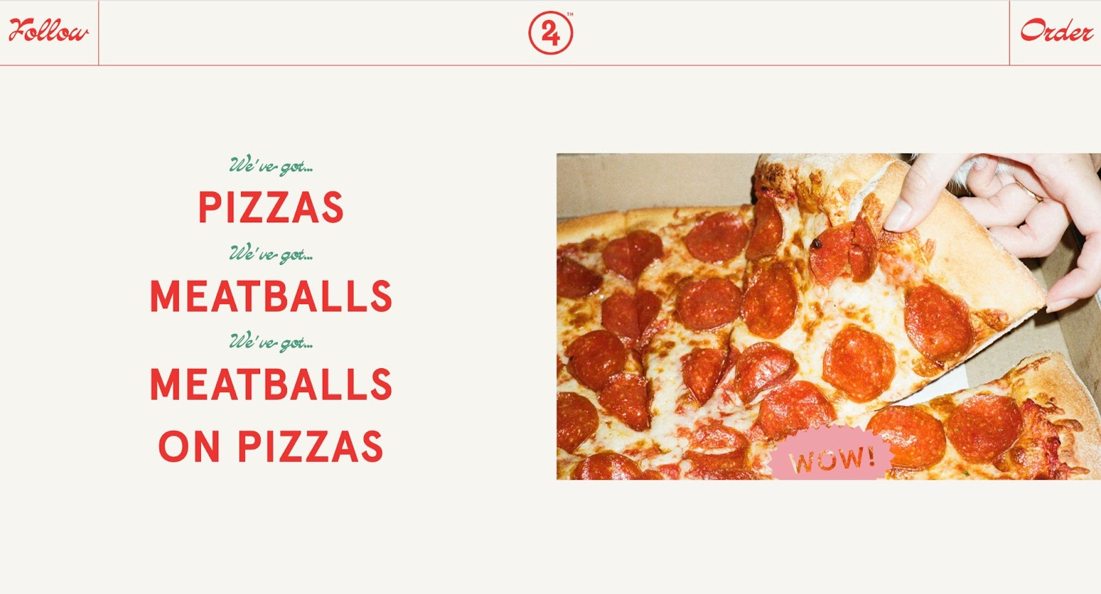
We’re obsessed with the mix of old and new, and especially love how the vintage font and photography are mixed in with modern minimalism and animation. It’s the perfect combination of nostalgia, quirkiness, and smart design. Plus, it helps turn a pizza website into an experience.
4. Koyi Tsang (Cloneable)
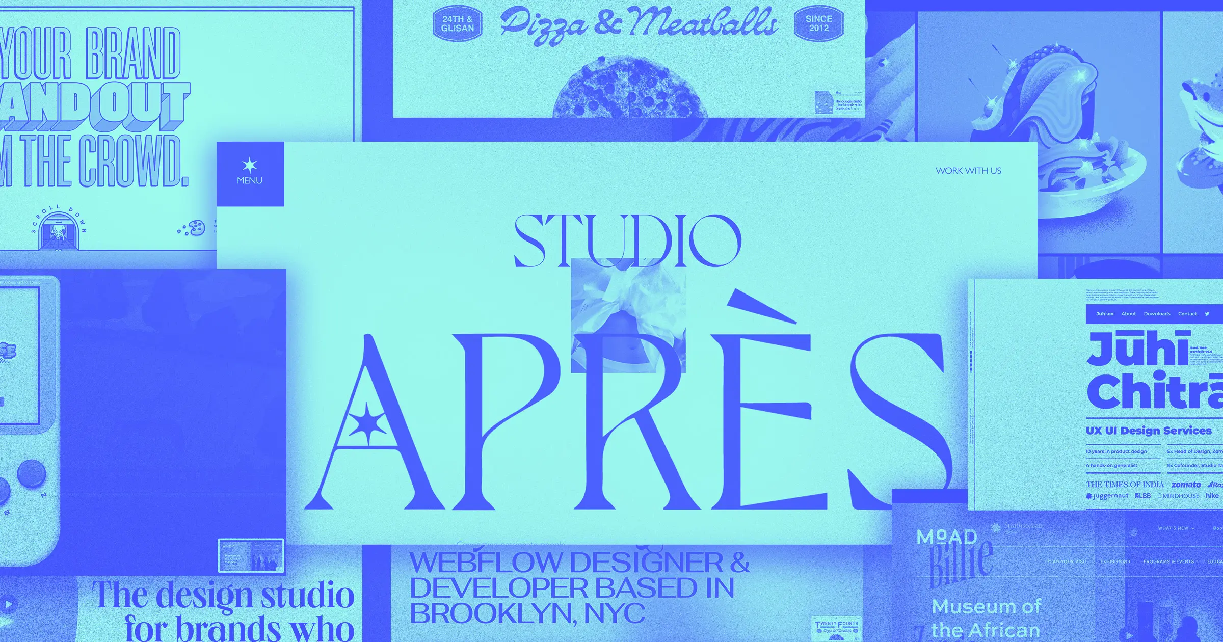
Koyi Tsang’s portfolio is an excellent example of balancing clean design with maximalism. Koyi — a Brooklyn-based Webflow designer and developer — uses bold typefaces, color, and locomotive scrolling alongside white space and clean lines.
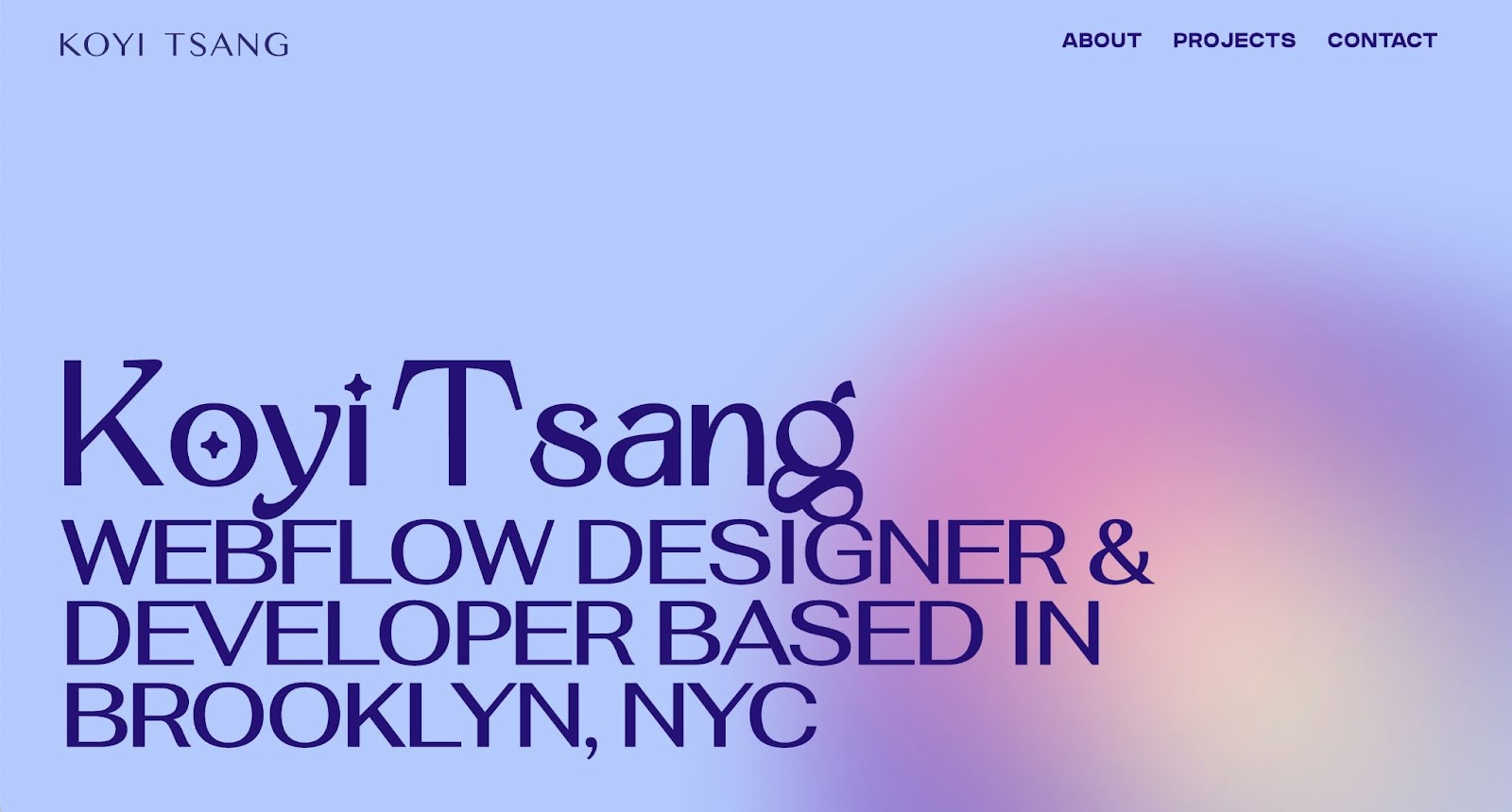
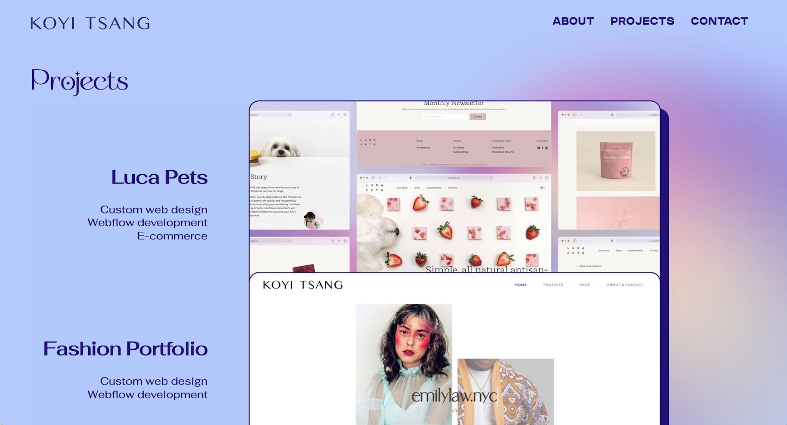
The key to Koyi’s site is her deliberate use of light and airy colors. By choosing muted versions of blue, yellow, pink, and purple, Koyi turns the colorfulness of the site into something a bit more ethereal. This allows the color palette to add a sense of calm to the bold design elements.
The best part of all of this is that Koyi’s made her portfolio into a cloneable, so you can bring this simple and striking design to your next project.
5. Antonio Segurado
Antonio Segurado’s value proposition to his clients is that he’ll “let your brand stand out from the crowd.” He backs up this claim with his own unique branding and site.
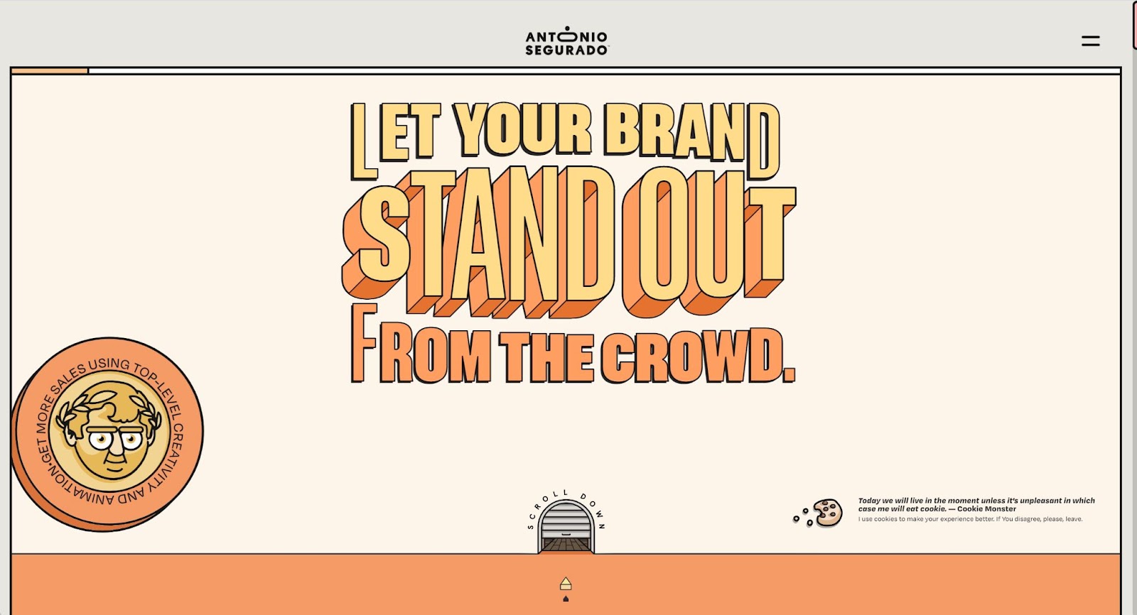
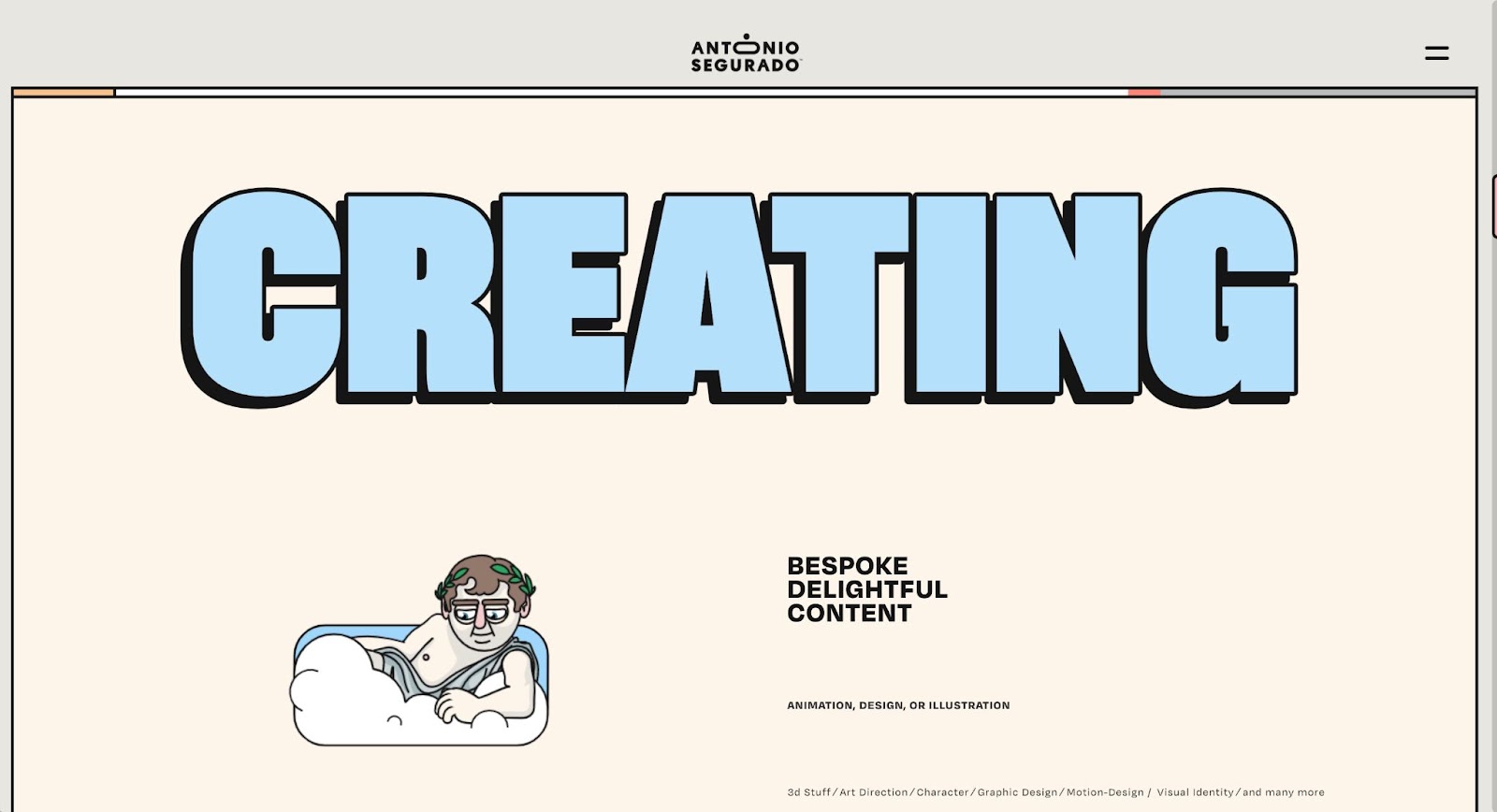
Antonio mixes muted color with bold design elements, showcasing his own personality with custom illustrations along with quirky copy and text. We especially love how Antonio makes oversized typography the star of the show by making text the focal point of each section and incorporating text animations as you scroll.


Get started for free
Create custom, scalable websites — without writing code. Start building in Webflow.
6. Studio Après
Arizona-based Studio Après’ mission is all about “connecting passionate people to high-end, specialty designs.” They specialize in overall branding, web design, and ecommerce sites.
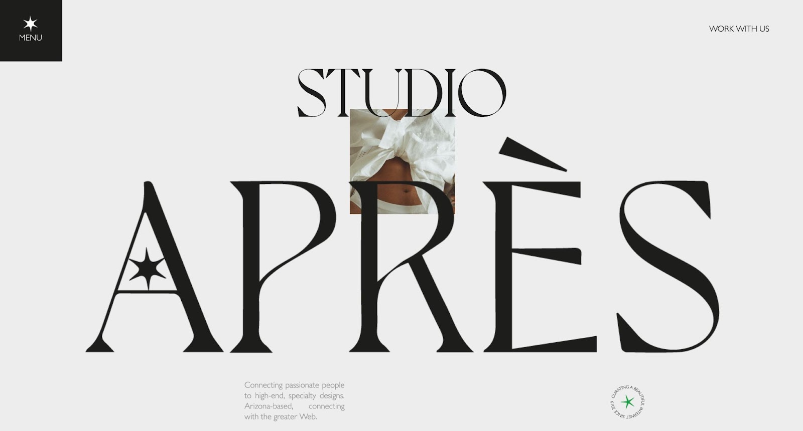
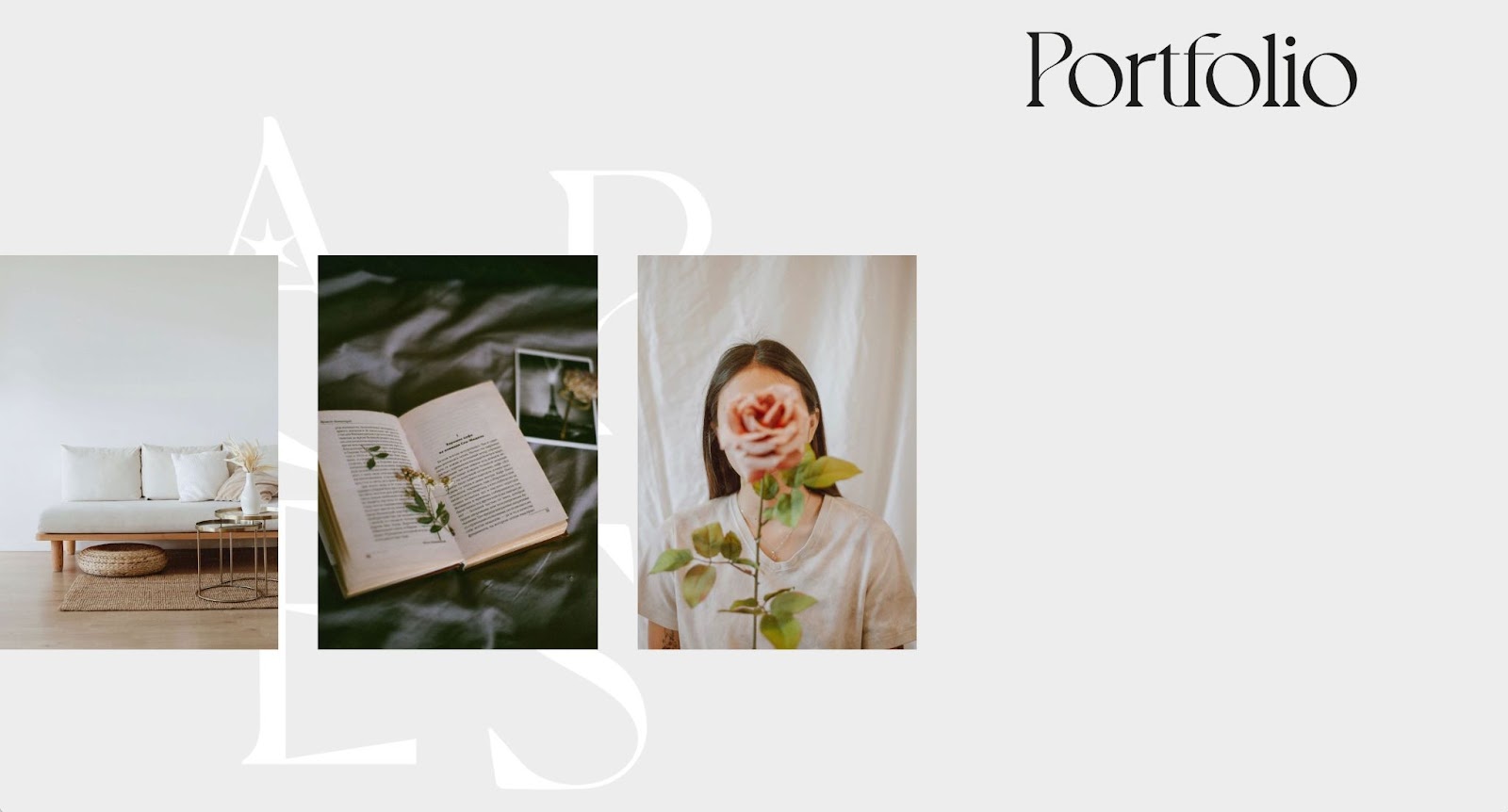
With Studio Après’ site, they convey their style of design and unique point of view clearly and effectively through their use of bold type, artistic imagery, and whitespace. All of these elements come together to create a clean, yet alluring design.
7. Museum of the African Diaspora
Web design agency 5four Digital built the gorgeous site for The Museum of African Diaspora (MoAD). This San Francisco-based museum “celebrates Black cultures, ignites challenging conversations, and inspires learning through the global lens of the African Diaspora.” MoAD is focused on contemporary arts. They have five different exhibitions at any given time, along with events and online programming.
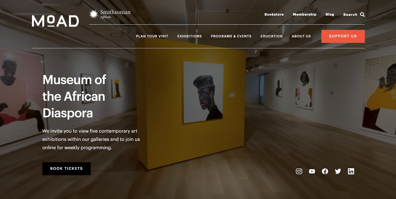
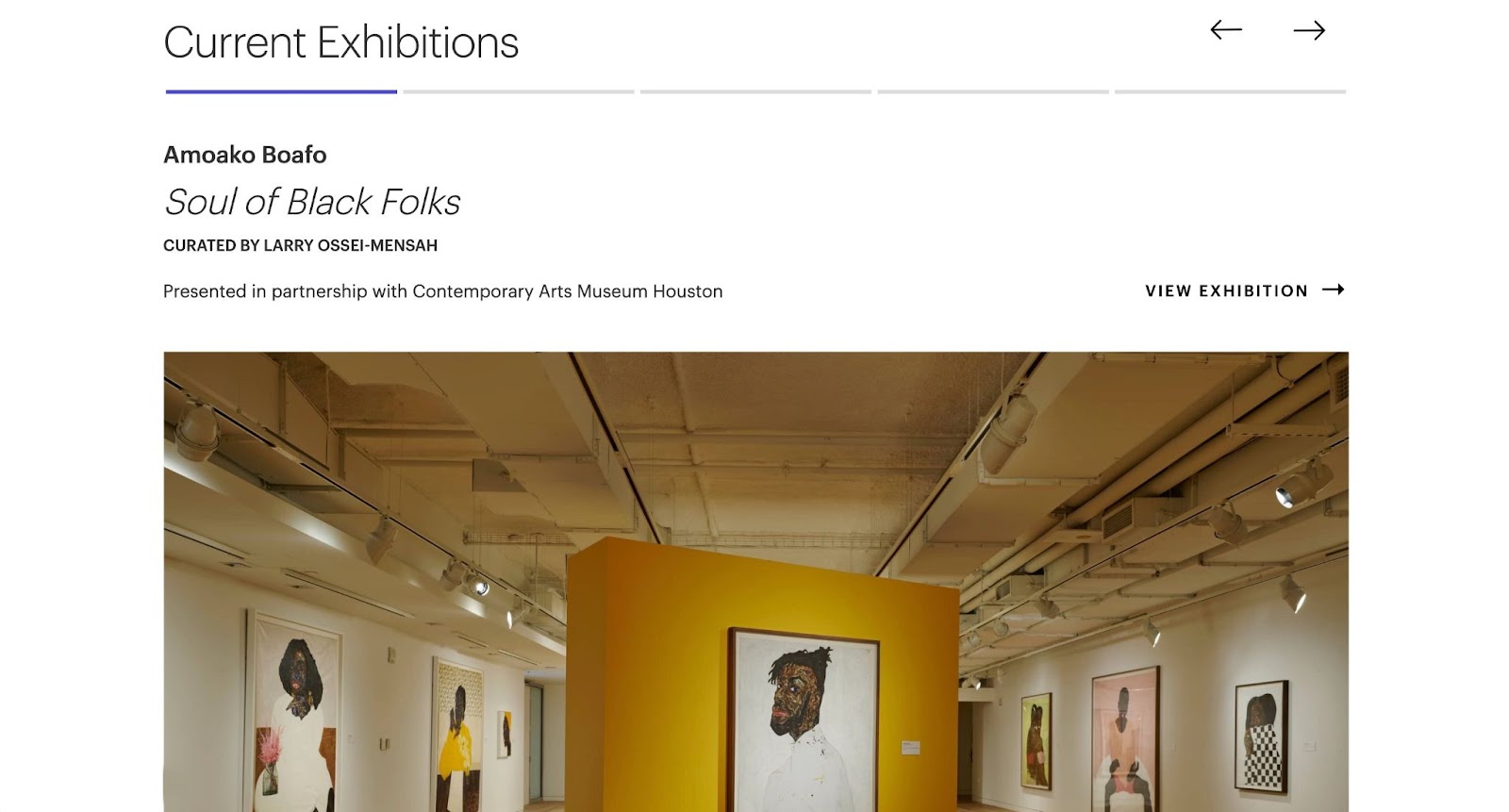
With all of the different information that larger organizations like MoAD need to provide on their site, it's imperative to have clear navigation, a smooth site experience, and easy-to-parse copy.
MoAD’s site has all of this and more. It’s as beautiful as it is functional — featuring photography and videography of the museum interior and different art pieces along with intuitive navigation, and a well-organized site layout.
8. Baby Race
Baby Race, created by Zürich-based supermarket chain Denner, is a platform game in the style of ‘80s Nintendo classics. In the game, you play as the Denner baby to collect pacifiers, fight off enemies, and try to complete the course before the countdown is over.
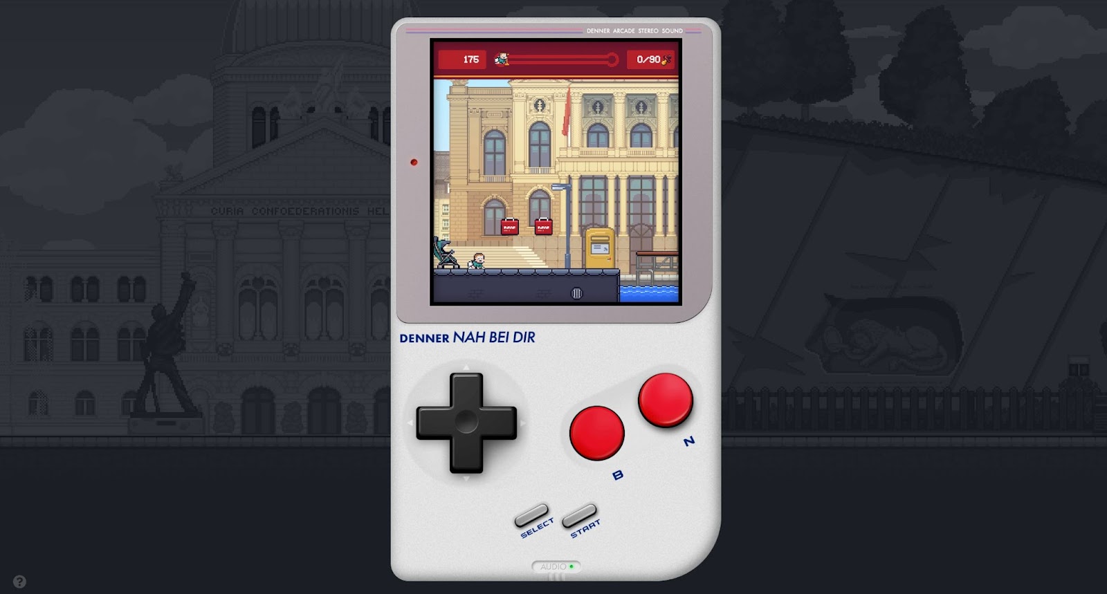
The Ese Agency created Baby Race as a Denner supermarket advertising tool. The goal is to show Denner customers how long it might take them to walk from a Swiss attraction to the nearest Denner supermarket — highlighting that Denner is “just a leap away.”
As we predicted in our 2022 web design trends, the web as a whole is moving towards being more experiential. Denner’s fun and creative approach to an advertising campaign certainly delivers a unique experience.
9. Juhi Chitra
We adore Juhi Chitra’s portfolio site. Based in Delhi as a UI/UX designer, Juhi has worked at and with companies like Zomato (as their head of design), The Times of India, Razorpay, and many others.
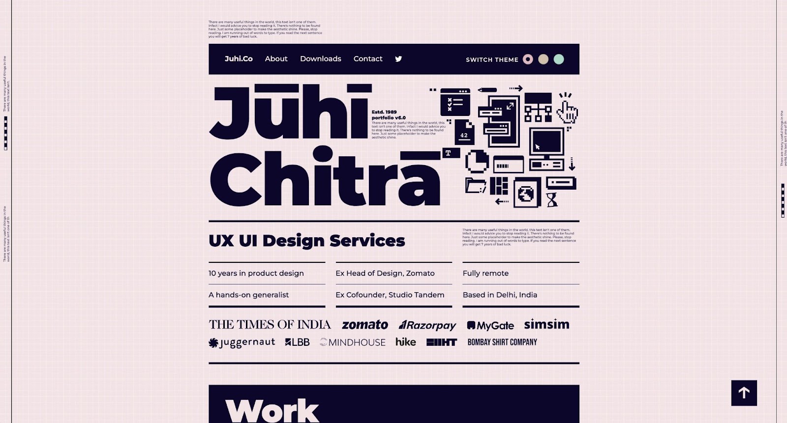
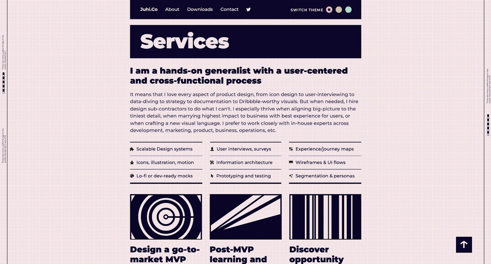
Juhi mixes an old and new approach — pairing icons reminiscent of ‘80s and ‘90s tech and a gridded background with subtle animations and a cool tonal pink and dark purple color palette.
Our favorite part? The different themes — Sans, Serif, or Mono — that you can pick as you browse Juhi’s site.
10. Snowhouse Studio
Snowhouse Studio is on a mission to combine creativity with “cutting-edge thinking in user interface design, e-commerce and conversion theory.” Though they launched in 2020, they’ve already worked with organizations like Elevate Brands, 8020, Craze, Mansa, and more.
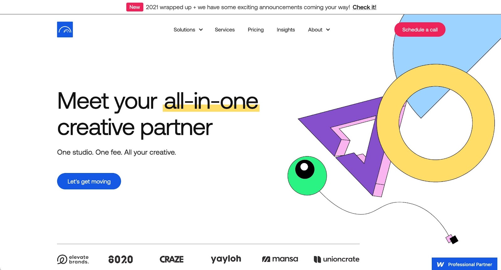
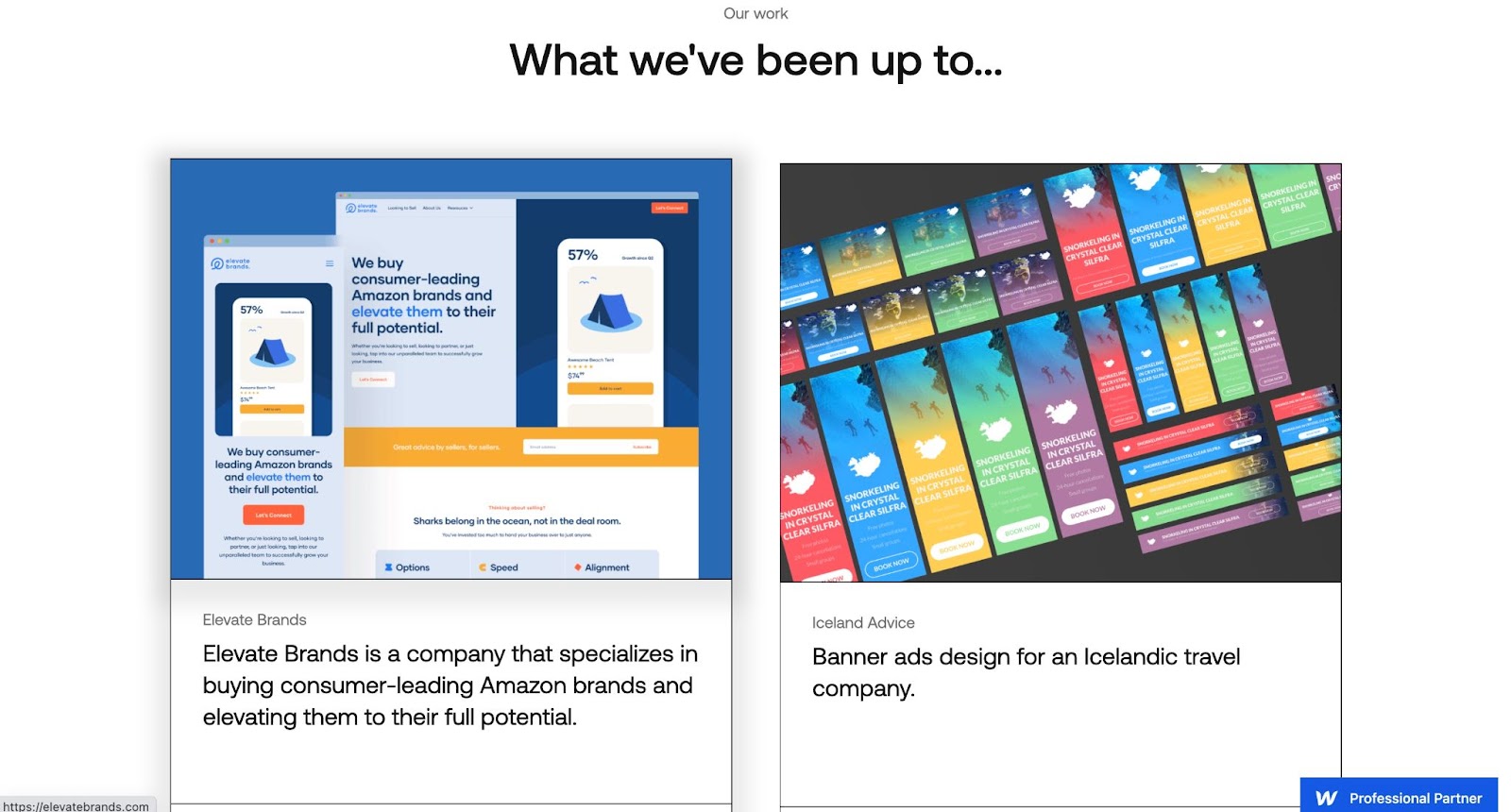
Their website is a great example of how to mix modern minimalist design with fun and color. The Snowhouse Studio site has clean lines and whitespace, but mixes in a fun sans serif font and quirky imagery to create a professional site with personality.
What are you working on?
Want to be featured in next month's roundup? Then be sure to submit your latest and greatest project to Made in Webflow — we’re so excited to see what you come up with!


