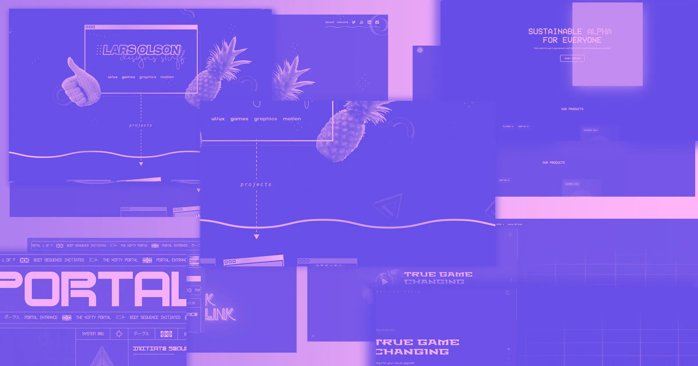
Bring on the nostalgia with a retro website for your client.
People choose brands, not products. Most of us want to see our interests and values reflected in a company’s branding. This helps us connect with the business and feel it’s the right choice for us. One way to build this customer-brand relationship is to lean into nostalgia to create a sense of familiarity.
Retro websites do just that, creating a meaningful connection with viewers by evoking cherished memories.
What’s retro website design?
Retro web design revives past trends to add liveliness and flair to a site and resonate with viewers’ emotions. Common retro themes include:
- Art deco style (art from the 1920s)
- Vibrant, flashy design from the 1990s
- Retrofuturism (the future as imagined by the 1950s)
- Maximalism (where more is more)
- ’70s revival (with funky shapes and warm color schemes)
- Art Nouveau
What are the elements of retro website design?
Here are a few commonalities throughout retro website designs:
- Throwback to a specific decade: A site often emulates a particular decade or moment in design, not several.
- Shapes, lines, and textures: Designers often use elements that were prominent in a certain decade to create a more suggestive retro feel.
- Previously trending fonts: Using fonts that were trendy in past decades is an easy way to add a retro feel to a site without changing much else. Many free font libraries exist to help you find one that suits your client’s taste while bringing in another dimension.
- Functionality: Retro websites imitate older design styles but prioritize modern navigation and functionalities.
8 fresh retro website designs
Here are eight websites that use retro graphic design elements to take us back to some well-loved eras.
1. Breakfast
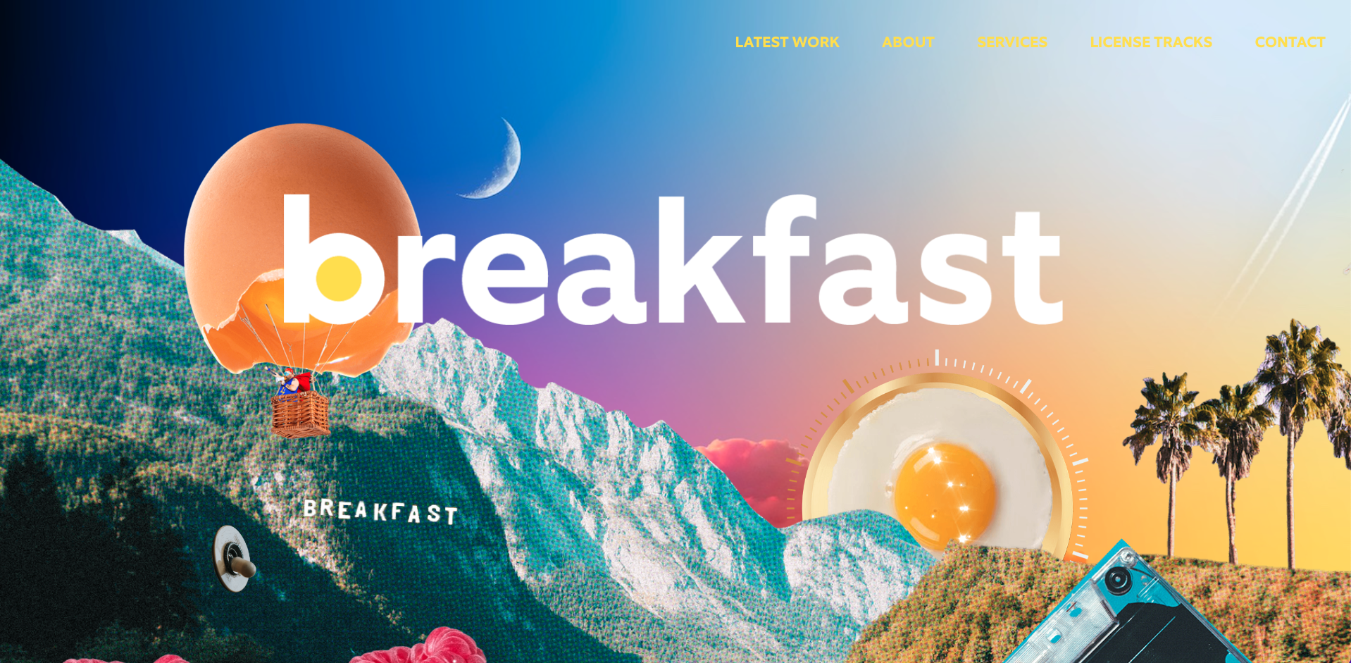
Breakfast is a creative music studio based in Los Angeles (LA) with a site that leans heavily on a retro-Hollywood ’60s style to resonate with the popular Laurel Canyon music scene, when recording studios were popping up all over LA. They use faded sepia-toned imagery to represent old photographs of Hollywood, plus graphics that directly connect with music’s well-loved past — an old recording studio switch, an egg that looks like a volume dial, and a cassette tape. Pairing this retro collage with modern fonts helps create a fun, colorful vibe.
These tactics help the site embody the era to provoke nostalgia from music lovers.
2. The Checkout by Klarna
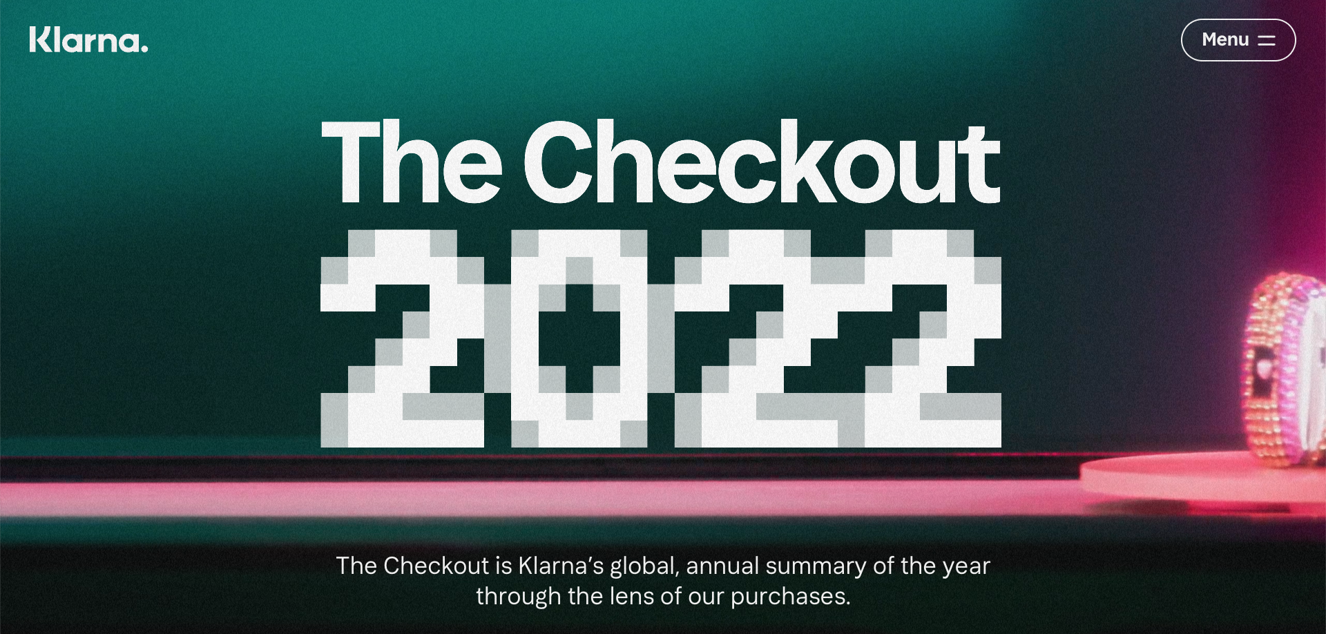
The Checkout from retail aggregator Klarna is an annual report that analyzes shopping trends. While not a retro gaming website, their 2022 site uses video-game-style pixelation throughout the header and some of the hover text.
The Checkout uses these video game elements to connect gamification (when a site uses video game tactics in non-game design) to shopping because most ecommerce stores incorporate some form of gamification. For example, any site that rewards buyers uses a subtle form of gamification. Like a video game that offers coins or points, these sites reward user behavior, such as purchasing, providing contact information or leaving reviews, to keep users “playing” — shopping on the site.
Klarna’s gamification tactic is to make it fun for viewers to explore the site by clarifying overly pixelated images as they click or hover. The longer users are on the site, the greater the chance they interact with something.
3. Peachtree Wellness

Atlanta-based Peachtree Wellness specializes in CBD and medicinal fungi products. Their designers, Tritium Marketing, chose a retro ’60s and ’70s vibe, with faded rainbow colors and bubbly, swirling graphics, to connect the products with the age when these ingredients picked up speed.
The slogan “CBD for the soul” suggests these products are holistic and intended to improve well-being. To tie into this suggestion, the retro style reminds us of the “Stay Calm and Carry On” and “Good Vibes Only” T-shirts popular in the ’60s and ’70s, reinforcing the idea that these products might help us relax.


Get started for free
Create custom, scalable websites — without writing code. Start building in Webflow.
4. Non-os
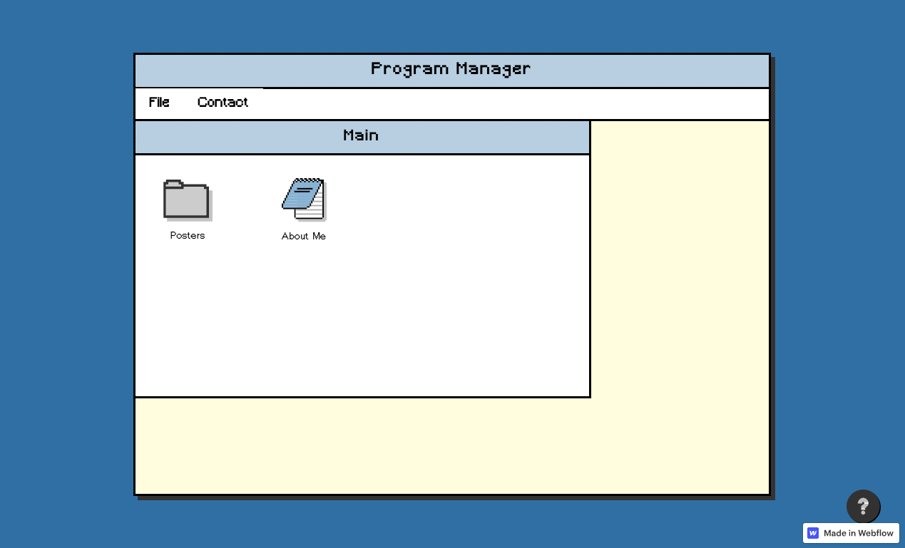
Nilay Nishit, an interaction and experience designer from India, created non-os. To express Nilay’s love of old computer interfaces, they’ve designed a website that resembles the original Windows 3.1, released in 1992, complete with the simplified icons for page links. This means the site is still navigable while adding visual interest with retro elements.
5. Daiya Droids

Fra Mauro designed the NFT site Daiya Droids, also opting for the vintage monitor look. Fra presents site content through an old TV monitor to resemble an interface that never made it out of the 1980s PC phase. With icons that resemble Windows 3.1, Daiya sells one of the most modern pieces of technology through a totally vintage lens.
6. Astro Forge
Astro Forge is a company that plans to mine asteroids, so the site’s retro arcade game, which resembles the 1979 game “Asteroids,” makes perfect sense. They even added pixelated character images that, when hovered over, jiggle like when you choose a character in a video game. Creating a site that resembles the game makes the site interactive and memorable while communicating the brand’s mission.
7. Simon Perini

Paul Hanna expresses Artist Simon Perini’s brand with a sepia-toned portfolio site that uses retro lines, shapes, textures, and the sun-bleached color scheme of ’70s surf culture to match Simon’s vintage designs. The best website designs keep content cohesive and on-brand to tell a client or artist’s story. This site connects fonts, graphics, and color tones to communicate the creator’s artistic style.
Create your retro website in Webflow
Web design trends constantly evolve, and what resonates with viewers changes daily. What’s most important is choosing a site design that effectively expresses what your client offers to assure visitors that this product or service solves their problems.
Webflow offers no-code templates that suit every audience and era — get started today.


