A well-designed photography website shows your client's artistic style to attract potential customers.
Whether your client specializes in wedding photography, portraiture, or commercial shoots, a stylish website is the best way to show off their work. With a compelling online presence, your clients will have opportunities to connect with audiences and grow their businesses.
From minimalist designs to bold, artistic layouts, these photography website templates offer the perfect starting point for creating stunning portfolios and designs.
What makes a good photography website?
From intuitive layouts to detailed biographies, here are the essential parts of an effective photography website.
Design and usability elements
Photography is all about aesthetics, so creating a beautiful, functional website is critical for attracting clients. Here are a few components to consider when building your client’s site:
- Visually appealing design — Photography website designs should have high-resolution images, minimalist layouts, and ample whitespace so visitors can focus on the work without distractions.
- User-friendly navigation — Make sure visitors can quickly find galleries, contact information, and other critical sections so they don’t leave the page. To improve navigation, create a well-organized visual hierarchy with a prominent menu and calls to action (CTAs).
- Responsive design — The site must be fully responsive, meaning it looks and performs consistently across all devices, including desktops, tablets, and smartphones. This responsive design helps potential clients have a similar experience regardless of how they access the portfolio website.
- Fast loading times — Slow web pages can frustrate visitors, causing them to leave the site. Photography websites are image-heavy, so ensure the portfolio loads quickly to retain and satisfy site visitors. Tactics like lazy loading and image compression can increase site speed.
Web page elements
When crafting photography websites, be sure to include the following:
- Portfolios and galleries — An effective photography website has curated galleries showing your client's best work. Organize these sections into project pages to help people quickly find what they're interested in.
- About page — An about page builds a personal connection with potential customers. It should include a short bio about your client, their professional background, and a statement about their photography style. This bio gives visitors insight into the person behind the lens.
- Contact information — Like menus and CTAs, contact details should be easy to find. For customers’ convenience, options for direct inquiries should be available through forms, email links, and phone numbers. You can also include online scheduling tools for consultations and bookings to help people reach out.
- Testimonials — Recommendations are a type of social proof that builds credibility and trust. Reviews show site visitors that other people had positive experiences working with your client, which helps convert potential customers.
- Search engine optimization (SEO) — Optimize your client's website to improve its ranking in search results. Reaching Google's first page makes their brand more discoverable, leading to more clicks and potential work.
10 inspirational photography website templates
An effective photography website engages potential customers by highlighting your client's work on a user-friendly platform. Here are 10 templates you can use to kickstart your designs.
1. Elise
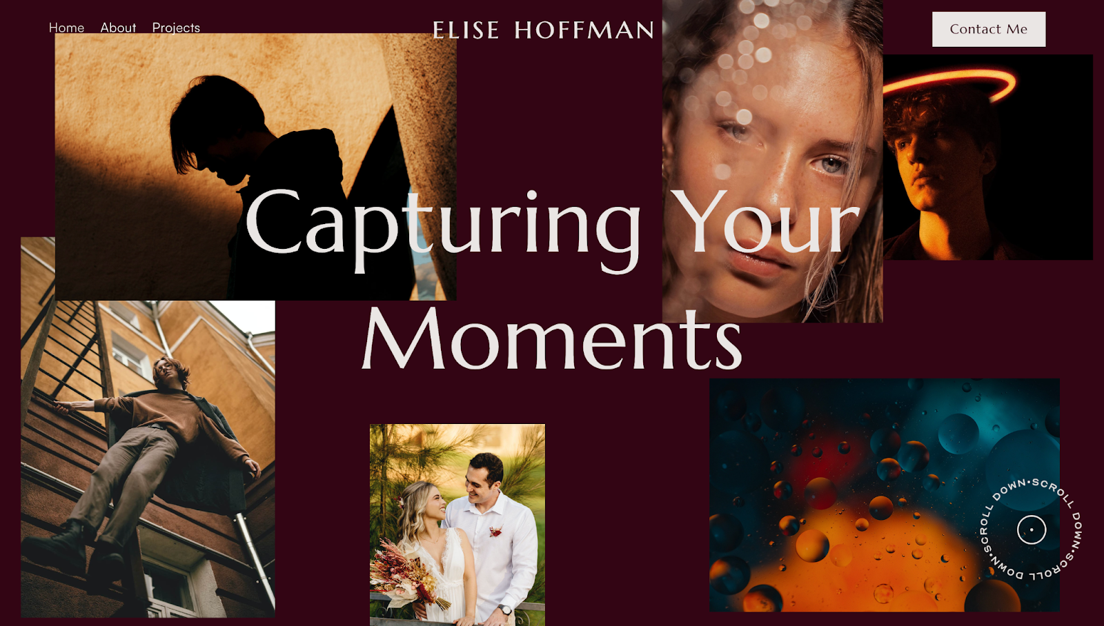
Lightning Lab created the Elise template as a portfolio for fictional photographer Elise Hoffman. A quick loading screen shows a portrait of Elise and her name, immediately telling visitors who’s behind the work shown.
A follow-up animation fills the homepage with examples of Elise’s work. “Elise Hoffman” moves to the top of the website, which reinforces her brand identity. On the left, a simple menu provides quick navigation options. And the prominent contact CTA button on the right allows potential clients to reach out anytime.
Scrolling reveals ample negative spacing between sections and elements. Readers can peruse an about section, social media links, and a photo gallery. By clicking on any image, site visitors will land on a separate page with a dedicated backstory to learn more about that specific project.
This layout keeps the focus on the photographer’s work, encouraging people who like their style to reach out.
2. Hailey
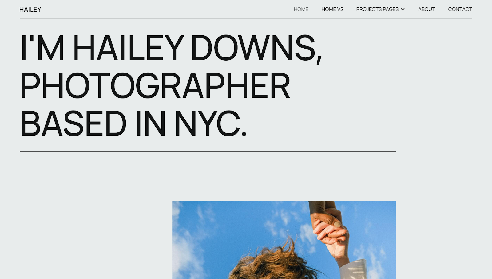
The Hailey photography site template, designed by Daniela Tomanova, has two homepage versions and four project page options to choose from. Both homepages immediately tell you that Hailey Downs is a New York-based portrait photographer. These pages have plenty of whitespace to draw attention to the images, which are static on Version 1 and dynamic on Version 2.
You can choose from four distinct project page layouts: two with dynamic hover animations and two with engaging scroll-triggered movements. Each option features a striking hero image to highlight the collections. No matter what you pick, you’ll offer visitors an interactive and captivating experience that invites them to explore the page further.
In the sticky menu, the about page also has a short bio with a list of clients and awards. Meanwhile, the contact page has a brief form with input fields, radio buttons, and a large “Submit” CTA button to streamline the form-filling process.
These flexible layouts allow you to customize the site for your client and make their work the focus of each page.
3. Leap
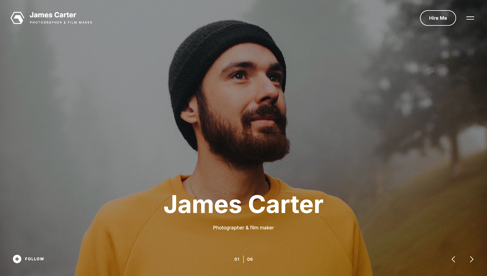
The Leap portfolio website template, designed by Elastic Themes, follows imaginary photographer James Carter's journey and services. The site has a clean, minimalist design that focuses on visuals. Full-screen images on the homepage immerse visitors, highlighting the photographer's work without distractions. Arrows let you browse pictures quickly in a slideshow style.
A hamburger menu and the "Hire Me" CTA in the top-right corner provide convenient navigation options and allow visitors to take action. The solid-color menu with hover-triggered background images adds an interactive element while keeping the design sleek and functional.
This template perfectly balances visual impact with a great user experience, allowing you to showcase photography while converting visitors into clients.
4. Photy
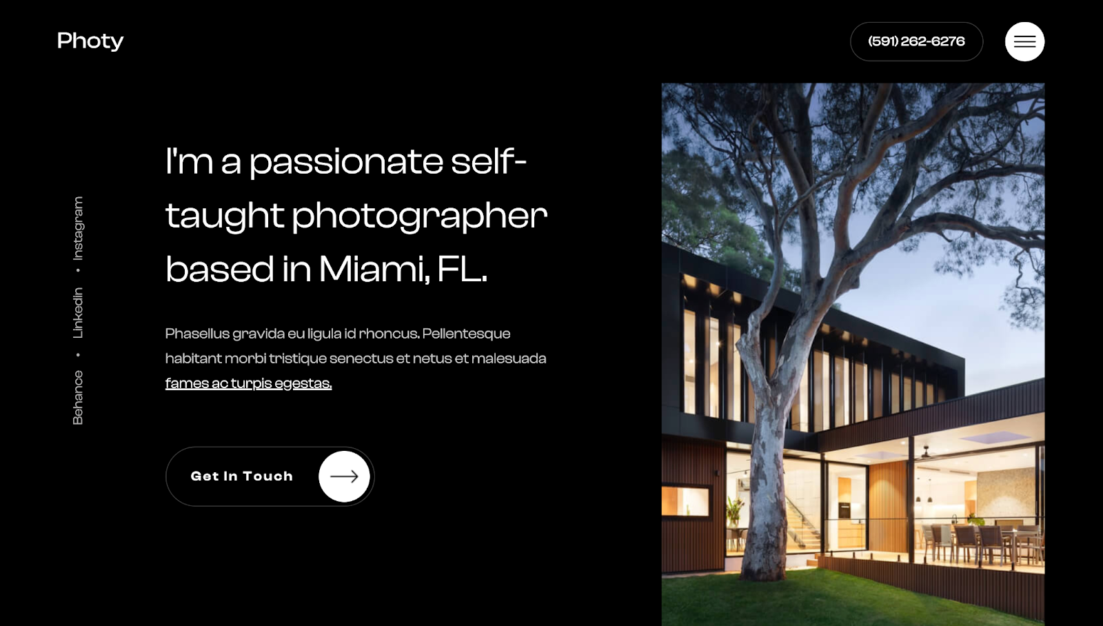
The Photy website template by Milos Knezevic uses a dark theme to create a sleek, modern aesthetic that makes the photographer's work stand out.
A single-page design prominently displays all essential information, such as a bio, number of clients, and years of experience. From left to right, a clear visual hierarchy guides the viewer from the brief bio to several image samples.
Clicking the hamburger icon in the corner reveals a sidebar menu with various navigation options, including an about page, a services section, and a portfolio. Under the portfolio page, the grid-style gallery lets readers filter images by category for quick navigation.
The services section breaks down these categories further by showing the photographer’s focus on wedding and car photography, which attracts visitors searching for this style. The template includes a dedicated blog so your client can share their knowledge with potential customers. All these elements combine to make a layout that’s perfect for highly specialized photographers with an in-depth understanding of their niche.
5. Mirro
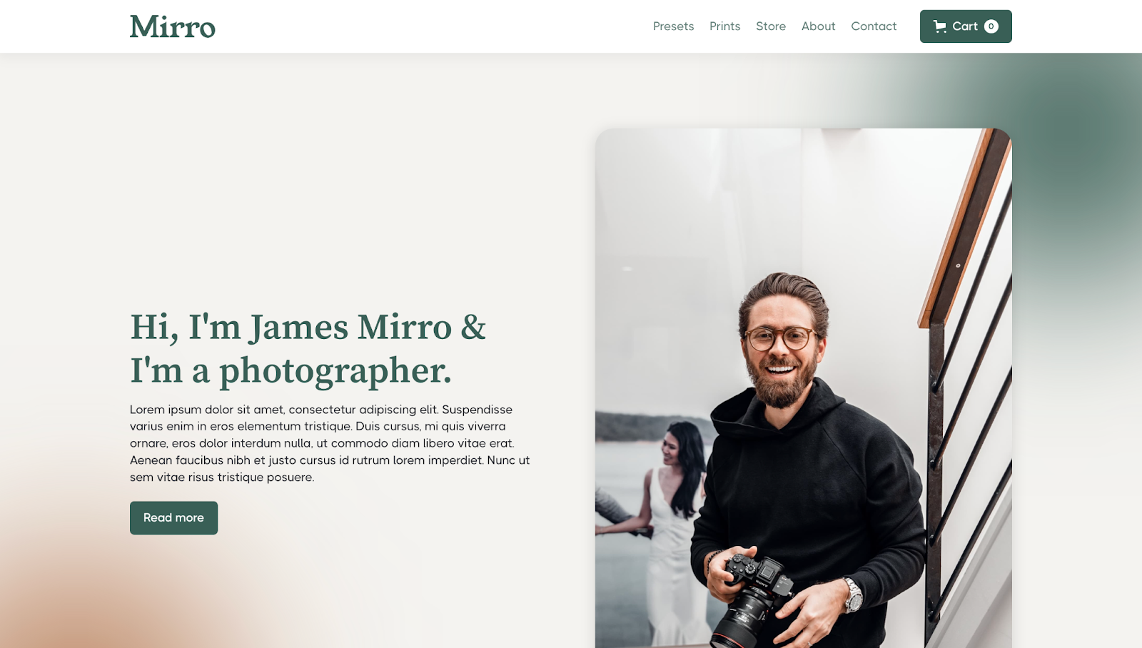
Designed by GKDC, the Mirro photography website template doubles as a portfolio and ecommerce store. With this layout, your client can both showcase their work and sell prints.
The homepage has a portrait of the photographer, James Mirro, with space for a solid personal introduction that can build an immediate connection with visitors. To create a consistent visual identity across the site, GKDC uses consistent branding elements like varied serif and sans serif typography, a soft gradient-like color palette, and rounded UI cards.
Scrolling reveals a well-organized services section outlining the photographer's offering. The ecommerce elements Presets and Prints have dedicated sections appealing to buyers.


Discover inspiring design work from the Webflow community
Made in Webflow is the place to browse, clone, and customize the latest websites built by the Webflow community.
6. Toronto
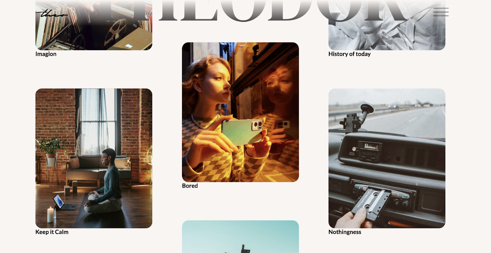
The Toronto photography site template, designed by Azwedo Templates, instantly engages visitors with its unique scrolling mechanism. Three photo columns move in opposite directions to create an interesting browsing experience while focusing on the photographer's work. Each image is a gateway to a dedicated project page, offering more context and details to help potential clients decide whether the photographer's style suits their needs.
Upon clicking the hamburger icon, a minimalist menu design appears, outlining a straightforward navigation path that doesn't distract from the visual experience. Since the menu only features three options, it keeps the focus on the photography.
7. Focal Photography
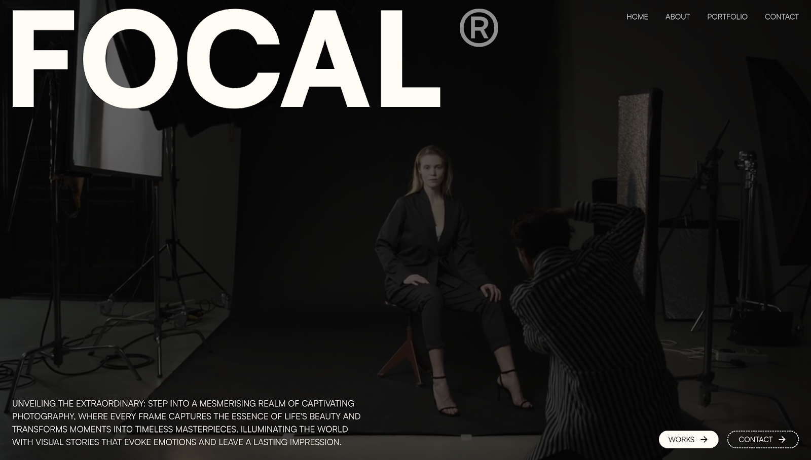
Daniel Vaszka designed this Focal Photography template, which features the fictional character Max Cooper's personal portfolio. The website's looping video immediately grabs attention by showing Max working with a model, humanizing his services and creating a personal connection with potential clients.
A short about section appears under the video, providing insight into Max's creative approach with information on completed photoshoots, years of experience, article features, and awards. Scrolling further reveals a section of Max's best work as a fashion photographer. The images are monochromatic, but hovering over a thumbnail colorizes it, bringing that picture into focus. Clicking on a photo takes readers to an expanded project version with more details.
The rest of the site's structure follows a logical flow, guiding visitors through dedicated pages on Max's credentials, featured work, and contact information. Daniel also uses large, bold text to effectively communicate messaging and a grid layout so readers can filter images by category.
8. Arete
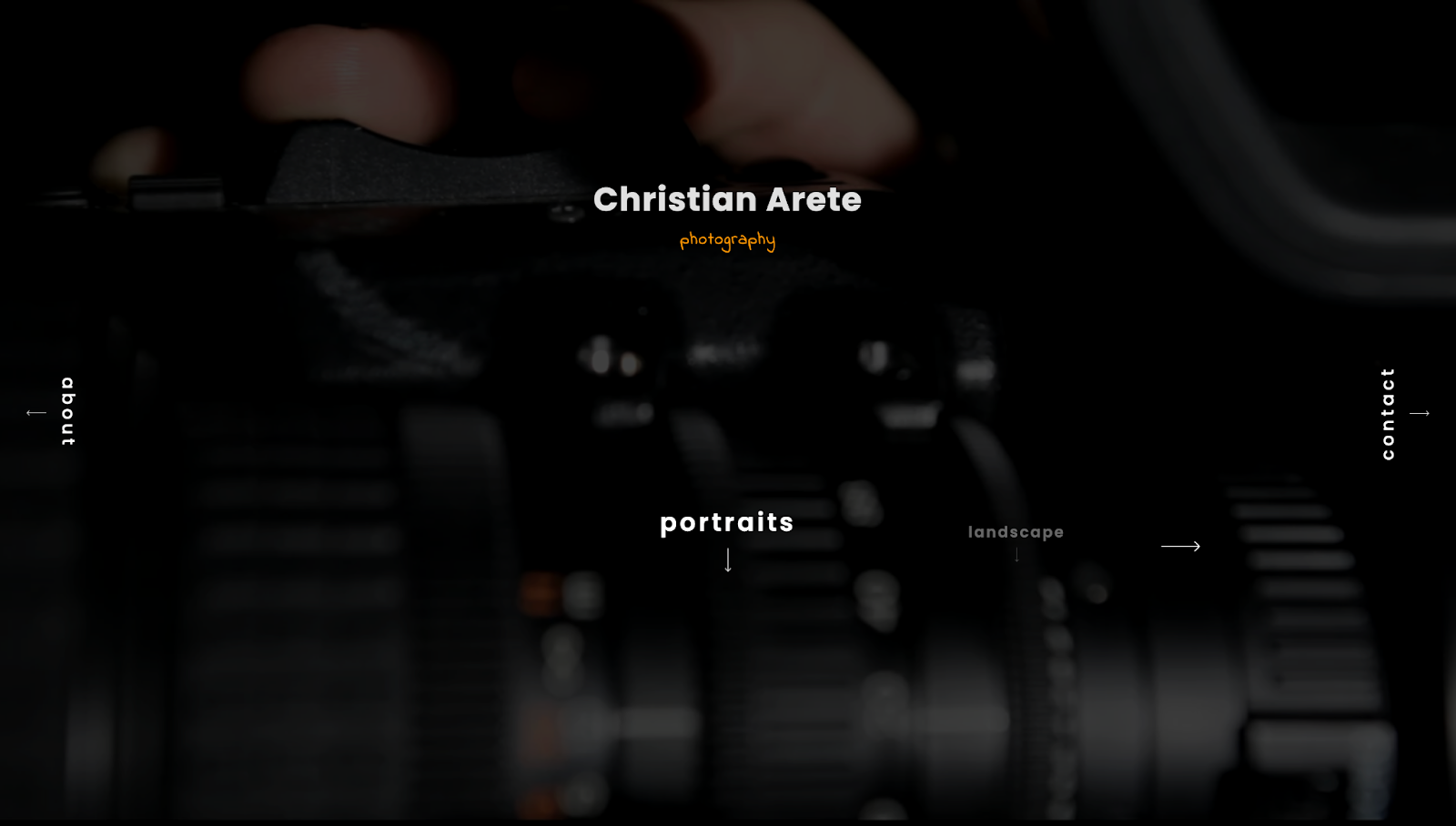
Arete is a cloneable website template created by Ivan Grozdic. This single-page layout’s background focuses on a dim video of someone adjusting a camera’s settings, and the rest of the page highlights navigation options. Using minimalist design techniques like this ensures an immersive user experience centered on the photographer's work.
Simplistic design choices allow visitors to navigate between wildlife, portrait, and landscape photography. For instance, to help visitors access essential information without distracting from the primary visual elements, text navigation for the about and contact sections appears in small, vertical font. And using a dark theme with contrasting text and negative spacing highlights essential information while placing the photos at the center of attention.
As a final, professional touch, each section has details about the photographer’s camera and settings. This snippet of authoritative content aims to reinforce the photographer’s expertise.
9. Visionary DB
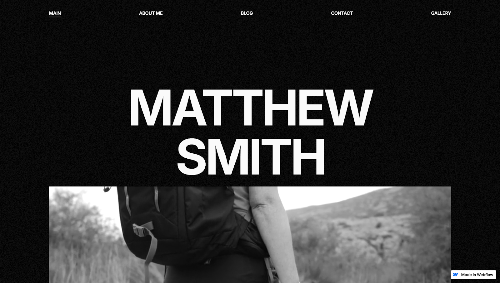
Visionary DB by Digital Butlers is a monochromatic photography website with plenty of whitespace. To create a modern aesthetic, the site uses minimalist design techniques, like sharp edges, sans serif text, and black-and-white images. Hovering over the pictures in the gallery sections colorizes them, drawing attention to the photos.
Testimonials and a list of high-profile brands lend credibility and show the photographer's experience as a collaborator and artist. The fictional photographer's name, Matthew Smith, appears in the header and footer, reinforcing their brand identity. A contact form and social media links in the footer also make the site an effective marketing tool, encouraging potential clients to reach out for work.
10. Aerials
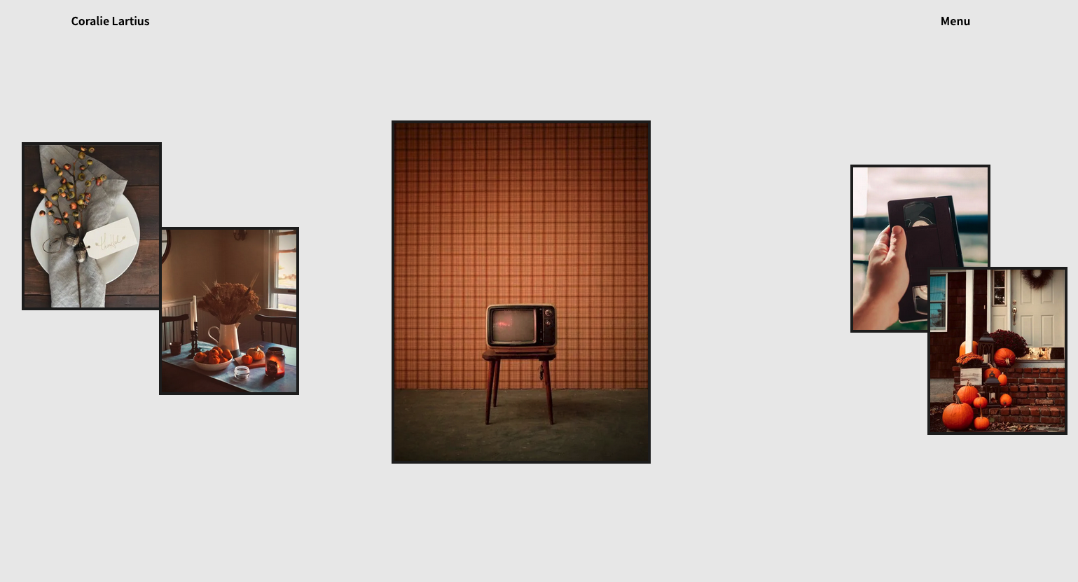
The Aerials website template, made by Over Sight, opens with framed images against a gray background. This layout makes the photos look like they’re hanging on a wall, giving site visitors the feeling of observing the photographer’s art at a gallery.
Following this homepage banner, an interactive carousel shows past projects. Hovering over these images makes red overlays appear, highlighting the project titles and model names. Similarly, when you hover over different photography styles, a related image appears and gently wobbles.
These dynamic elements give the site a playful edge, making the photographer seem more approachable. And Over Sight pairs these animations with a monochromatic theme and detailed package information to create a fun yet professional brand identity.
Show off your clients’ styles with Webflow
A photography portfolio puts your clients on the map, allowing them to collaborate with like-minded professionals and land customers. While they focus on taking pictures, you can access Webflow's visual website-building tools to bring their work to life.
Jump-start your design process with Webflow templates, or build portfolios from scratch using the Designer tool. Our SEO features help Google index your client’s content and improve their SERP rankings. And as their portfolio grows, you can make real-time updates to their page with edit mode.
Find everything you need to create, manage, and launch photography websites with Webflow.

Get started for free
Create custom, scalable websites — without writing code. Start building in Webflow.


