A SaaS landing page has one goal: convert visitors into potential customers.
Your landing pages need to do more than look good — they need to connect with visitors and drive results. A compelling software as a service (SaaS) landing page uses engaging headlines, visuals, and calls to action (CTAs) to convince visitors to convert.
Every design decision should showcase how the service suits the target audience’s needs. It takes some experimenting to get just right, but these landing page examples will give you some design inspiration that’ll help.
Essential elements of a SaaS company landing page
Whether you’re making a SaaS landing page for a client or a company you work for, you’ll need the following elements to best showcase the service:
- A hero section at the top of the landing page that features eye-catching visuals and headlines. This segment should immediately get readers excited to learn more about the service.
- Feature highlights that describe the service’s unique value proposition.
- Testimonials, reviews, and other forms of social proof explaining why existing customers love the service.
- A call to action (CTA) that coaxes readers into your conversion funnel by giving them a clear next step to take.
How to tailor your landing page to your audience
SaaS companies develop platforms for a wide range of needs, like designing websites or editing text. These needs should be your focus when creating a SaaS landing page — the more you understand your target audience’s pain points, the better you can explain how the software solves them.
Thankfully, you likely already have a set of developed user personas to rely on. Before building a SaaS platform, developers research potential customers and tailor the product to these ideal users. Review these demographics to learn about your target audience’s expectations, then use your landing page to highlight the selling points that will interest them most.
6 great examples of SaaS landing pages
Use the following six Made in Webflow landing page examples to inspire your own designs.
1. Typogram
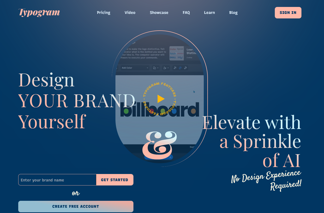
Typogram gives customers the tools to design their own logos and enhance them with artificial intelligence (AI). The landing page opens with a demo video of someone creating a logo, showing viewers how to use features like kerning and coloring. This video demonstrates the whole process in three minutes, suggesting that the platform is simple to use.
Throughout the rest of the page, targeted CTAs lead to relevant next steps. For example, one section describes which features customers can access during a free trial, and a button beneath reads, “Create Free Account.” And other text boxes ask visitors to sign up for the brand’s newsletter. As a result, viewers can enter the marketing funnel in several ways, which could lead to higher conversion rates.
2. Clay

Clay is a research and lead management tool. It uses AI to help marketing teams make better decisions about ads, lead generation strategies, and conversion rate goals.
On the left-hand side of Clay’s landing page, tangled wires lead to a flowchart of the company’s offering. And the last step connects to a set of organized wires on the right. This clear visual represents marketing teams’ processes before and after using Clay — it suggests that the platform will detangle confusing tasks and data.
The site backs up this claim by showing off big-name clients like HubSpot and Dropbox. Including top brands as social proof signals that Clay is a reliable platform.
To subtly lead readers into the conversion funnel, this page uses CTAs like “Try AI messaging” and “Explore enrichments for free.” By placing CTAs where they’re most relevant and matching these phrases to related features, Clay invites site visitors to learn more about the software at every step of the way.
3. Audienceful
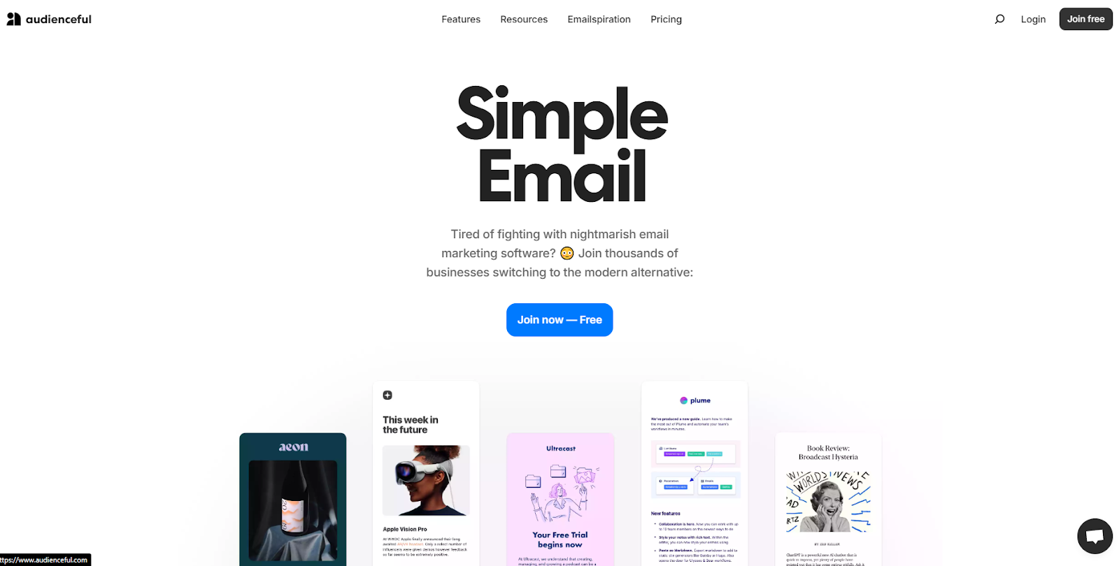
Audienceful helps marketers design personalized email marketing campaigns. They aim to help users increase conversion rates and build better brand awareness. The platform’s landing page aligns with those goals by showing off real email examples made with their software so visitors can see what the tool is capable of.
This page’s use of emojis and casual language shows that you don’t need complex copywriting skills to create a compelling, high-converting homepage. Instead, Audienceful relies on persuasive, concise headlines like “Easy as writing a doc” and “Branded, modern emails in 1 click” to showcase their value.
Pairing these titles with candid testimonials that offer relatable social proof gives the brand a more authentic feel. All these elements work together to make Audienceful’s product seem both useful and approachable.


.jpeg)
9 B2B website optimization ideas that work
In this ebook, learn strategies to increase B2B website conversions
4. Way
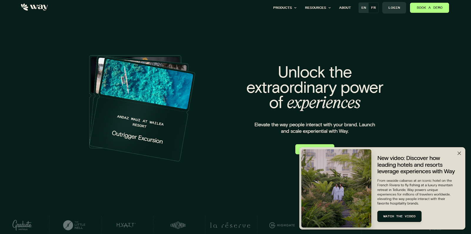
Way works with hospitality platforms, restaurants, and retailers to help them connect with potential customers. From reading their landing page, you can tell they have a detailed understanding of their customers’ concerns. Way speaks directly to specific use cases and shows how their features precisely meet those needs.
For instance, the company recognizes that their target industries want to save time on branding. So, the site positions the platform as an all-in-one solution with headlines like, “Manage experiential from a single hub.”
This landing page example highlights the importance of user research. By speaking directly to your target audience’s pain points, you can better convince them to consider your service.
5. Storylane
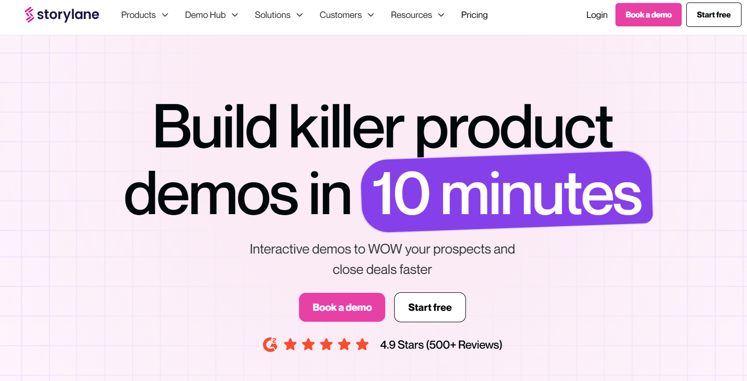
Storylane is a service that builds interactive demos for other products and services. Built by ThunderClap, the landing page begins with a large headline that immediately announces Storylane’s value proposition: generating great demos in a fraction of the time it usually takes.
After that, the site offers an interactive demo so visitors can explore the platform firsthand. This shows Storylane’s confidence in their product since they allow potential customers to try it without signing up. To instill even more trust with site visitors, the page includes a header that reads, “Loved by 3,000+ marketing teams at,” and then lists the brand’s major existing clients.
6. Summit
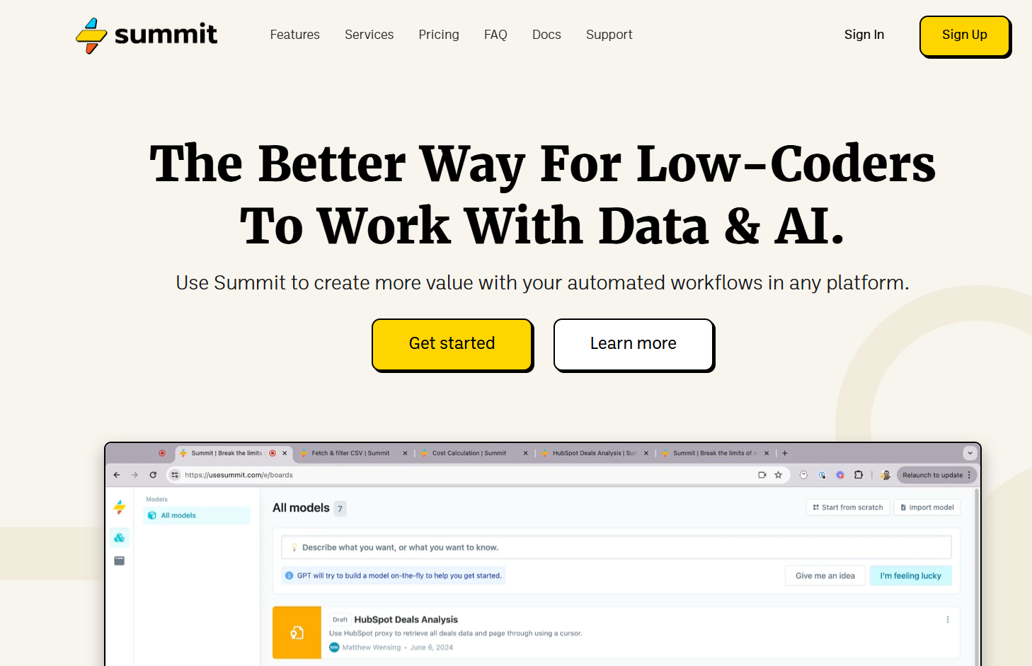
Summit is a workflow automation tool that requires minimal coding. Its primary appeal is that it’s lightweight and versatile, which the landing page design neatly reflects. There’s plenty of white space, and the concise headlines make scrolling through it inviting. This alignment between the product and the landing page gives Summit a cohesive brand image that convinces readers that they know what they’re doing.
This page shows the importance of matching your site to the service you’re describing. In this way, your landing page design serves as a demo of the product experience visitors can expect.
Build high-converting SaaS landing pages with Webflow
Achieving a high conversion rate is about more than having the best service. Even if you have the most features, lowest prices, and highest review scores, you still need a landing page that makes all those facts plain to your target audience. They’ll only enter your conversion funnel when they’re convinced that your service is the best.
To accomplish this goal, try Webflow. With our platform, you can quickly create engaging designs that carefully weave visuals, headlines, and CTAs together. Whether you want to build a site from scratch or start from a template, Webflow supports your design goals.
Get started with Webflow to launch your next SaaS landing page project.

Build with Webflow
Webflow Enterprise gives your teams the power to build, ship, and manage sites collaboratively at scale.